I know a secret about Internet marketing that you may not and it directly affects how you should layout your website homepage.
Here you go…
The Internet – all of it – is nothing more than advertising.
I am not just referring to the ads that appear on Google Search results or the Facebook ads that appear on your news feed. Those are ads too, for sure, but that’s not what I mean.
The currency of the Internet is your attention. Every tweet, status update, forum post or YouTube video is an invitation for your time, energy and attention. And each one of these items is essentially in competition with each other. Only the most interesting or valuable or relevant item will command your attention.
What does this have to do with how you layout your website homepage?
Everything!
You see, the way I think of the homepage of a website is that it is essentially a series of advertisements for the inner pages of your site.
The challenge when it comes to structuring a website is that there is more than one user type coming to the site and they each have their own needs.
Some visitors are in information gathering mode, they’re not even sure what solution they need at the moment and are not ready to make any type of buying decision today. But they probably will in the next 3-6 months.
Other visitors are ready to make a purchasing decision now and are just looking for the best option. But even among those visitors, there are many different types. Some users are looking for the best price, others the most reliability, others still are just looking for the best.
In any case, the point is, there are lots of different people coming to your site, each of who is at a different stage in the buying cycle and who are looking for different things.
Because of this, the homepage of your site needs to serve as a decision-making tool, to allow visitors to quickly identify the thing they are interested in and take the next step.
That is why I like to think of the homepage as a series of advertisements to the rest of the pages of your site.
How to Layout Your Website Homepage
Here’s how we typically layout a website homepage design.
The first thing we do is establish the sitemap of the website. You can read more about how to create a sitemap, but the main idea is, what are all of the pages of the website going to be and how do they relate to each other?
Once the pages of the site have been established and we know which pages are the most important, which is typically on the top level of the navigation menu, we then mirror the content structure of the homepage to cover all of those pages.
So, let’s use a recent client as an example. The top-level navigation is Home, About, Services, Portfolio, Pricing, Blog, and Contact. We structured her homepage layout as follows:
- Services
- About
- Blog
- Portfolio
Once we know which pages need to be represented when you layout your website homepage, we will add some elements to enhance the Influence factors of your site. These are based on the groundbreaking research of Dr. Robert Cialdini, outlined in his book Influence.
Here are some of the elements we might add:
Testimonials
This is done to increase Social Proof as well as Likeability

Logos
When we layout your website homepage, we add either partner logos or association logos to increase Authority and Social Proof

Quick Stats
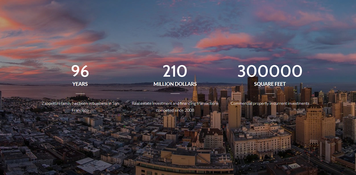
We find adding quick, eye-catching stats on the homepage to be very useful.
This plays on visitor’s availability bias allowing them to access information quickly without having to expend too much energy

Giving
While this shouldn’t be done solely for self-serving purposes, you should highlight charities you support. If your company gives back to the community in a meaningful way or actively supports a cause you believe in, it’s a great idea to highlight that message on your homepage. This triggers Liking and Reciprocity.

Newsletter Sign up / Lead Magnate
For visitors who aren’t ready to make a buying decision today, you can stay in touch with them via a newsletter or capture their email via a Lead Magnet
This triggers the Commitment and Consistency bias as well as the Reciprocity bias

Next Steps
So, going back to our example, here was the updated content structure:
- Services
- About
- Testimonials
- Posts
- Portfolio
- Giving Back
- Featured In Logos
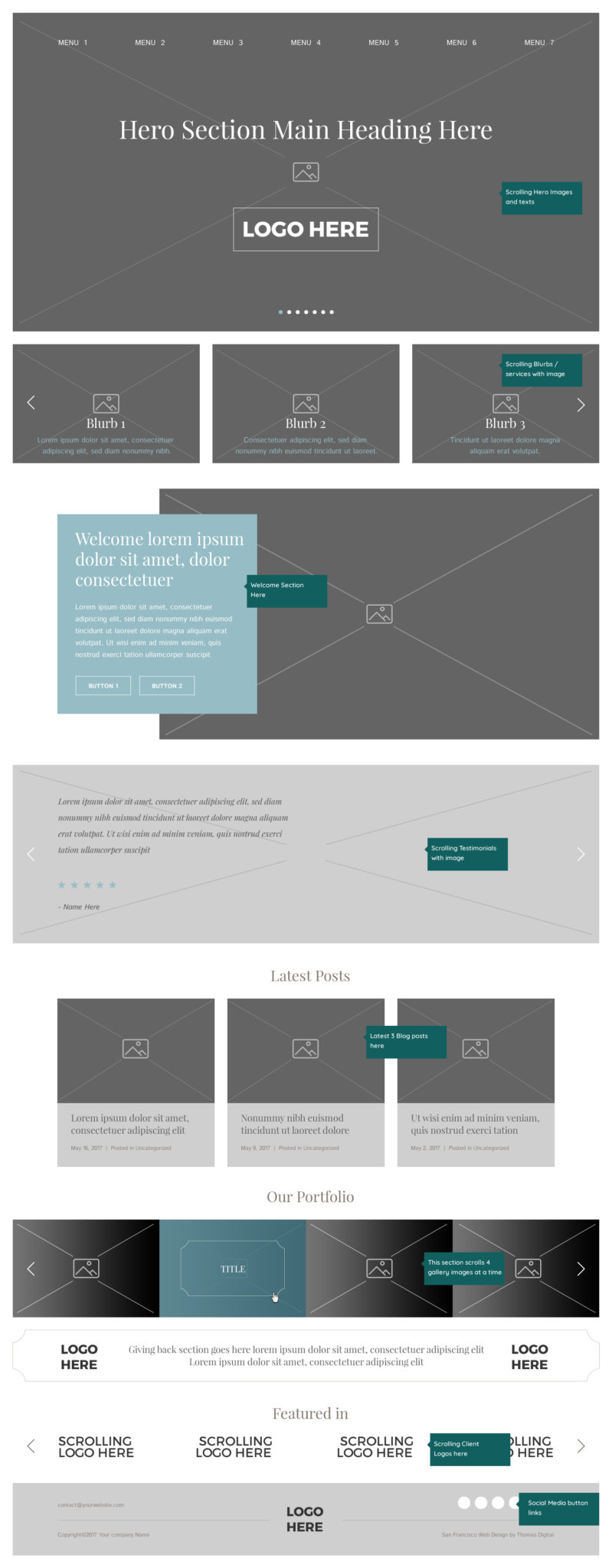
Now, once we know what the content sections will be on the page, we turn each of these into a picture.
Conceptualize these as a simple wireframe. See the example below.

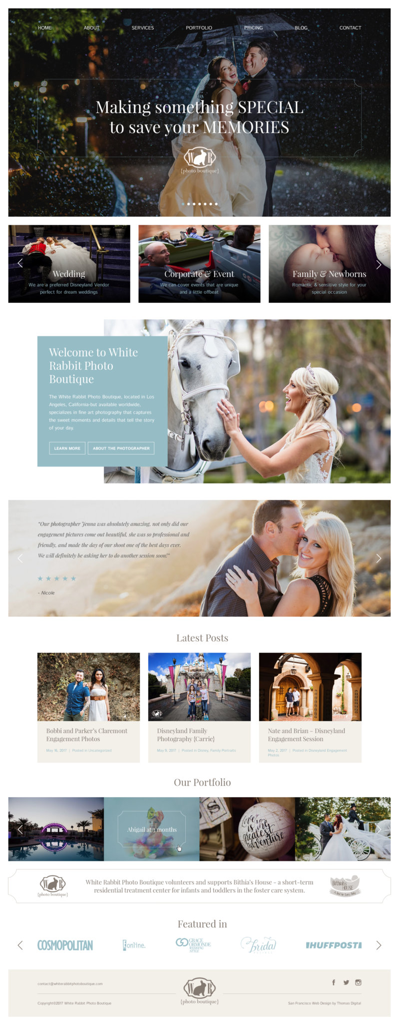
Next we will turn that wireframe into a series of pictures, or in fact, a series of compelling advertisements meant to call attention to the specific desires of each unique visitor that comes to the site.
Here is how we have turned that wireframe into a series of pictures:

And there you have it! Voila! A clean beautiful looking website, designed specifically cater to the needs of most key visitors to the site and send them on their way to the most relevant piece of content on the site and from there, taking the next step and inquiring further.
If you would like help redesigning your website, read below to learn more about our Free Mockup Offer and how we can employ this entire process for you for Free before you sign or pay for anything.
