Looking for the best nonprofit websites on the web? We’ve got you covered. We’ve scoured the best in nonprofit web design so you don’t have to. Nonprofits are looking for ways to engage their supporters and donors in new ways. Nonprofit websites have evolved over the years from an online brochure to a rich experience where nonprofits can tell their story, share updates with followers, engage supporters, and make it easy for more visitors to take action. In this blog post, you’ll find resources that every Nonprofit Web Designer should be aware of!
Table of Contents
Nonprofit Website Design Inspirations
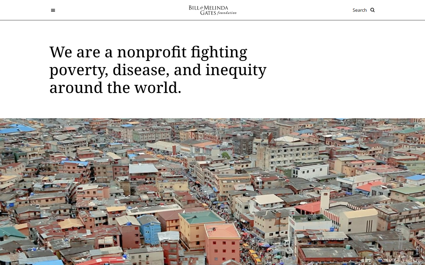
1. Bill & Melinda Gates Foundation
Why it works: Strong and striking statement on the hero section with clean execution of graphics. Each section narrates a different mood to match a corresponding organization’s brand story.
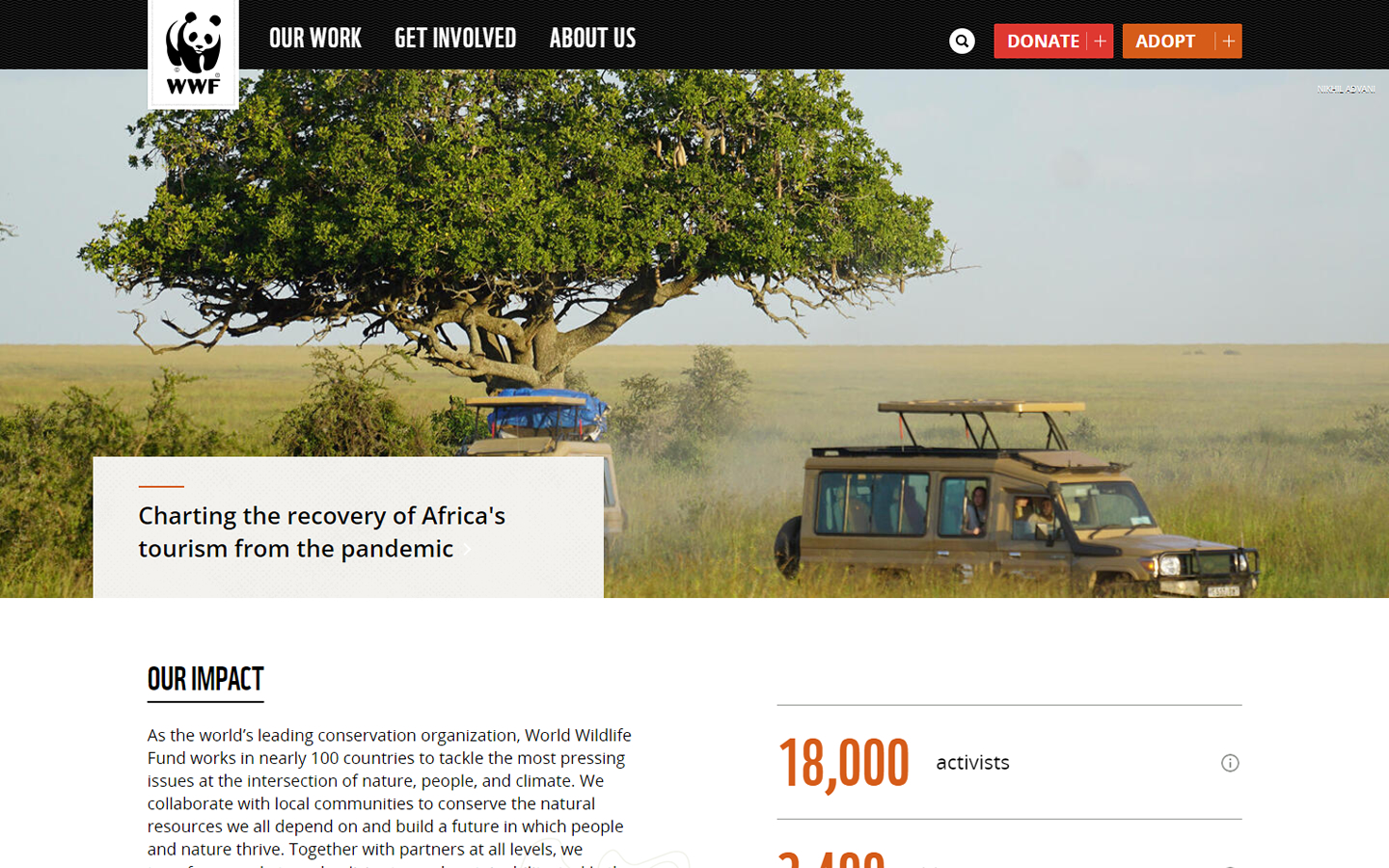
2. WWF
Why it works: The donation and adoption buttons are immediately seen upfront. The use of a masonry grid in displaying information is elegant. The donation form is simple and straightforward.
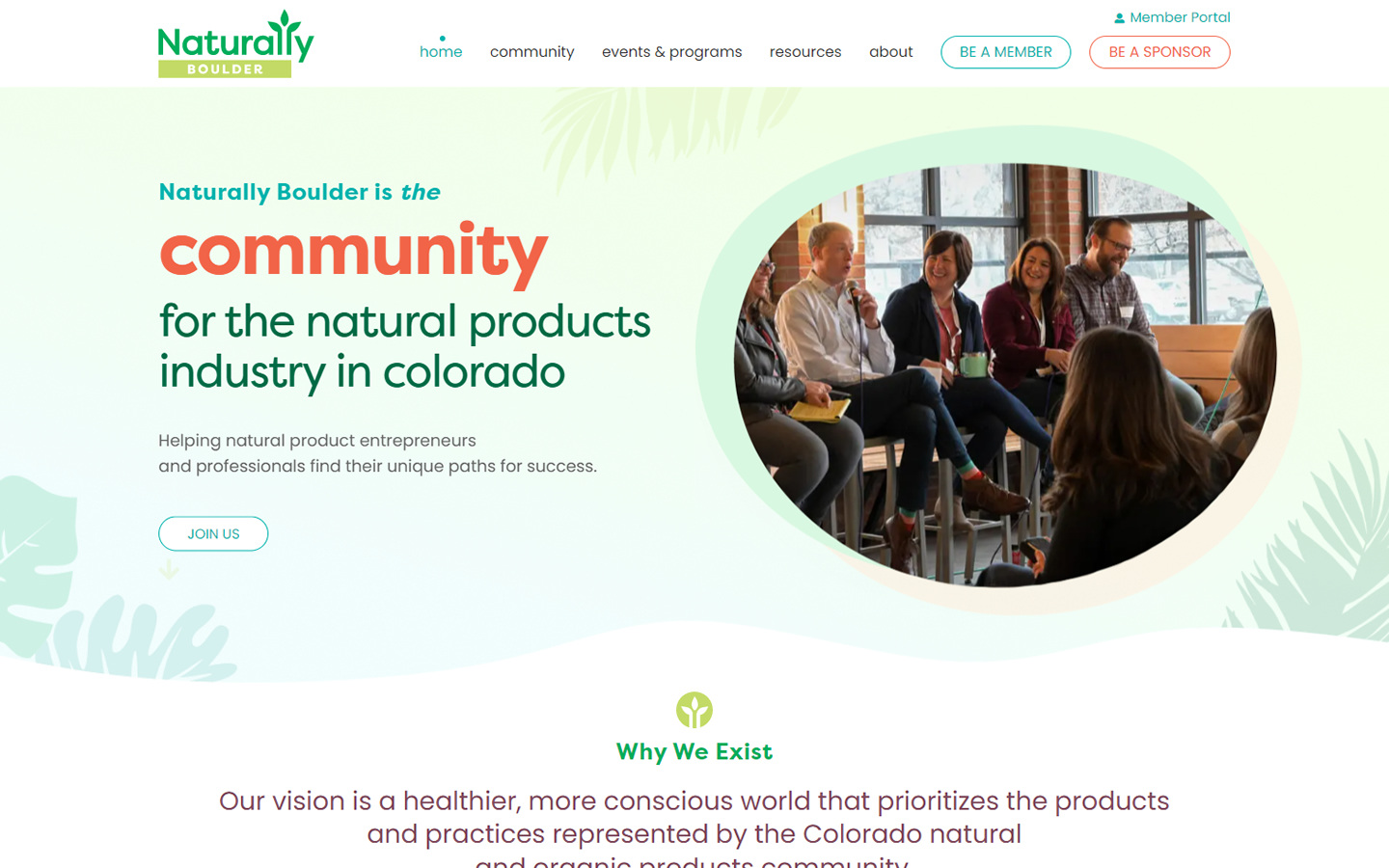
3. Naturally Boulder
Why it works: The hero banner is interesting and creative. The bright, serene hues convey optimism and faith to the target audience.
best nonprofit website design
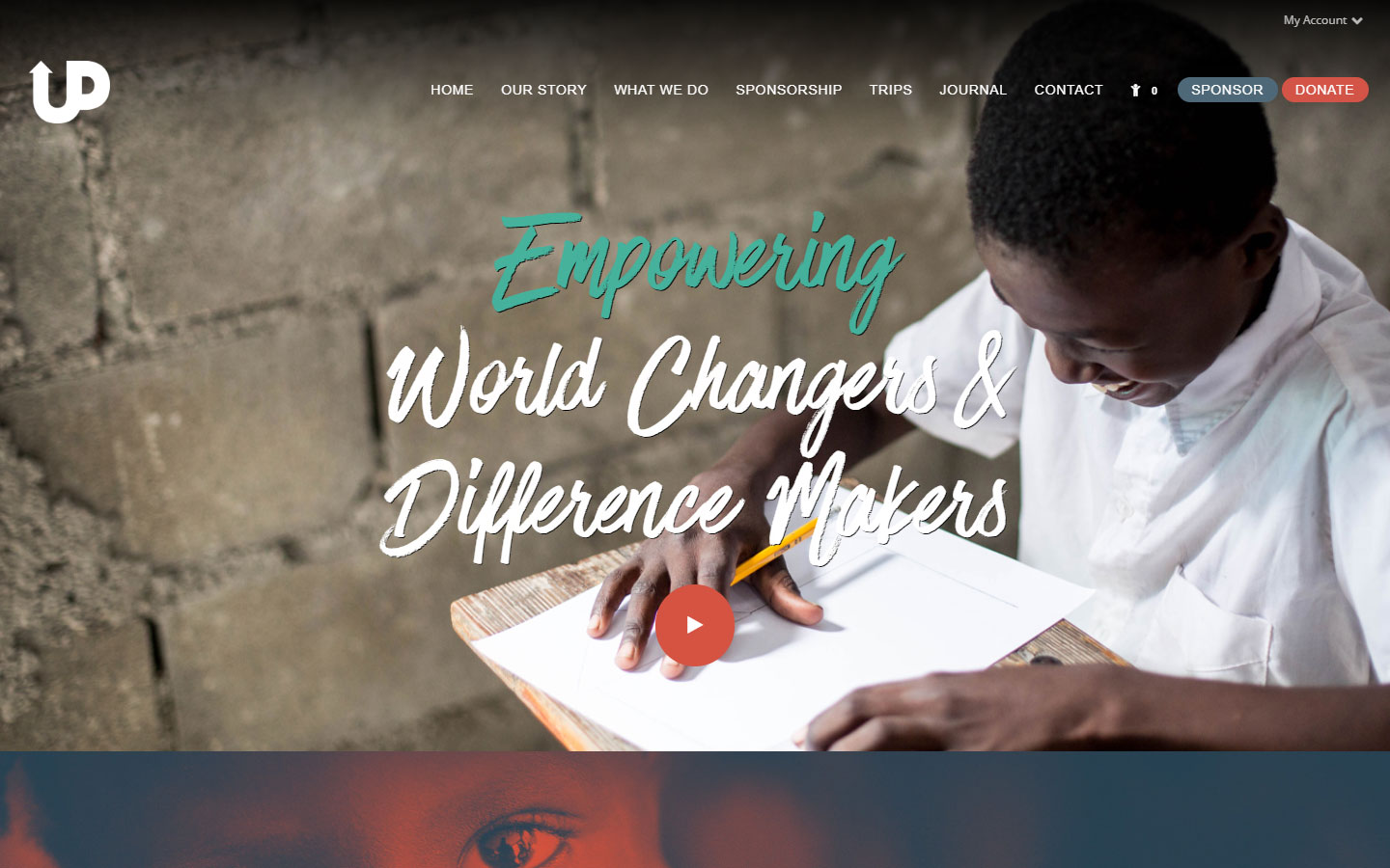
4. Upstream International
Why it works: This website’s design elements incorporate some of the most popular photo filters as a theme. Fantastic photography. Colorful yet clean web design. The donation page of the website is very organized and makes it easy for donors to see where their online donations are going.
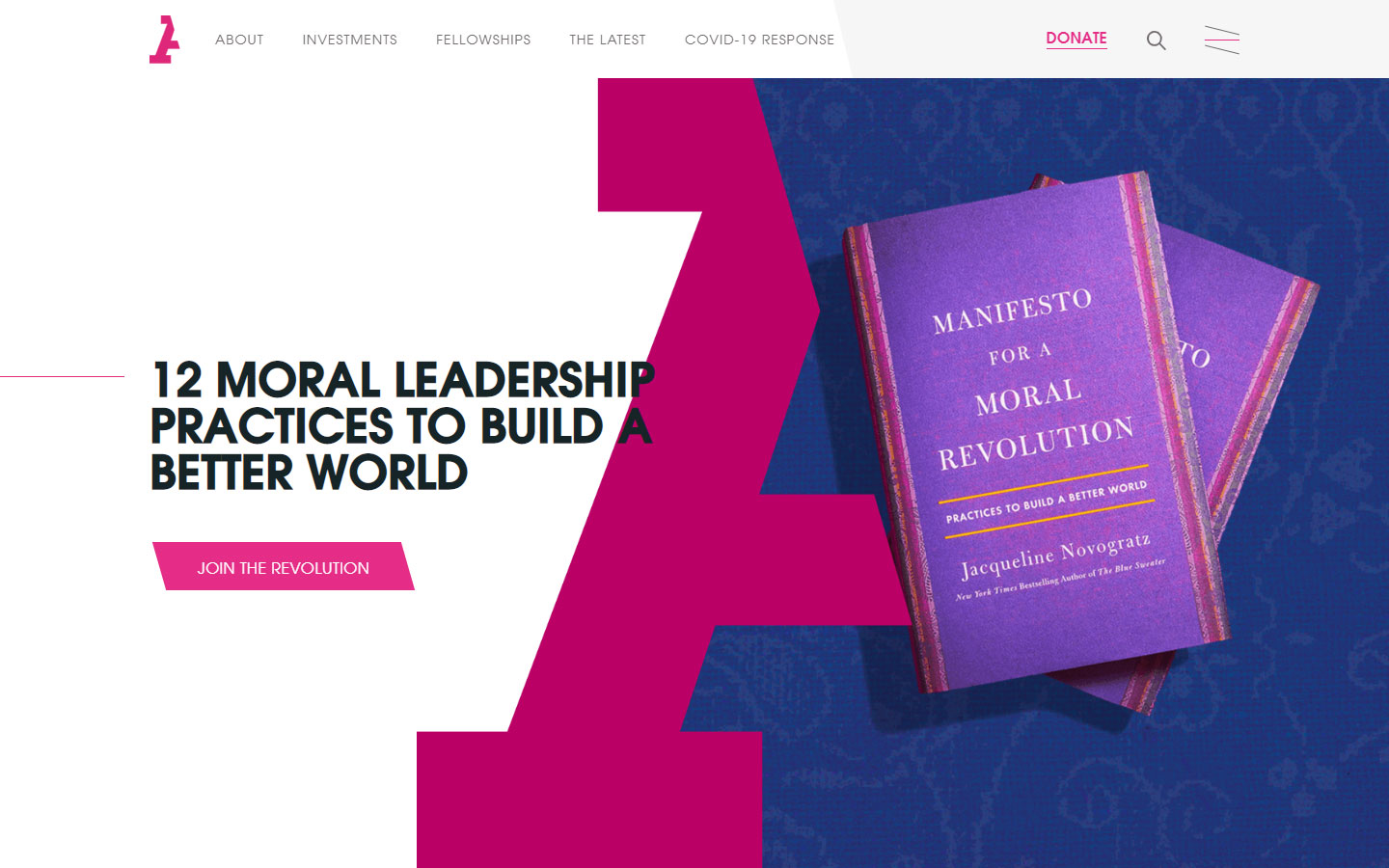
5. Acumen
Why it works: The striking pink/magenta color scheme together with the spacious layout makes this website stand out from many websites. The beautiful sans-serif typeface added a touch of class to the visual design of the site.
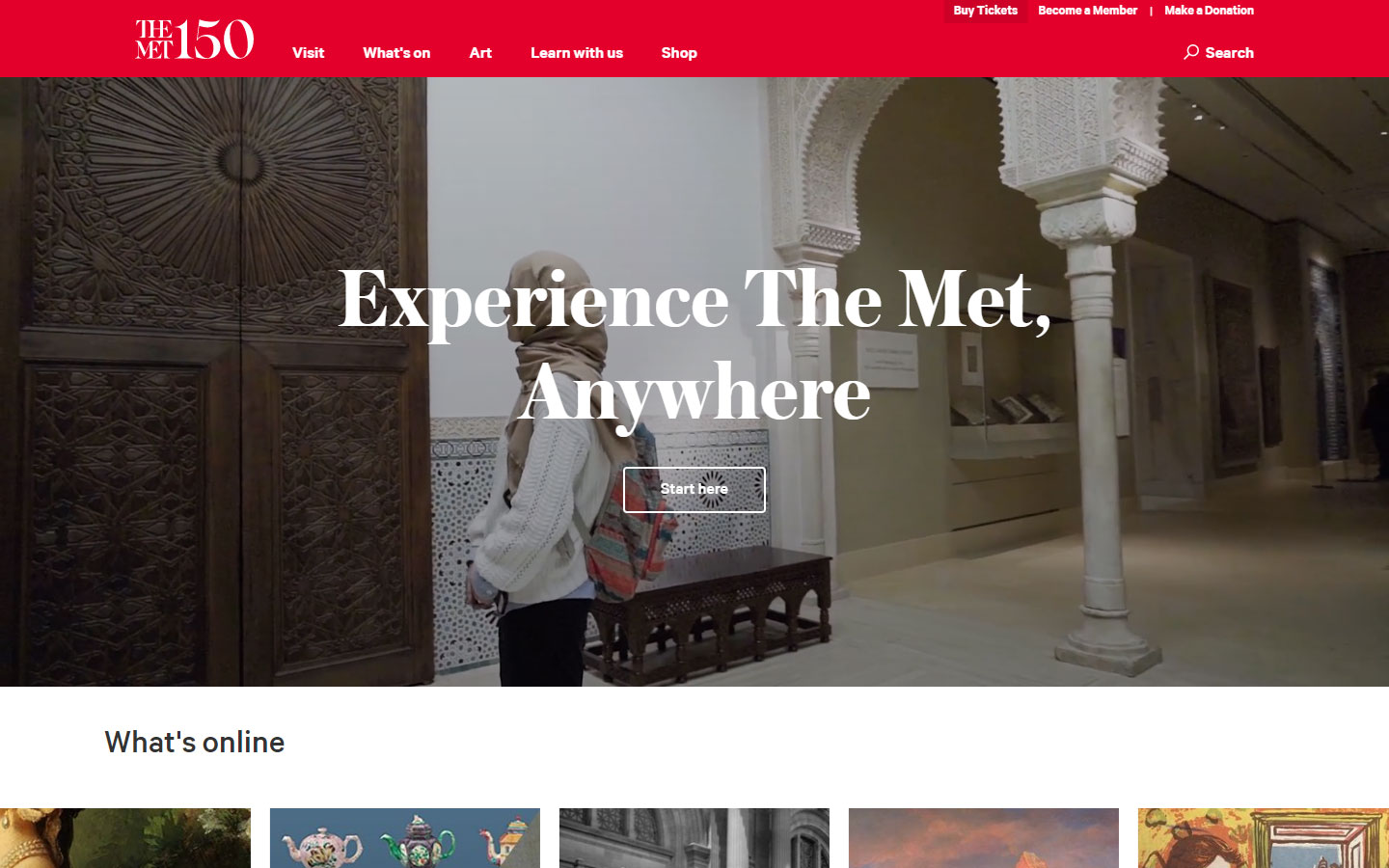
6. The Metropolitan Museum
Why it works: This web design is both elegant and sophisticated. It has a clean and simple layout with a compact navigation bar. The museum’s interior was shown in a beautiful video. They accept online donations thru their easy-to-use donation page.
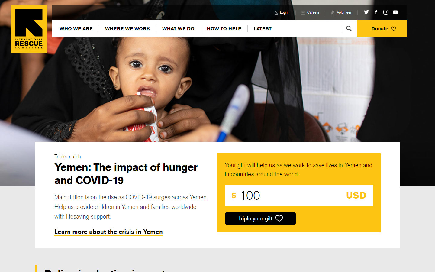
7. International Rescue Committee
Why it works: The clear and powerful gift-giving widget is seen above the fold of the site which makes the giving process easy and accessible. Gorgeous header and navigation. Texts are very easy to read in a nice yellow-black color scheme.
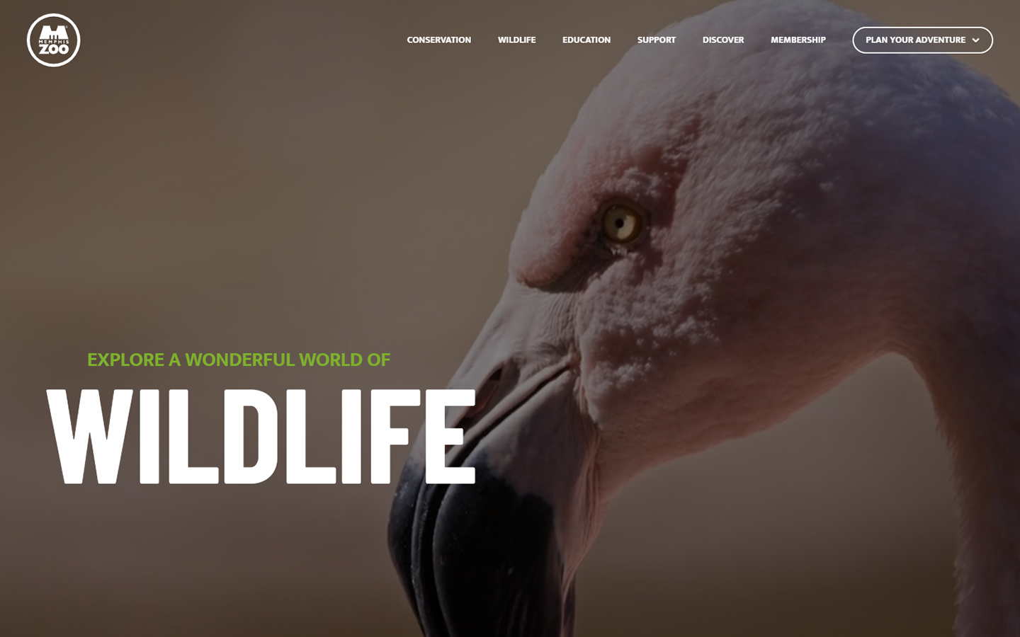
8. Memphis Zoo
Why it works: One of the most dynamic websites in this list of nonprofit website designs. A kid-friendly website without losing the best practices and functionalities. Bright colors, strong bold typefaces, and interesting and engaging images add appeal to the site.
website design for nonprofit organization
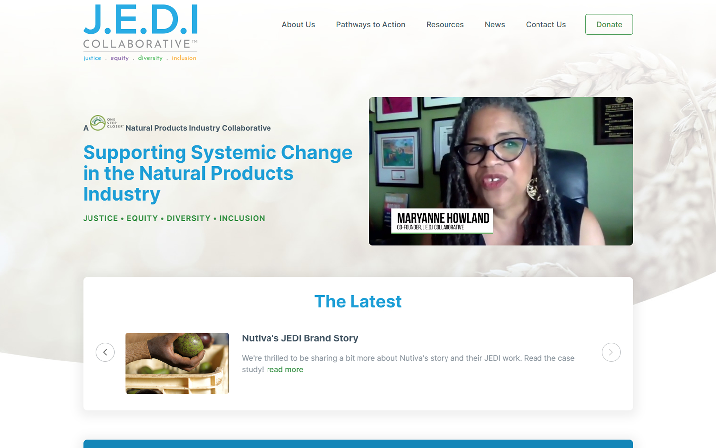
9. Jedi Collaborative
Why it works: This nonprofit website design is colorful yet soothing. The site also has clean iconography and a simple layout to help users navigate it. The donation form of this website page is very well organized.
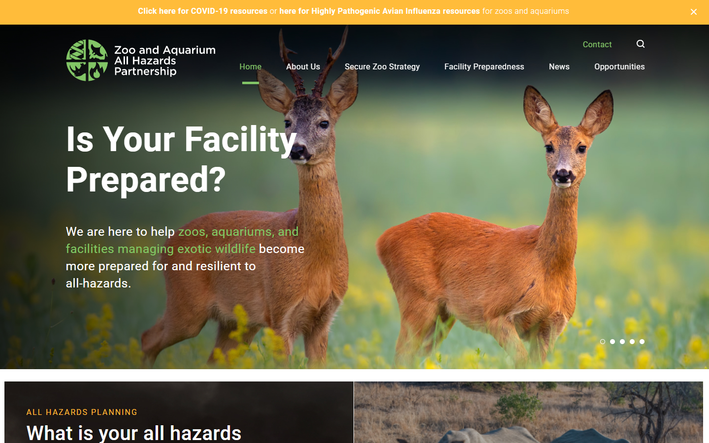
10. Zoo and Aquarium All Hazards Partnership
Why it works: A well-designed website that is both professional and clean. This non-profit site had great pictures of different kinds of animals to pique visitors’ interest. The website has a responsive design making its digital presence available in mobile browsing.
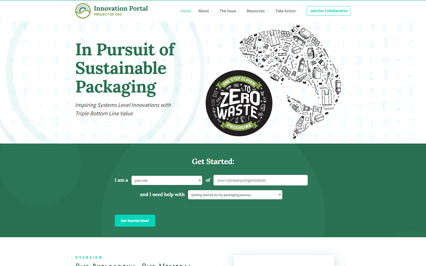
11. Packaging Collaborative
Why it works: The optimistic goal of this nonprofit website is complemented by the organic curves and the green color palette. The website had a very upbeat, forward-thinking vibe. The “Join Our Collaborative” button is easily seen and accessible.
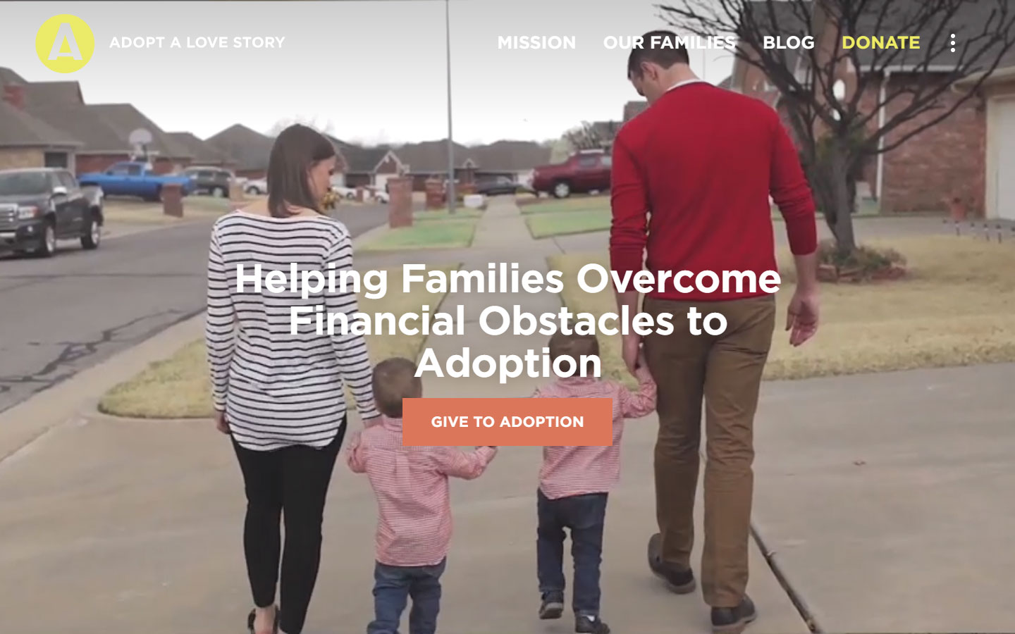
12. Adapt A Love Story
Why it works: Big bold custom fonts are used for maximum readability and usability. Each section of the homepage tells a different narrative, making the organization’s story simple to understand for anybody.
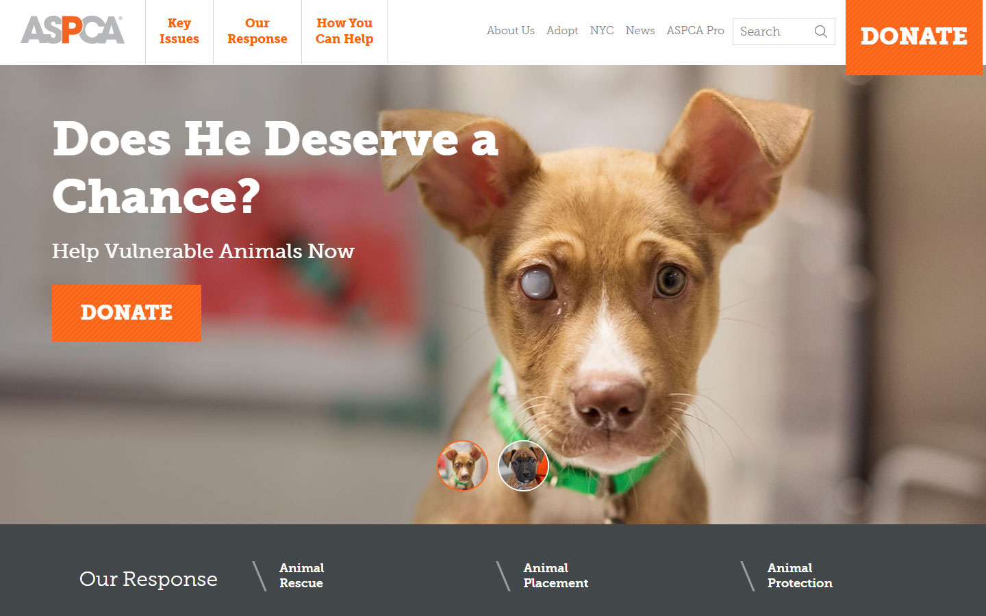
13. ASPCA
Why it works: Through quality content, colors, and adorable pictures, one may feel the deep understanding, love, and passion behind this organization’s goals.
nonprofit website design best practices
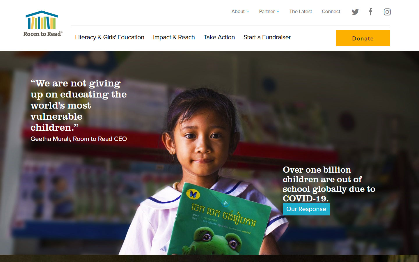
14. Room to Read
Why it works: Unlike the dreary, unhappy atmosphere characteristic of traditional charity websites, this bright, optimistic, and genuinely warm nonprofit website was lively, hopeful, and entirely welcoming.
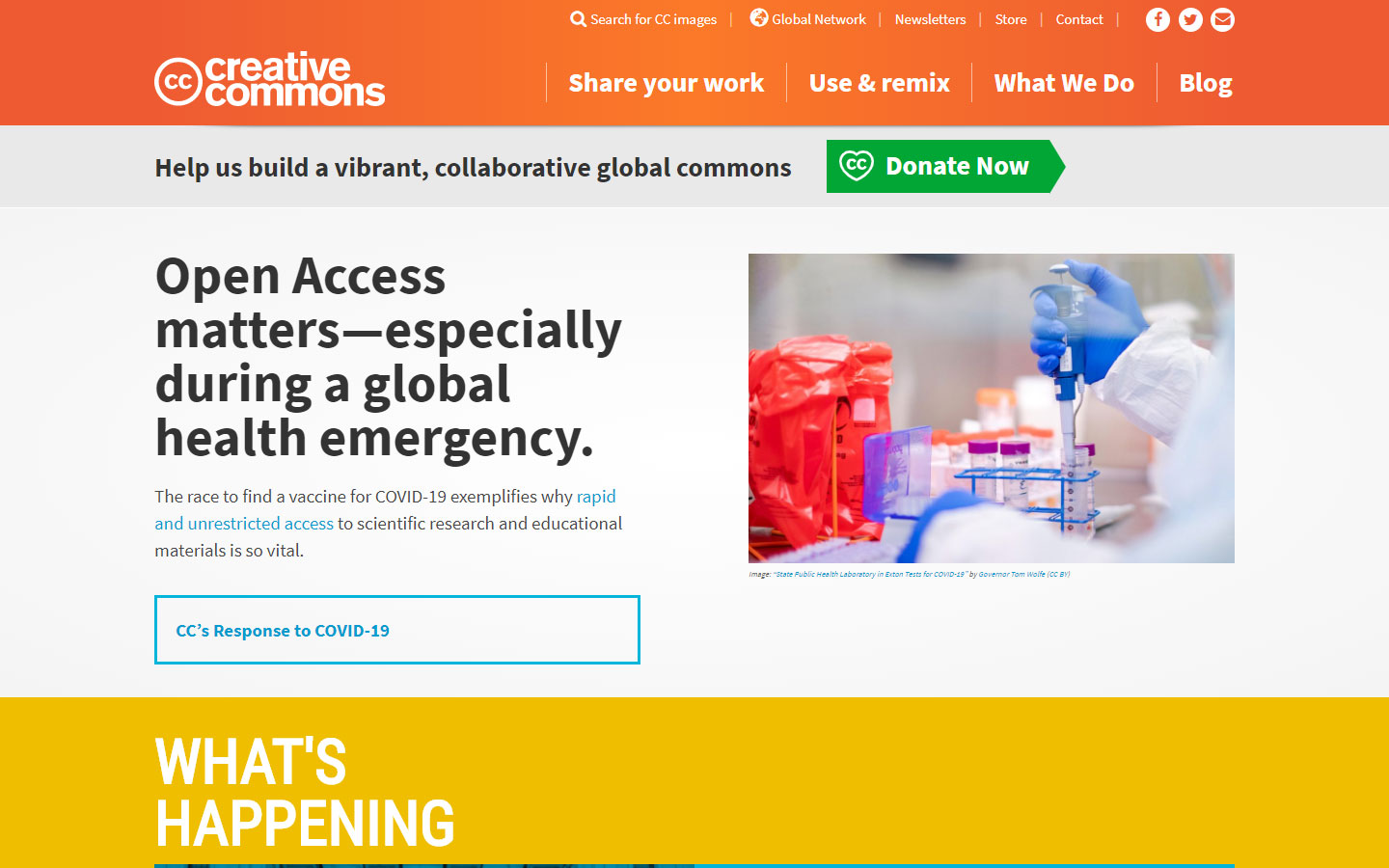
15. Creative Commons
Why it works: This appealing nonprofit website has bright colors and big, bold texts. The fast donate button is strategically positioned. The explore area features icons that are very handy for locating specific niches quickly. The website has a responsive design.
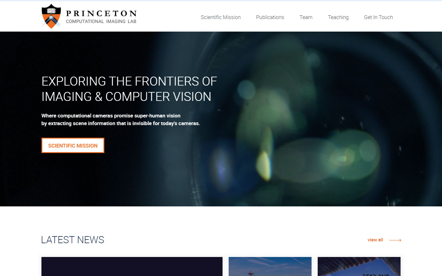
16. Princeton Computational Imaging Lab
Why it works: Information is well-organized and bite-sized, and the typography is really clean. This nonprofit website has an interesting hero video that is subtle but effective.
17. Names for Change
Why it works: This non-profit website has a very evident brand identity and personality. A web design that is highly unusual yet unforgettable. Effects and functions are well coded by the web development team.
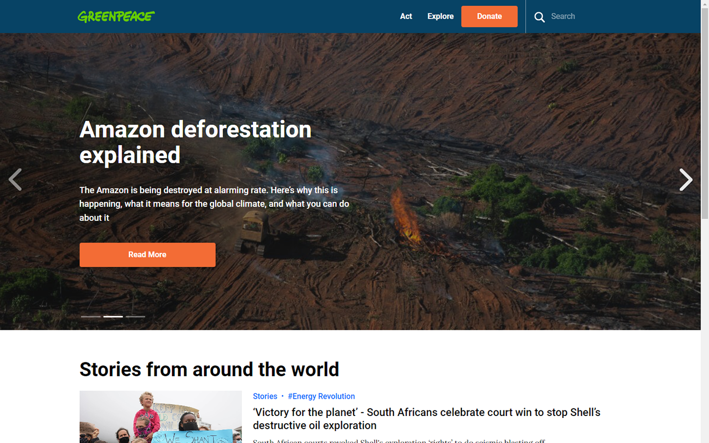
18. Greenpeace
Why it works: The donate panel is always accessible and not intrusive. This nonprofit website uses bright vivid colors.
website design for nonprofit organizations
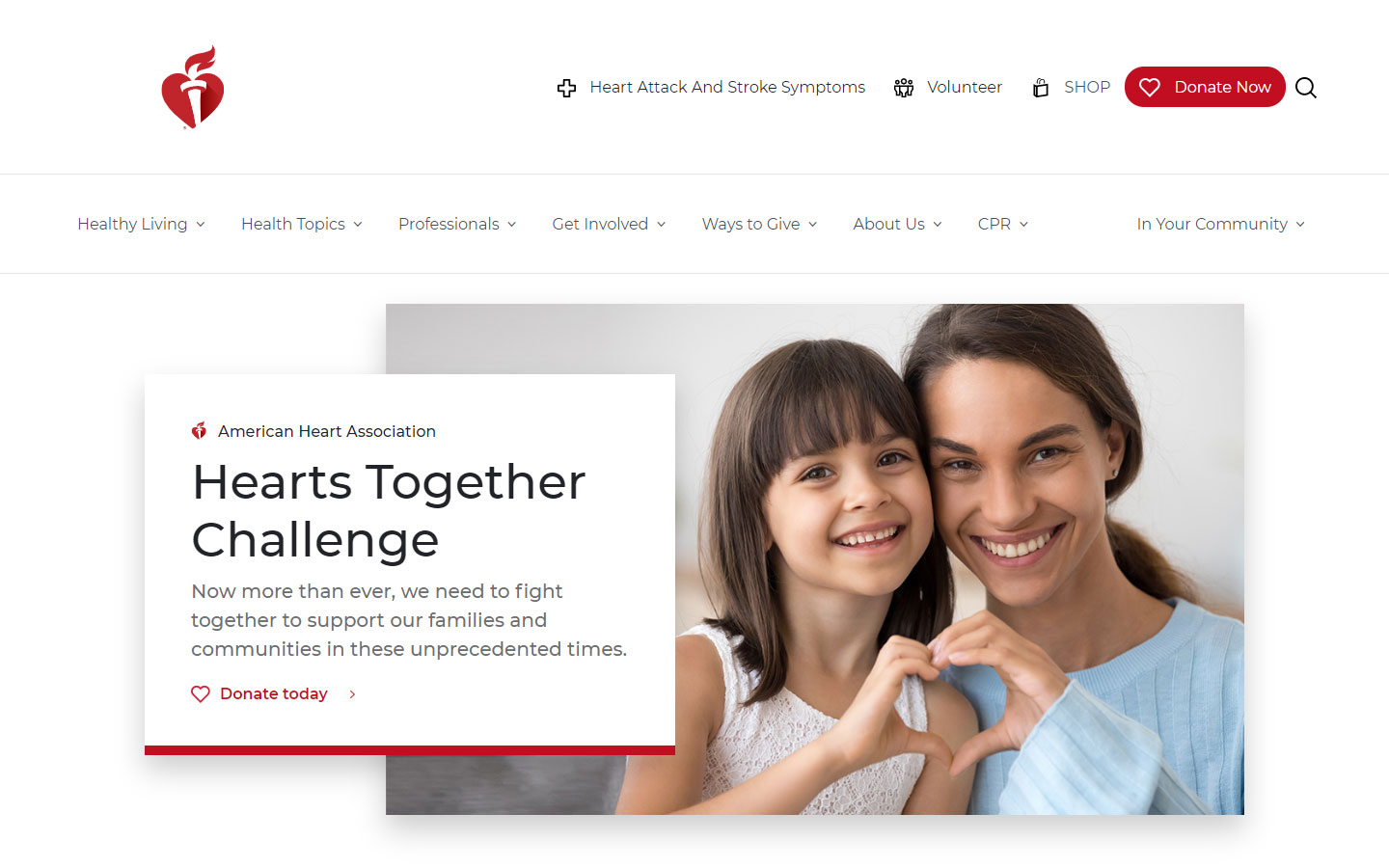
19. American Heart Association
Why it works: Real clean web design with lots of breathing space with excellent use of red as an accent. Call to action buttons are strategically placed. Overall a very pleasing UX.
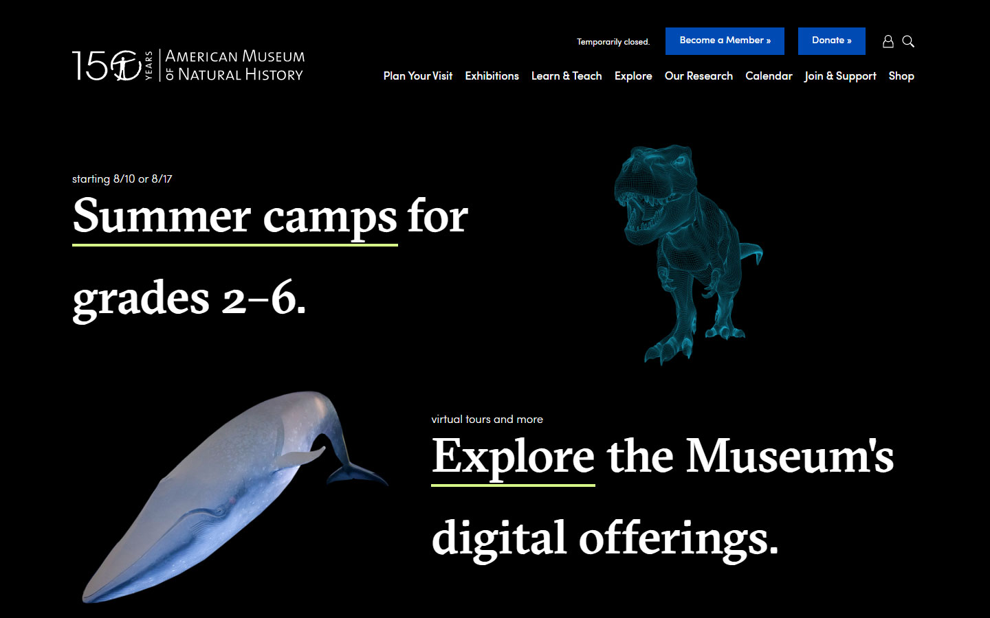
20. American Museum of Natural History
Why it works: Navigation menus that are well-designed. An excellent example of digital marketing is its use of stunning visuals and graphic design that are both attractive and informative.
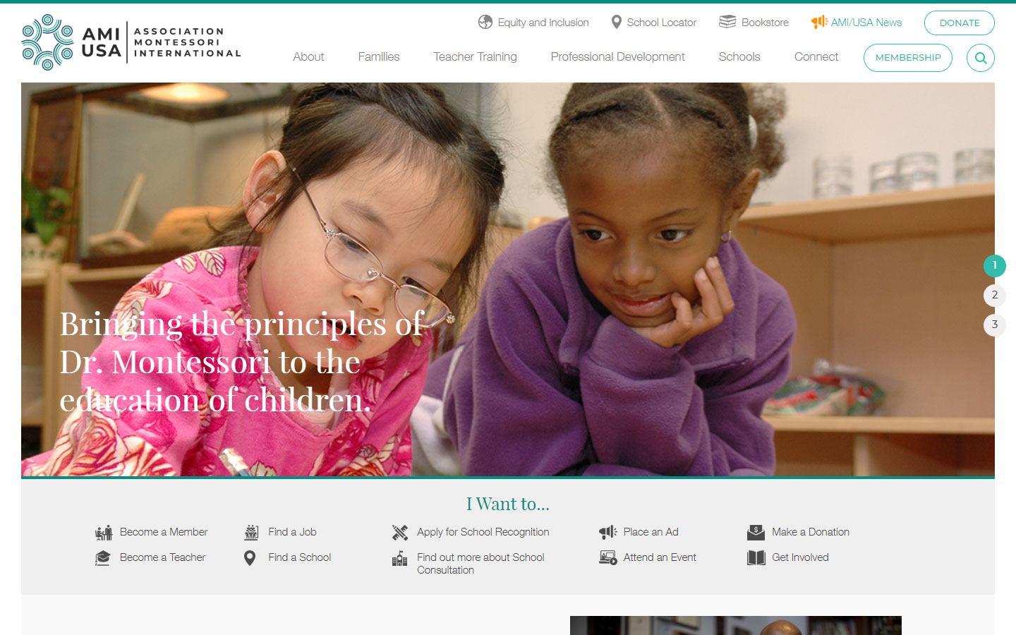
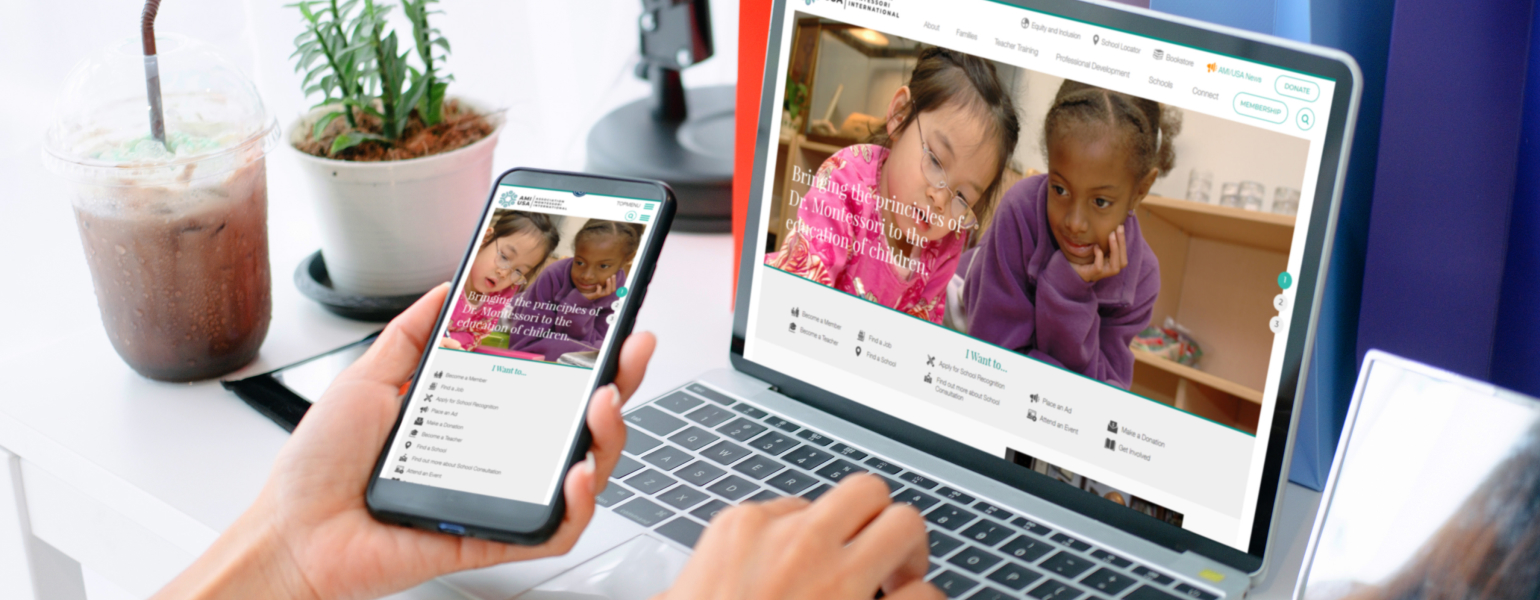
21. AMI USA
Why it works: The website’s text is nicely laid out in a clean light-themed website. For users’ additional ease of access, the footer of this nonprofit website is well organized.
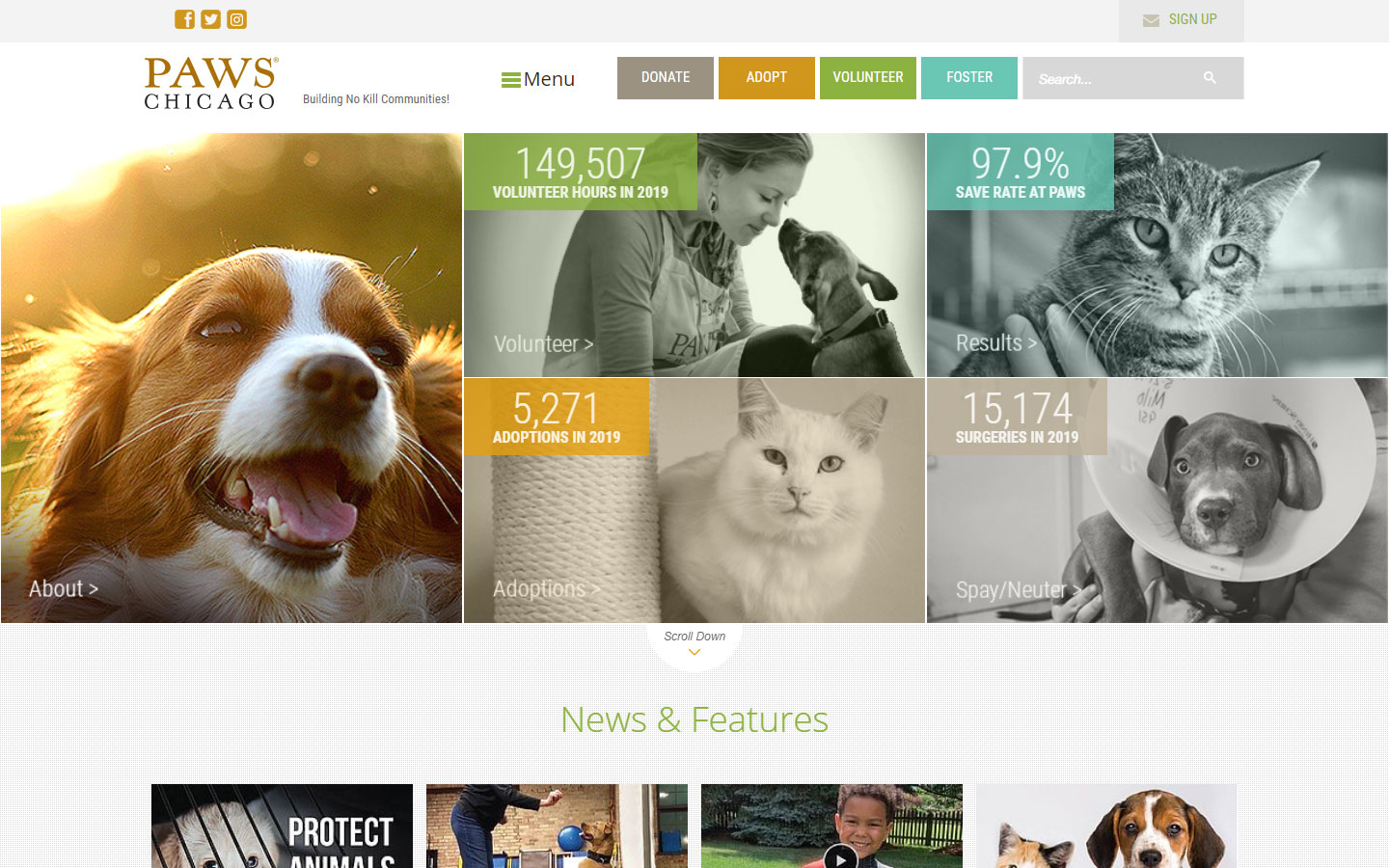
22. Paws Chicago
Why it works: The hero section contains several subsections that may be used as a portal to other pages of the site. The website’s colors are pleasant, and the navigation bar is creative which are all helpful to up their web presence.
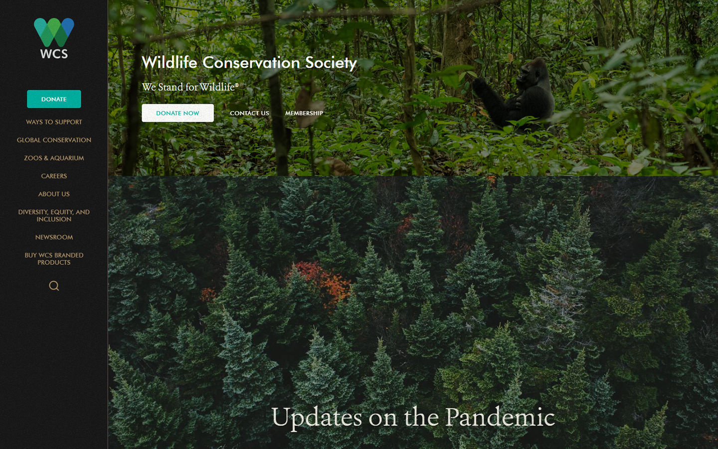
23. Wildlife Conservation Society
Why it works: The sidebar of this nonprofit organization’s website is very straightforward to use. The key pages and calls to action buttons are easy to find. Beautiful imagery is used throughout the site while the footer is simple and clean.
website design nonprofit
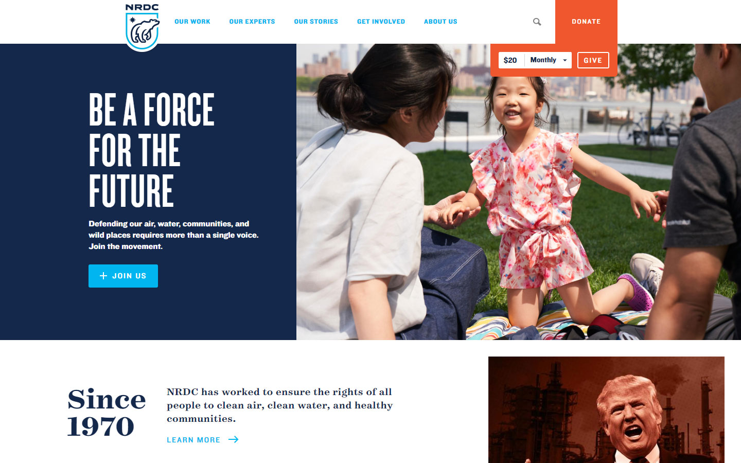
24. NRDC
Why it works: On the header of this nonprofit website, there’s a quick donate option. This website is very informative and uses a non-traditional layout. We appreciate the statistics area on this site.
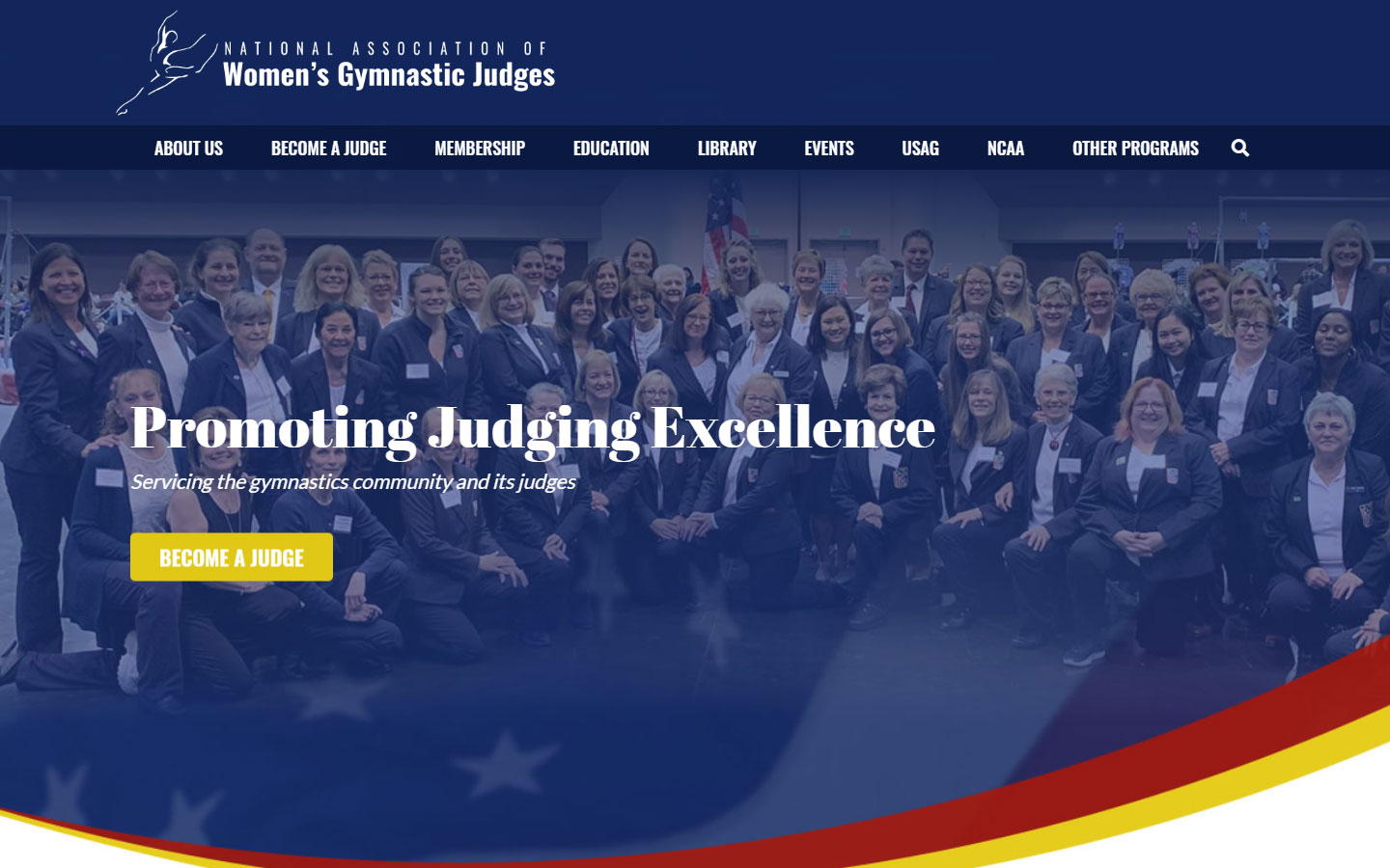
25. NAWGJ
Why it works: This nonprofit website has bright graphics and colors for the hero image. Calls to action are prominent and clear. The center aligning of text makes it easy to read.
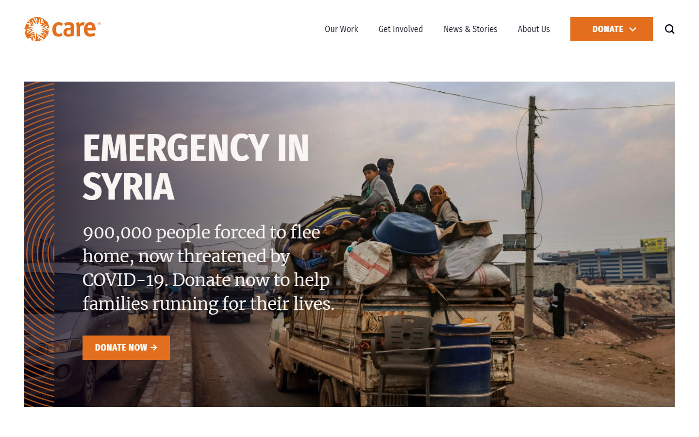
26. Care
Why it works: Adding a subtle touch of graphics to the engaging images is very smart. The large texts on several areas create intensity to this nonprofit’s cause.
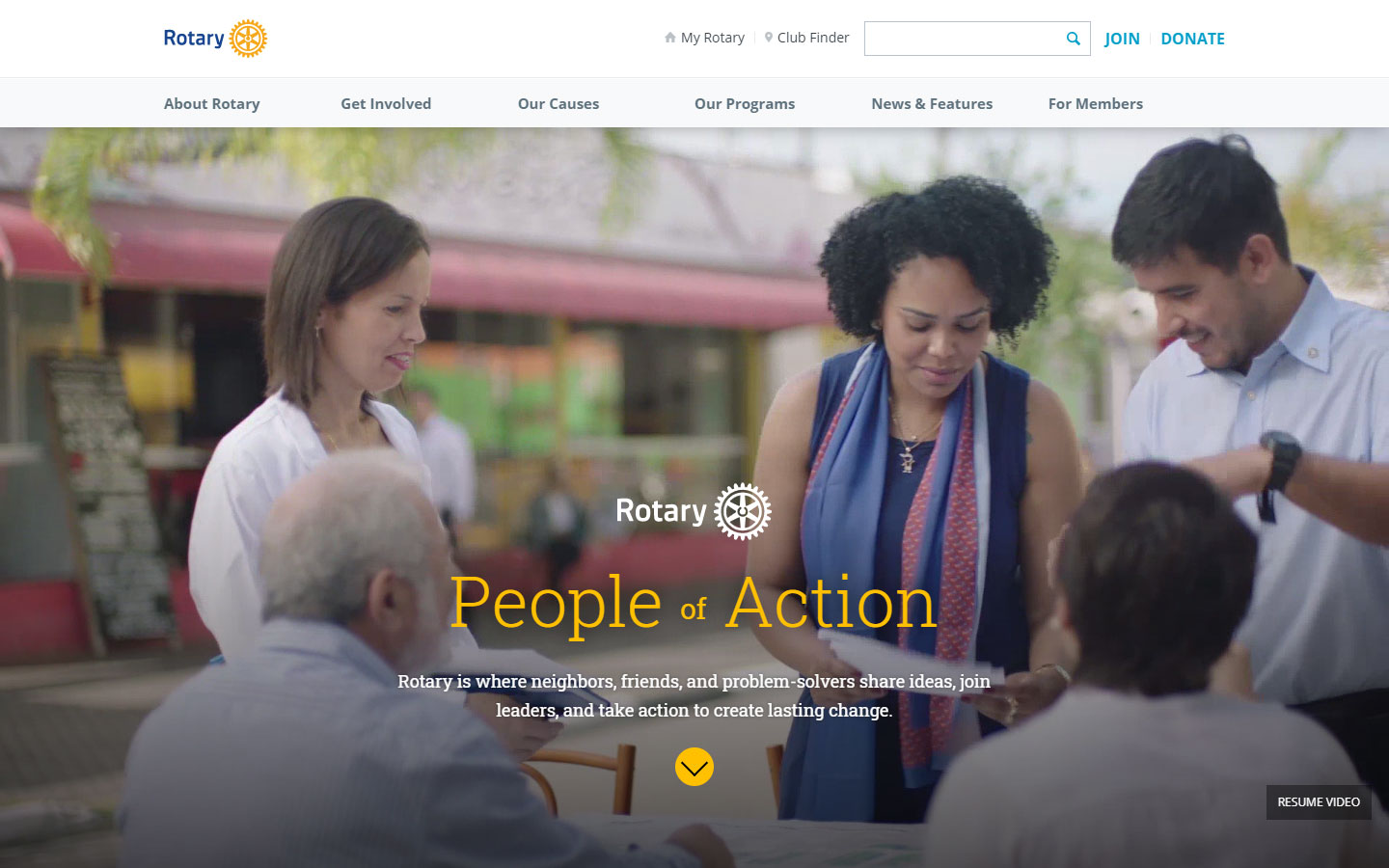
27. Rotary
Why it works: The website builder used amazing animations and transitions. The flowing line that follows the mouse as it scrolls is just genius for storytelling and content creation.
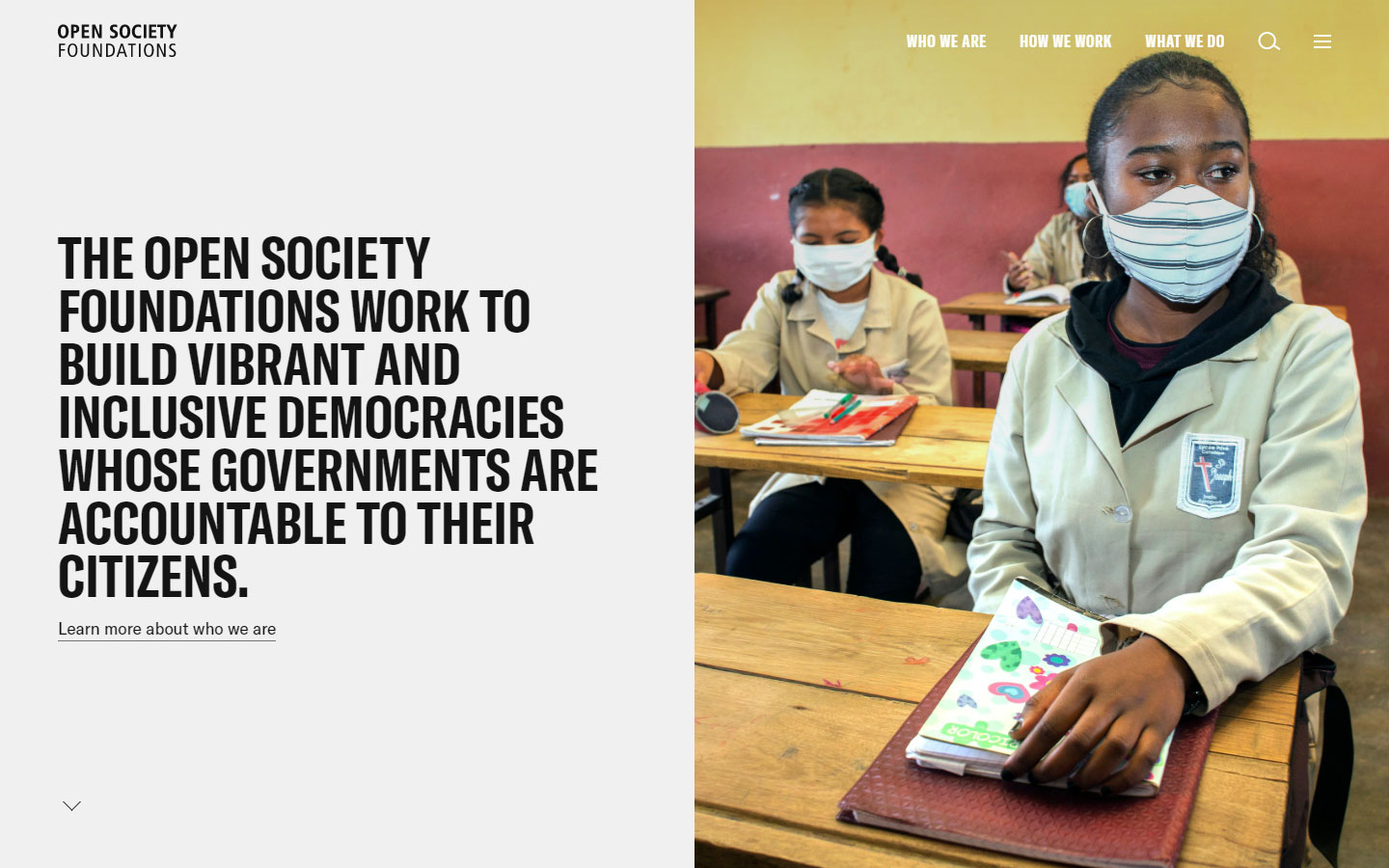
28. Open Society Foundations
Why it works: A simple web design that doesn’t sacrifice quality. This nonprofit website is not image-heavy but looks modern. The interactive “where we work” section is fantastic.
nonprofit website design inspiration
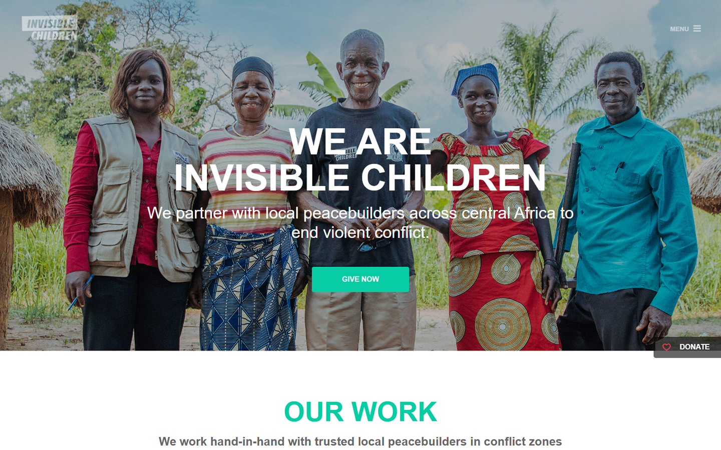
29. Invisible Children
Why it works: The website builder used crystal-clear texts with a strong contrast between elements adding impact to this nonprofit website design. The sticky donate button isn’t overwhelming but always accessible.
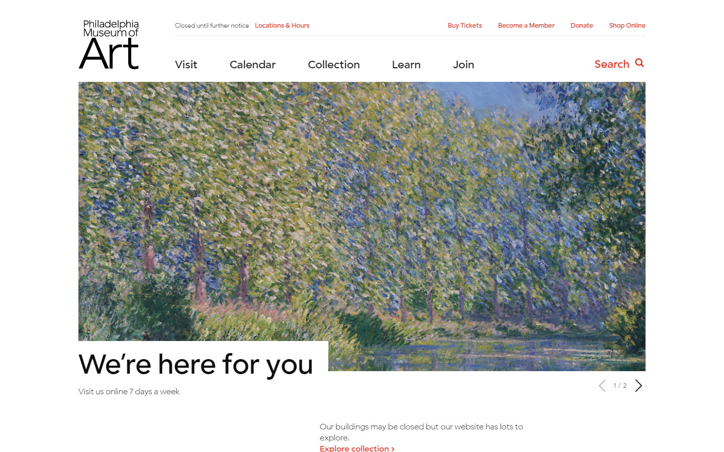
30. Philadelphia Museum of Art
Why it works: We love the minimalistic approach of this nonprofit website to showcase their articles online. This website is cozy, clean, and very appealing.
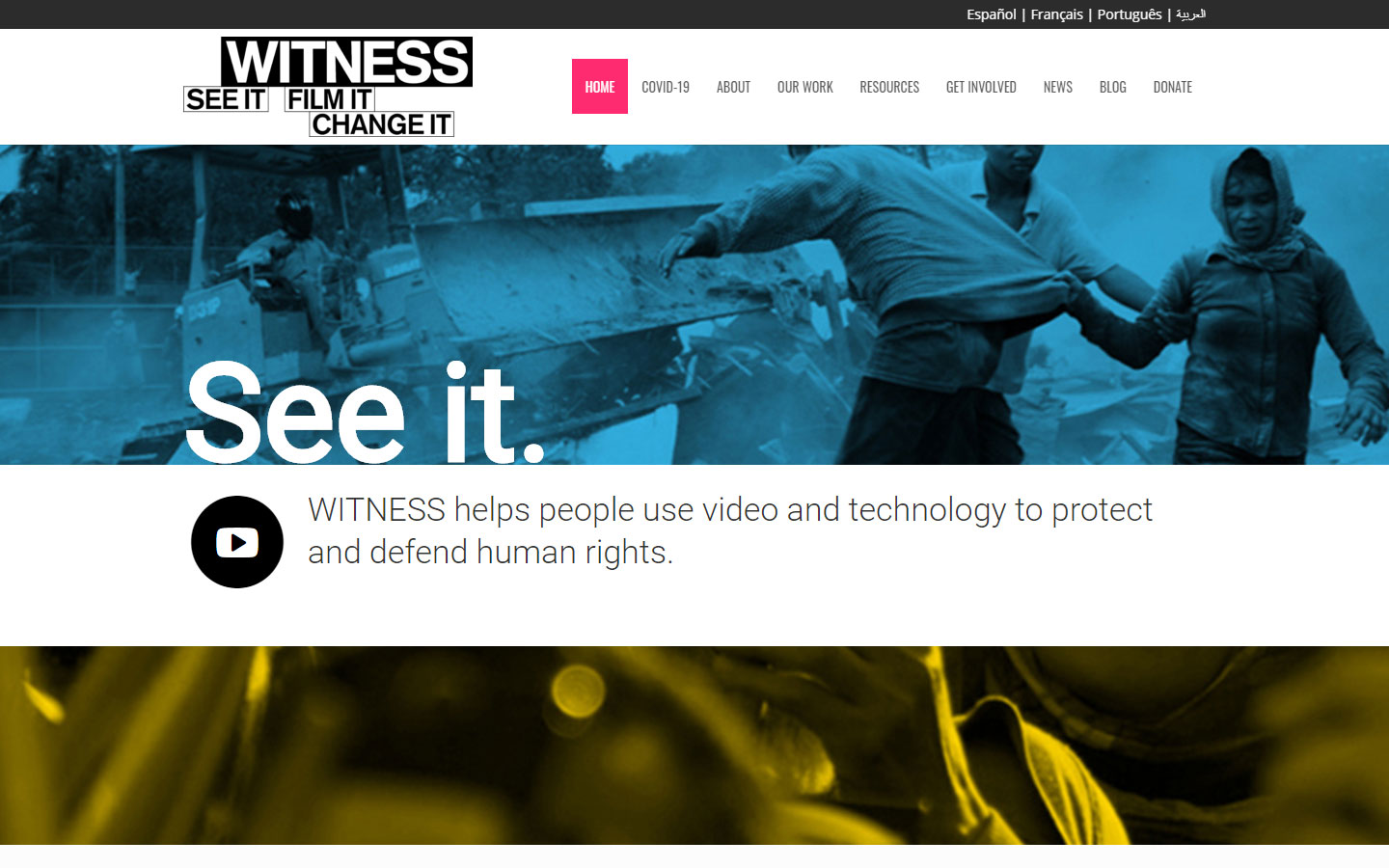
31. Witness
Why it works: One can immediately feel the seriousness of the field of this nonprofit website just by the web design alone. Provides a positive view of advocacy that is focused on community involvement.
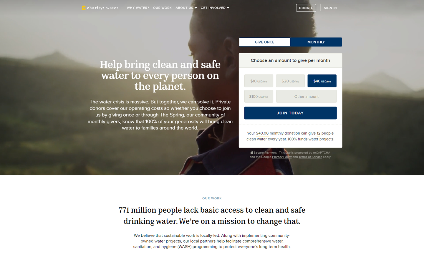
32. Charity Water
Why it works: This nonprofit website is very quick and lightweight, with just the right amount of information delivered in the hero part. Great sign-up process animation in their online forms.
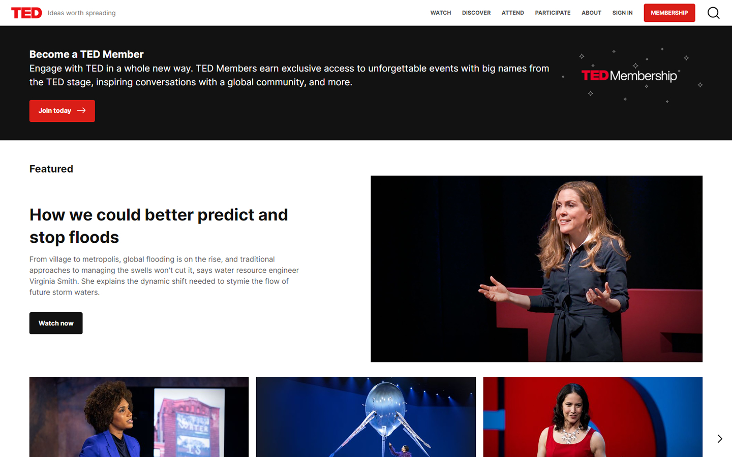
33. TED
Why it works: The entire homepage is focused on content delivery for a better user experience. Sections and thumbnails of this nonprofit website are beautifully organized without looking crowded or messy.
best nonprofit websites
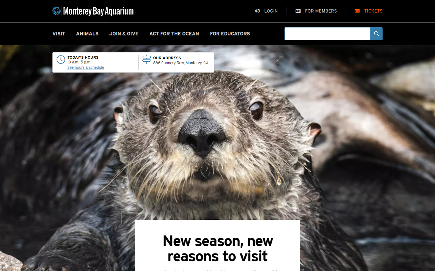
34. Monterey Bay Aquarium
Why it works: The Monterey Bay Aquarium’s website is a fantastic cocktail experience with beautiful photographs, moving images, texts, and information all on one page.
35. Convoy of Hope
Why it works: In the hero slider, there is a fantastic animation section. The animations creatively draw attention to the content. Also, the custom design iconography is excellent.

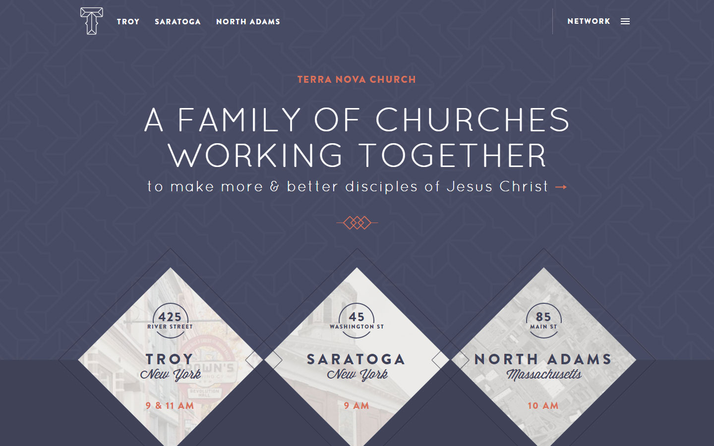
36. Terra Nova Church
Why it works: This non-profit website has a unique and creative approach to shapes and geometry, in contrast, to simply using photos. The bespoke icons complement the website’s theme.
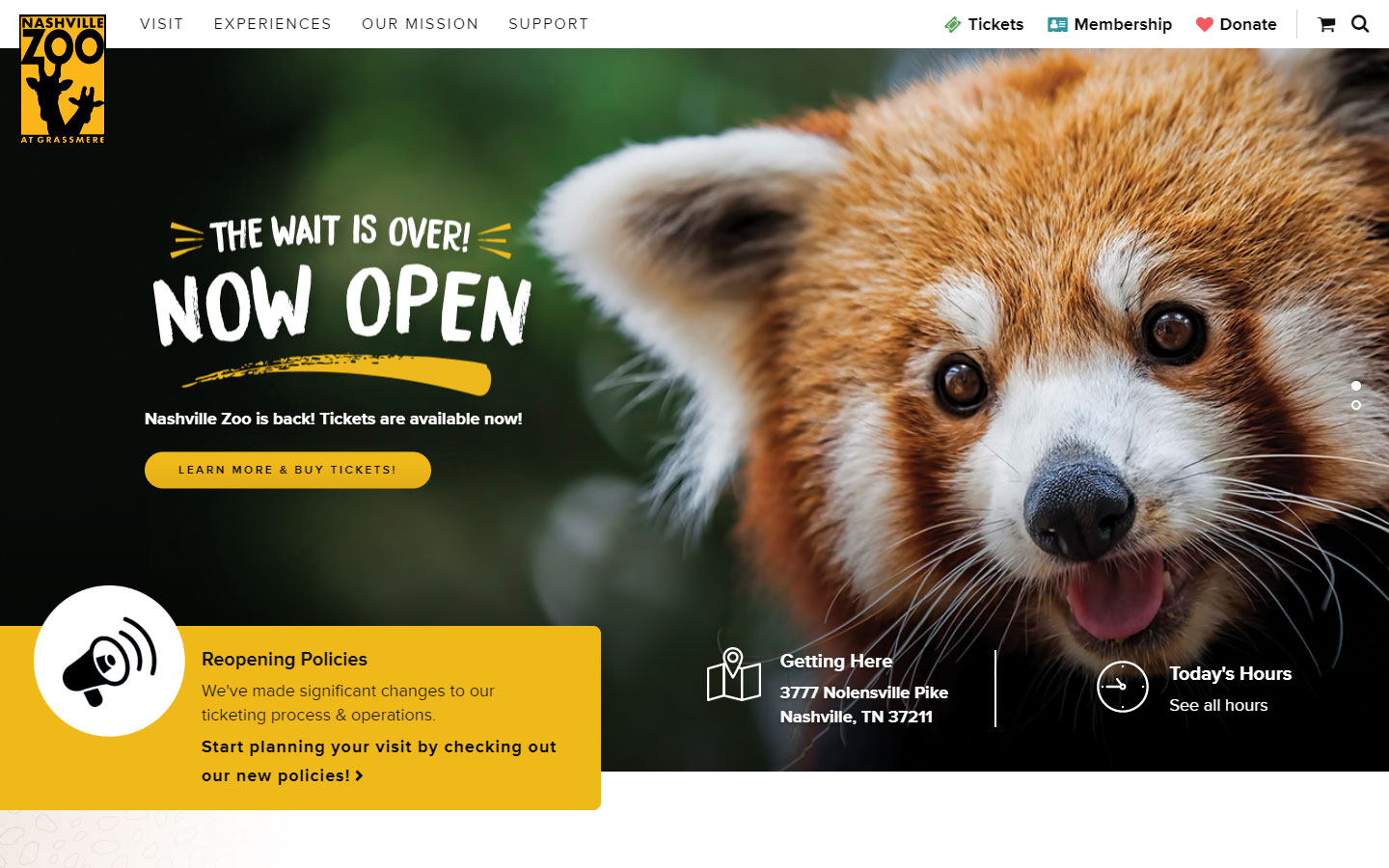
37. Nashville Zoo
Why it works: A beautiful harmony of web design, youthful typefaces, and imagery. Every corner has a splash of color. The web design of this website is suitable for all ages.
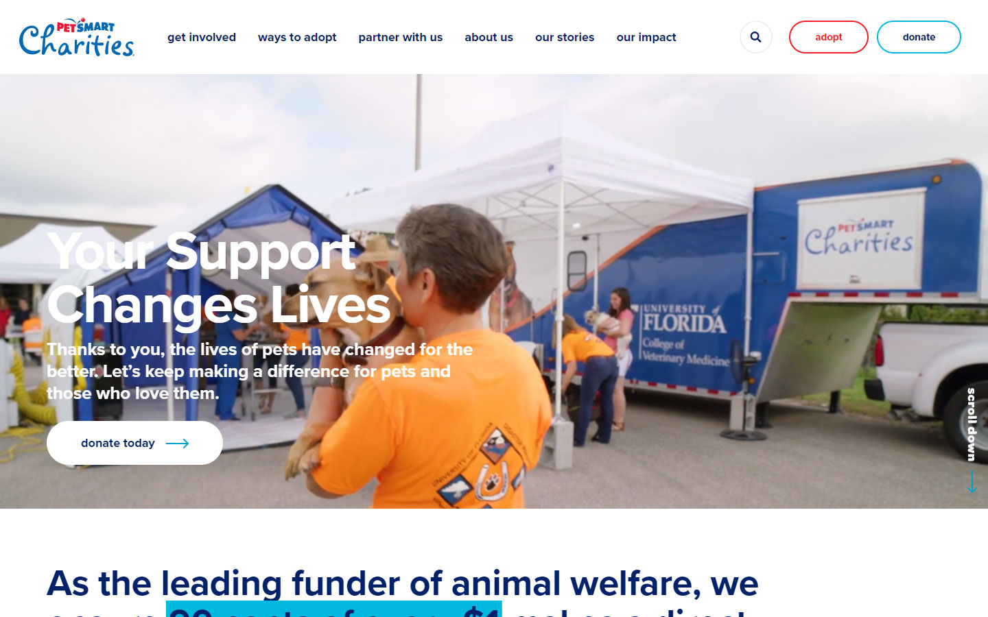
38. Petsmart Charities
Why it works: A white-themed website with just the right amount of color. The subtle animation adds life to the pages. Despite the amount of material on the site, it does not feel heavy and the page load time only takes a few seconds.
nonprofit website design examples
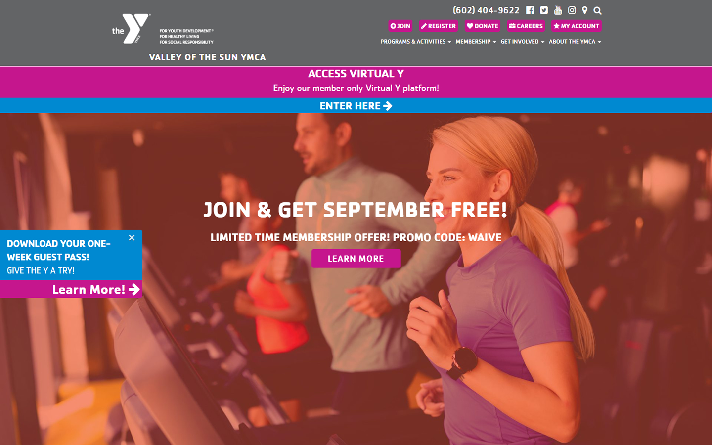
39. Valley of the Sun YMCA
Why it works: The upper right corner of this website has an ample amount of information. There is a nice blend of colors and pictures. Despite the compactness of this website, it is still effective.
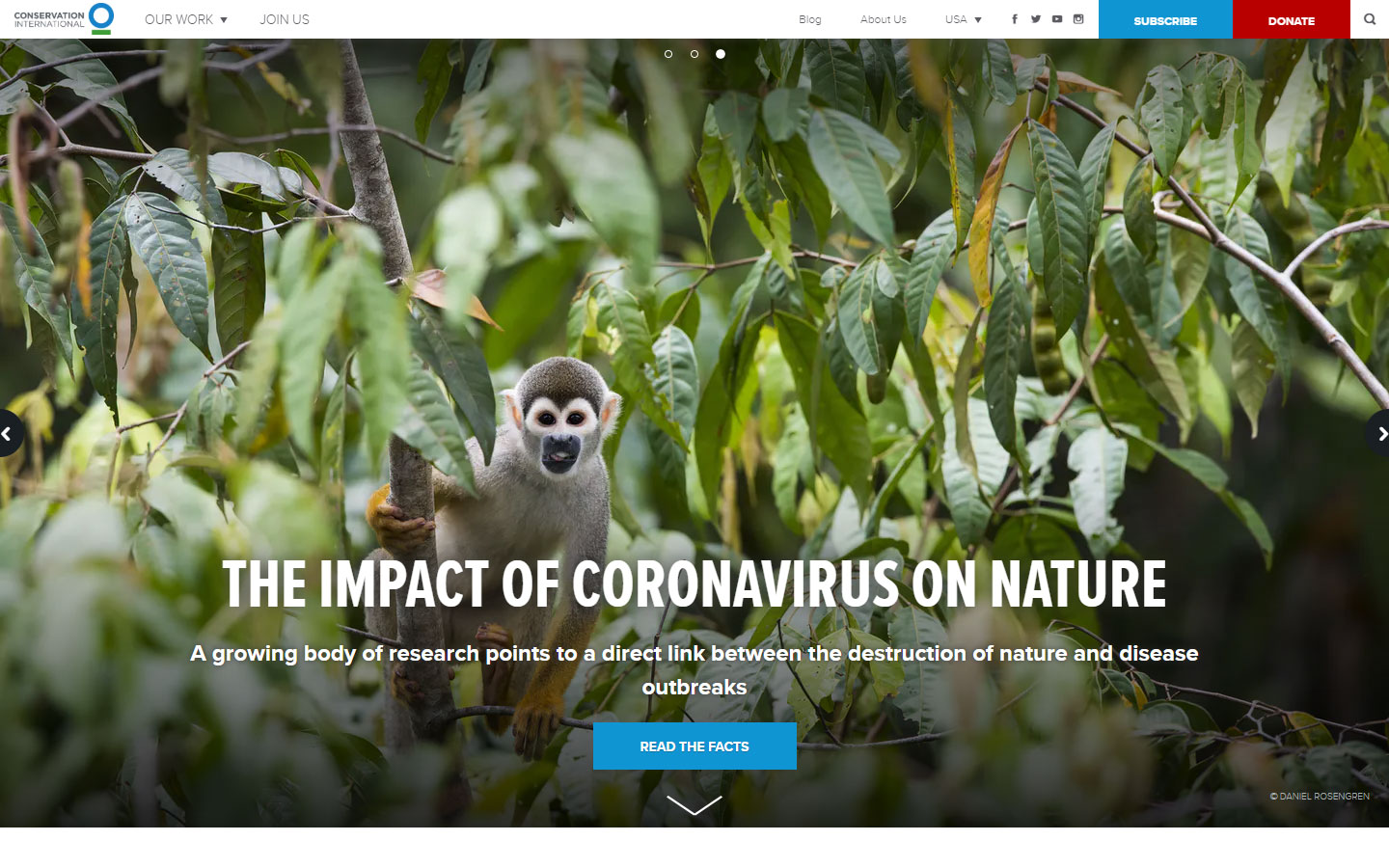
40. Conservation International
Why it works: Form submissions of this website such as subscribing and donation are simple and straightforward. The subscription and donation buttons are clear. A clean web design with easy-to-read texts with an artistic footer design.
Nonprofit Web Design Best Practices
What makes a nonprofit or not-for-profit different from other industries? A nonprofit web design must reach out to several different groups visiting your site. It’s not just about your customers; it’s also about donors and applicants. Let us show you how we can tailor your Nonprofit Web Design project to handle all these different groups. We promise results with no risk to you.
- Identify the Needs of Your Website Visitors
- Which people do you need to reach?
- How will they interact with your site?
- What is your goal for each group?
- How does your website fit into your overall business plan?
After we target your audience, then we lay out a nonprofit web design that services them in the most efficient way possible. Every site is custom made so that you won’t see another website anything like yours on the web. Our design process customization goes beyond colors and images. We never use templates. Your web design and web development are 100% unique to your company.
Meeting the Needs of Your Audience
A nonprofit web design is more like three websites wrapped up into one. First, you must reach out to your donors. They should know your story, your needs, and how they can help. Do you collect money or sign-up volunteers? What about corporate sponsors? It’s important that you clearly communicate with these different groups and present them with an easy-to-navigate clear call to action.
You should also consider your “customers.” Who are the people using your services? In other words, who does your organization benefit from? Your nonprofit web design should meet their needs and help them along their journey as well.
Another thing unique to nonprofits is the “events.” Most organizations host several events over the course of the year. You may need to create pages for your event registrations or event attendance for exhibitors, organize donations, and register attendees. Our nonprofit web design process structures its content around each separate group you need to service.
Use Images to Reach Your Audience
Because you are reaching out to several different audiences, the navigation of your site must be clear right away. Donors should immediately identify where they need to go for information as opposed to someone wanting to register for an event.
Most people want to be able to scan a page and quickly find the information they need. By using a clean layout and eye-grabbing imagery, we create a web design where your visitor can quickly identify what they are seeking.
A Nonprofit Web Design Should Be Easy to Maintain
Nonprofit information seems to be always changing. Sponsored events come and go, and published needs evolve over time. Because of this, a nonprofit web design needs to be easy to update and maintain.
Do you want to spotlight an event or a client? That’s not a problem. We can put together a design that makes it easy for you to switch between events or customers at different times throughout the year.
We can show you how to do the editing yourself by using a content management system, saving you money. Whatever level of support you need for your new site, we are there to help.
A Mobile-Friendly Website
Every day more and more people are searching using a mobile device. Currently, over 30% of all Google searches come from smartphones or tablets. Starting in 2017, Google plans to make its mobile rankings their primary source for all search engines’ results. In plain language, this means that if you do not perform well on mobile devices, then you see a decrease in web organic traffic no matter what type of device site visitors are using.
We optimize all our nonprofit web designs for web accessibility on mobile devices. They are fast and mobile-friendly. We make sure to stay on top of all the new requirements, so you don’t have to worry about your web presence.
Why Nonprofits Choose Us as Their Web Design Company

Nonprofits need to connect with several different groups coming to their website. We help structure your site around these groups. Visually compelling design with the use of custom web development strategies moves them quickly to the areas they need to go to and then prompts them to respond accordingly.
We recognize that the content, on a nonprofit site, changes frequently and so we make our designs easy to edit and update using top-of-the-line content management systems. We want to make it so that you don’t feel the need to call your web designer and web development team every time you want to change the date or add a new event.
Let us show you what’s possible. Unlike other nonprofit web design firms, we show you exactly what your new website will look like before you ever sign or pay for a thing.
That’s right. There is no hassle and no risk. What do you have to lose? To find out what’s possible, just click below and learn more about our Free Mockup Offer.