A web design for doctors should be designed by a professional designer with the patient in mind. A good doctor website should have an uncluttered, clean design and be easy to navigate. It should also be mobile-friendly and has a responsive design so that more potential patients can easily access it from their mobile devices. Search Engine Optimization (SEO) should also be taken into consideration to ensure that the website appears high in search engine results which is good for your business web presence.
In addition, the best doctor websites should include important information about the doctor’s medical practice and services, such as location, hours, and contact information.
Here are 40 of the best doctor website designs ideas that we found that meet all of the above criteria and more:
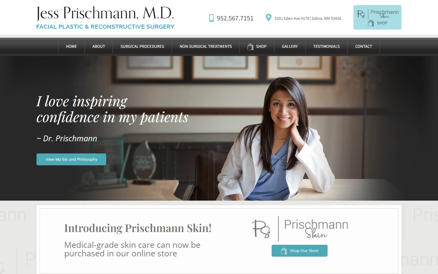
1. Jess Prischmann MD
Why it works: An example of a gorgeous doctor website with a great sense of harmony regarding color, typography, and tone. New patients can surely feel secure and confident just by merely visiting the website.
2. Eduardo Besser MD
Why it works: Contact number, physical address, and booking functions are readily accessible above the fold. Tack-sharp mouse effects and interactions. Clean but effective layout.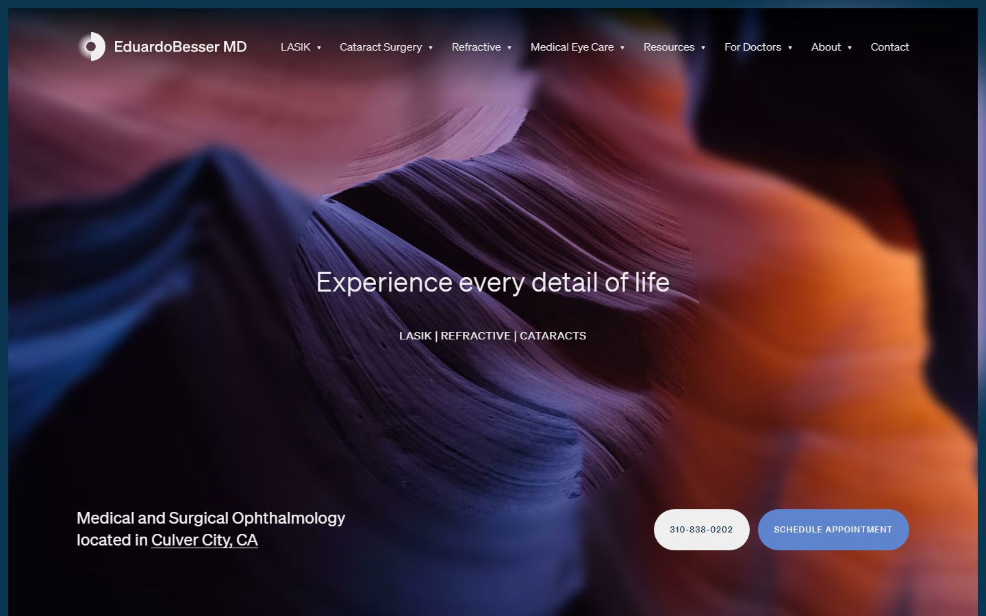 www.eduardobessermd.com
3. Dr. Karen R Threlkel
Why it works: Aside from the refreshing green color scheme, we also love the ample amount of CTAs that are just there when you need them. The amount of healthcare reviews showcased is also a feature that better promotes their services and practices. These are great digital marketing ideas to help your healthcare business create a positive web presence.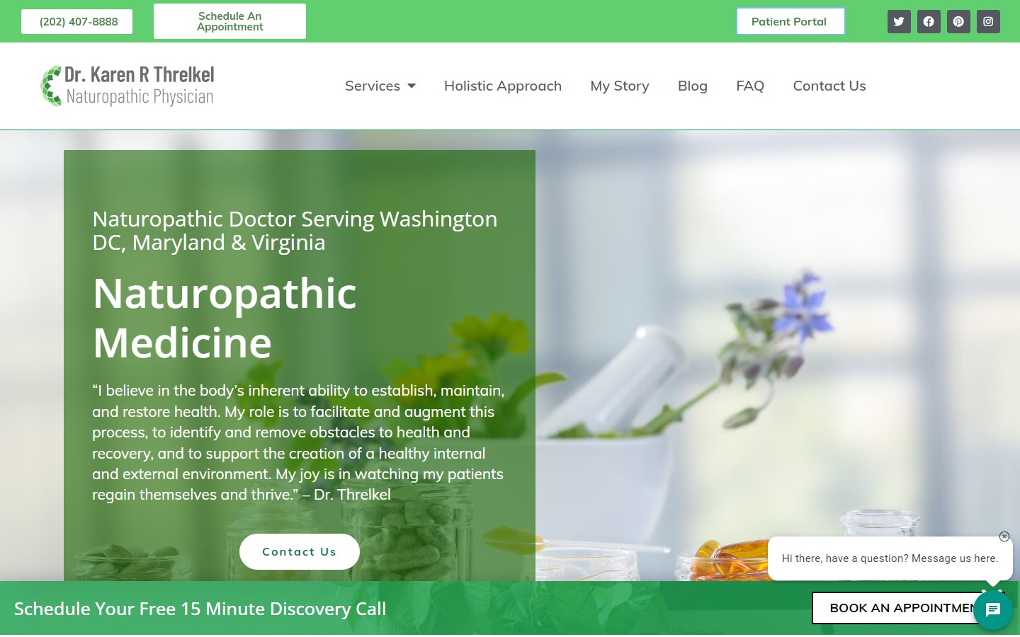 www.karenthrelkelnd.com
4. Mississauga Foot Clinic
Why it works: Upon landing on the doctor website, the prospective patients are immediately greeted with a decision box allowing us to get clear instructions and be guided quickly based on the medical issue they’re facing. Other than this, we love the beautiful photography, the clean layout, and the calming color scheme.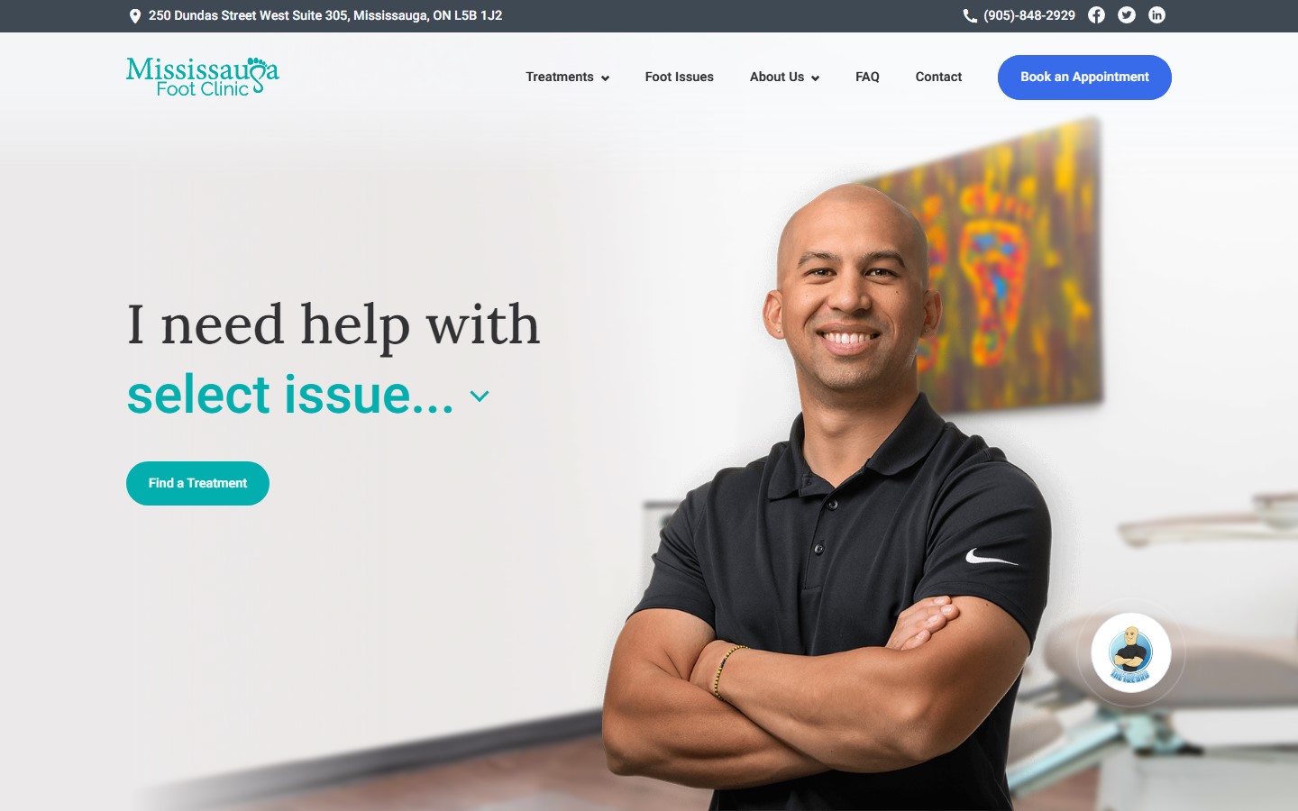 www.mississaugafootclinic.com
Doctor Web Design
5. Dr. Carmony
Why it works: An example of a luxurious, sleek, and very functional medical website. Dr. Carmony has a strong and great website that gives a lasting impact on viewers or healthcare patients. We also love how contact details and office hours are immediately available on the home page.
www.drcarmony.com
6. Gotham Footcare
Why it works: A top-rated podiatrist should also have a top-notch website to begin with. Luckily, the one by Doctor Miguel Cunha is not only classy and modern but is also very accessible to more patients of all ages. The showcase of their award is a plus in digital marketing.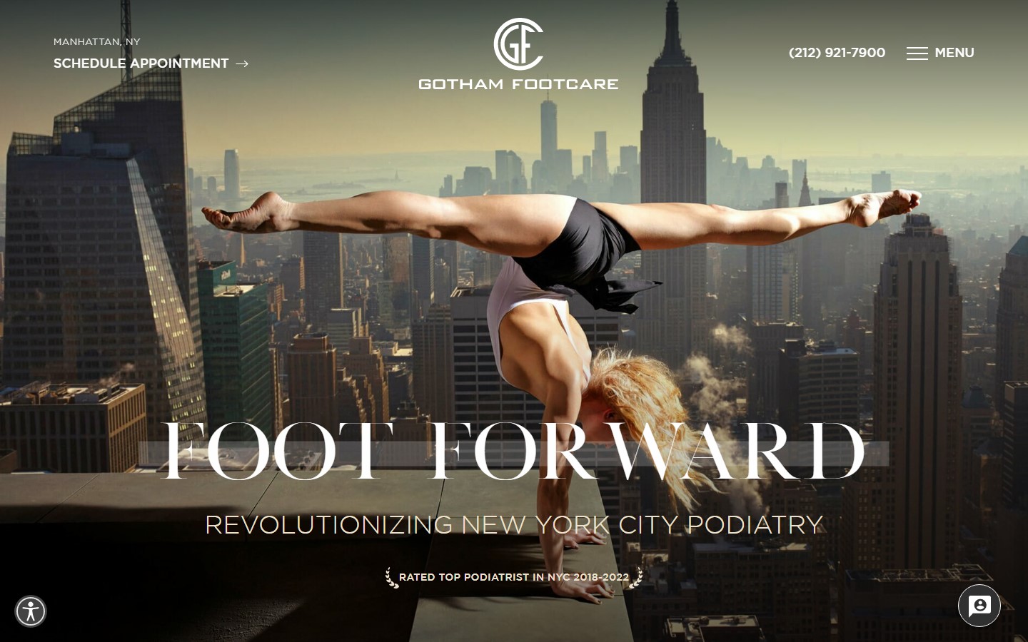 www.gothamfootcare.com
7. New York Opthalmology
Why it works: With dazzling graphics and humorous colors, this website with a great design is never boring to visit. The choice of font face and sizes is superb in making sure that the website is ‘eye-friendly’. It’s also packed with all the information you need about their services and practice areas. You can even book an appointment online!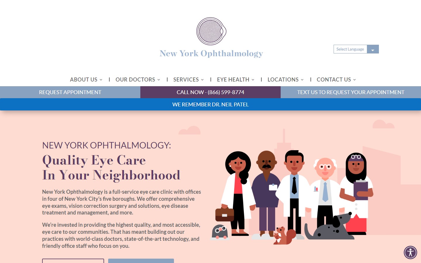 www.nyoph.com
8. Pitner Orthodontics
Why it works: The use of shapes and cute graphics make this website design-friendly and suitable for patients of all ages. We also love how the navigation links are bolded for extra visibility. Their contact number and medical offices are easy to find. The subtle colors and wide-open spaces make this website look refreshing and trustworthy. We also love how the call to action buttons are well-designed.
www.drpitner.com
Web Design for Doctor
9. Harpreet Bawa, MD
Why it works: An example of a very professional-looking doctor website with just the right amount of design elements, animations, decors, and functions. The overall UX felt very easy without being crowded with too many buttons or other distractions. www.bawajointreplacement.com
10. Dr. Richard Bevan-Thomas
Why it works: Doctor Richard Bevan-Thomas’ website employs gray and blue to create an adult, professional tone. An image of the doctor greets visitors, along with a biography. Scheduling an appointment for their medical services is also easy. All of these are examples of effective digital marketing ideas.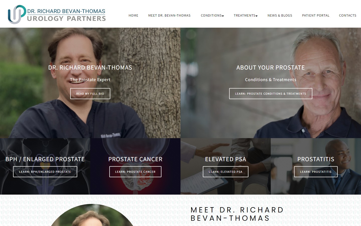 www.drbevan-thomas.com
11. Dr. Alexis Shields
Why it works: Instead of the usual boring color scheme, the website of Doctor Alexis Shields incorporates amusing colors that are refreshing and invigorating. We also like how each section is unique and different from one another. Her website is also responsive and mobile-friendly which means it looks good on any mobile device.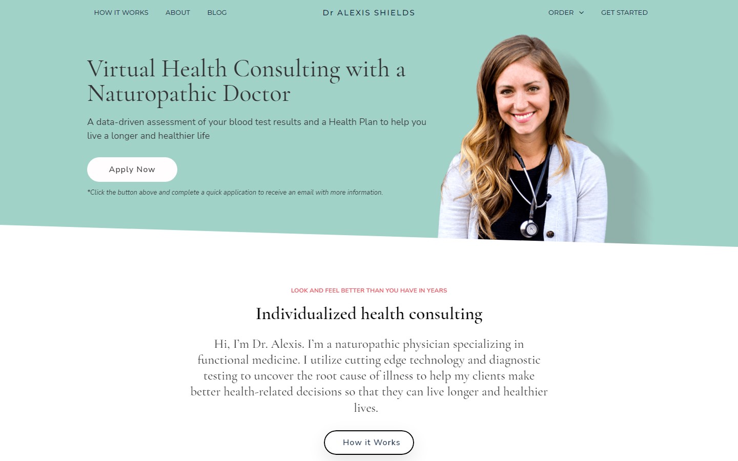 www.dralexisshields.com
12. Schwartzman Rheumatology
Why it works: With the use of greyscale images and gold color accents, this website design inspires confidence and trustworthiness. All important details about setting appointments are also available right on the home page. www.schwartzmanrheumatology.com
Best Doctor Websites Design
13. Physicians Footcare
Why it works: Physicians Footcare offers healthcare customers this website crisp images of a wide range of medical professionals and patients. It’s also quick to divide the website into 3 parts, which helps patients find the medical information they need.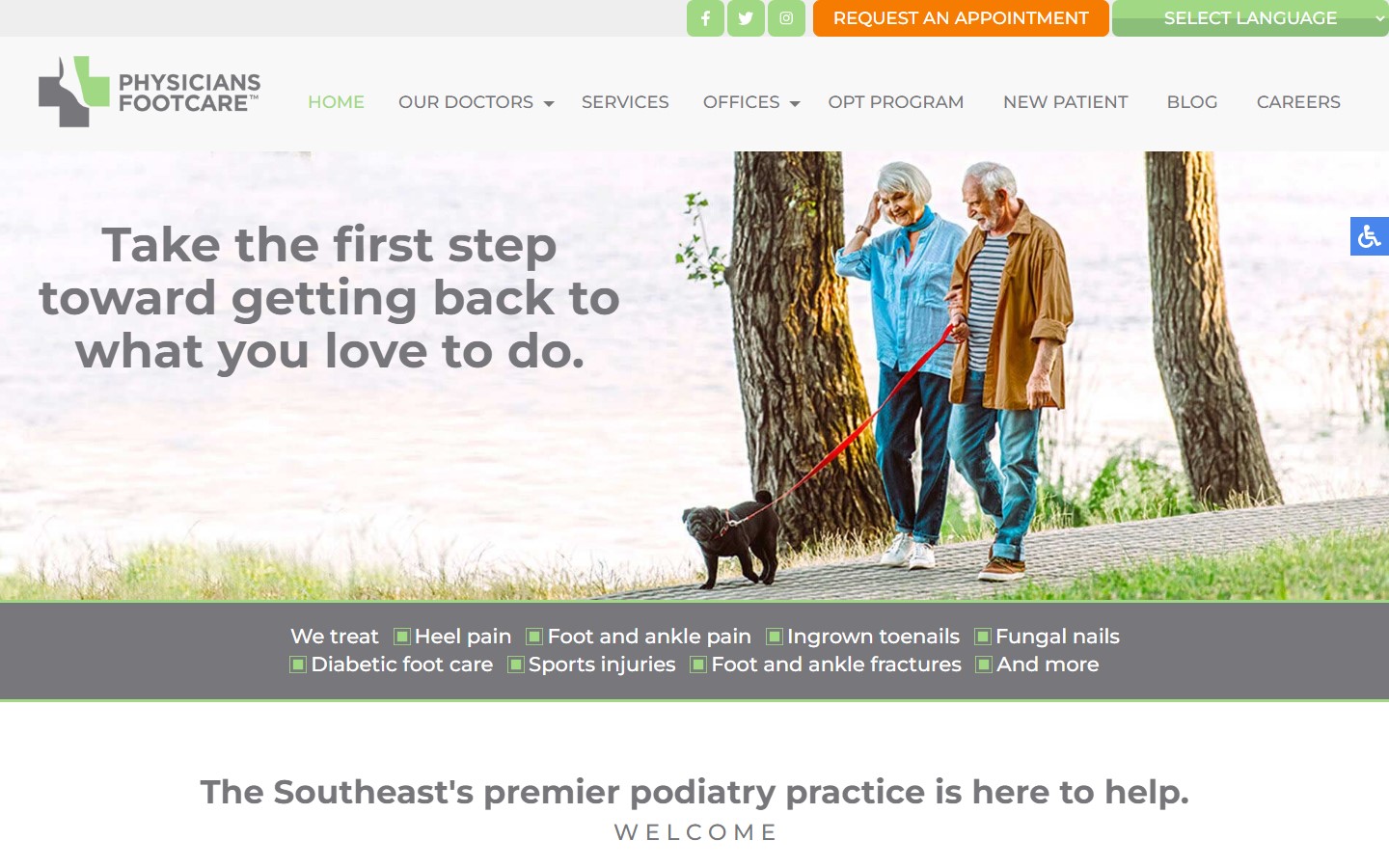 www.physiciansfootcare.com
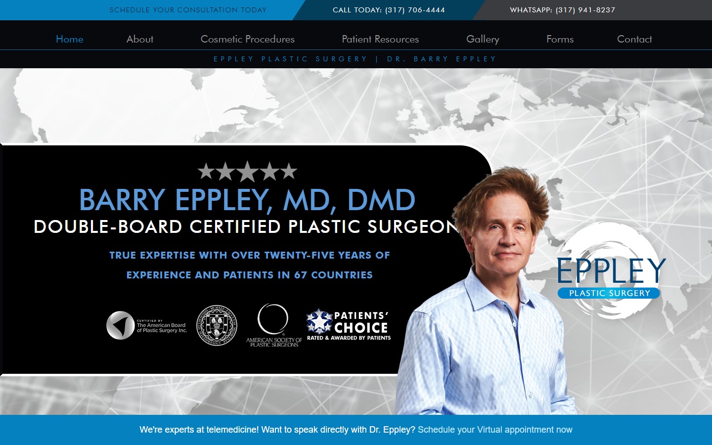
14. Barry Eppley, MD
Why it works: There’s a lot to love about this doctor website, but some standout features include high contrast design, authoritative presence, a generous amount of CTAs from top to bottom, and easily accessible contact information.
 www.eppleyplasticsurgery.com
15. Amplify Health
Why it works: Simple and straightforward website, but very personal and intuitive. One can easily tell the medical practices and services offered by Doctor Sandmaier are sincere and promising. Their resources page is great for SEO (search engine optimization) and a for additional reading on how to have a healthy life.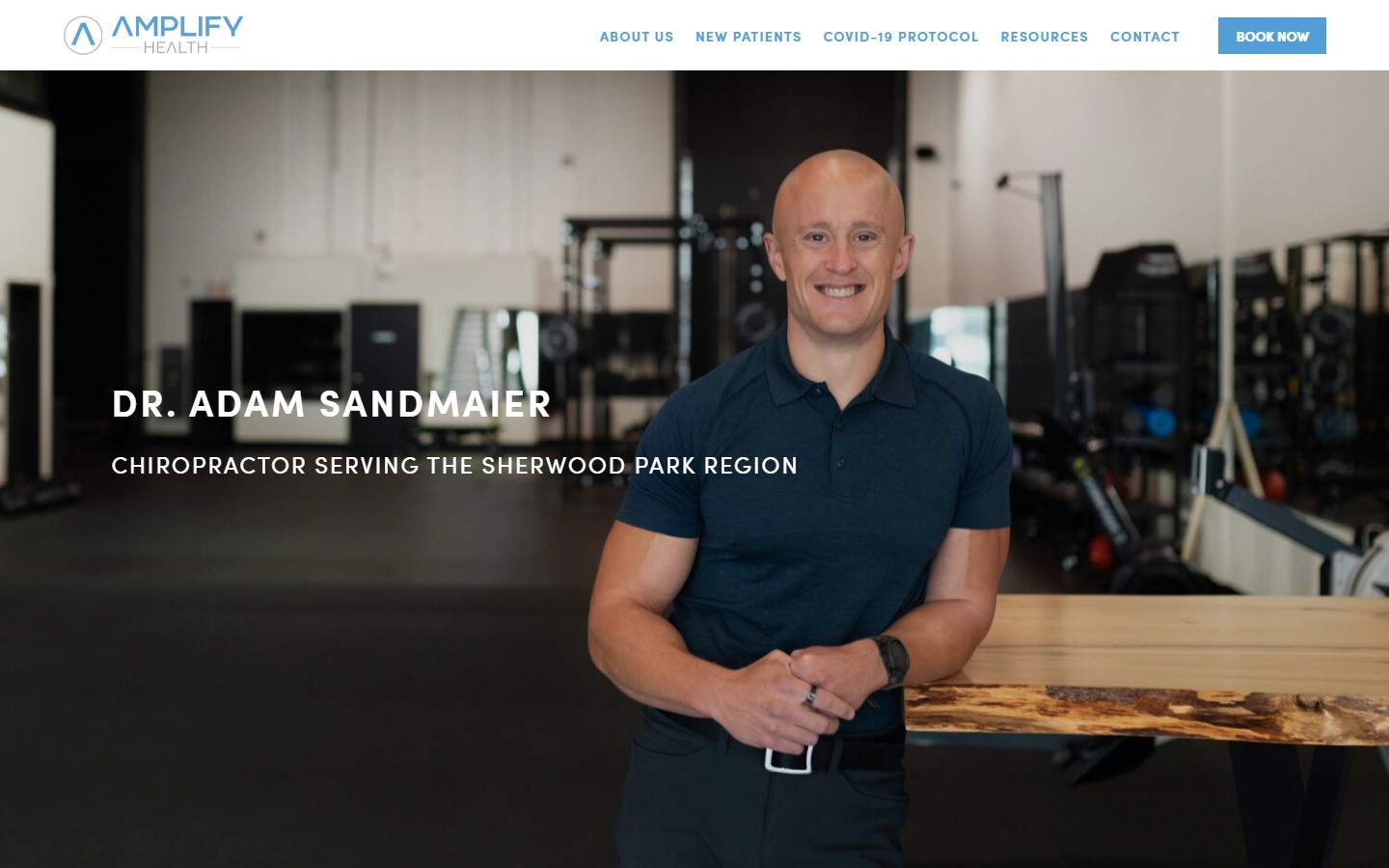 www.amplifyhealth.ca
16. The Roxbury Institute
Why it works: One might mistake this site to be that of a hotel, but the luxurious design fits well also with the service this website offers. We also like the sticky ‘book online’ button that works smoothly and intuitively on the page which can enhance the UX experience of their healthcare customers. www.theroxburyinstitute.com
Best Doctor Web Design
17. Eye Physicians & Surgeons of Arizona
Why it works: If a professional designer gonna use images in grayscale, they have to execute it well. Luckily the use of greyscale images in this website is very complimentary to the site’s look and feel. We also like how they used relevant images to support the written content on the page.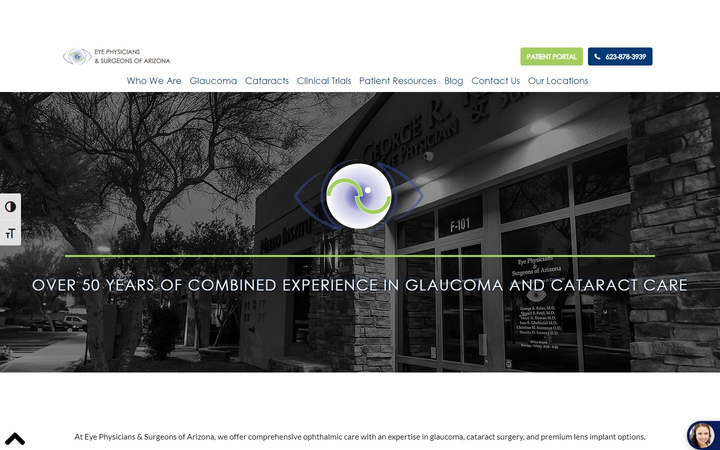 www.eyesarizona.com
18. Dr. Judith ND
Why it works: Dr. Judith’s website is a perfect example for those who want to de-stress. The use of muted colors and a very clean interface are great design choices that make this site very calming to browse through. The doctor website photos are also very appropriate. www.drjudithnd.com
19. Paula Moynahan, MD
Why it works: We love how compact the website looks at first, but the substance is right within the inner pages, all properly categorized and organized. The soft particles raining on the home page are a sweet touch to make this website look full of life.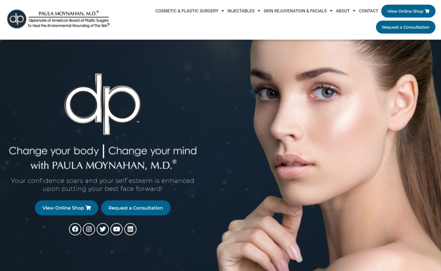 www.paulamoynahanmd.com
20. Acuity Eye Group
Why it works: The site’s sliders are powerful and catchy because of the animations and graphics. The overall look is polished and sleek, which helps create a sense of authority for the team. All the website content is also neatly organized on all inner pages without looking crowded.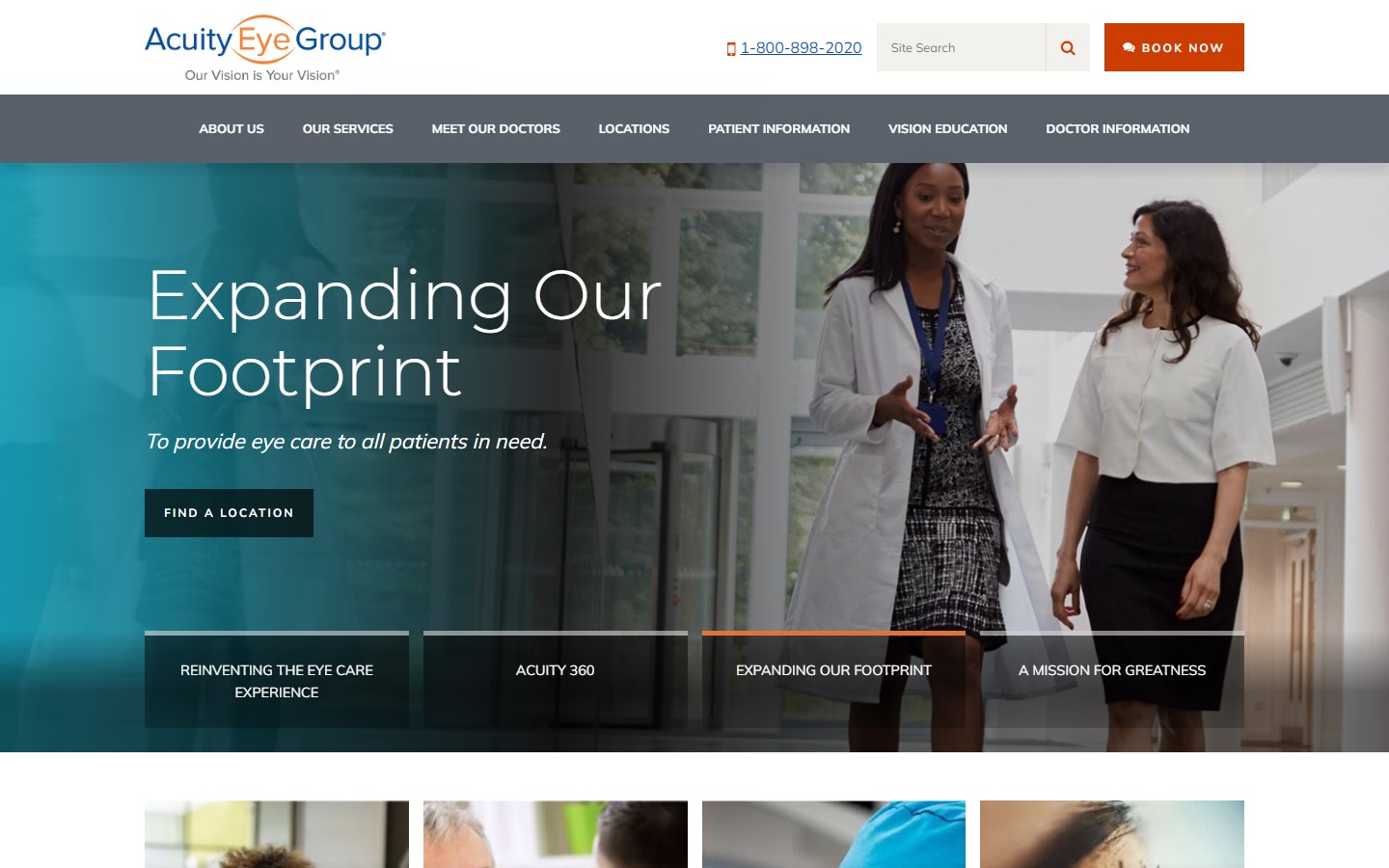 www.acuityeyegroup.com
Web Design for Doctors
21. Adean Kingston
Why it works: Great photography on a website design is truly admirable, and the one by Adean Kingston is just exceptional. Featuring gorgeous skin tones, it’s easy to tell the quality of skincare the doctor provides. This doctor website is creating a very personal and inviting vibe. We also like how they use overlays on some images to provide more information about their process and services.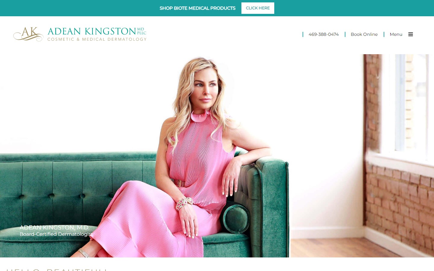 www.adeankingstondermatology.com
22. Dr. Eric Wood, ND
Why it works: Dr. Eric Wood, ND, shares his journey to natural healing. Rather than emphasizing his medical practice and services, he tells stories to demonstrate to more patients that he understands their medical problems. This is a fantastic method of marketing and helping establish trust and convert visitors into new clients.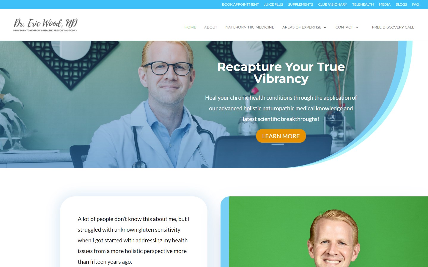 www.drericwoodnd.com
23. Rapaport Plastic Surgery
Why it works: The styling and the feel of this website are very consistent with fashion and other cosmetic business sites. It is a good thing because visitors can immediately know what practice areas and services Dr. Rapaport are creating and marketing. www.parkavenueplasticsurgeon.com
24. Kagan Institute
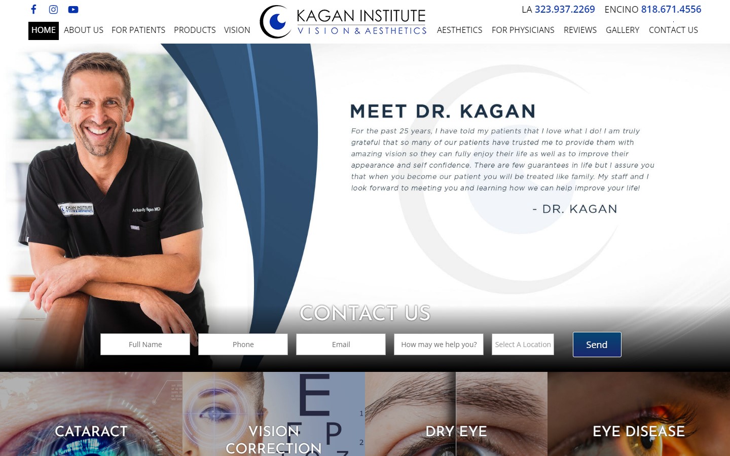
Why it works: Showcasing a portrait of the specialist is one neat trick to quickly establish and create trust with potential clients. Another great thing about this website design is the well-thought body of content even on the homepage alone.
 www.kaganinstitute.com
Doctor Website Design
25. Dr. Hooman Madyoon
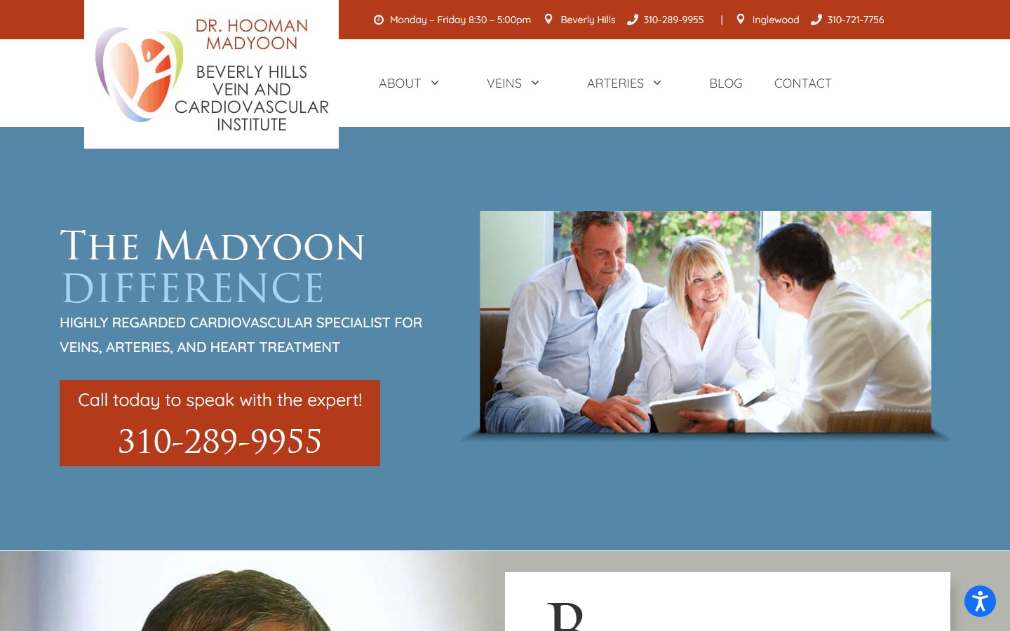
Why it works: This particular doctor website design may feature strong and striking colors, but the design still managed to make the site look friendly and warm. The use of big in-your-face photos makes this stand out from other websites, too.
 www.bhvci.com
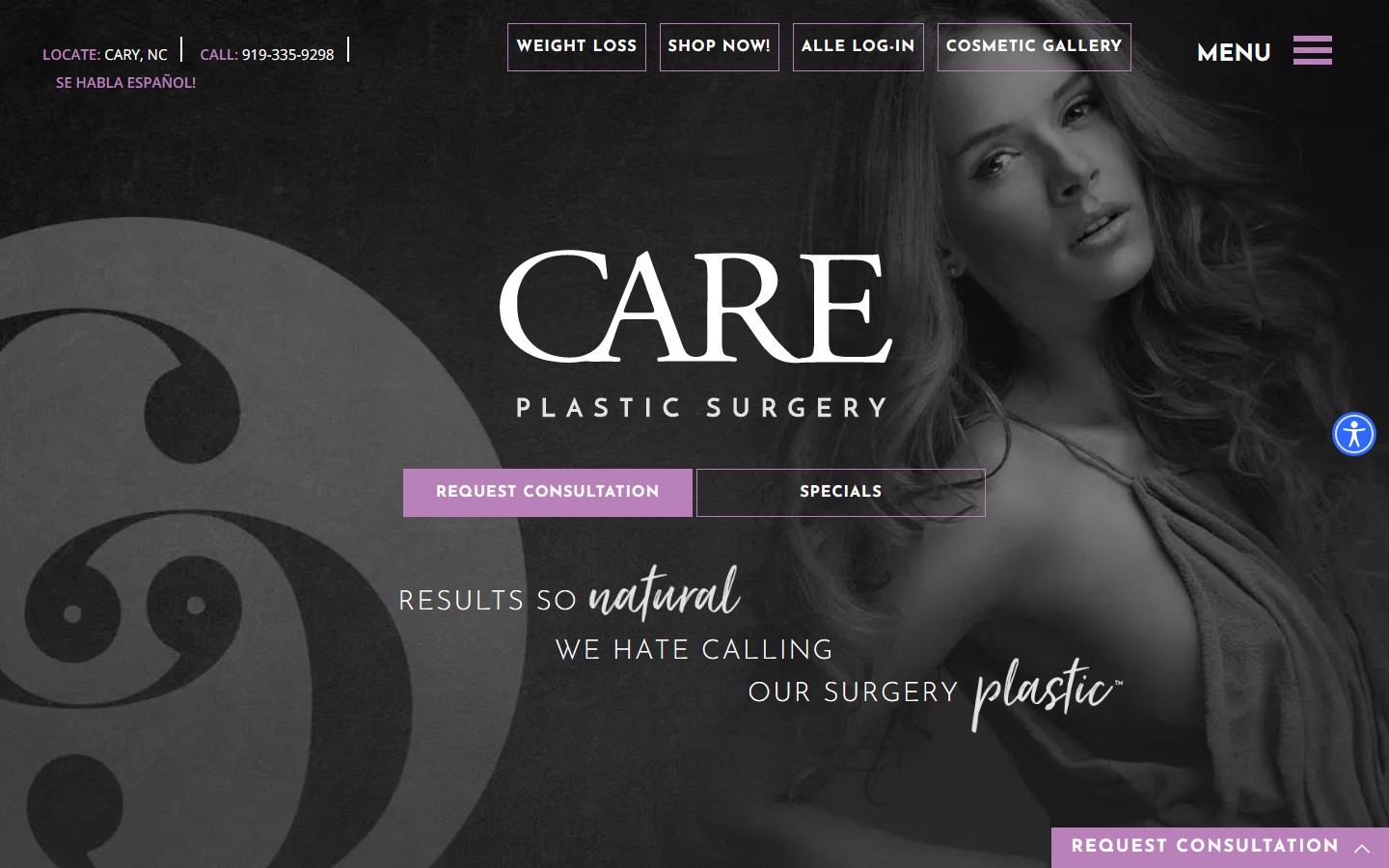
26. Care Plastic Surgery
Why it works: Feminine and sophisticated, yet create a very pleasing to the eyes vibe. Their office and other information the patients need can quickly and easily be accessed. The doctor website also displays authority, more because of the awards they showcase to promote their patient base services.
 www.careplasticsurgery.com
27. Manhattan Cardiology
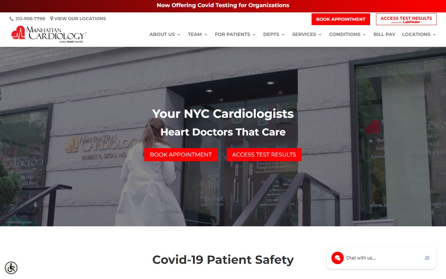
Why it works: The slo-mo home page video is very touching and relevant. Overall, the website layout is easy to skim through, with just the right text sizes for visitors and new patients of all ages. Their office location and contact number can be viewed with ease.
 www.manhattancardiology.com
28. Infinity Holistic
Why it works: There are many creative ways of creating and marketing a professional and trustworthy image. This website accomplishes this with photographs of the naturopathic physician and first-person content chunks.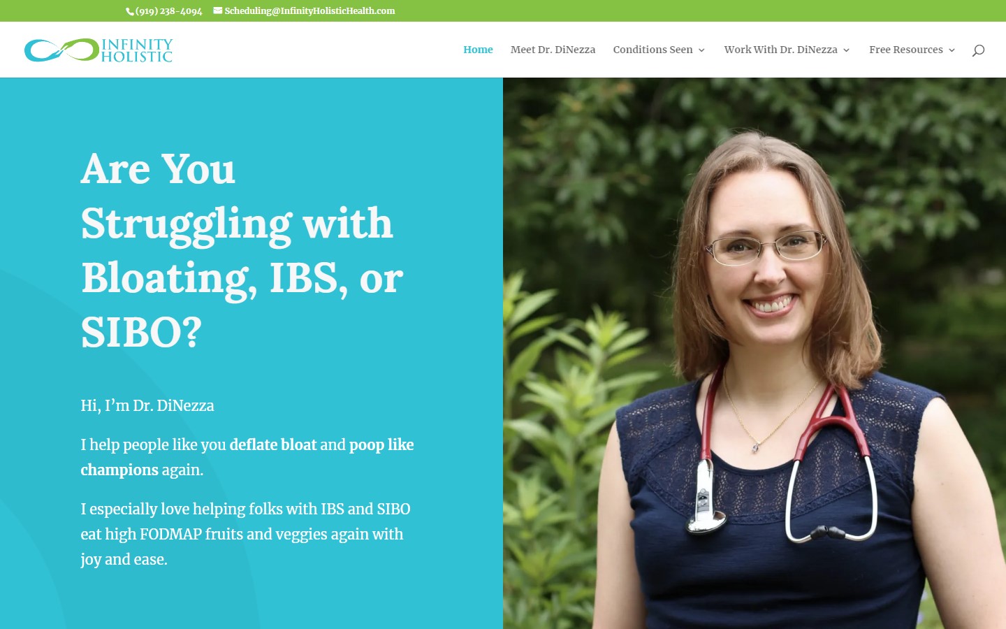 www.infinityholistichealth.com
Best Doctor Website Design
29. CVI Fibroid Center
Why it works: We love the very emotional and human feel of the landing page. The layout is also beyond ordinary. The smooth animations also create and add to the overall warm and calming feel of this website. www.cvifibroidcenter.com
30. Dr. Lana Wellness
Why it works: The website builder did a great job in making the visitors feel the dedication to wellness of this site. The use of green gives off a very refreshing and relaxing ambiance. The amount of whitespace is also generous and goes well with the images and typefaces being used.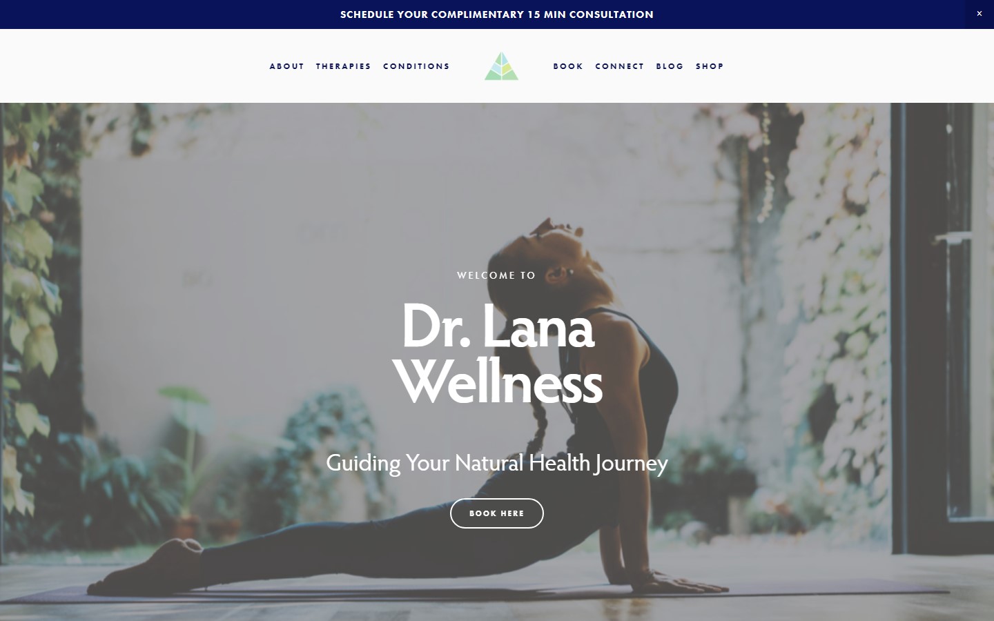 www.drlanawellness.com
31. Premier Cadiovascular Care
Why it works: The button ‘see a cardiologist’ is a standout on the home page which is a good marketing idea. The use of vector graphics in representing cardiovascular issues is not only complementary to the branding but also helps visitors understand quickly the practice areas and services the doctors cover.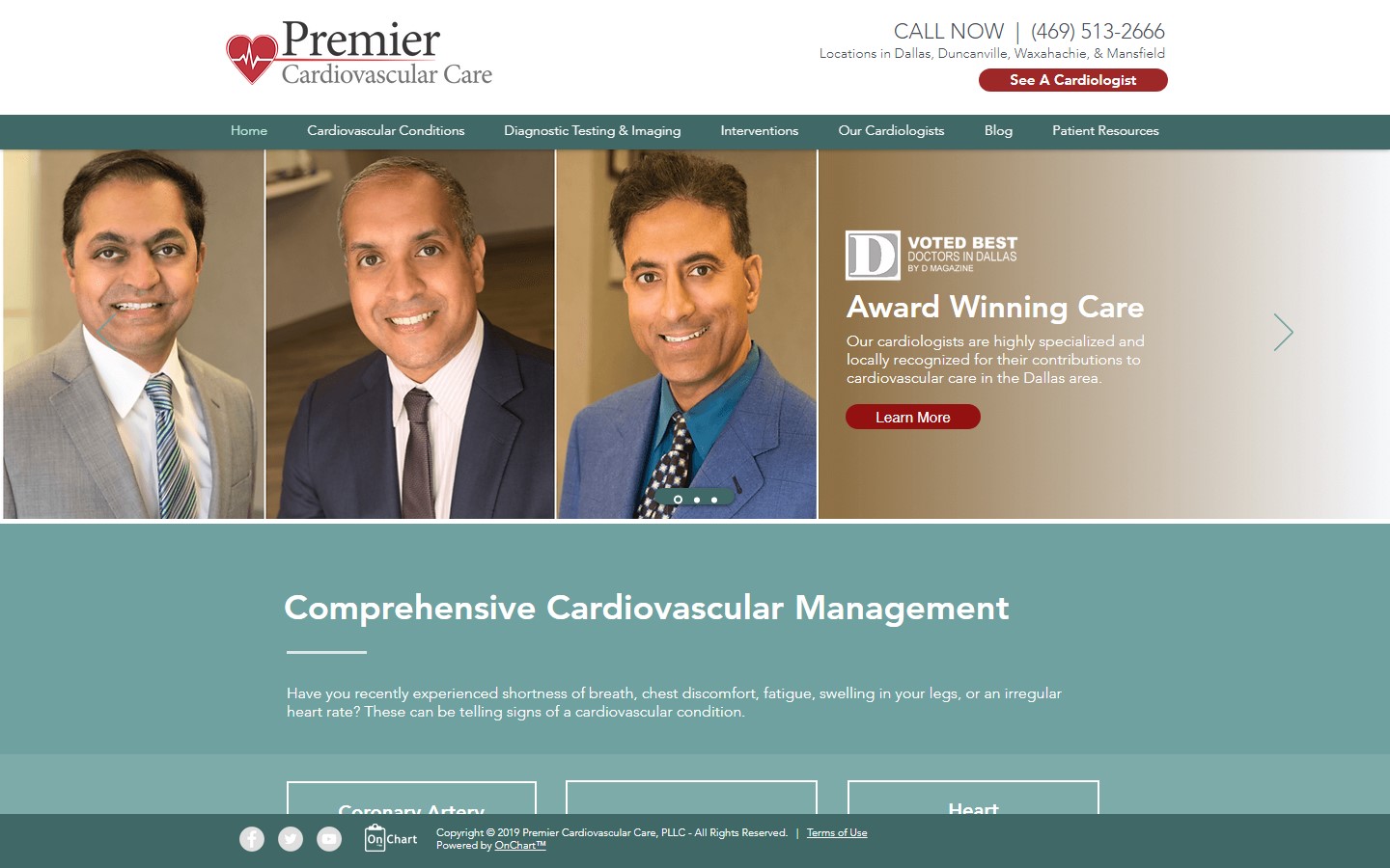 www.premiercardiodallas.com
32. Y. Mark Hong, MD
Why it works: Looking for a phone number or location is easy with this website of Doctor Mark Hong. The website is also educational yet in a very pleasing way. A doctor website that is designed with a focus on usability and patient education.
 www.markhongmd.com
Best Doctor Website Designs
33. Hawaii Gastroenterology Specialists
Why it works: With large texts, clean and spacious layout, and accessibility features, this website is planned well by the builder with elderly people in mind. This website is one of the best in terms of design and user experience. www.hgsaiea.com
34. Shafer Clinic
Why it works: The high contrast applied to texts is a sure win for this website. Scrolling down the pages is also delightful, particularly because of the smooth page transition process and effects. www.shaferplasticsurgery.com
35. Kiran Farheen, MD
Why it works: The website greets visitors with a carousel of the doctor’s practice areas and services. It is also rich with images that can easily guide healthcare patients visually in the right direction.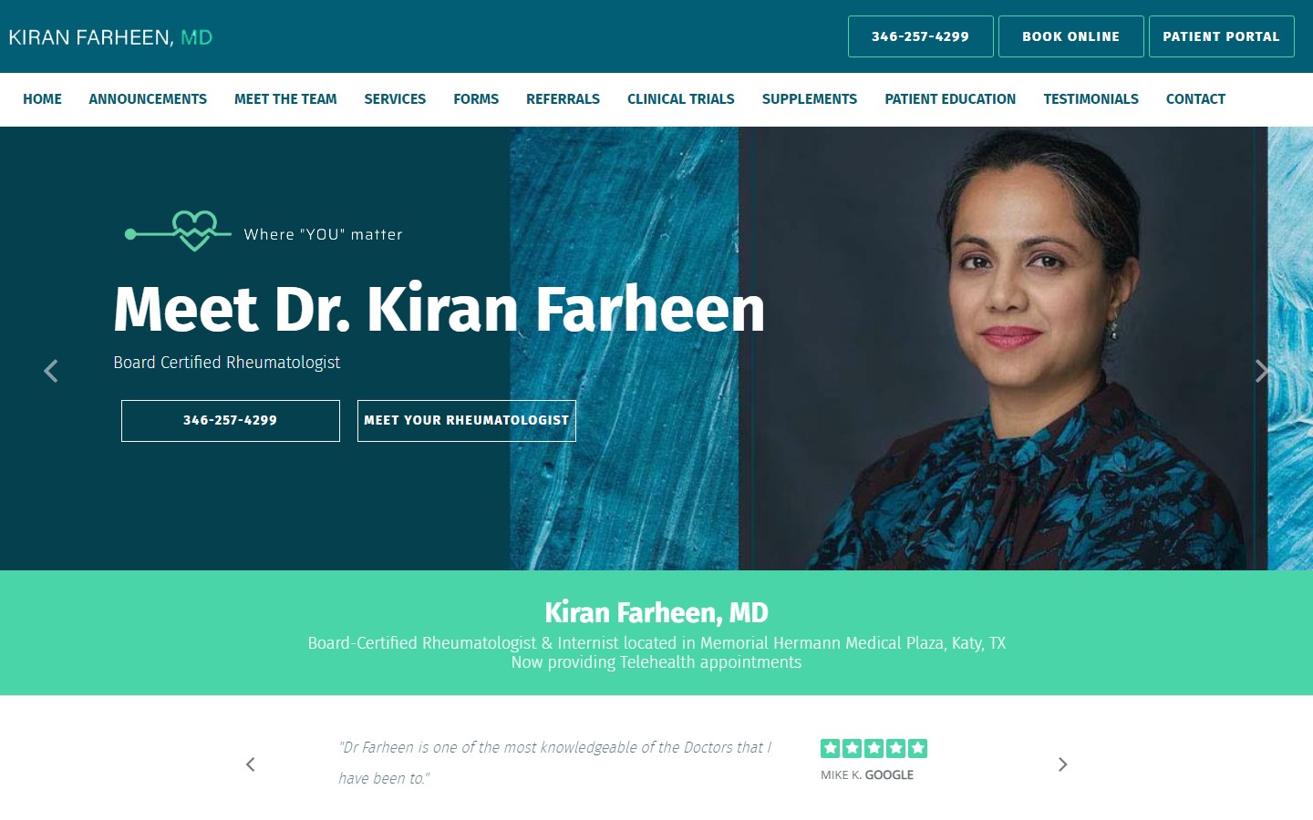 www.drfarheen.com
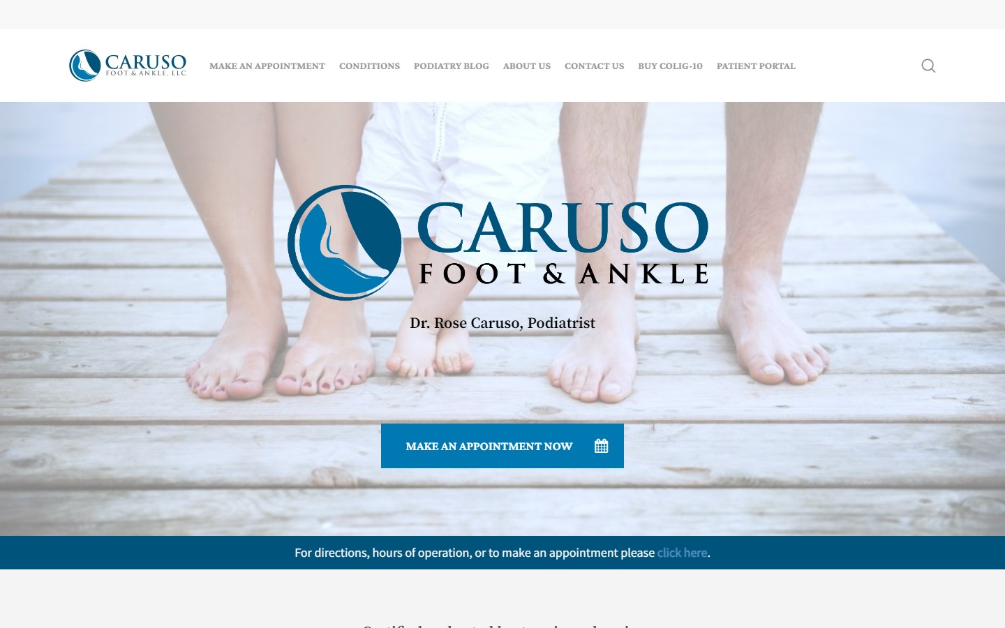
36. Caruso Foot & Ankle
Why it works: Other than the mesmerizing graphics that do not interfere with the content, the amount of text on the website is kept to a minimum while staying informational. This website also boasts a well-organized and easy-to-follow layout. The use of icons is also a great addition to making the design more pleasing and fun.
Web Design for Doctors
37. North Texas Plastic Surgery
Why it works: This website is worthy of our list because of how alive it feels to the visitors. The homepage video is well-made and very professional. The custom animations are also top-notch. The overall look is clean, making it easy for visitors to find the services and practice areas they need.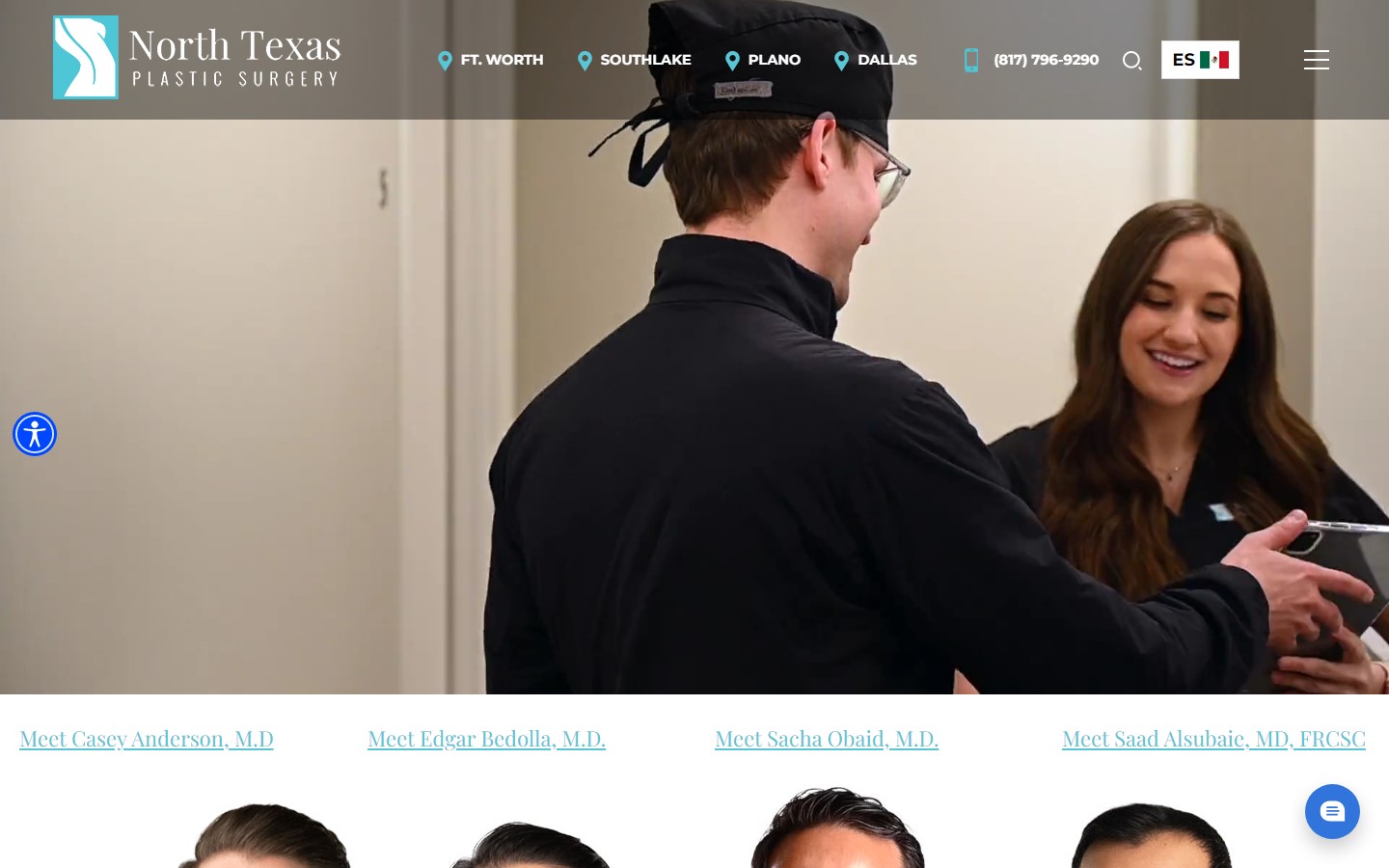 www.northtexasplasticsurgery.com
38. Greystone Chiropractic
Why it works: While the design is basic and the layout is standard, we love the cohesiveness of the branding throughout the site. The videos section is also great for establishing trust and rapport with clients. The website is also easy to navigate with well-organized content.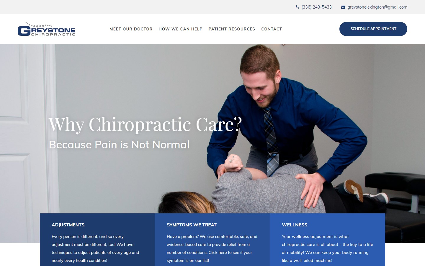 www.greystonelexington.com
39. Avicenna Cardiology
Why it works: Aside from the clean and airy layout with lots of white spaces, we also love how easy to access those buttons and contact information are. The use of those line icons is really smart in making the site look more professional. The layout is also very straightforward and easy to follow. The overall design is also pleasing to the eyes.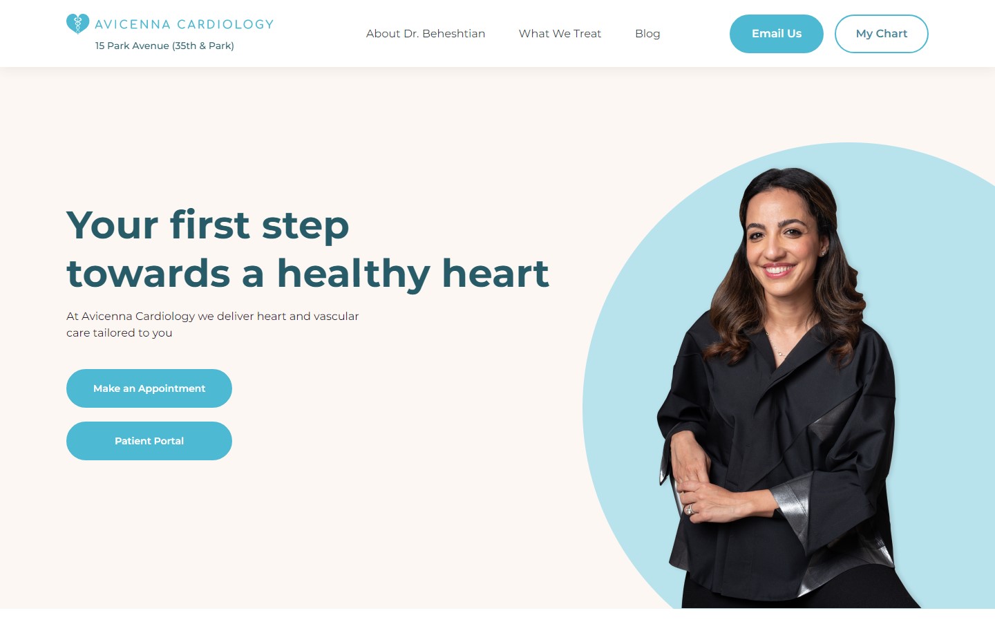 www.avicennacardiology.com
40. Niagara Vascular
Why it works: One can easily be impressed by how clean and professional the site looks and feels. It is uncluttered, engaging, and interactive. The navigation is very intuitive, the buttons are highly accessible, and the readability is ready for all ages. The overall design is also fresh and modern.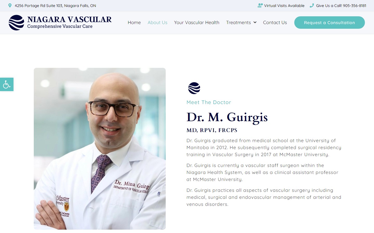 www.niagaravascular.ca
Conclusion
If you’re ready to invest in a top-quality doctor website design. All you need is to provide us with some basic information about your practice and what you’re looking for in a website. Our team will from there. You can focus on your patients while we design the website of your dreams. When we’re done, we’ll show it to you and make changes until you are satisfied.
You can simply take advantage of our experience in website design and marketing to get a website that is: Easy to use, customized for your unique brand, flexible and scalable, able to grow with your practice, SEO ready, and designed with your target clients in mind.
Our website builder will create a custom mockup of your new website before you sign or pay for anything. If you like our design for your business we can move forward working together. If not, there are no hard feelings and no other obligations. Get started today and see the difference a well-designed doctor website can make in your business!
That’s right. There is no hassle and no risk. What do you have to lose? To find out what’s possible, just click below and learn more about our Free Mockup Offer.