Web design changes so quickly, that things considered fresh and modern just a couple of years ago may now seem completely dated. If your website is 3-5 years old, you probably know what I’m talking about. If you’ve purposed to redesign your website in 2018, then you want to get as much mileage from your new web design as possible. That means it needs to be both aesthetically pleasing and coded properly. Knowing which website design trends for 2018 will last and which won’t helps you plan a long-lasting and profitable website.
7 Website Design Trends for 2018
Here are 7 things you might want to consider for your website.
#1 – Asymmetry and Broken Grids

I’ve got bad news for those of you who like everything lined up in neat little rows. Asymmetry tops the list of popular website design trends for 2018.
That’s right!
During 2017, the introduction of asymmetrical and ‘broken’ layouts found their way into web design. The appeal was instantaneous and only seems to be growing.
Why?
Because right now, asymmetry is something different in a world where competition is stiff, and people often equate ‘new and different’ with ‘better.’
In another five years, when its time to redesign your website once again, it’s entirely possible that we will be back to orderly arrays, but for 2018, it’s time to let go and let your web designer ‘out of the box.’
#2 – Gradient Backgrounds
Flat design lives up to its name… it leaves people flat.
3D Animations and gradient backgrounds give a website depth. In the past, a web designer might have used shading to make buttons pop or to create faux pop-ups.
But the website design trends for 2018 call for much more than shading!
Bold, vibrant colors swirled together can draw the eye and incite a feeling of action. Many are even overlaying images with gradient colors to get a ‘rainbow’ effect.
For many, you can incorporate this new trend without going to the extreme. A simple gradient background could provide the perfect backdrop for other images. Use bold colors but shy away from employing the full spectrum in one element.
This way you can get longer life from your web design, even if this particular fad fades in the next year or two.
#3 – Scalable Vector Graphics
This particular web design trend is NOT a flash in the pan. Scalable Vector Graphics are becoming the primary image type for websites. It won’t be long before .jpg, and .png images are a thing of the past. SVGs are lightweight vector images that promise perfect rendering of images regardless of screen size or resolution.
Since people view websites on all types of screens, this has become highly desirable.
- Smart TVs with HD Screens
- Laptops
- Mobile Phones
- Tablets
Here we have four different sizes of screen and four different resolutions. SVG works well with all of them, and it doesn’t matter if you are viewing 3D images, animations, graphics, or photos.
#4 – Unconventional Layout
This web design trend for 2018 goes beyond asymmetry or ‘broken’ grids. Web Design has now taken on the traditional header and footer. Forget that horizontal menu across the top of your site, or the social icons and address in the footer. Instead, consider using a hamburger menu or a floating social bar.
What you get by embracing the unconventional is more than eye appeal.
It gives your web designer more freedom with page size and alignment. It also allows a variety of media all in one space. I saw one web design that placed all their ‘specials’ in their footer. By doing so, they kept their content free and uncluttered and with the unexpected placement, drew their visitor’s eye. We notice things that are ‘different’ than what we expect.
This web design trend for 2018 comes with a word of warning. USER EXPERIENCE IS ALL-IMPORTANT! Make sure you don’t move critical information where your website visitor can’t find it.
#5 – Illustrations

During 2017, a lot more illustrations started popping up on websites. Many, especially service websites, found that what works in their boardroom presentations also worked well for their web designs.
Illustrations are visually engaging and can often explain a concept better than a photo. For some, illustrations can take on a playfulness that engages their customers. This injects personality and makes a company more approachable and ‘trustworthy.’
During the coming year, you will find that more and more web designs rely on illustrations to give a human touch to dry concepts. Consider incorporating this trend into your next web design.
#6 – Voice Search

Not all the website trends for 2018 are visual. Many new elements of design will reside on the back end or be integrated into the text. For instance, the future of voice search is assured. Every year, the demand for ‘audibility’ grows. People are on the go and don’t have time to sit and read.
For instance, let’s consider the website that ‘reads’ its text to you. This is perfect for those who need info while driving their car.
Then, of course, there are the Google Home Minis and the Dots out there. Web Design needs t0 include keyword phrases for vocal search. These phrases need to be included on your primary landing pages. Content plays an important part in web design.
Just watch… web design trends for 2018 will include interfaces that understand voice commands. It won’t be long before most of what we do on the web is voice activated.
And while some website design trends for 2018 will have their glory day in the sun and then disappear, audibility is here in some form for many years to come
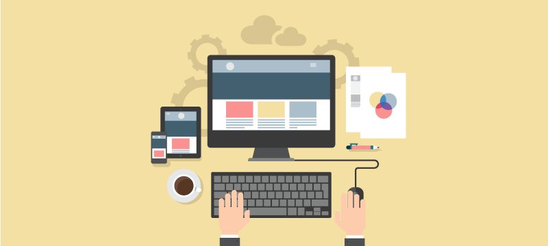
#7 – Mobile Design

By 2014, laptops had practically replaced stationary computers. At that time, web design also began to change. Well, 2017 was another year of change. For the first time, browsing on mobile phones and tablets overtook desktop browsing.
What does this mean?
Uh… in case you’ve been living under a rock for the past couple of years, it means you MUST HAVE A MOBILE FRIENDLY WEBSITE.
In 2018, you can expect more and more advances in mobile design. It will become increasingly important to have two versions of your web design, one for laptops and another for mobile devices. Smaller screens will require icons, not large dynamic images. Information will need to be organized in a more sophisticated manner.
On the backend, your site has to be optimized and fast.
Mobile-friendly websites are now so important that we would even venture to say that this is not a ‘trend,’ as that word implies that it will change. Mobile is here to stay (and dominate) until some unforeseen technology takes its place.
As we move forward into 2018, I encourage you to consider these new design trends and determine if your website doesn’t need a facelift. Thomas Digital Design offers a Free Mock-Up of a new website design focused on user experience and conversion. See the possibilities without any commitment or risk.