Finding the right Financial Advisor Websites can be tough. There are many things to consider when designing Financial Advisor Websites, and it can be difficult to know what you need for your website design. That is why we have created this list of 40 Financial Advisor Websites that you will love!
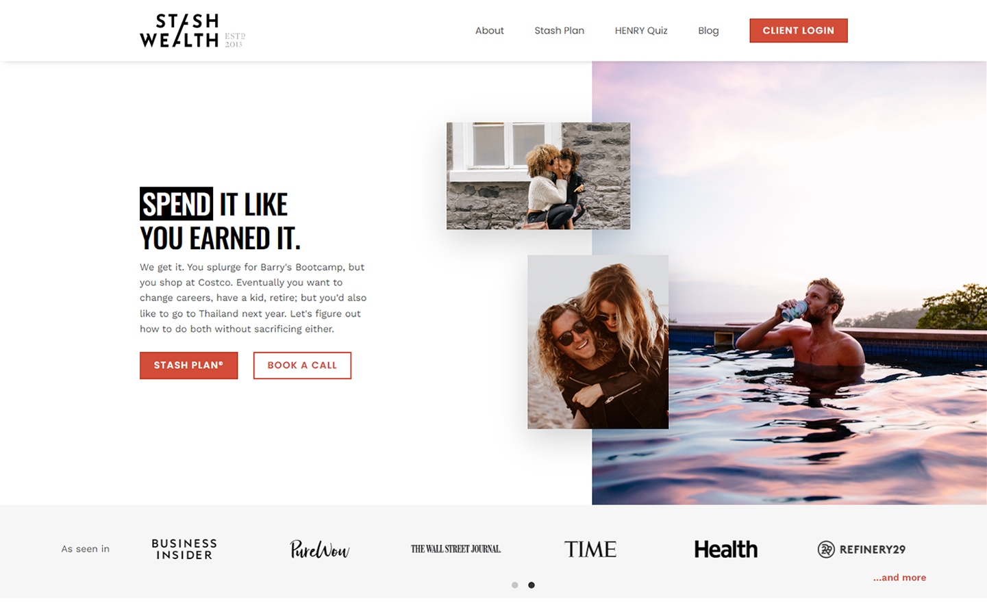
1. Stash Wealth
Why it works: The black and red color scheme is used consistently across the website. The audience is targeted through the use of graphics, content text, and language. The utilization of social proof via reviews and testimonials sites aids in establishing confidence.
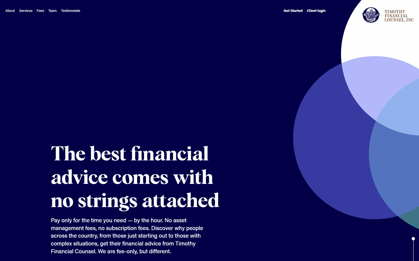
2. Timothy Financial Council
Why it works: The homepage is simple and straightforward. The hero features a single image animation that changes into an interactive graphic element. The colors used suggest a professional and formal business.
3. Wealthspire Advisors
Why it works: Blue and yellow are used effectively and consistently. Angled lines, boxes, and design components are used throughout the website’s various sections, based on the company logo’s angular lines.

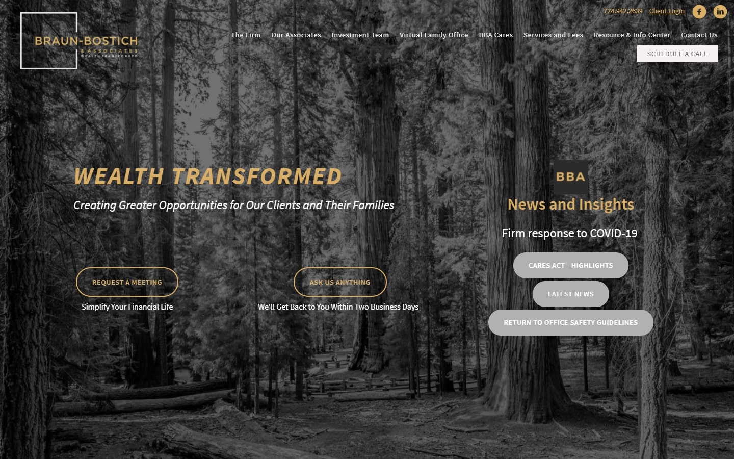
4. Braun-Bostich & Associates
Why it works: This financial advisor website directs visitors to the right page by providing numerous portals on the home page.
financial services website design
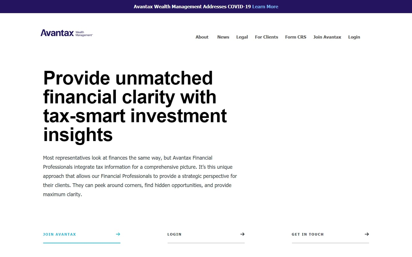
5. Avantax Wealth Management
Why it works: The website has a clean and professional appearance. There’s a lot of white space, huge pictures, and big headline typefaces. Colors are used sparingly—only to highlight clickable elements while the lack of an image in the hero section is unique.
6. Safran Wealth Advisors
Why it works: The typefaces on this site are very fashionable. They’re often seen on fashion-related websites, therefore making this site distinct from other financial advisor websites.

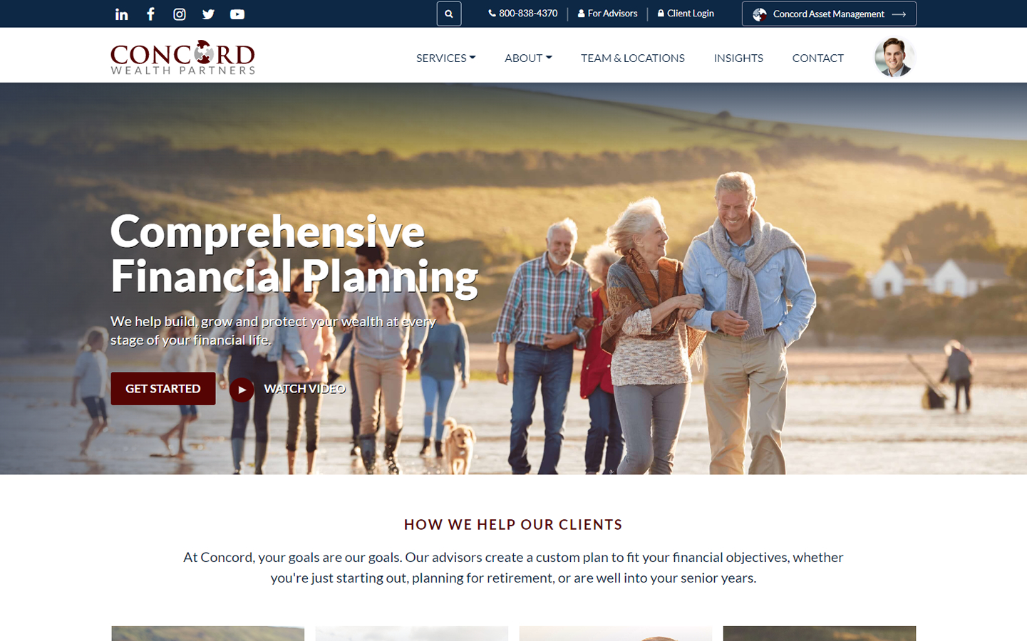
7. Concord Wealth Partners
Why it works: The site’s layout is optimized for higher conversions and usability. Beautiful spacing between the content and design components. The photos used have clickable links that open to new pages. Overall, the design is modern and fresh-looking.
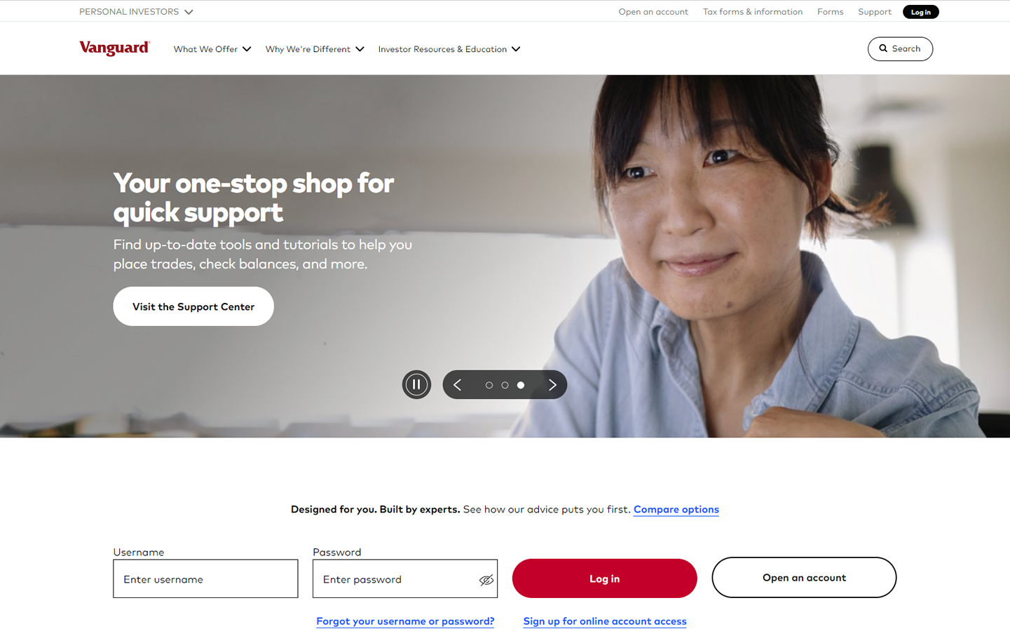
8. Vanguard Group
Why it works: The video testimonial section is well-made. Despite the fact that numerous high-resolution photos are utilized, the site still loads quickly. Informative website with plenty of content that are well organized. The site is simple to use thanks to the dropdowns and comprehensive sitemap on the footer.
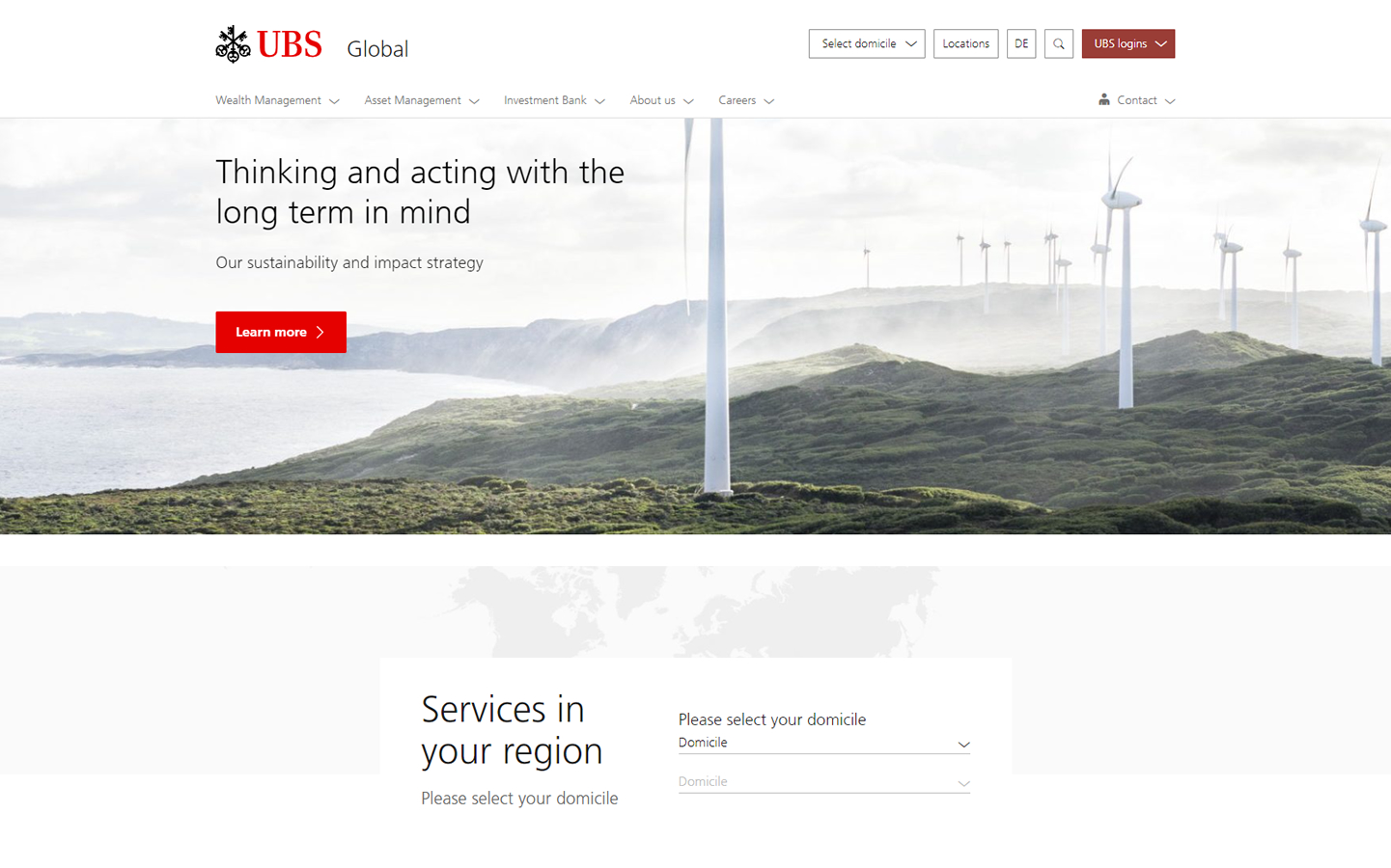
9. UBS Financial
Why it works: The completely light website emanates a clean straightforward website. The logo and call to action buttons are the only elements highlighted in color. Language-specific localized versions of the site are also available.
Best Financial Advisor Sites
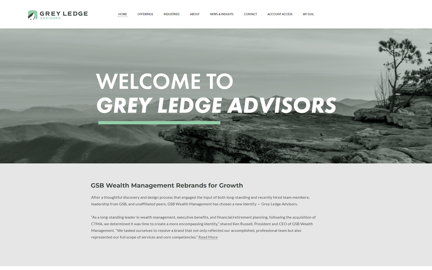
10. Grey Ledge Advisors
Why it works: The professional atmosphere is enhanced by the use of serif heading typefaces and sans serif content types in this website. This is further strengthened by applying significant negative spaces. The parallax scrolling also aids in the site’s attractiveness.
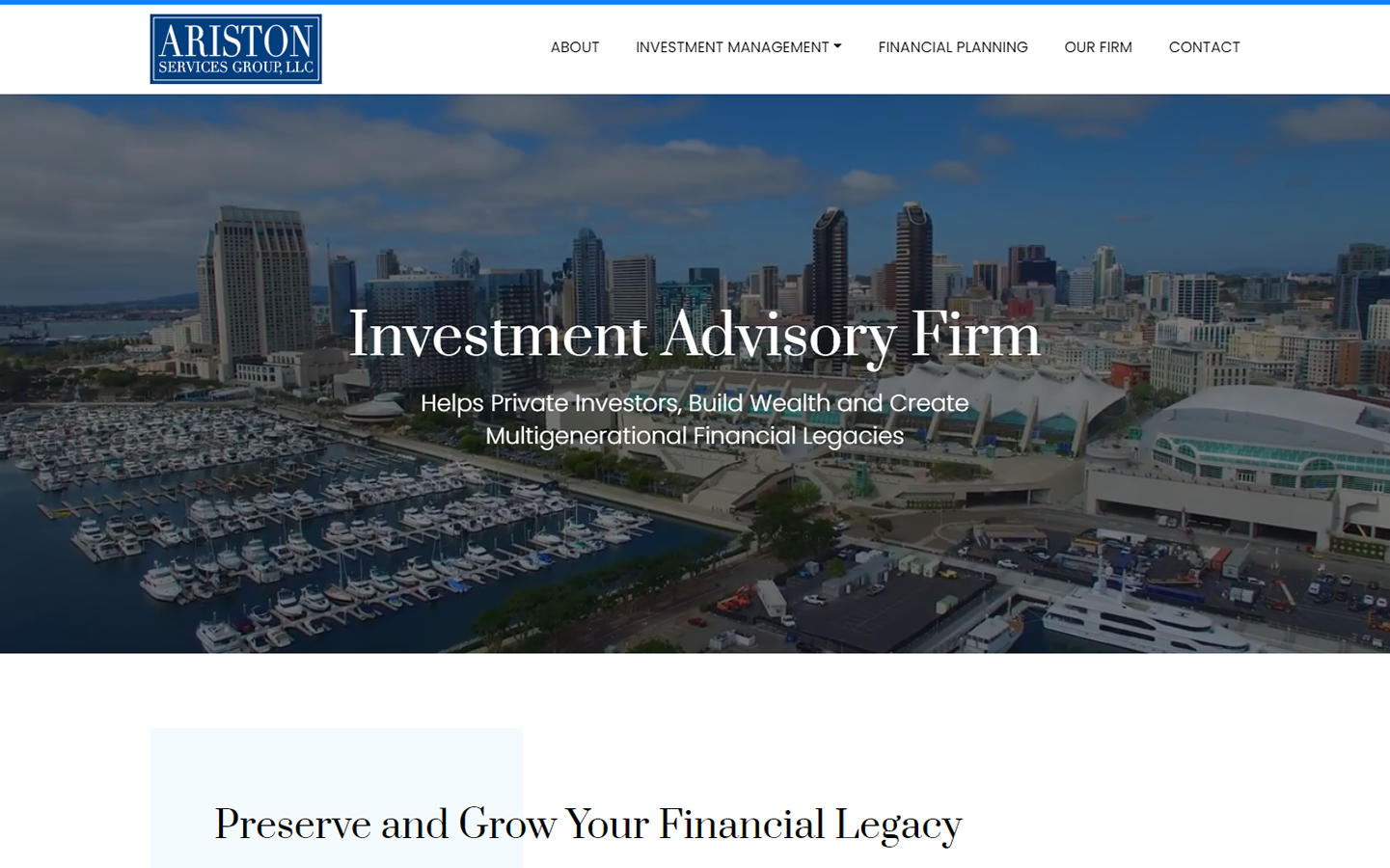
11. Ariston Services Group, LLC
Why it works: The home page is visually appealing with its use of a high-resolution video in the hero section. Professional yet pleasant-looking typefaces were used on this website.
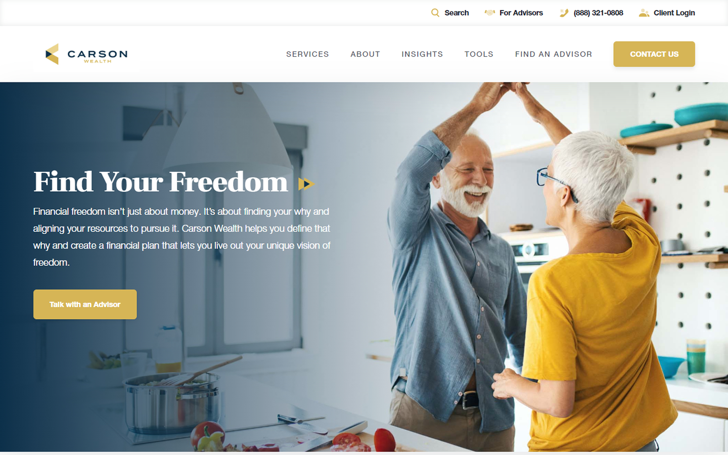
12. Carson Wealth
Why it works: The home page has a very clean and organized look, which makes it easy to navigate. The use of light colors makes the text easily readable, even against a light background. Even in the photos used, the color scheme is apparent.
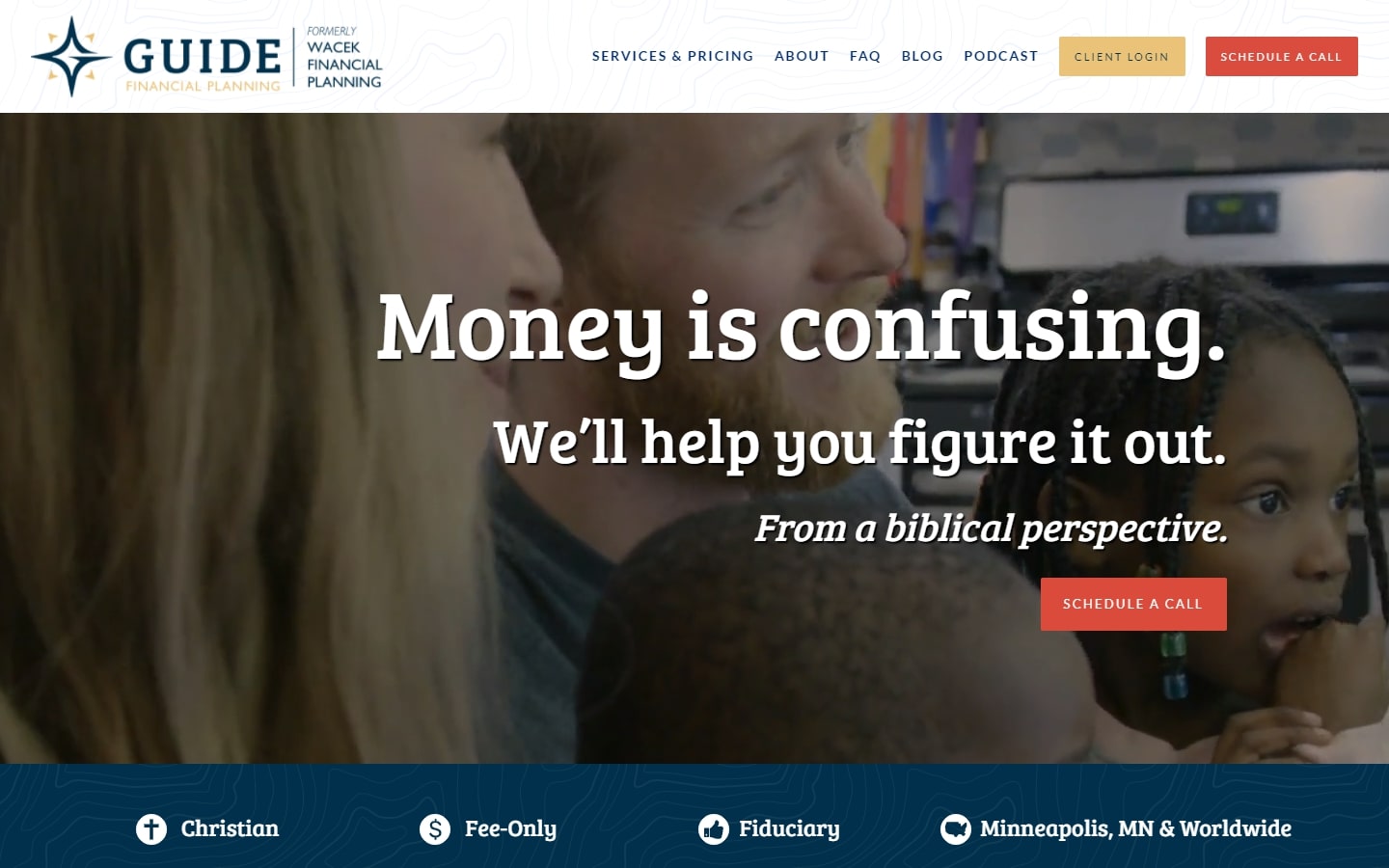
13. Guide Financial Planning
Why it works: The company’s homepage is intended not only on showcasing its services, but also on establishing trust. The “as seen on” video section and logos of affiliates and memberships contribute to the company’s credibility.
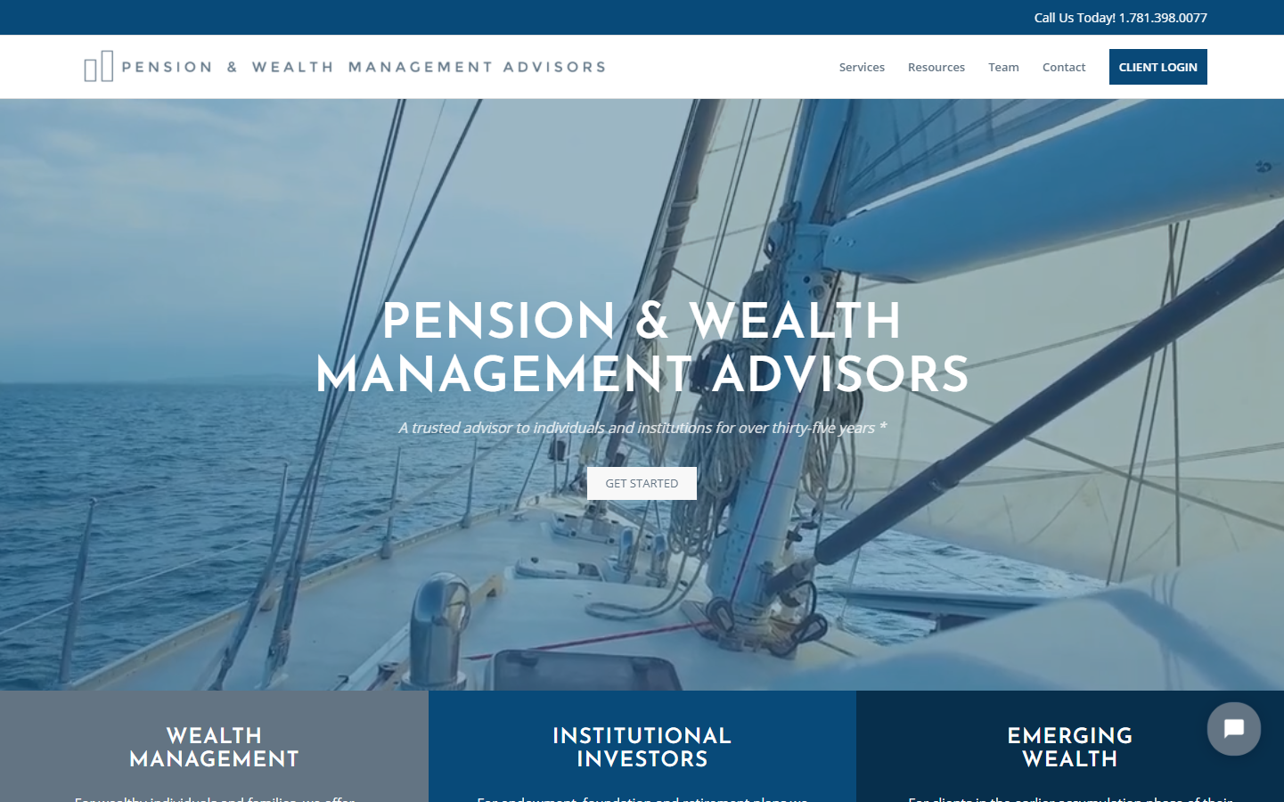
14. Pension & Wealth Management Advisors
Why it works: The site is clean and well organized in terms of content alignment. The use of only the color blue and its shades adds to consistency and cohesiveness. The sharp fonts add appeal to the site.
Financial Advisor Sites
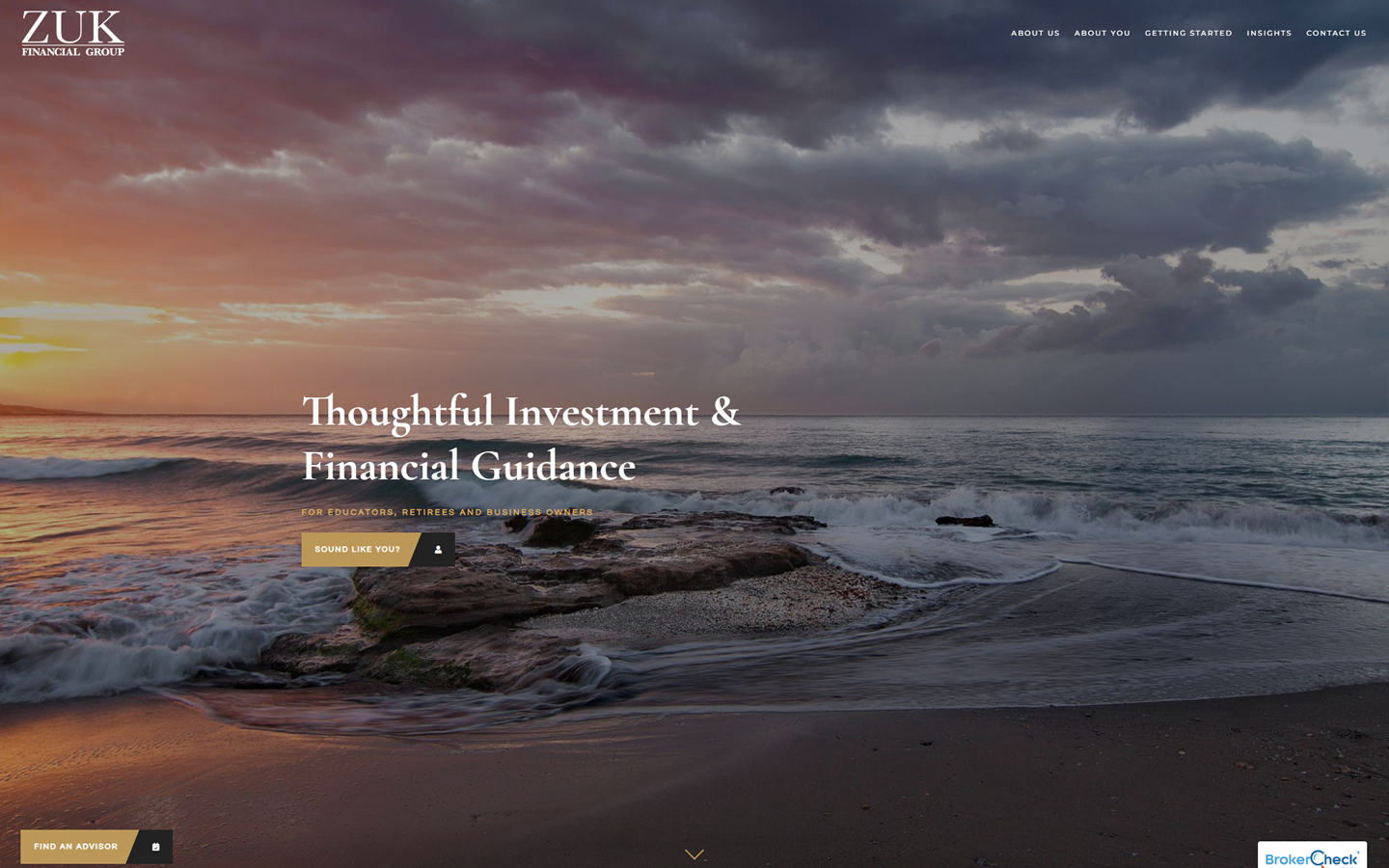
15. ZUK Financial Group
Why it works: From the moment website visitors land on this financial advisory website’s homepage, they feel relaxed and at ease. The clean, sharp fonts and the line spacing employed also aid in readability.
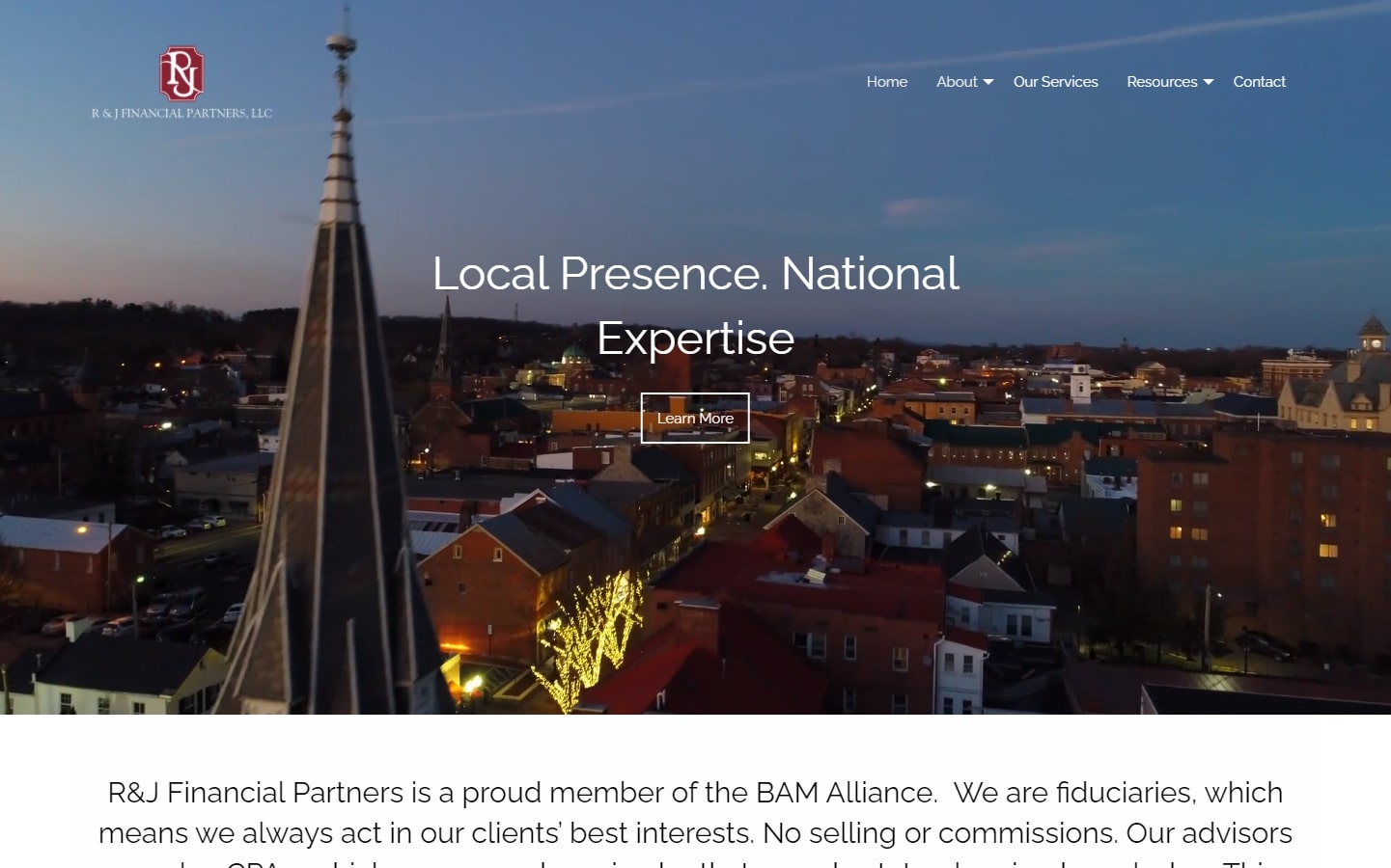
16. R&J Financial Partners
Why it works: Beautiful hero video. Simple and straightforward homepage. Contact information present on the footer.
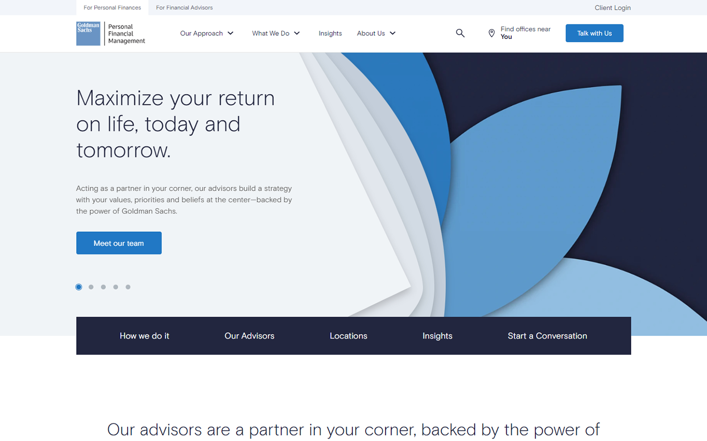
17. Goldman Sachs
Why it works: White space is used effectively, with no clutter to distract you from the information on the page. A call to action button in each section, as well as a contact form near the bottom of the page, ensures that website visitors are encouraged to get in touch.
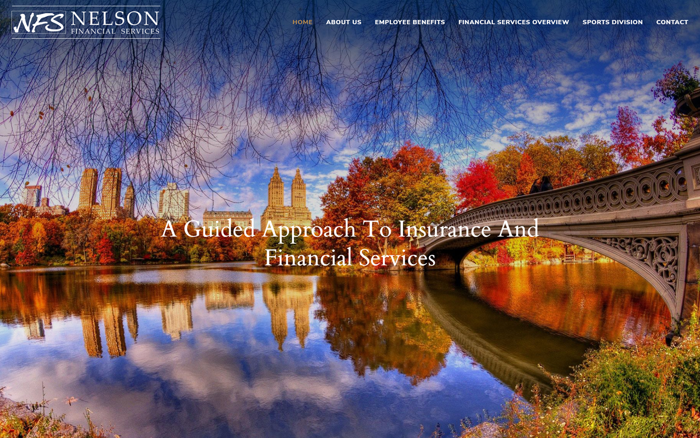
18. Nelson Financial Services
Why it works: The website contains beautiful pictures and simple, direct statements. There are no frills on this website with a focus on the financial advisors and their services.
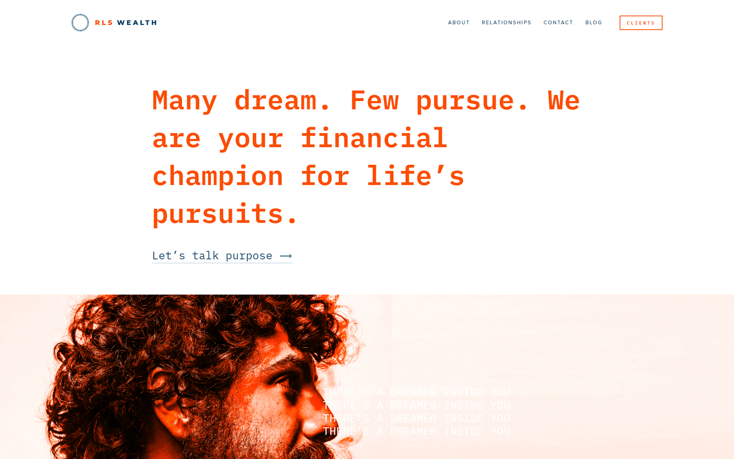
19. RLS Wealth
Why it works: Although this wealth management website has a simple layout, it uses contemporary techniques, such as stunning images and bright colors. This website uses a unique color scheme that sets it apart from other sites in the industry.
Best Financial Advisor Websites
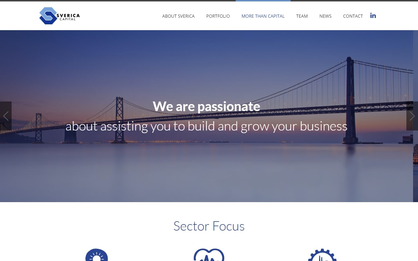
20. Sverica Capital
Why it works: Negative or white space is nicely utilized in this financial advisor website. The distinctive iconography resembles the logo design. The homepage areas are well defined and structured.
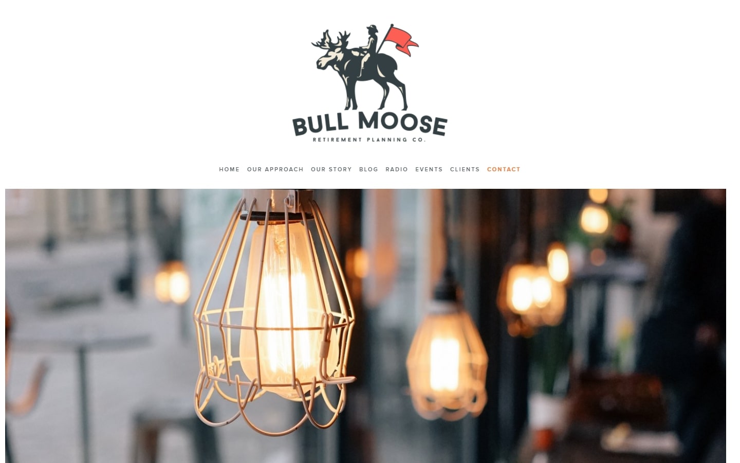
21. Bull Moose Retirement Planning Co.
Why it works: Overall, the design is minimalistic in terms of font usage, picture selection, and iconography. Email capture near the footer effective for acquiring email list of prospective clients.
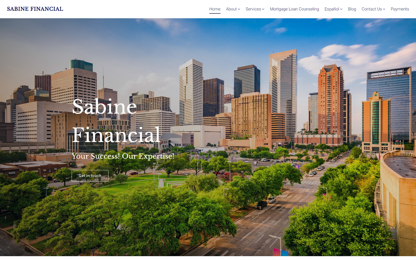
22. Sabine Financial
Why it works: This website’s design is professional and clean, with clever use of white space to highlight important information. They also have a dedicated Spanish-language page, which is great for catering to new sets of potential clients.
23. Clark Asset Management
Why it works: The aptly selected hero image has a clear sky at the top which provides a fantastic backdrop for the company logo and navigation elements. The ‘Retiring Soon?’ or ‘Already Retired?’ calls to action are suited to older consumers which are their target clients. They even offer free videos explaining why signing up for their financial services is a smart decision for new clients.

24. Illumint
Why it works: The looping full screen video and changing heading text adds drama to the site’s distinctive narrative. Despite the narrow content section, the content is organized into several blocks which immediately tells a story.

Financial Advisor Websites
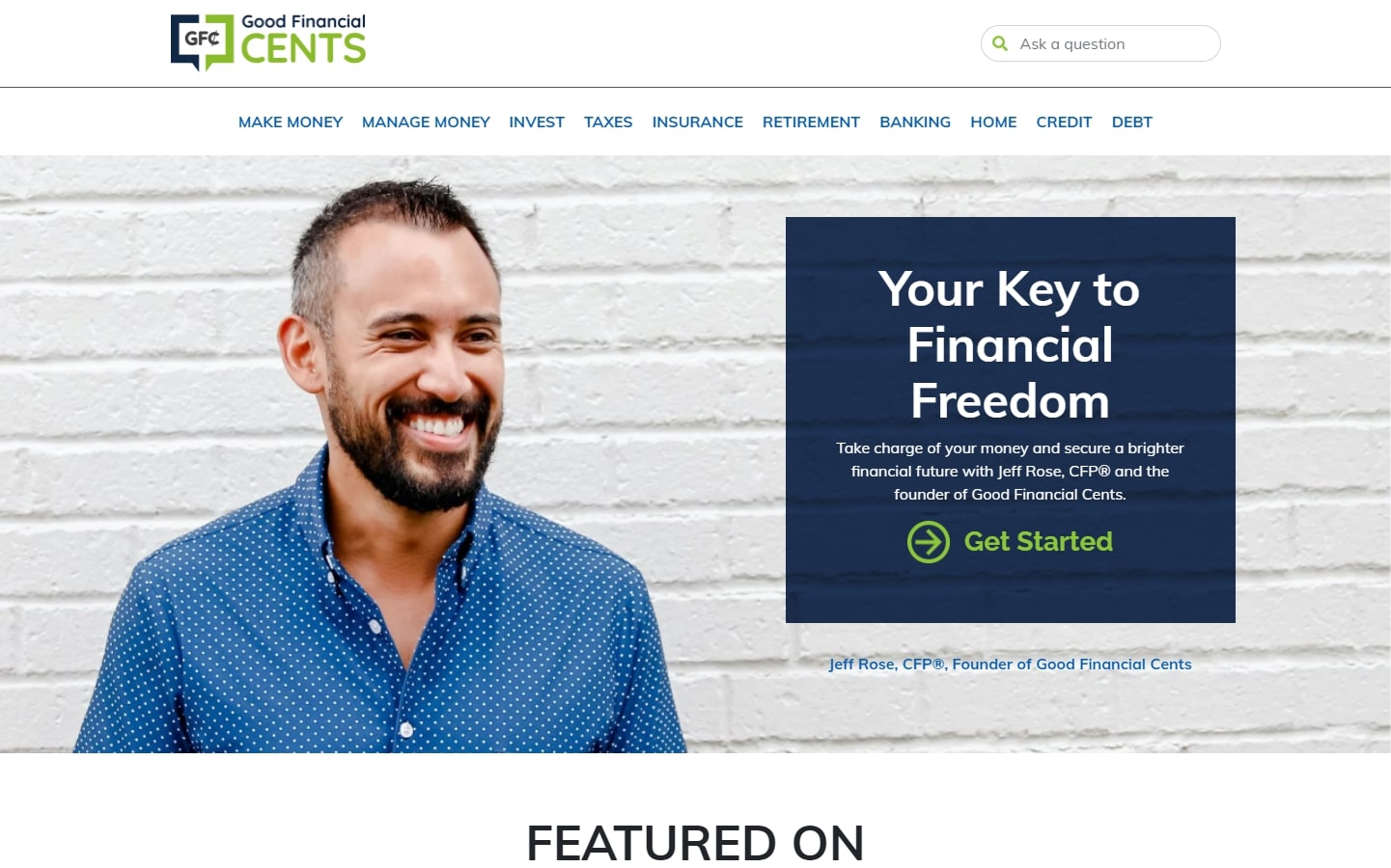
25. Good Financial Cents
Why it works: This clean website has an excellent color contrast with big legible and pleasant typefaces. The picture of the firm’s founder of gives it more credibility.
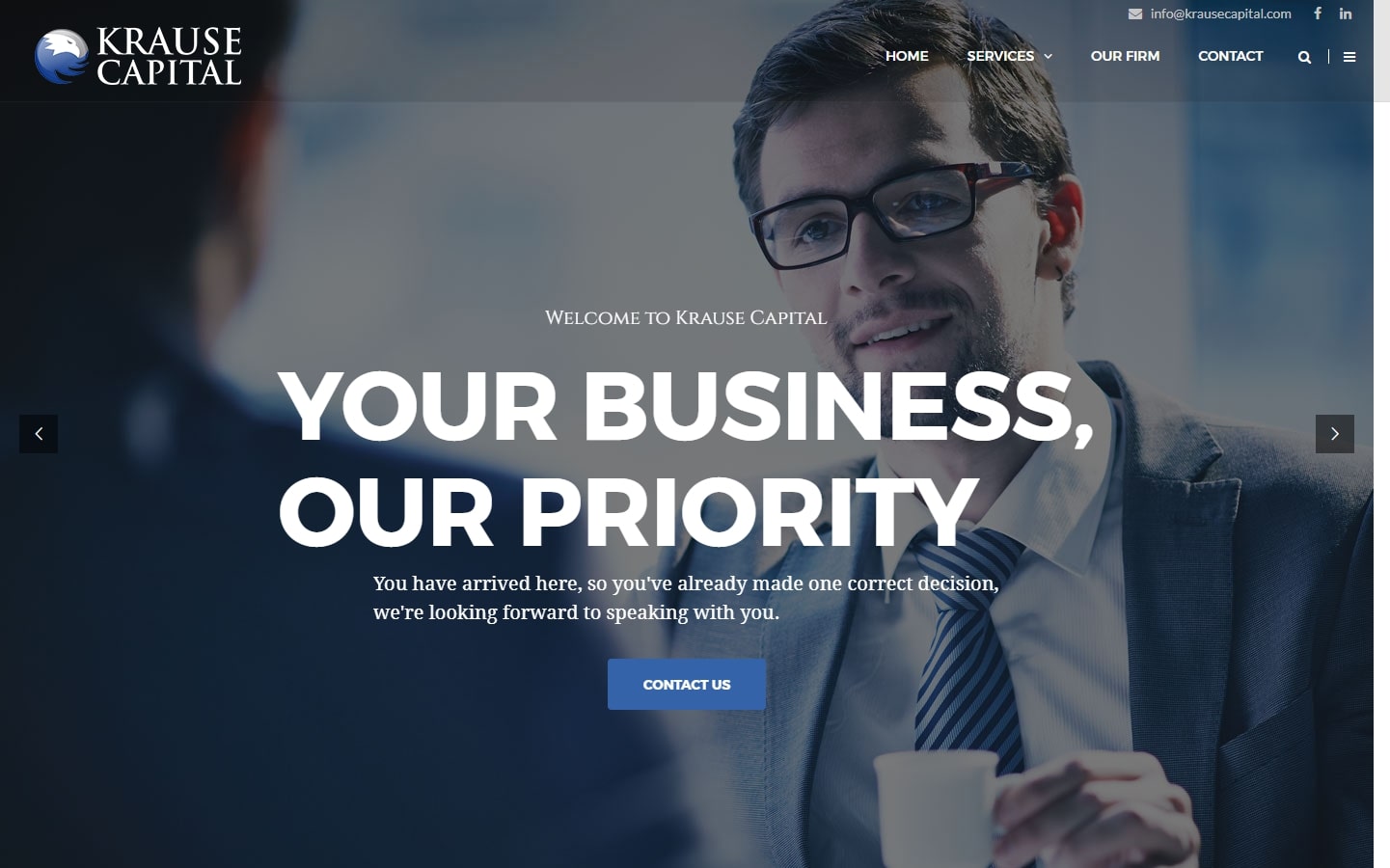
26. Krause Capital
Why it works: The hero section contains attention-grabbing value proposition heading text and large image background. The logo and call to action button are both clear and apparent.
27. Humanitas Financial
Why it works: This financial advisors website implemented a simple, sticky navigation bar so key details are always in view as site visitors scroll through the website. Because of the colors and smiling people, the site exudes a pleasant atmosphere.

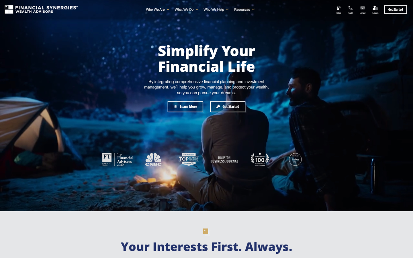
28. Financial Synergies Wealth Advisors
Why it works: The use of dark and light sections to create a visual contrast separates information into bite-sized pieces that are ideal for lengthy scrolling websites. When scrolling, subtle animation effects provide aesthetic impact and appeal.
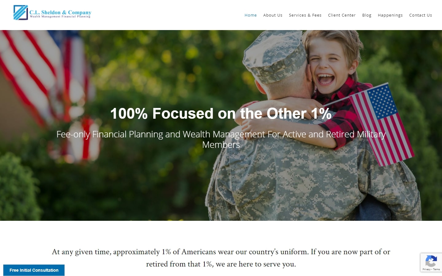
29. C.L. Sheldon & Company
Why it works: Patriotic images and colors are used to cater to their target market, the military veterans. Clean and clear text sections and updated blog content are also a plus.
Financial Advisor Websites for Inspiration
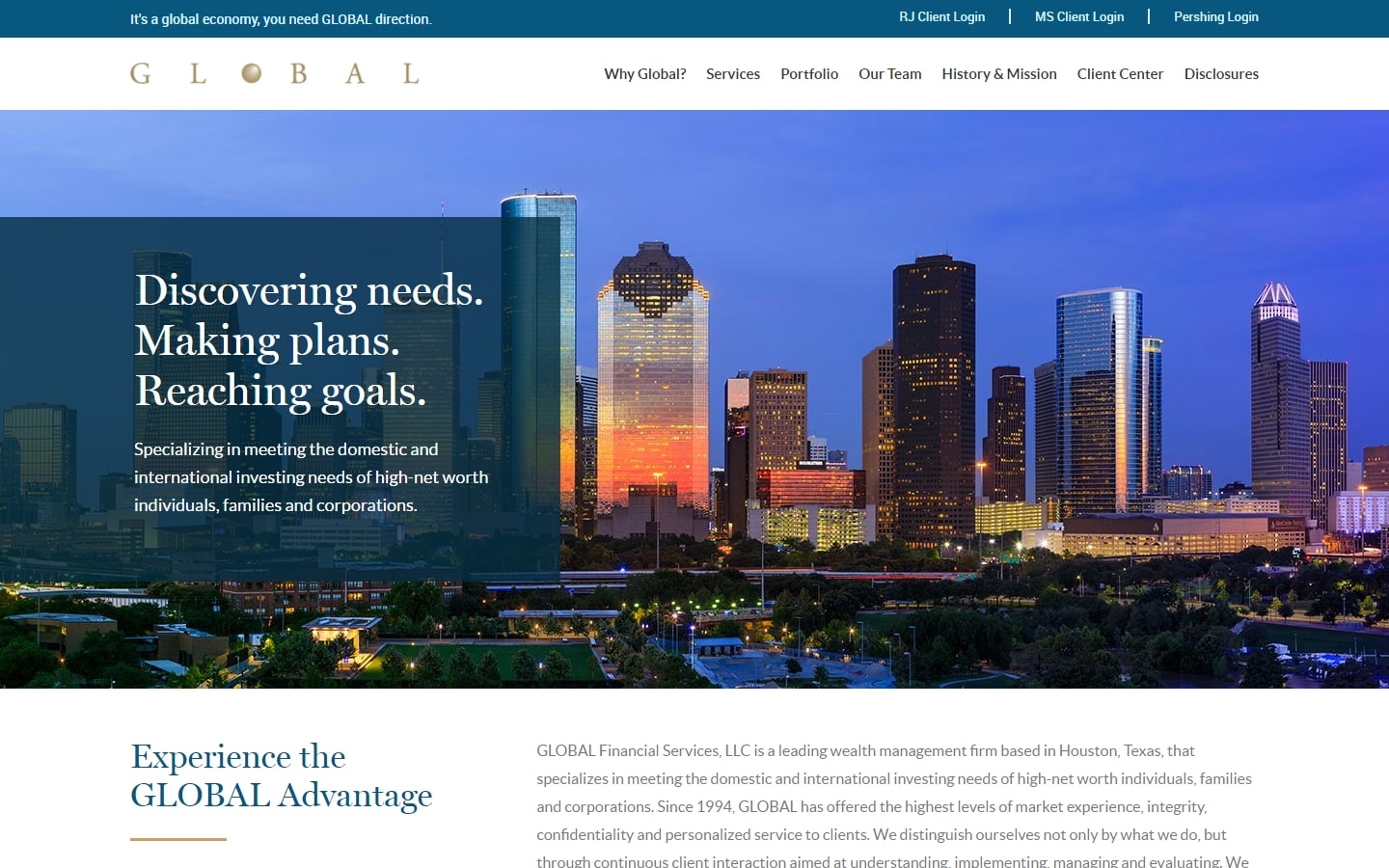
30. Global Financial Services
Why it works: The high-resolution hero image of Houston, Texas’s business capital is a great photo to use on this website and in order to make the hero text readable, a semi-transparent block is used. The typefaces appear professional and appropriate for this site.
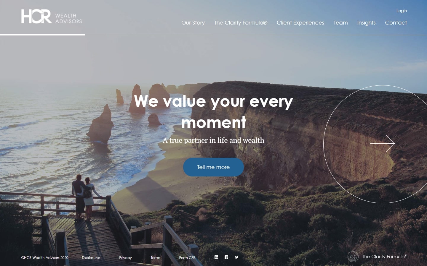
31. HCR Wealth Advisors
Why it works: The fantastic on-hover arrow section starts out with an attention-grabbing animation, after which clicking on the big on-hover arrow component changes the page content, which then redirects to separate webpages when clicked. The inner pages are beautifully organized and the elements are spaced well.
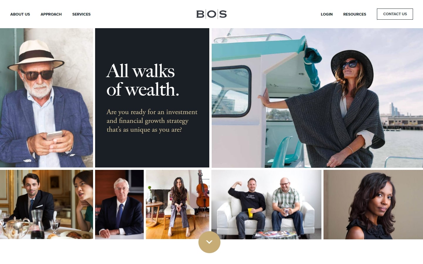
32. Bingham, Osborn & Scarborough, LLC
Why it works: Despite being asymmetrical, the image blocks in the hero section appear to be well-organized because they are all confined within rectangular compartments. The team section, on the other hand, employs the same principle but with photos that are clickable and include a mouseover function.
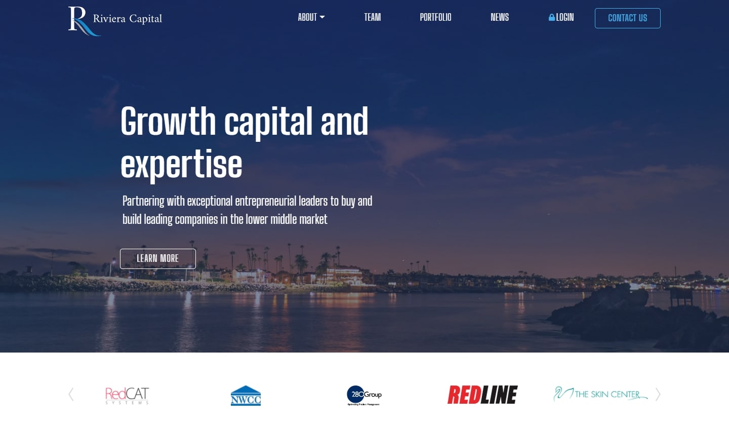
33. Riviera Capital
Why it works: A well-designed website that is both professional and clean. Use of dark filters over images to make text more legible, yet the text content is still readable despite the condensed fonts used.
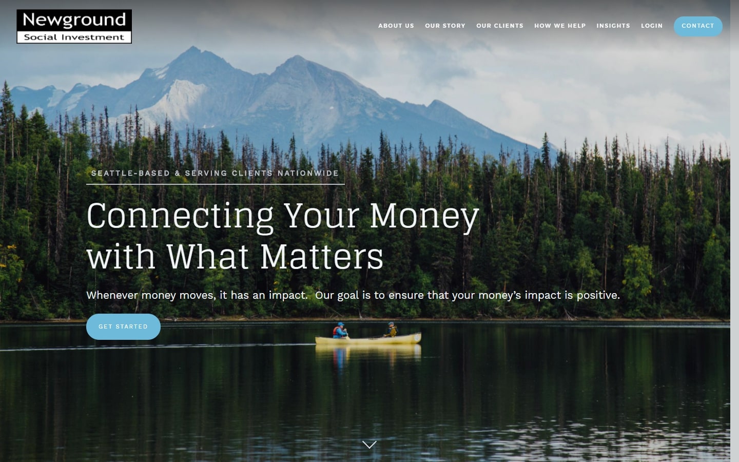
34. Newground Social Investment
Why it works: Hero section with a beautiful full-screen image backdrop. Apart from an introduction text, they also have a welcome video, which adds a personal touch. The company’s credibility is further strengthened by the inclusion of a partners and affiliates section.
Financial Advisor Websites
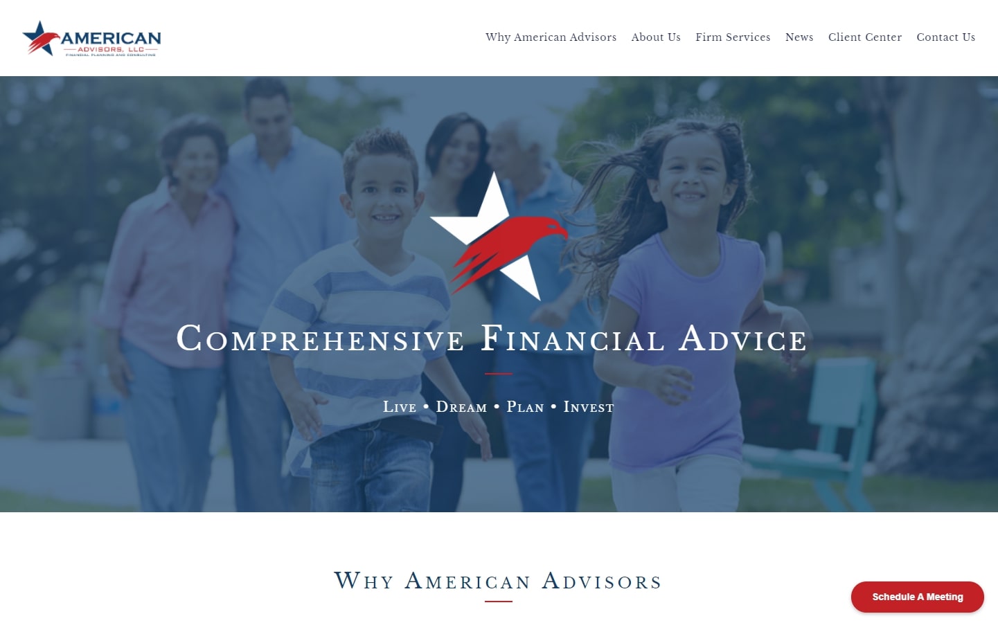
35. American Advisors
Why it works: The colors red, white, and blue together with the imagery used are all related to the company’s name. The use of on page clickable sidebars reduces the need to open new pages to display additional content.
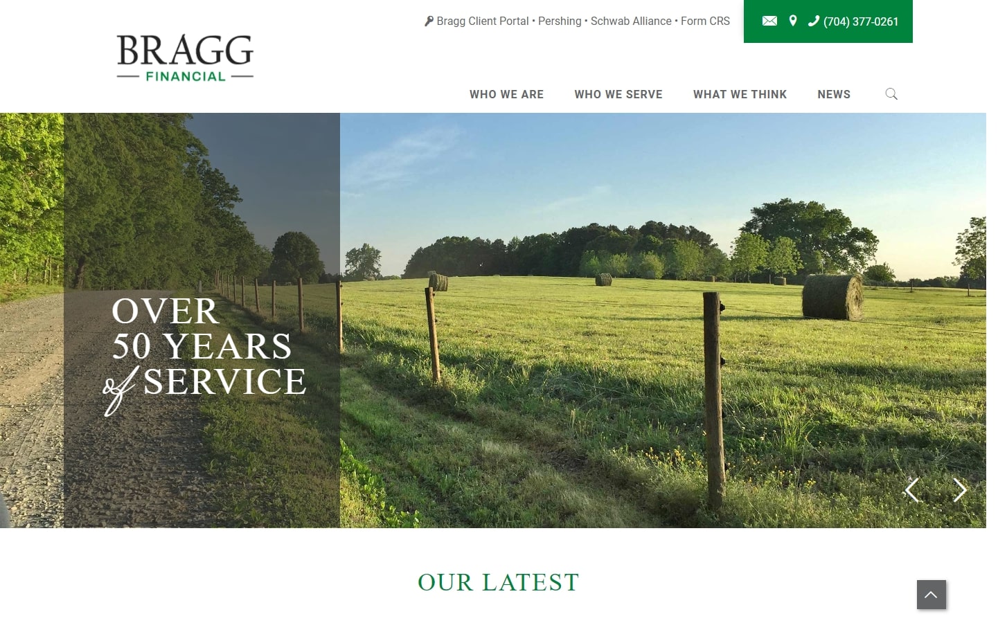
36. Bragg Financial
Why it works: This financial advisor website has simple animation effects, subtle background graphics and textures. Professional yet pleasant-looking typefaces were used. Beautiful pictures of the company’s location and vicinity were also highlighted.
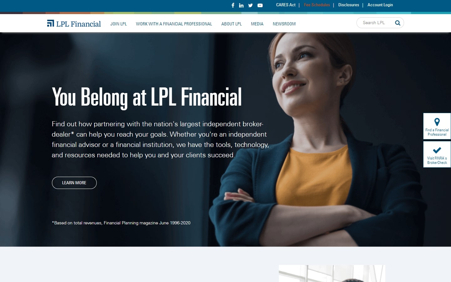
37. LPL Financial
Why it works: LPL Financial’s website shows effective use of alternating dark and light sections. Their content is regularly updated as seen in their news section. Inner pages are unique compared to most financial websites.
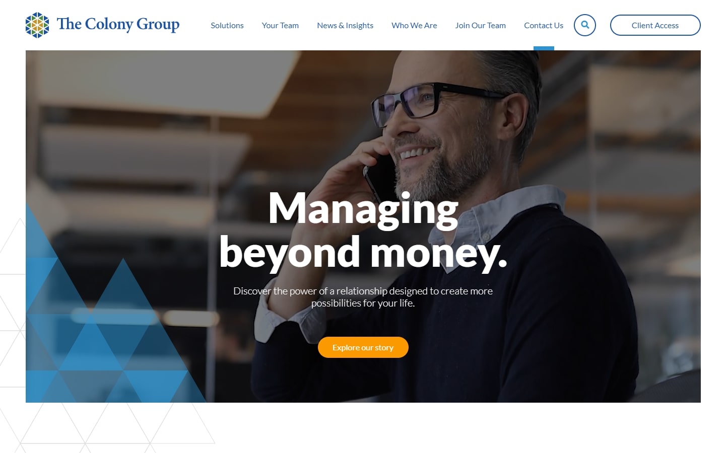
38. The Colony Group
Why it works: This site’s homepage features a fantastic huge hero video backdrop, as well as big hero heading text. Images and graphic elements intertwine well together. Even after a scroll, the sticky navigation ensures that the navigation is apparent.
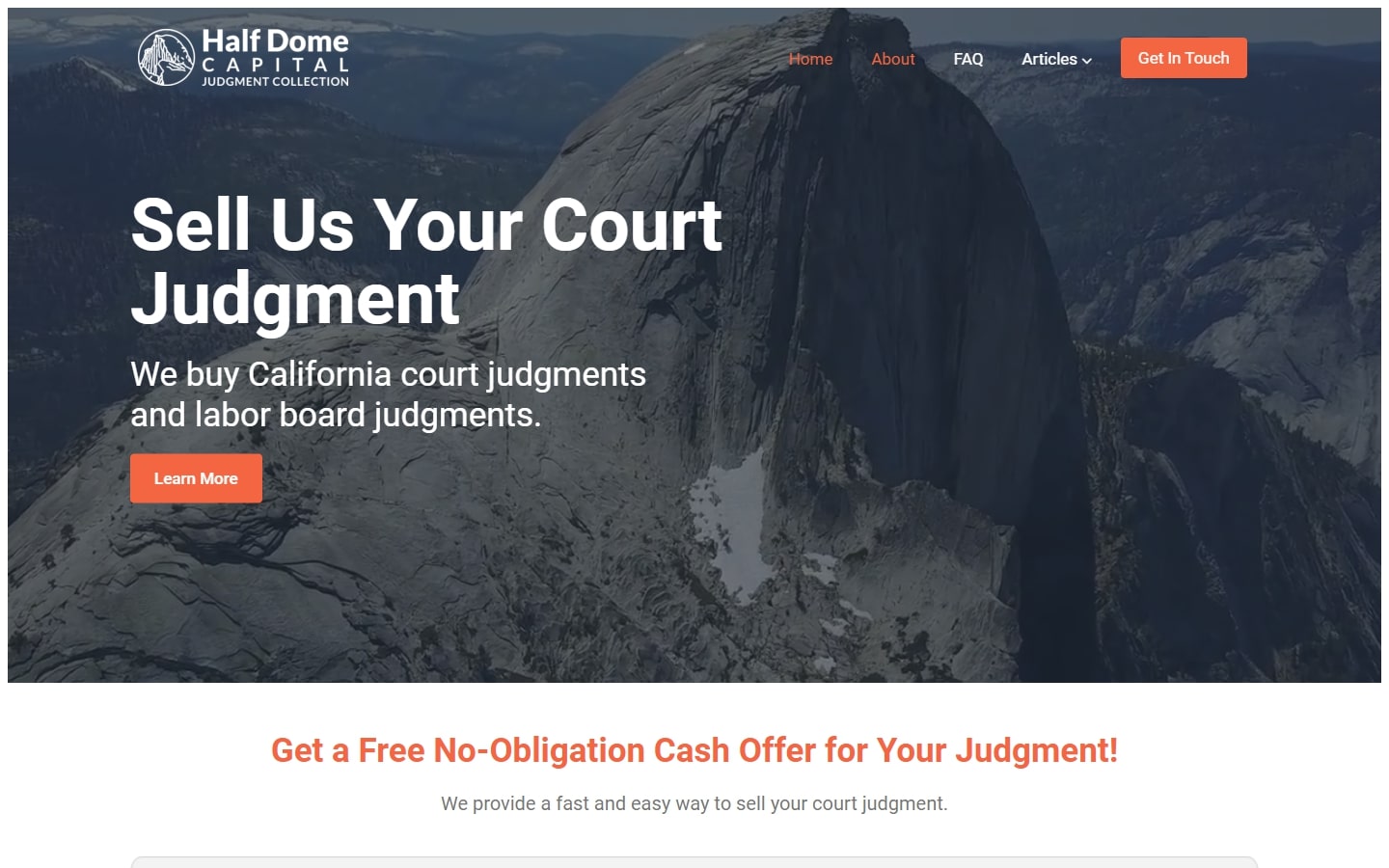
39. Half Dome Capital
Why it works: The home page is visually appealing. The hue of orange used in the call to action buttons and heading text stands out against both dark and light backgrounds, which makes it quite effective.
Financial Advisor Website Design
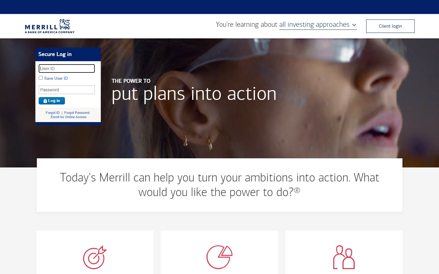
40. Merril
Why it works: The video in the hero section adds visual representation to the main headline. The overlapping of elements between sections and the use of subtle shadows adds depth and layering to the overall design.
Conclusion
We want to thank you for reading our blog. If you’re in the market for a financial advisor websites, please contact us! Our team of designers are ready and waiting to help bring your vision into reality with beautiful designs that will increase customer conversion rates.
We will design a custom mockup of your new website before you sign or pay for anything. There is nothing to sign and no payment information will be taken. If you like our design for your business we can move forward working together. If not, there are no hard feelings and no other obligations.