We’ve searched high and low to find the Best Personal Injury Websites out there. According to Hubspot, 97% of people learn more about a local company via the internet. That includes personal injury law firms, lawyers or attorneys focusing on personal injury. Your website is your digital storefront and having a sticking design is key to generating new clients. Listed below are 40 of the best personal injury lawyer websites out there to give you inspiration for your next web design project.
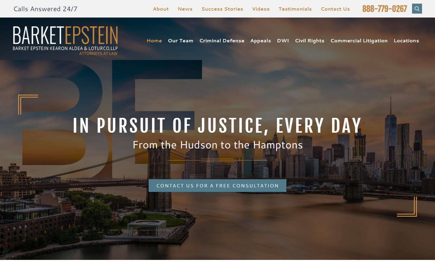
1. Barket Epstein
Why it works: This website’s design has a really strong hero section, creative graphics, a catchy header, and an effective layout. Their services as personal injury attorneys representing car accident victims, defective products, medical malpractice, dog bites, wrongful death and other legal matters are easily accessible in the practice areas section.
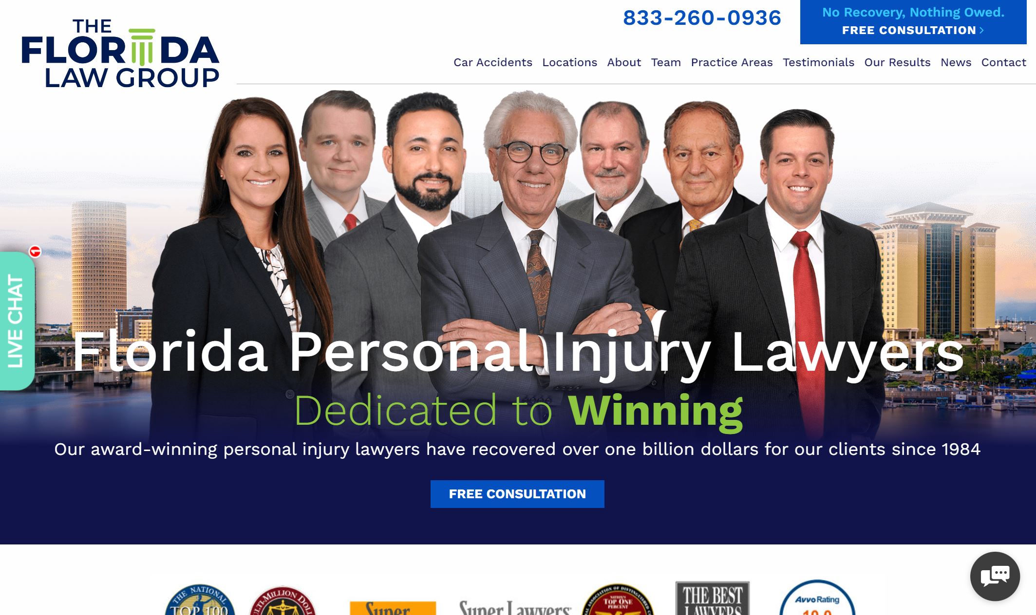
2. The Florida Law Group
Why it works: We love the strong bold graphics and the vivid blue color that conveys credibility. The scattered elements show the legal experience of these personal injury lawyers that recovered maximum financial compensation for their accident victims.
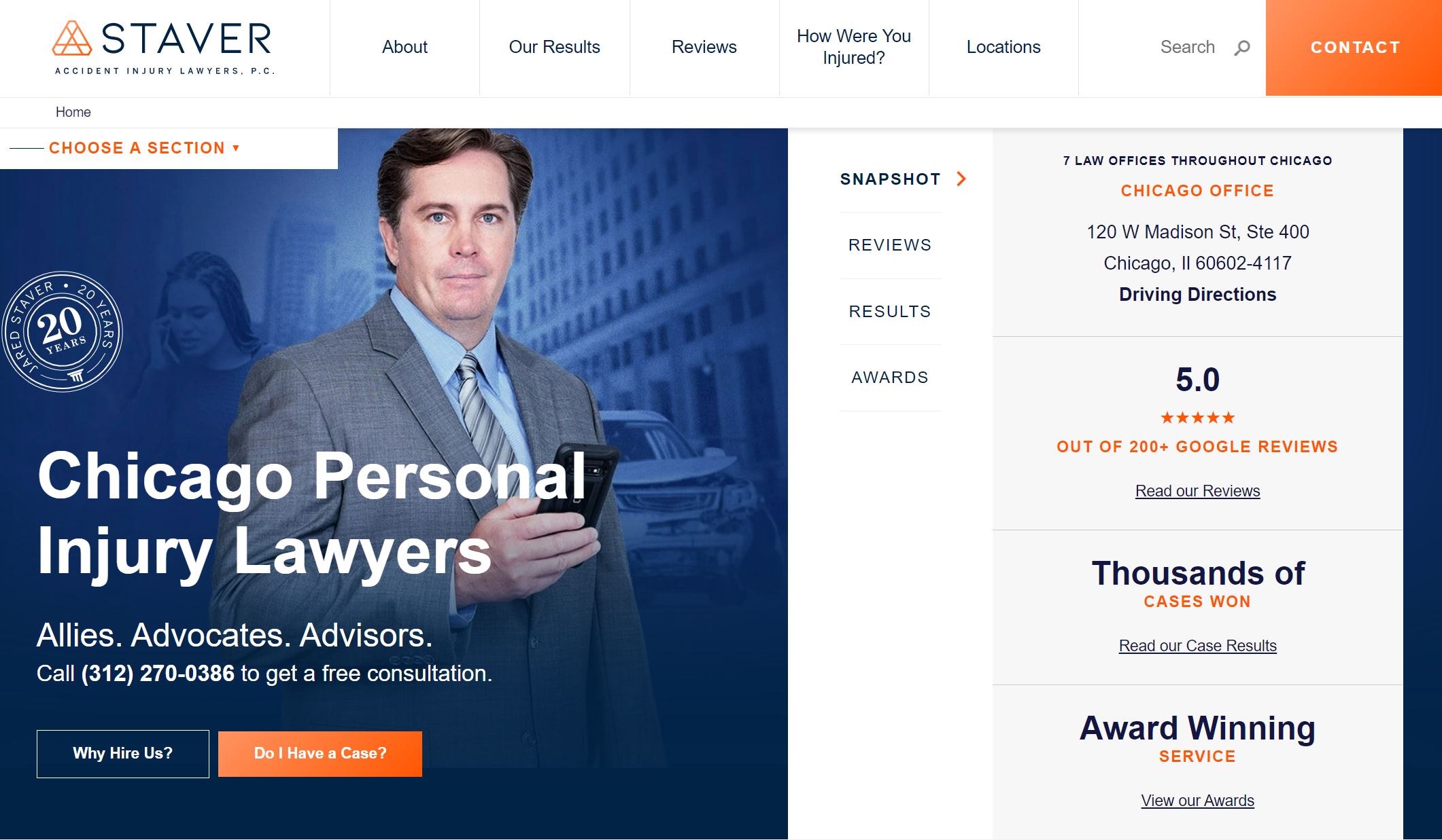
3. Staver Accident Injury Lawyers
Why it works: Despite being out of the box, the web design of this personal injury lawyer gave a very clean and professional impression. Regardless of the generous amount of information, this website is truly a winner due to the excellent layout, color scheme and strong beautiful graphics.
personal injury website
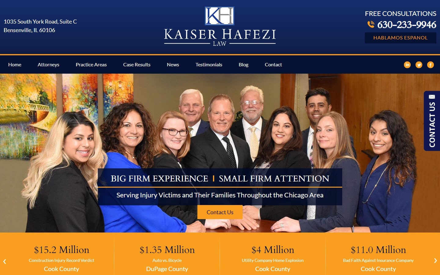
4. Kaiser Hafezi Law
Why it works: Kaiser Hafezi Law’s website is designed with a classic color scheme of blue and orange/yellow-gold. This well-built personal injury website also has a simple and uncluttered design that is easy for people of all ages to comprehend.
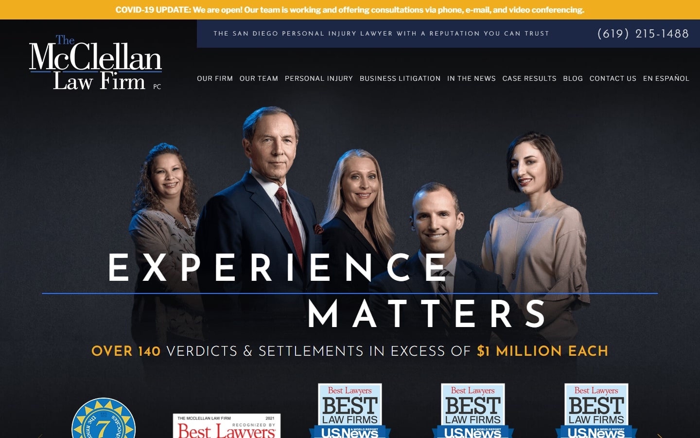
5. The McClellan Law Firm
Why it works: The McClellan Law Firm website is a great example that meets or exceeds all of the criteria in the list: typography, colors, branding, images, content. The overall atmosphere of the website leaves a long-lasting impression on prospective clients.
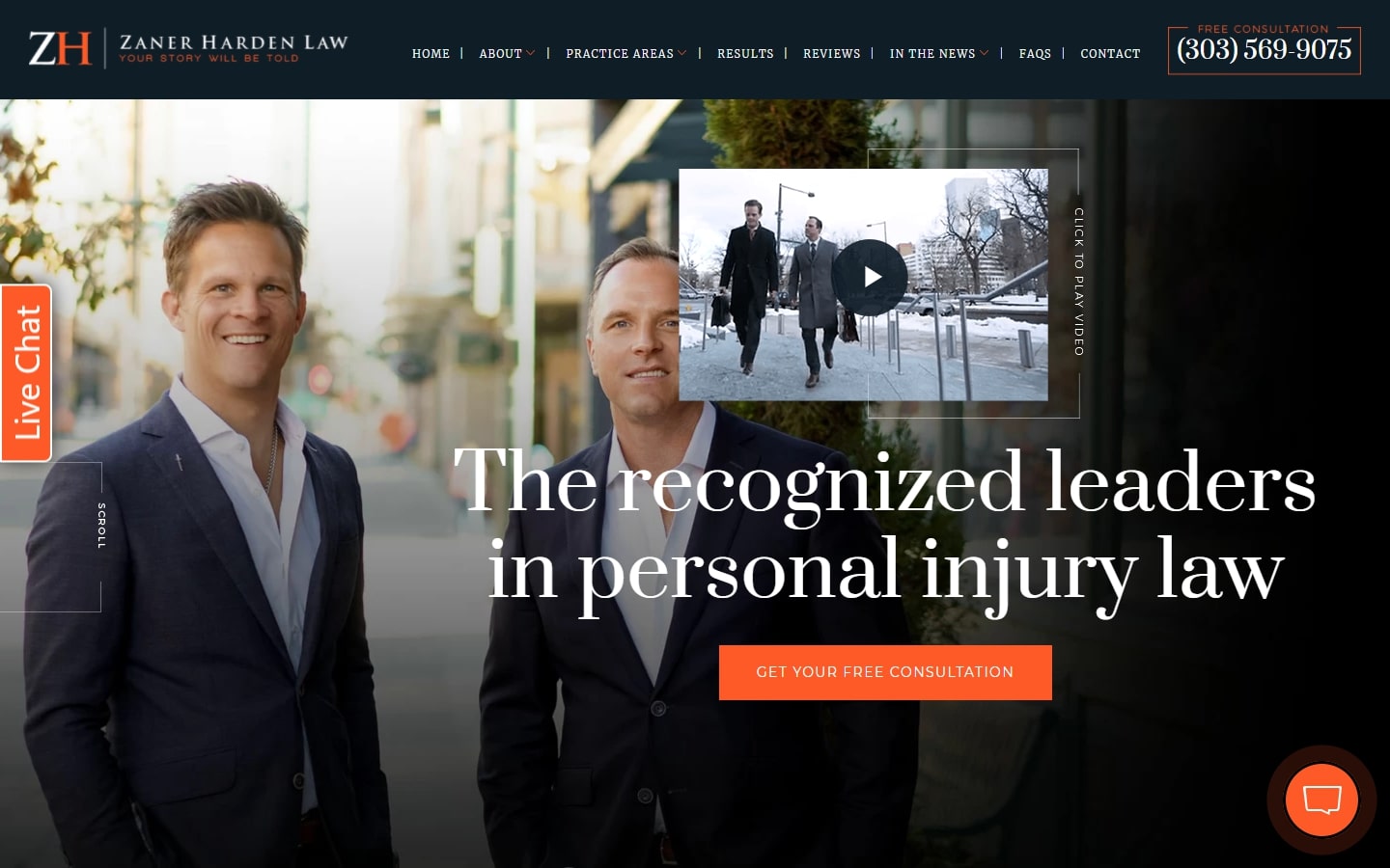
6. Zaner Harden Law
Why it works: The design of this law firm website is gorgeous enough to rank on everyone’s list. It has excellent typography, a great theme, and a layout that deserves every designer’s attention. Their personal injury lawyers are highlighted in the hero section.
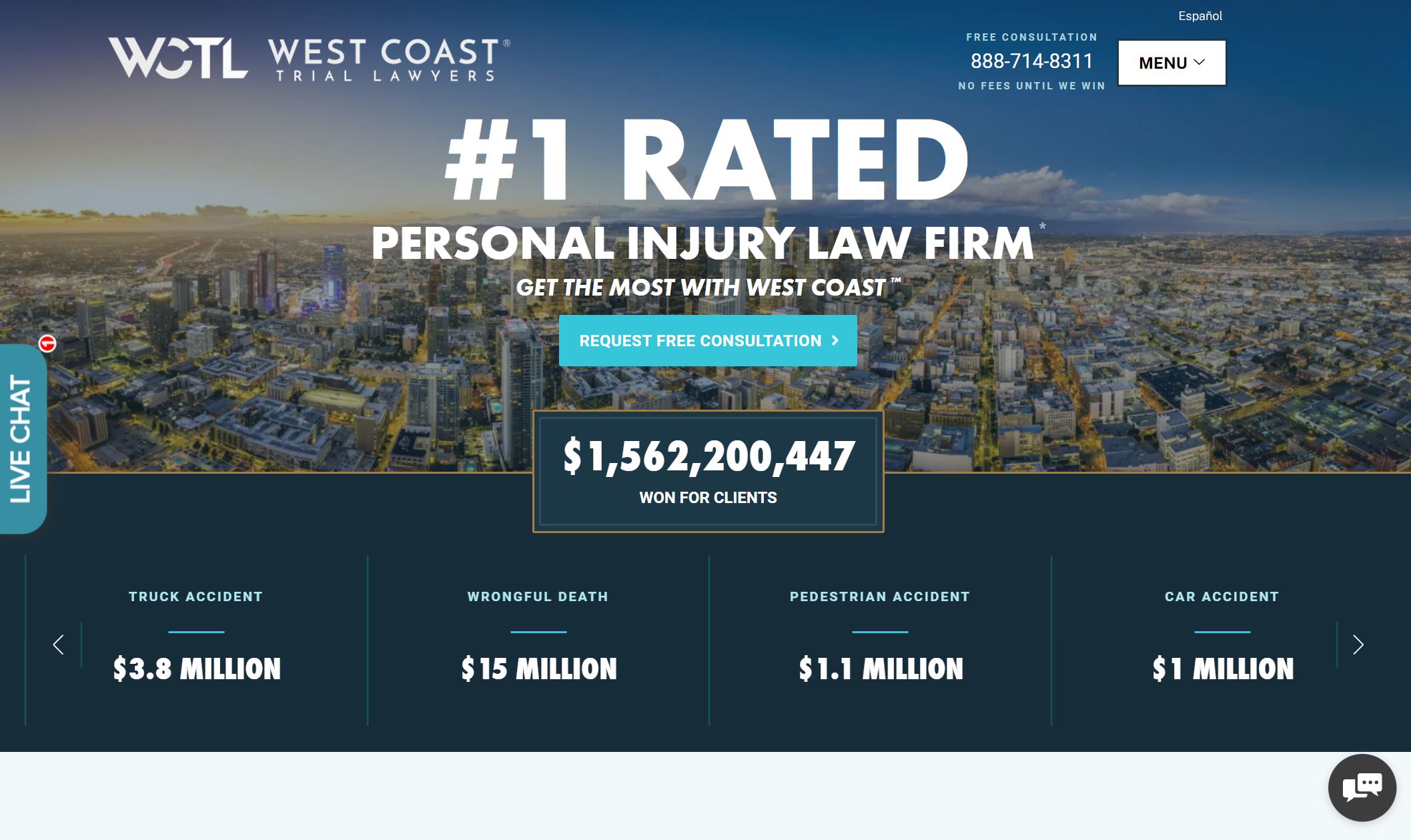
7. West Coast Trial Lawyers
Why it works: The website is well-designed and professional. Because of their excellent online ratings, the experienced team of the law firm is highlighted. It’s very informative, with key details for every personal injury clients who come to the site.
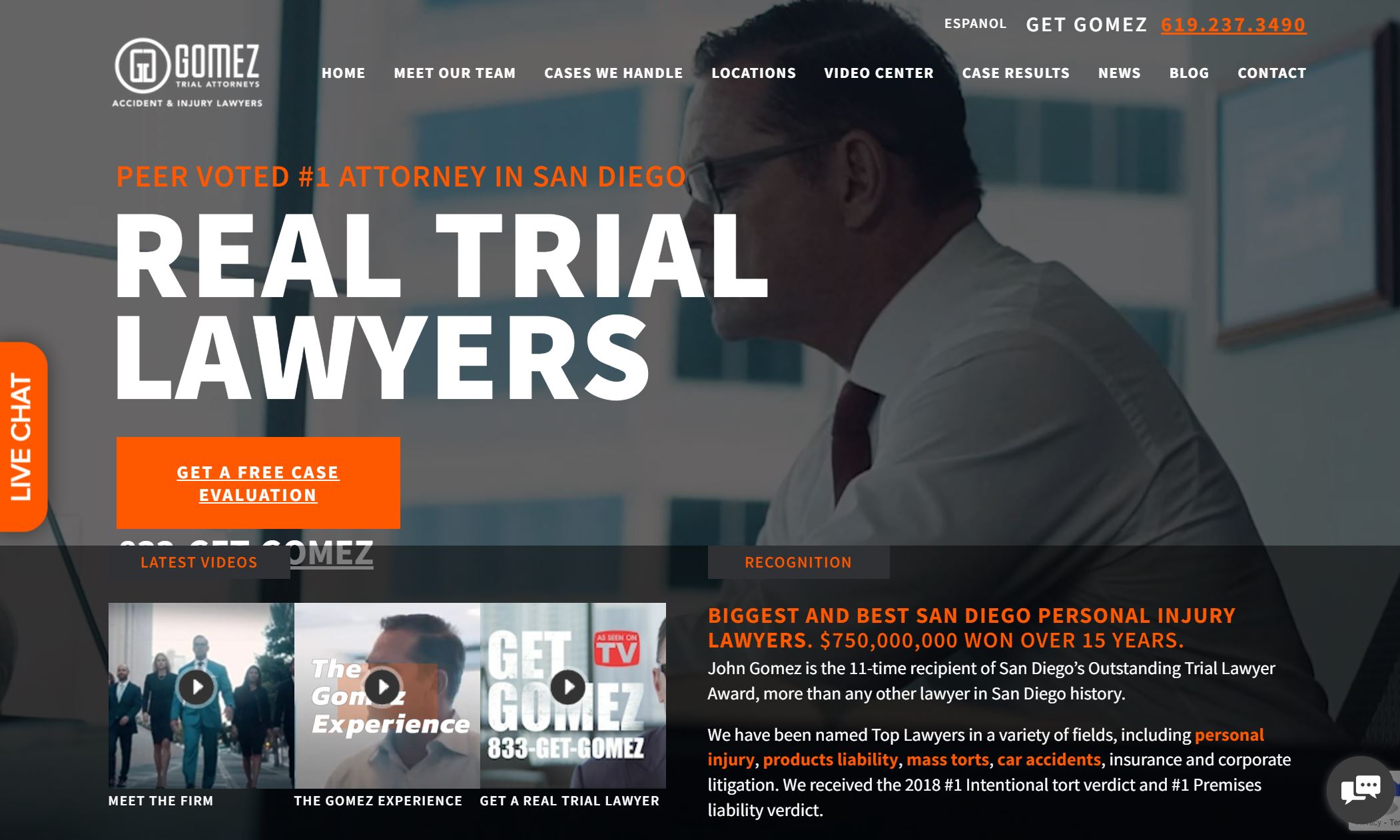
8. Gomez Trial Attorneys
Why it works: Serious, professional, and bold—three words that best describe the website of the Gomez Firm. A dark color scheme for a personal injury law firm website isn’t common, and this website did it beautifully.
best personal injury websites
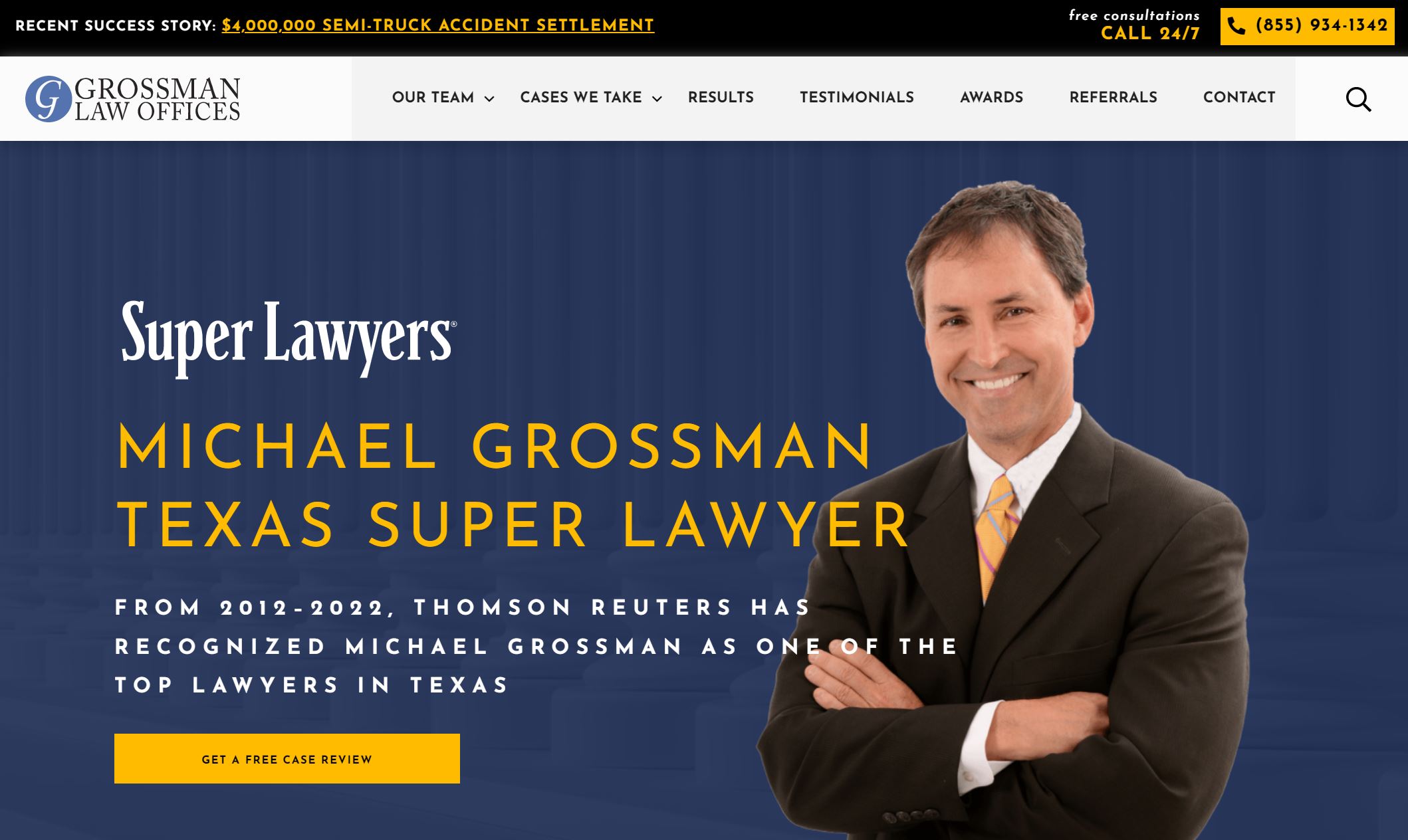
9. Grossman Law Offices
Why it works: The website has different vibe from other personal injury websites. The design felt very authoritative just by the looks of it. The website has beautiful colors without sacrificing contrast. It also has great typography, professional-quality photos and images, and a contact form everyone can easily access.
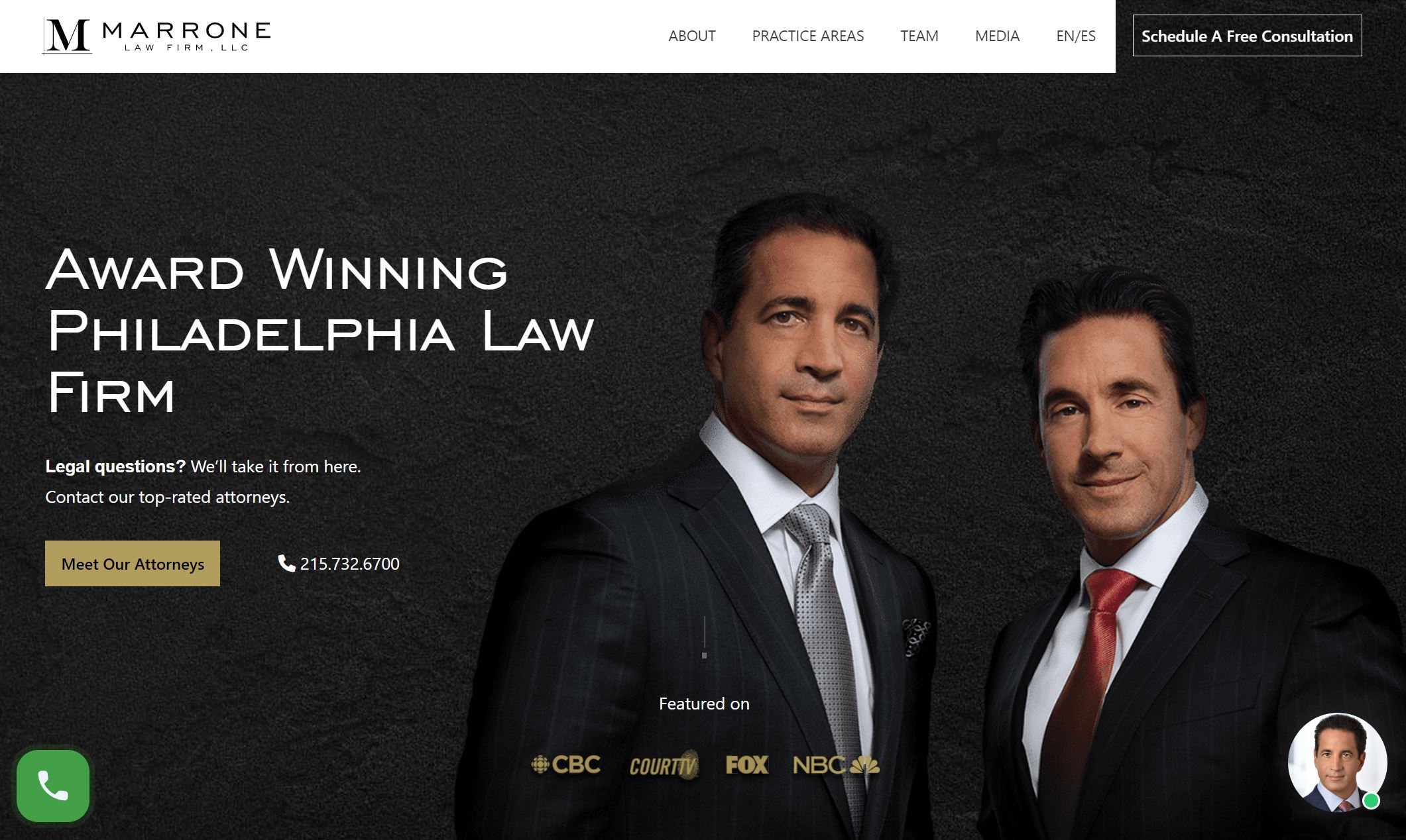
10. Marrone Law Firm
Why it works: Another great item on the list, Marrone Law Firm’s website features a very mouth-watering design with gorgeous animations. The coding done here is excellent. Try to hover your pointer on the two lawyers at the hero section!
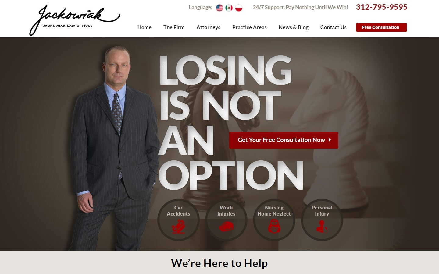
11. Jackowiak Law Offices
Why it works: Although a brown color scheme isn’t every designer’s fantasy, it can make an incredible impact when done correctly, as is the case with this website. What we love particularly also on the website is it’s an attempt to assure its potential clients of their high chance of winning cases.
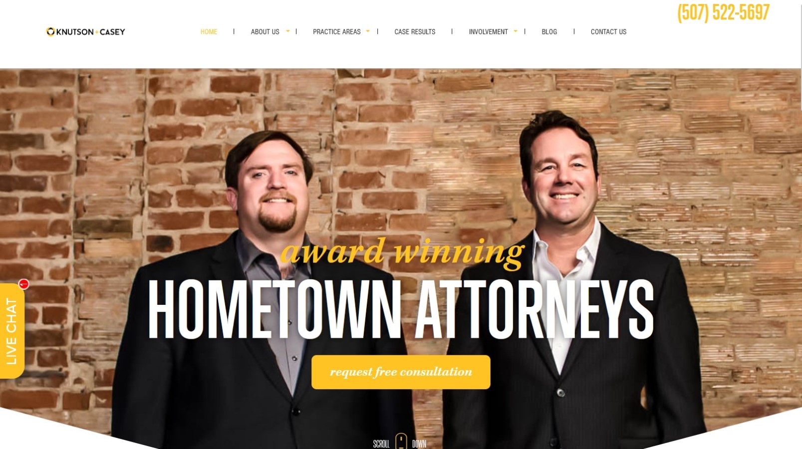
12. Knutson+Casey
Why it works: A very effective layout that creates a lasting impression. The use of geometric shapes, big bold texts, and a bright color scheme make it more visually appealing and the element works together to create a cohesive look conveys the brand they try to impart.
13. Flanagan & Bodenheimer
Why it works: One of the cleanest layouts and designs on the list for personal injury firms website. Flanagan & Bodenheimer law firm website has a very professional color scheme with content that is beautifully structured for everyone. They offer a free consultation which is one of the great marketing goals in every campaign.

best personal injury law firm websites
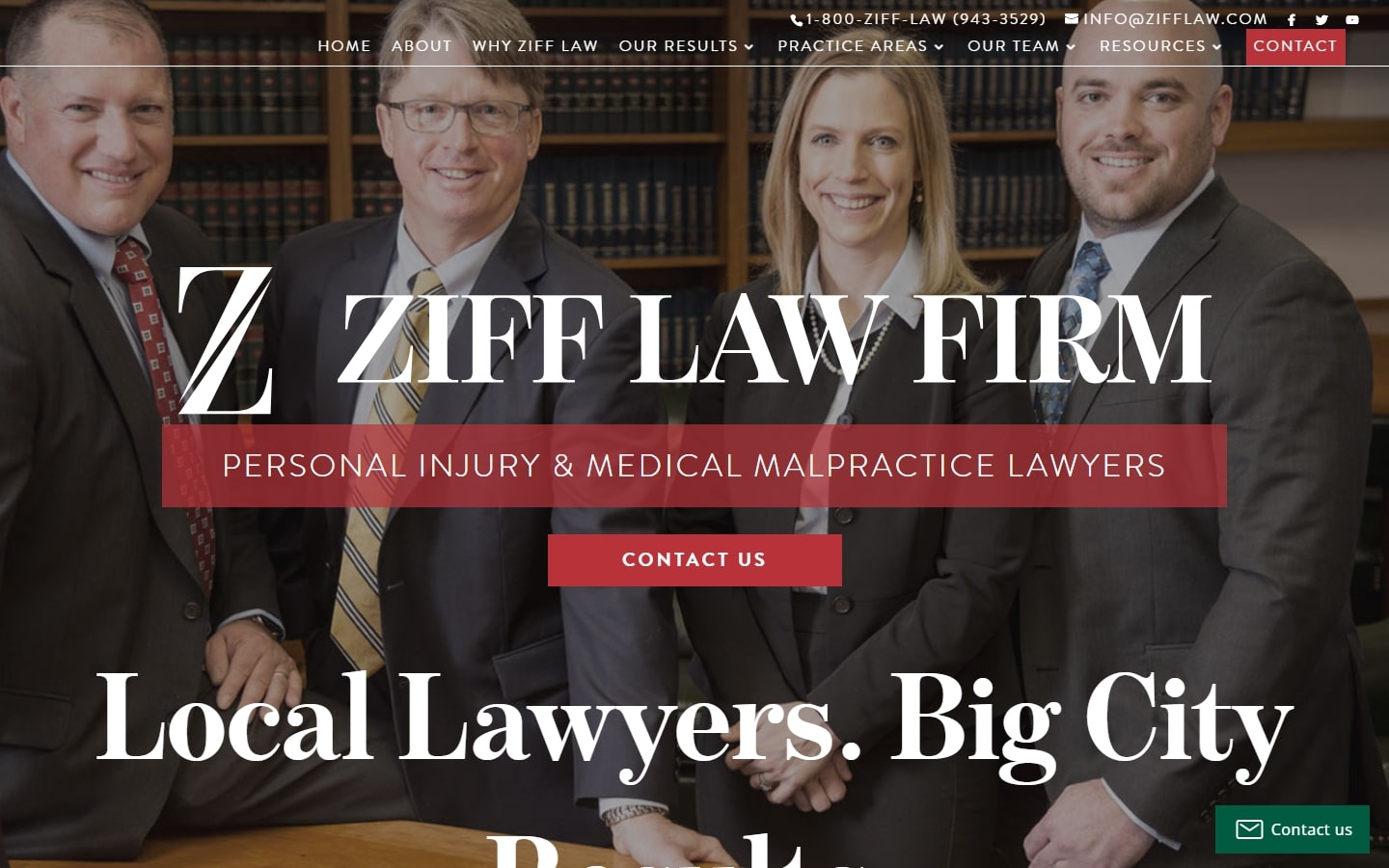
14. Ziff Law Firm
Why it works: This personal injury and medical malpractice lawyers firm website have a compact design that doesn’t neglect any key information. They also have helpful case studies that show their legal representation of injury victims that were given fair financial compensation.
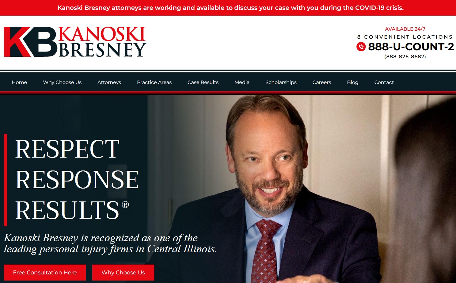
15. Kanoski Bresney
Why it works: The website design of Kanoski Bresney has one of the catchiest color schemes we can find in any law firms. The resulting contrast is top-notch, without sacrificing readability and ease of use.
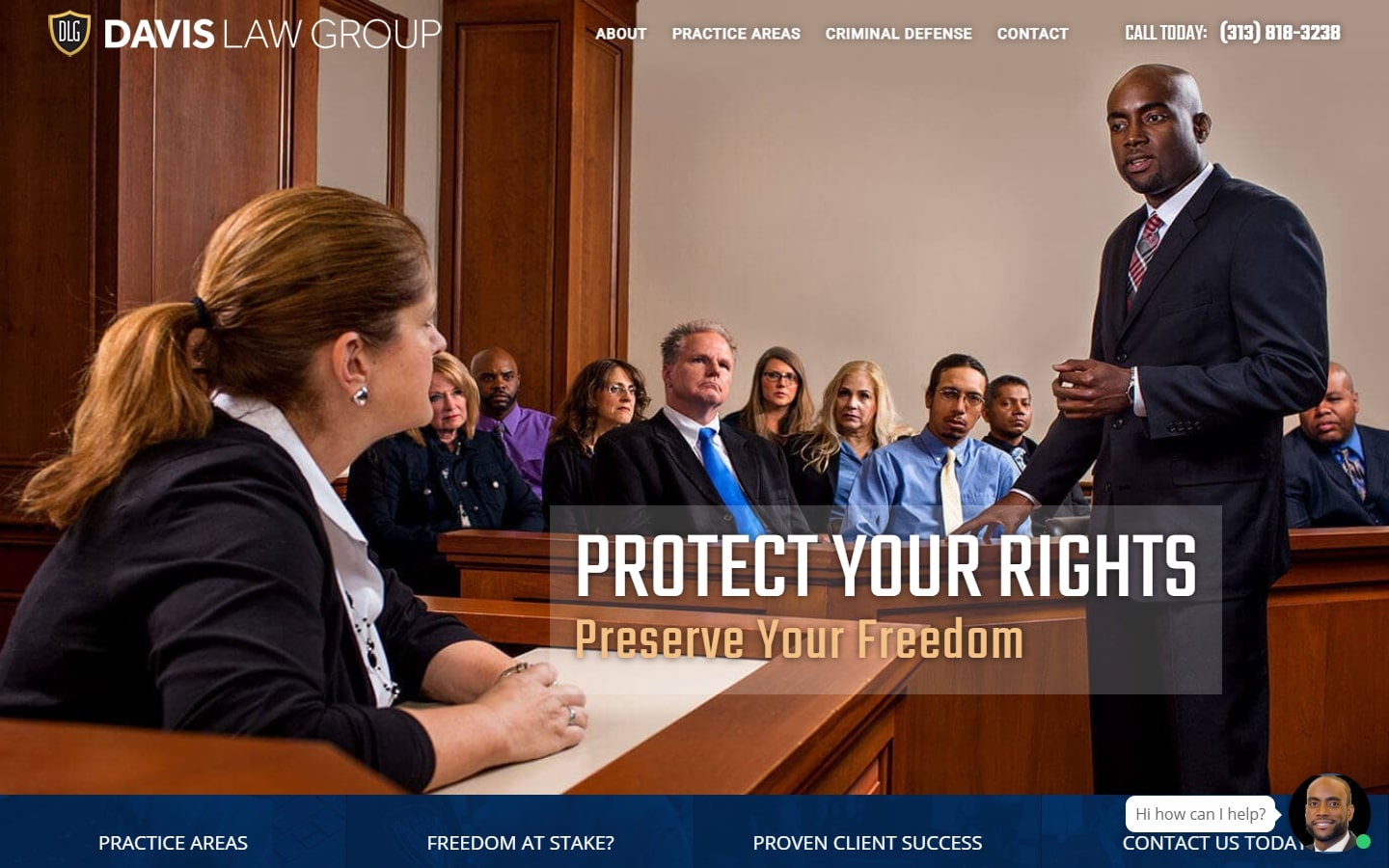
16. Davis Law Group
Why it works: Featuring the personal injury attorney in the actual courtroom image is very dramatic and realistic to any legal representation. It features various layouts for each section which makes them easier on the eyes.
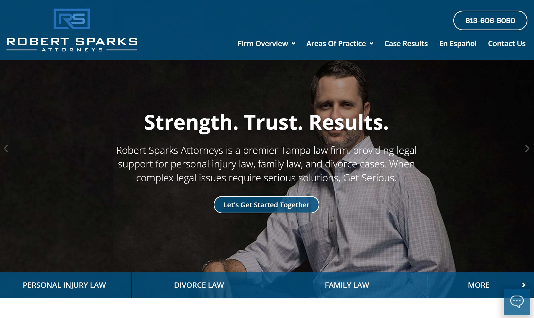
17. Robert Sparks Attorneys
Why it works: A very striking hero area that features big numbers of recovered millions and personal injury claim portraying the serious results they accomplish. The website also includes bursts of visuals and images that go well with their brand.
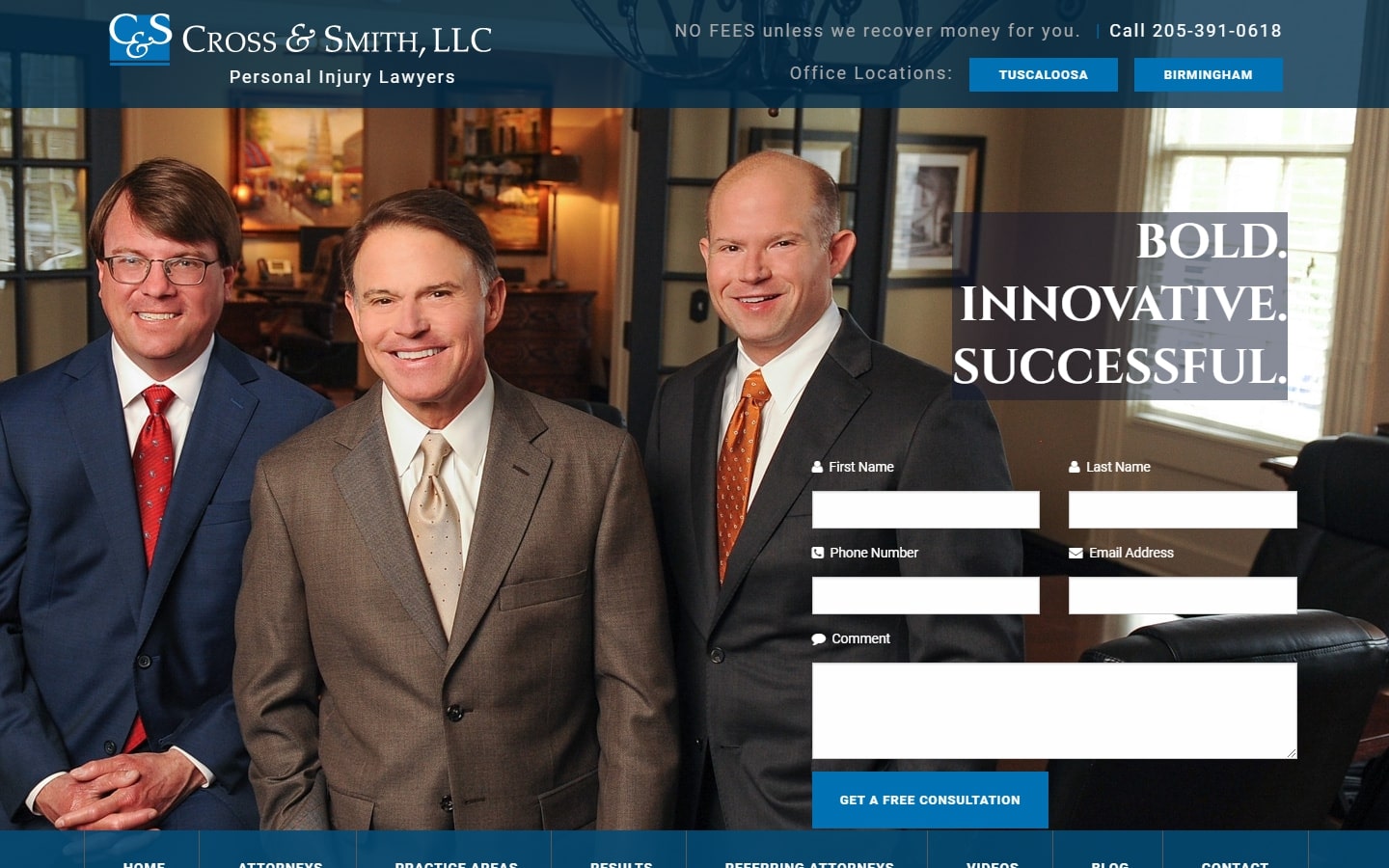
18. Cross & Smith, LLC
Why it works: This website design has one of the most beautiful hero sections we could find, with a contact form upfront, live chat features, and just the right amount of images. They cleverly used a grid of images leading to their practice areas like workers compensation, truck accidents and car accident.
Personal Injury sites for inspiration
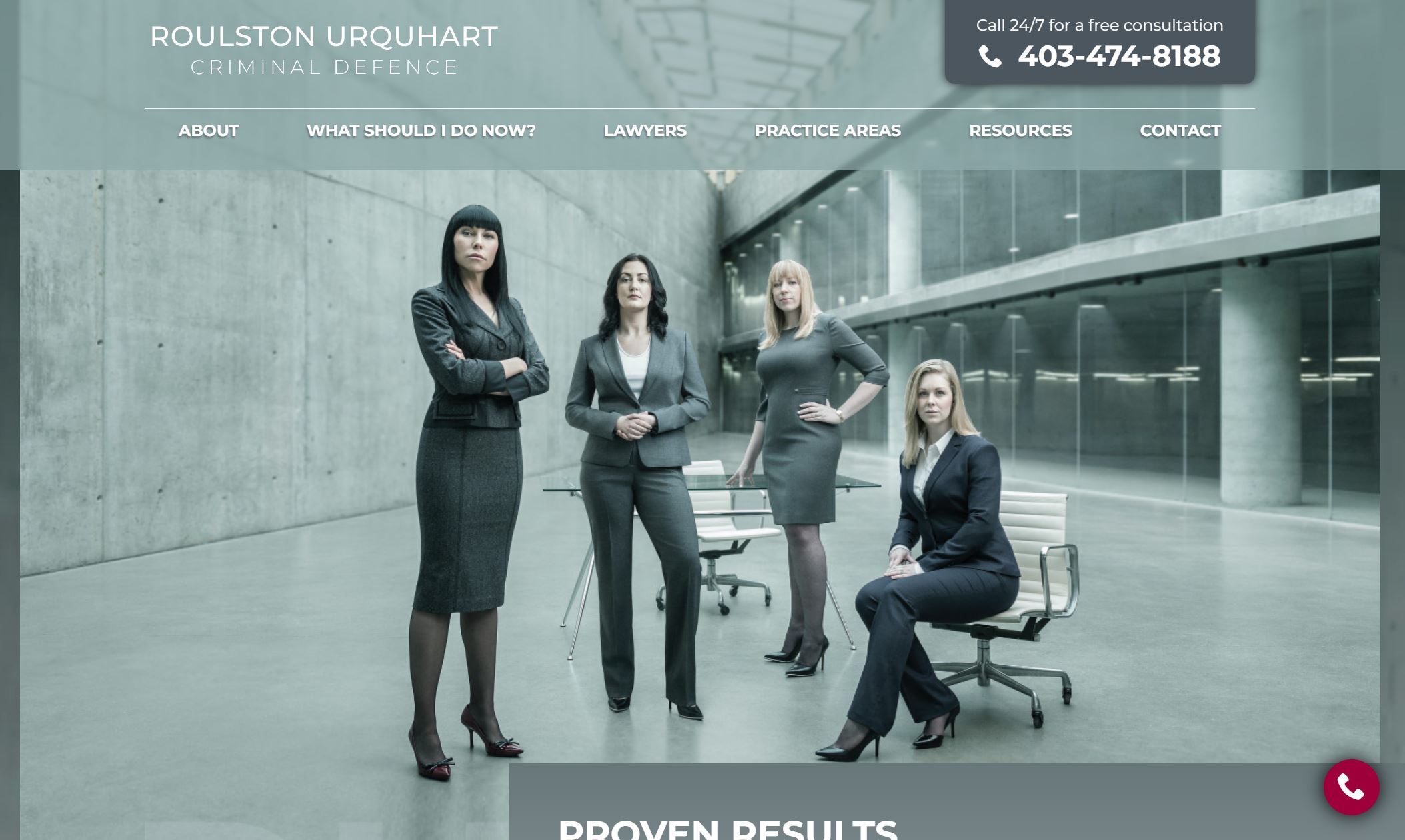
19. Roulston Urquhart Criminal Defence
Why it works: Very well invested in great photography showcasing their personal injury attorneys. The website of this law firm is modern and classy without compromising professionalism. The navigation of the website is top-notch from other websites.
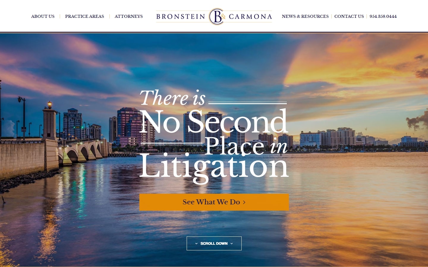
20. Bronstein & Carmona
Why it works: In terms of design, the website of this insurance defense firm stands out. What we appreciate most is the beautiful header that complements their logo and branding.
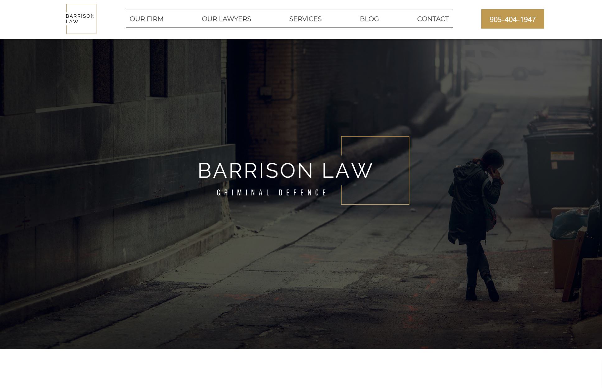
21. Affleck & Barrison
Why it works: This is another excellent example of a well-designed and structured website. This design organizes all of the information in manageable chunks.
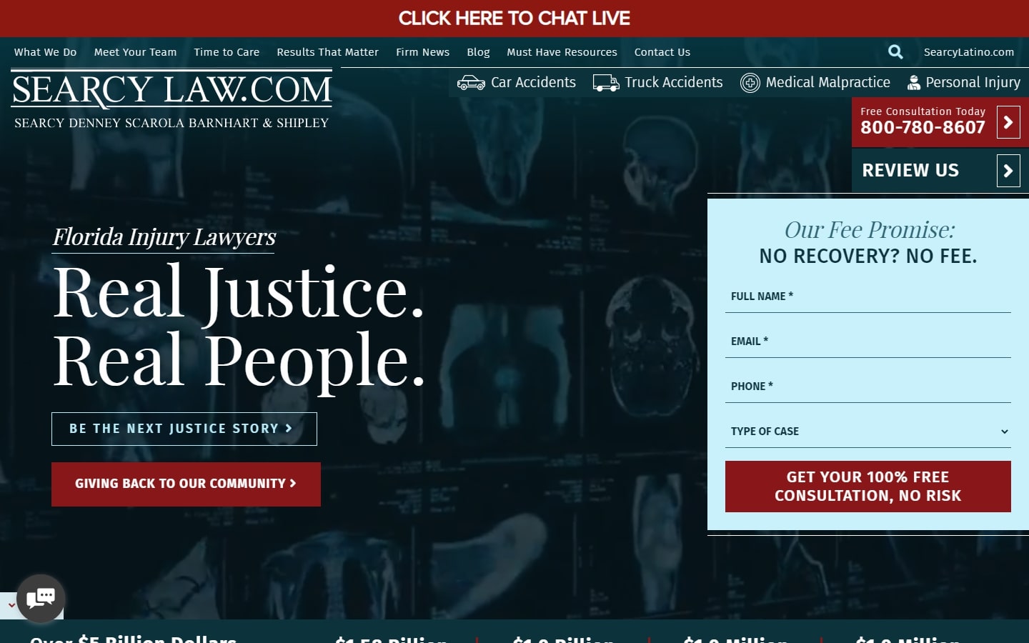
22. Searcy Law
Why it works: The website may be lengthy, but it has a variety of sections with elements that break up the monotony and make the site as a whole feel lively and engaging. CTAs are also not lacking throughout the layout.
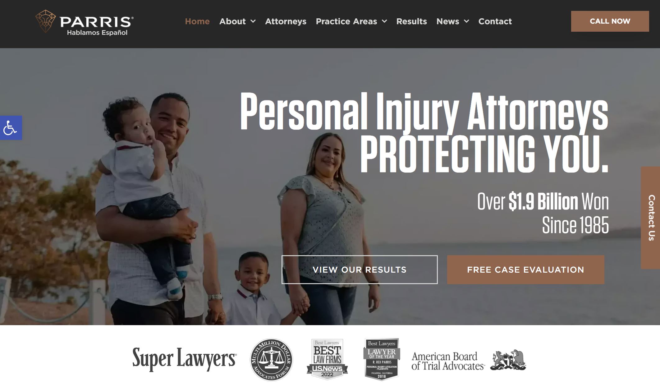
23. Parris
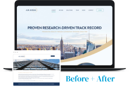
Why it works: The big bold text on hero section is eye catching and great detail for any personal injury websites. A strong description of what they do and how they can assist. The website’s structure is smart, with sections within sections.
Personal Injury Websites
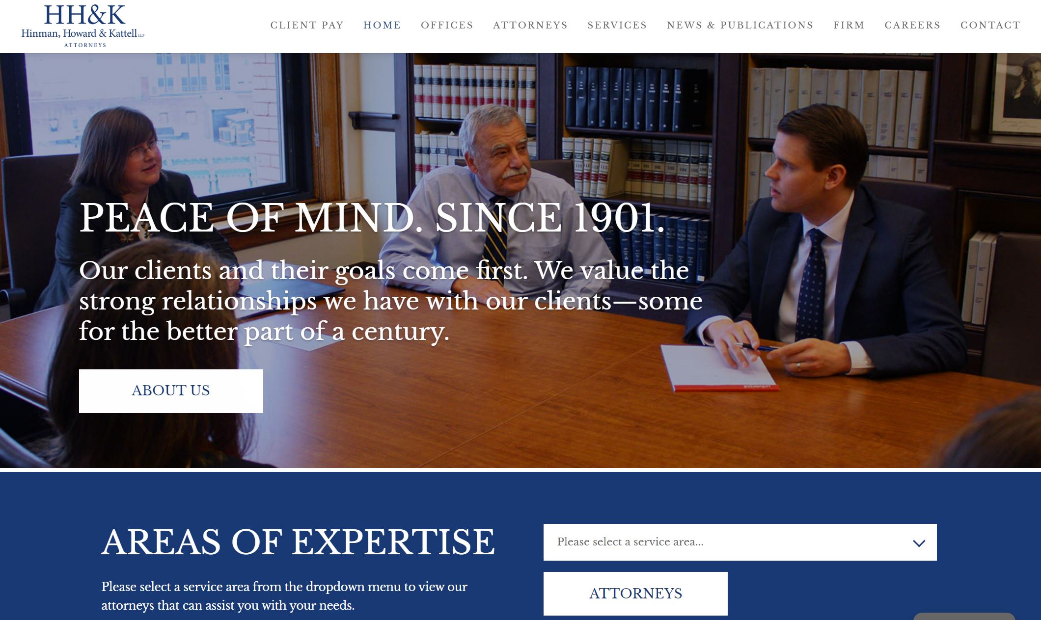
24. HH&K
Why it works: Though this website looks simple and short, what we appreciate most is that they stuck to the basics while still keeping aesthetics, not to mention they employed their own high-quality visuals which is great for marketing campaign.
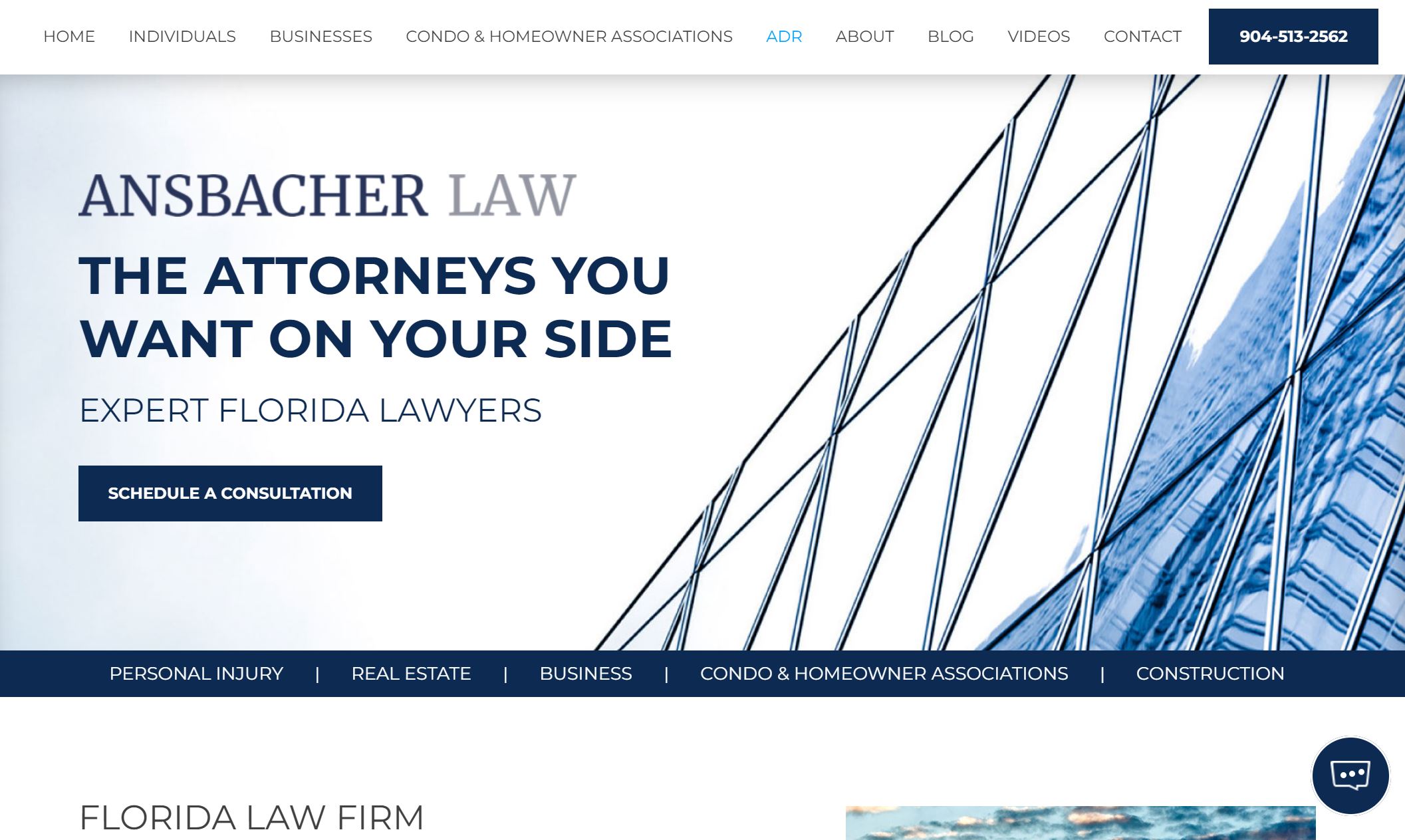
25. Ansbacher Law
Why it works: The badge and logo strip beneath the hero gives it an intriguing sense of trust. Potential clients who are into specific injury concerns like car accidents and premises liability will find this website intuitive.
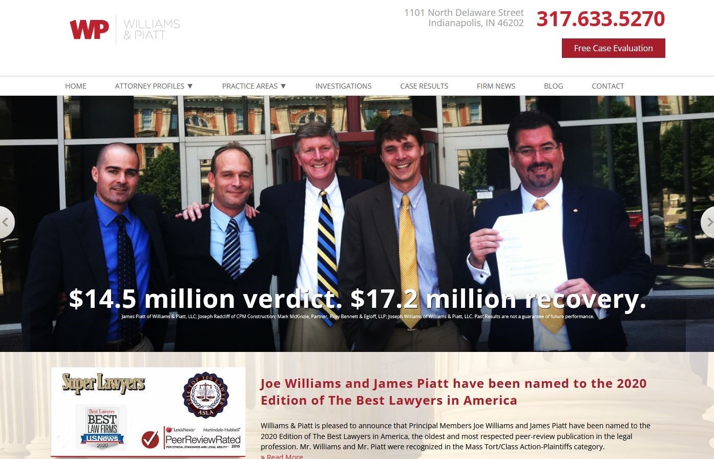
26. Williams & Piatt
Why it works: The website has an appealing and simple design that makes it easy to navigate. The use of original images in the hero section is a plus, as they give a great first impression on what will be seen by readers throughout.
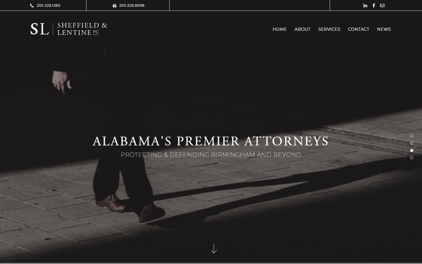
27. Sheffield & Lentine
Why it works: Very minimalistic and clean website design with just the right amount of content. It strips away all those unnecessary elements to facilitate viewers in getting the help they need.
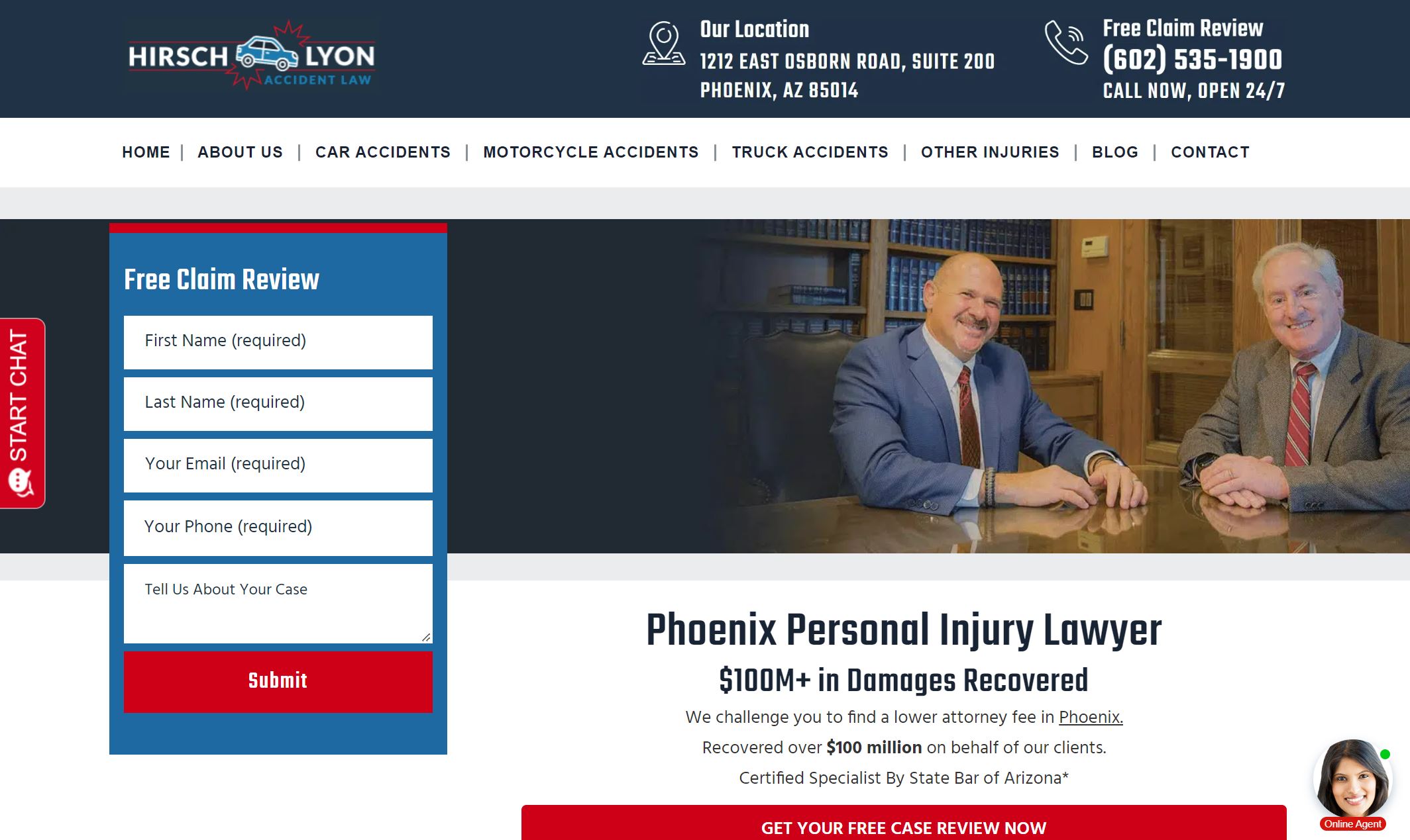
28. Hirsch Lyon Accident Law
Why it works: There’s a lot to love about this personal injury website design. It has a ‘glowing’ free claim review button at the top right area of the page, clear contact information in the header, and well-laid content that didn’t feel overpowering.
best personal injury lawyer websites
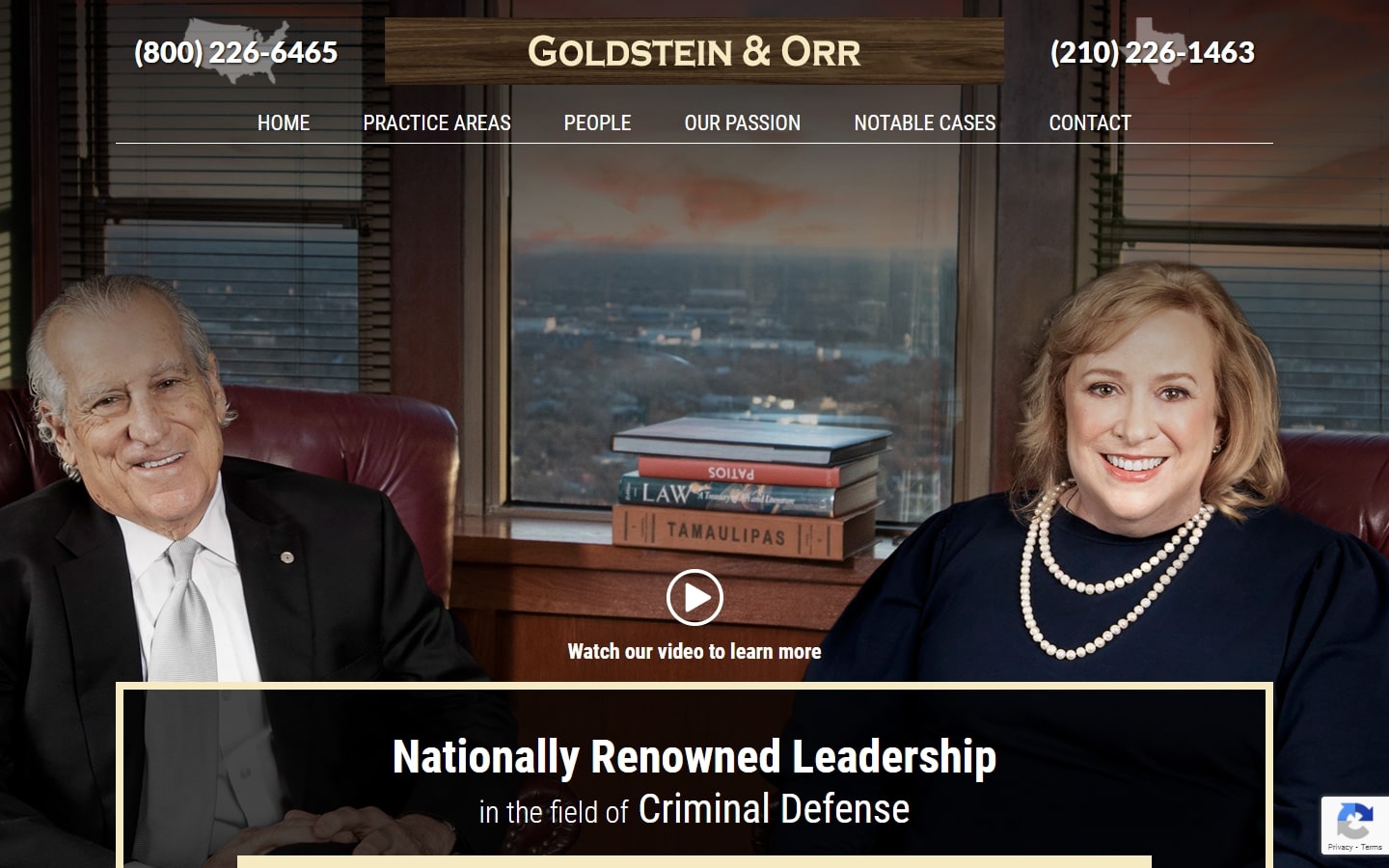
29. Goldstein & Orr
Why it works: A strong hero introduces the website to everyone. The “honors and awards” section is fascinating in that it appears to be a wall full of awards.
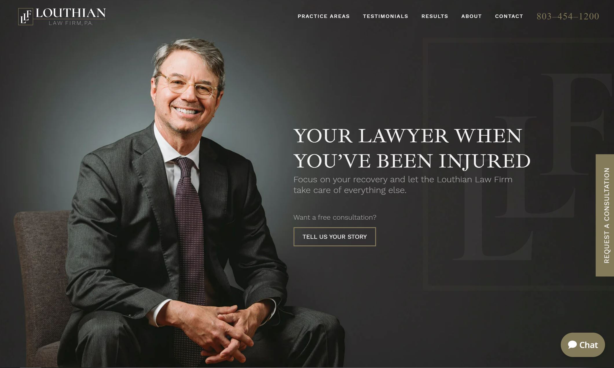
30. Louthian Law Firm
Why it works: Another minimalistic website that focuses on typography and substance; the rest are just ornaments to promote their services.
31. Sky Law Group
Why it works: This space is bright and airy, with lovely contrasting color schemes. The subtle transition animations on certain components give life to this otherwise loaded-content.

32. Urban Thier & Federer
Why it works: Despite the standard look and layout, this website design used a somewhat uncommon color scheme and turned it into a masterpiece. Also love the big bright phone numbers up top.

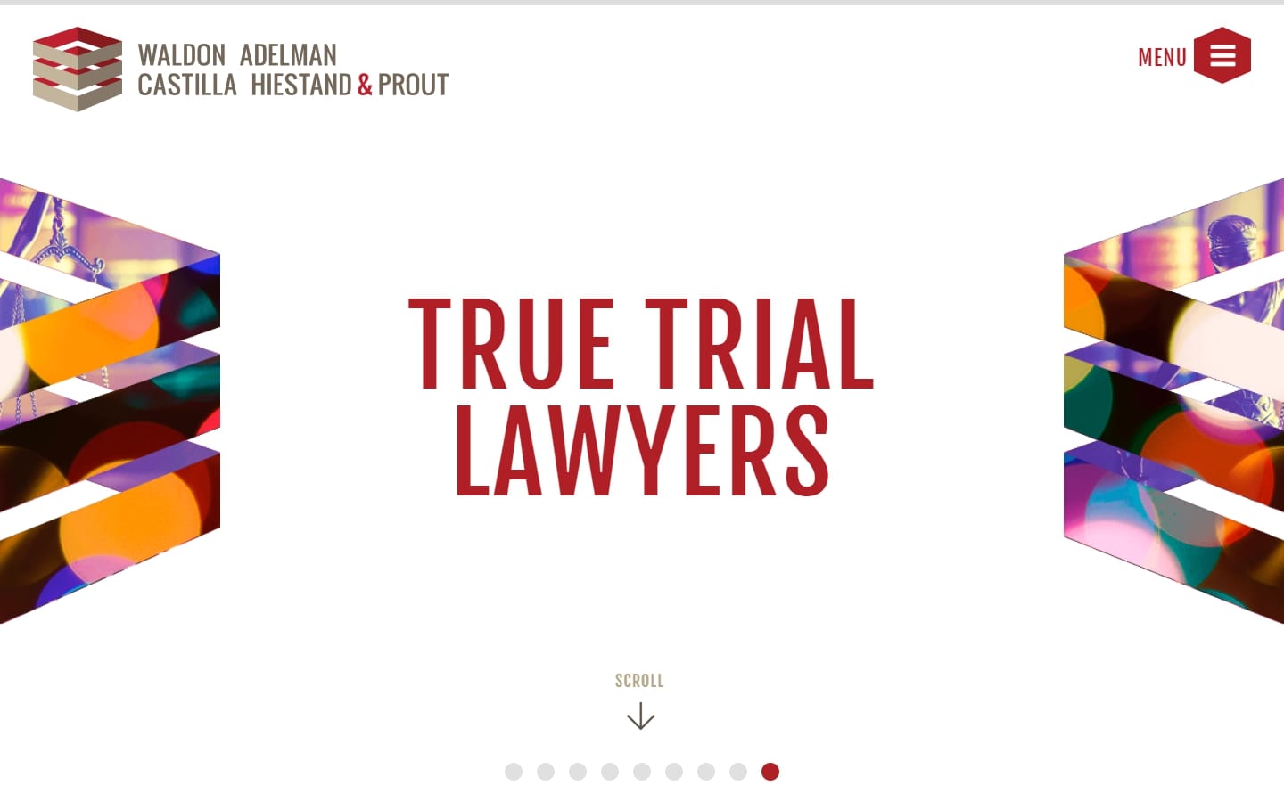
33. Waldon Adelman Castilla Hiestand and Prout
Why it works: Very creative entrance animation. The site’s layout is well-designed and easy to browse. Shapes and graphics are used effectively throughout the site.
personal injury attorney website
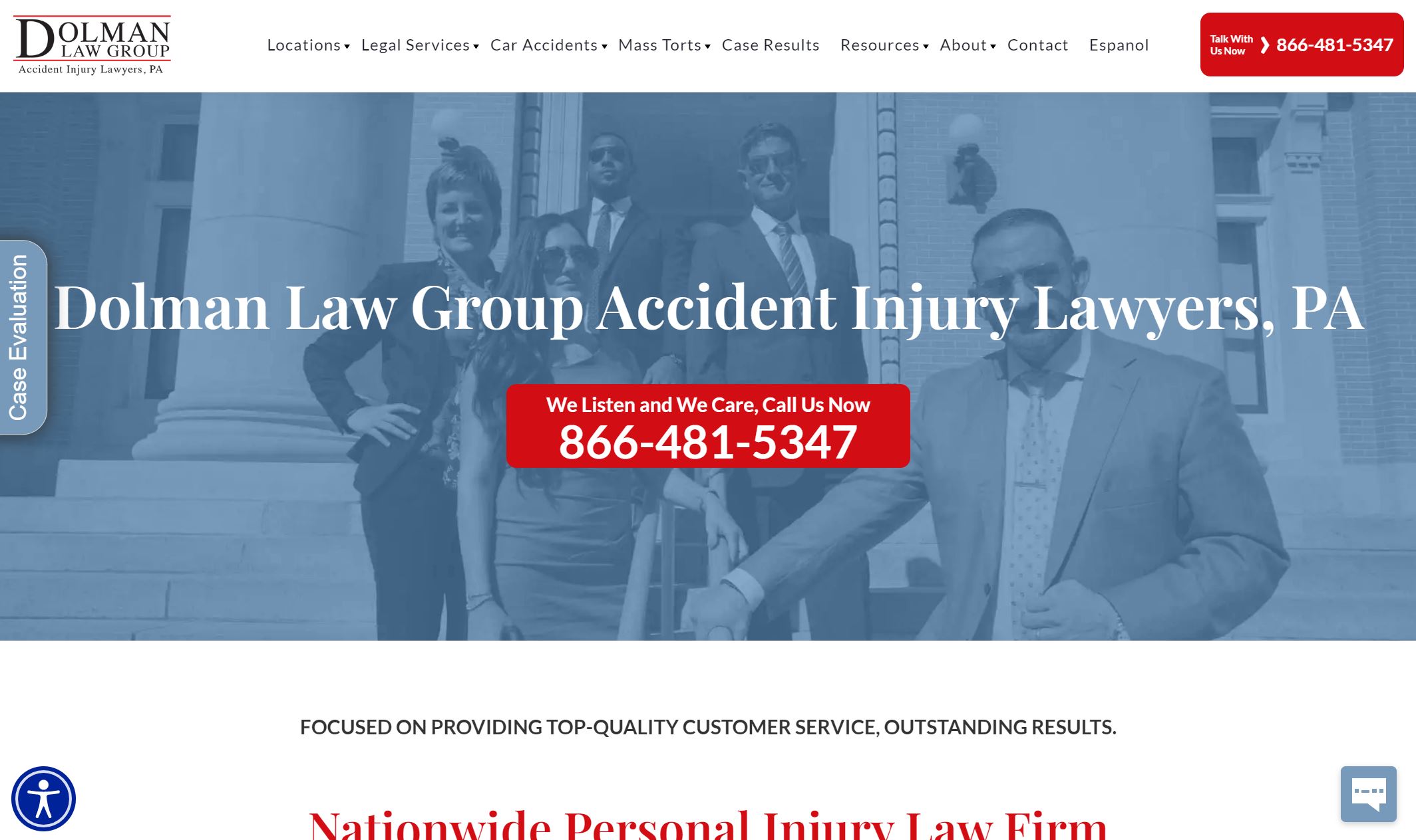
34. Dolman Law Group
Why it works: The design and structure are both fantastic, with great iconography. The phone number is big enough for everyone to see, as well as the sticky header, which is helpful without being obtrusive.
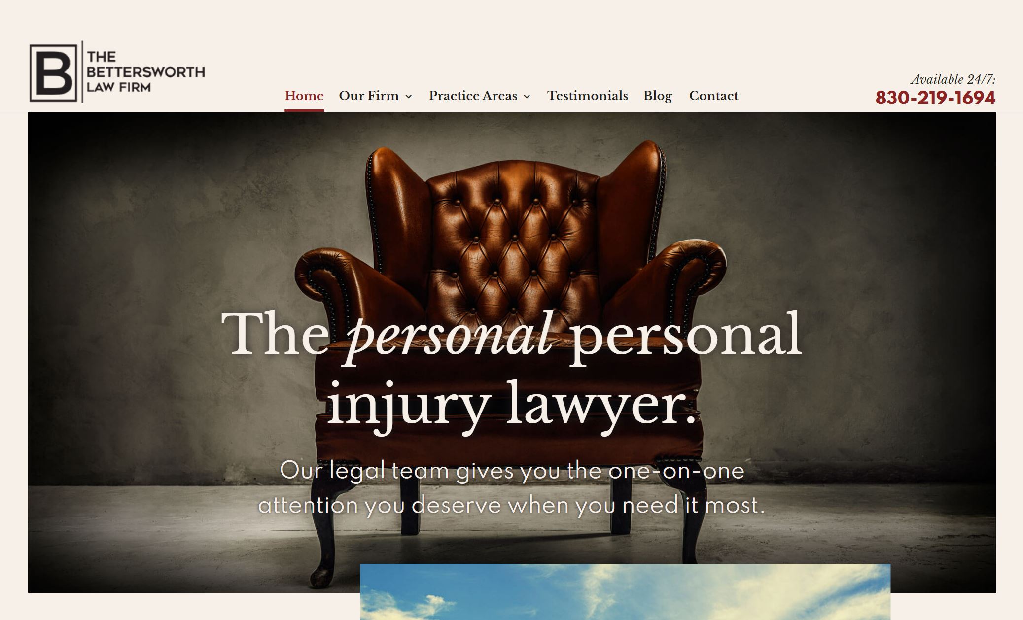
35. The Bettersworth Law Firm
Why it works: The website design is not your typical the way it uses a color scheme that might be seen as uncommon. The big bold text on top of this site make for an eye catching user experience.
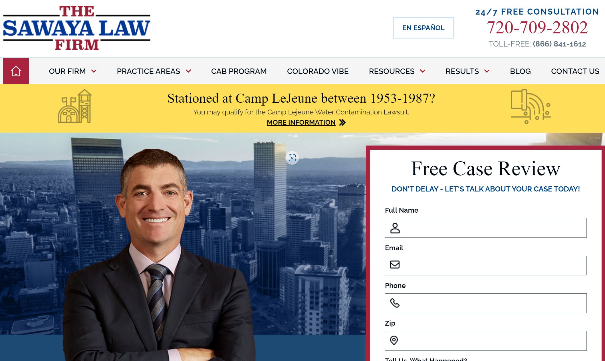
36. The Sawaya Law Firm
Why it works: The design of The Sawaya Law Firm is also very pleasant to the eyes, with easy-to-read text. Everything in the design is well defined and clear. The firm boasts of helping injured people with legal issues with their insurance company so they can be assisted in their medical bills and medical expenses.
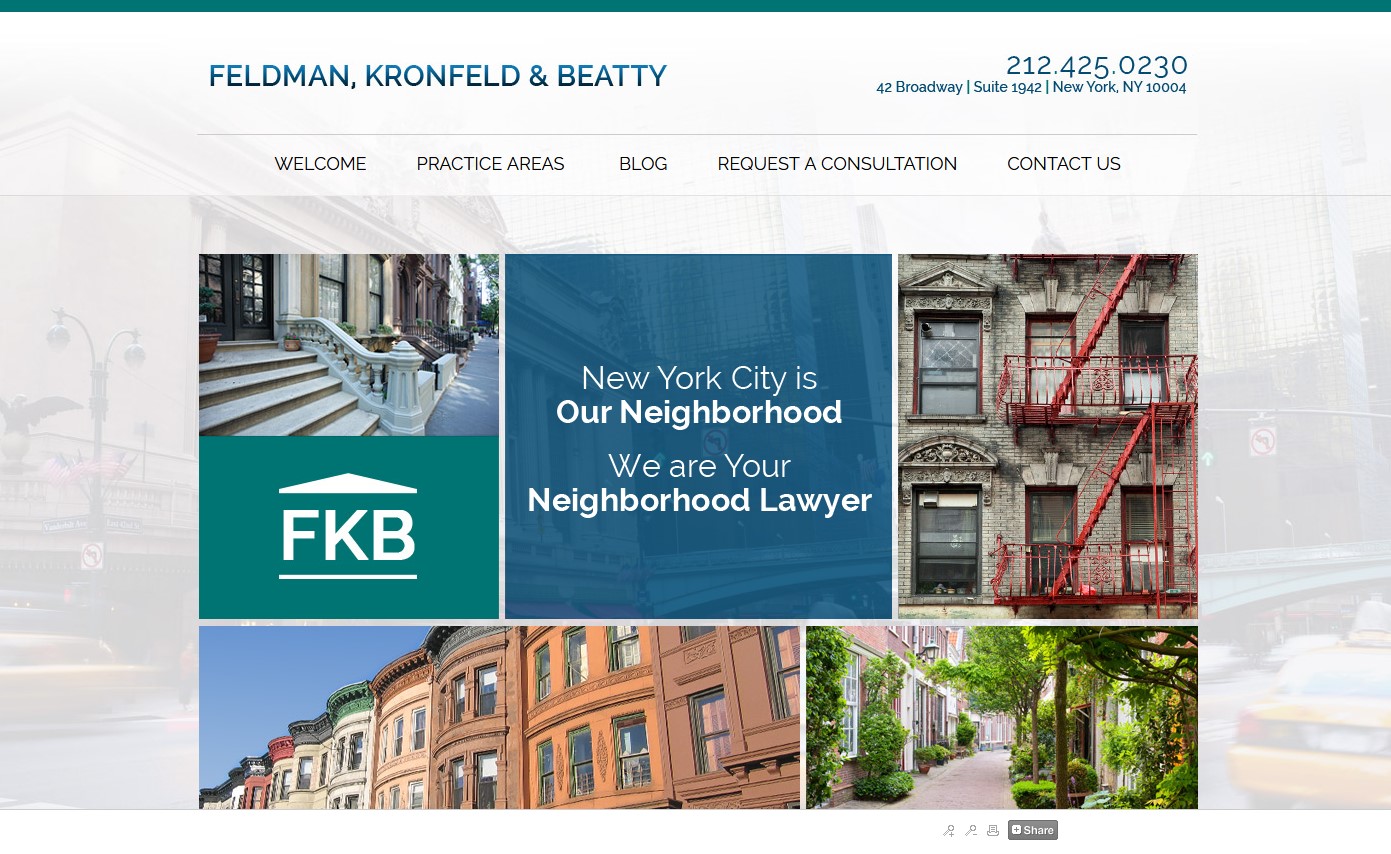
37. Feldman Kronfeld & Beatty
Why it works: An exceptionally catchy website that is both fascinating and minimalistic. The car accidents, truck accidents and spinal cord injuries icons make it easier for personal injury clients to access that specific practice area.
38. Cuming & Gillespie
Why it works: The website’s unusual color scheme for these personal injury lawyers, while being surprisingly beautiful and functional is worth mentioning in this list.

personal injury lawyer website design
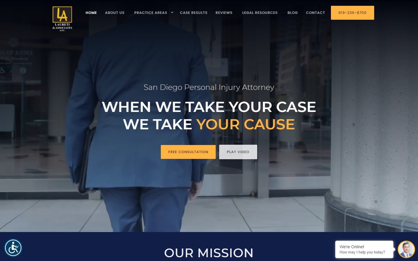
39. Laureti & Associates
Why it works: A very well-thought design from top to bottom. The video in the hero section is outstanding and very professional. The images for dog bites, truck accidents, wrongful death, workers compensation and car accident are linked to their practice areas.
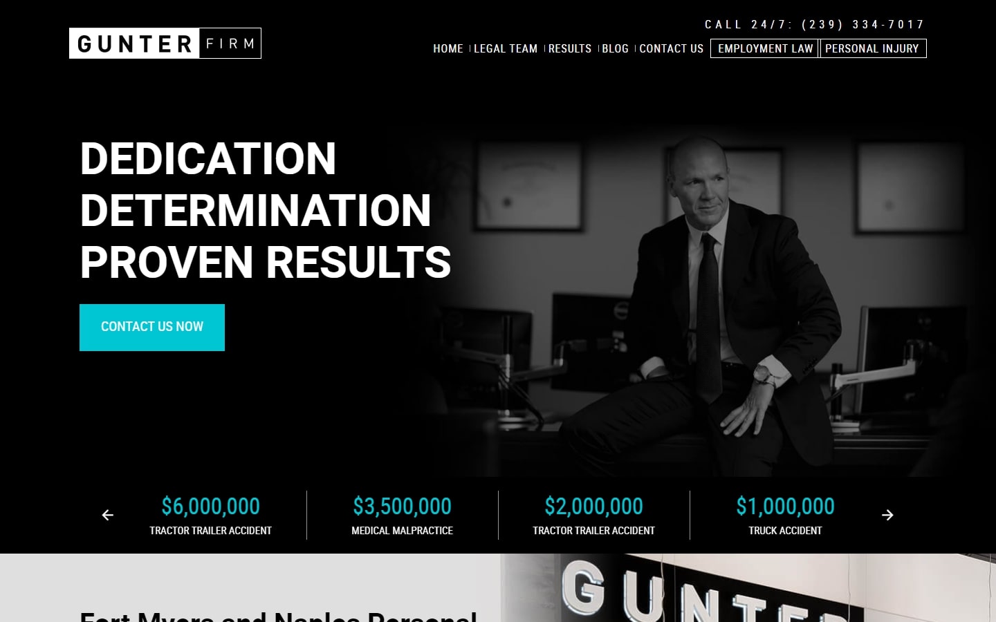
40. Gunter Firm
Why it works: What makes this personal injury website design so catchy is its inclusion of a lot of contrasting colors and elements. The CTAs pop out just enough to catch people’s attention. The footer of the site is also beautifully laid out.
Conclusion
With so many examples of personal injury websites designs out there, it’s difficult to know where to start. That’s why we created this list of the best 40 personal injury website designs in hopes that you can find inspiration from some of these great sites. If you’re looking for help with your personal injury website design project, whether it be an old or new website, you’re in the right place.
We’ve worked on many websites of legal firm companies and have a proven process to deliver great results. All our sites are responsive and mobile-friendly, so you can be sure that your website looks great on any device.
Best of all, we offer a Free Custom Mockup of your new website before you sign or pay anything. No hidden fees! Our design process is simple and straightforward, so you know what to expect every step of the way.
So if you’re in the personal injury industry and looking for a personal injury website design inspiration or just need a great website design for your law firm company, feel free to reach out and we’ll be happy to help.