If you are in the financial services industry, it is important to have a website that looks professional and trustworthy. In this blog post, we will showcase 45 of The Best Financial Services Website Design that will surely inspire you. These websites have been carefully designed and developed to reflect the professionalism of the financial services industry. We hope that this blog post will help you create a website that will impress your website visitors and generate more revenue for your business!
Table of Contents
Private Equity
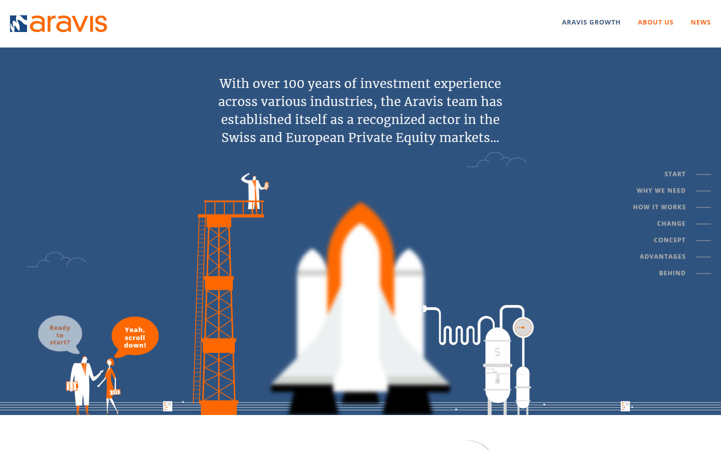
1. Aravis
Why it works: The entire website has outstanding visuals and animations, as well as a range of website effects to match the website design concept.
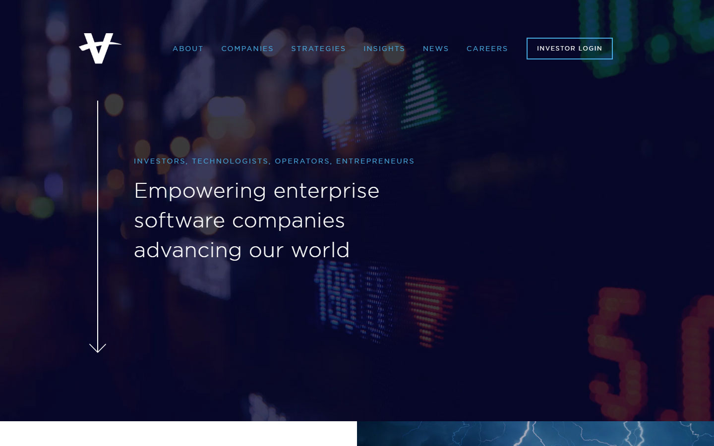
2. Vista Equity Partners
Why it works: The animations and movements are both subtle and effective. While contrasting visual hierarchy is well-planned.
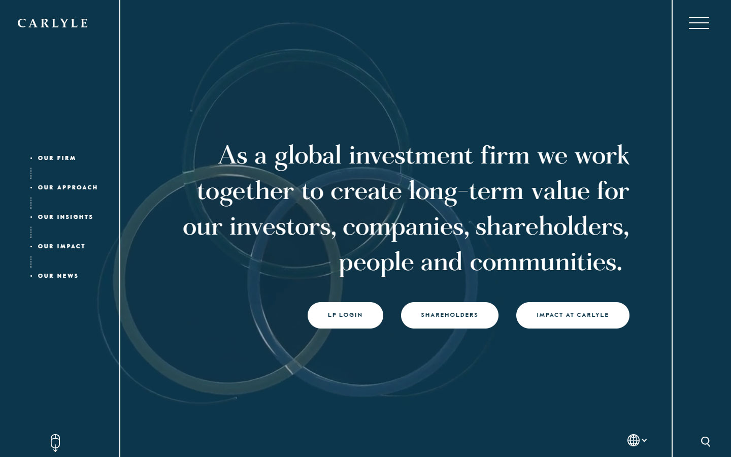
3. Carlyle
Why it works: Carlyle’s website has an unconventional layout that possesses original and strong personality and branding
website design for financial services
4. White Square Capital
Why it works: White Square Capital has a clean website design. Strong transitions and interactive animations were used that pushes the content forward.

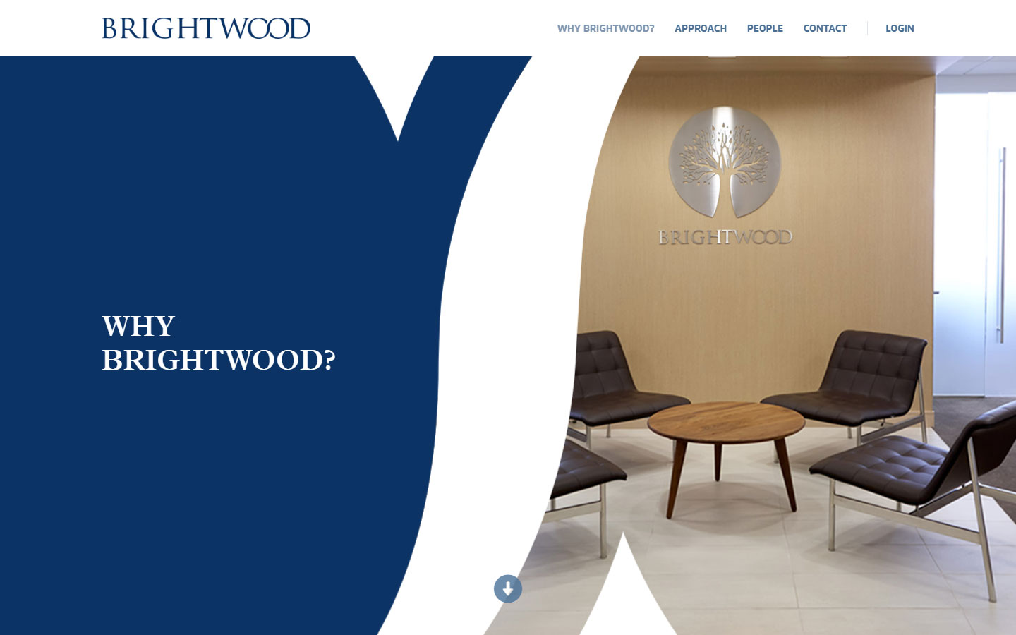
5. Brightwood
Why it works: This financial services website has a good mix of colors and elegant design. The creative transitions and animations keep this website interesting.
Venture Capital
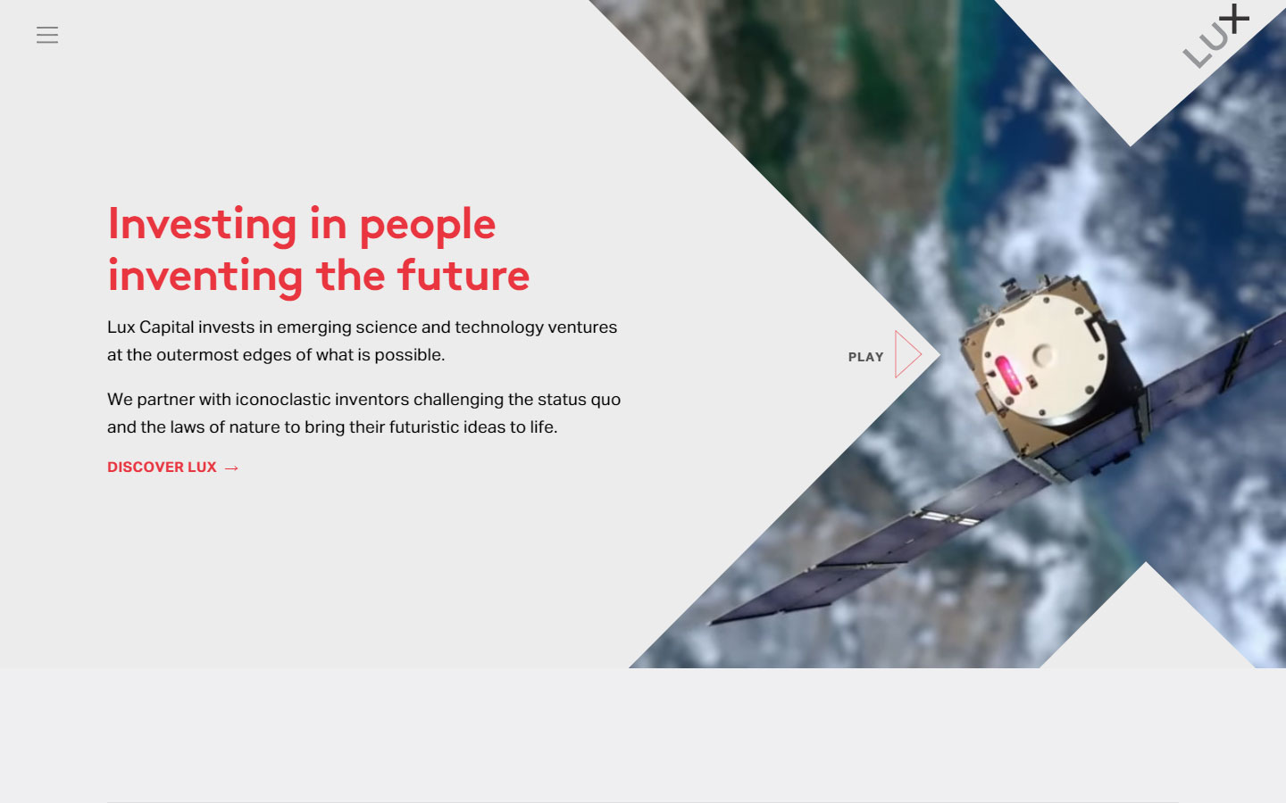
1. Lux Capital
Why it works: Content-centered website design without sacrificing creativity. Throughout the pages, strong pictures and appealing videos were employed.
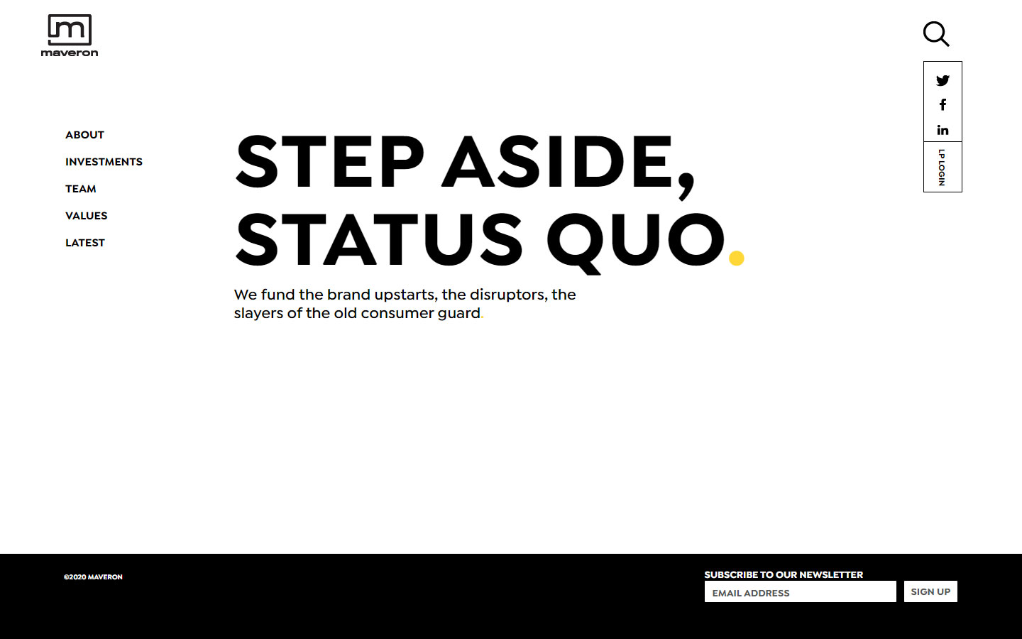
2. Maveron
Why it works: Simple and easy-to-read design, with a simple statement in a strong bold typeface. Minimalistic yet modern
3. Scale
Why it works: The color scheme exudes flair and personality, as well as the fascinating animations and elements.
best financial services website design
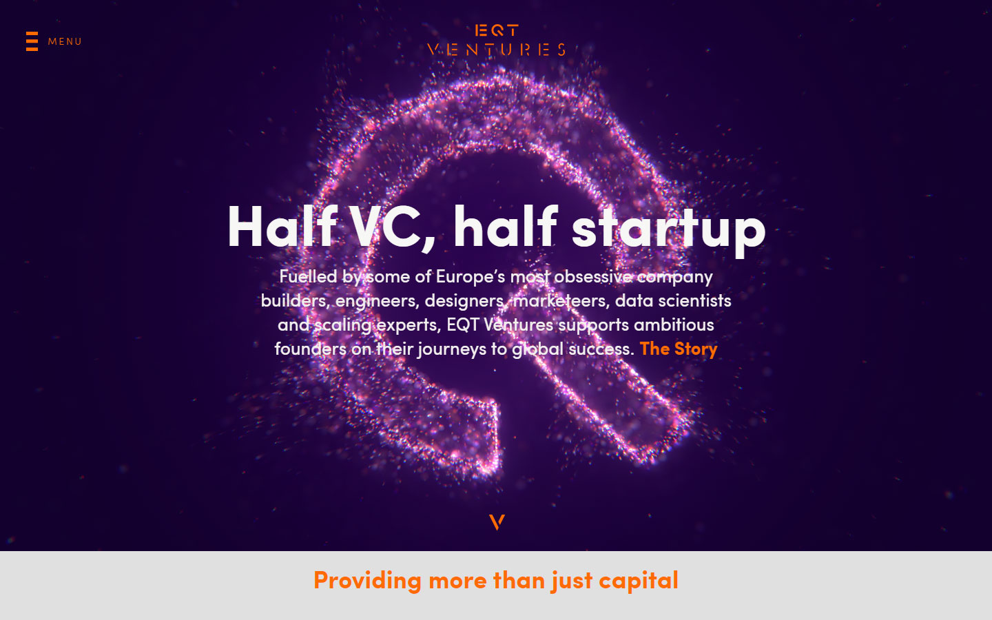
4. EQT Ventures
Why it works: The website design is otherworldly due to the video backgrounds and transition animations. Bright vivid colors and high-contrast elements were used throughout the website.
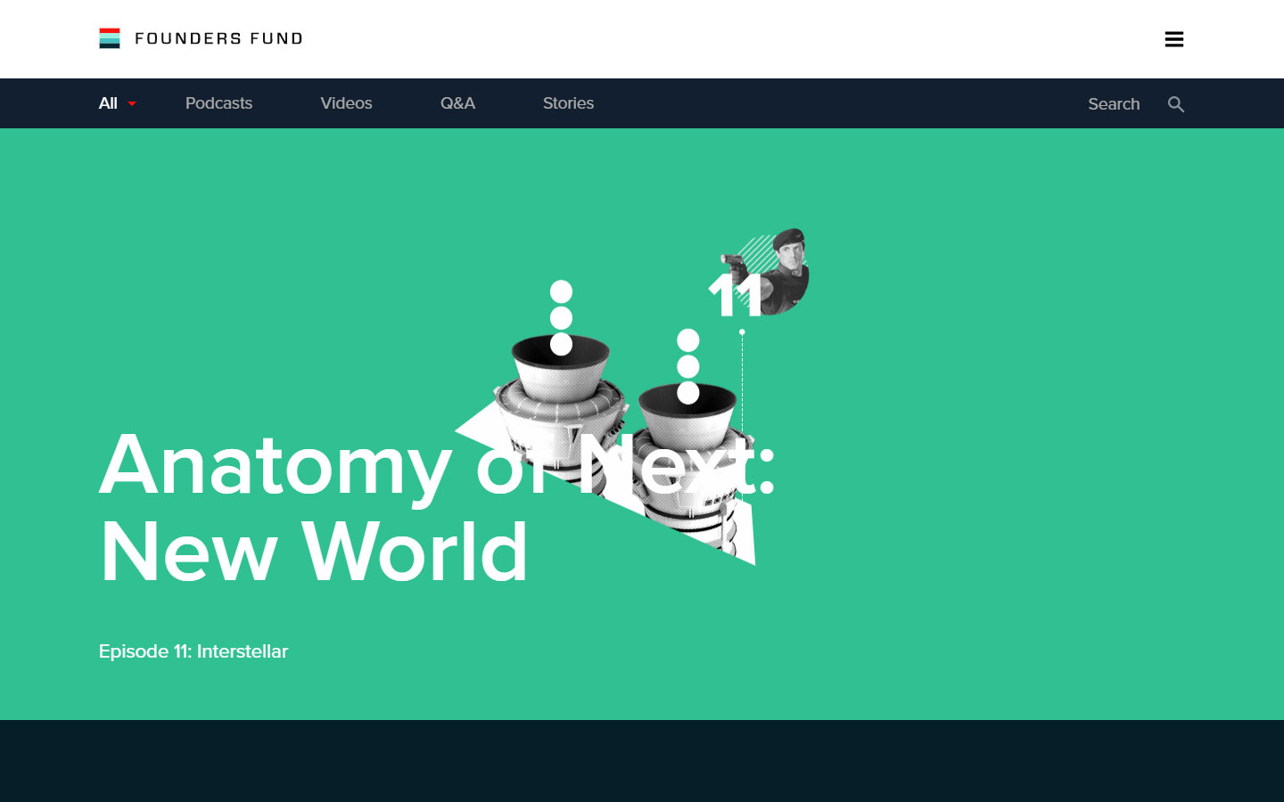
5. Founders Fund
Why it works: The financial website design is heavy with creativity, especially in the mix of graphics and photos.
Hedge Funds
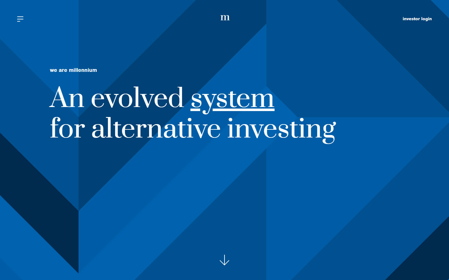
1. Millennium Management
Why it works: Minimal graphics are used to highlight the content. This website makes effective use of type.
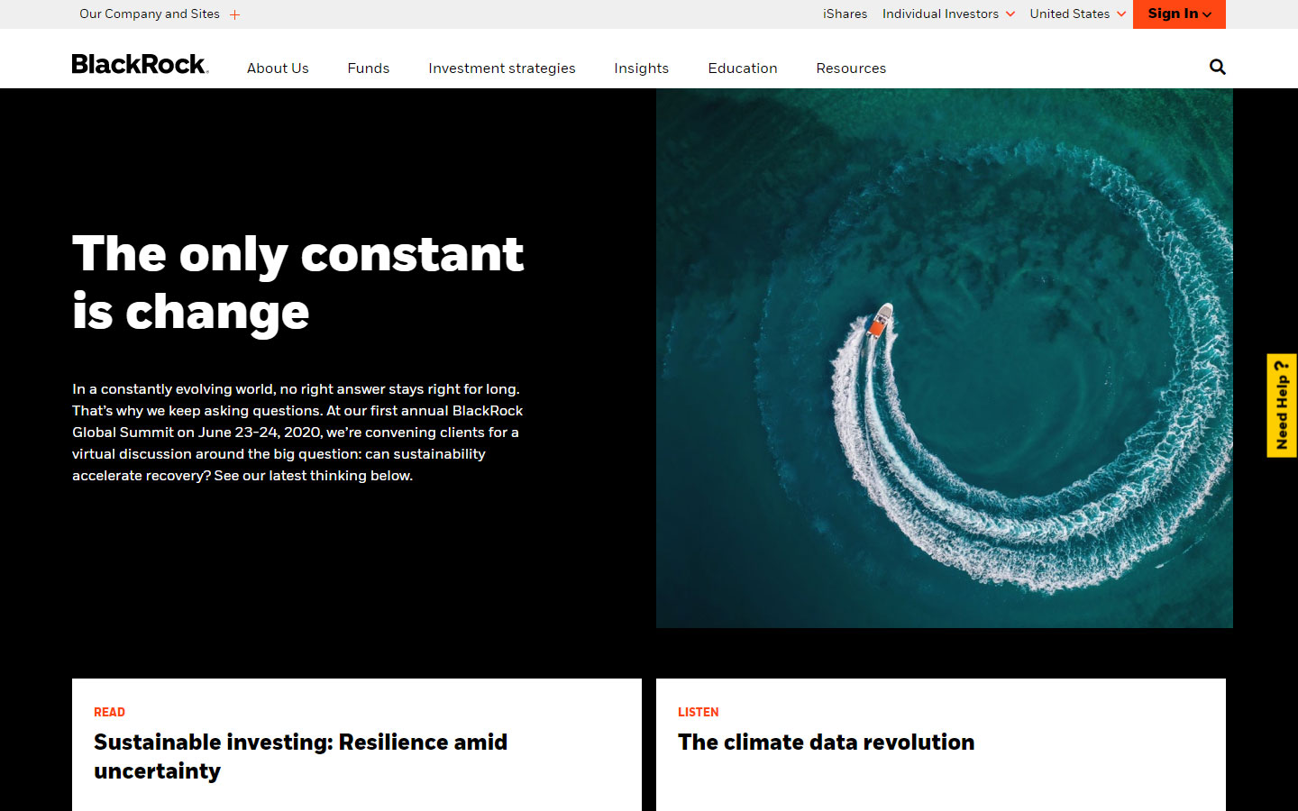
2. BlackRock
Why it works: The mix of solid black and white is really nice. The use of bite-size information and sections for easy navigation is truly ingenious.
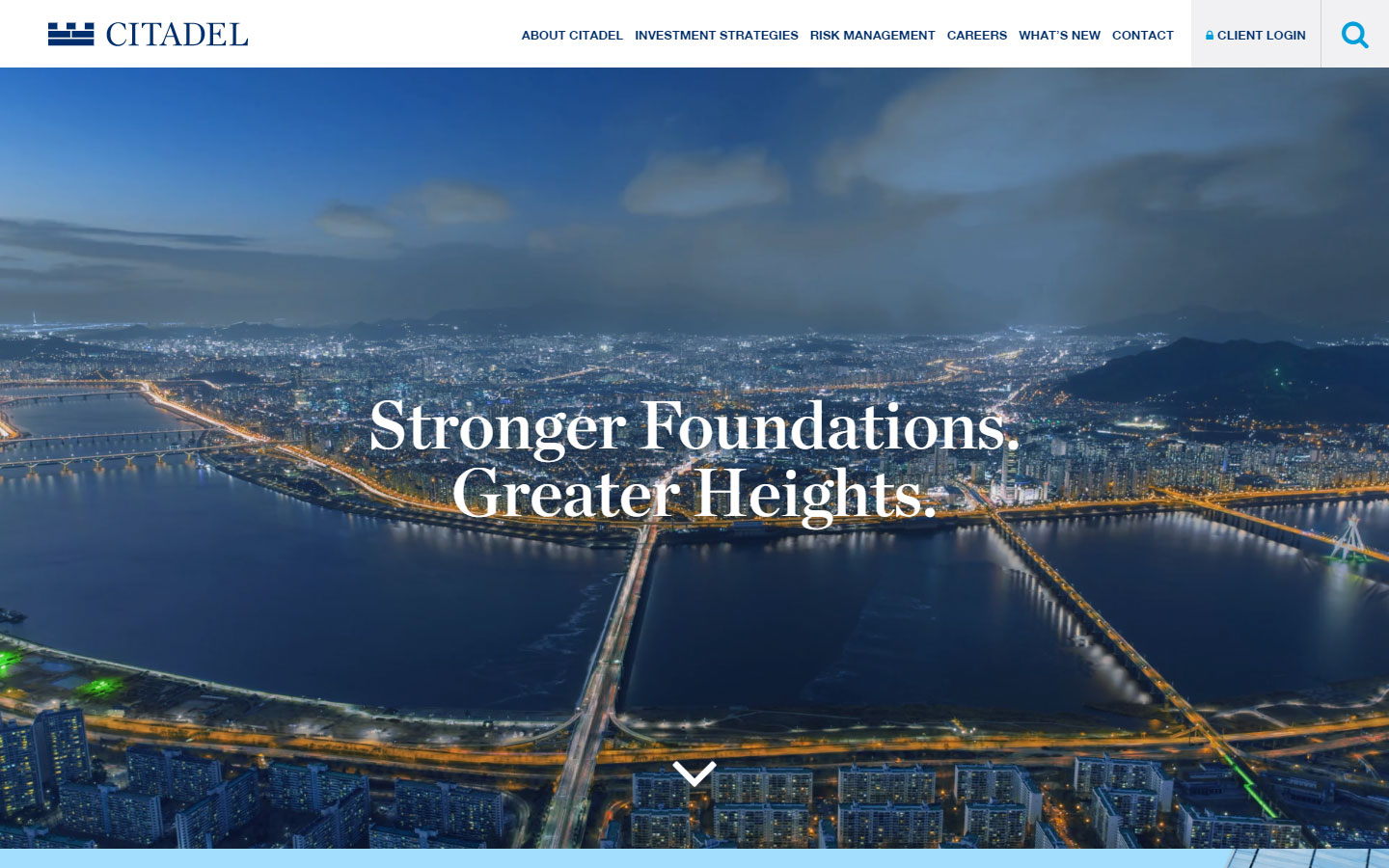
3. Citadel
Why it works: The hero’s backdrop is a beautiful timelapse video background. Because of the uniformity in color and design, branding is on point.
website design financial services
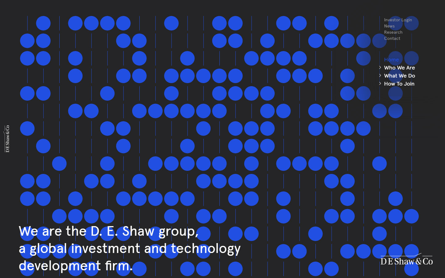
4. DE Shaw Group
Why it works: This financial website is distinctive and unique. Simple yet intriguing effects keep the website interesting.
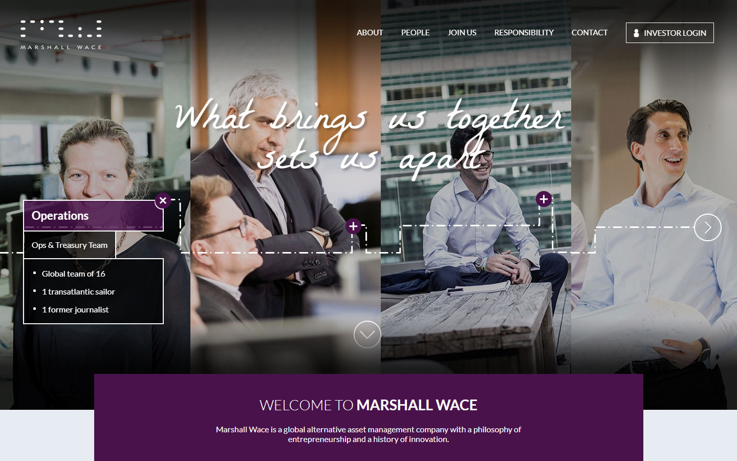
5. Marshall Wallace
Why it works: Interesting graphic elements were added to the hero section. The site has a sophisticated appearance thanks to good photography on the homepage.
Family Offices
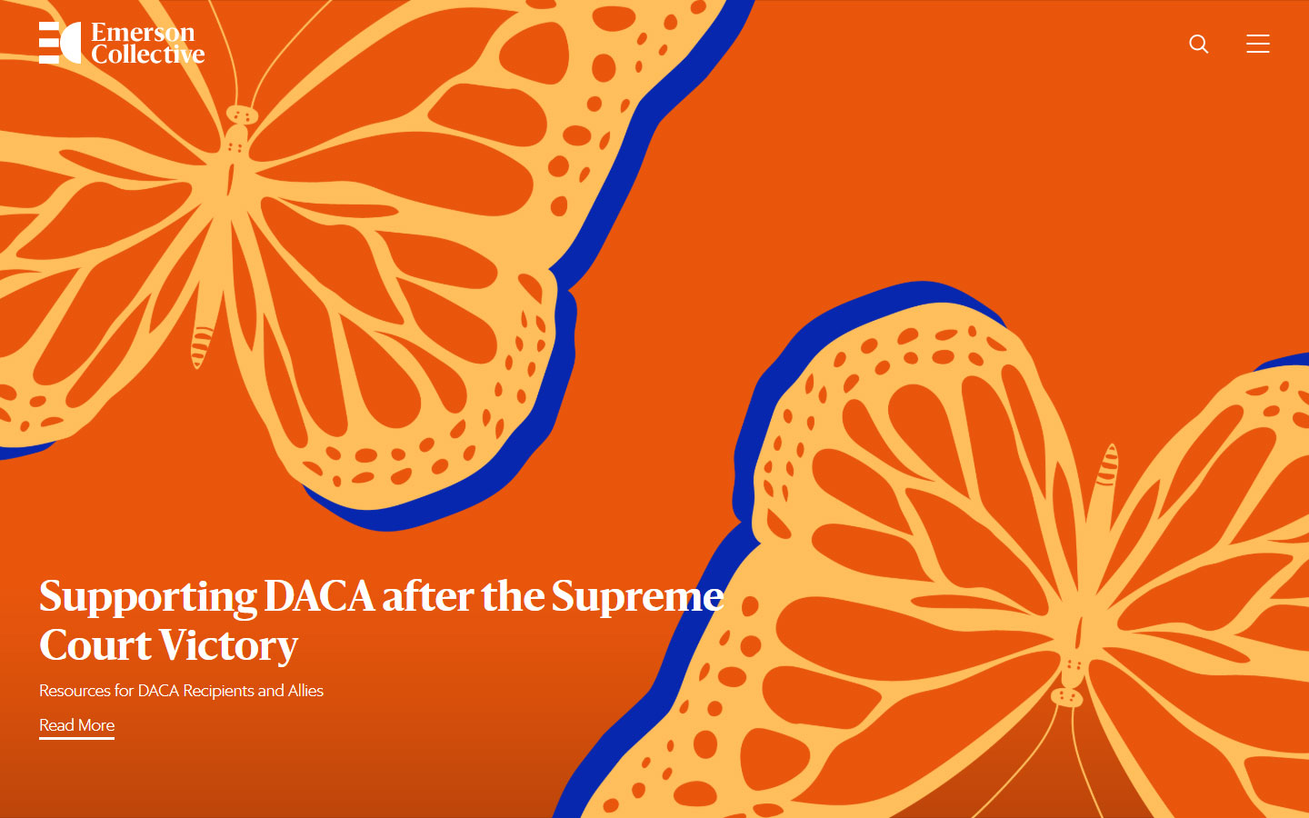
1. Emerson Collective
Why it works: Beautiful and bright graphics are used in this financial services website. Easy to navigate and explore.
2. Vulcan
Why it works: This website has a visible presence above the fold. Interesting animations and easy-to-understand sections.

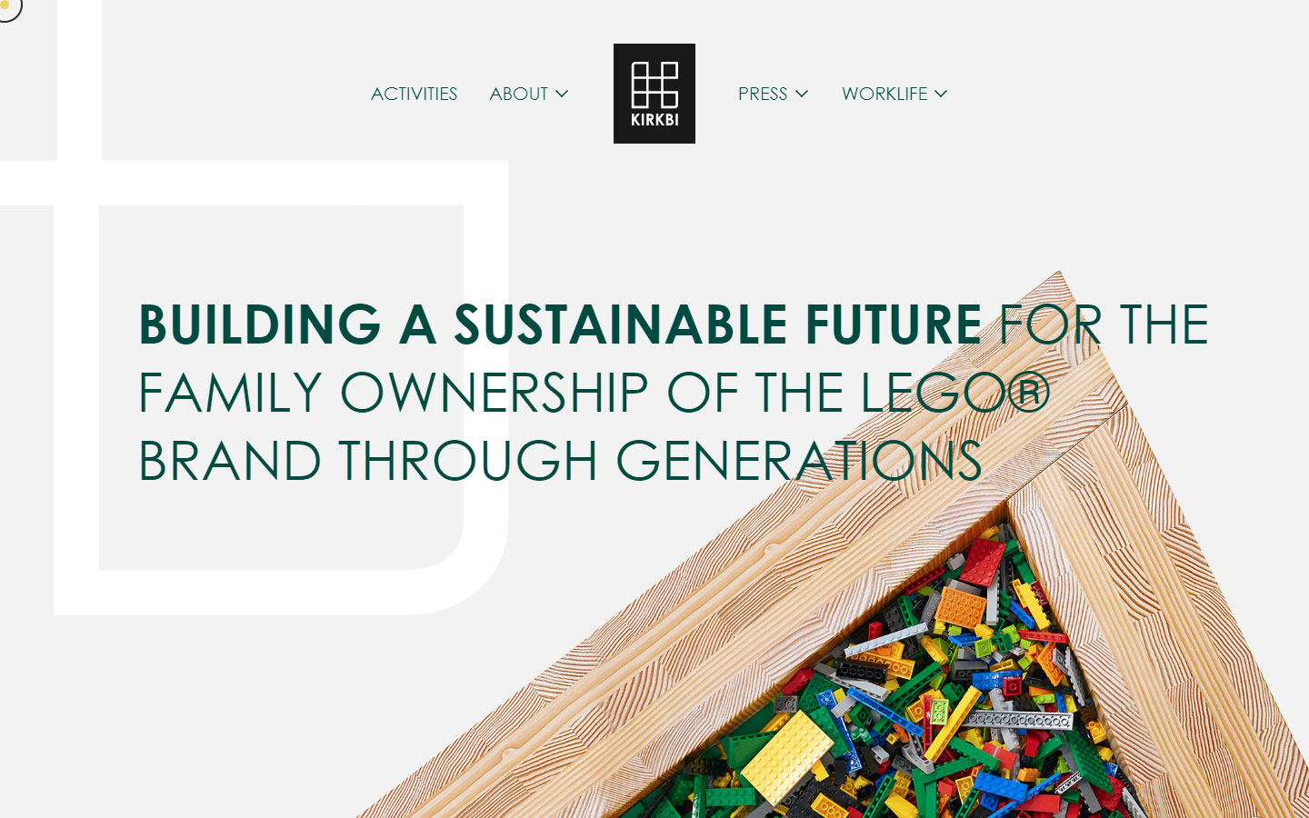
3. Kirkbi
Why it works: Kirkbi’s website has beautiful photography, custom pointer and well-structured information.
financial website design
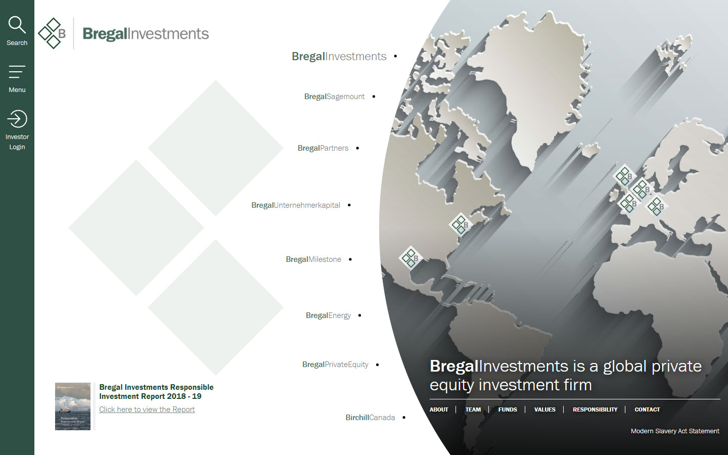
4. Bregal Investments
Why it works: This is a financial services website that features a unique layout, effective sidebar, and navigation.
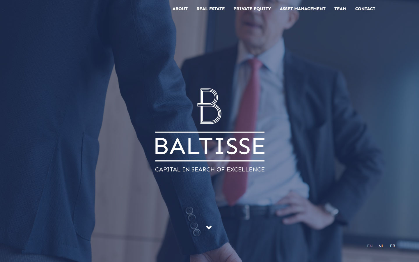
5. Baltisse
Why it works: This website has a clean professional design, great button hover effects, and nice divisions between sections.
Mergers and Acquisitions
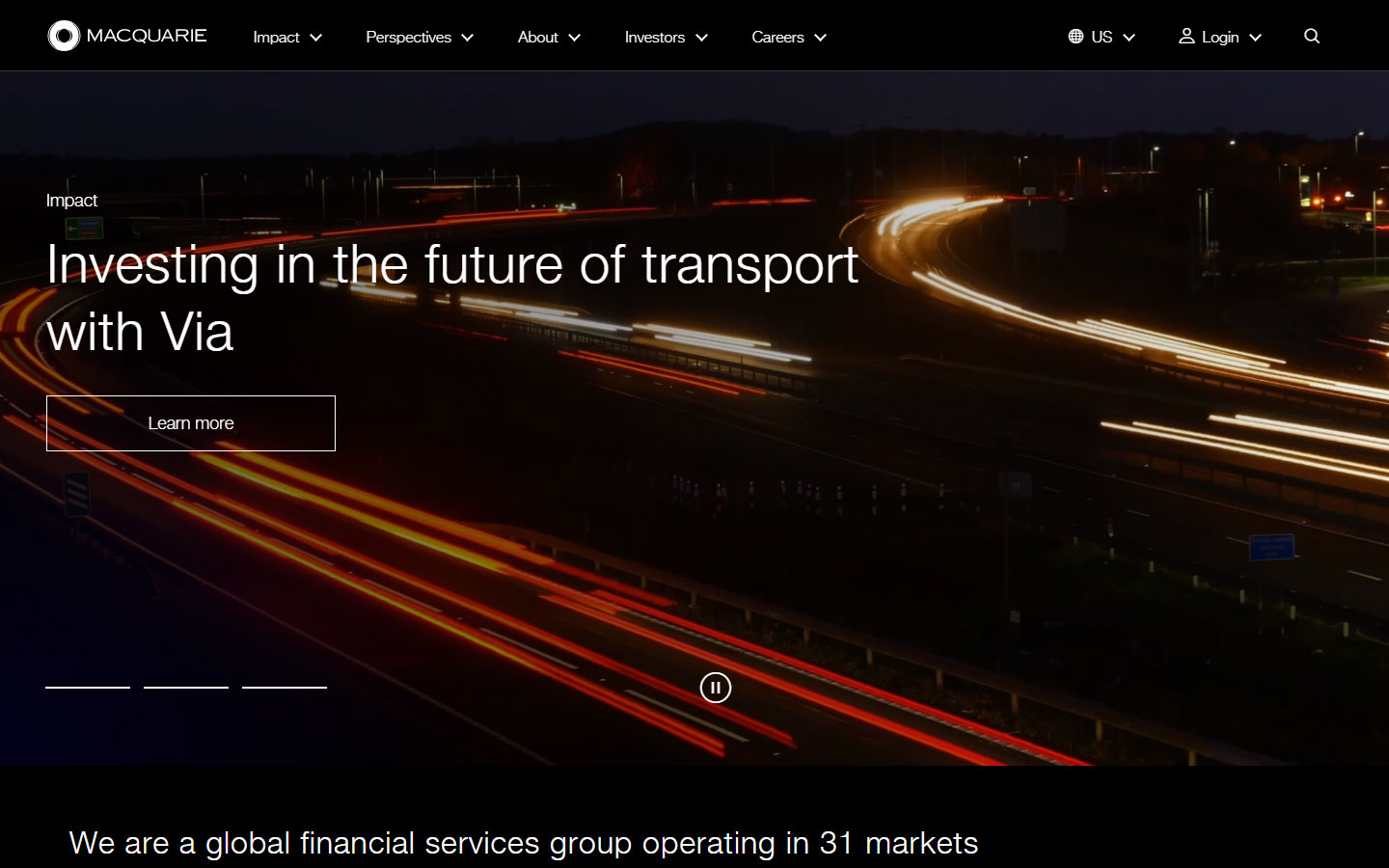
1. MacQuarie
Why it works: This financial services website has a great video background for the hero area. The colors and words are bright, with a simple and uncluttered design.
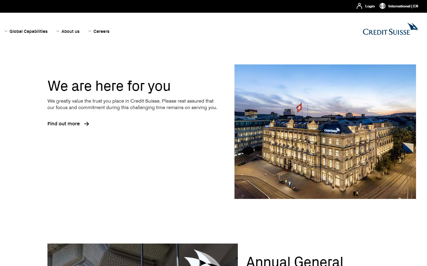
2. Credit Suisse
Why it works: Super clean design, no ornaments and elements to distract from the content.
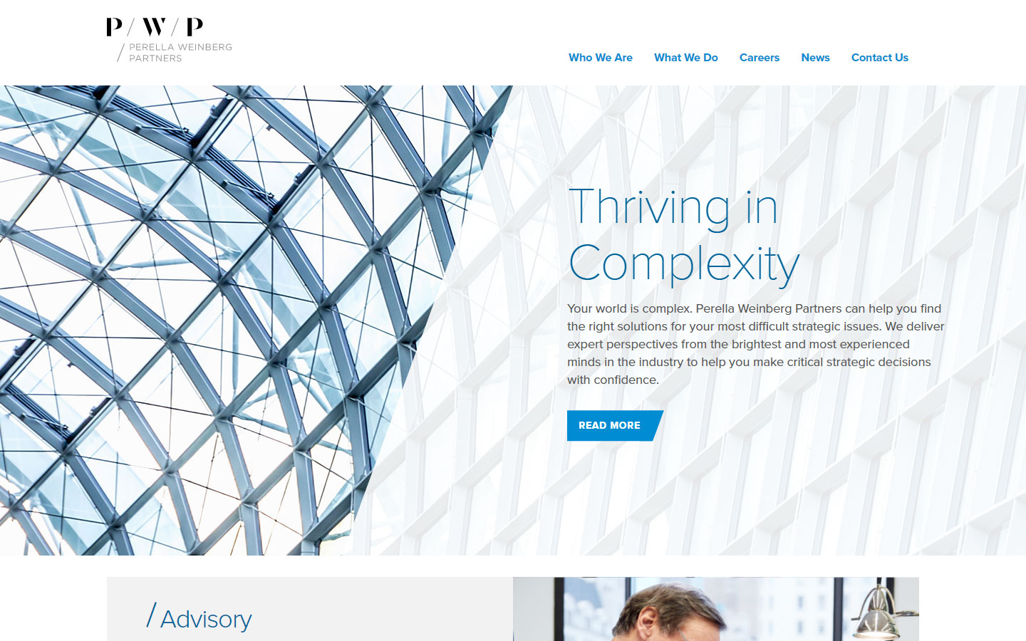
3. Perella Weinberg Partners
Why it works: A modern, refined design with a clean light feel. The website is simple to use.
financial services web design
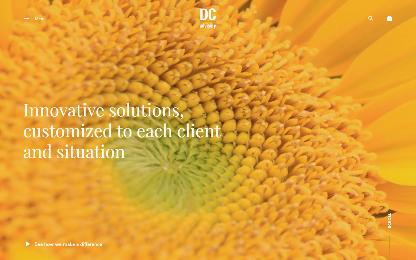
4. DC Advisory
Why it works: This financial advisors’ website used powerful photos and videos. The line animations make this site engaging for users.
5. Clairfield International
Why it works: The strong statement of purpose in the banner is created by good typography.

Banks
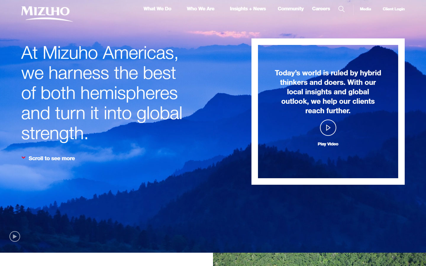
1. Mizuho Americas
Why it works: This finance website features breathtaking landscape videos and images on the homepage.
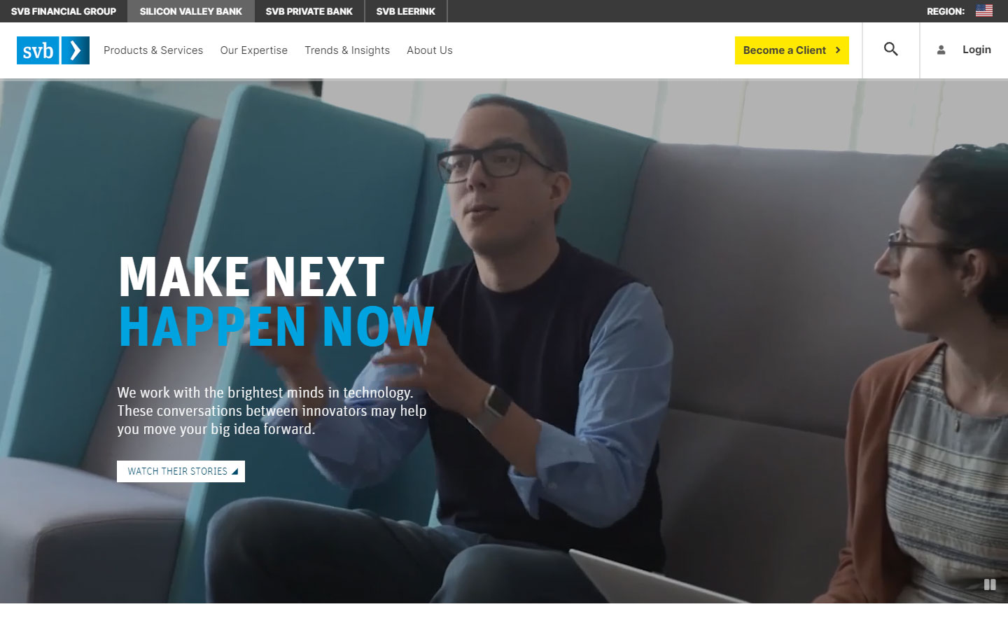
2. SVB Financial Group
Why it works: Clean functional design that’s people-centered.
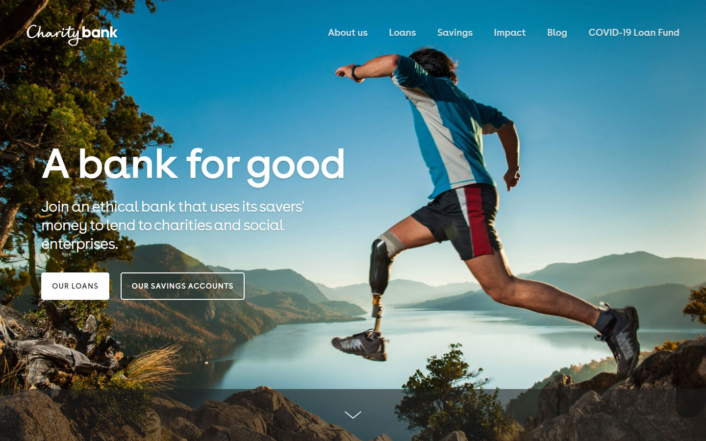
3. Charity Bank
Why it works: Well-thought and organized content, a very interesting hero image that sums up their vision.
web design financial
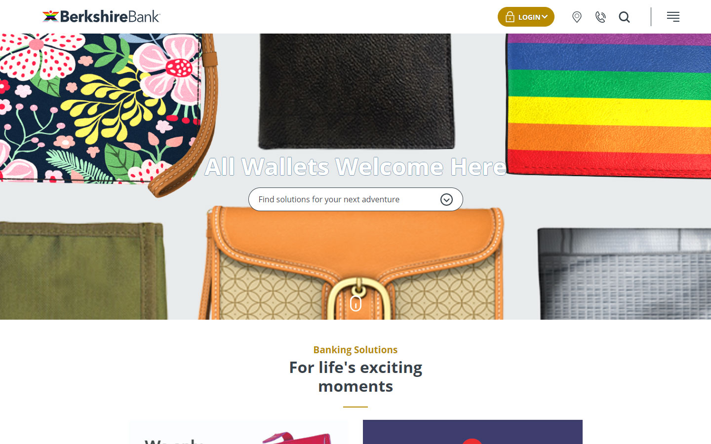
4. Berkshire Bank
Why it works: Very youthful design with interesting images and animations.
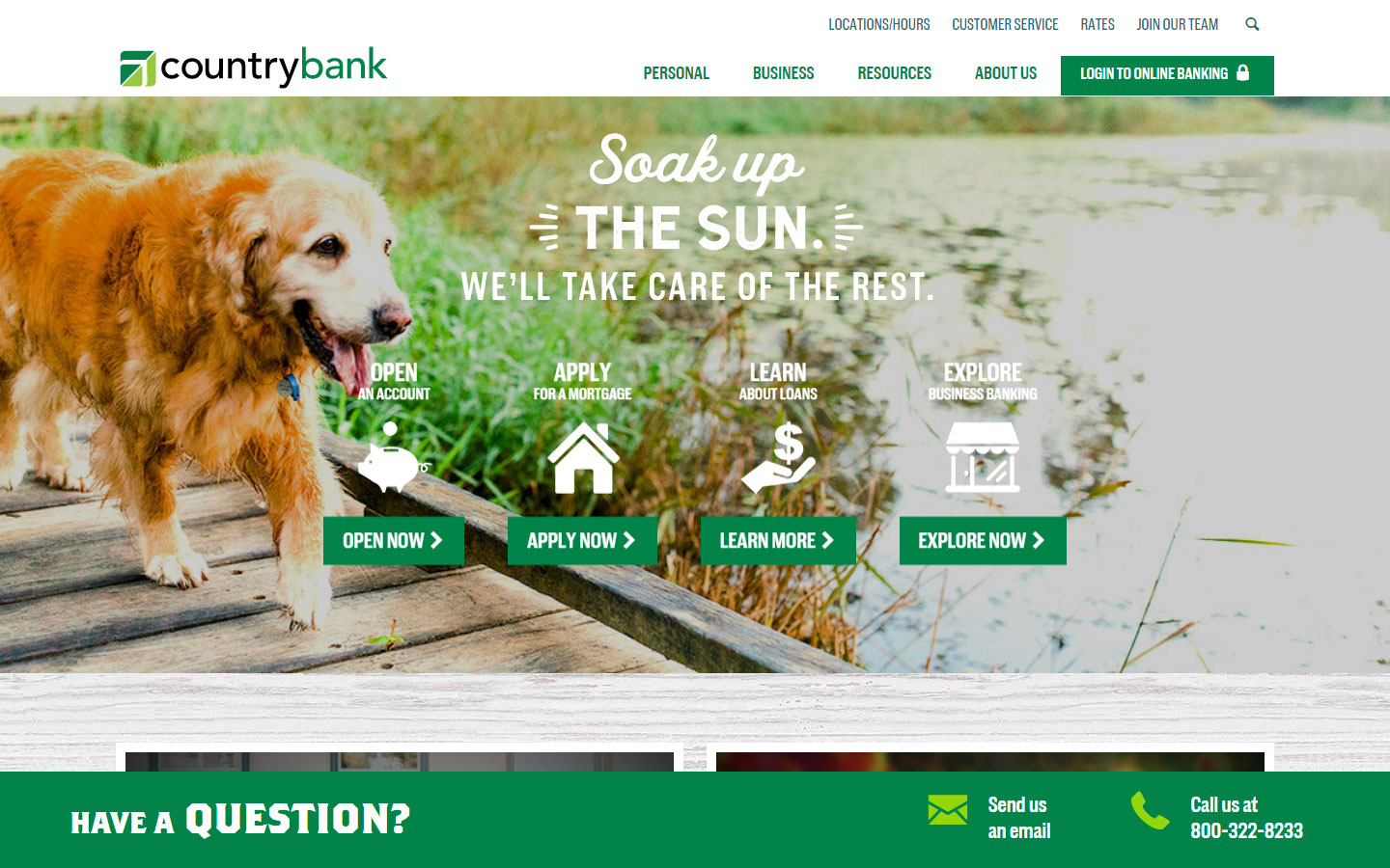
5. Country Bank
Why it works: Outstanding typography, content organized in chunks, and strong calls to action at the bottom of the screen.
Investment Banks
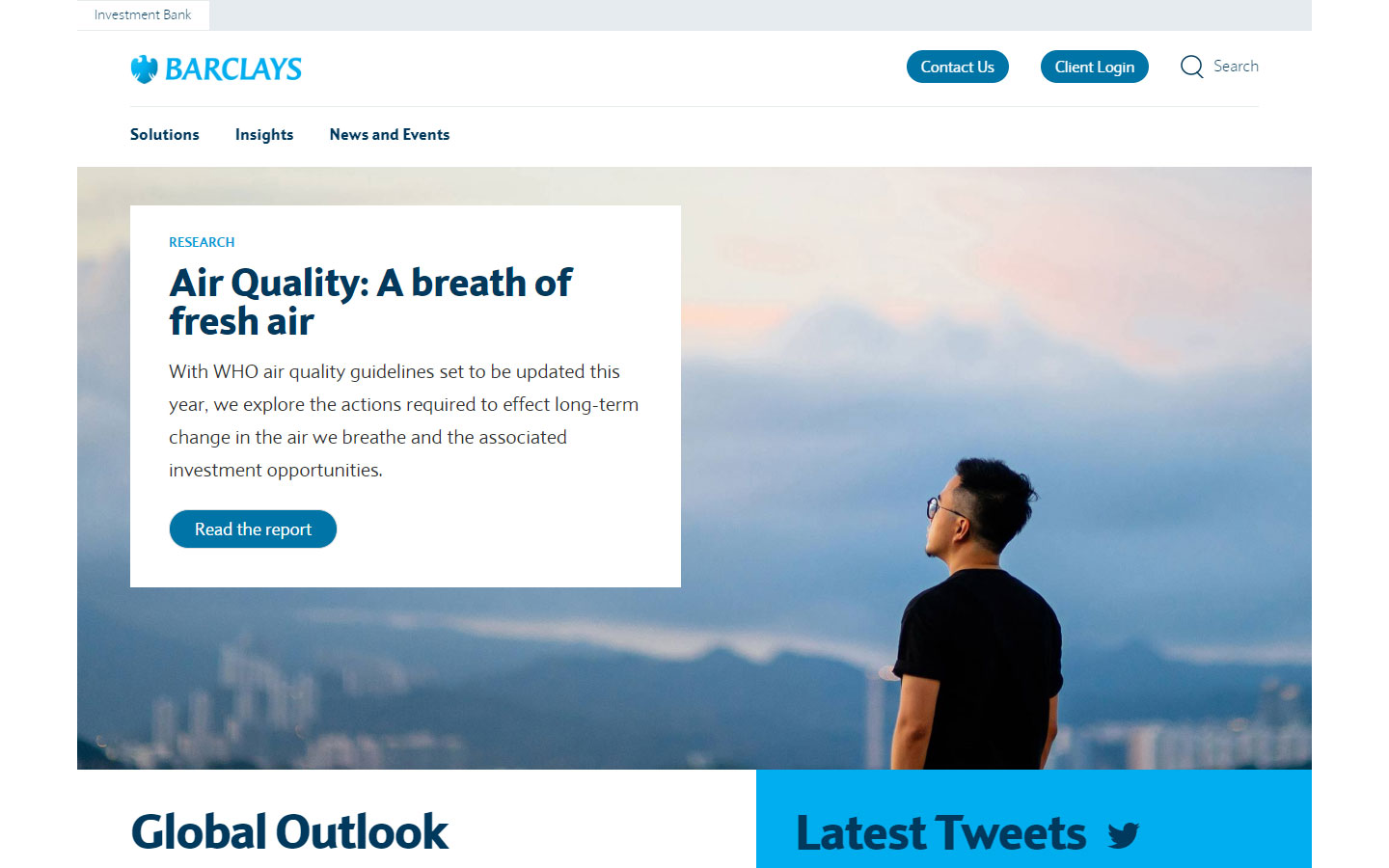
1. Barclays
Why it works: With an intuitive design, this financial services website is easy to navigate. The investment services solutions are always accessible thanks to the sicky navigation.
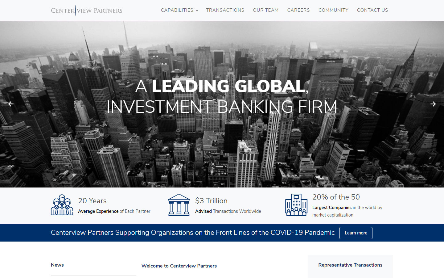
2. Centerview Partners
Why it works: This investment banking firm used a traditional design with extraordinary use of black and white images.
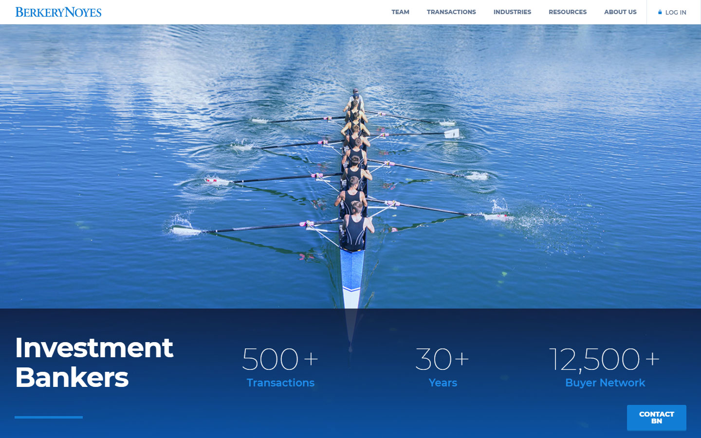
3. Berkery Noyes
Why it works: Simple design without information overload. The sticky contact button on the bottom right aids users to easily contact the company.
web design finance
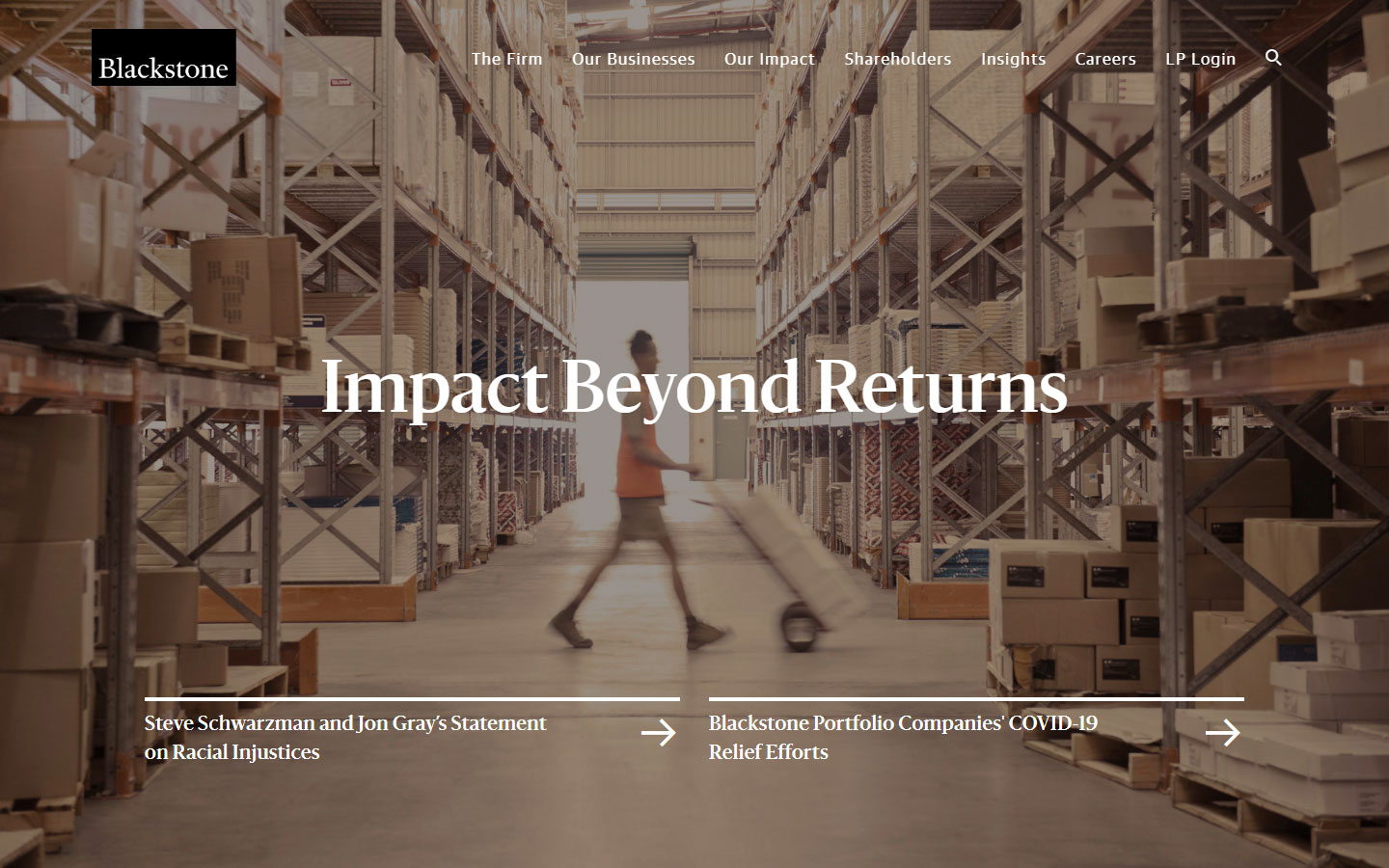
4. Blackstone
Why it works: Good typography. The subtle but catchy animations lead the viewers to the right content of focus.
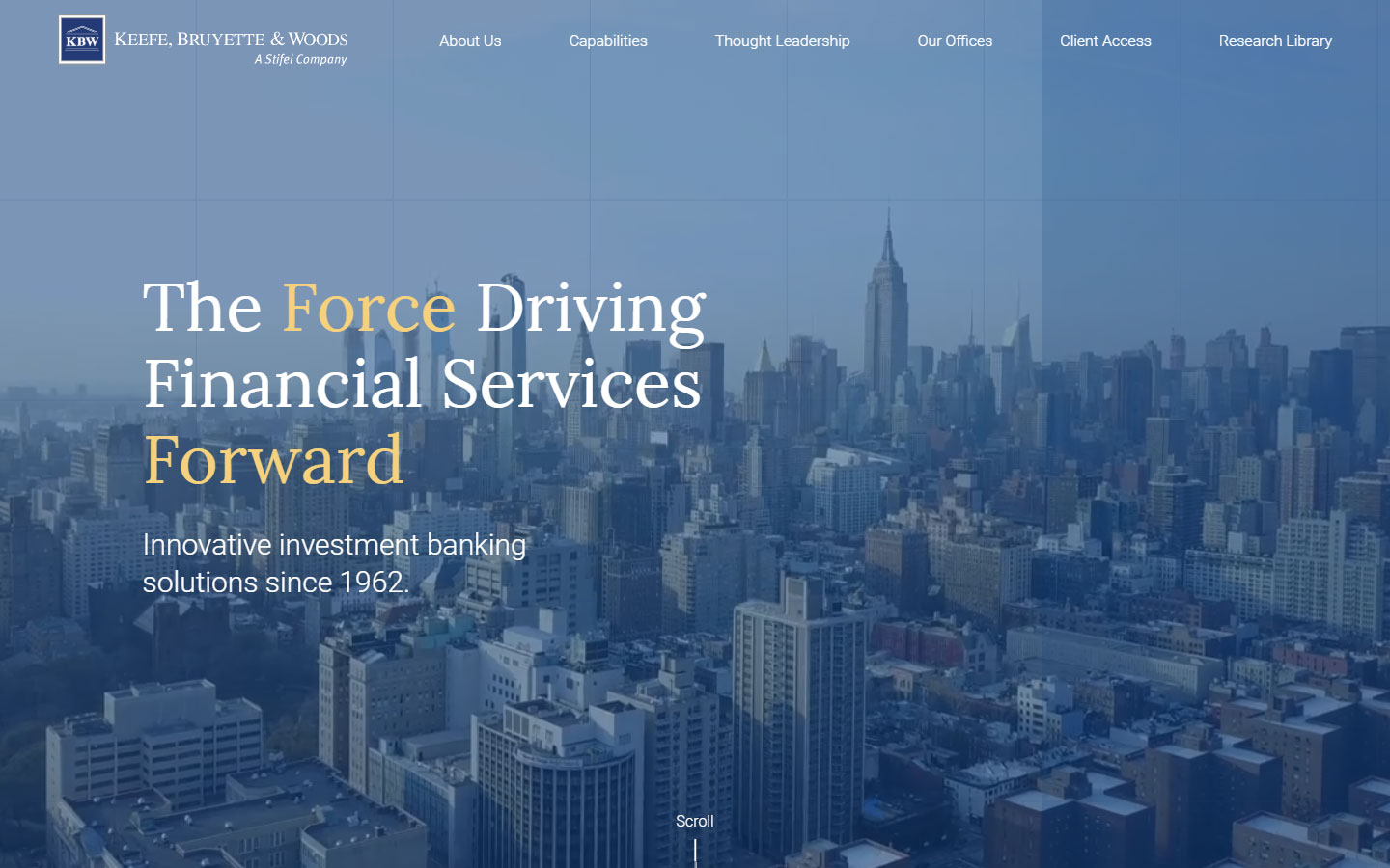
5. Keefe, Bruyette & Woods
Why it works: Cool to the eyes. The video background shows their dominance in the industry.
Lending
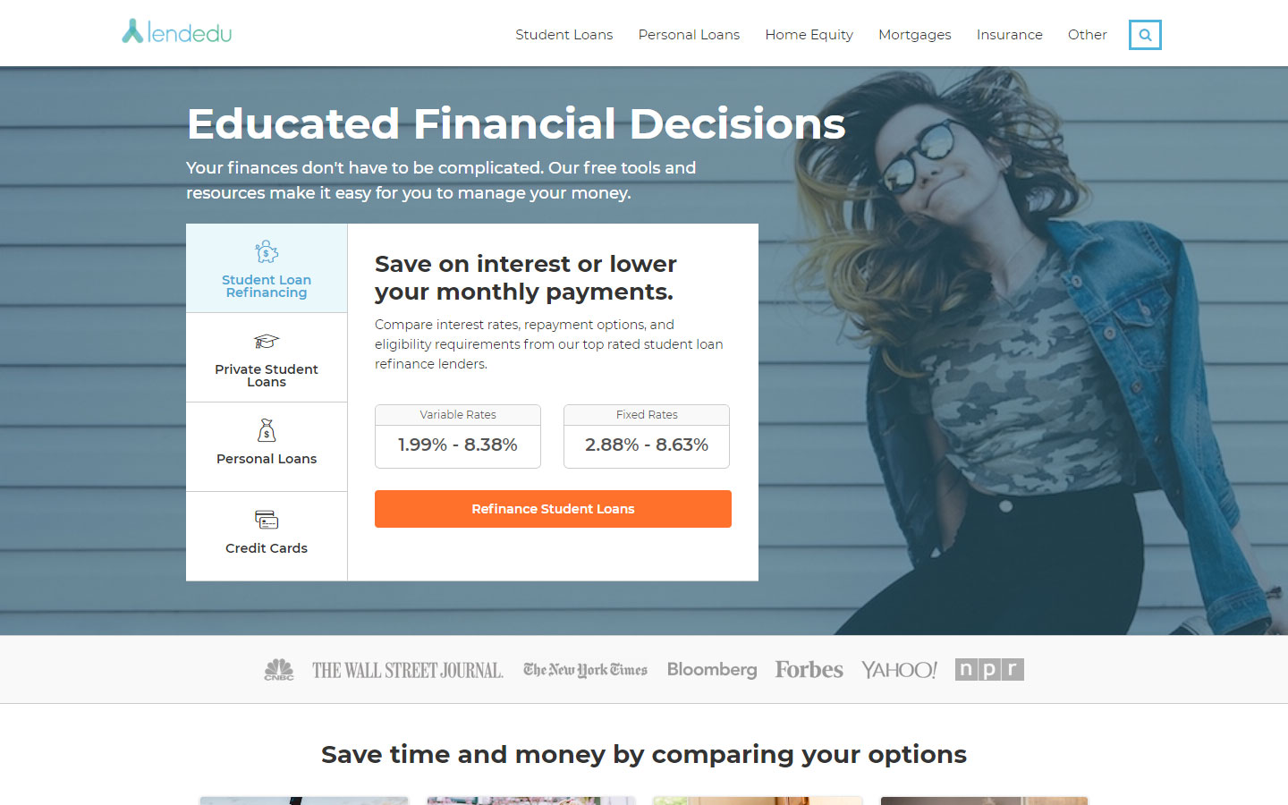
1. Lendedu
Why it works: They added quick links to the Student Loan Refinancing, Private Student Loans, Personal Loans, and Credit Cards on the homepage banner. This is a great website example of how to improve users’ access to important information easily.
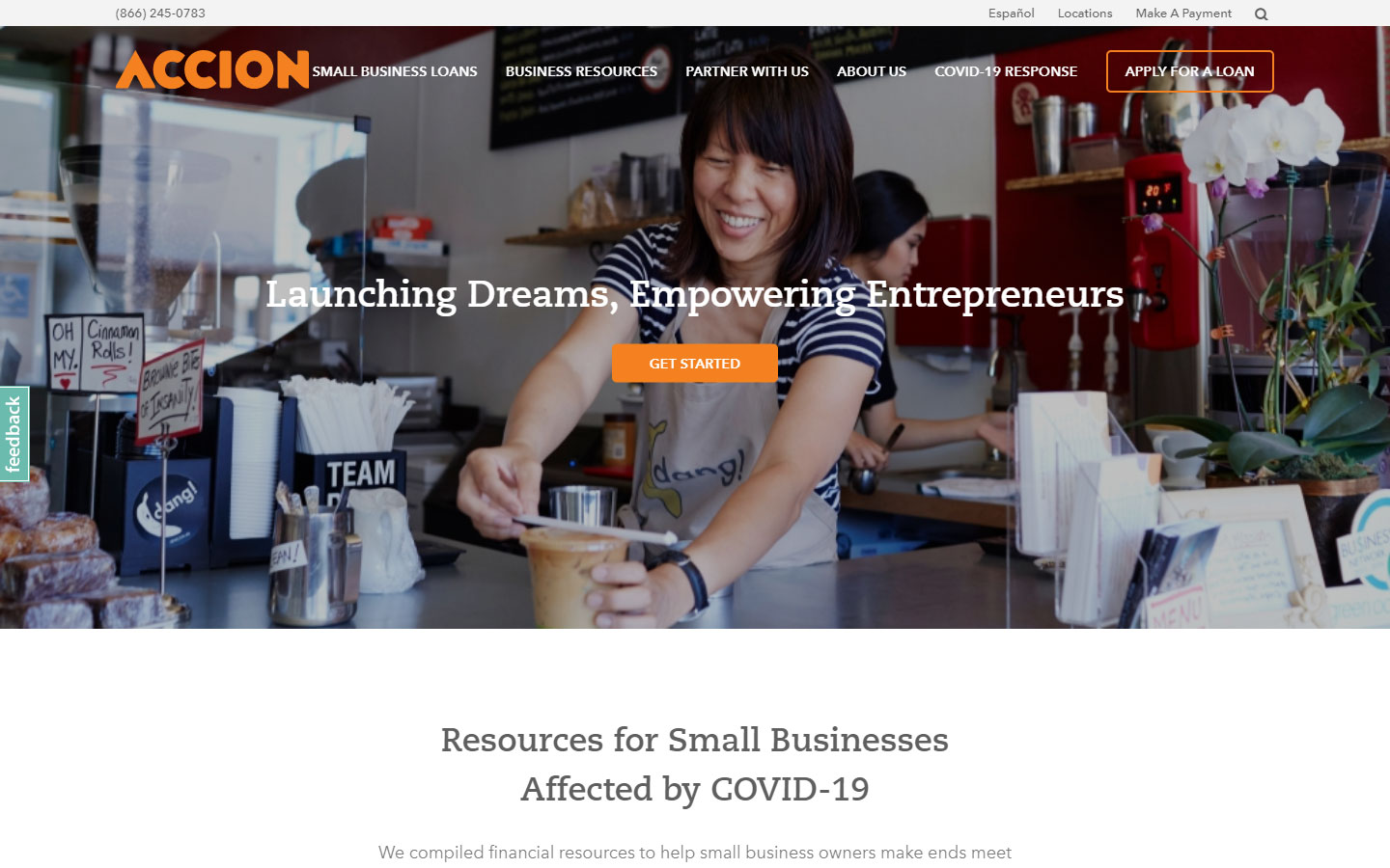
2. Accion
Why it works: Spacious and simple. The choice of photos is outstanding.
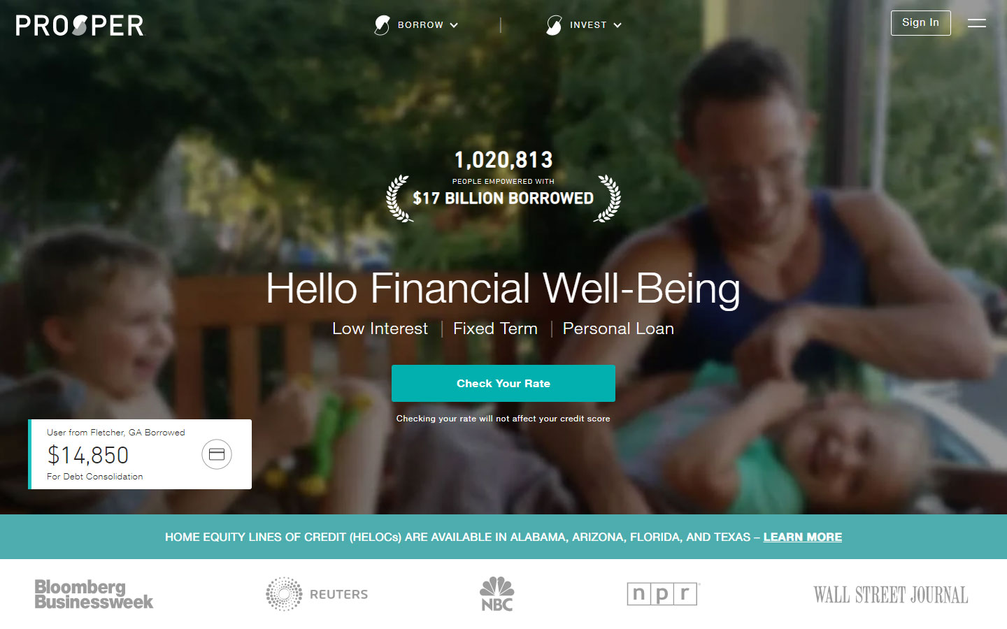
3. Prosper
Why it works: A no-fuss no-guess site that you can easily trust and figure out what they do best.
best financial website designs
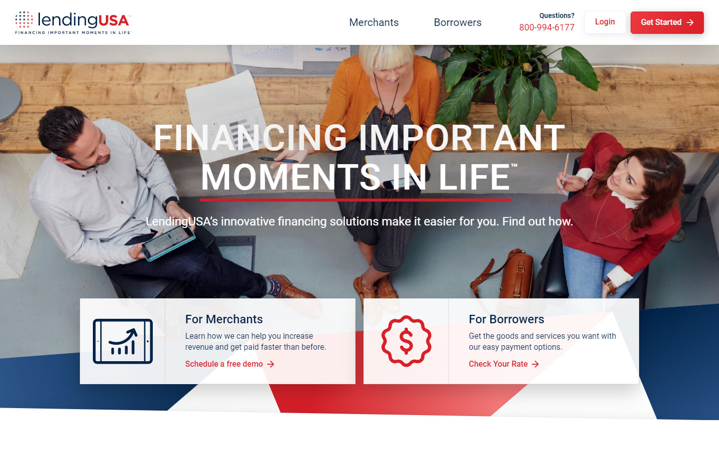
4. LendingUSA
Why it works: Good choice of colors, bright clear images used, and a very pleasant experience throughout.
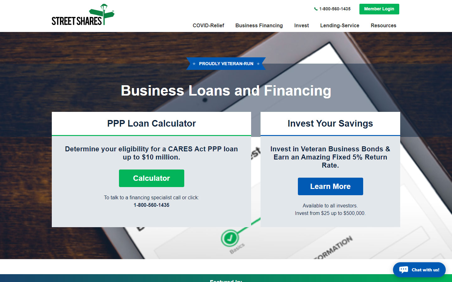
5. Street Shares
Why it works: The services and calculator are immediately accessible. The live chat widget is a useful addition to the site.
Fintech
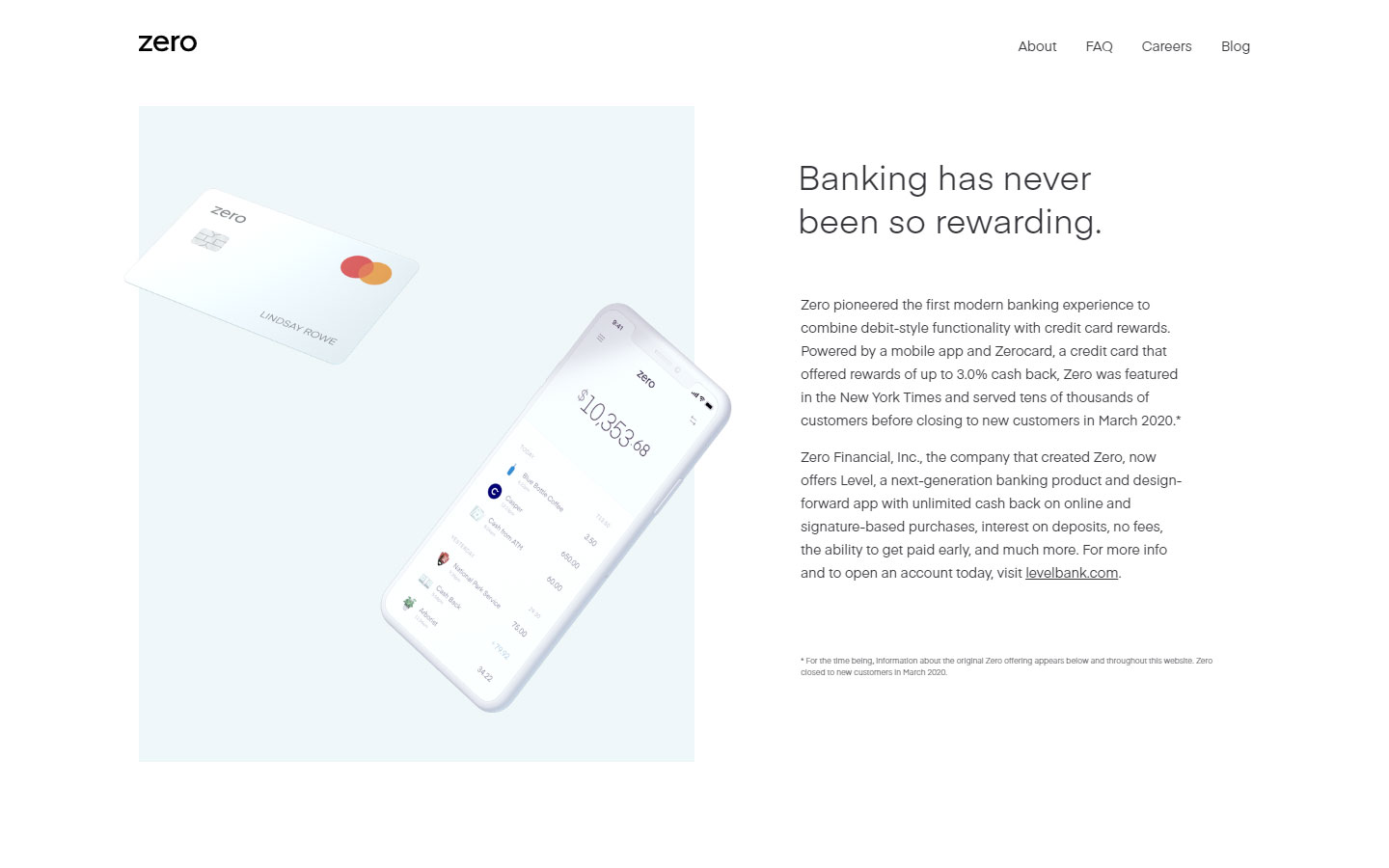
1. Zero
Why it works: Highly minimalistic with a focus on actual content. Subtle animations and an interactive cashback calculator are nice features of the site.
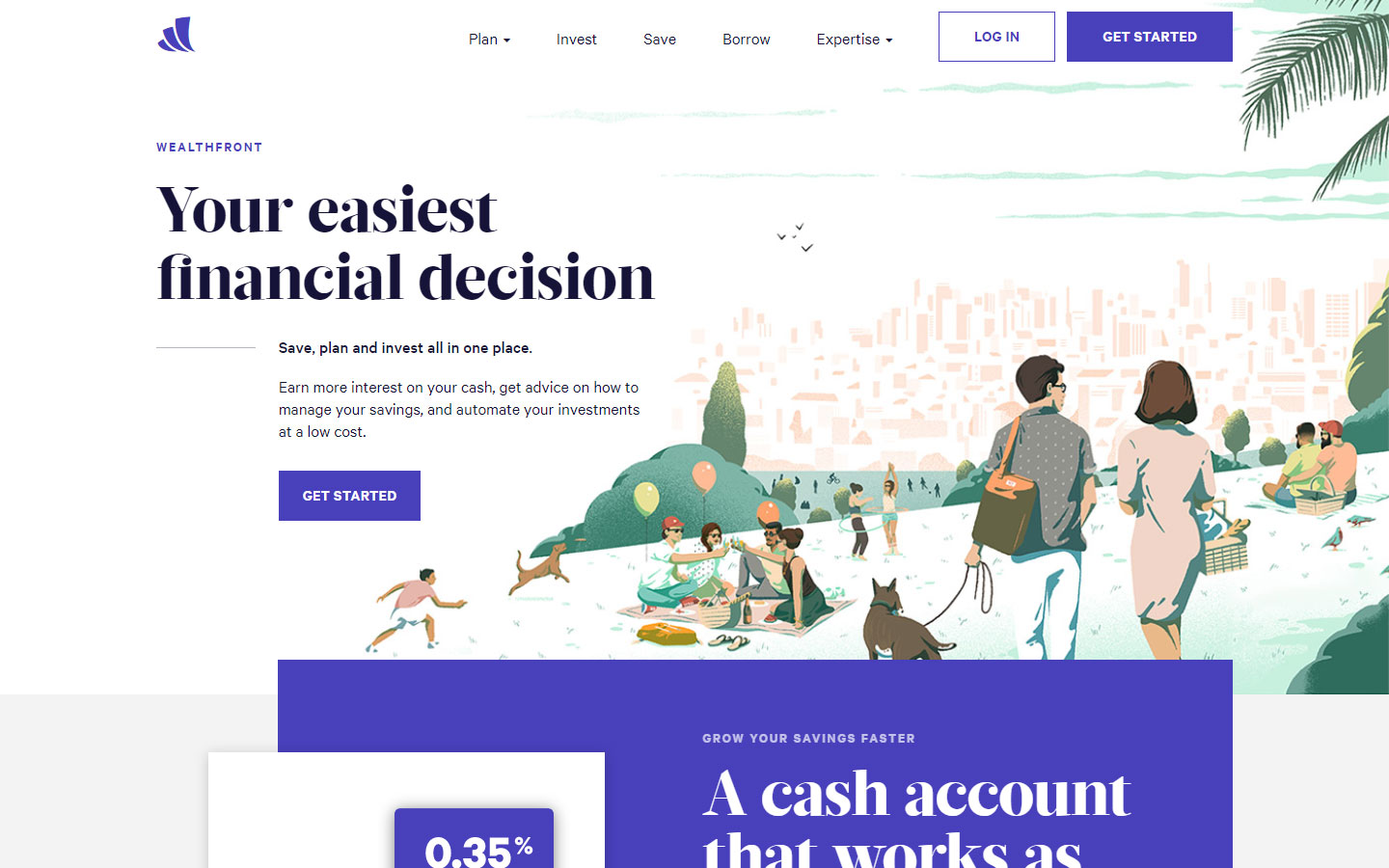
2. Wealthfront
Why it works: The typography, complementary images, as well as the contemporary design and site experience, all add to the appeal of this site.
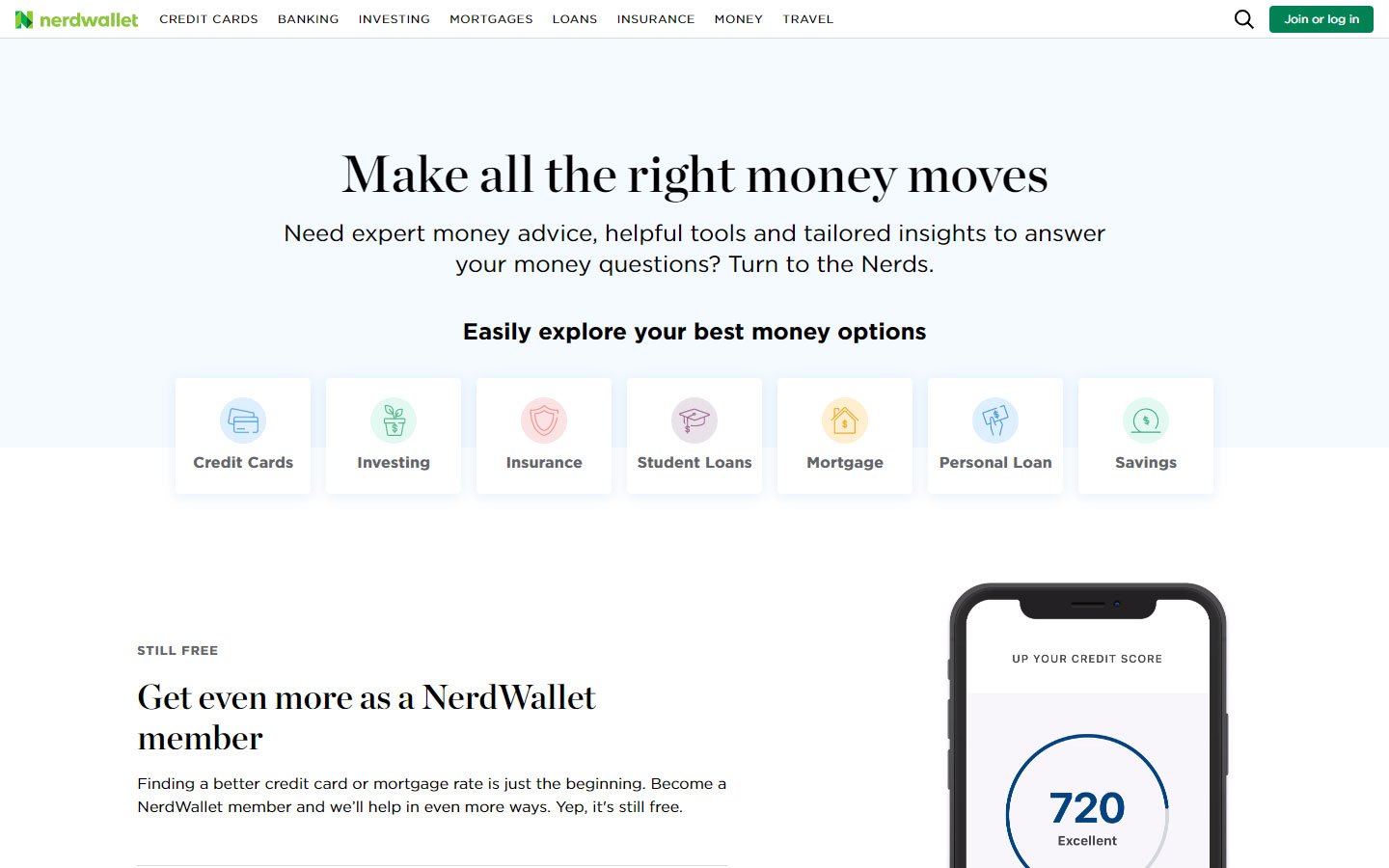
3. Nerdwallet
Why it works: Minimalistic, clean design using light background colors. The website is very engaging from top to bottom.
best financial websites design
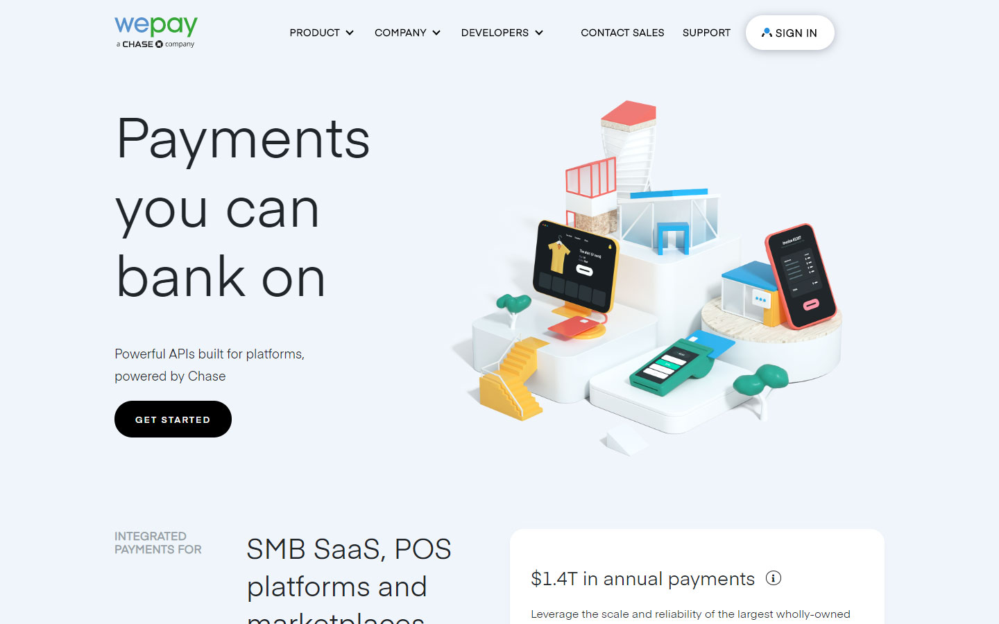
4. WePay
Why it works: WePay incorporates a wonderful blend of youthfulness thanks to the use of 3D miniature figures on the homepage.
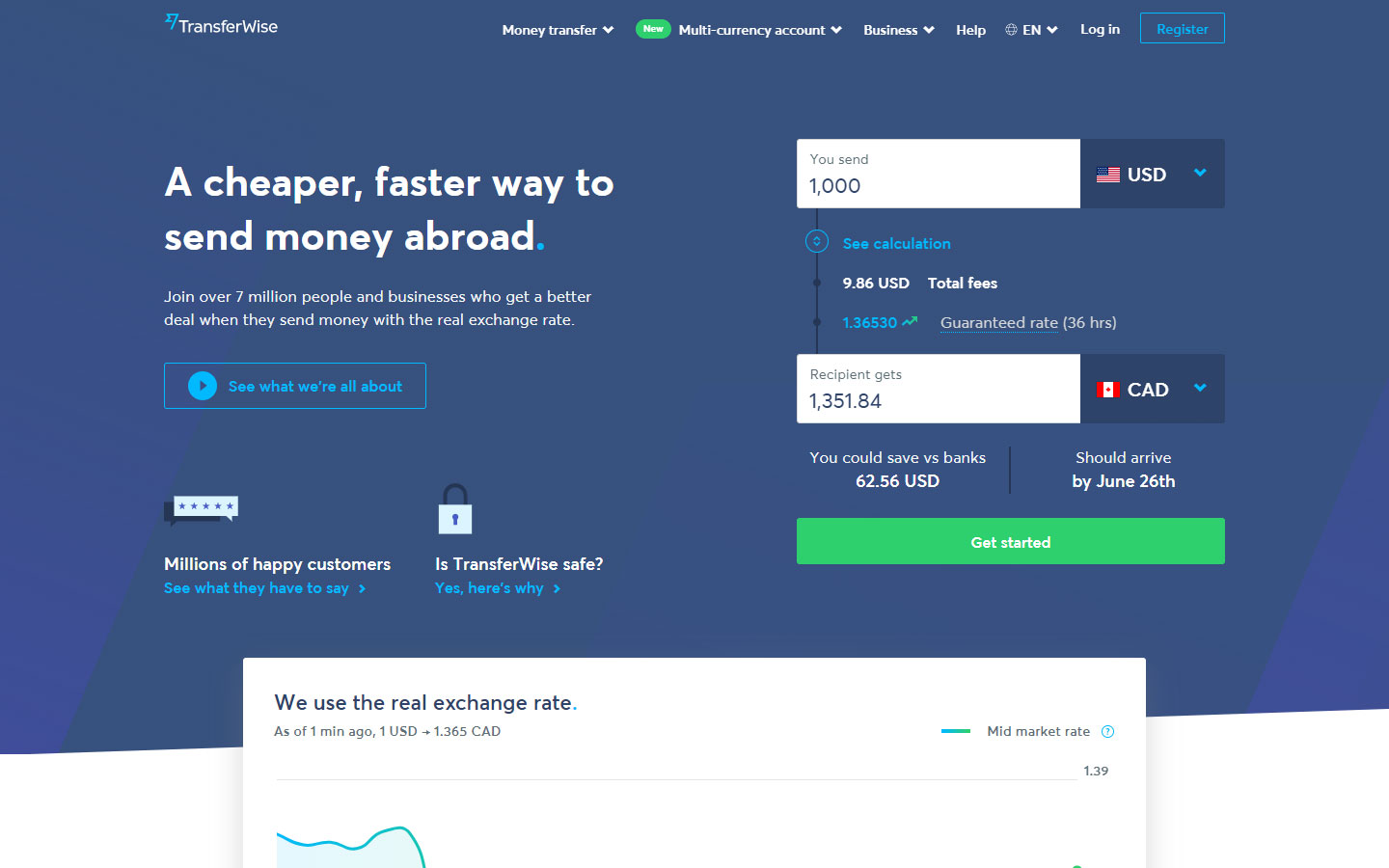
5. TransferWise
Why it works: This site instantly generates an experience of trust through straightforward and honest information, tools, and verbiage.
Financial Services Website Design
If you’re looking for help with your financial website design project, you’re in the right place.
Do you want to project a professional image for prospective customers? If so, then let us show you how we can build your Financial Services Web Design project. We promise results with no risks.
We recognize that not all financial service professionals are alike. Therefore, each of our financial services web design projects is 100% unique.
Before we start designing, we sit down and ask several questions.
- Who is your target audience?
- Do you specialize in a specific type of service?
- What part does your website play in your overall business plan?
- What kind of results do you hope to achieve with your website?
After we identify your specific needs, then we design your site at no cost to you. Every site is 100% custom made so that you won’t see another website anything like yours on the web. That includes the layout, text, or images.

We Get Results!
Our financial services web design layout changes with each of our customers. However, we strive to achieve the same results with every website we put together.
A Mobile-Friendly Website
Starting in 2017, Google plans to make their mobile rankings their primary source for all search results. In plain language, this means that if you do not perform well on mobile devices, then you will pay the penalty in rank, even with those searching on desktops.
All our financial services web designs are optimized for mobile devices. They are fast and mobile-friendly. We make sure to stay on top of all the new requirements, so you don’t have to worry about them.
Our Sites Are User-Friendly
With so much information just a click away, people don’t have patience with poorly structured websites. They want to grab their information and go. However, you don’t want them to “go.” You want them to stay and move further along towards becoming a lifelong customer.
To keep people on your site, you need to have simple, engaging content. Finding information should be quick and easy. We help you identify what your customers need most and make sure it’s easy to find. If you give the user a positive experience, then they WILL come back.
top financial websites
Credibility as a Financial Services Professional
Make a long-term investment in quality content. We show you how to establish yourself as an authority in your industry. This can be accomplished with articles and blog posts. Some of you will be comfortable writing your own material, but others may prefer to have professional help. Whatever level of support you need, we can help.
Goals for Financial Services Web Design
Most financial service customers come from three places: website traffic, direct contact, and referrals. Website traffic occurs through search engine optimization (SEO) and paid advertising.
Getting Ranked for Maximum Exposure
Both SEO and paid advertising accomplish the same thing. They put your website in front of prospective customers. They both achieve results, but paid advertising requires a greater financial investment.
SEO is less expensive and has longer staying power. To rank well with SEO, you need to make your way into the top three spots in the search engines. There are several ways to accomplish this, and that’s where our financial services web design pays dividends. We write all your website content for both your customer and the search engines.
Keywords and related phrases help search engines know what you have to offer. They look for these keywords in very specific places within the website. There are a lot of guidelines to follow, and frankly, you are in the business of financial services. Do you have time to learn all the rules?
That is what we do. We keep on top of what’s new and make sure your website has all the current requirements it needs to rank in those top spots.

Service Existing Customers as Well as New Ones
We don’t just build beautiful websites. We understand how to market them. Your financial services website should meet the needs of your clients, wherever they are in their journey.
Communication is always the key to keeping clients. We give you opt-in forms for mailing lists and newsletters. We can also set up password-protected pages for sensitive information.
Why Financial Service Professionals Choose Us as Their Web Design Company
Financial service professionals need to connect with their clients and foster relationships built on trust. Normally, you are too busy servicing clients to take time for web design. We know this, and that’s why we do what we do.
Let us take the burden of programming and web mechanics off your plate. There is no risk. Unlike other financial services web design firms, we show you exactly what your website will look like before you ever sign or pay for a thing.
That’s right. There is no hassle and no risk. What do you have to lose? To find out what’s possible, just click below and learn more about our Free Mockup Offer.