Who wants to see boring generic examples of law firm website design that all look the same? Not us!
Law firms are always looking for new ways to have more clients. And one of the best ways to do that is by having an impressive and well-designed website. But with so many legal firms out there, it can be tough to stand out. That’s why we’ve put together this list of 45 Best Law Firm Websites you’ve probably never seen before. These best law firm websites come from all over the world and showcase a variety of different design styles. So whether you’re looking for design inspiration or just want to see some cool lawyer websites, be sure to check out the list below.
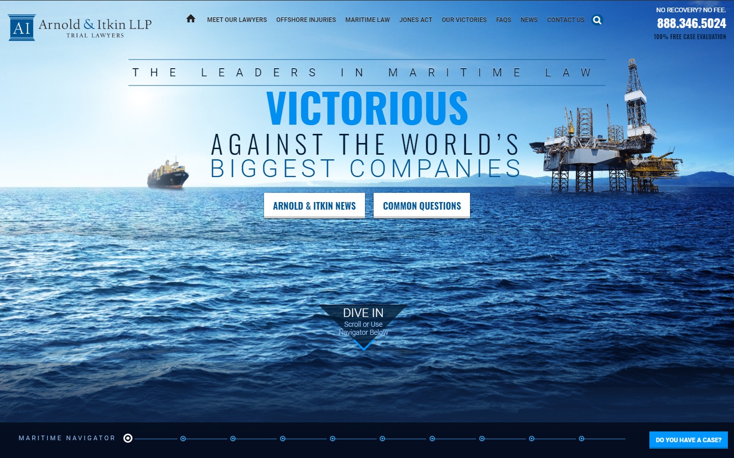
1. Arnold & Itkin LLP
Why it works: This best law firm website features outstanding graphics and animations, as well as a parallax scrolling effect that makes you feel like you’re flying through the law firm’s website.
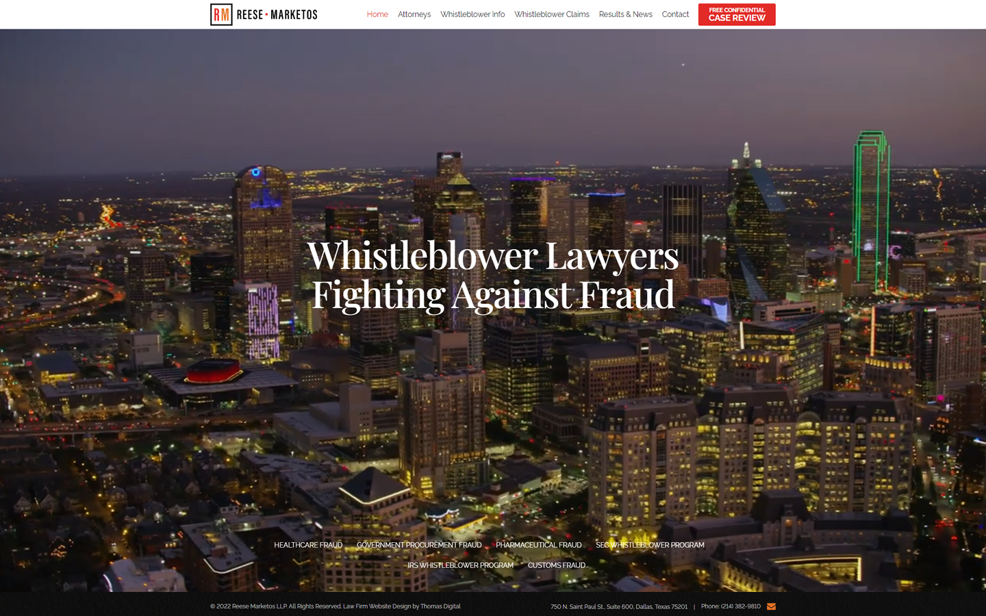
2. Reese Marketos LLP
Why it works: By adding an excellent video background to this website, this law firm can keep potential clients engaged and interested. The law firm’s website layout is well structured and information is easy to find.
3. Gecic Law
Why it works: The use of excellent videography on this site as a backdrop is an effective way to add depth and interest to this website.

Law Firm Web Design
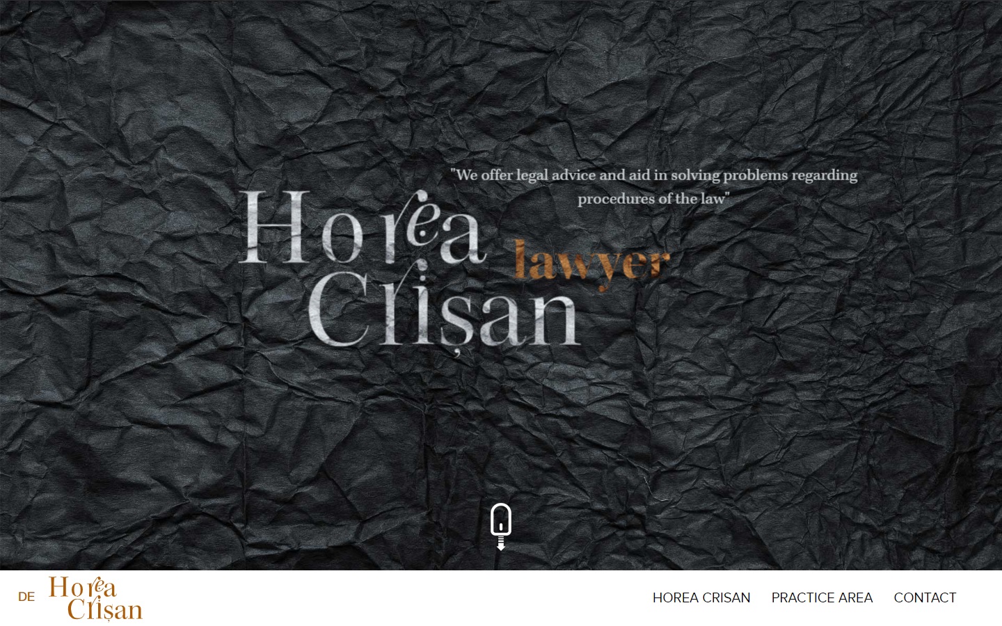
4. Horea Crisan
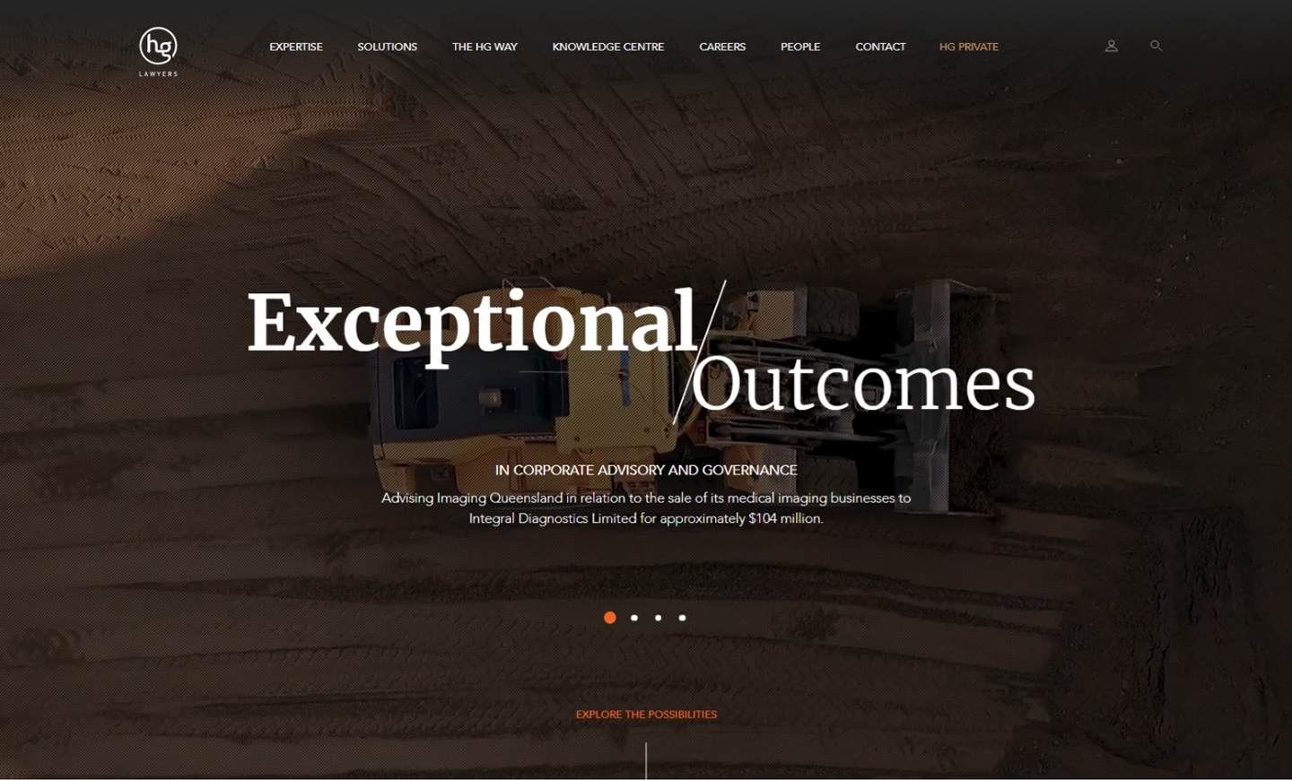
Why it works: The grunge look and the strong stylish serifs give the website a very cinematic feel catching the attention of prospective clients. Their legal practice areas such as criminal law, personal injury law, business law, and workplace law are front and center on the home page.
5. Aharoni Business Law
Why it works: The hero section has a catchy and striking tagline, friendly colors, and icons. This site also has a clear and simple contact right on the homepage making it easy for a potential client to contact a lawyer in this law firm.

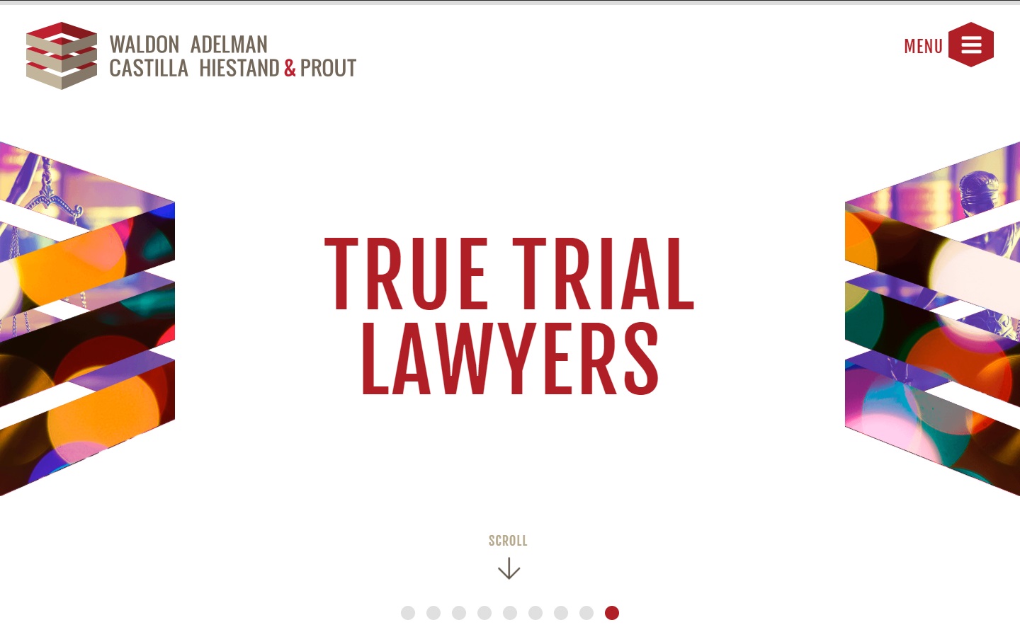
6. Waldon Adelman Castilla Hiestand and Prout
Why it works: This website design features a perfect blend of contrasting colors and minimalism. The result is an elegant, timeless, and best website.
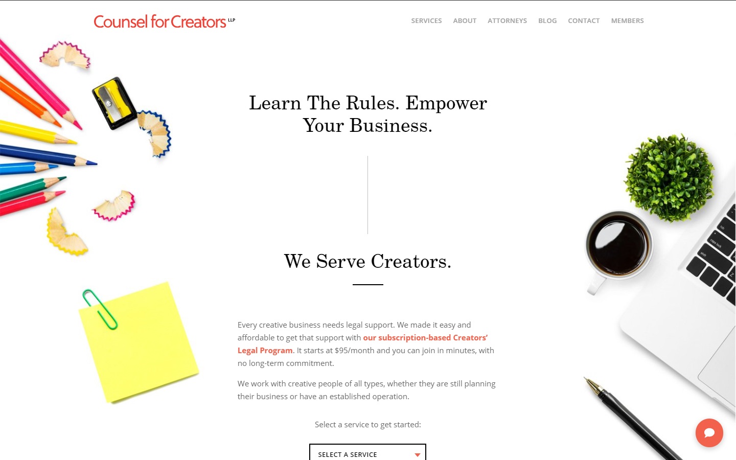
7. Counsel for Creators
Why it works: Targeted to cater to the creative industry, this site design demonstrates that it’s current with law firm industry trends. It is mobile-friendly and easy to navigate for best user experience.
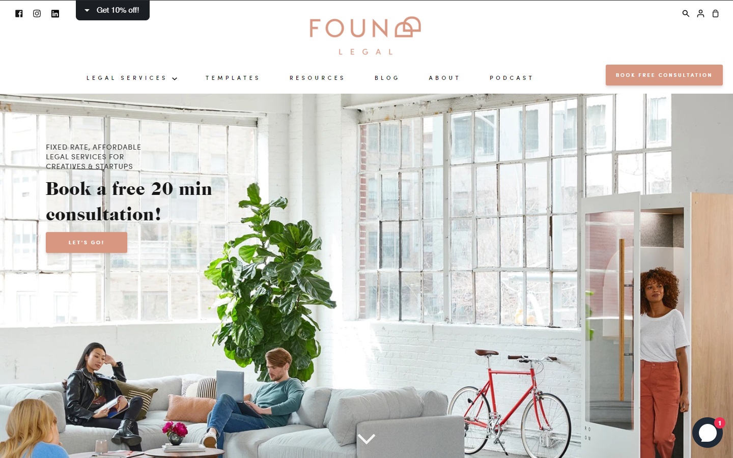
8. Foundd Legal
Why it works: This attorney website is cozy, fun, and well-ventilated with excellent whitespace. The typography is modern and the overall design of this law firm gives off a creative vibe.
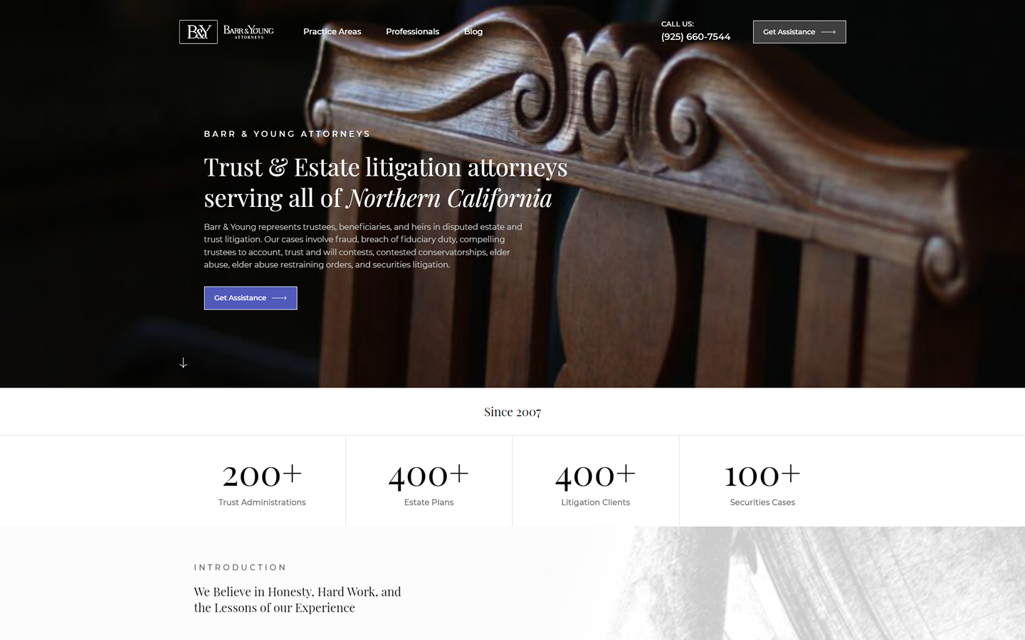
9. Barr & Young Attorneys
Why it works: The website for this law firm is well-designed and uses strong contrast between elements and elegant photos. Website visitors will appreciate the simple website, easy-to-read layout, and the use of typography.
Law Website Design
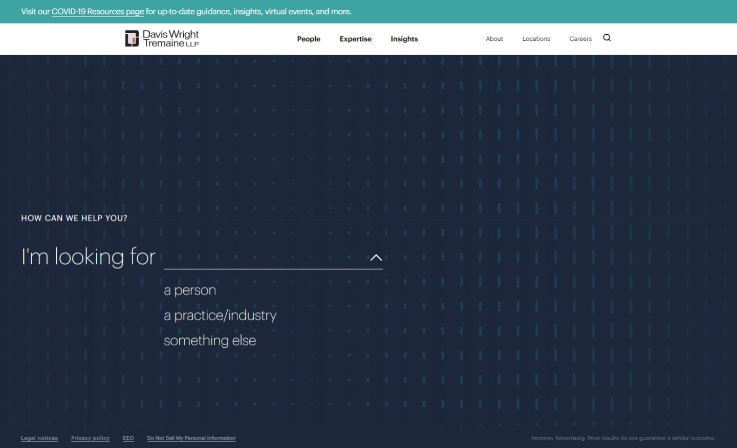
10. Davis Wright Tremaine LLP
Why it works: This website immediately gets down to business with a virtual consultation. With this great marketing approach, existing clients and website visitors would turn into happy clients.
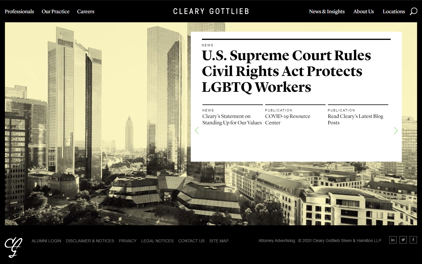
11. Cleary Gottlieb
Why it works: This law firm website uses a literary-newspaper style. The current website is easy easily accessible, and the typography makes it a pleasure to read.
12. Jaszczuk
Why it works: Jaszczuk’s law firm website features strong unique branding with tons of bright modern colors. This website will appeal to a wide range of clients who are looking for an energetic and creative law firm.

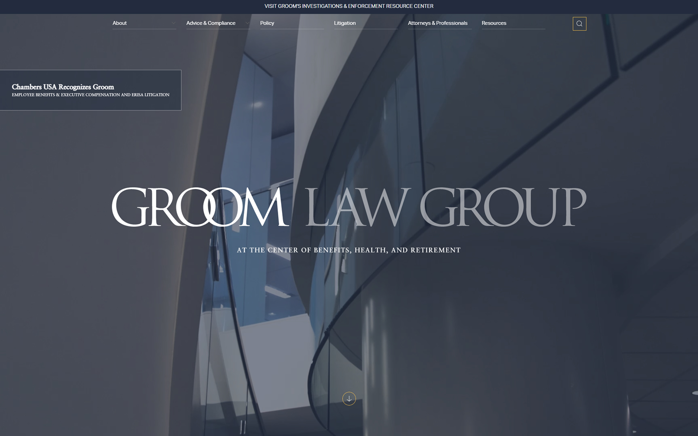
13. Groom Law Group
Why it works: The online strategy of this website is client-base, straightforward, and to the point, with a focus on providing actual-life solutions.

Best Law Websites
14. Hop Good Ganim
Why it works: A lovely combination of video hero background art with stunning images and succinct information makes this one of the best law firm websites.
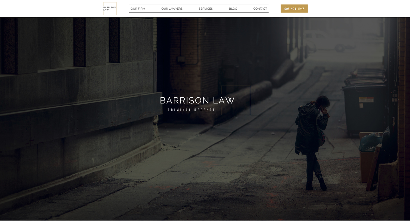
15. Barrison Law Criminal Defence
Why it works: This website’s design is simple, professional, and to the point. The alternating dark and light regions provide clean and readable content. Sharp lines and corners, geometrically balanced sections, and a structured alignment of content and subsections all contribute to the site’s overall look.
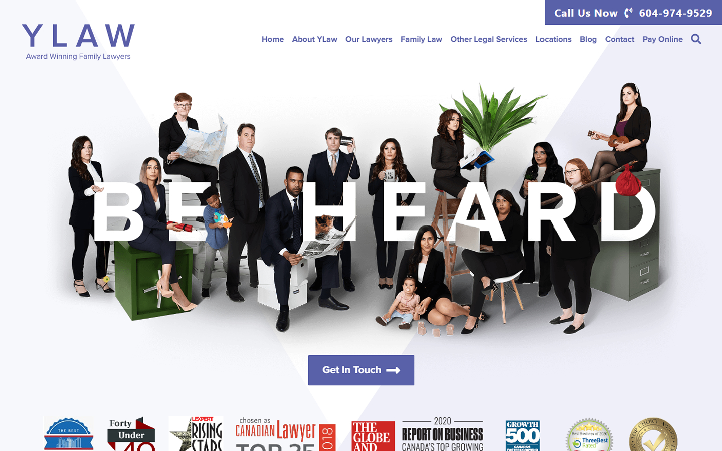
16. Ylaw Group
Why it works: The Ylaw Group uses unusual yet amusing pictures to pique more clients’ attention and build a narrative.
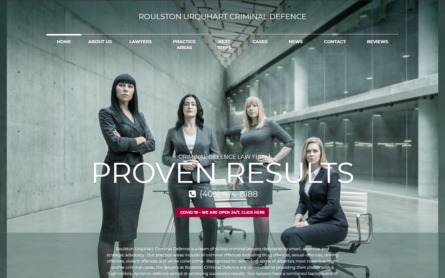
17. Roulston Urquhart Criminal Defence
Why it works: This criminal defense website has an intense cinematic/theatrical feel to it, which is sure to get clients’ attention. The design is on point with the law firm’s brand.
Best Law Websites
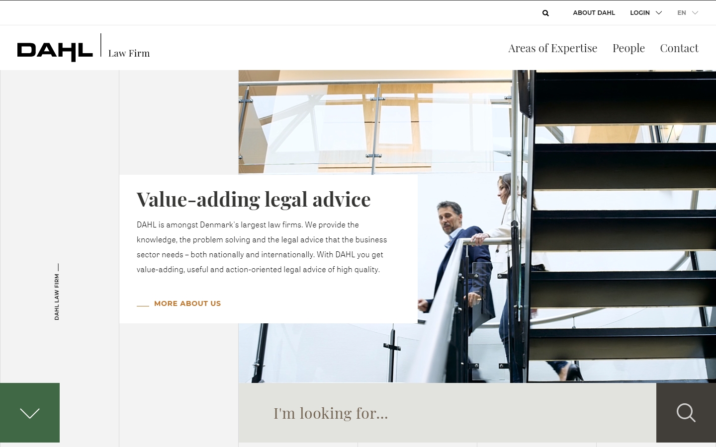
18. DAHL
Why it works: This law firm website is one-of-a-kind since it has an innovative out-of-the-box design. Their legal marketing approach is to be interactive and welcoming.
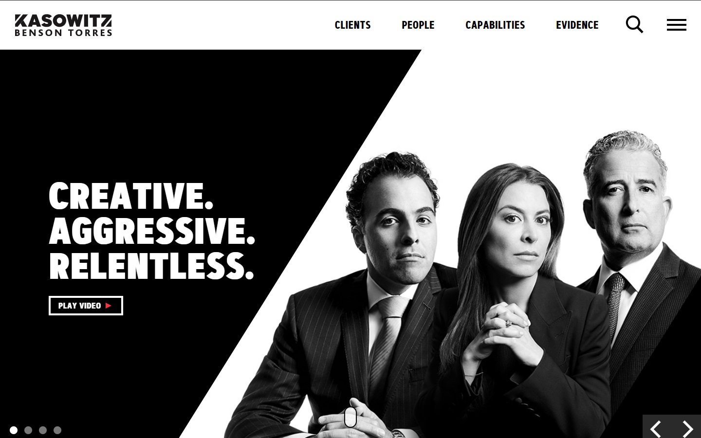
19. Kasowitz Benson Torres
Why it works: Their tagline “Creative. Aggressive. Relentless” totally matches their law firm website design. The web designer used a modern, sleek, and interesting color scheme.
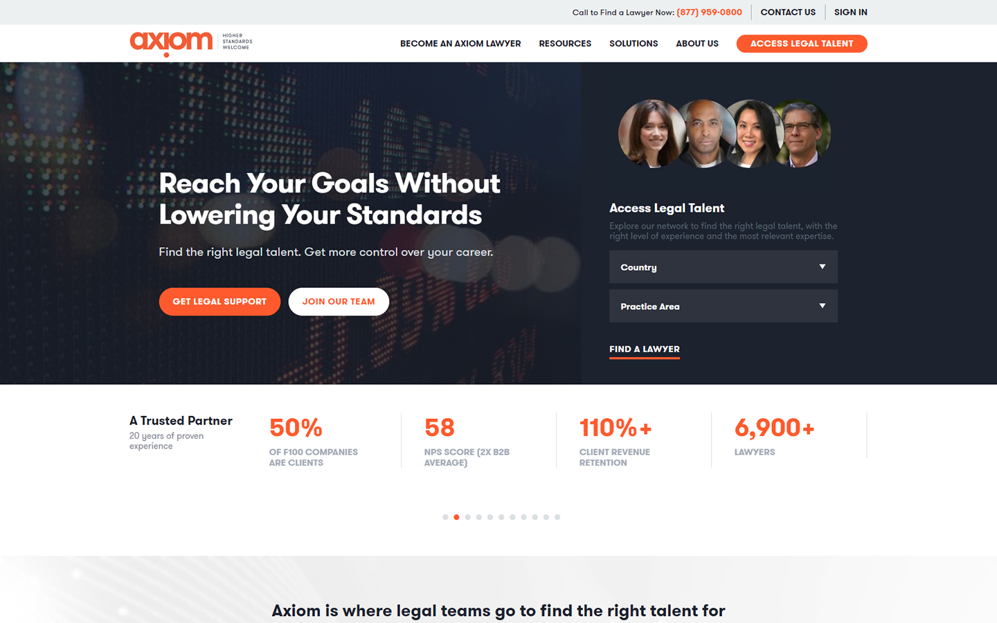
20. Axiom Law
Why it works: Axiom Law’s website is sleek, simple, and stylish. The web designer uses a great color scheme that makes the site easy on the eyes. The layout is also well done and easy to follow. Clients can easily search from their talented team of attorneys right from the hero section.
Law Website Design
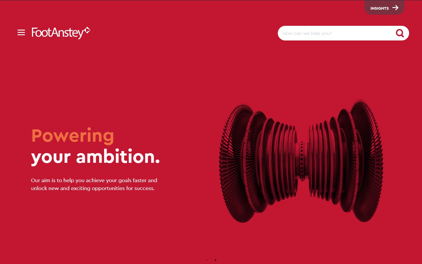
21. Foot Anstey
Why it works: A unique personality for the site is created by strong contrasting elements against a strong red color. Their services are easy to find, and the website makes a great first impression.
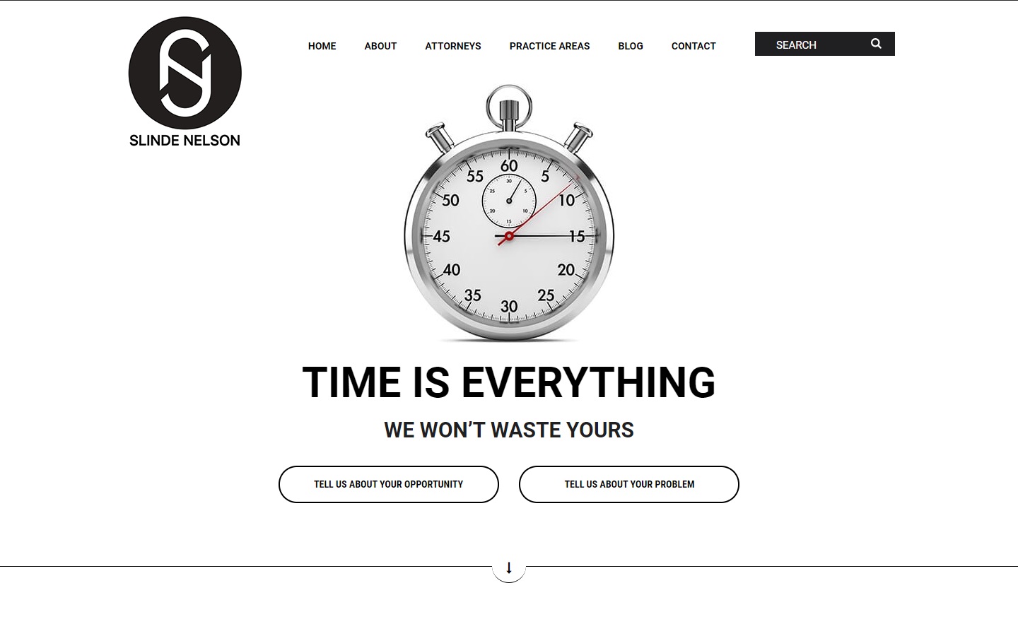
22. Slinde Nelson
Why it works: This minimalist law firm website is simple and creates a sense of urgency to resolution. The typography is modern and easy to read, with a focus on what the law firm business can do for their clients.
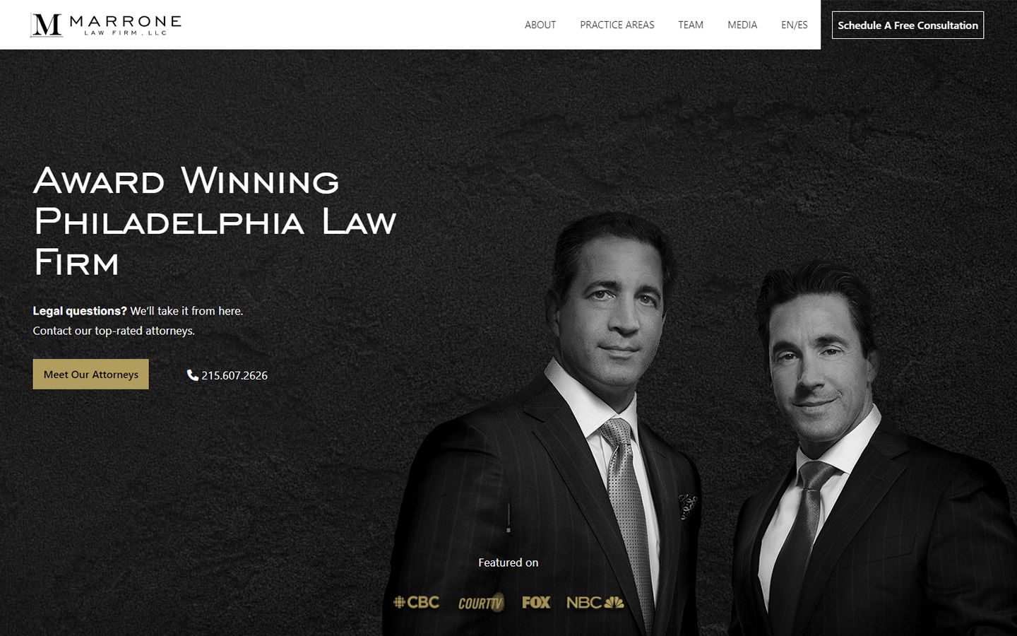
23. Marrone Law Firm LLC
Why it works: The website’s design demonstrates a significant amount of effort to offer information that no other law firms’ site does. The website is easily accessible, making it a great resource for clients who need legal assistance.
Website Design for Law Firms
24. Oyen Wiggs
Why it works: A great legal marketing strategy for this website is the use of a generous amount of good graphics and moving pictures. The website is also accessible on mobile devices.

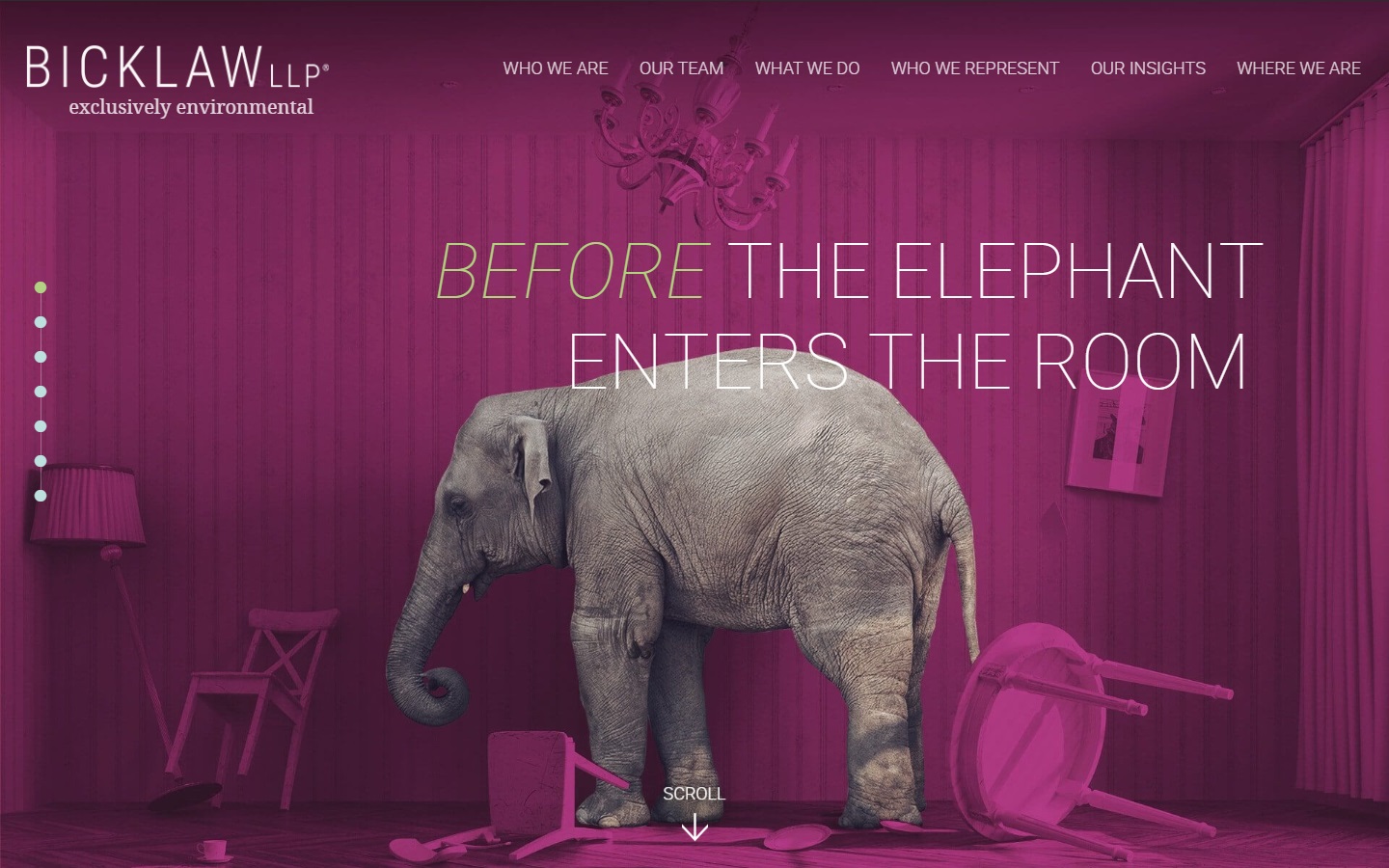
25. Bicklaw LLP
Why it works: It’s a good idea to place the animals at the center of attention, which is where this small law firm services specialize. They also use creative typography to their business marketing advantage.
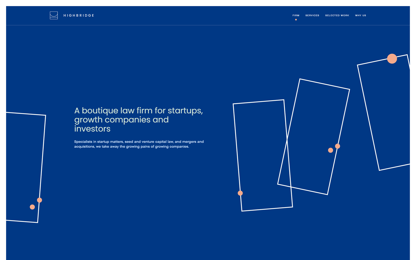
26. Highbridge
Why it works: This is one of the best law firm websites because of its outstanding use of visuals and smooth animations. They also use creative scrolling animations to show their business experience and law practice expertise.
Law Firm Web Designs
27. Orent Law Offices
Why it works: Orent Law Offices uses a dark-themed user interface. The badge certainly gives the law firm site some weight in marketing their business firm.

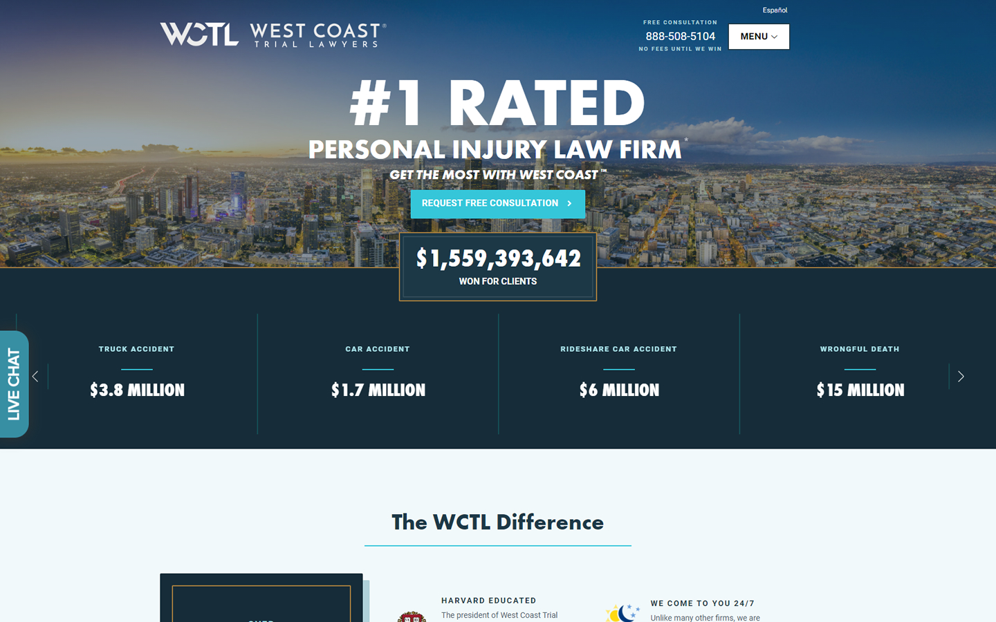
28. West Coast Trial Lawyers
Why it works: This law firm’s website shows both stability and trustworthiness. They use an innovative and interactive approach to law firm web design, which makes them stand out among the other best law firm websites.
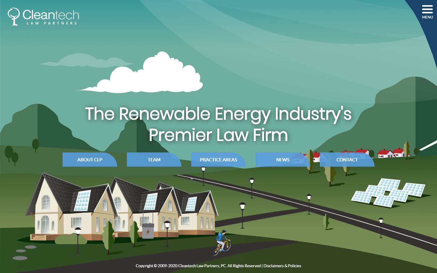
29. Cleantech Law Partners
Why it works: Simple but effective rendition of a modern tech feels on a law firm website. The good-looking graphics, elements and navigation pull-out stands out very well from the other law firm websites.
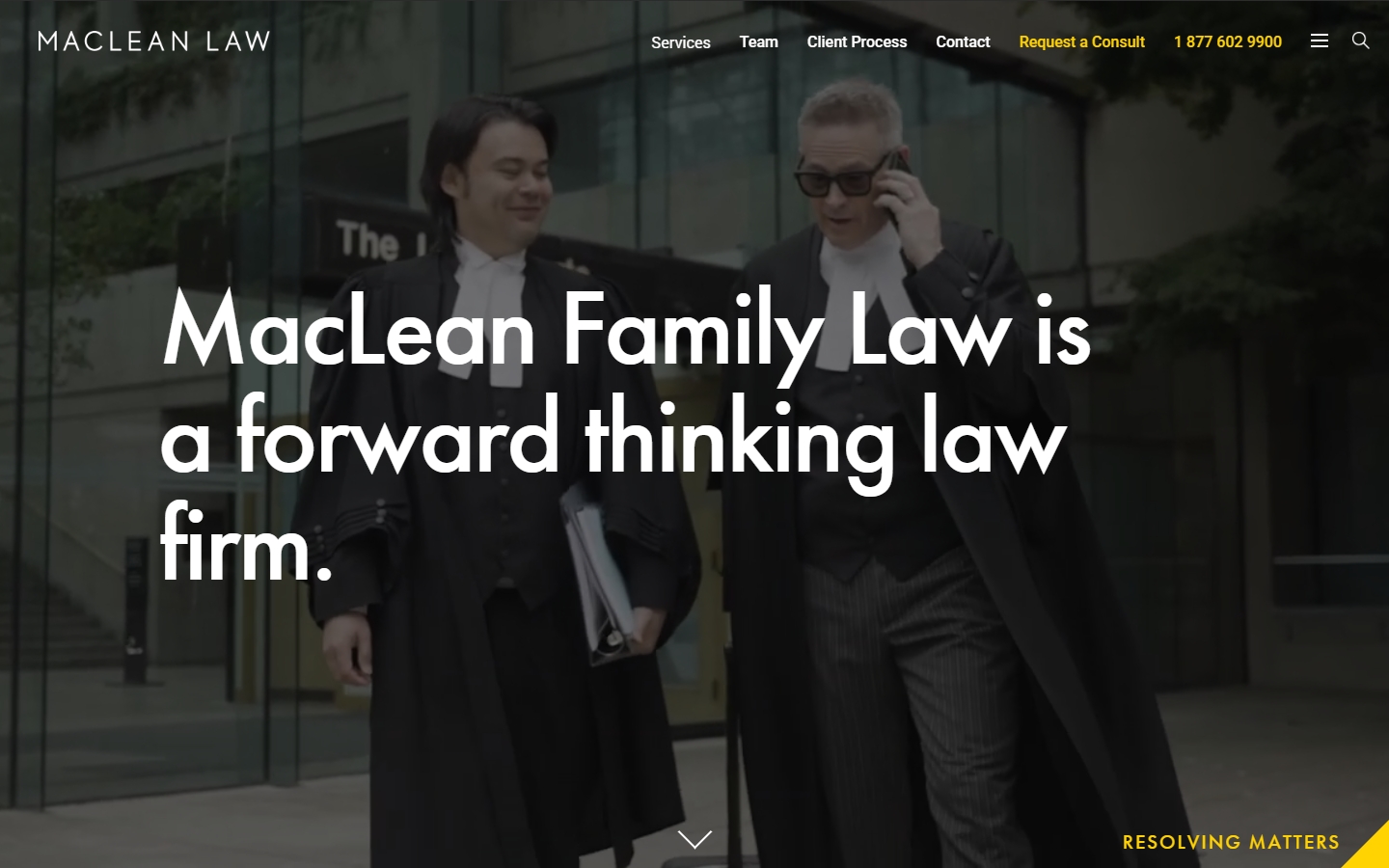
30. MacLean Law
Why it works: The website features a large in-your-face statement of what the firm does, as well as an intriguing hero video. The website makes use of a great color scheme and typography.
Best Law Website
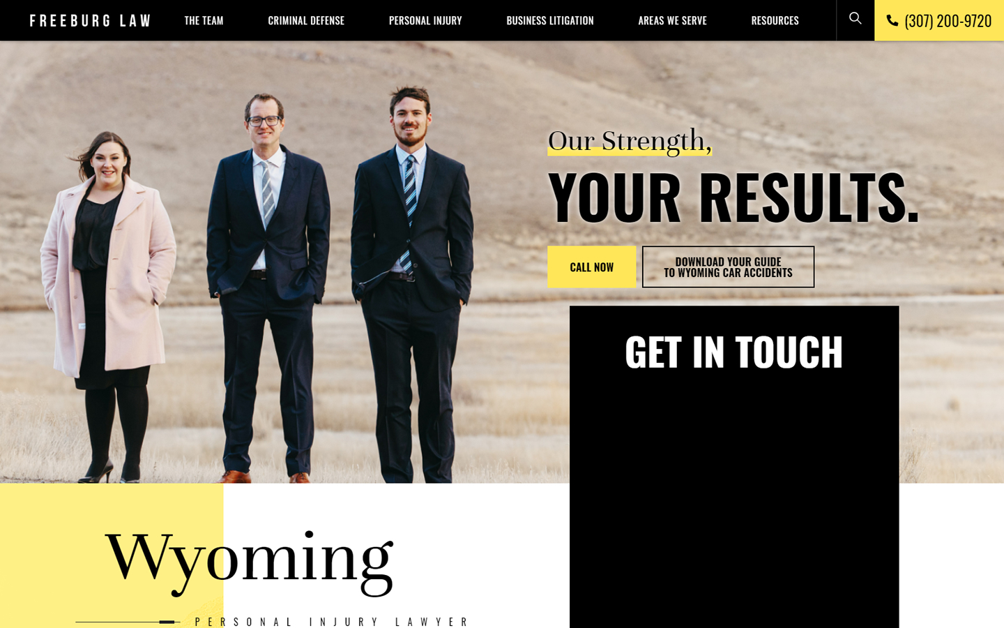
31. Freeburg Law
Why it works: The law firm site’s style was very personal and simple to use. They use a great color scheme and make excellent use of visuals for marketing the services of their attorneys.
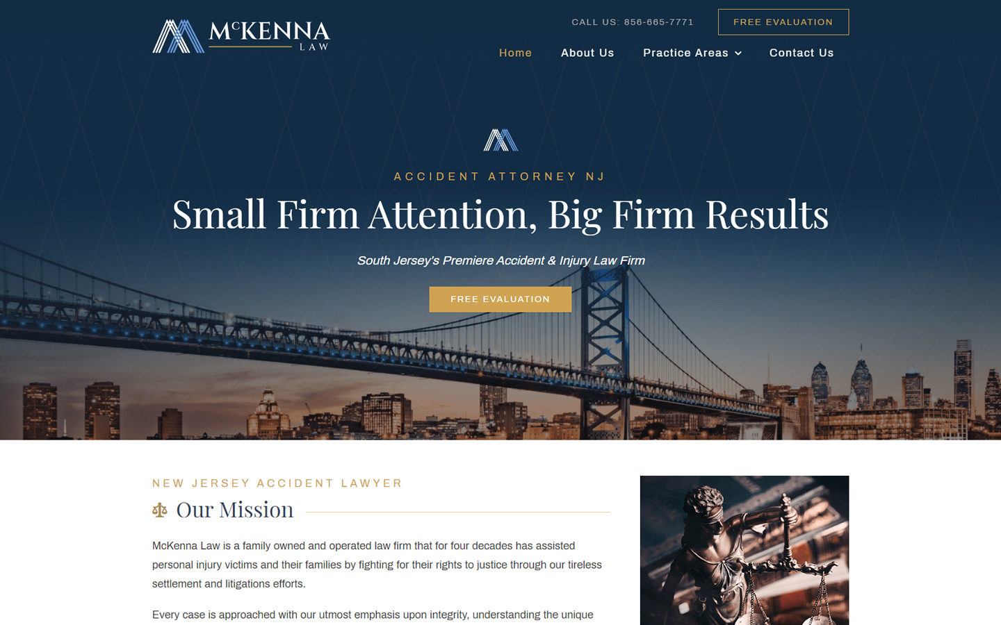
32. McKenna Law
Why it works: The website of this personal injury lawyer has a gold-accented design that is professional and regal. Their first page makes a great impression with a list of the law firm’s achievements.
33. Turks Legal
Why it works: We love the strong black-and-white imagery used throughout this law firm website. The website gives instant access to detailed information about their legal services and law practices.

Best Law Firm Websites
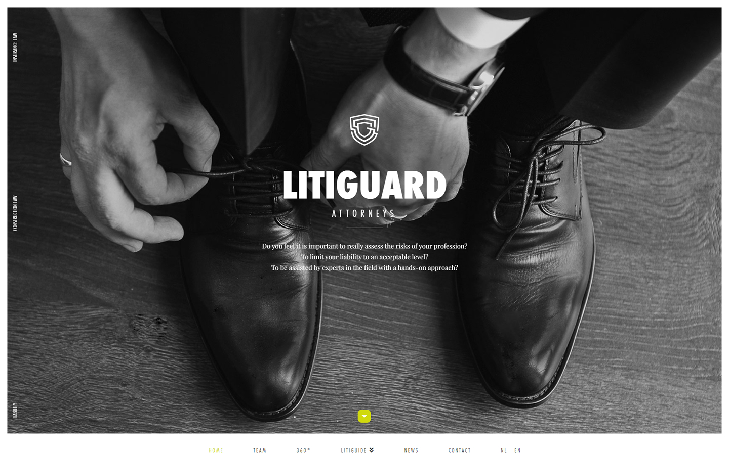
34. Litiguard Attorneys
Why it works: This website design is not overselling, not overly embellished, but still attractive. This law firm that specializes in estate planning, estate litigation and trust litigation managed to be professional and modern at the same time.
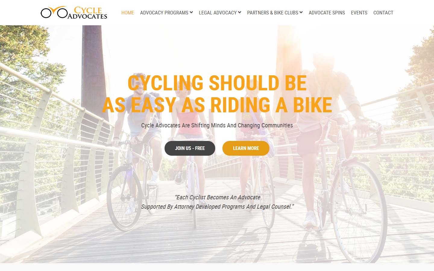
35. Cycle Advocates
Why it works: The law firm site’s easy-to-navigate layout is also enhanced by a visually appealing and intuitive infographic on the ‘Advocacy Cycle’ section, as well as the effective use of simple graphics that complement their professional branding.
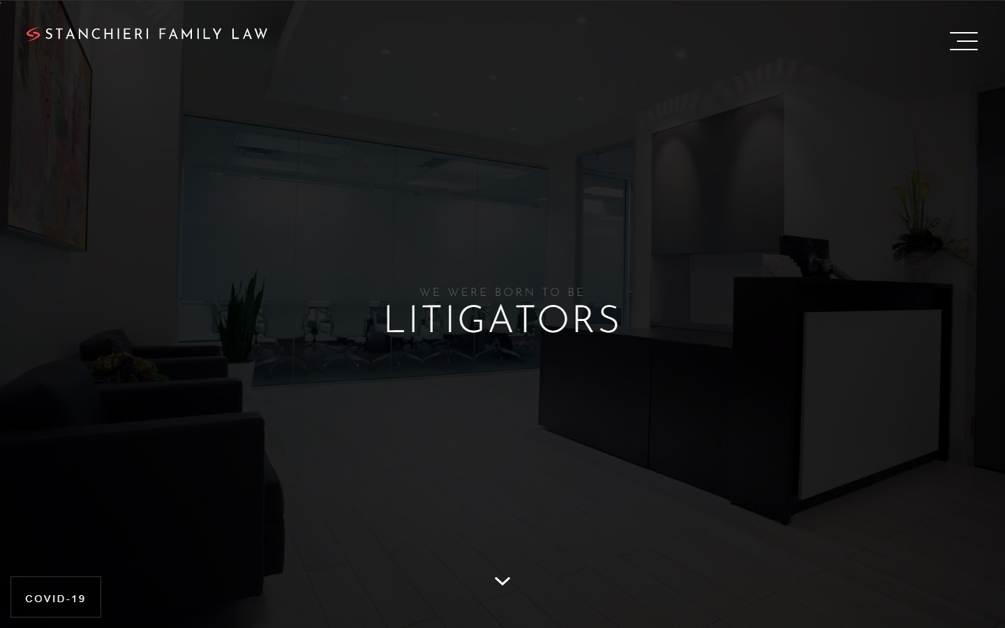
36. Stanchieri Family Law
Why it works: The website of this family law firm is dark, minimal yet very impactful. The clients are the focus and they make good use of strong visuals to show their dedication to family law.
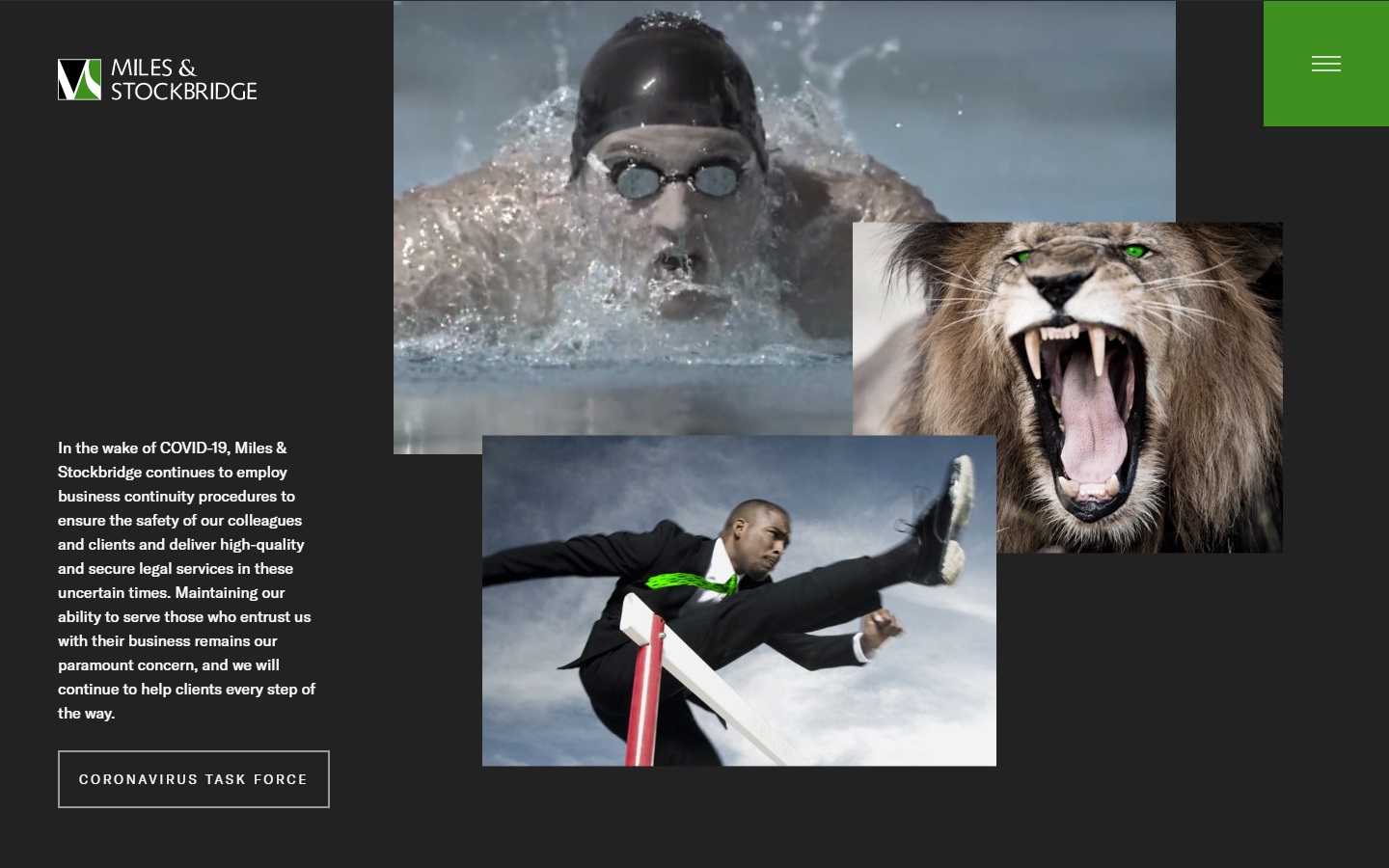
37. Miles & Stockbridge
Why it works: The design felt ‘free’ of constraints, and very straightforward while staying informative enough for website visitors and new clients.
Best Law Firm Website Design
38. Staver
Why it works: This personal injury law firm uses a clean and modern design. The web designer used a great color scheme and the overall look is professional and easy to navigate. Potential clients can use the search bar to find the practice area or educational resources that they need.

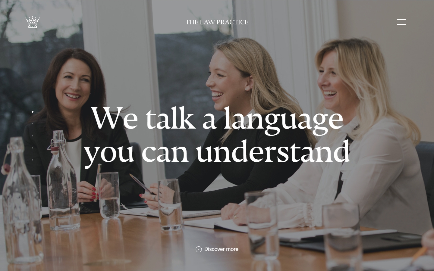
39. The Law Practice
Why it works: The website exudes a warm and welcoming space for legal issues. They use an innovative and interactive approach to web design, which makes them stand out among the other best lawyer websites out there.
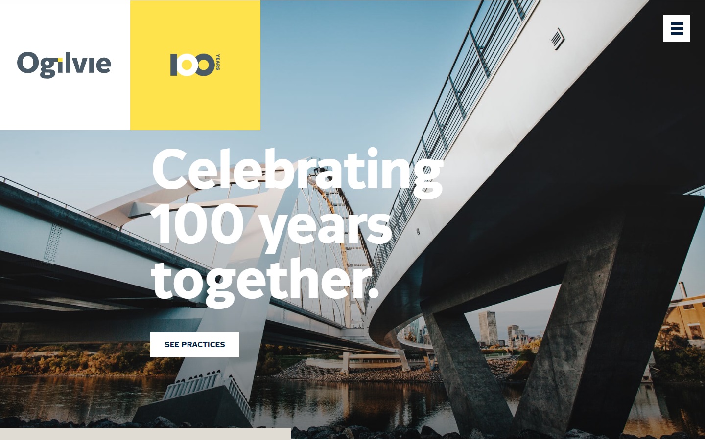
40. Ogilvie Law
Why it works: The law firm site’s strong personality is established by the large, audacious designs and images. They also use creative typography to their business marketing advantage.
Law Firm Web Designs
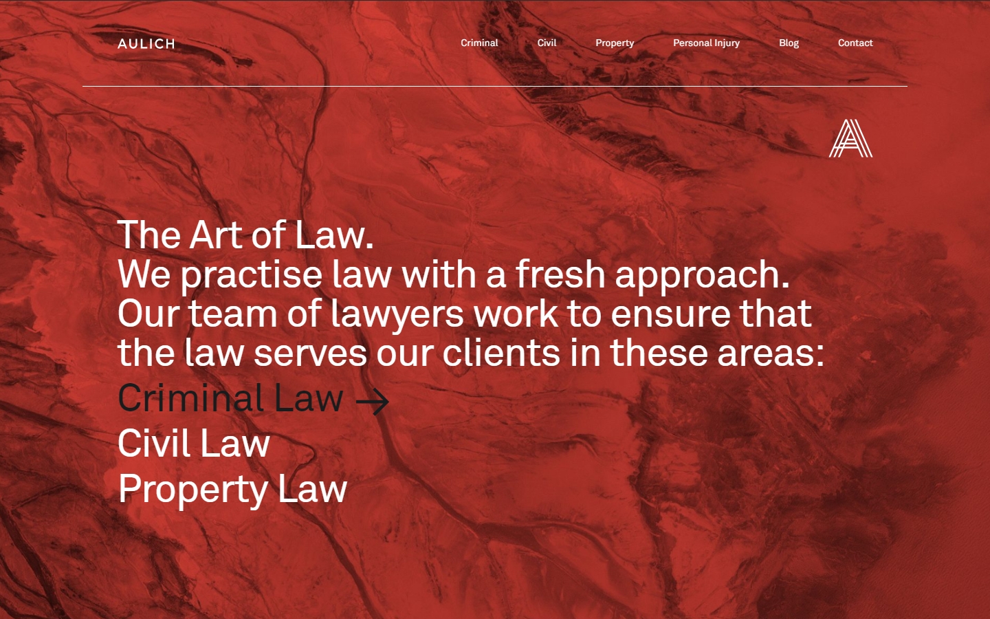
41. Aulich
Why it works: Aulich’s site has an interesting design with vivid colors for every practice area. Their marketing strategy is driving traffic to their website.
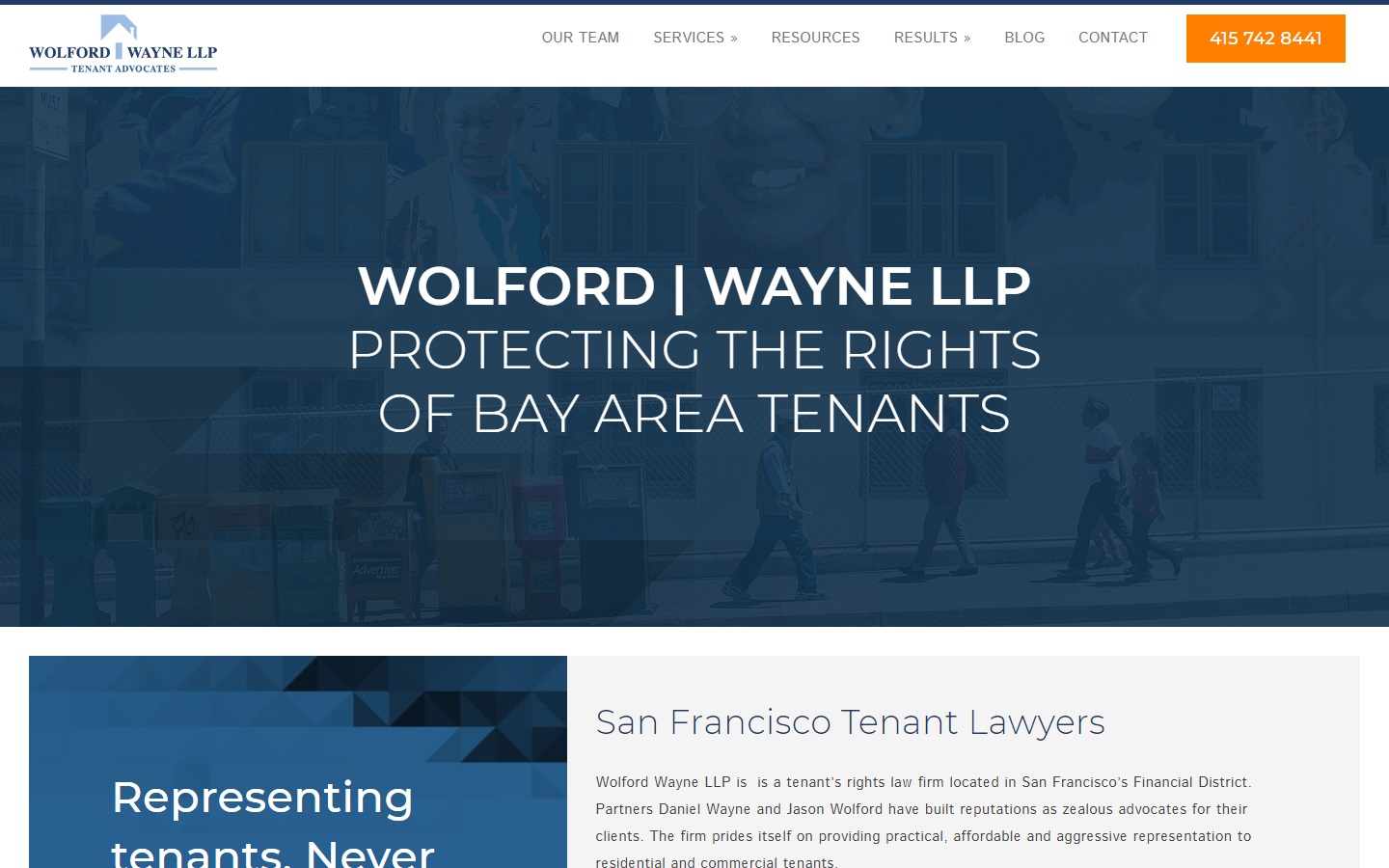
42. Wolford Wayne
Why it works: Very clear and readable texts with easy-to-find CTAs. Good use of sidebar in inner pages for easy navigation. Their website is easy to use on any device.
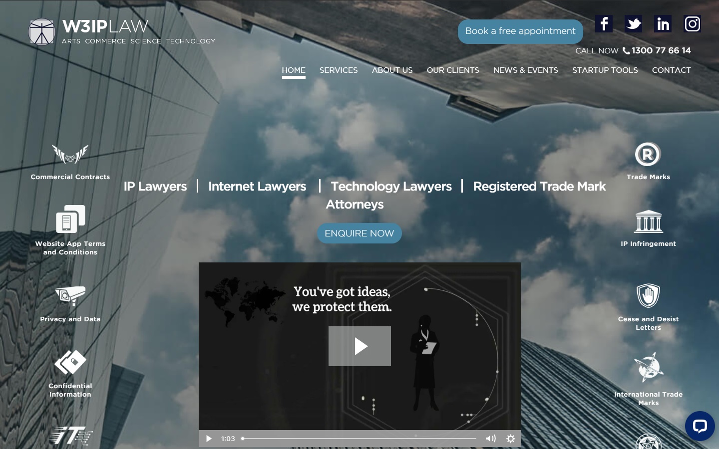
43. W3IP Law
Why it works: W3IP Law has an unusual above-the-fold layout that matches the practice areas they cater to. The website is easy to navigate, with good use of graphics and fonts.
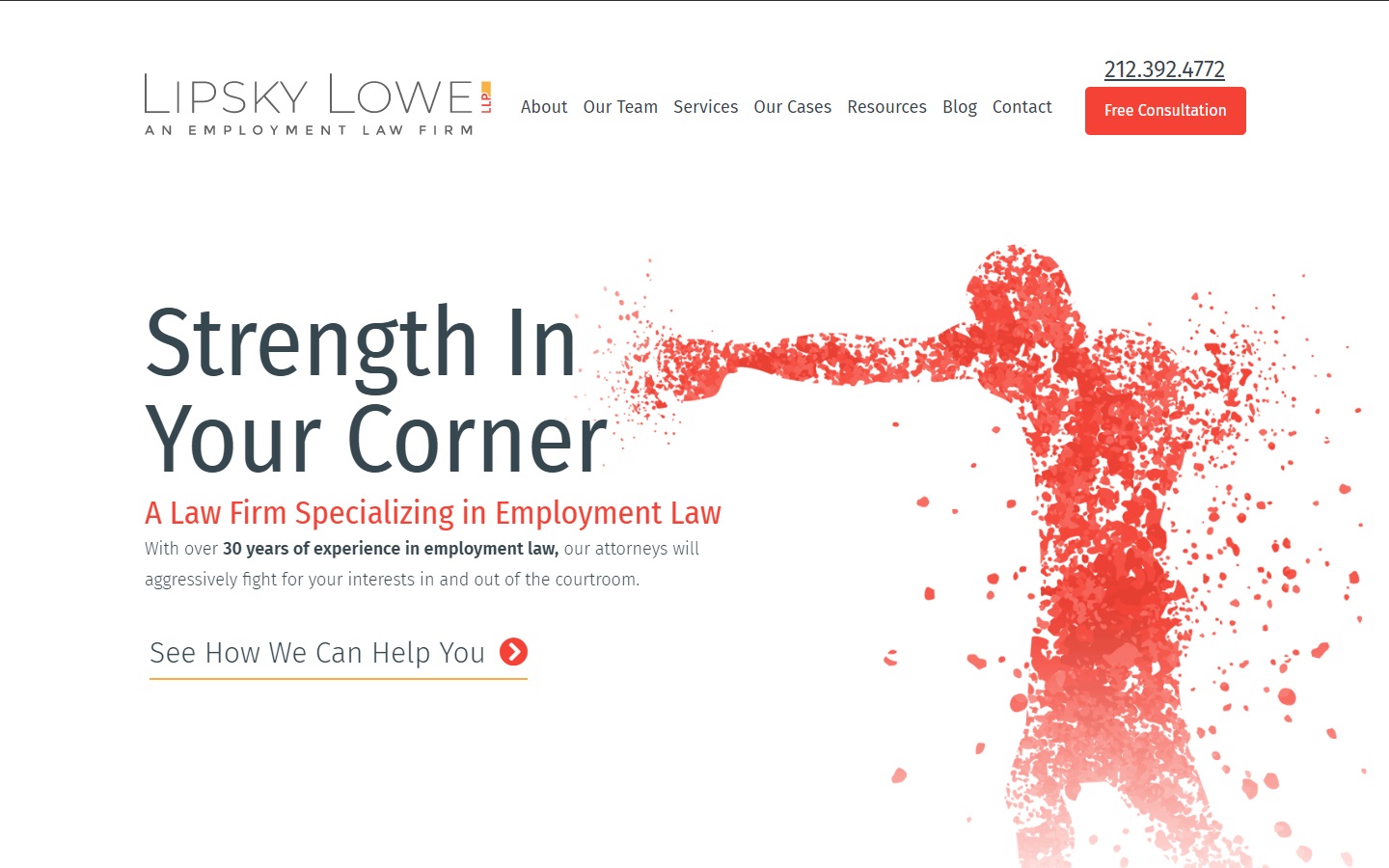
44. Lipsky Lowe
Why it works: The law firm website’s layout is clean and information is easy to read. They make good use of an interactive map to help clients find the right office location.
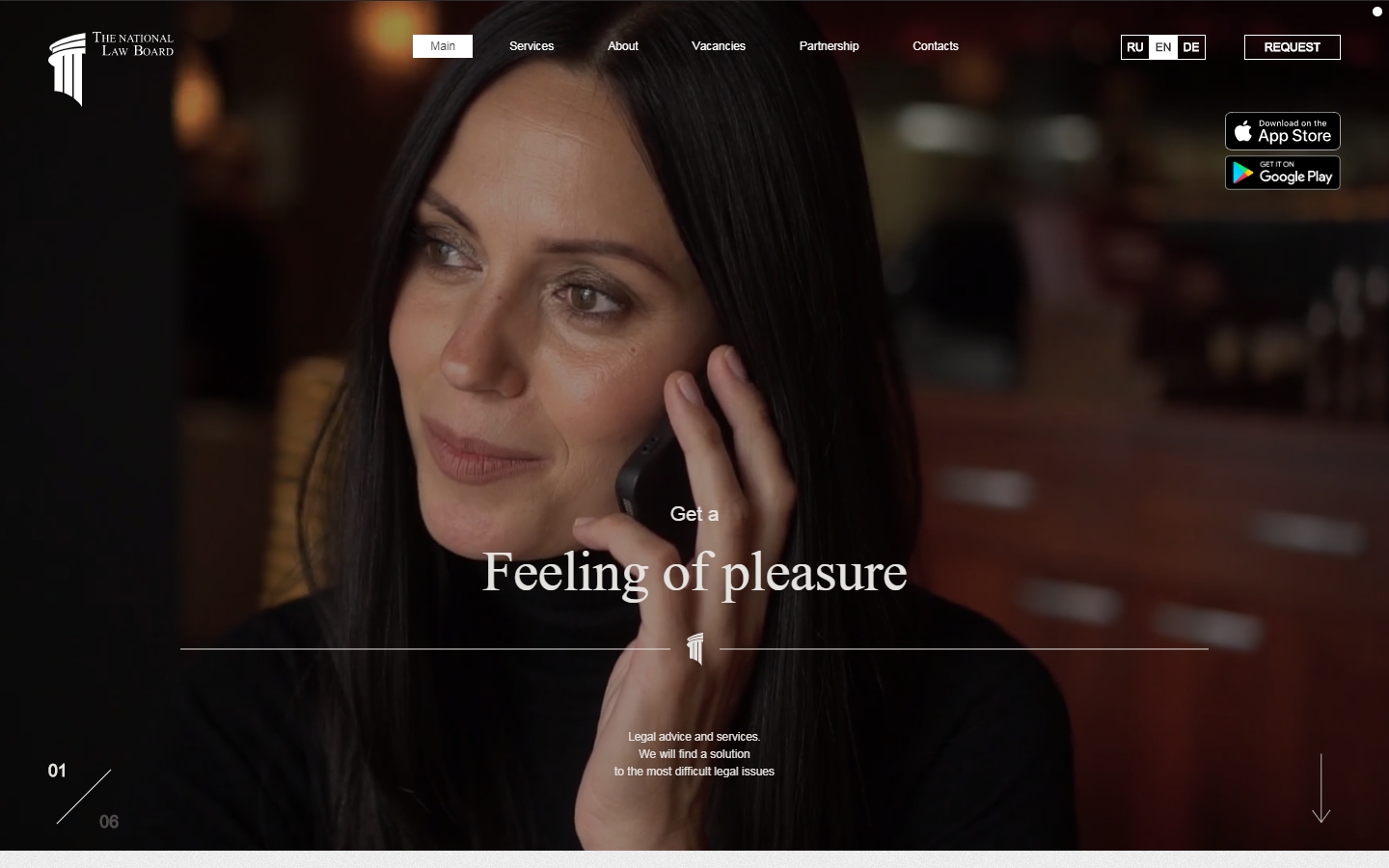
45. The National Law Board
Why it works: The National Law Board’s site is minimalistic with more focus on geometry and typography. The website makes use of an interesting selection of fonts.
Conclusion
Hey, before you go! Looks like you’re here looking at examples of eye catching law firm website designs.
Well, guess what? We LOVE working with Law Firms and have helped many firms with their old and new website projects.
If you are a lawyer who needs help with your Law Firm Website, please don’t hesitate to get in touch. We have a team of experienced law firm web designers who would love to help!
Check out these examples.