Are you looking for a comprehensive guide to SaaS web design? You’re in the right place!
In this article, we review some of the best SaaS website designs on the web today. Then we share the latest trends in SaaS web design along with vivid design examples. And lastly, we share our take on the best practices of a SaaS website design. So let’s get into it!
Table of Contents
SaaS Website Design Inspiration
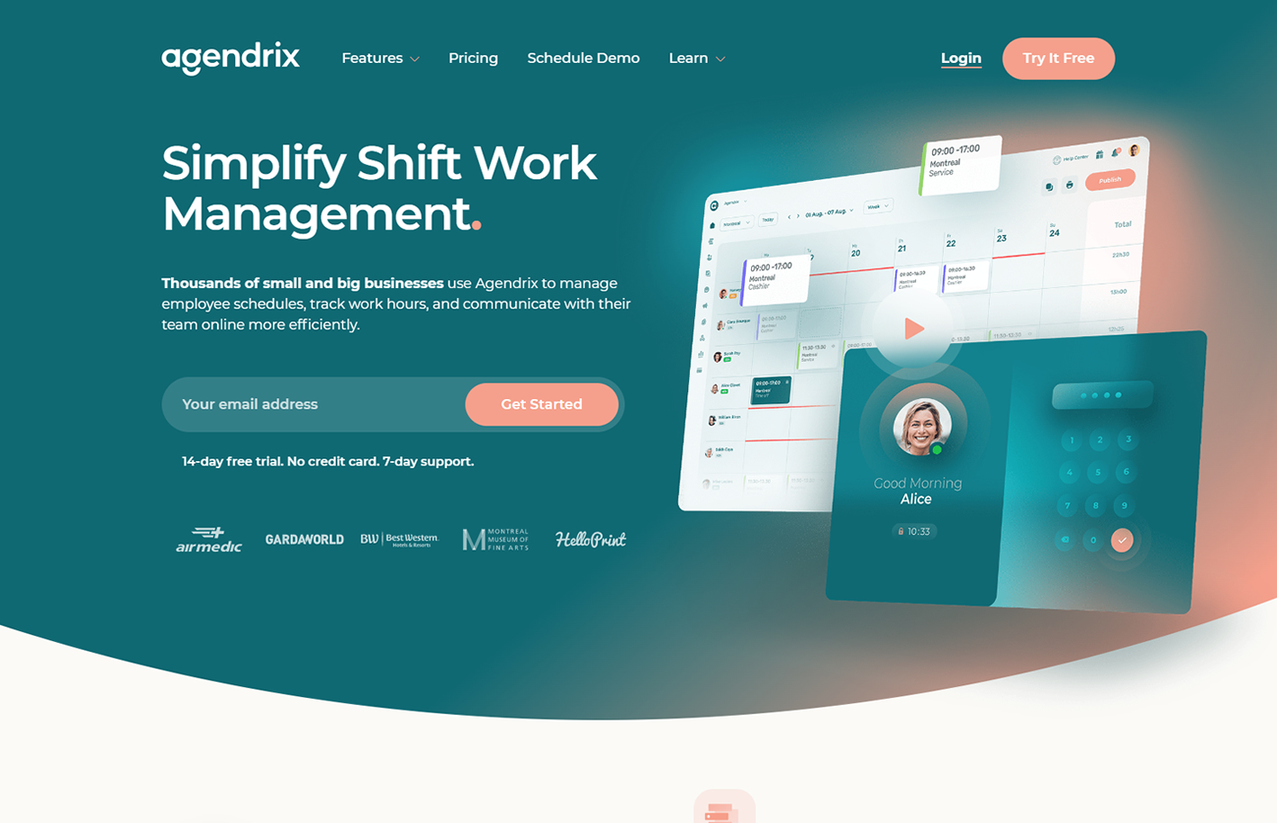
1. Agendrix
Design Highlights: The color palette is easy on the eyes, the typography is beautiful, and the call to action is simple and visible. The subtle graphical elements and effective use of white space add to the appeal.
saas websites
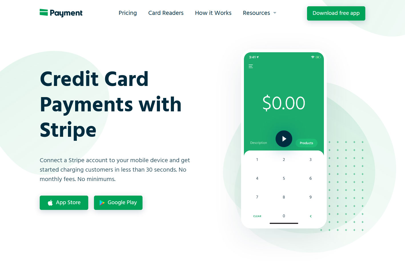
2. Payment for Stripe
Design Highlights: Easy on the eyes, bright color palette, bold typography, simple and visible call to action, subtle graphical elements, and effective use of white space.
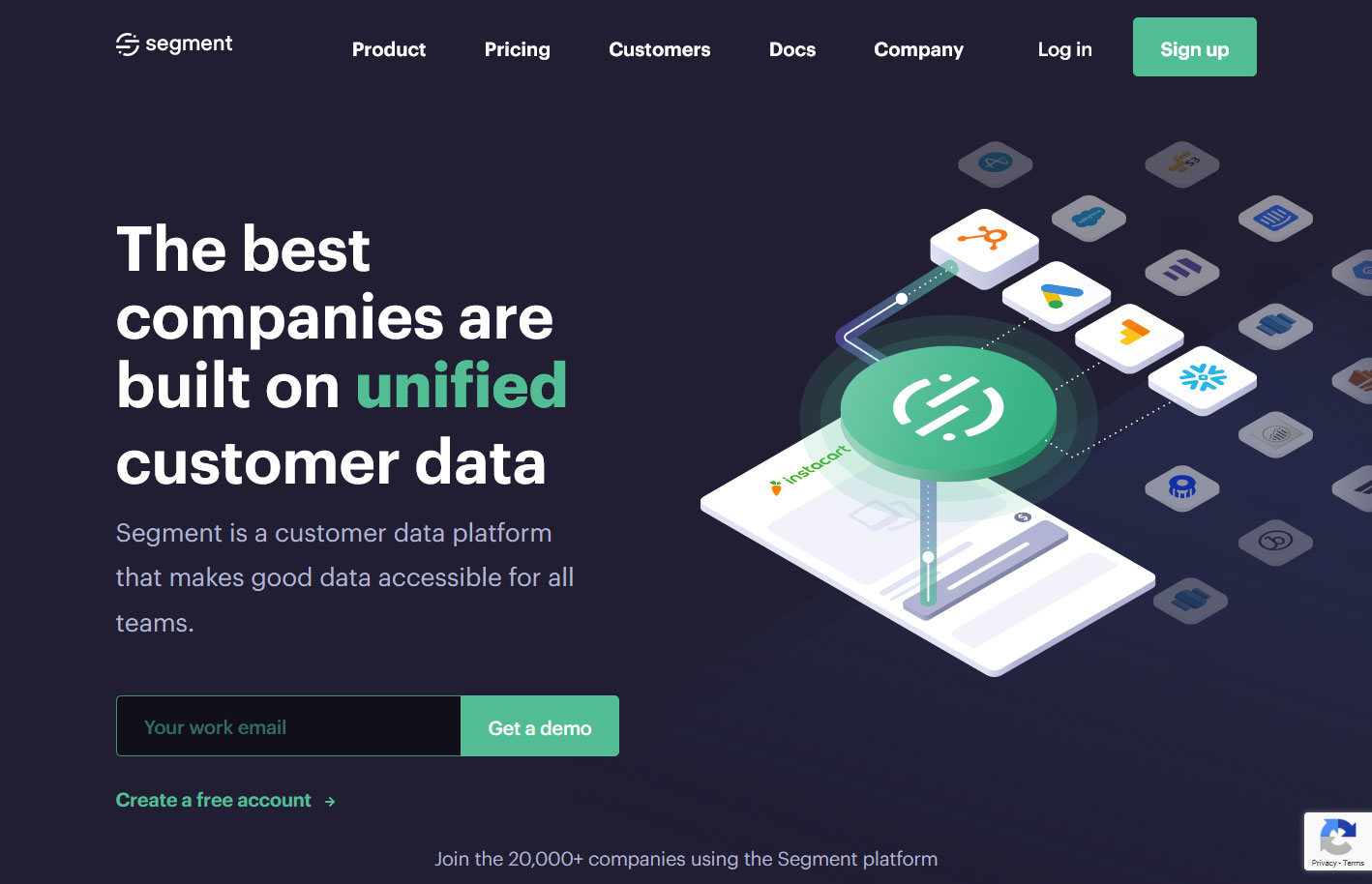
3. Segment
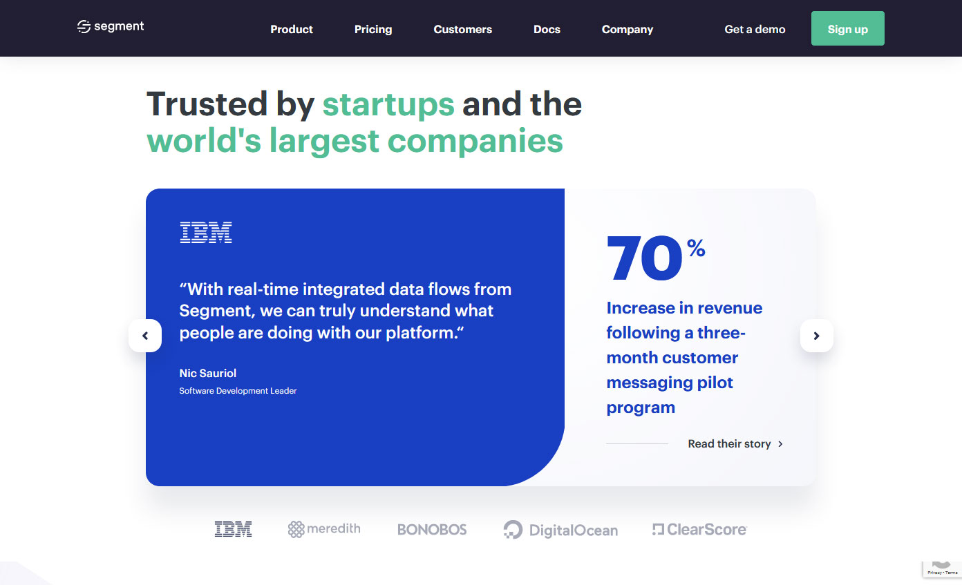
Design Highlights: Beautiful color contrast, navigation is always visible, bold and large headings – readable fonts, multiple font sizes and colors per block, presence of social proof.
4. ManyChat
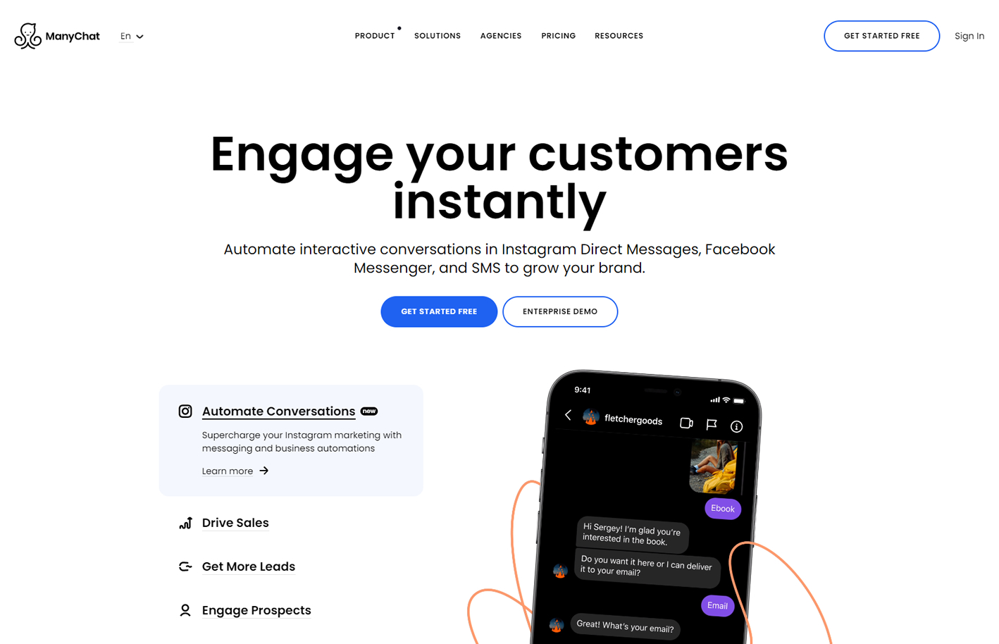
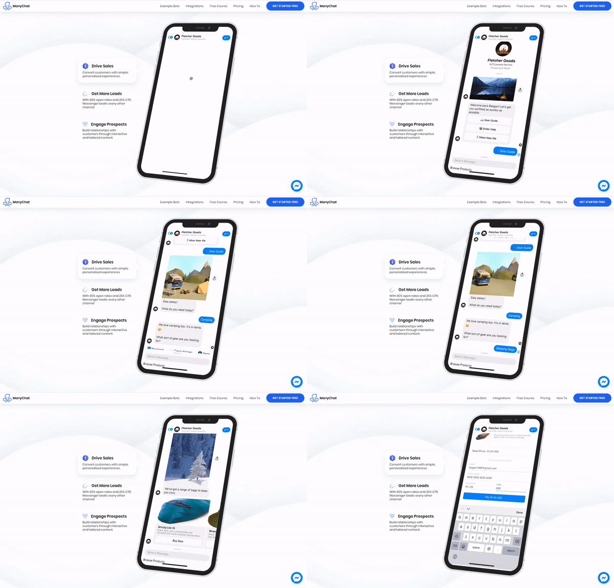
Design Highlights: Animated images / graphics, presence of social proof, navigation is always visible, nice color contrast, alternating text and image blocks.
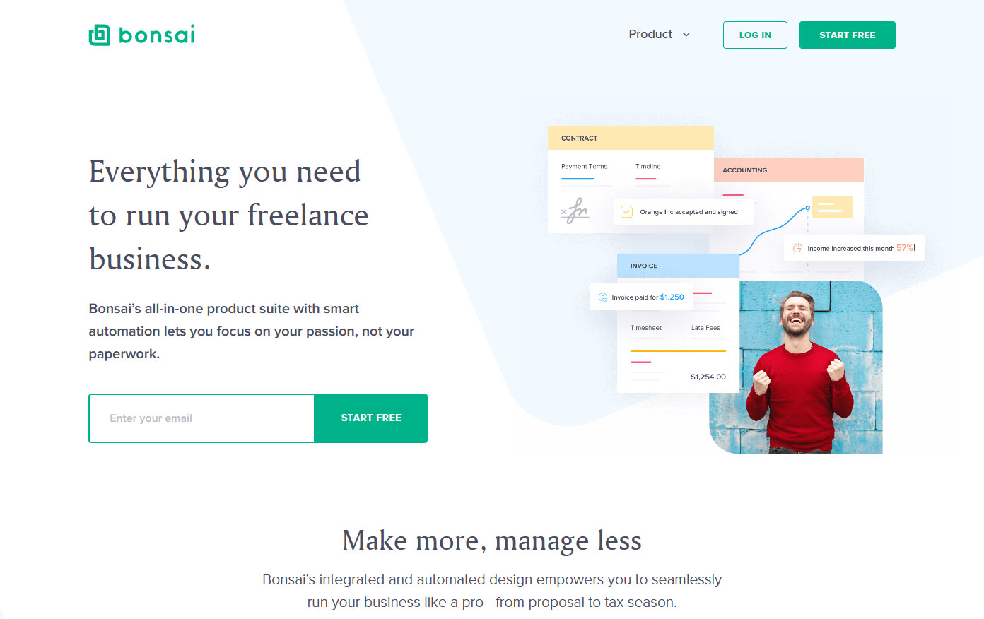
5. Bonsai
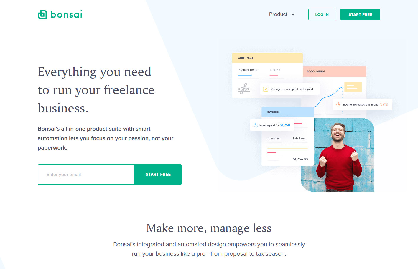
Design Highlights: All white background with pastel colored shapes that add flavor, icons that have a matching color scheme, and a simplified signup process.
saas company website
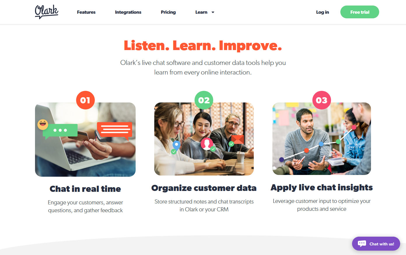
6. Olark
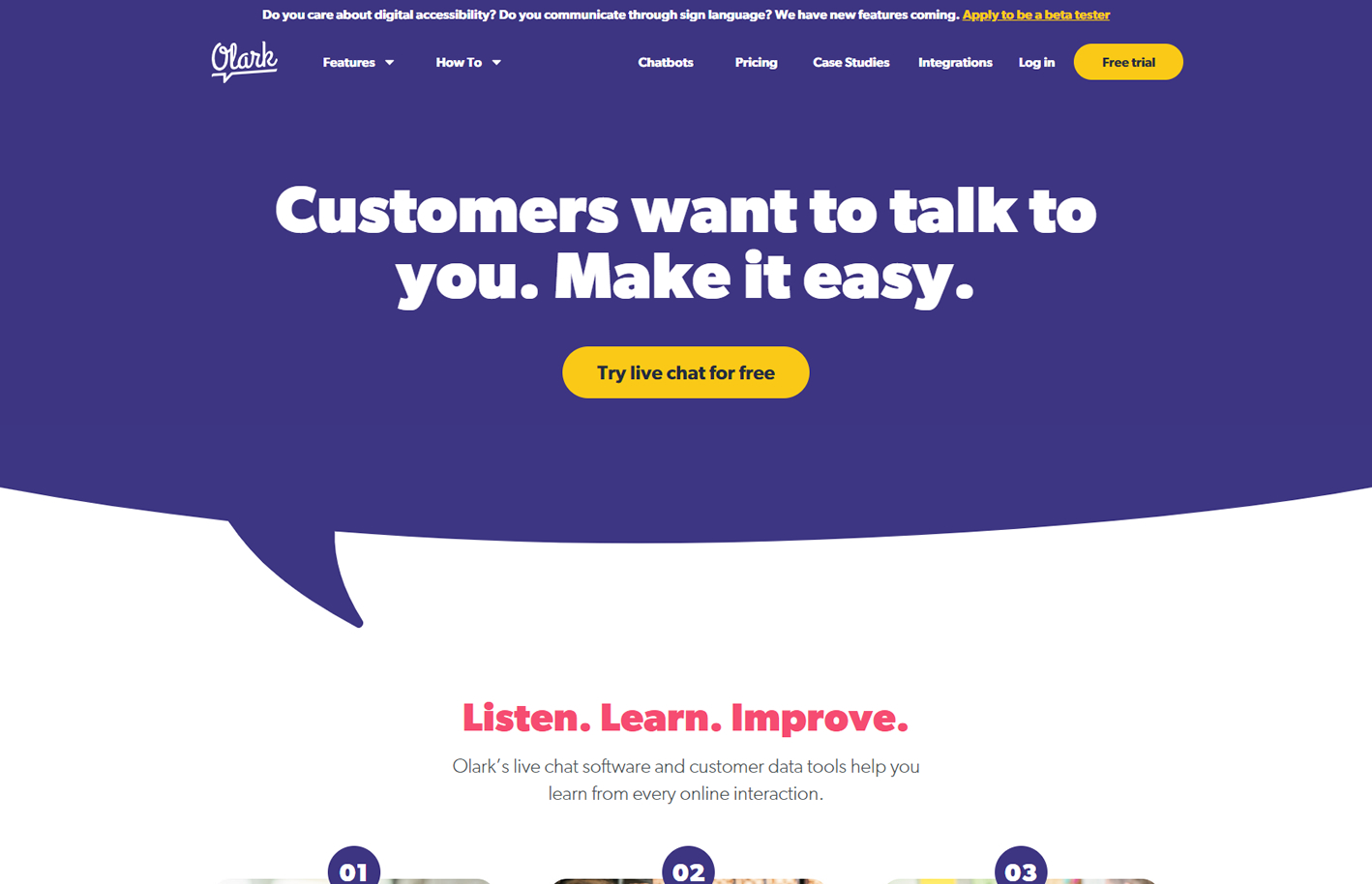
Design Highlights: Big and bold value proposition, has a friendly vibe because of the colors and rounded shapes, offers a free trial, and uses/shows images of the actual team.
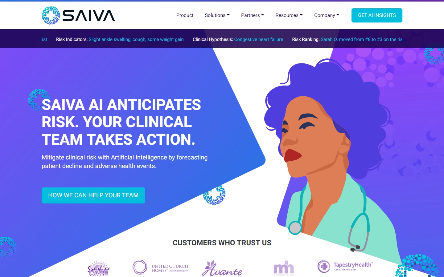
7. SAIVA.AI
Design Highlights: The very creative and attention-grabbing custom graphics may be the first thing you notice on their website. This web design makes effective use of color. The call-to-action buttons are also well placed and easy to find.
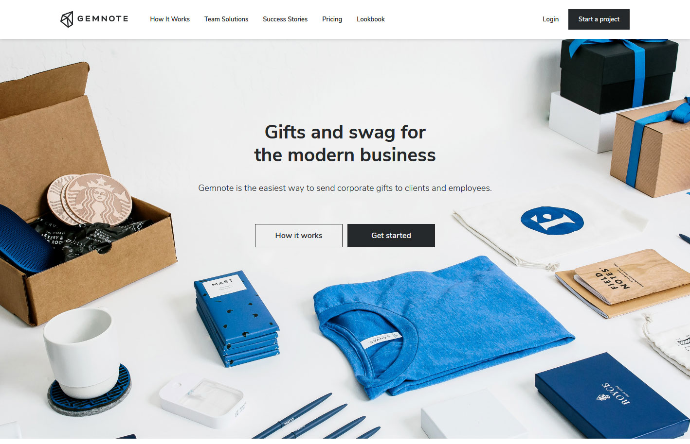
8. Gemnote
Design Highlights: Unified color scheme on the home page and pictures, updated content, and tasteful selection and positioning of product shots.
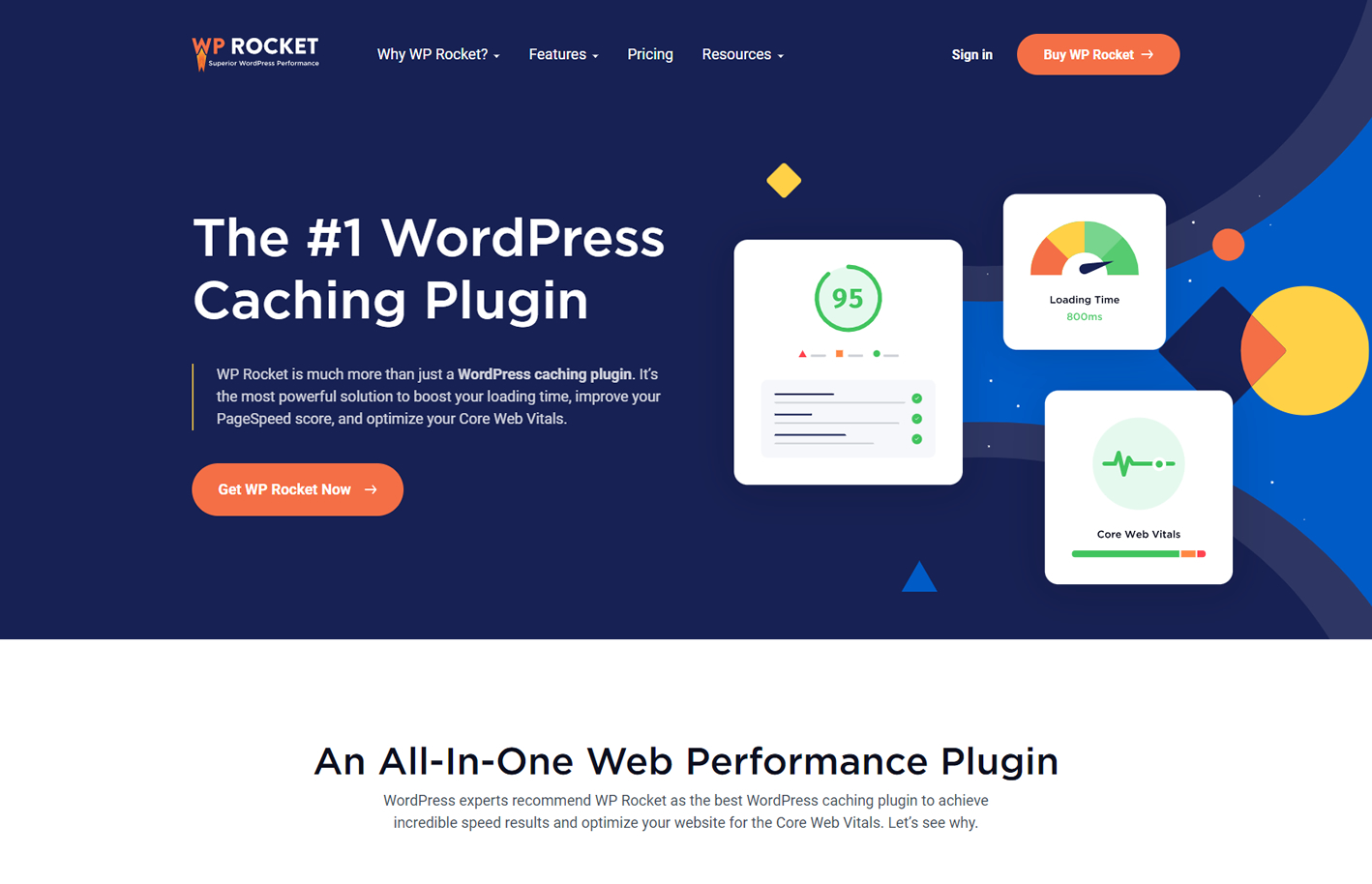
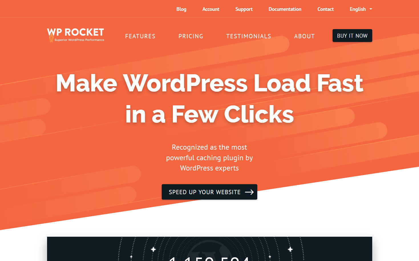
9. WP Rocket
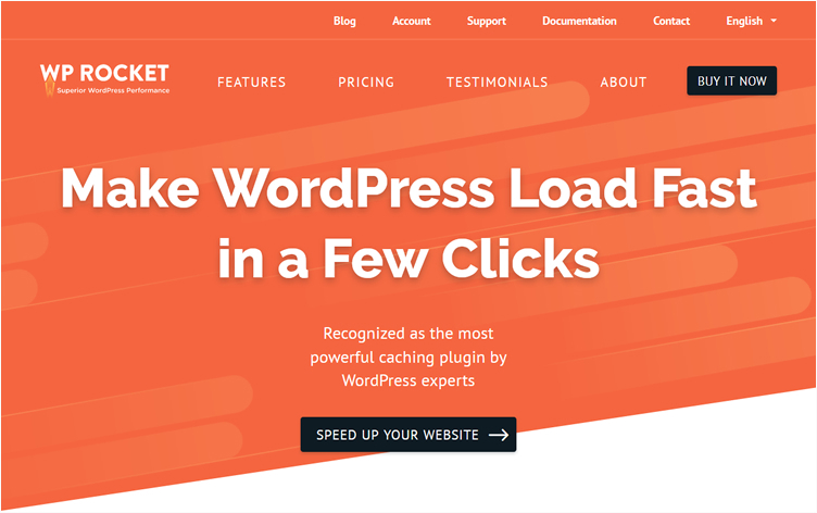
Design Highlights: Clear value proposition, energetic color palette, minimal use of photos, bold and large heading fonts, and actual photo of the support team on the web page.
saas website
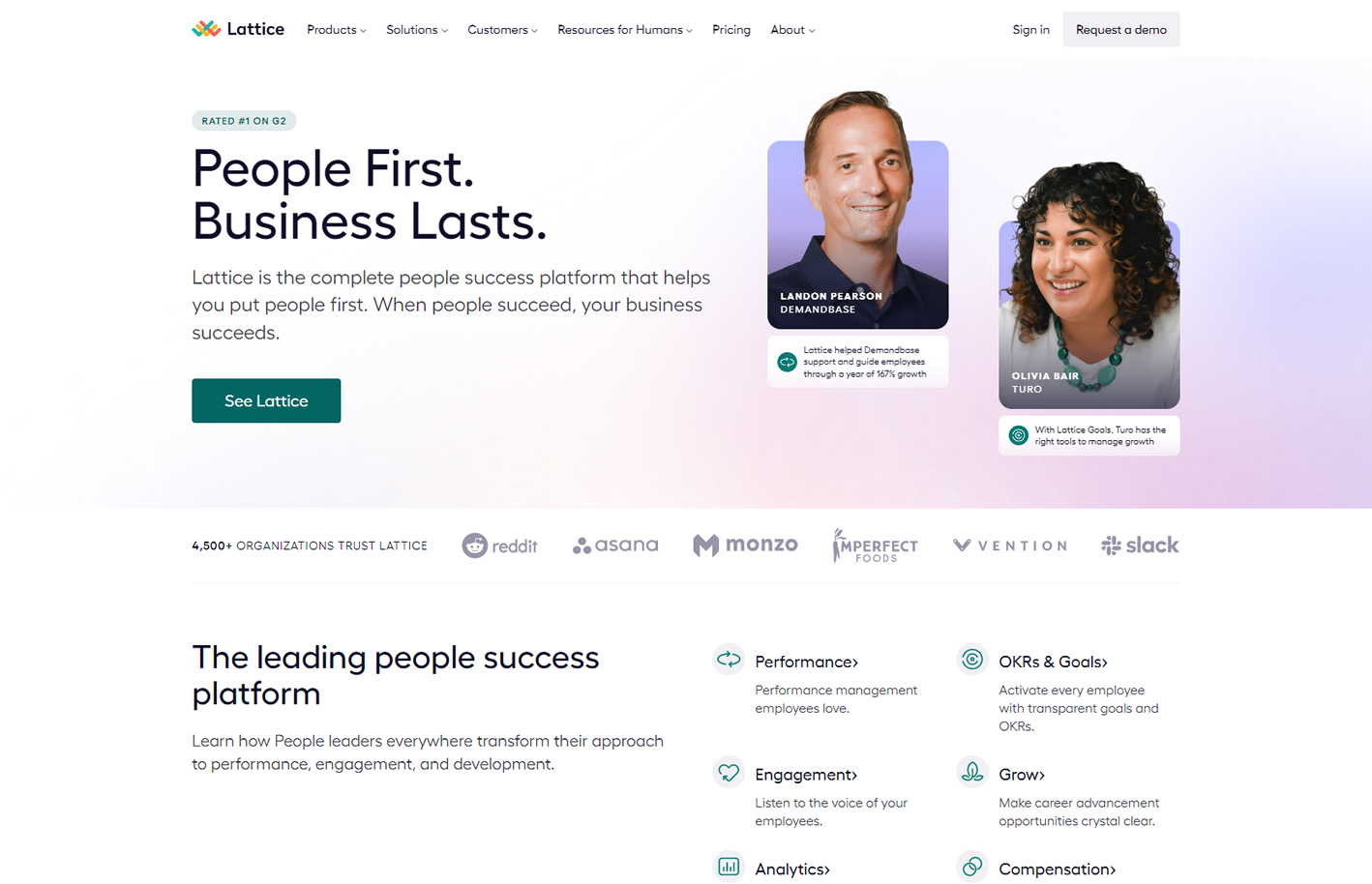
10. Lattice
Design Highlights: Subtle animations, a good blend of graphical elements around photos, navigation is always visible, presence of social proof.
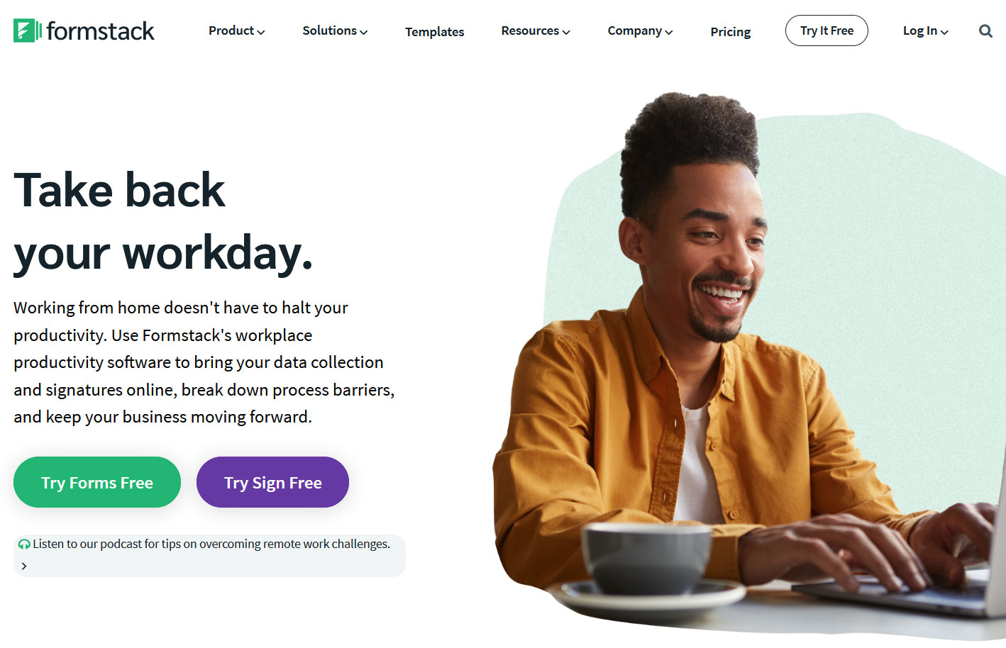
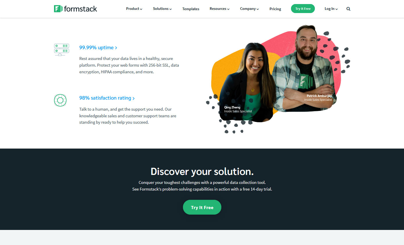
11. Formstack
Design Highlights: No overlapping between text and images/graphics, alternating images and text blocks, navigation is always visible, free trial offer, minimal use of photos.
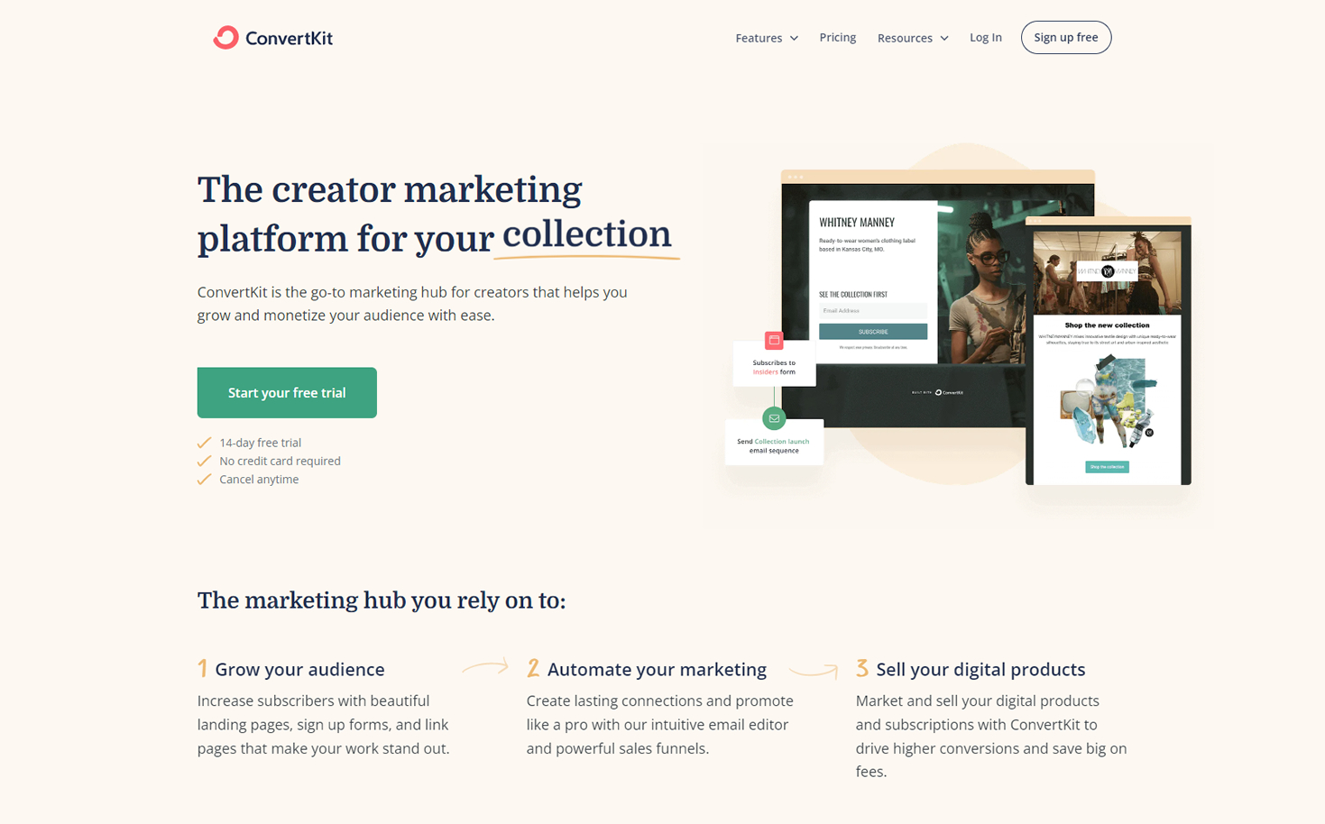
12. ConvertKit
Design Highlights: Great storytelling, effective use of whitespace to separate blocks and ideas. Minimal and clutter-free design.
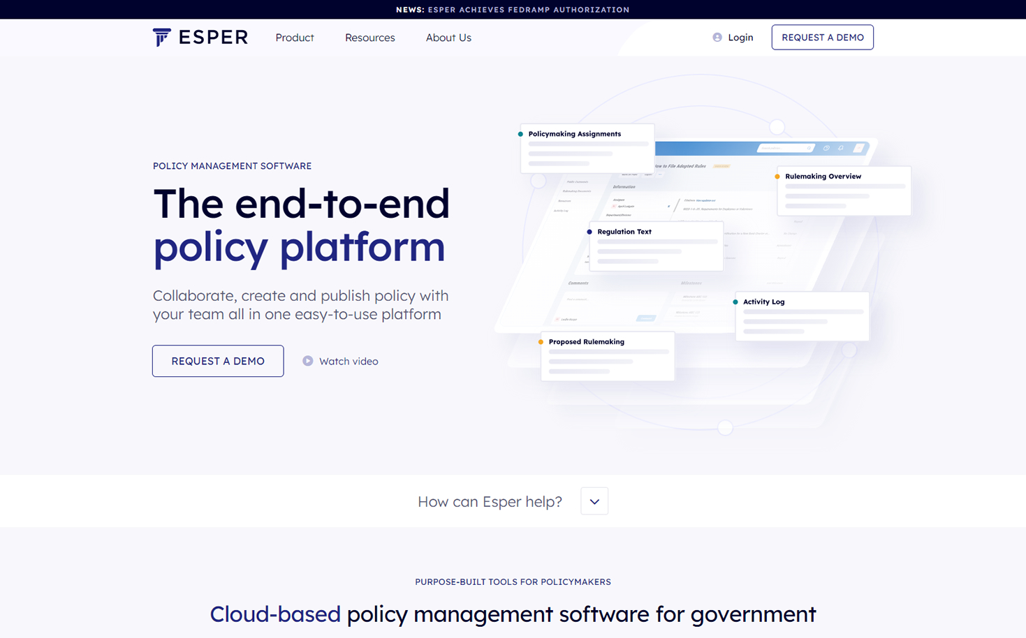
13. Esper
Design Highlights: Very creative use of colors, patterns, and shapes. Consistent styling of design elements throughout the whole SaaS website. The custom SVG animations add style and interest to this great SaaS platform.
saas web design
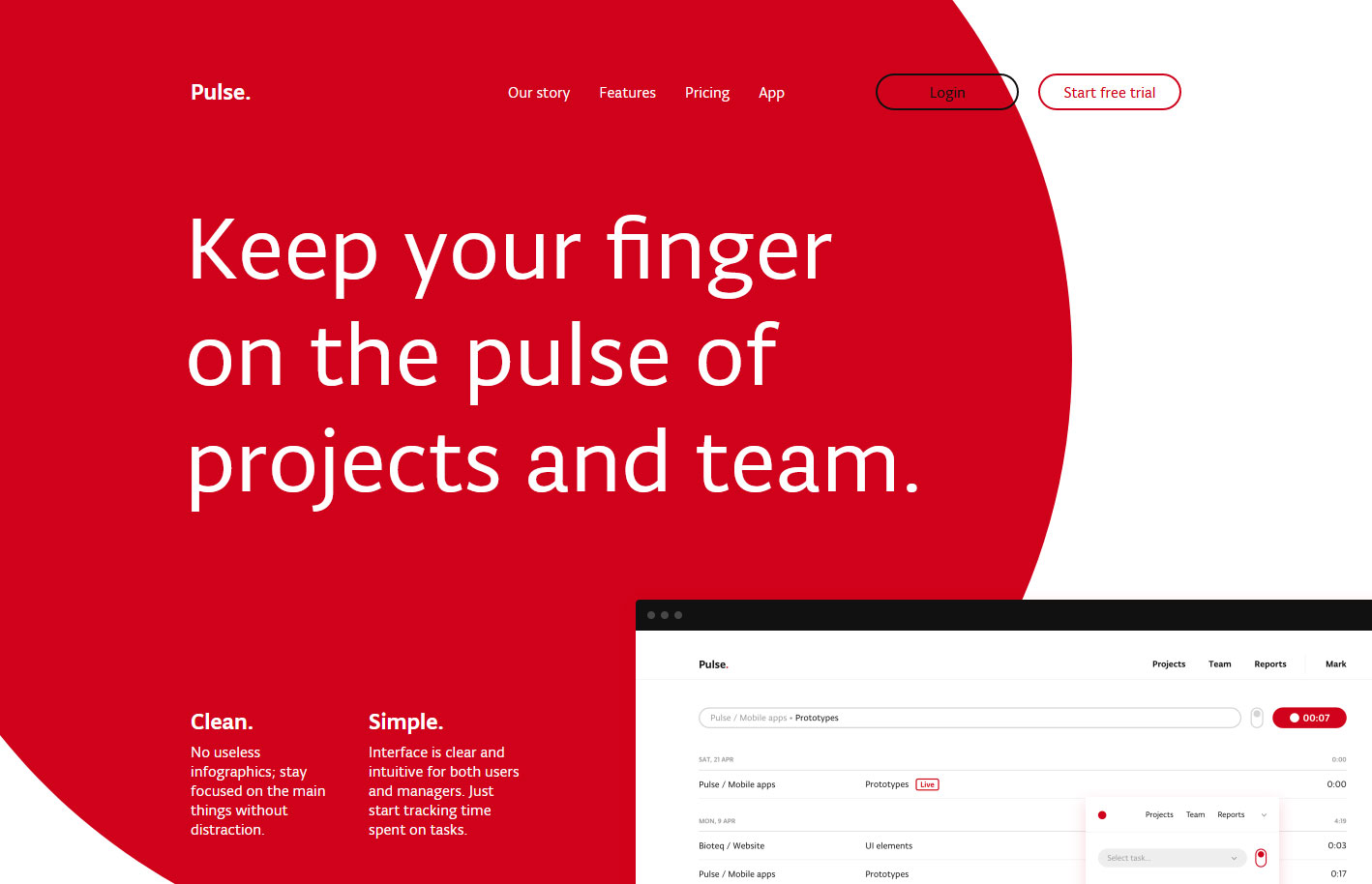
14. Pulse
Design Highlights: Subtle animations that guide the viewers’ eyes, large heading for people who love to skim, offers a free trial, effective use of whitespace.
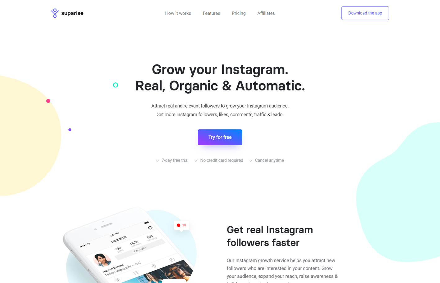
15. Suparise
Design Highlights: Clear value proposition, simplified signup process, free trial offer, subtle animations, effective use of whitespace, a light background with seamless sections.
best saas websites
SaaS Website Design Trends
1. Use of Whitespace
Whitespace also called “negative space” are areas in a design that is empty – the large empty space between design elements, content, and spaces between letters. Whitespace increases readability, helps to group different elements logically, and helps direct the viewer’s eyes.
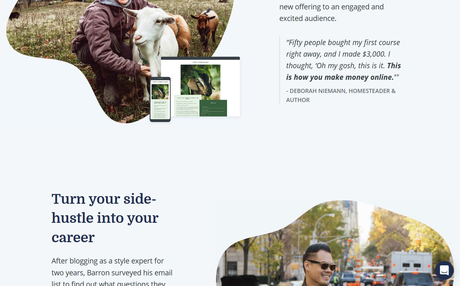
2. Animated Images and Graphics
Subtle animation not only entertains site viewers but also keeps them engaged. It adds to the positive user experience. However subtle animations are preferred as some viewers get dizzy or nauseous when bombarded with too many animation effects.
best saas website
3. Light Background Colors
Light background colors serve as a clean canvas that increases readability and provides contrast to other page contents such as texts and images. There are exceptions to this however mainstream SaaS company websites moreover than not have light backgrounds.
4. Alternating Text and Image Positions
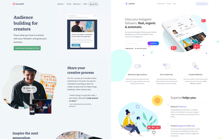
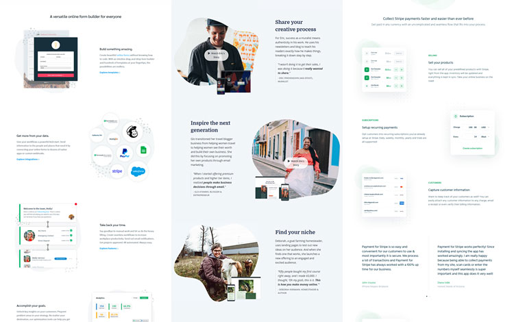
This practice alternates the placement of image and text on each horizontal row which is often referred to as “split layout” or “zigzag layout”. Apparently, this layout breaks the monotonous look of traditional content layouts. However, quality or meaningful images and content should be used.
5. Multiple Font Sizes and Colors Per Block
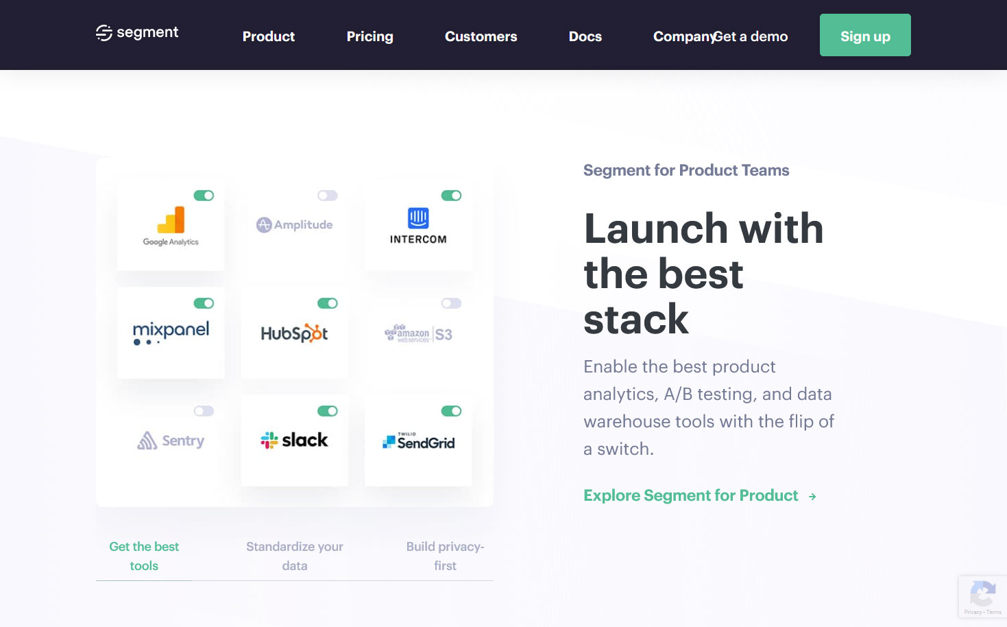
As seen in the screenshot below, the topmost small and bold line is usually the section title. The large text is the main idea and the paragraph below it is the description. Below all these is a link/button. Breaking up the content into different sections aids in readability and organization.
6. Minimal Use of Colors
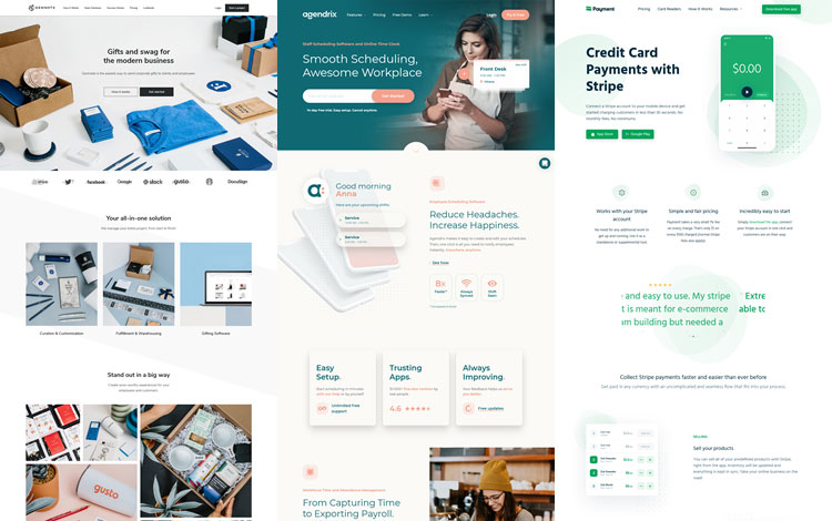
Most high-end websites feature only a few colors. This promotes a sense of consistency and professional elegance. Some websites even carefully select photos that match their color scheme. Other sites use only one or two colors in their content while displaying other colors from photos.
website design for saas
7. Bold and Large Heading Fonts
The use of large and or bold heading fonts is a trend not only for SaaS websites but for many other websites as well. This trend is most effective when paired with a specific and brief value proposition. Apparently this trend takes its roots from the traditional print industry.
8. The Dominant Use of Sans Serif Fonts
A great majority of SaaS websites use sans serif fonts. These fonts convey a modern, clean, edgy, simple, and approachable look. Since SaaS companies deal with technology, the characteristics of sans serif fonts compliment their line of business.
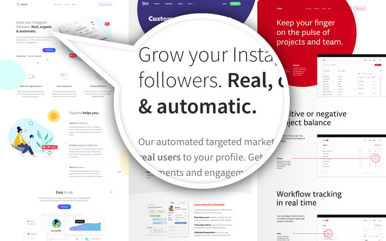
9. Continuous/Seamless Background Color
Similar to the effective use of whitespace, a white background improves readability through contrast thereby giving more emphasis to important content. Delineating one section from another is done using whitespace. Take note that not all viewers like this style.
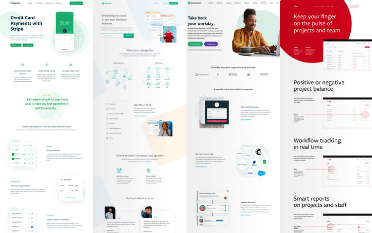
10. Less Photography, More on Illustrations/Graphics Elements
Similar to the effective use of whitespace, a white background improves readability through contrast thereby giving more emphasis to important content. Delineating one section from another is done using whitespace. Take note that not all viewers like this style.
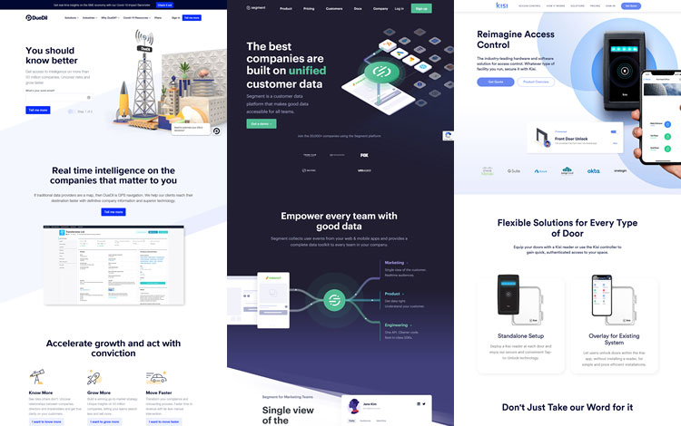
saas website design
SaaS Website Design Best Practices
1. Focus on Ability to Convert Visitors Into Leads
The best looking website is useless if it cannot get customers. The primary goal of a SaaS website is to make a sale or at least get a lead via email or contact info. Leads can be collected by giving away something for free, such as a free saas product demo or trial.

2. Clear Value Proposition + CTA
The value proposition describes in very few words what a business does and why someone should use it and what problem the business solves. A simple, clear, and specific value proposition with a call-to-action are usually the first thing visible on a website.
saas website designs
3. Navigation Items Always Visible
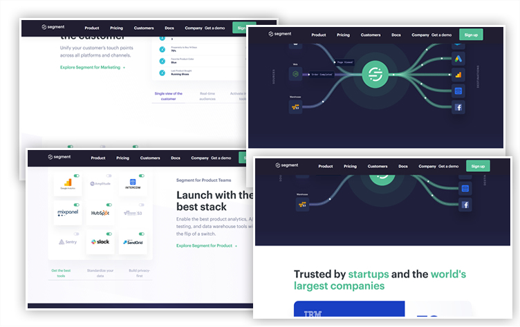
Most SaaS websites have lots of content and long scrolls. Some website viewers may feel lost with all the available content. The presence of in-page navigation, persistent navigation bars – or “sticky headers” provide viewers comfort and control while exploring webpages.
4. Minimal, Clutter-Free Designs
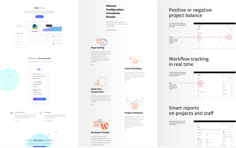
The goal of minimal design is to put emphasis on important content to make them stand out and be the focal point of a website. There is a balance to this however and the culture of the company behind a website should be given due consideration.
5. Concise/Brief and Specific Text Content
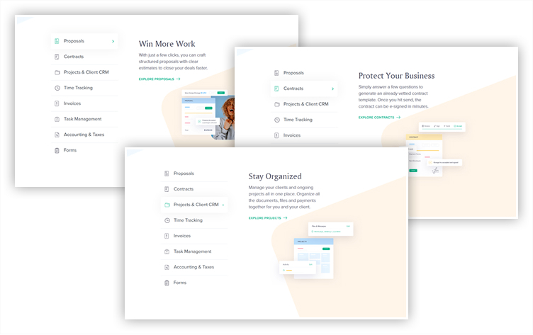
There is nothing more off-putting for website visitors than to be suffocated with tons of text. As technology advances, the attention span of readers recedes. Top-level content should be brief and specific, comprehensive content may be used in drill-down / detail pages.
6. Social Proof
Social proof is the concept that people will adapt their behavior according to what other people / influencers are doing. User testimonials, celebrity endorsements, media exposure, and client lists are some of the more common social proofs used on websites.
saas best practices
7. Free Trials / Product Demo Links
Product demos create user experiences on product features, product functionality, and value without upfront investment. Demo or trial users get a better understanding of whether a product is a good fit or not. Leads and better understanding can be collected for follow-up.
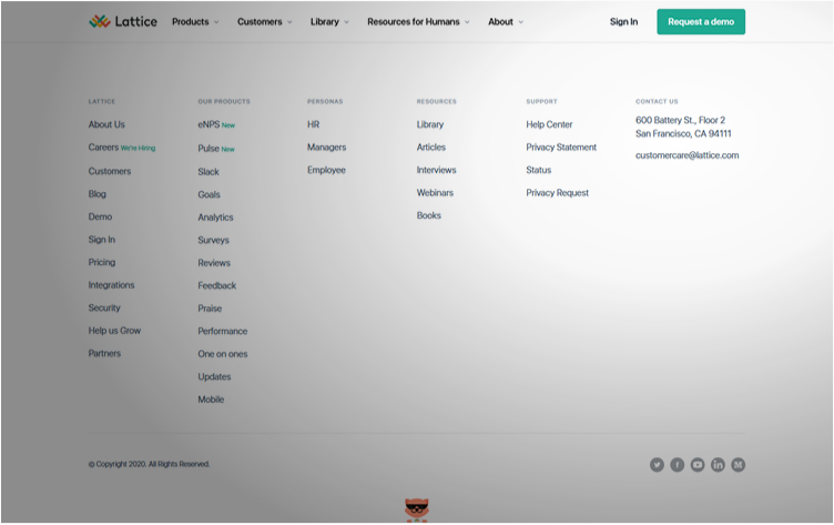
8. Visible Contact Information or Link on Every Page
Visible contact information on a website builds trust and adds legitimacy to a website. This also adds to the user experience since a prospective client is given a chance to communicate to a company representative via a phone call, email, chat, or social media message.
9. Simplified Signup Process
People are getting increasingly impatient in the modern digital age, if they can’t immediately make quick registrations, they are likely to abandon the process completely. Consider a simple sign up form or opt to signup via Google or social media accounts.
10. Minimal, Clutter-Free Designs
Conventional use of standard design elements such as logo position, location of navigation links, text structure, overlay functions, and link or button styles does not result in boring websites. Conventions reduce the learning curve and make a site easy to use.
saas website best practices
Conclusion
There are trends and then there are best practices. Trends come and go like the seasons but best practices remain. A challenge in the SaaS industry is to balance trends and best practices and still achieve their goals.
Websites especially in the technology sector is an ongoing continuous improvement process. SaaS website optimization requires further testing and adaptation to the ever-changing needs of prospective and regular clients. This also includes regular updates in form, function, and content.