A website is a powerful tool for any company, and an essential part of the marketing strategy. When you take into account how many people use the internet every day and the number of potential customers in your area alone, you will see that website design is a crucial factor for success. A good CPA website design will help your company stand out from its competitors and give consumers a reason to choose your business over theirs. In this article we have compiled 40 Best CPA Websites that are worth checking out!
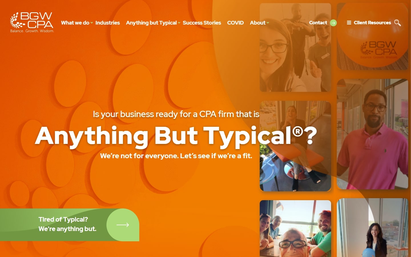
1. BGW CPA
Why it works: King of our list today is BGW CPA’s website. Consistent with their tagline ‘anything but typical,’ this design is outstanding in visuals, execution, copy, and user experience. Everything here is a feast to the eyes.
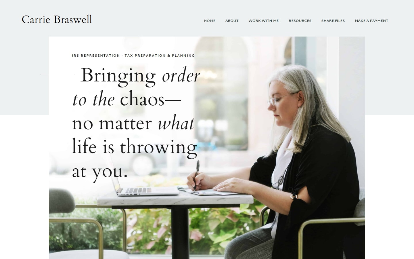
2. Carrie Braswell
Why it works: Accounting website with a personal feel, Carrie Braswell’s website is very modern-looking, with a strong emphasis on typography which it also showcased well. Photos are also very professional, and the text is well-composed for easy reading.
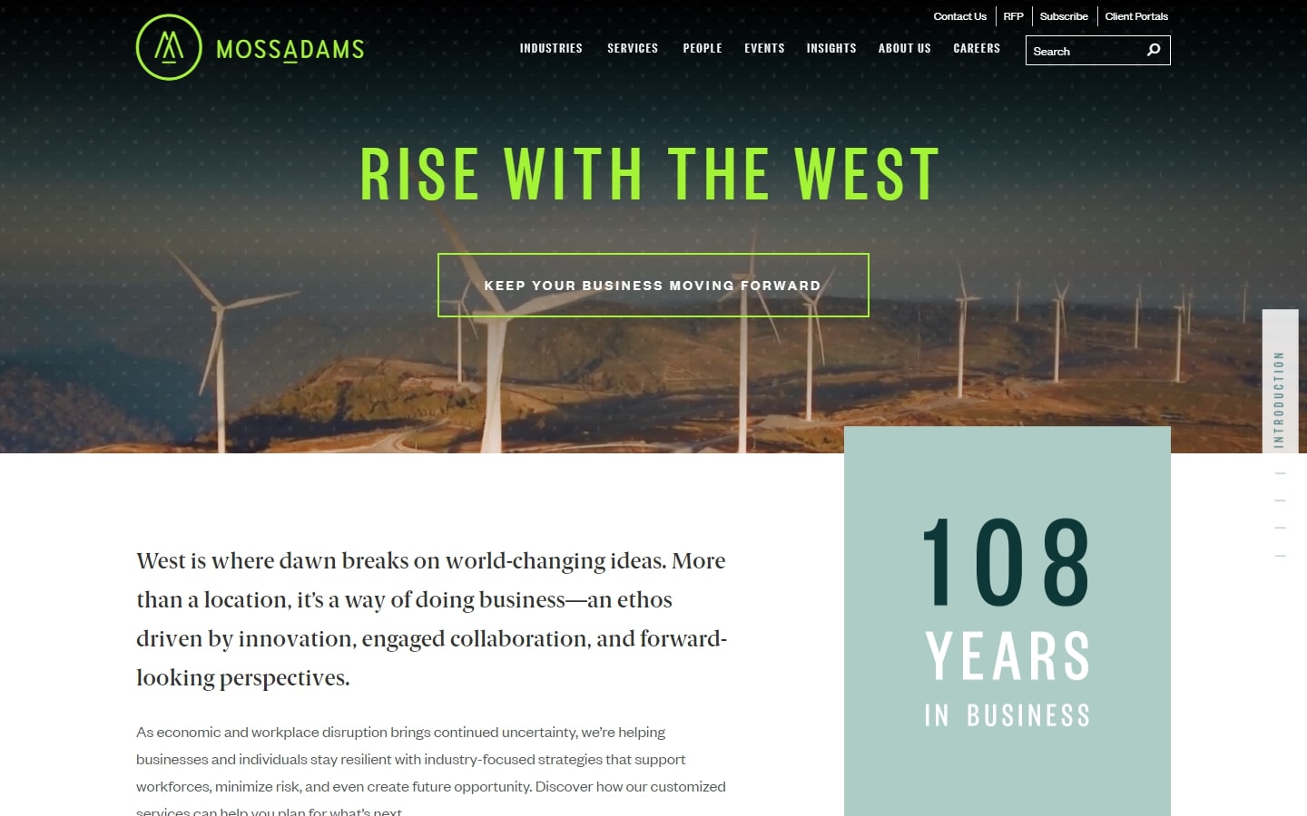
3. Moss Adams
Why it works: Very modern with parallax and cool hover effects, going to this site felt like a step to the future. And unlike most websites today, the hero section is kept to a minimum height in favor of content.
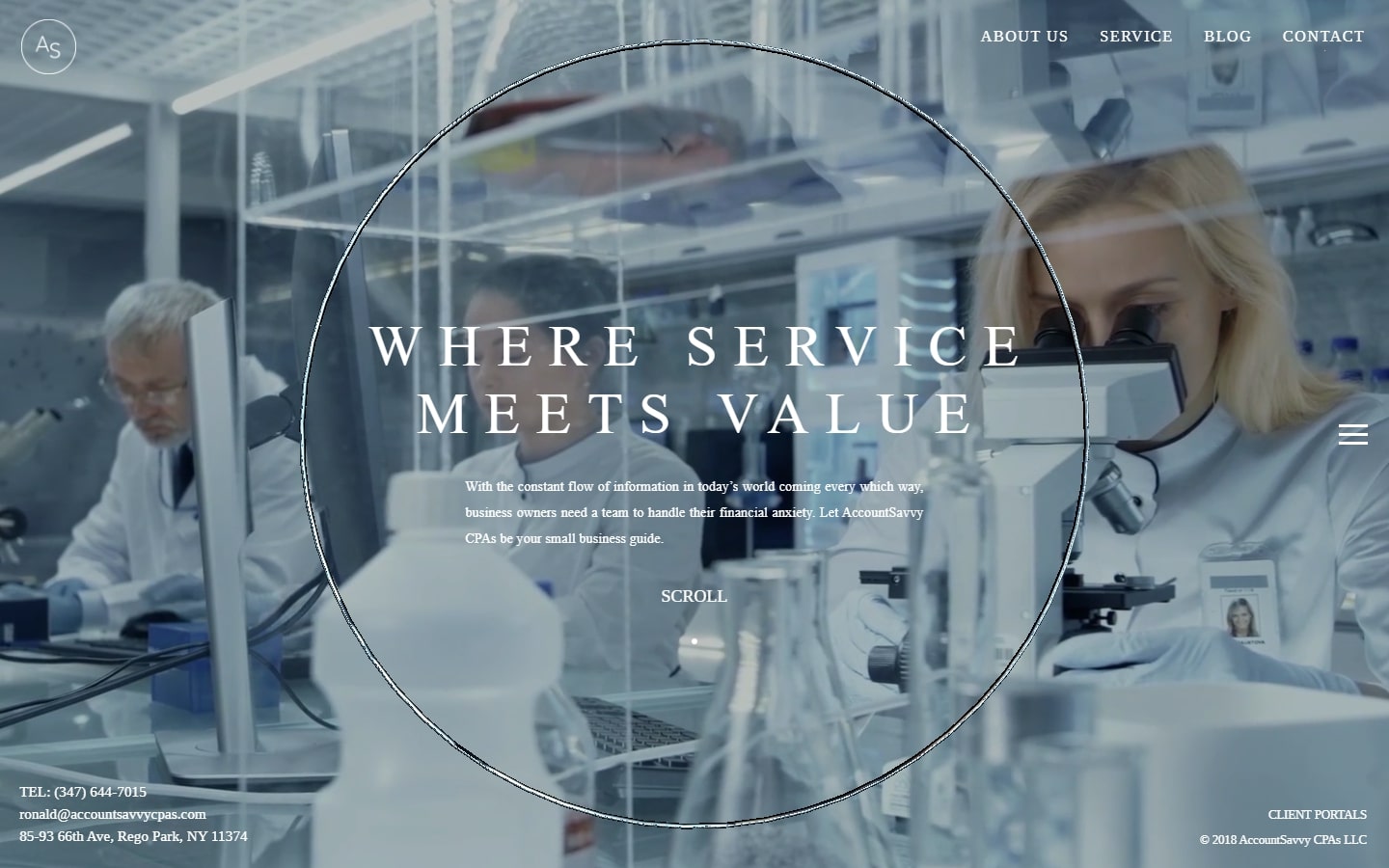
4. AccountSavvy
Why it works: AccountSavvy’s website design is just one page, but it felt like you are in different dimensions because of the animations, effects, and out-of-the-box elements. The inner pages were also cleverly stripped down to a minimum while maintaining good looks.
Best CPA sites
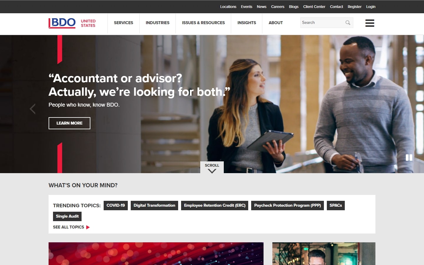
5. BDO
Why it works: Accounting website with a personal feel, Carrie Braswell’s website is very modern-looking, with a strong emphasis on typography. Photos are also very professional, and the content is well-composed for easy reading.
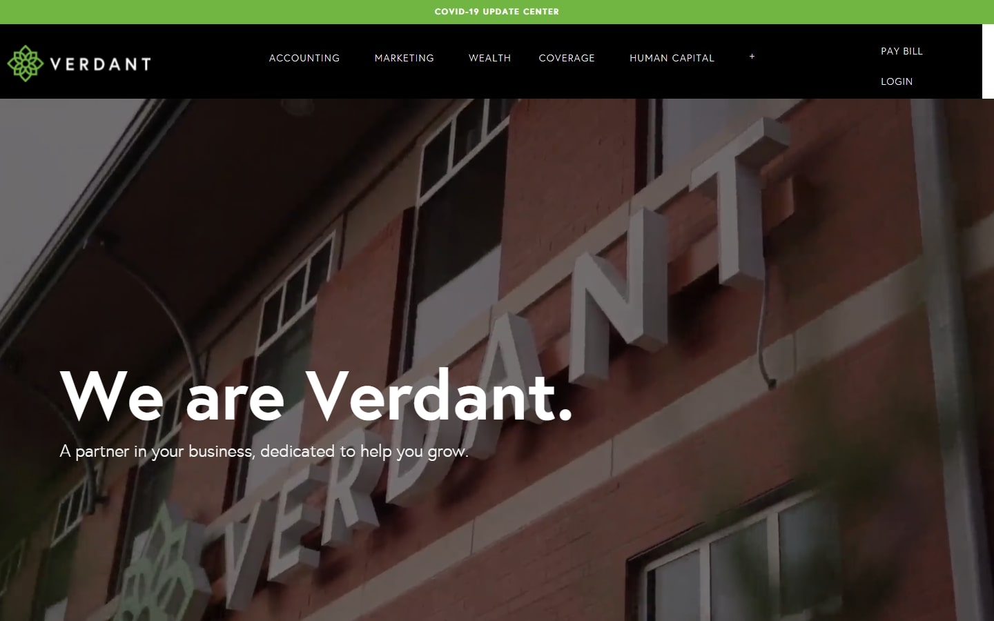
6. Verdant
Why it works: One great example of a modern-looking website is Verdant’s. The texts are very clear and easy to the eyes, the video background is very custom and invigorating, and the layout is tack-sharp.
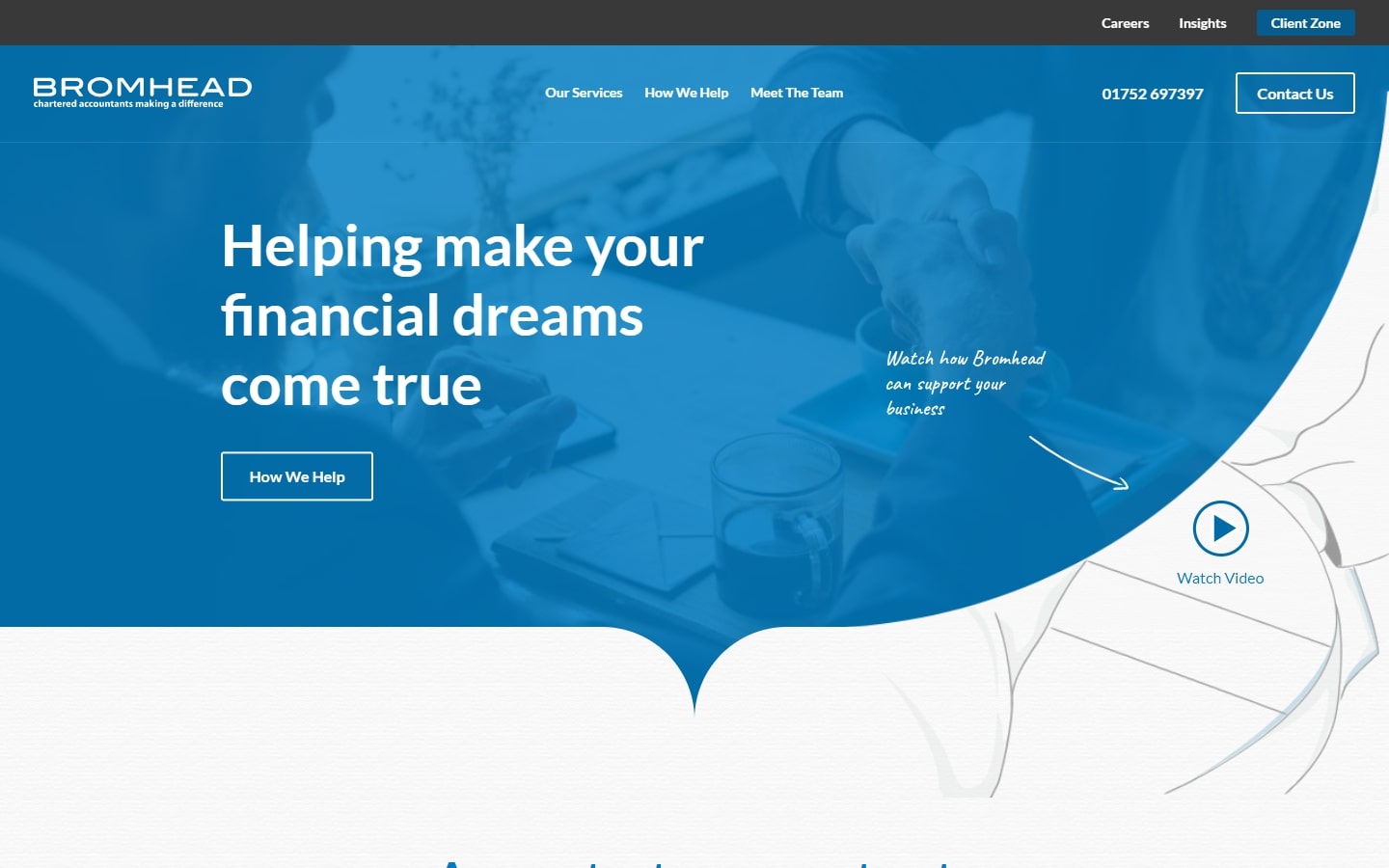
7. Bromhead
Why it works: This website’s quirky geometric forms, simple graphics, and short but coherent structure sets it apart from the rest. This is a fantastic approach to demonstrate how a design may be minimal and simple without sacrificing quality.
8. DMCL
Why it works: We liked how DMCL’s website is interactive without feeling overwhelmed. The subtle animations, interactive elements, and other effects give a real boost in the energy projected by the design.

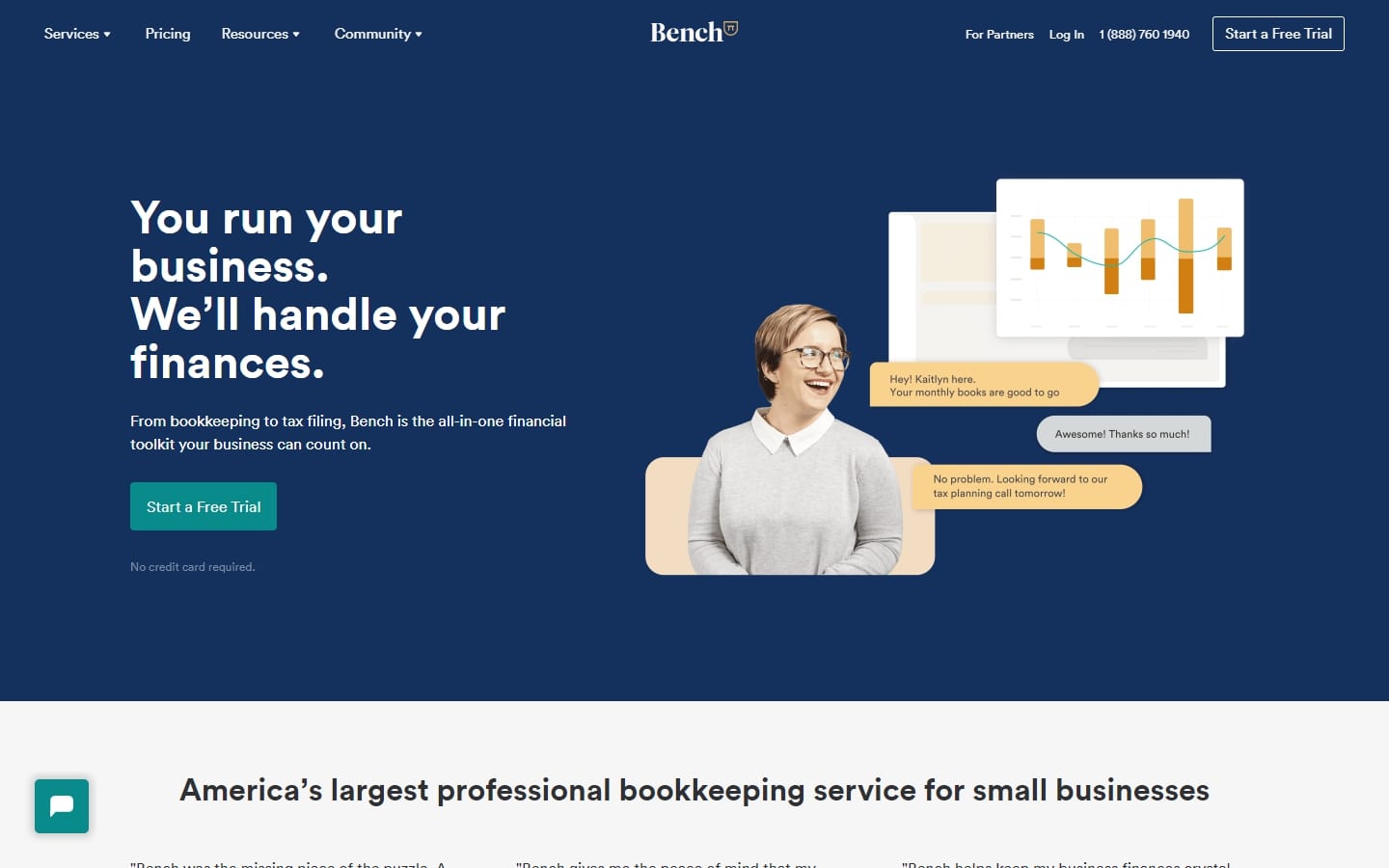
9. Bench
Why it works: Running into Bench’s website will give you that you are in the modern age of web design. Even though the website doesn’t feature a lot of dope animations or interactive events, one can easily tell that the design has gone through rigorous planning and screening because of its quality.
Best CPA Websites
10. Marcum LLP
Why it works: Appealing and catchy graphics, with just the right colors. The animations and special effects were carefully planned out and implemented.

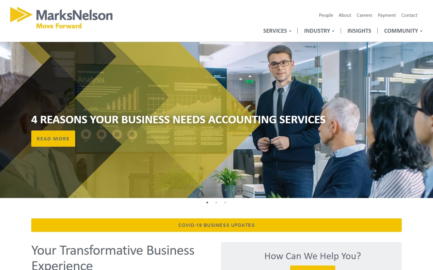
11. Marks Nelson
Why it works: There’s a lot to appreciate about this website, but one thing that stands out is how creatively they utilized the yellow color, which is quite difficult to do. The structure of the site is also never boring from top to bottom, making it worthy of a position in this list.
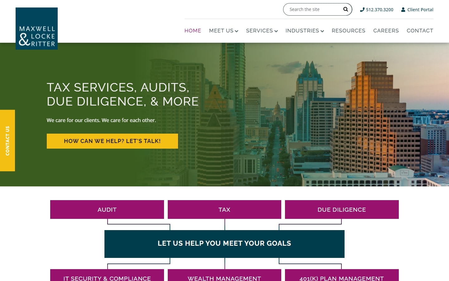
12. Maxwell & Locke Ritter
Why it works: We thought the illustration next to the hero area of the website was particularly brilliant. It succinctly summarizes what they do, what they specialize in, and a strong CTA inviting consumers to contact them for assistance.
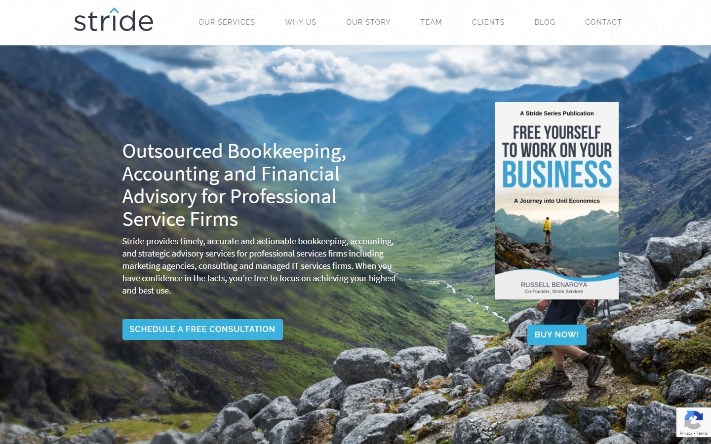
13. Stride
Why it works: Very airy design with lots of whitespaces and breathtaking images. The content is also properly organized into pages and sections for easy navigating.
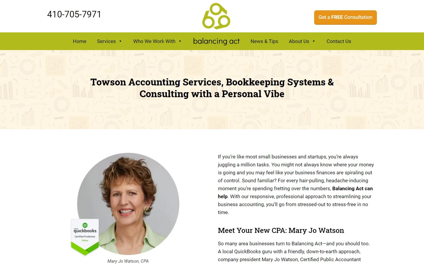
14. Balancing Act
Why it works: If you aim for a website that is chic, simple, but very personal to your target audience, consider looking at this website design. There’s a lot of places to go to within this website, and for sure, despite the simple look, you can be ensured of a quality service that fits your needs
CPA Websites for Inspiration
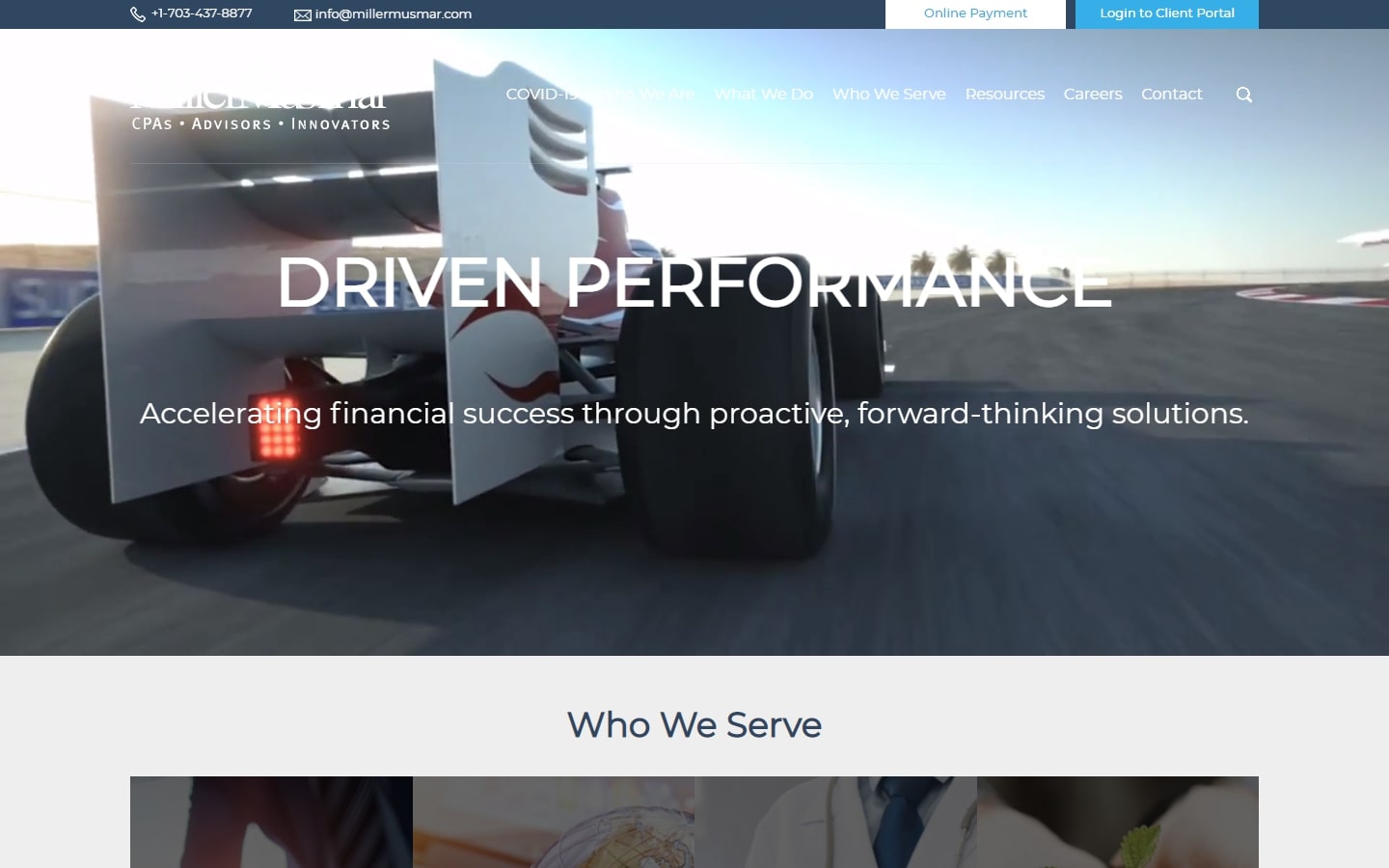
15. Miller Musmar
Why it works: The hero video background contains a lot of energy which breaks the ice of the usual accounting website look and feel. We also love the very elegant logo, and the intuitive layout ready to serve different audiences.
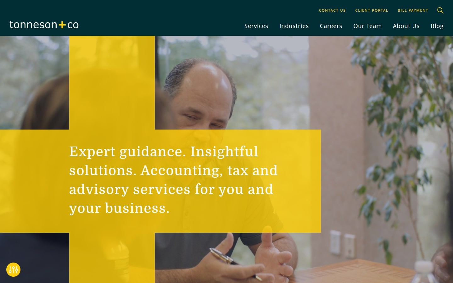
16. Tonneson + Co
Why it works: The big ‘plus’ symbol that appears right before your face is what sets this website design apart. It’s a good example of risk-taking, making a bold statement of the weight of their service and the quality of experience they try to provide.
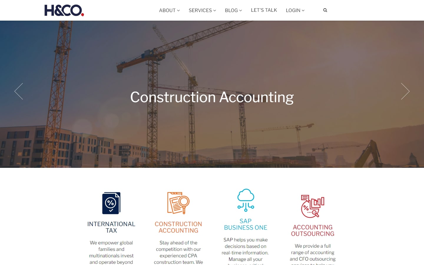
17. H&CO
Why it works: Accounting websites don’t have to look bland, that’s why we are glad to see the splash of colors everywhere in H&CO’s website design. The solutions they offer are displayed. The footer is also very clean and gorgeous.
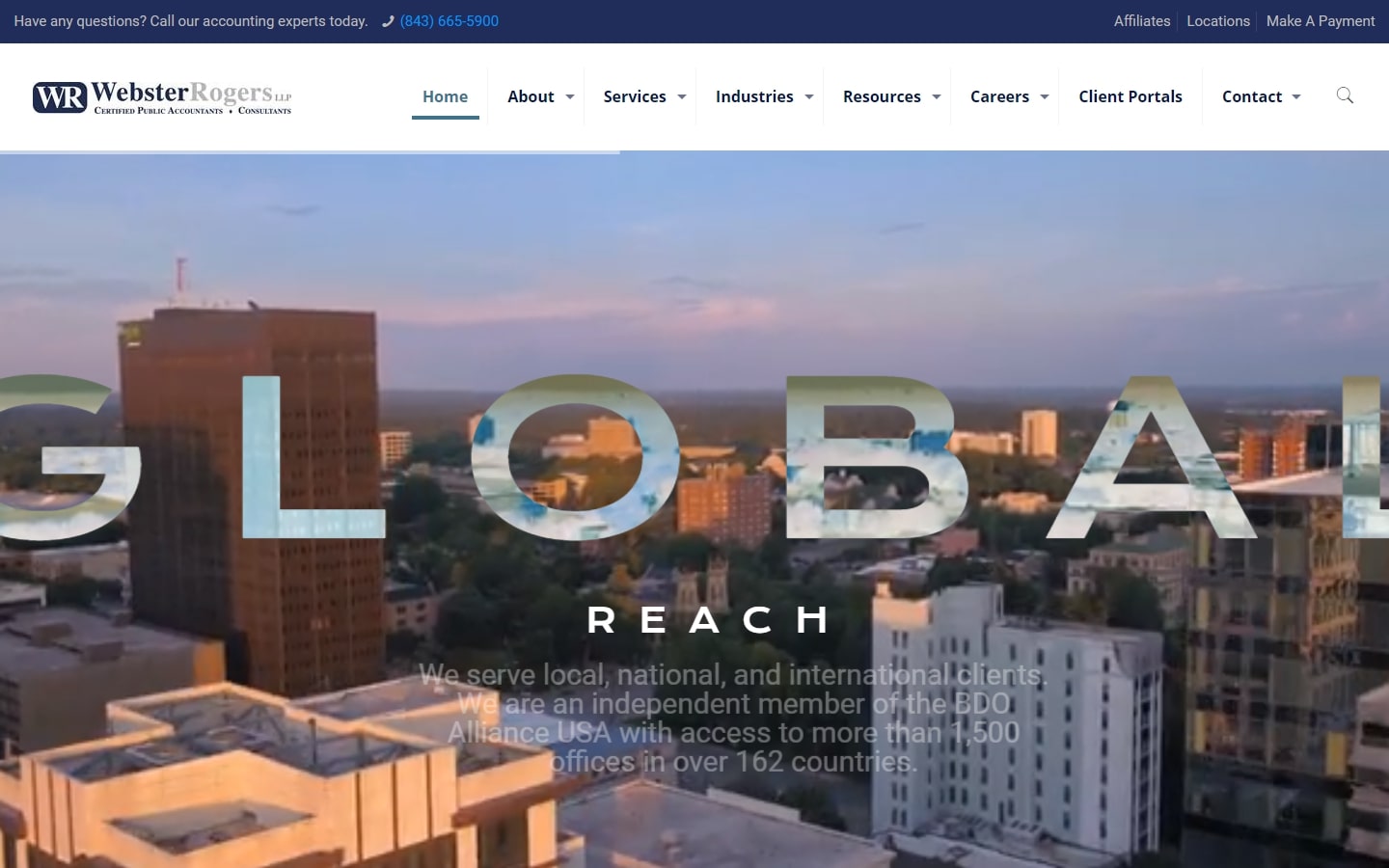
18. Webster Rogers LLP
Why it works: Perhaps the standout feature in this design is the creativity in the hero video. It is very personal while at the same time directed to large-scale enterprises.
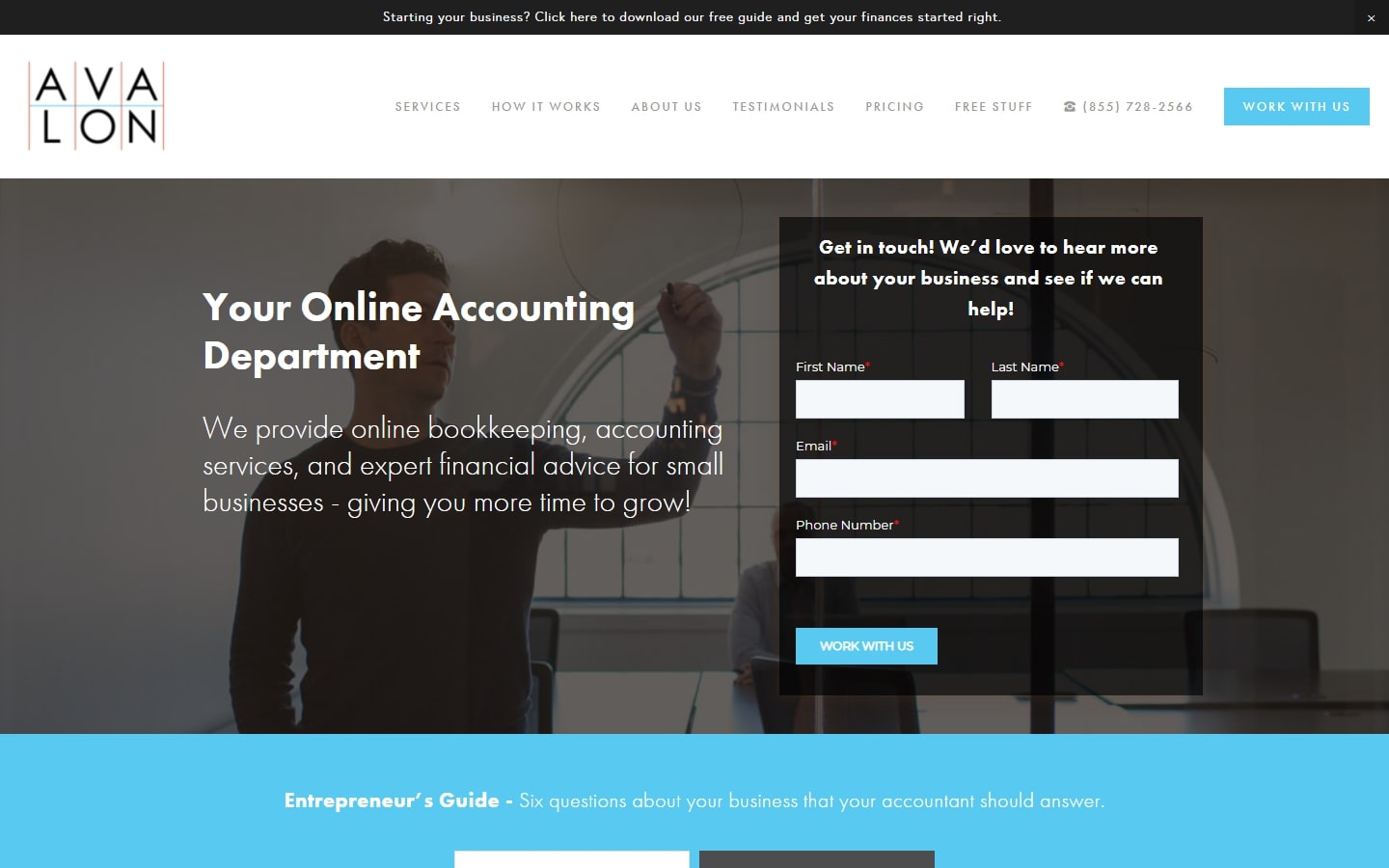
19. Avalon Accounting
Why it works: What we especially love about Avalon’s website design is its focus on being helpful, starting from the messaging, down to the choice of images used. The instant contact form on landing is, of course, a neat feature.
Certified Public Accountant Websites
20. Wolters Kluwer
Why it works: A people-centered design that focuses on fostering care and problem-solving more than numbers and spreadsheets. One should not miss the mega menu too because it’s very comprehensive and very well done.

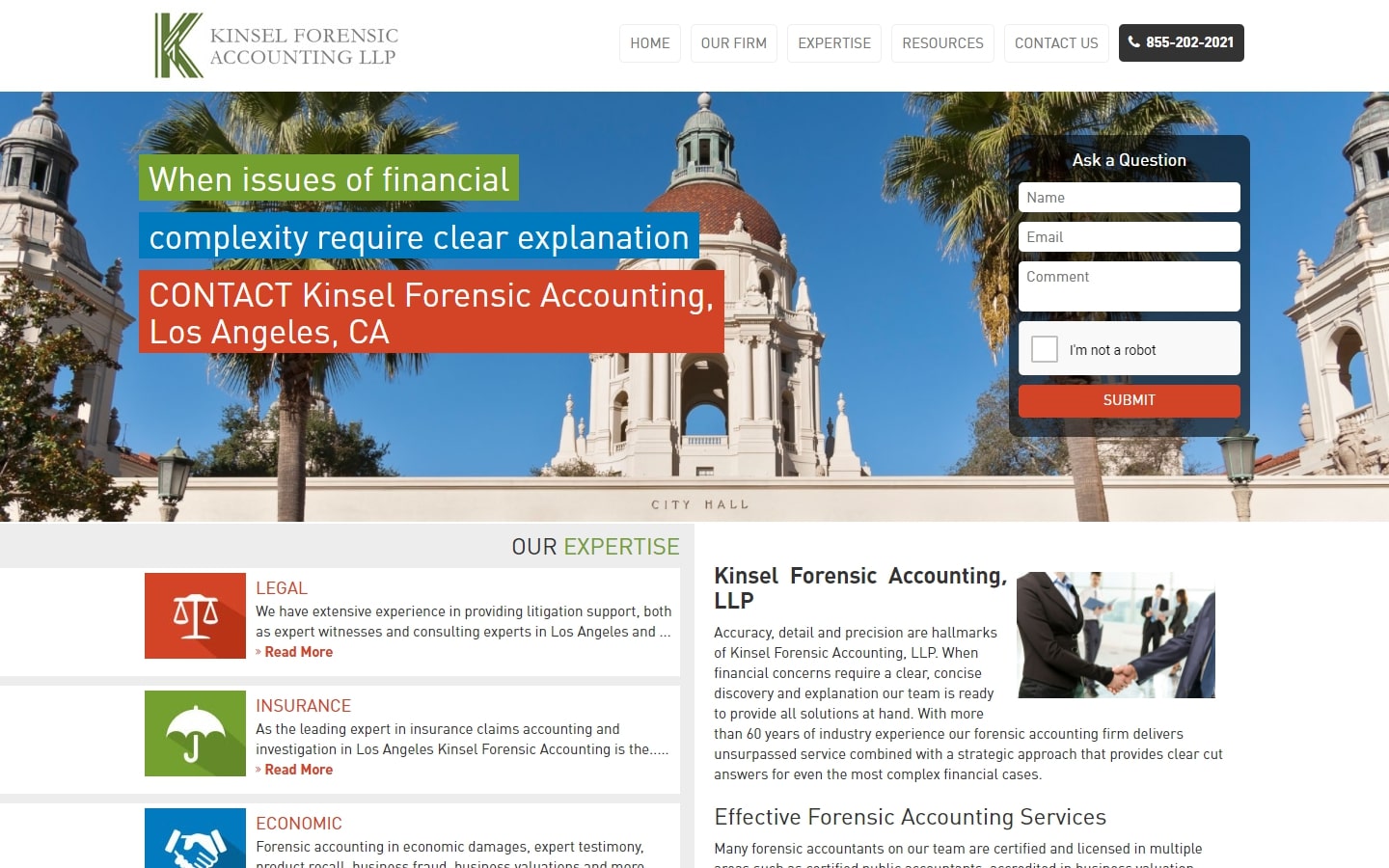
21. Kinsel Forensic Accounting LLP
Why it works: Despite having a short stature, we love how ‘in-your-face’ the messaging is, even without scrolling yet. Everything is compact yet clean without looking cramped. The addition of the contact form above the fold is a welcome addition as well.
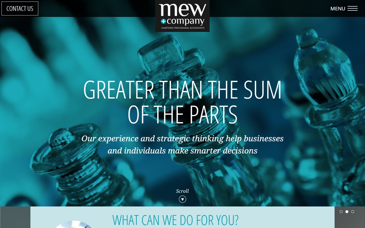
22. Mew and Company
Why it works: We admire originality, and this website is nothing short of original and artistic. The layout alone speaks much about the quality of the services they provide, all without being too pushy.
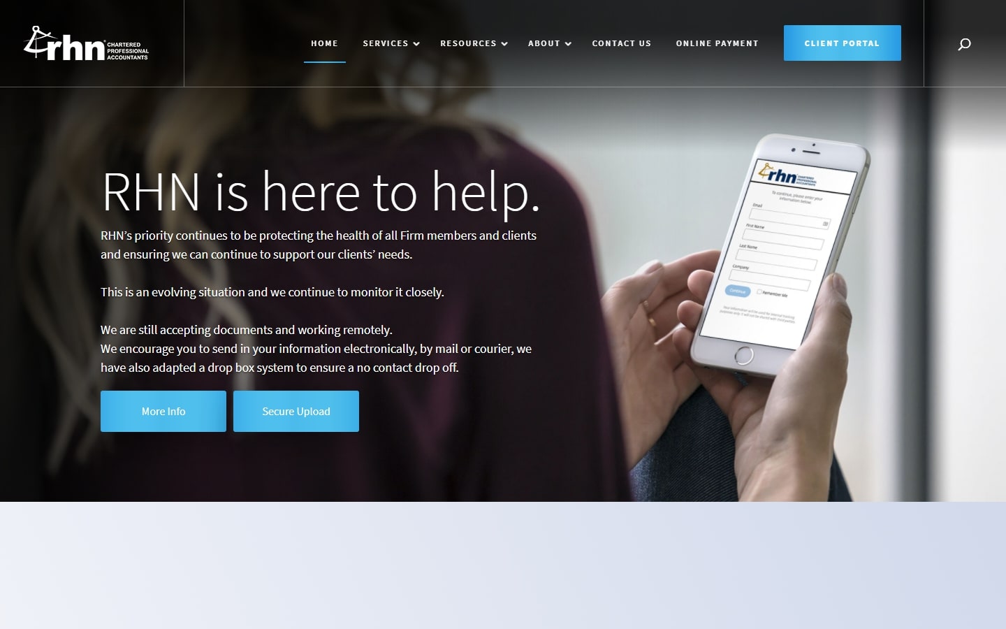
23. RHN CPA
Why it works: Unlike the usual accounting sites where we show graphs and other boring materials, this website features both people and productivity. We also love the very clean and spacious layout for each story they tell.
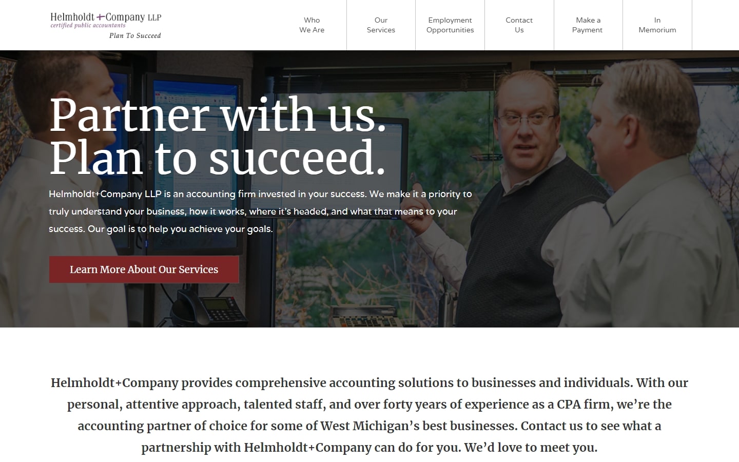
24. Helmholdt
Why it works: Most standard layouts look dry and unappealing, but Helmholdt’s website is a fresh take. We love the cleanliness of the site starting from the hero page down to the inner pages. Everything felt ‘just right’, and is, therefore, a good experience for the visitors.
Best CPA Websites
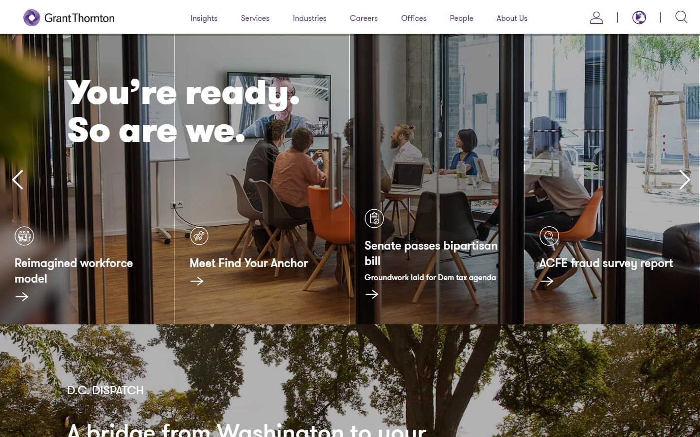
25. Grant Thornton
Why it works: An out-of-the-box layout that everyone would surely love. The images may look busy along with some other elements, but with the right animation and presentation, one can easily understand how this website functions to the end-user.
26. Startup’s CPA
Why it works: Everything here looks well-ironed, but one thing we like to emphasize is their hero image: glasses for better clarity. That messaging may not be obvious to some, but to us, is a bold move, and a creative one at that.

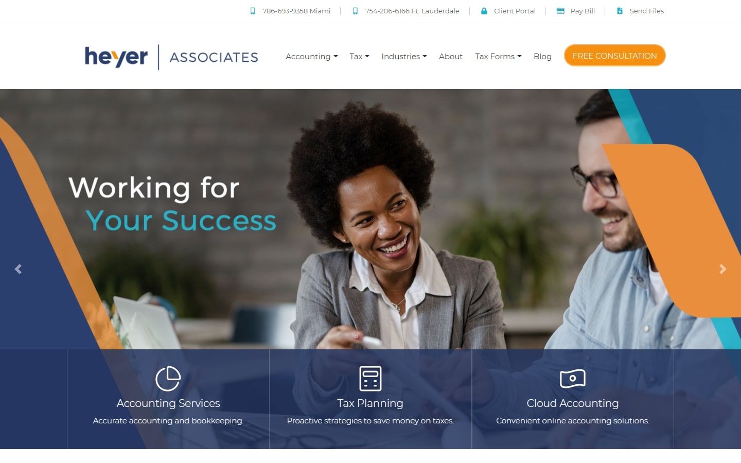
27. Heyer Associates
Why it works: The clean presentation of the header is just top-notch, especially the CTA which popped beautifully for extra visibility. The layout is clean, easy to use, and stripped off of any visual clutter.
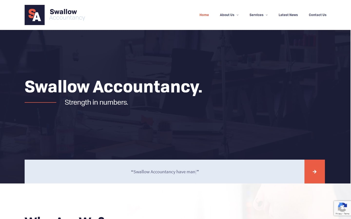
28. Swallow Accountancy
Why it works: Despite having a somewhat template-y feel to it, we love this design because of the use of creativity in a plain canvas. Content is kept to a bare minimum, and the CTAs are clear and distinct.
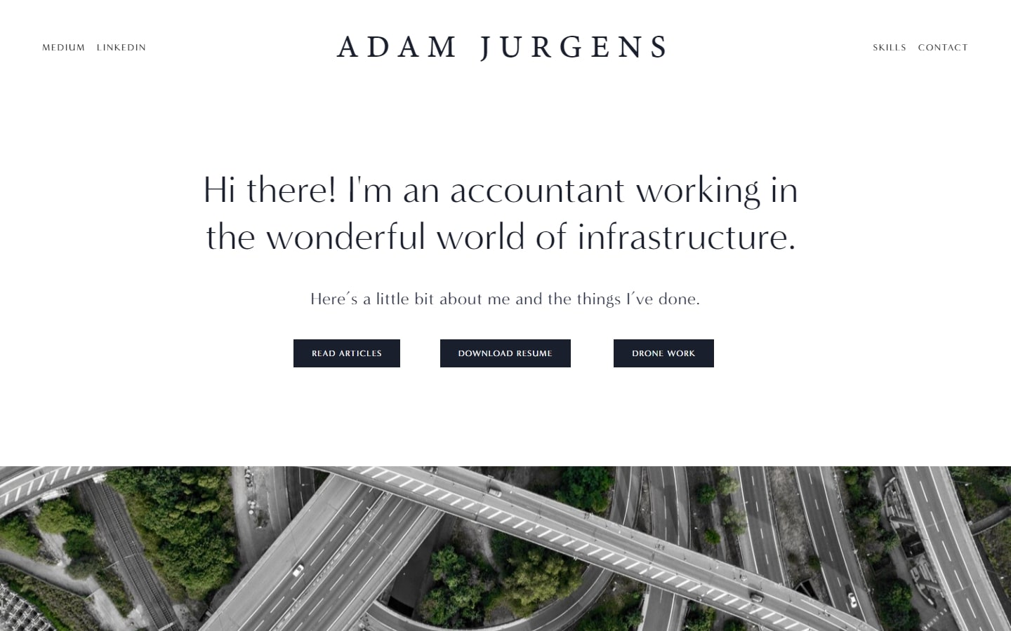
29. Adam Jurgens
Why it works: Going away from firms for a bit, we have the website of Adam Jurgens. It’s very refreshing to the eyes, delightful to read on, and the buttons are crisp and easy to identify. There’s no overselling here too, which is a solid qualification.
CPA Websites for inspiration
30. COPE Staffing
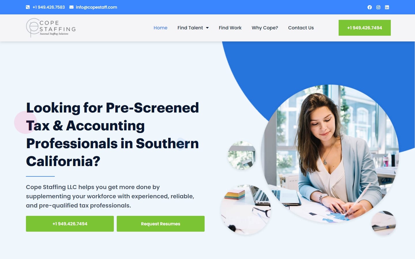
Why it works: Perhaps the friendliest-looking website in this list is from COPE Staffing. The typefaces are sleek and very clear, the images used are right to the point, and the use of basic shapes is second to none.
31. Tanner
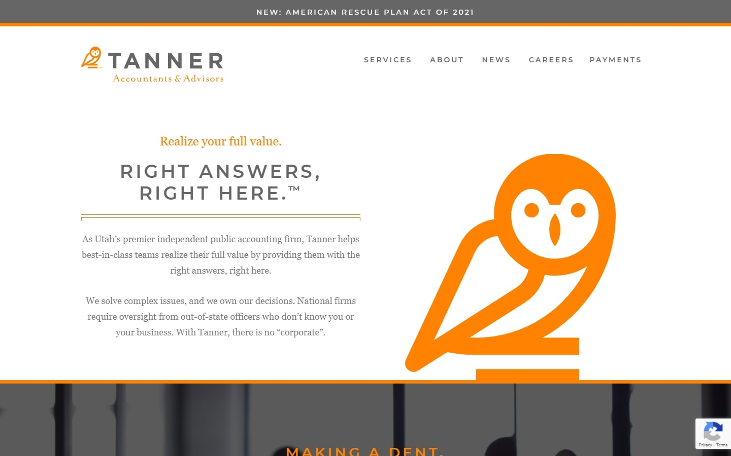
Why it works: While first impressions say the website is tidy, we also love the custom graphics, making the website feel less boring and even adds a personality to it.
32. Nordens
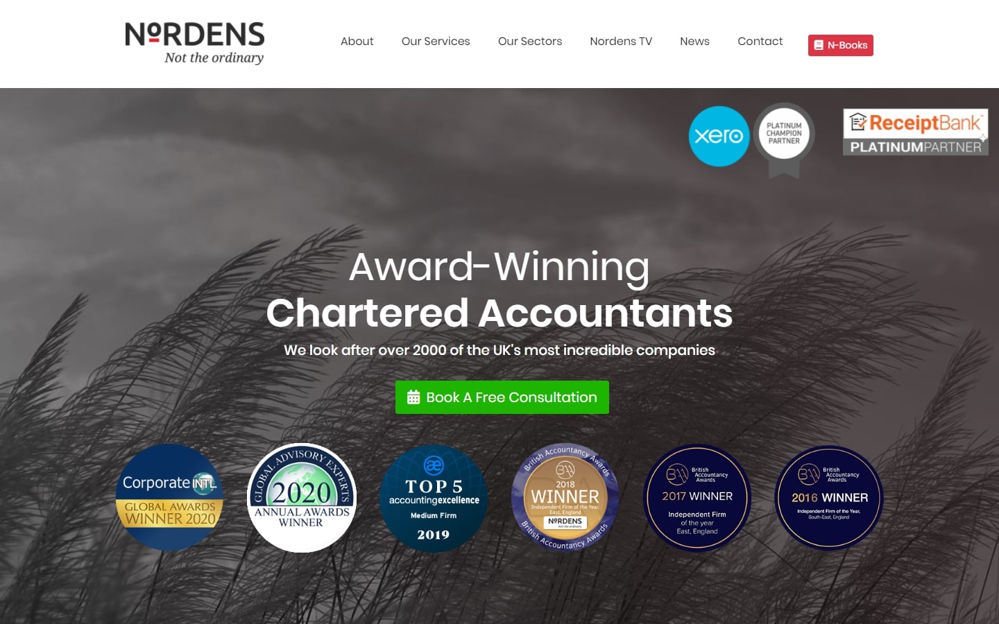
Why it works: One very unique feature of this website is how they showcased their plaques and awards right above the fold. This generates an instant feeling of credibility which we like. All the more, we also like the mega menu and the floating button for a free consultation.
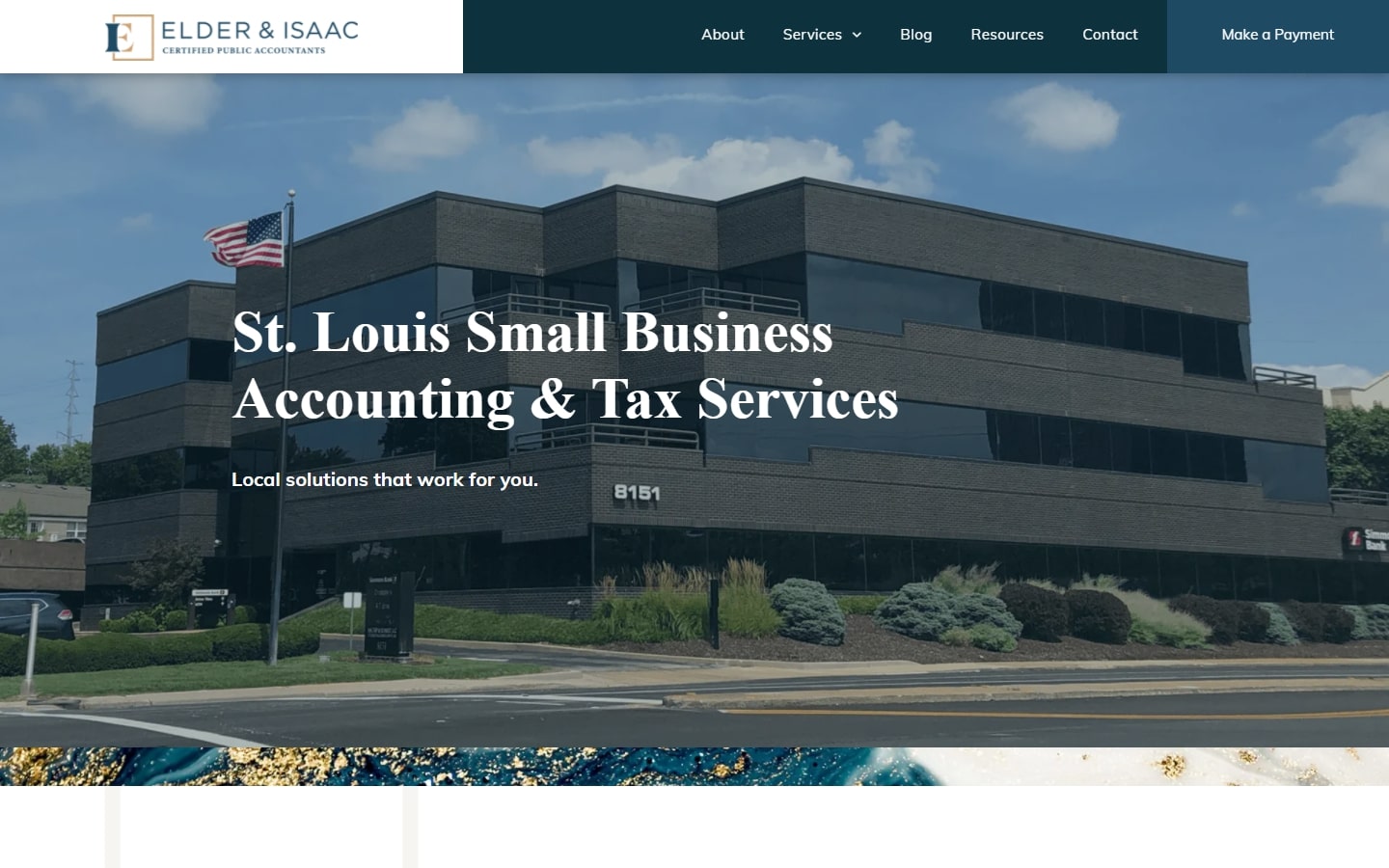
33. Elder & Isaac
Why it works: Joining our list is Elder & Isaac’s website. Among the things we love are: the strong adhesion to branding, a serious and professional look and feel, and also the quick and easy layout for all audiences.
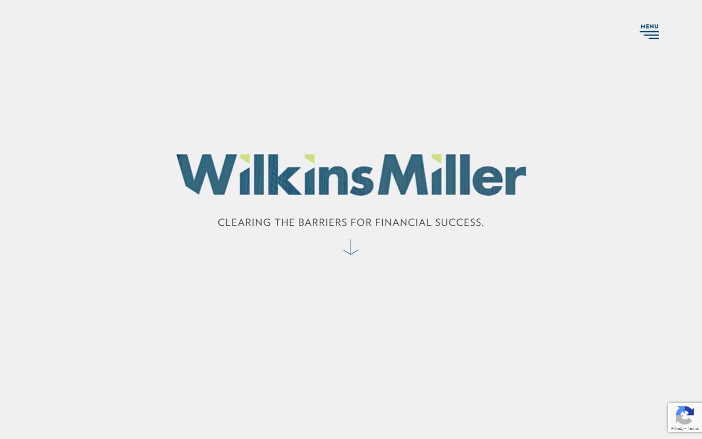
34. Wilkins Miller
Why it works: This website packs a lot of surprises, so don’t miss it! Moreover, it has a lot of functions and features that one can rarely see on other CPA websites. We also love the popping side menu which showcases all of what they do and where one can go after.
Certified Public Accountant Websites
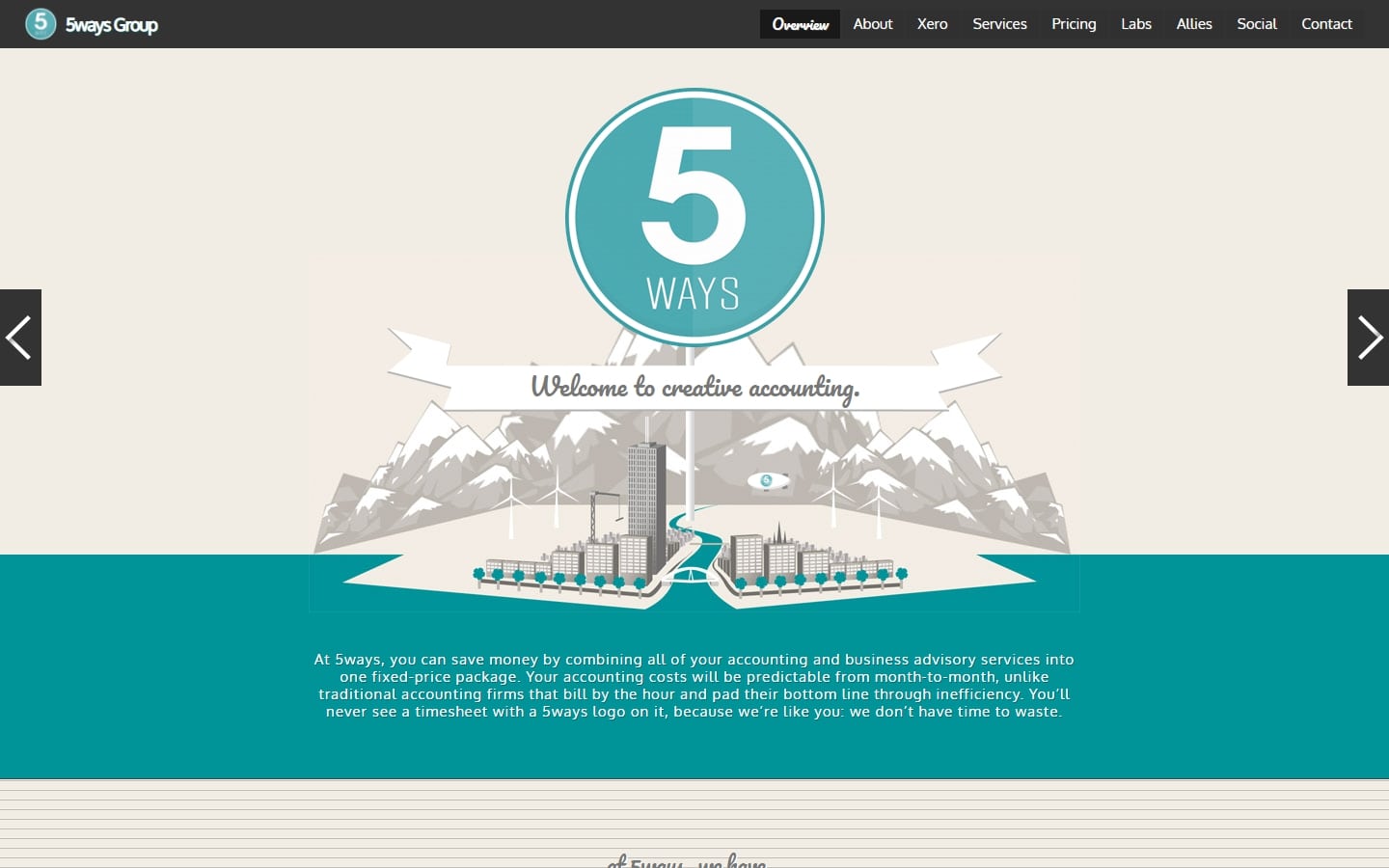
35. 5ways Group
Why it works: Creative accounting’ is what they offer, and it is very evident in their design, starting from the homepage alone. The custom illustrations, subtle animations, and engaging content all lead to a well-crafted masterpiece.
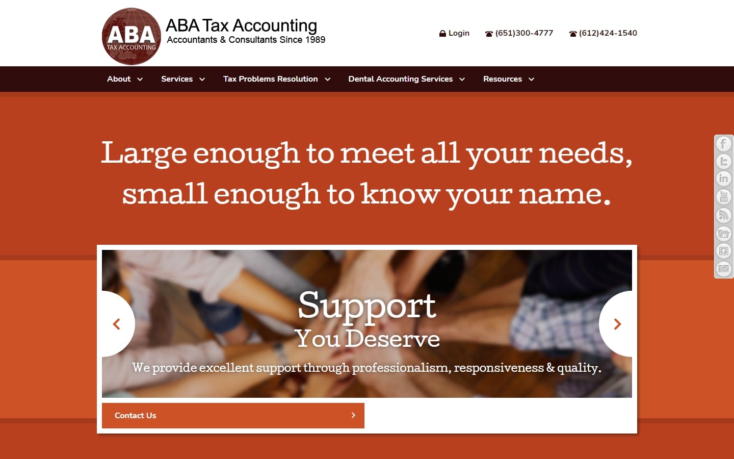
36. ABA Tax Accounting
Why it works: The biggest thing we love about this website design is the very bold statement of what they do without the need to dig in deeper. The colors are popped out well, too.
37. Beene Garter LLP
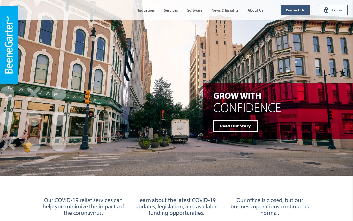
Why it works: Looking at the design alone, one can easily tell that the company is well-established, serious in their business, and capable in their confidence.
38. HHM
Why it works: Compact but powerful, HHM’s website is a good example of class and professionalism. One can also easily admire the generous amount of content revealed in the navigation menu.

39. Crest Accountants
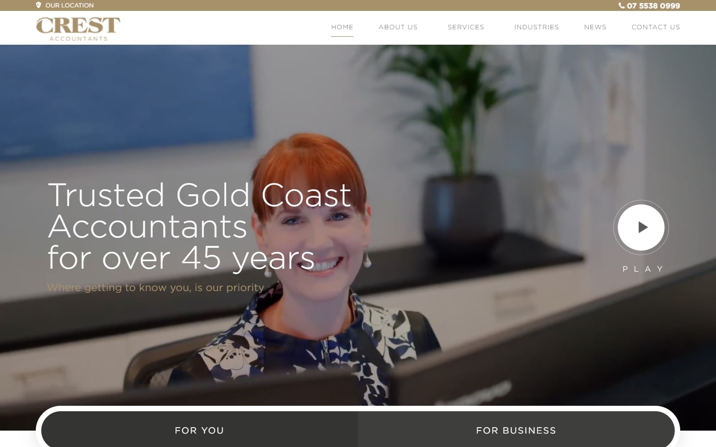
Why it works: The gold color is a tricky one, but Crest’s website used it extensively and without looking broken. The website felt very professional and appealing, with elements that keep your attention from going off the site.
Best CPA Websites
40. TOA Global
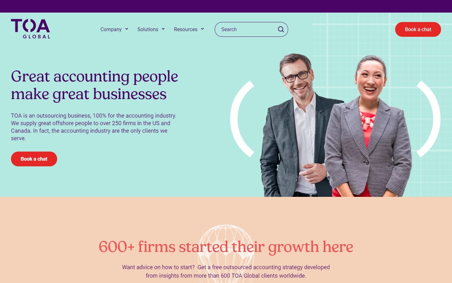
Why it works: We love TOA’s website because it is very spritely, positive, and friendly. The choice of typeface also makes this claim stronger. Moreover, the generous solid colors throughout the site looked clean and interesting in every section.
Conclusion
This list is a compilation of the top 40 Best CPA websites. It includes everything from major companies, to small firms that are making waves with their innovative designs and functional layouts. We hope you’ve found this article helpful.
If you’re looking for help with your CPA website design project, you’re in the right place. We will design a custom mockup of your new website before you sign or pay for anything. There is nothing to sign and no payment information will be taken. If you like our design for your business we can move forward working together. If not, there are no hard feelings and no other obligations.