Medical websites are important for many reasons. Medical professionals need them to share information with patients and other doctors. New patients or prospective patients need them to search for the right doctor, read about their health conditions, or learn more about a certain procedure they may be interested in undergoing. This list of 40 Best Medical Website Designs is going to help you learn more about what makes the best medical web design!
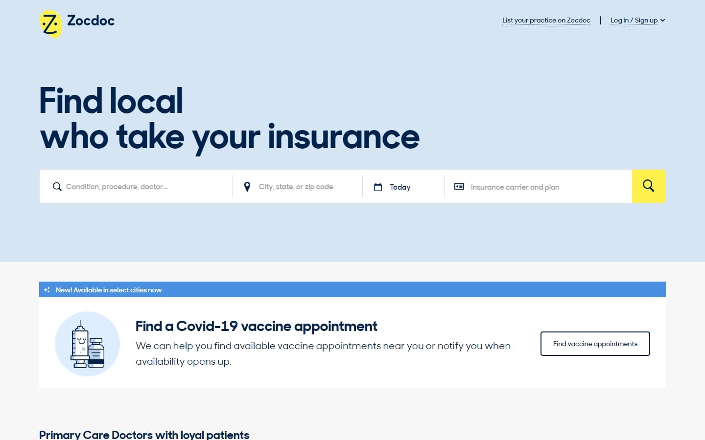
1. Zocdoc
Why it works: One finds a lot of good items in this custom medical website design: modern interface and typography, easy-to-use interactive elements, eye-catching icons, and mobile-friendly.
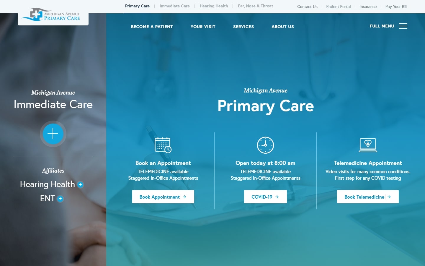
2. Michigan Avenue Primary Care
Why it works: To provide the best care for their patients, this healthcare provider has a user-friendly medical website design that provides all necessary information like contact details and appointment requests, all while looking professional and pleasing to the eyes.
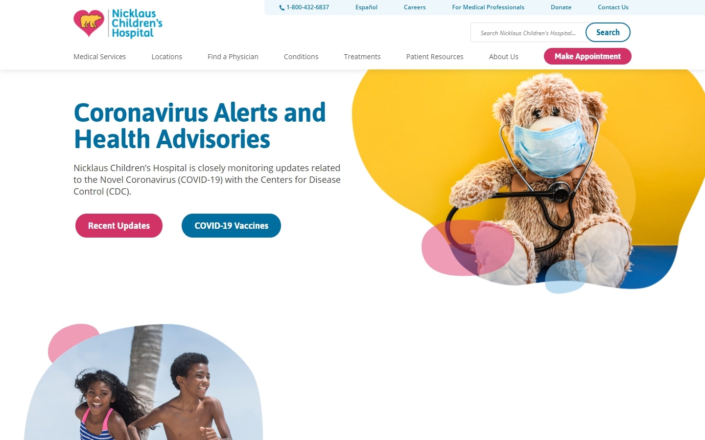
3. Nicklaus Children’s Hospital
Why it works: The website is crafted beautifully, starting from the logo to those moving blobs. These are design ideas you should take note of. We admire how the site is friendly and easy to use for people visiting.
MEDICAL SERVICES WEB DESIGN
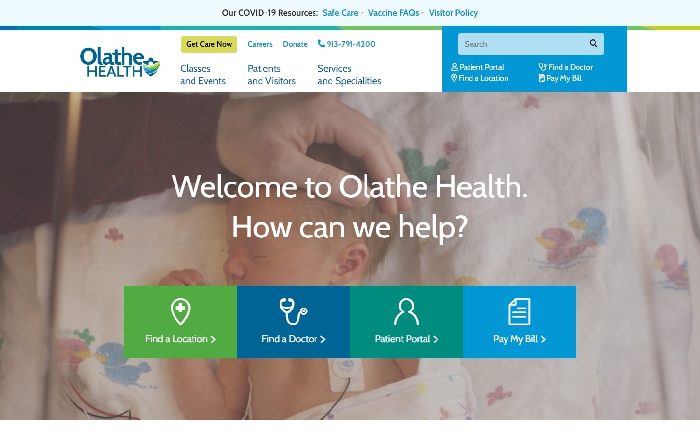
4. Olathe Health
Why it works: What makes this website so effective is the four sections prominently displayed on the hero image. Current and potential patients can find help here in answering their needs.
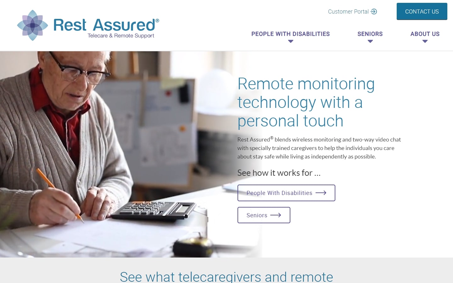
5. Rest Assured
Why it works: For a website offering services for seniors and PWD, this design features top-notch accessibility features such as strong clean contrasts between texts and elements, highly-visible buttons, and a simple but intuitive user experience.
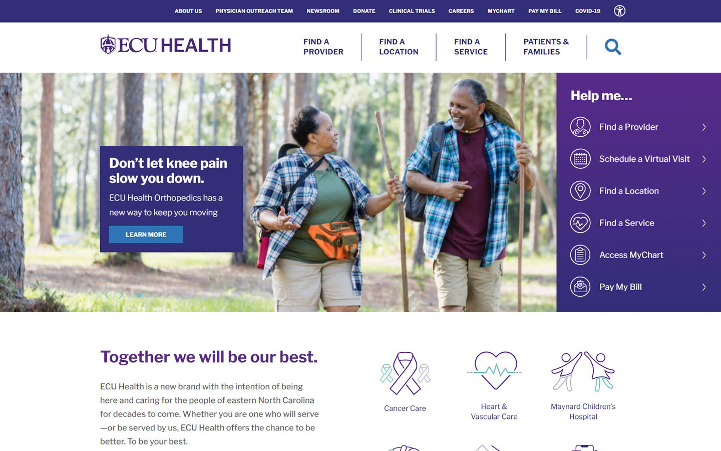
6. ECU Health
Why it works: The sidebar in the hero section contains helpful links for faster browsing. The header navigation in this medical website is easy to the eye. Colorful graphics and icons on a clean interface.
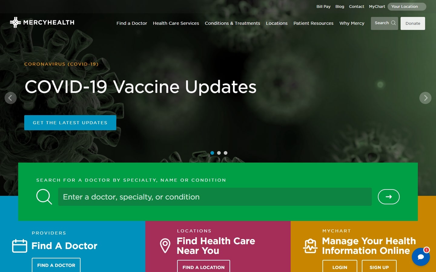
7. Mercy Health
Why it works: This medical website does a great job of breaking things up and using various layouts and a great color scheme, which makes the experience more dynamic.
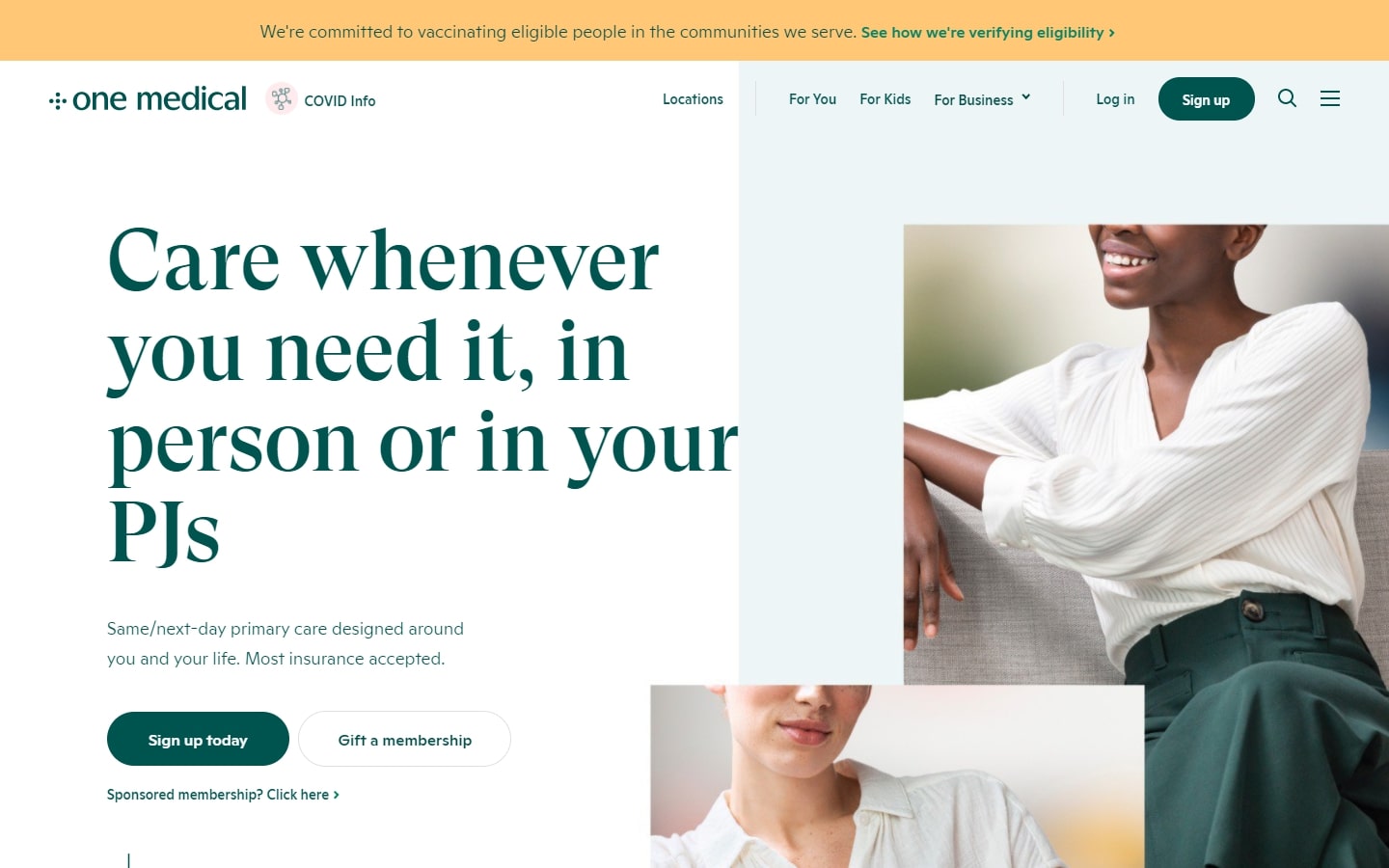
8. One Medical
Why it works: One Medical has a healthcare website design that has an unfamiliar yet very modern look and feel. The use of chic iconography makes a unique personality to their branding.
HEALTHCARE WEBSITE DESIGN
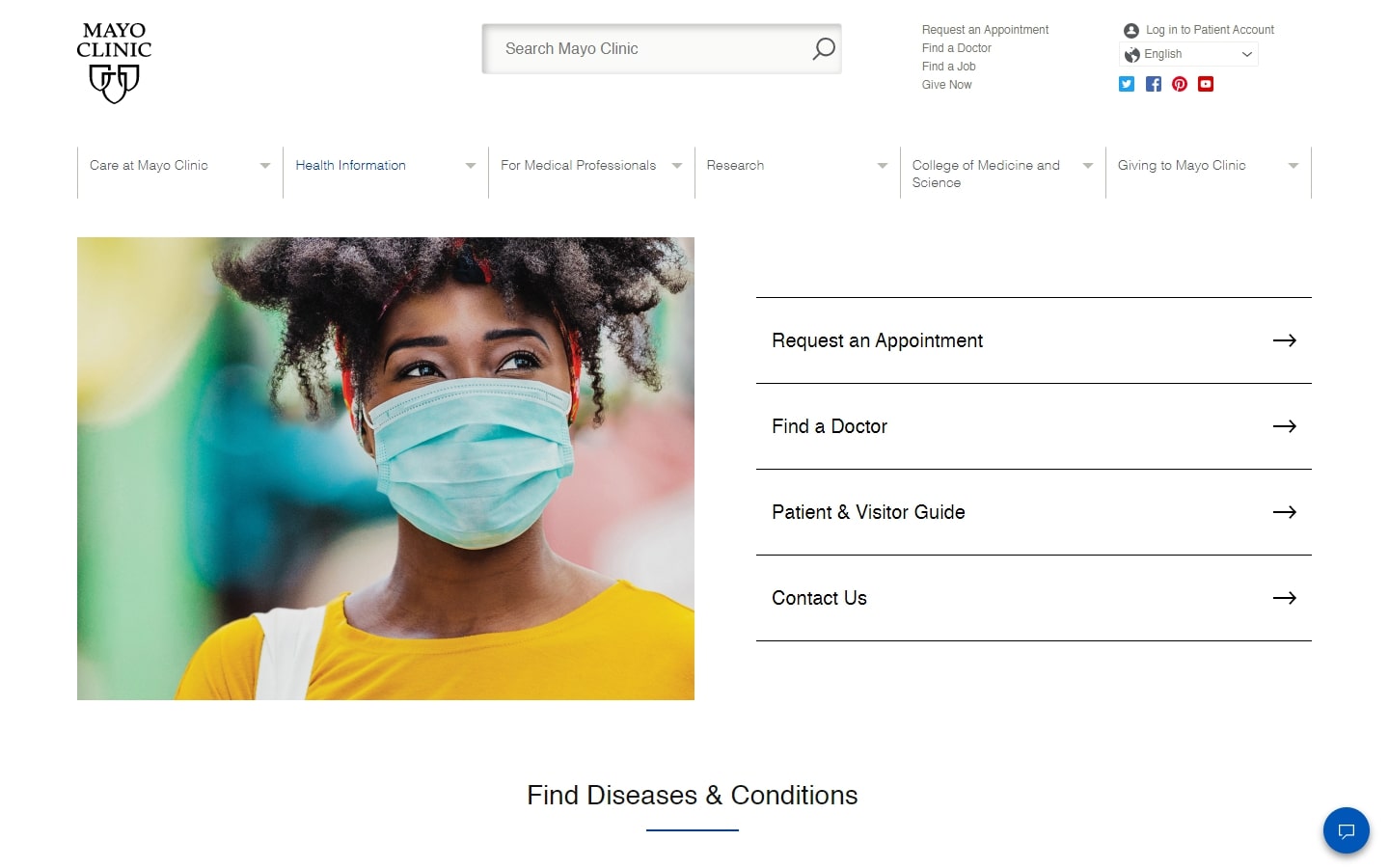
9. Mayo Clinic
Why it works: With a sleek and clean design, Mayo Clinic’s website focuses on providing quality medical information to visitors and patients. Their move of stripping away unnecessary elements pushes the website’s content to the front.
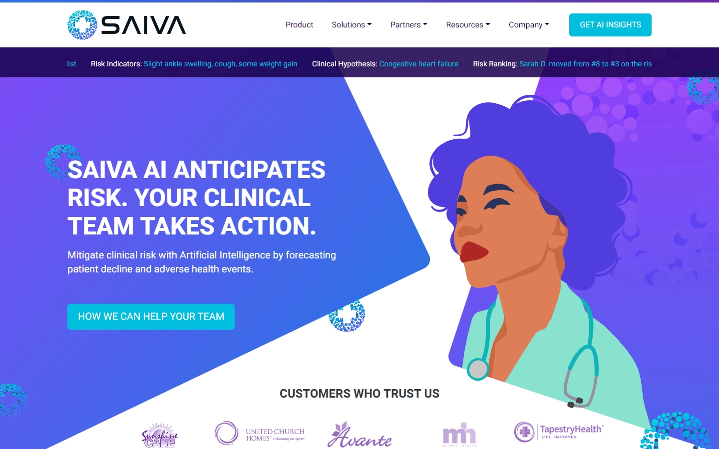
10. SAIVA.AI
Why it works: The very creative and attention-grabbing custom graphics may be the first thing you notice on their website. This web design makes effective use of color. The call-to-action buttons are also well placed and easy to find.
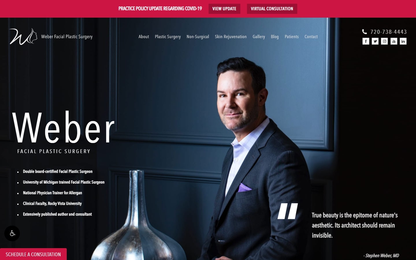
11. Weber Facial Plastic Surgery
Why it works: The breathtaking website design elements features eye-catching animations and transitions. One cannot miss the gorgeous imagery they used throughout the site. Their medical practices, patient reviews, and patient testimonials are highlighted in specific sections on the home page.
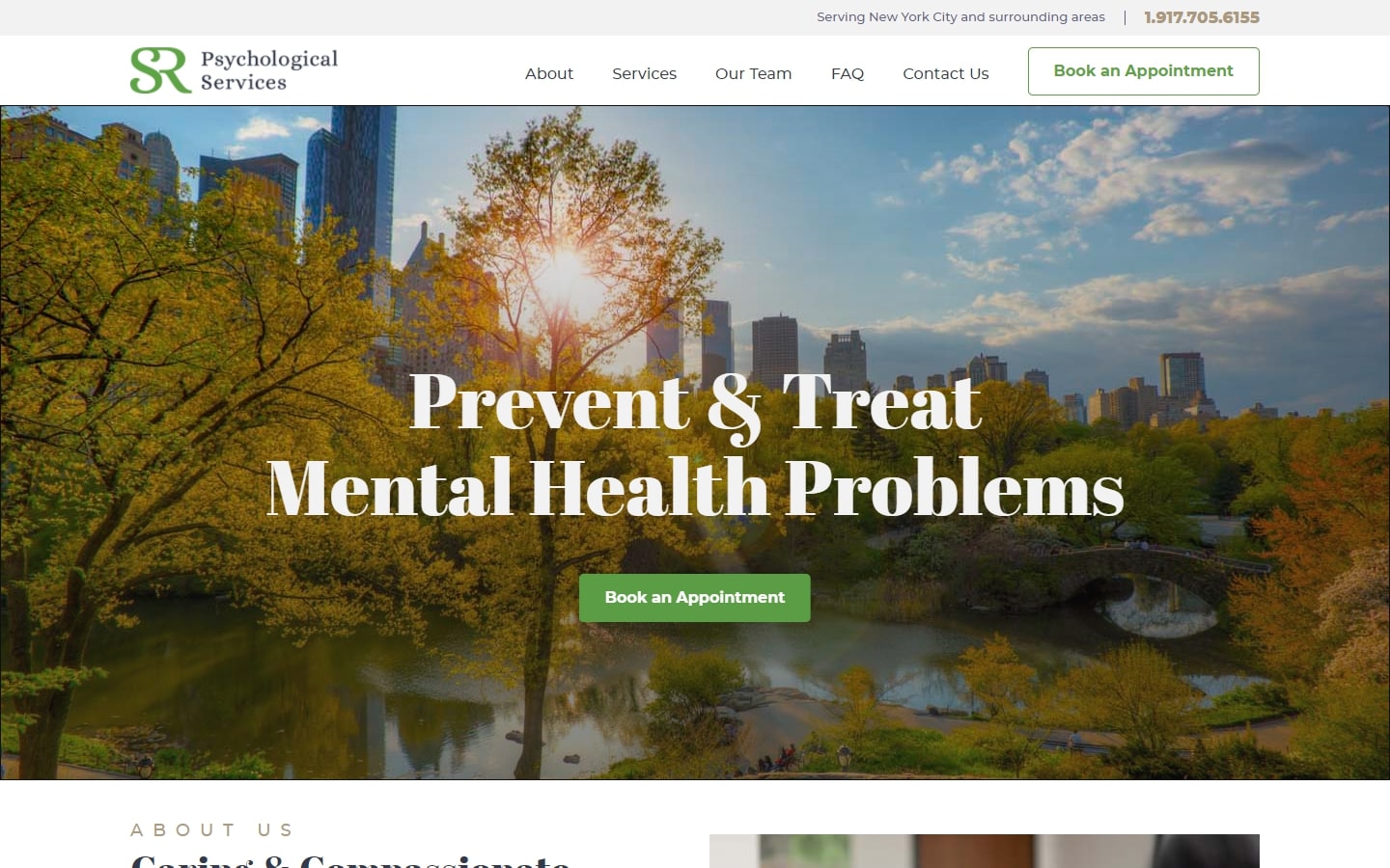
12. SR Psychological Services
Why it works: With the right choice of typeface and soft colors, this healthcare website has a specific mood that makes website visitors feel welcome and at ease. Very appropriate for a site that provides comprehensive psychological services to patients.
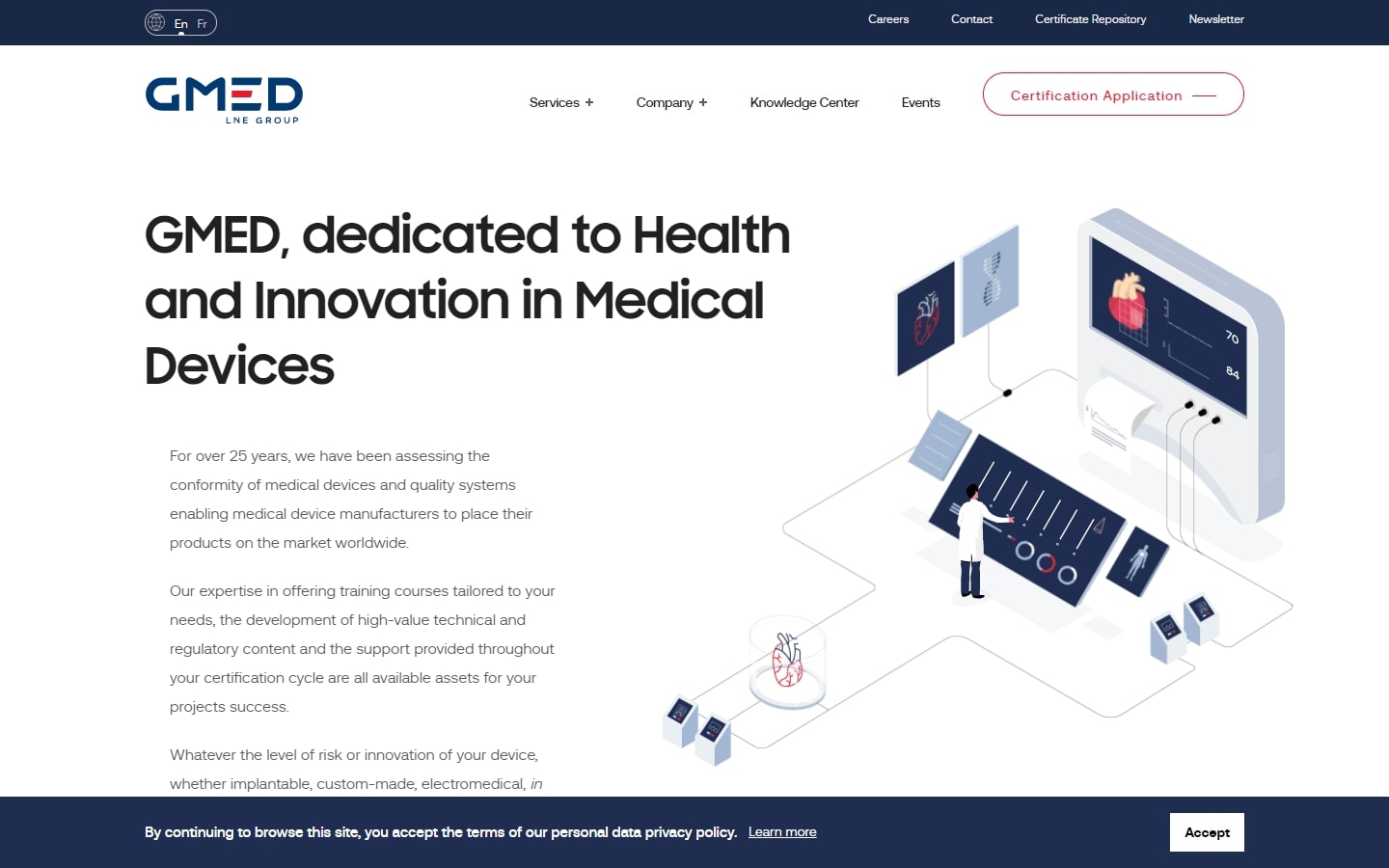
13. GMED
Why it works: An innovative website design with flashy animations and graphics. GMED is trying to shake the ground here with this out-of-the-box web design.
MEDICAL WEBSITES FOR INSPIRATION
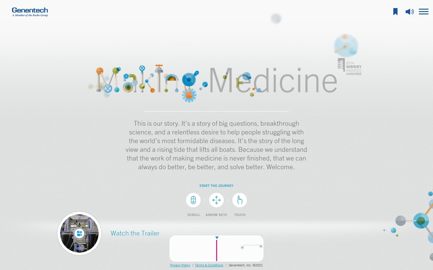
14. Genentech
Why it works: Winning some prestigious awards, this website landing page features a timeline with animations and graphics splattered all over. What’s also surprising is how it manages to work on mobile phones!
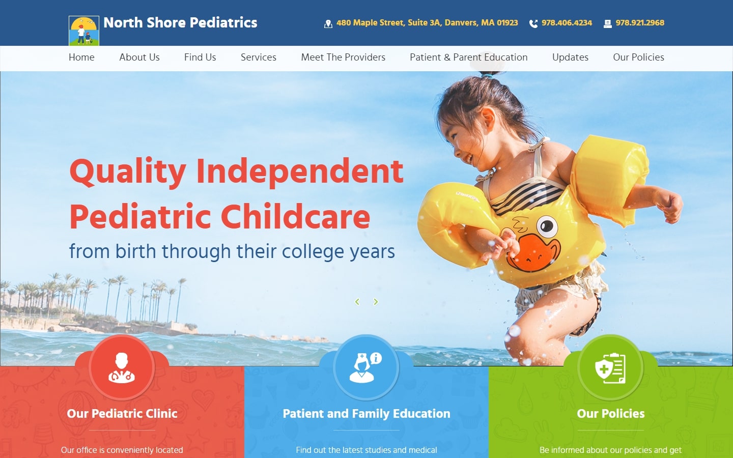
15. North Shore Pediatrics
Why it works: This website is perfect for those who are interested into pediatrics. The navigation is very easy to use and the colors are appealing to both children and adult patients.
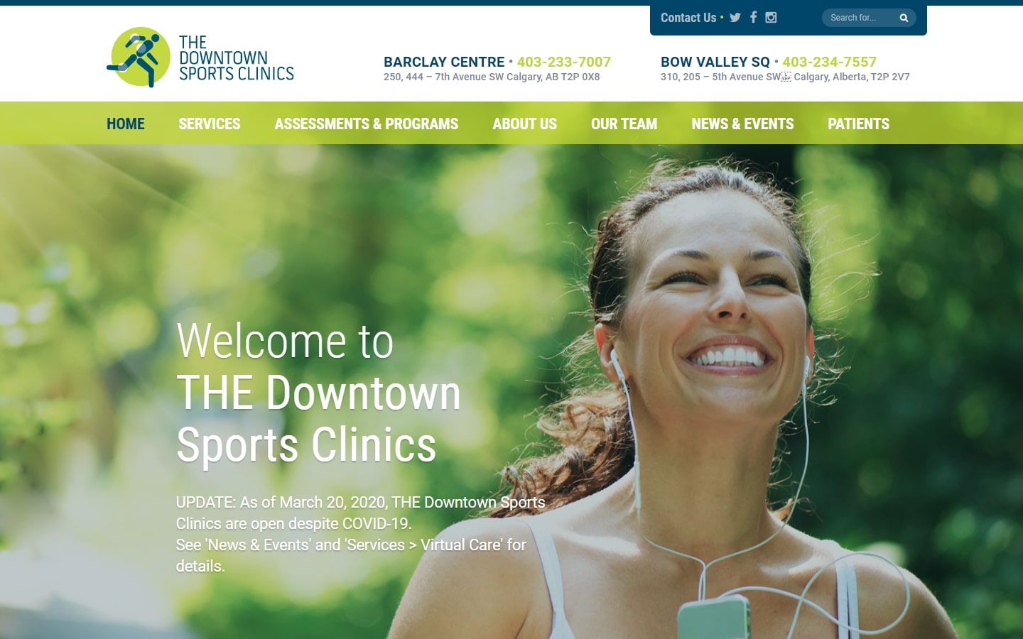
16. The Downtown Sports Clinics
Why it works: This medical website uses refreshing colors and design to draw the user in, links to their services are beautifully displayed upfront with clear and comprehensive navigation.
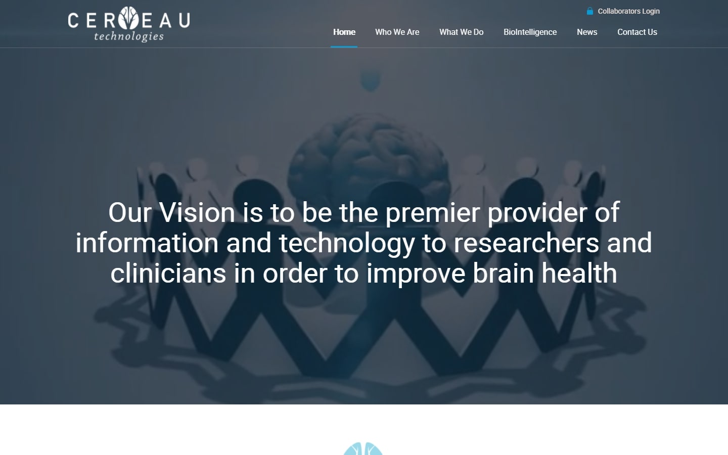
17. Cerveau Technologies
Why it works: Despite the mysterious yet interesting hero area, this website design looks very professional. We also love how the design managed to make the big chunks of texts into blocks of useful information that don’t get in the way of user experience.
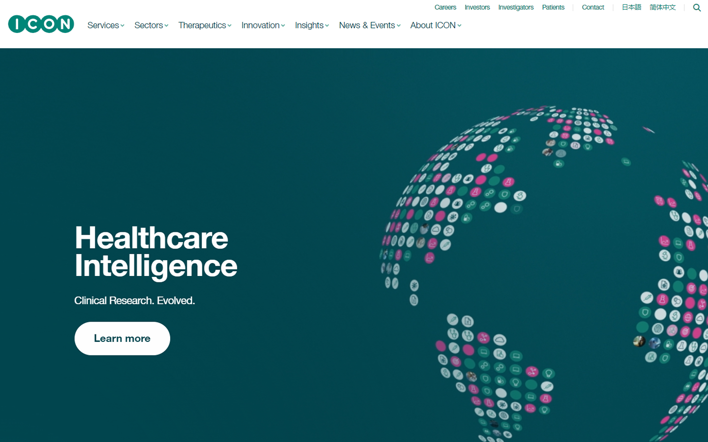
18. ICON
Why it works: This healthcare website has a sleek and trendy hero slider design. The layout is simple yet very modern thanks to its vivid colors.
best healthcare website design
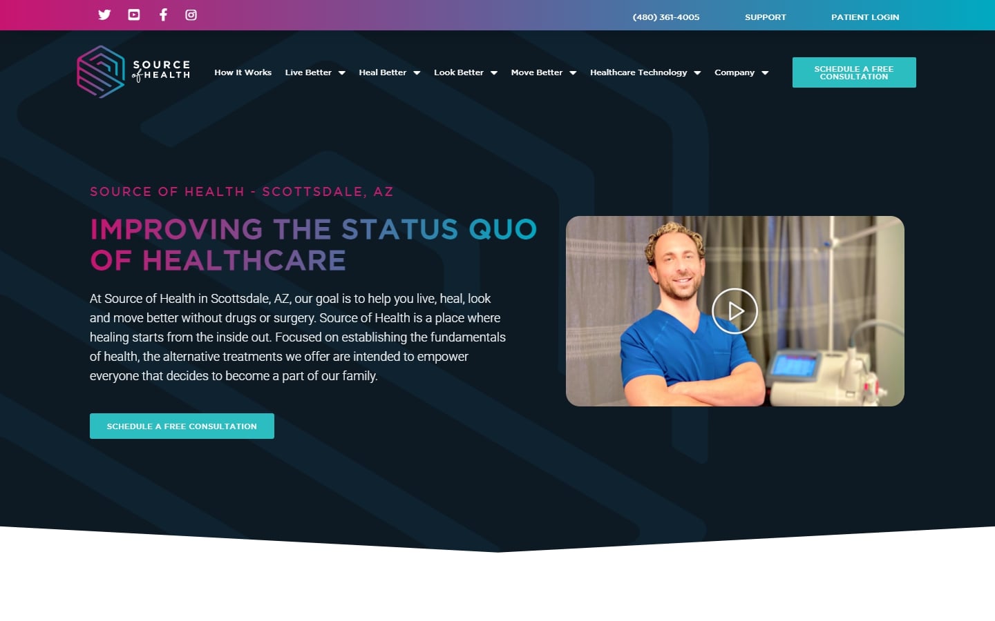
19. Source of Health
Why it works: The use of unique and modern graphics, along with colored gradients makes this medical website design both original and memorable.
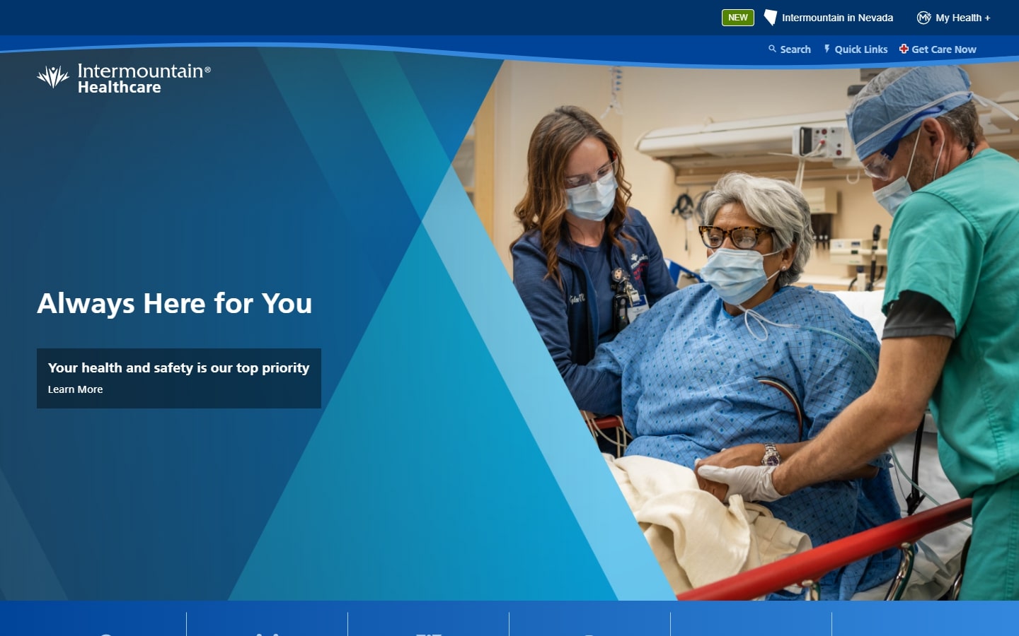
20. Intermountain Healthcare
Why it works: The homepage design for this site is true to be a well-laid-out cradle of every page visitors might need. All contents are arranged in a way that they can quickly find what they seek with ease.
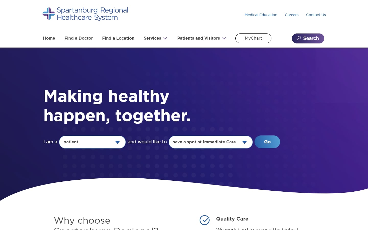
21. Spartanburg Regional Healthcare System
Why it works: One of the friendliest-looking website designs in this set. A nice choice of typeface makes it very easy on the visitors’ eyes.
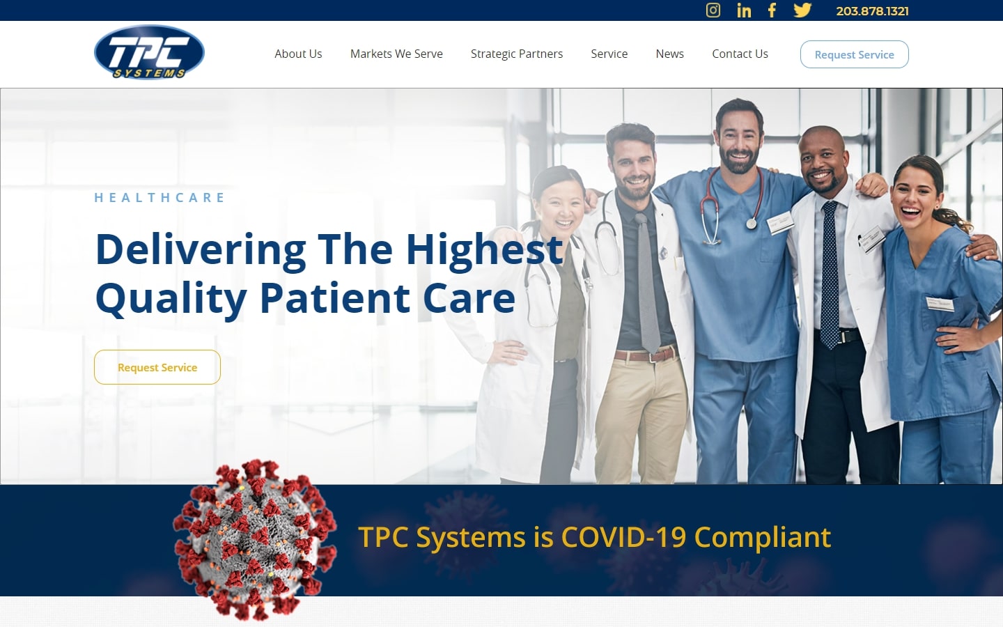
22. TPC Systems
Why it works: If you are looking for Safety Solutions, one huge item in your checklist would be the trustworthiness pictured on a company’s website. Trust is the #1 impression one can easily derive from this web design.
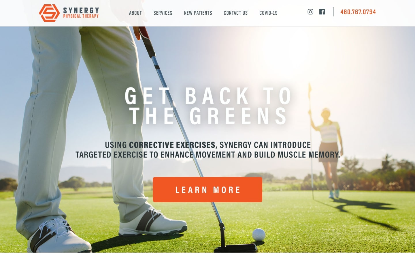
23. Synergy
Why it works: Physical therapy can be depressing, so it’s very helpful when your doctor’s office has a motivating web design.
MEDICAL WEBSITE DESIGN EXAMPLES
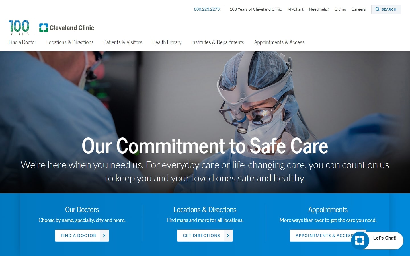
24. Cleveland Clinic
Why it works: Stunning photographs, clean easy navigation and header. There’s a quick link for patients, patient education and doctors.
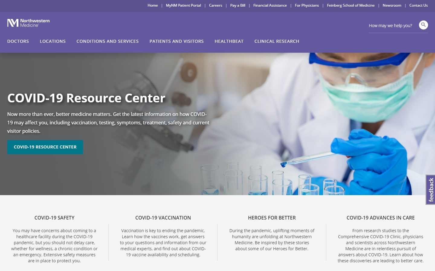
25. Northwestern Medicine
Why it works: This healthcare website has a user-focused functionality that is easy to navigate.
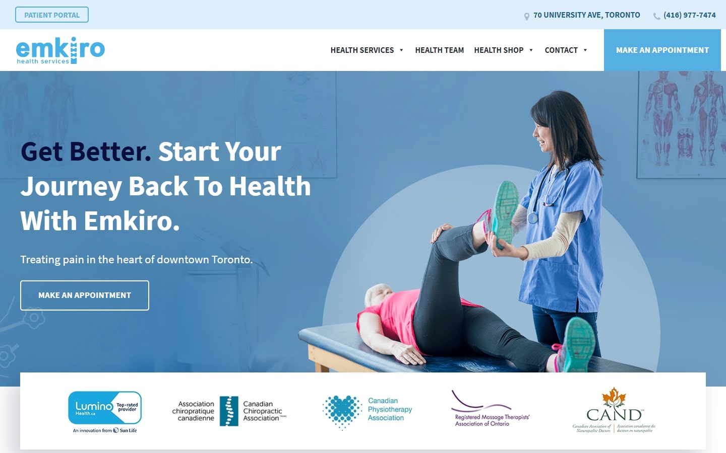
26. Emkiro
Why it works: This medical practices website design is notable for its creative use of icons and other graphics to further promote the facilities’ brand and services.
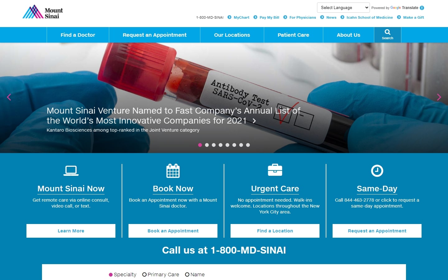
27. Mount Sinai
Why it works: This medical industry website features a lot of tools and interactive elements to quickly aid visitors and patients, all in an easy-to-navigate layout.
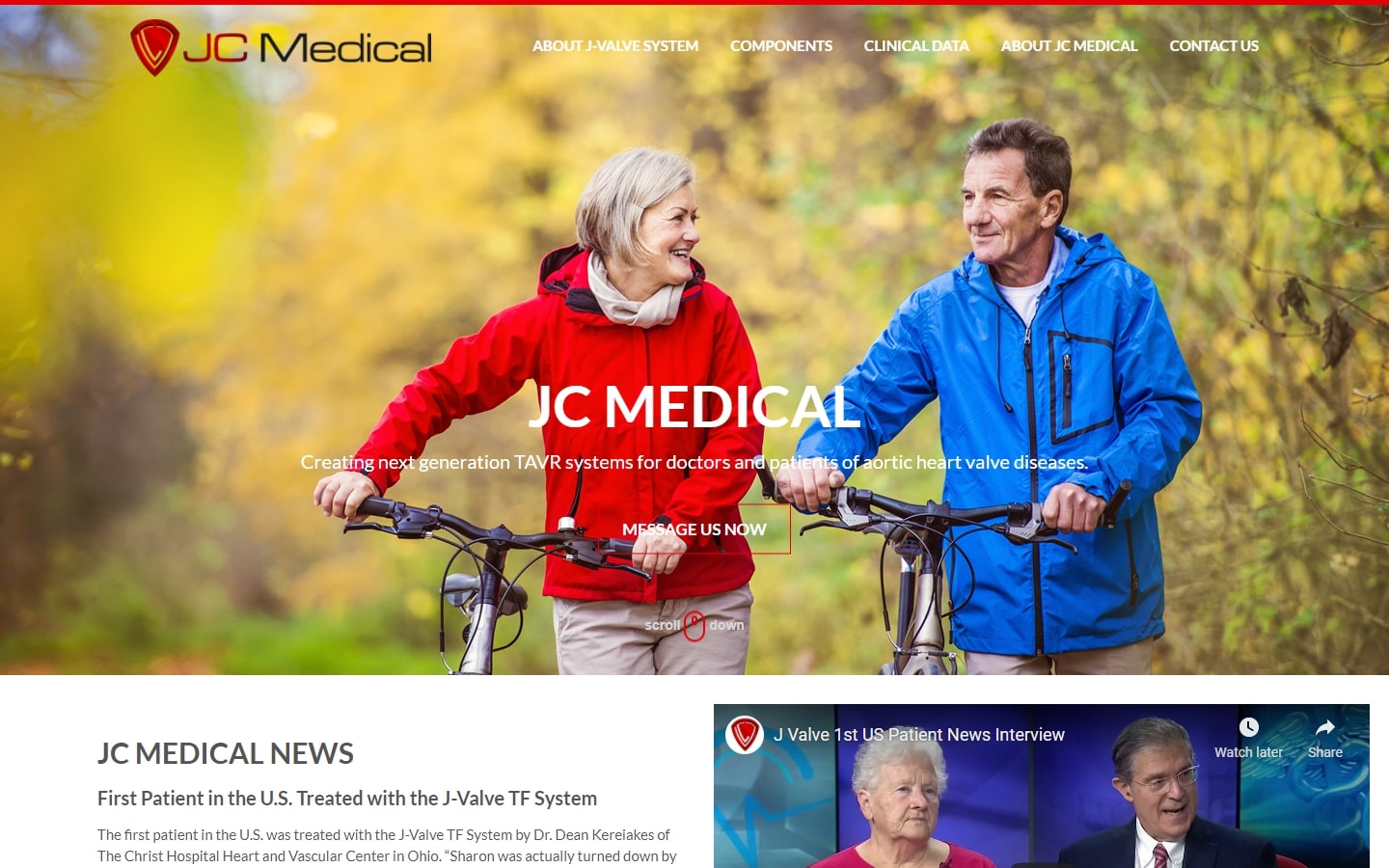
28. JC Medical
Why it works: The design of this site was very authentic, despite the typical layout. It’s clear that a lot of thought and care went into how products are displayed at the homepage without viewers needing to get too deep in-page.
best medical web design
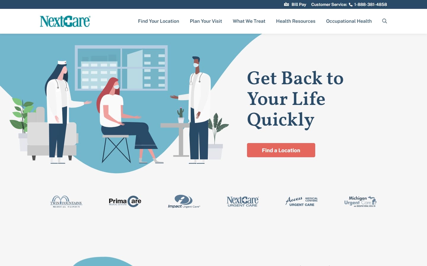
29. NextCare
Why it works: This modern website design uses quality illustrations and graphics to portray what they do or offer. The site also makes very expressive use of whitespace.
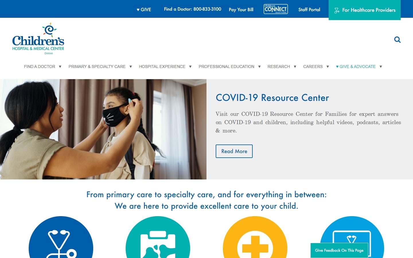
30. Children’s Hospital and Medical Center
Why it works: This healthcare website design shatters the cliché that children’s websites need to be entirely in bright colors. The large icons above-the-fold are attractively spaced out without feeling crowded.
31. Ascension
Why it works: The homepage has a very clean and minimal design, with a focus on CTAs, particularly the ‘Schedule an Appointment’ button. Long paragraphs are also put into sections for easier reading. Accessibility is enhanced by adding the Quick Links to My Patient Resources, Find Careers, Make a Payment and News.

32. West-Com
Why it works: A lot of medical websites are forgettable and use the same color scheme over and over, but West-Com’s website injects creativity by using different splashes of colors to create intrigue and web presence.

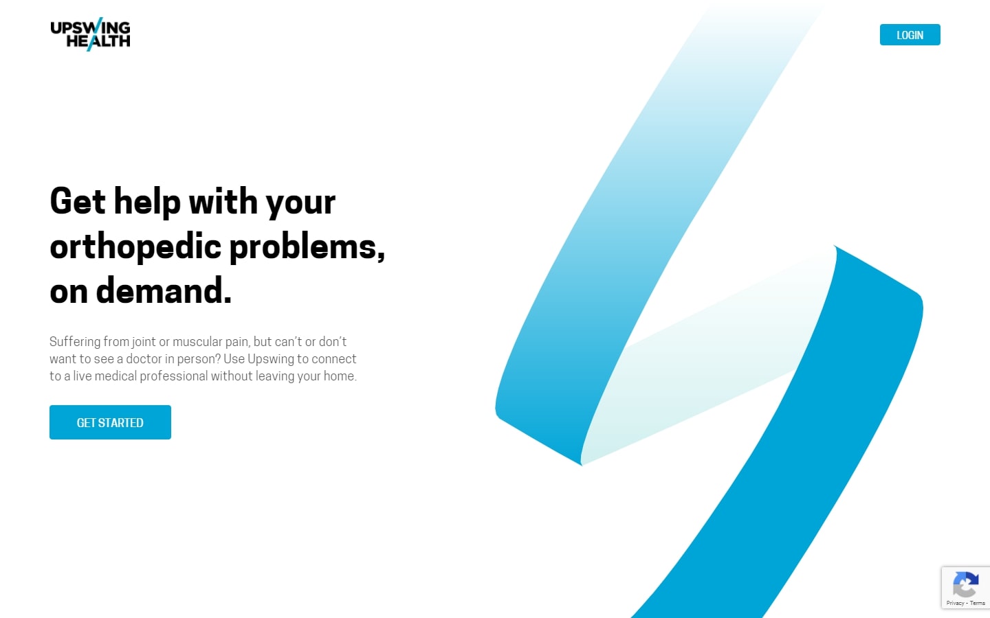
33. Upswing Health
Why it works: Simple elegance describes the design of this healthcare website. The free assessment tool is a great support and marketing strategy for their target audience.
medical website inspiration
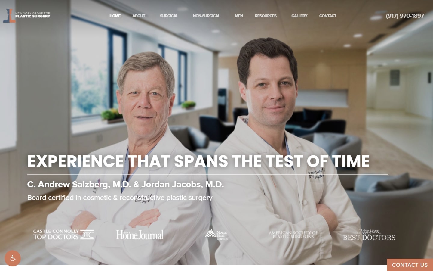
34. NY Group for Plastic Surgery
Why it works: High-quality images, a modern layout of the paragraphs and headings make the website easy to read. A sticky ‘contact us’ button is located in the bottom right corner of the screen.
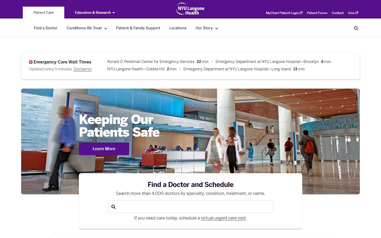
35. NYU Langone Health
Why it works: This healthcare website shows great design examples and design ideas. The ‘Emergency Care Wait Times’ feature is something you should take note of. The images used are high quality making this medical website clean and professional-looking.
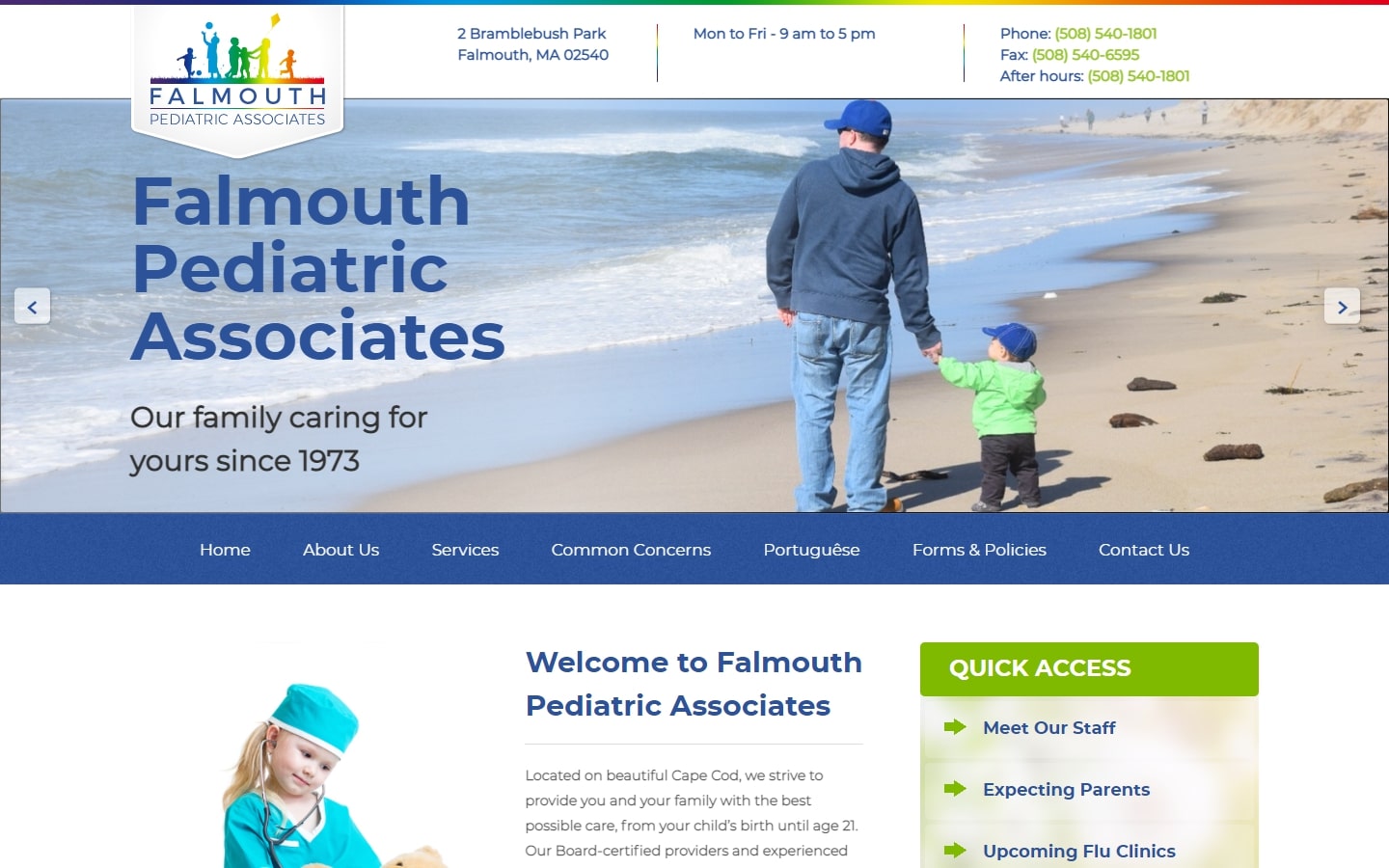
36. Falmouth Pediatric Associates
Why it works: The website of this healthcare organization maintains a clean, compact design without sacrificing content or authenticity. Safety, Emotional Health, Nutrition and Newborn Information links on the homepage aid accessibility for users.
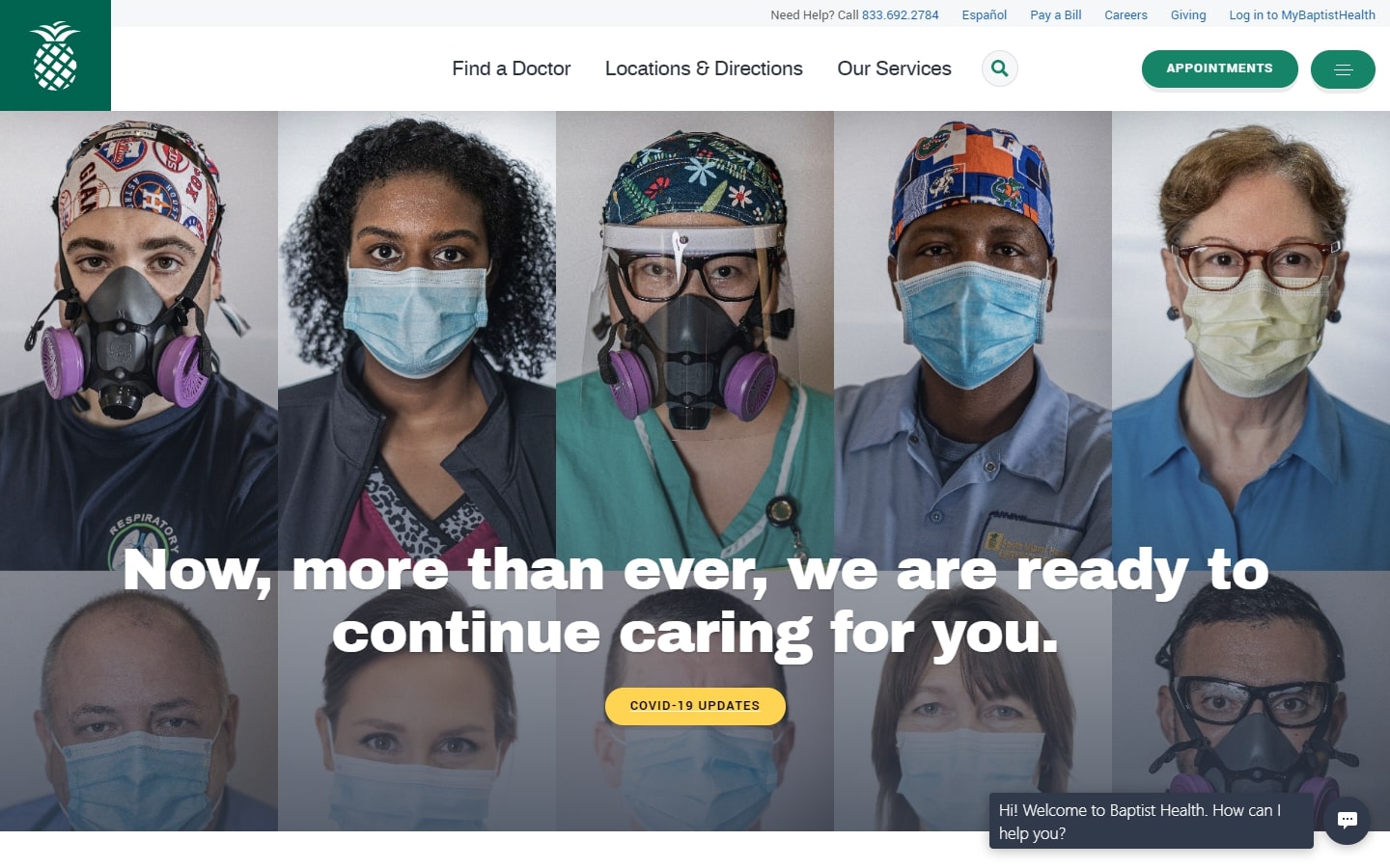
37. Baptist Health
Why it works: High-quality and interesting images make up the fantastic header. Essential and urgent care tools like the Find a Doctor section are easily available on the sticky navigation.
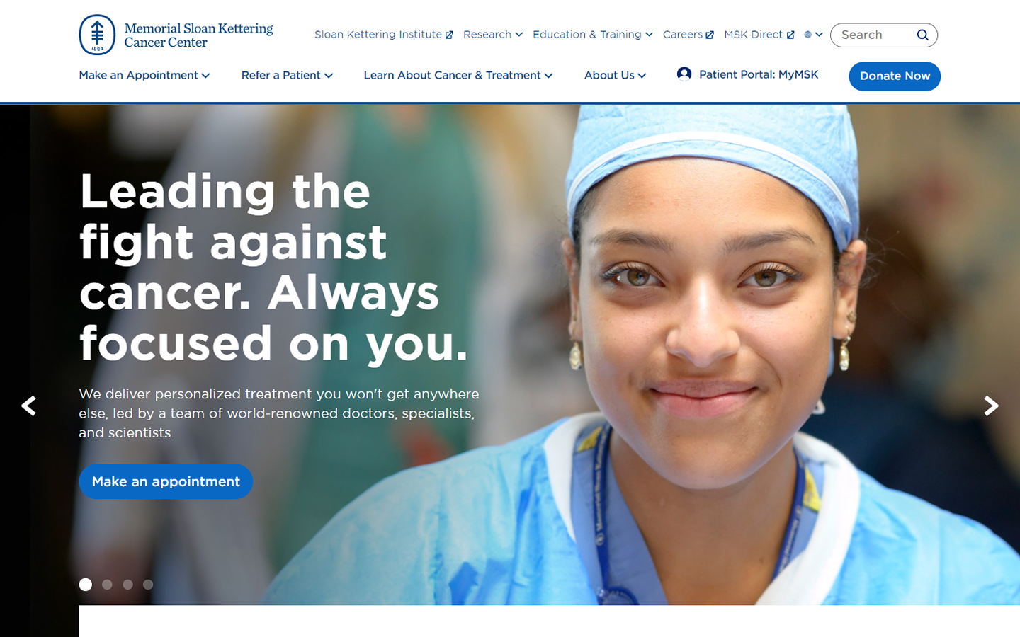
38. Memorial Sloan Kettering Cancer Center
Why it works: Indeed, this design has lots of helpful tools to help you find a doctor, other healthcare providers, or make an appointment. The clean interface creates a calming and trustworthy feeling for their brand.
healthcare web design
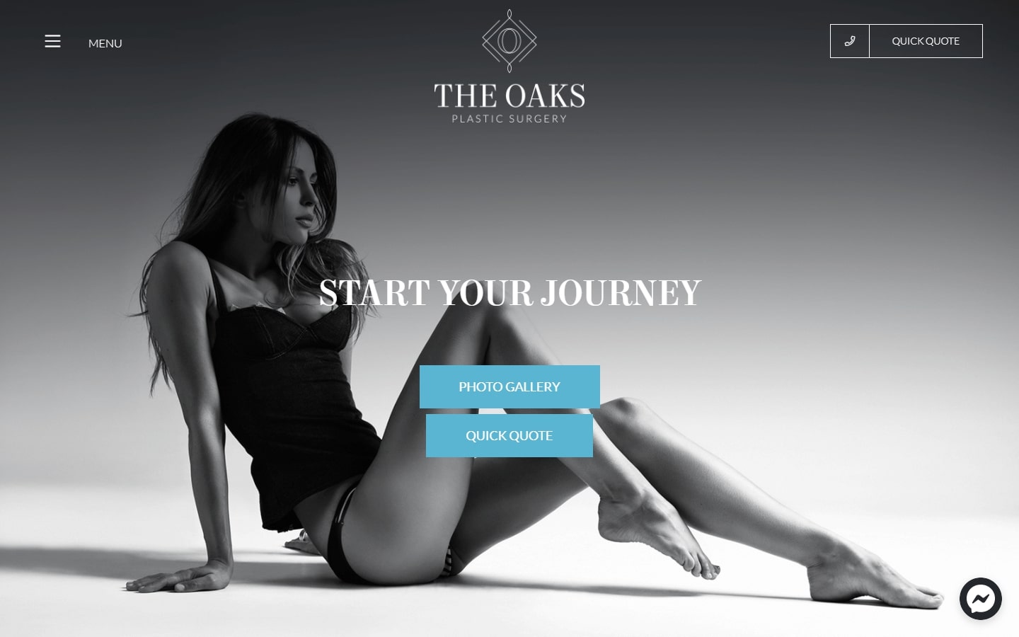
39. The Oaks Plastic Surgery
Why it works: The minimalist black-and-white website design is cool and pairs well with the blue accents. We also love the small video clips used to better portray the results of their services.
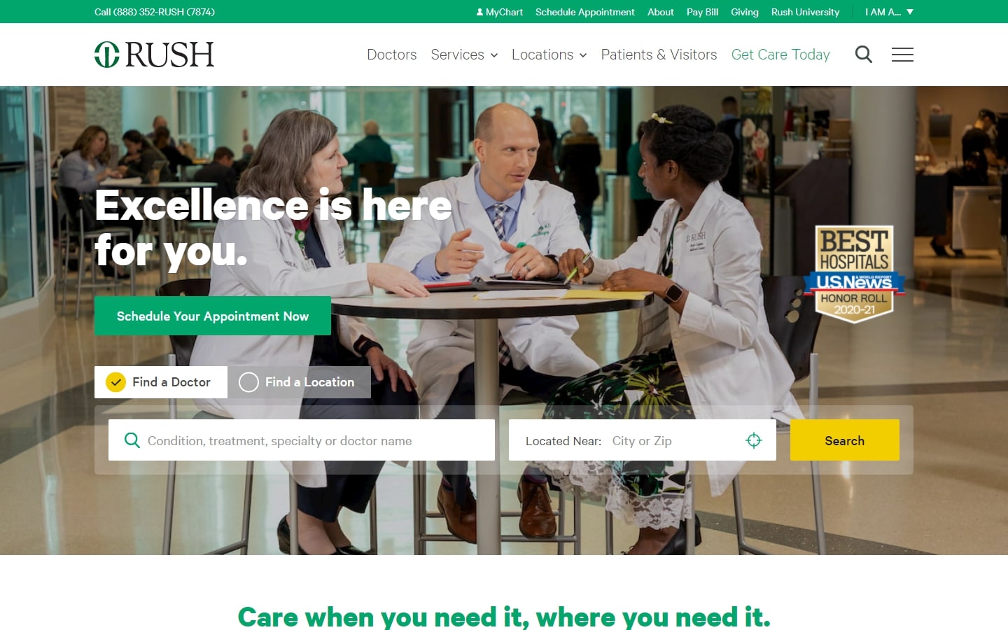
40. Rush University Medical Center
Why it works: This design makes us think of TripAdvisor because they share some similarities in look and feel. Potential patients can easily search for physicians using the Find a Doctor feature in the banner. They are both pleasing to visit and easy to navigate even on mobile devices.
Conclusion
We hope you’ve enjoyed this list of the best medical web design. It’s a great resource for anyone who is looking to build or redesign their healthcare website, as well as an inspiration for those in the medical industry. If you would like more information on how we can help with your digital marketing needs, please contact us!
We will create a custom medical website design before you sign or pay for anything. There is nothing to sign and no payment information will be taken. If you like our design for your business we can move forward working together. If not, there are no hard feelings and no other obligations. Click the button below to learn more.