In this article, we will be listing the top 30 Painting Website Design on the internet. Painting is a very popular hobby and pastime that many people enjoy doing in their free time. There are many different types of paintings ranging from abstract to realistic, but what they all have in common is how relaxing it can be to just sit down and paint! Painting has been around for centuries with some of the earliest evidence dating back to prehistoric times. Painting was originally used as an art form, but today there are also uses for painting such as interior decorating or making handicrafts like pottery. With so much variety between various types of painting styles and mediums, you’re sure to find something that suits your interests!
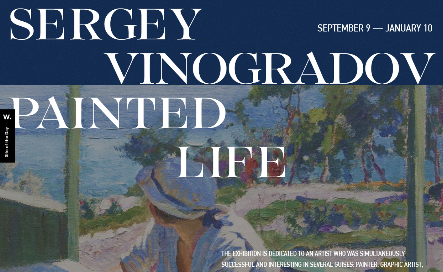
1. Sergei Arsenievich Vinogradov
Why it works: Not a typical layout but what makes it unique to any other Painting sites are the use of large font size, and large painted images. Plus they added a slight animation to make it not boring.
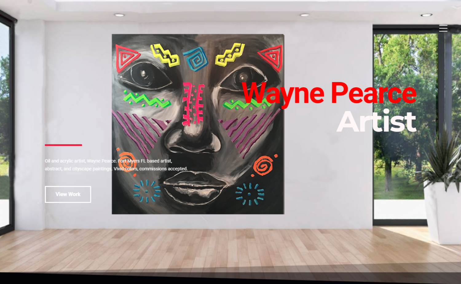
2. Wayne Pearce Artist
Why it works: You can see the contrast of color against the dark background. The site is interactive and what’s really nice about it are the easy to follow directions for how to create a painting of your own.
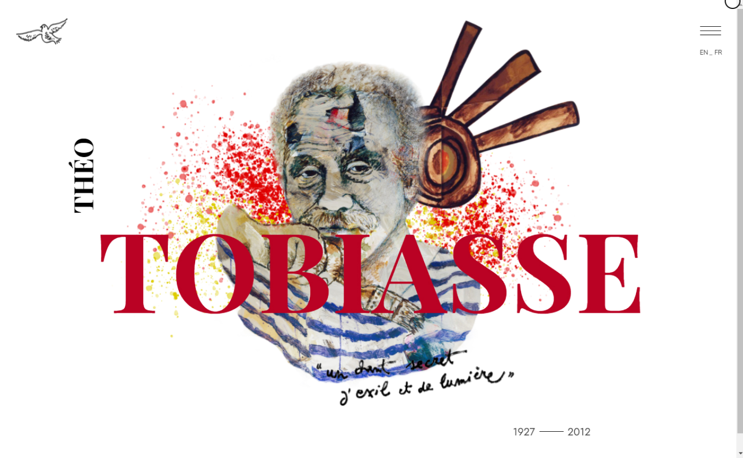
3. Tobiasse
Why it works: The design is very innovative, modern, and minimal. We love the perfect choice of typefaces against the clean white background.
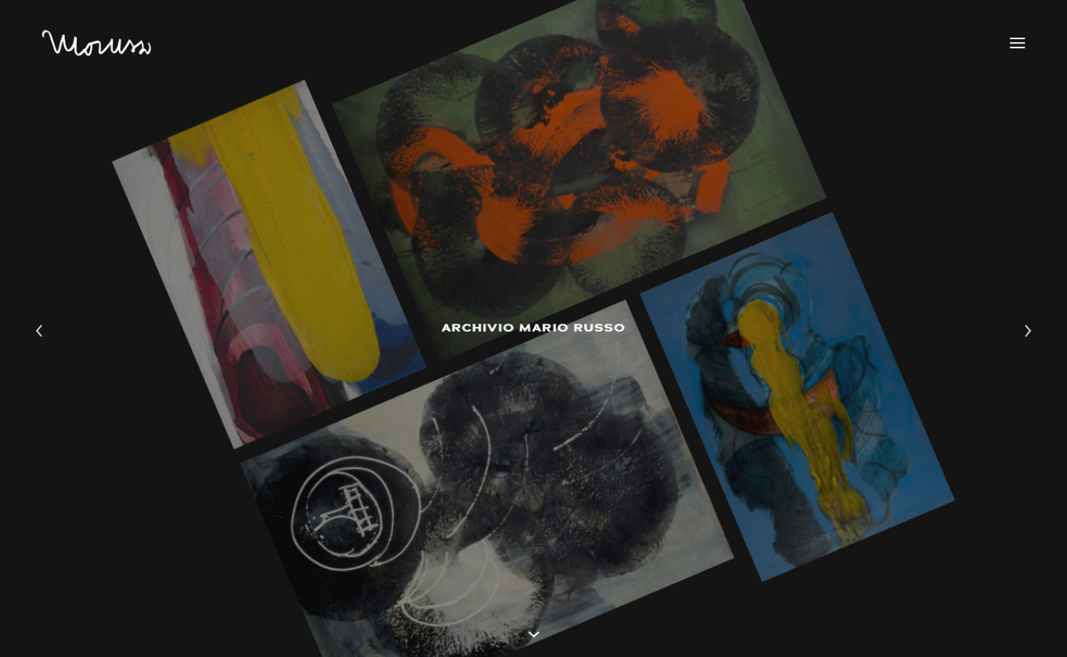
4. Archivio Mario Russo
Why it works: There isn’t one theme on this site, and there is something for everyone. It’s user-friendly and the images are as crisp as they come.
5. ARTSTUDIO.app
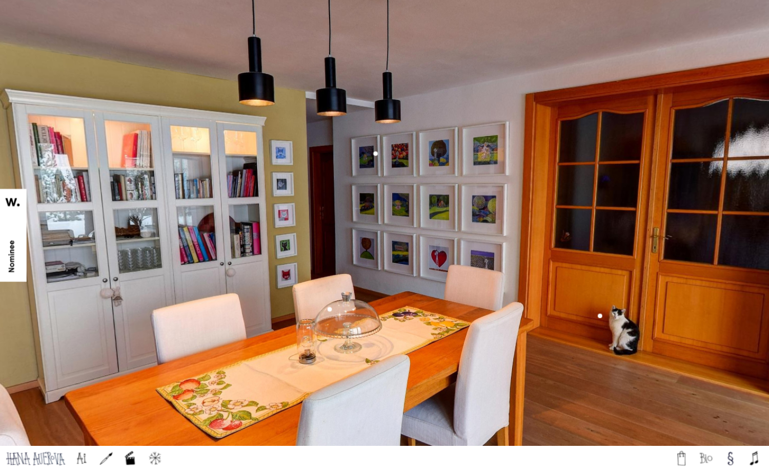
Why it works: The site is so simple and elegant, it’s soon obvious that the animations are what really “bring its cute illustrations to life”
6. Lick
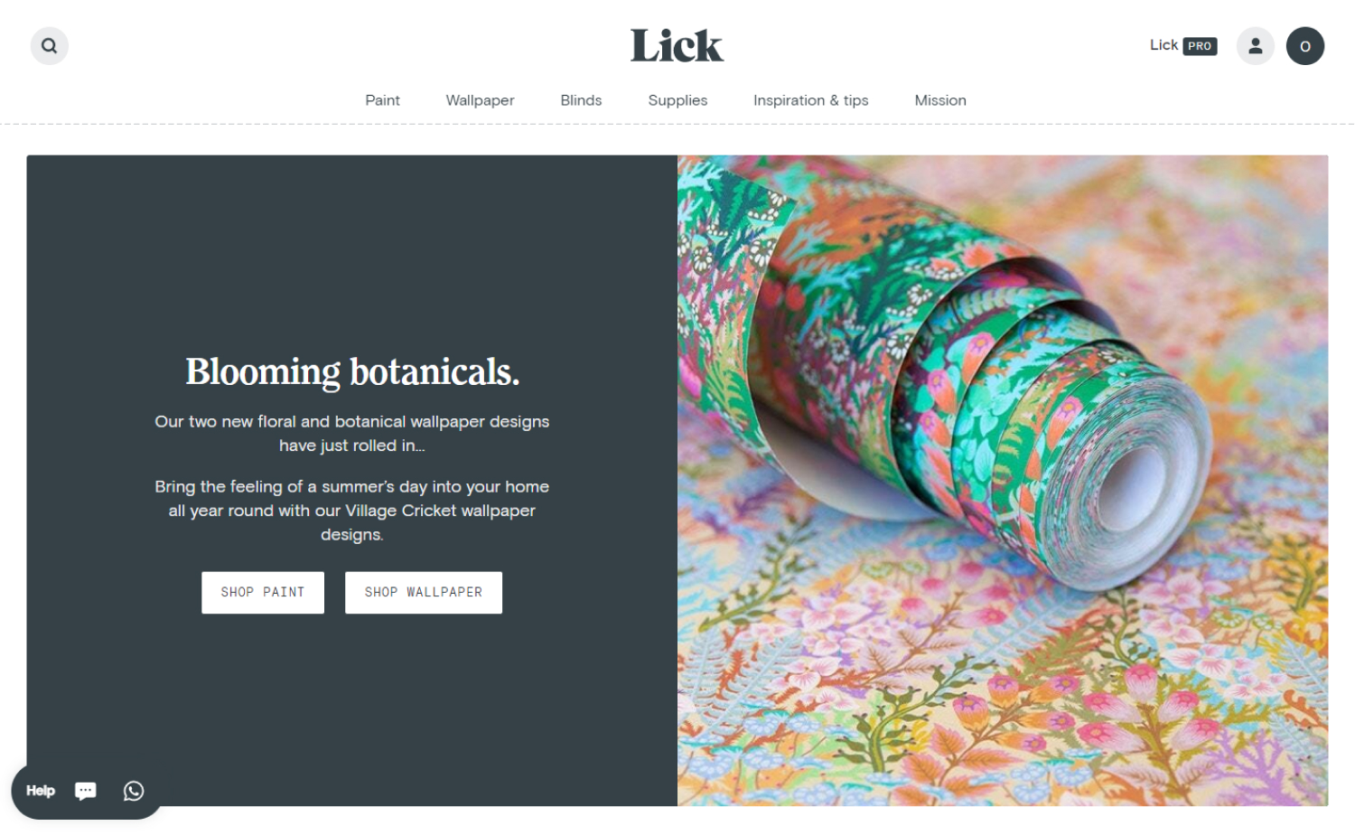
Why it works: The design successfully combines simple text and imagery that make the site feel clean, fresh, and simple. Highlighting their projects on the homepage is impactful without being too complicated.
Best Painting Websites
7. Guilbo – Artiste Peintre
Why it works: This website design is largely different from its alternative. It invests heavily in good-looking pictures to promote its branding – a breakthrough achievement.

8. Parnell Gallery
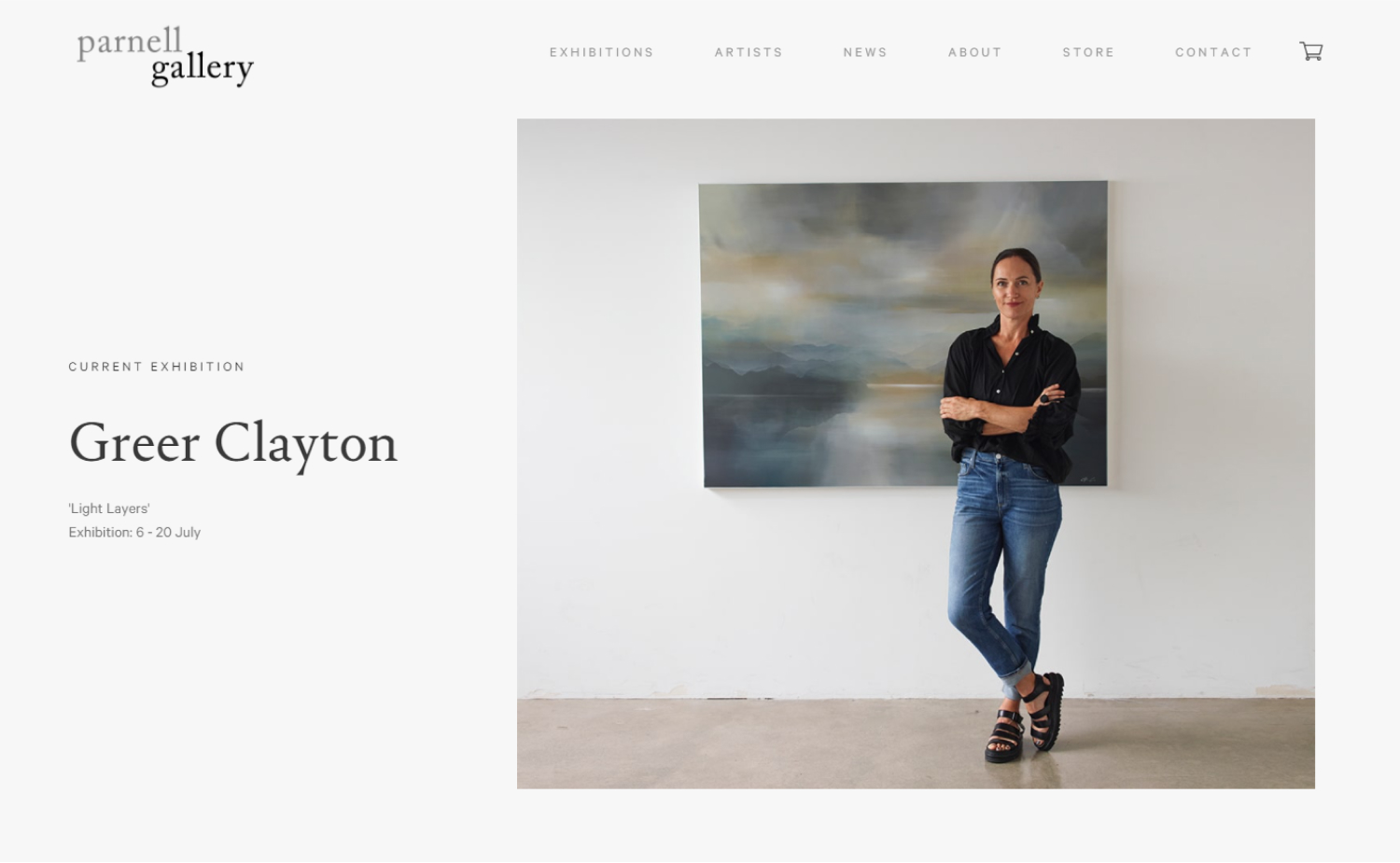
Why it works: The design of this website is a direct showcase of what professional portfolios should look like in the current digital age.
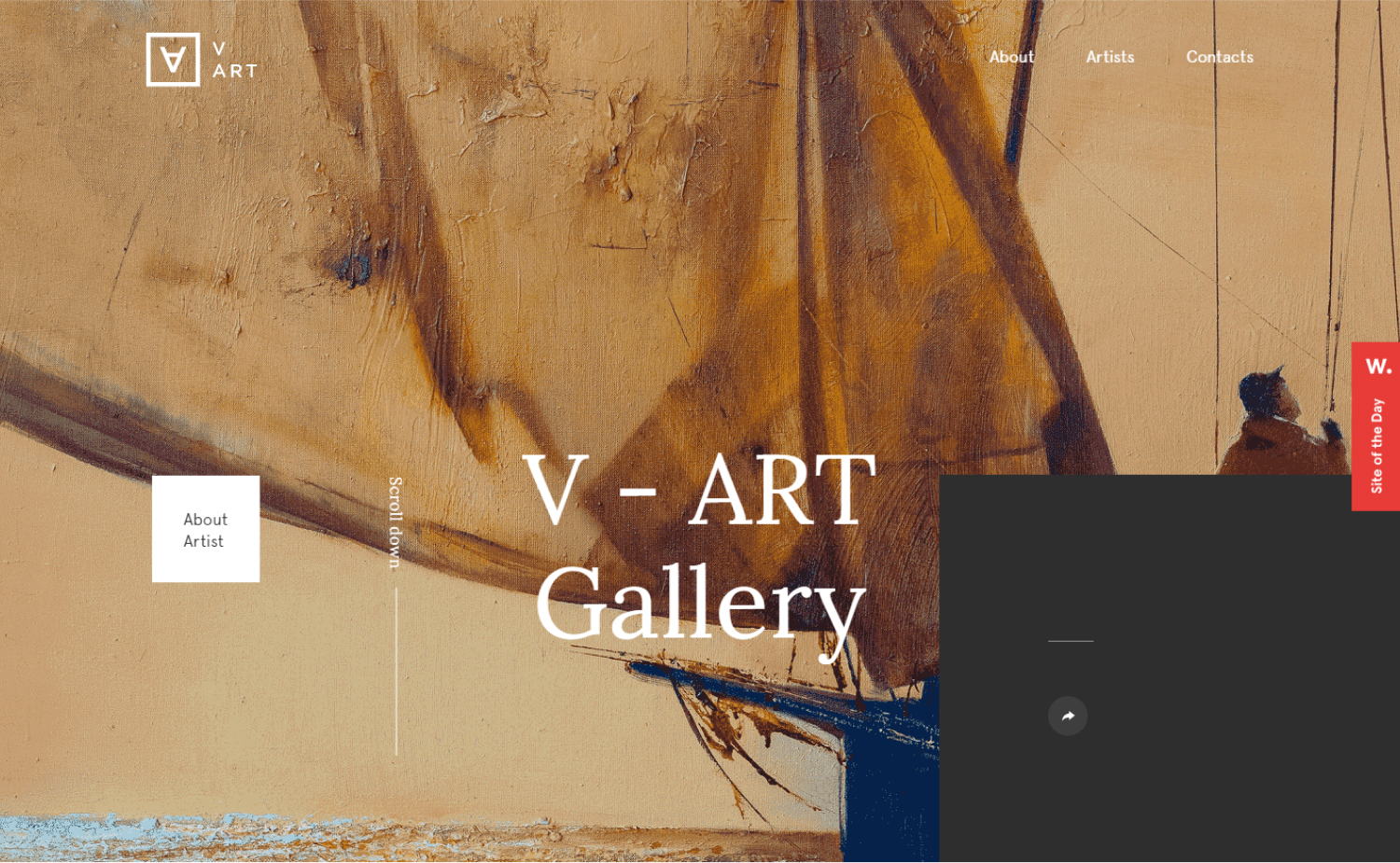
9. V-Art
Why it works: Clean, modern and classy, there is a generous use of whitespace throughout which makes the site seem both polished and professional.
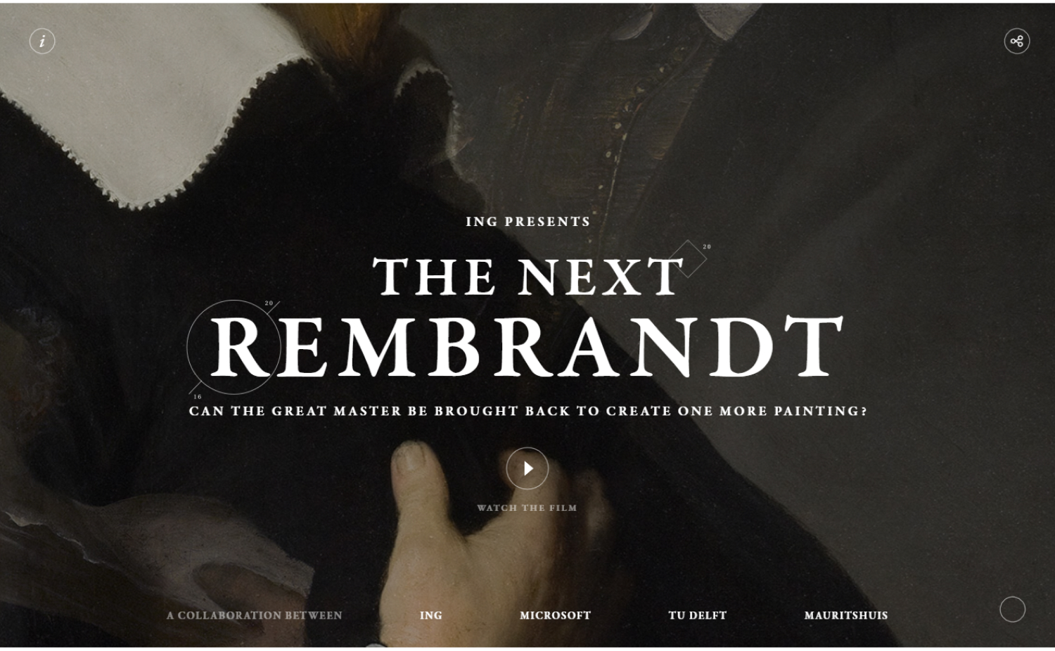
10. The Next Rembrandt
Why it works: The website’s layout is aesthetically attractive and combined with animations and creative transitions, allows for interactive elements like lines and outlined shapes.
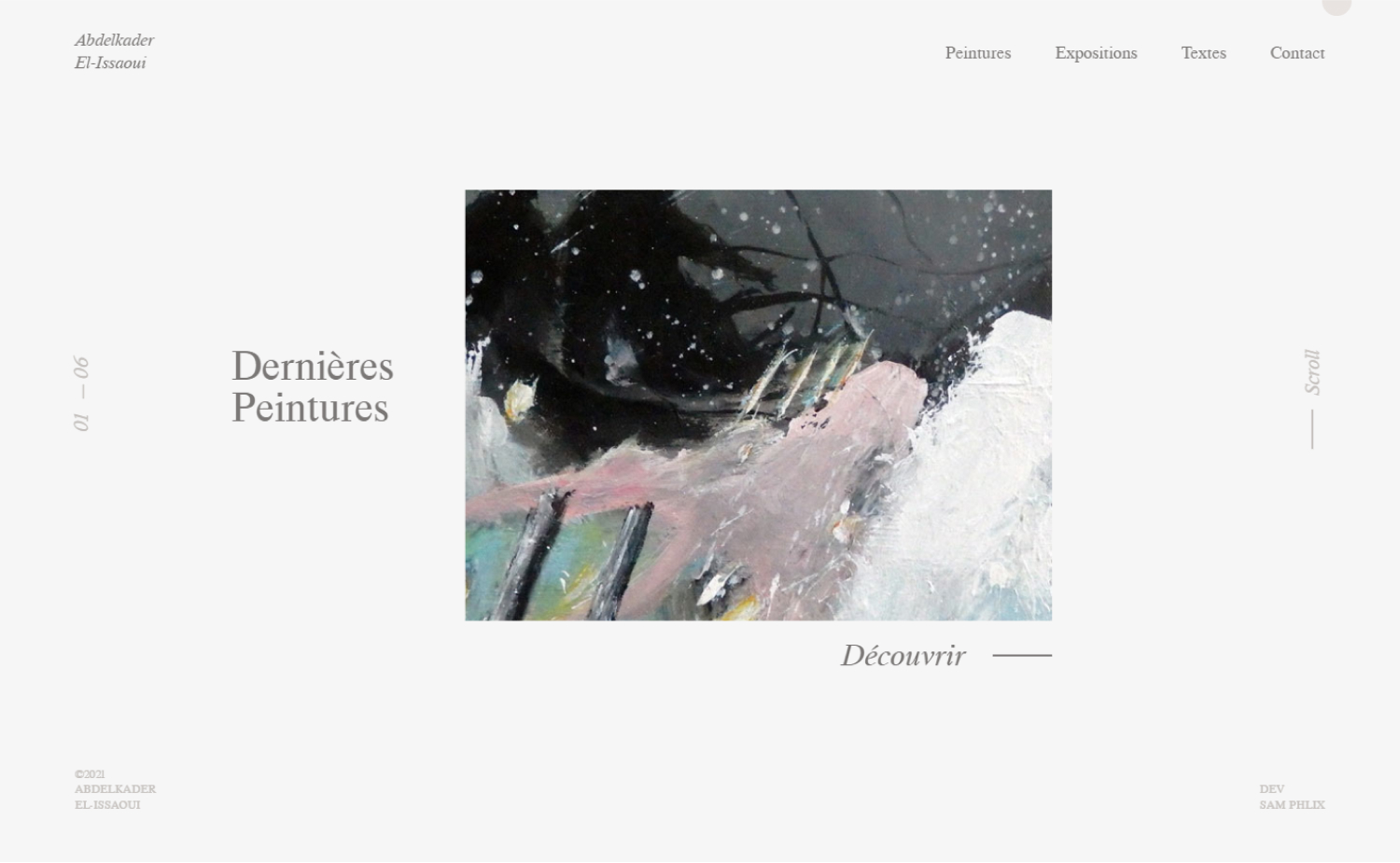
11. Abdelkader El-Issaoui
Why it works: Super minimal yet interesting, this website design does the value proposition quickly while explaining the process.
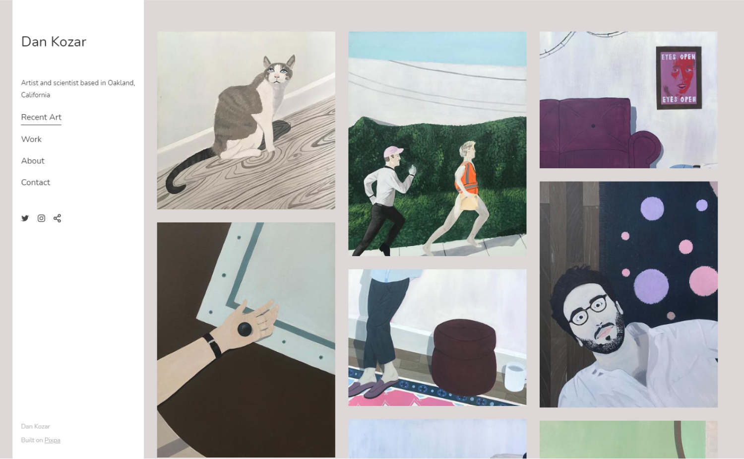
12. Dan Kozar
Why it works: What we love about the design of the website is how artfully tiles and grids are used to create a new experience for everyone. It also didn’t felt dry or uninviting because of the amazing colorful artwork from top to bottom.
Art Websites
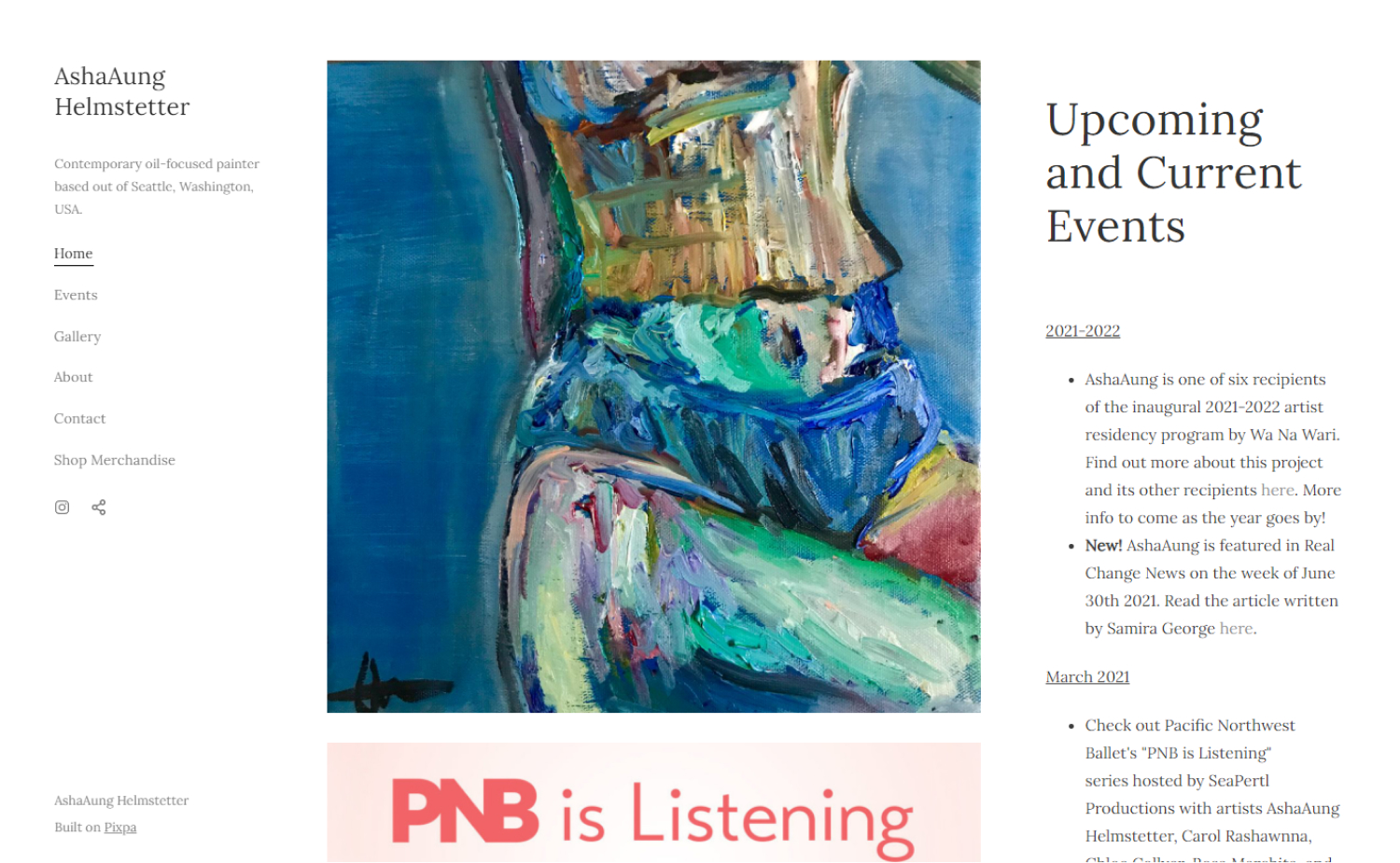
13. AshaAung Helmstetter
Why it works: The navigation is easy and the site isn’t cluttered with content, making it easy to find what you’re looking for.
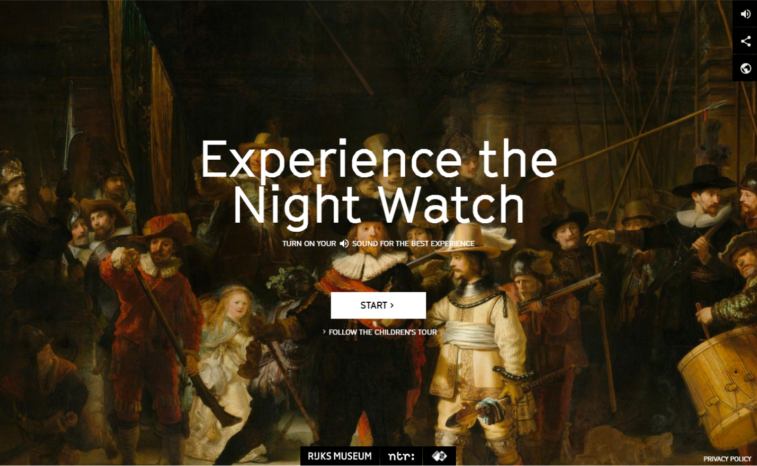
14. Experience the Night Watch
Why it works: Ascend to an interactive documentary on Rembrandt’s The Night Watch. This compelling video makes the hero story really enrapturing and does not overwhelm the text above the fold.
www.nightwatchexperience.com/en
15. KAMOI KAKOSHI Co.,LTD.
Why it works: The appearance of the site is great with cool colors and illustrations that are especially on the hero section.

16. Artic
Why it works: What we particularly love in this site’s design is the unconventional layout that actively highlights the different works of an artist.

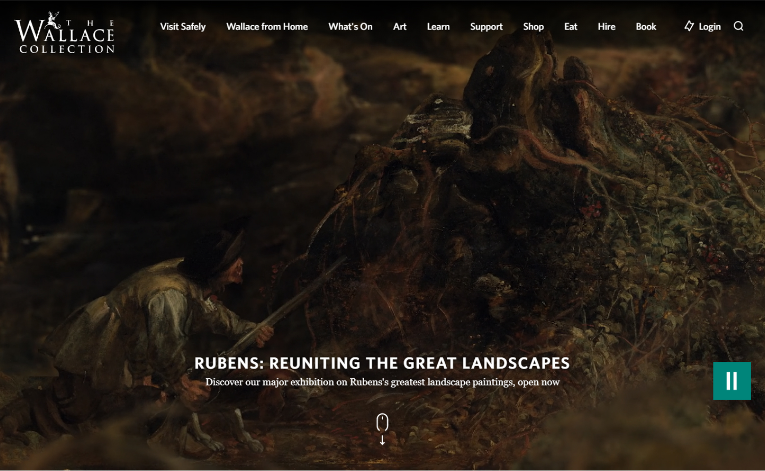
17. The Wallace Collection
Why it works: Boxy type with image heavy of unsurpassed masterpieces of paintings, sculpture, furniture, arms and armour. We love this because even though the site is image heavy it also loads fast.
18. Marcella Lassen
Why it works: The design of this site is particularly clean and comfortable. Besides, paintings on that website are amazing.
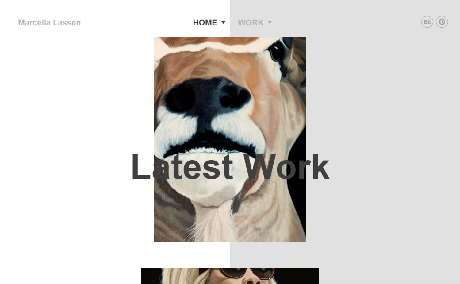
www.marcellalassen.com/en/#home
Unique Artist Websites
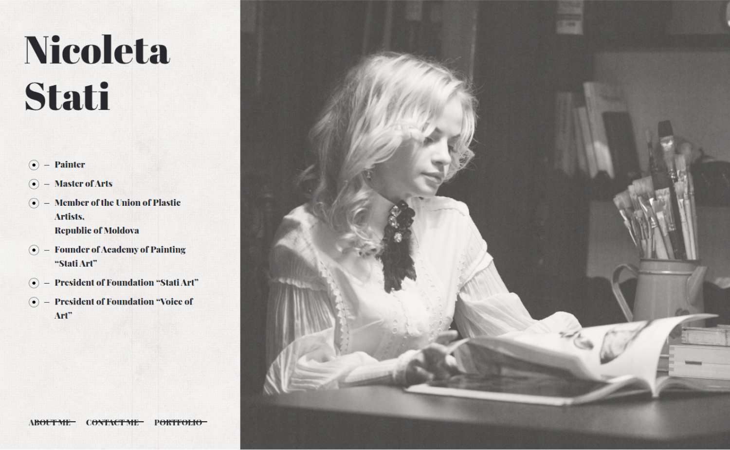
19. Nicoleta Stati
Why it works: The well-curated collection of artworks on her website already serves as a strong selling point.
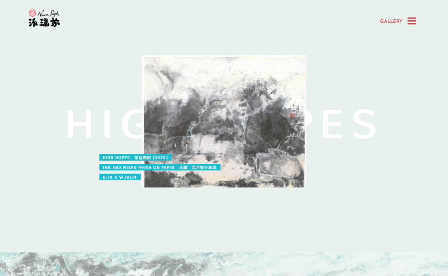
20. Nina Pryde
Why it works: An enjoyable website with all types of animated eye-catching designs.
21. Stoyan Kutsev Art Projects
Why it works: The great thing about this site is it has tons of quality photos and helpful links.

22. Super Painting
Why it works: Unique color scheme and theme for the website, with abundant content in all pages.

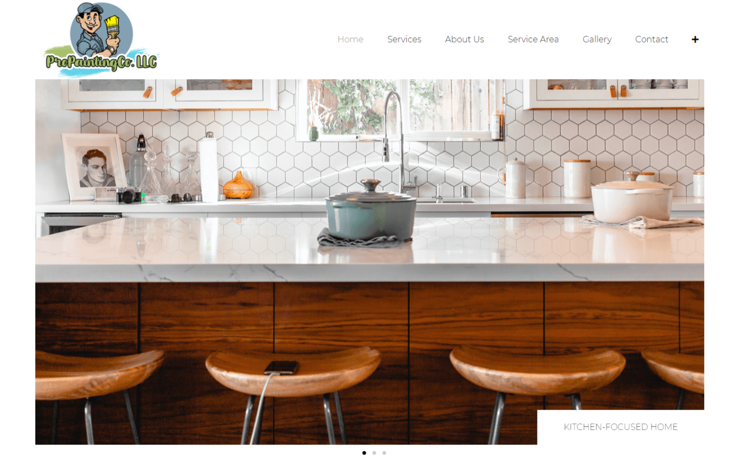
23. Pro Painting Co, LLC
Why it works: This website makes it onto our list because of its enjoyable user experience. The colors are nice and vivid, and despite the generic layout, they make the site more interesting than others on the internet.
24. Raider Painting
Why it works: Design-wise, this website’s design looks like it is built on a template, but there are some elements that make all the difference. For instance, each section has its own place and we love how clean and organized everything feels without overdoing it.

Best Artist Websites
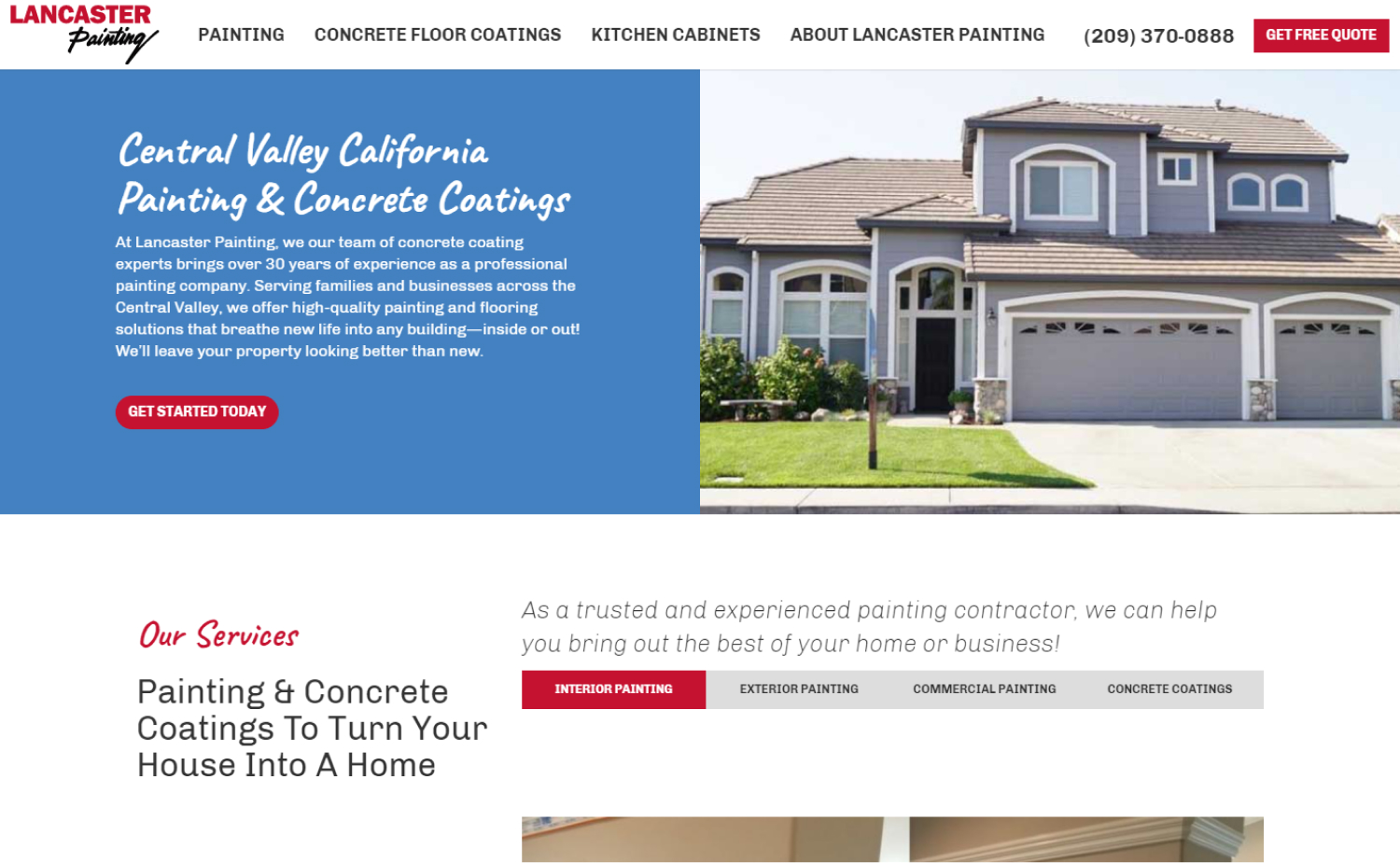
25. Lancaster Painting
Why it works: A balance of aesthetics, usability, contrast, and ease of use. Appears very professional.
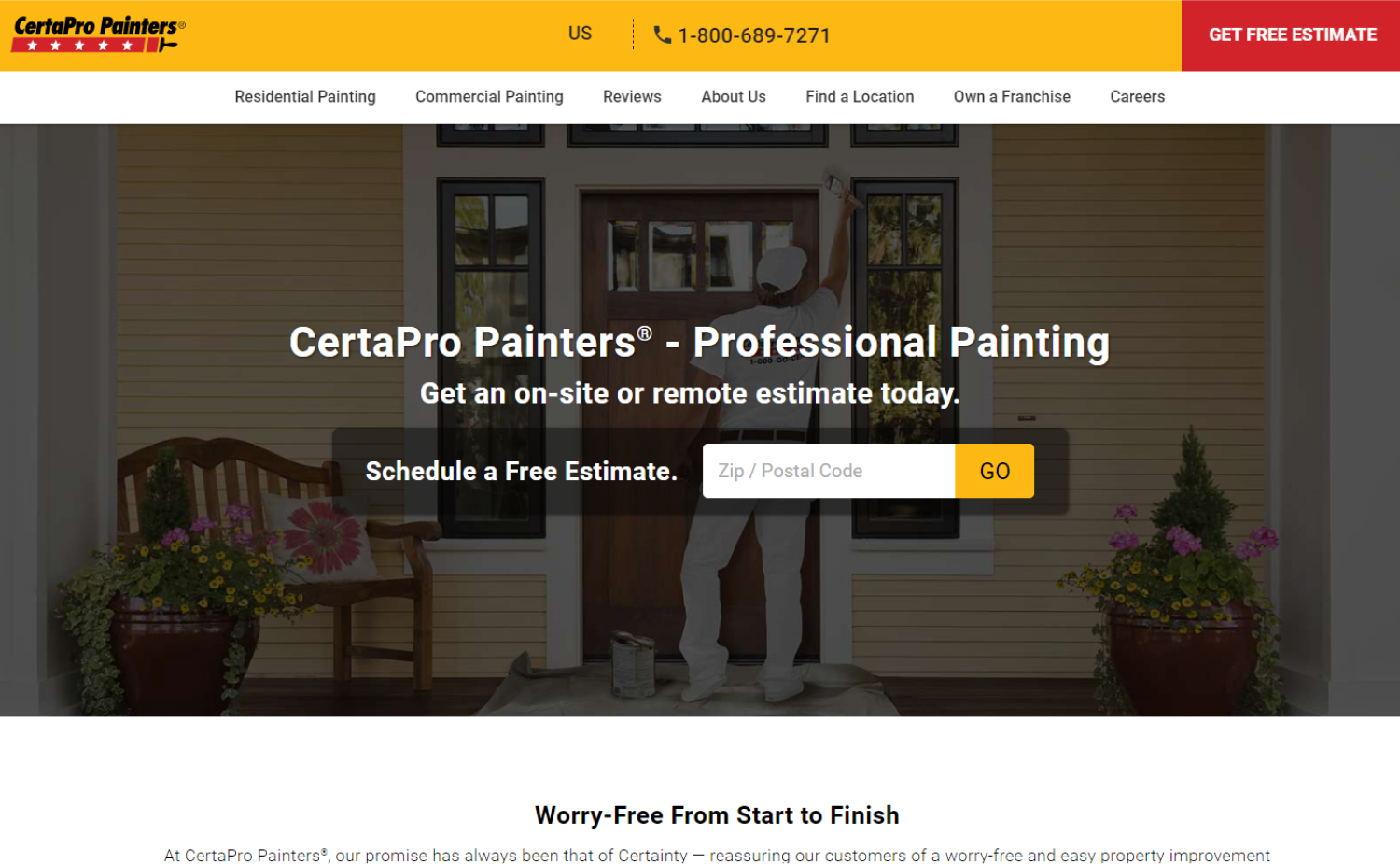
26. Certa Pro Painters
Why it works: This website could be a good example of what a home page should look like. It features all the important and relevant links in an aesthetically pleasing way without getting repetitive.
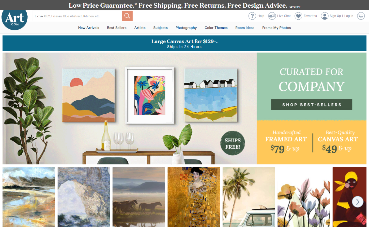
27. Art
Why it works: The design is simple and organized, but it’s stylistic with splash of color everywhere. It’s easy to use.
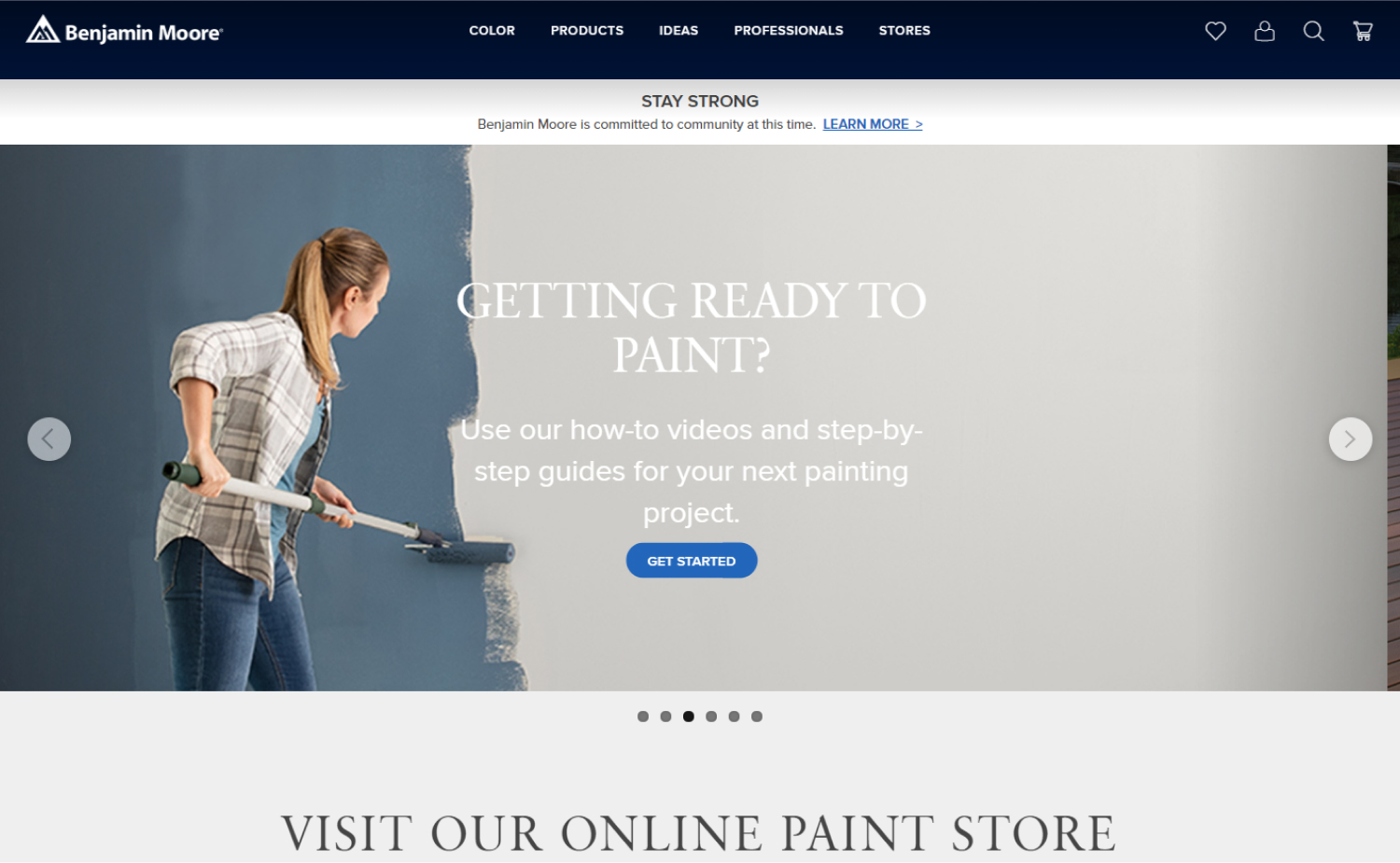
28. Benjamin Moore
Why it works: This site has a light and minimal design, which makes it easy to access for audiences of all ages.
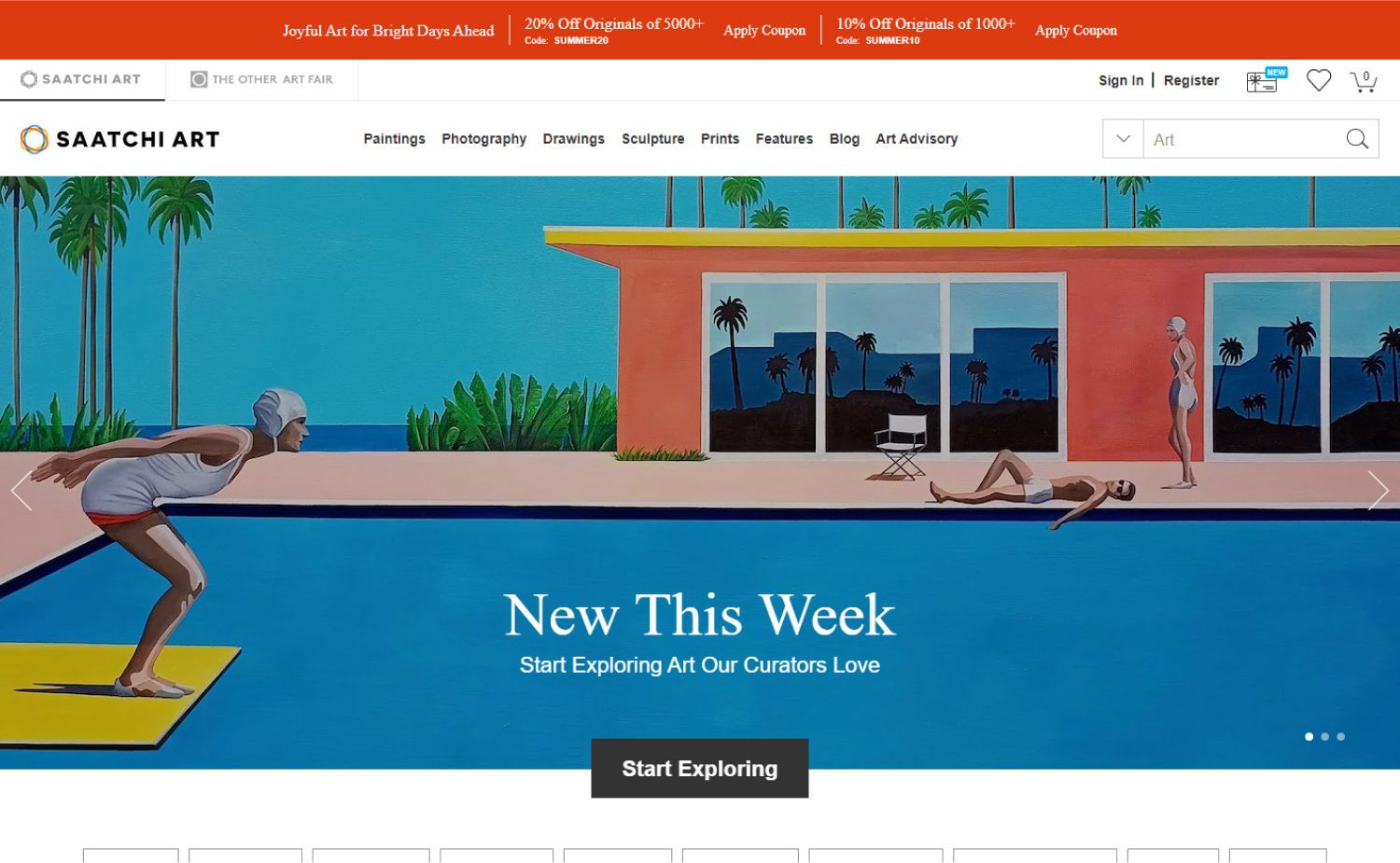
29. Saatchi Art
Why it works: A good balance of aesthetics, usability, contrast and ease of use means the professional feel is undeniable.
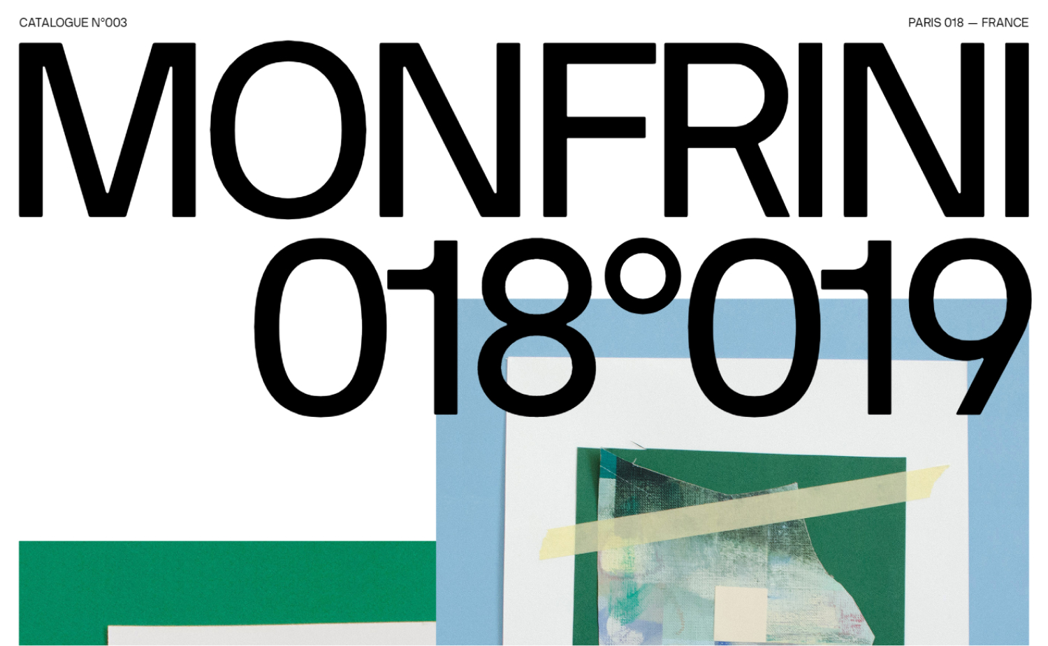
30. Florian Monfrini
Why it works: This site has big bold graphics, a super large font size that emphasizes quality over quantity.
Conclusion
The painting website design that were reviewed in this article have a lot to offer. They are all unique and they each have their own specialties, so the best way for you to find a painting website that is right for you is to read through the list of painting websites here and then go check out what makes them different on your own. It’s worth it!