Venture capital is a process of financing startup companies and other entrepreneurial ventures. This type of investment can be costly, but it also has the potential for large returns. If you’re looking for some inspiration on how to set up your own Venture Capital Website, read this blog post! We’ve compiled a list of the best venture capital websites around the internet for inspiration.
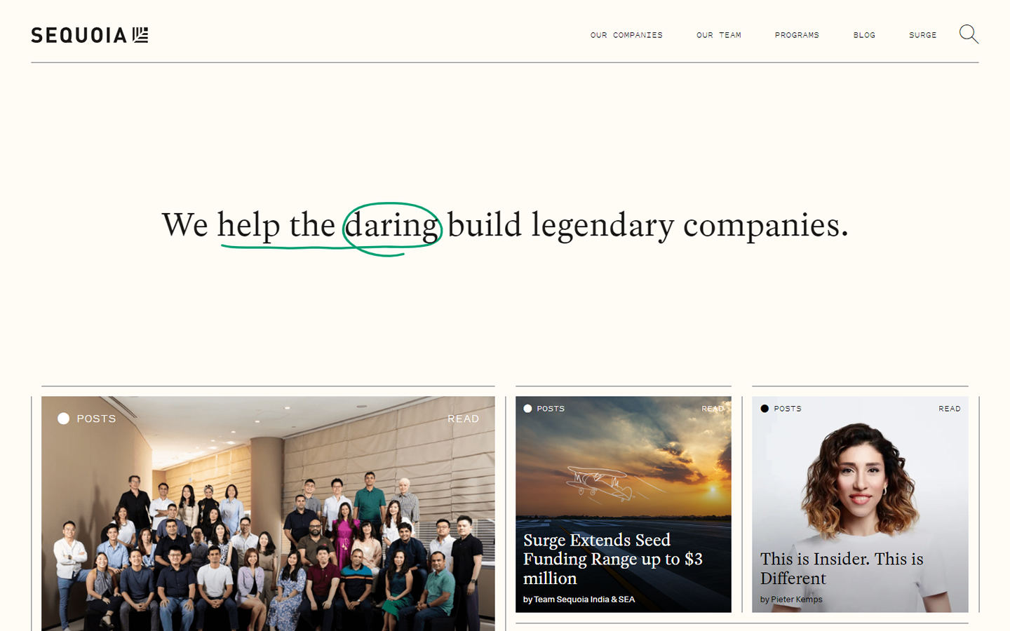
1. Sequioa Capital
Why it works: This great design is very creative and unique. Everything is well-thought, even the subtle animation as the home page loads. The overall experience is excellent and impactful.
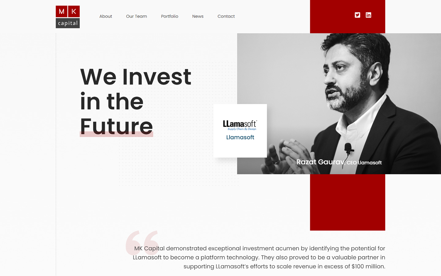
2. MK Capital
Why it works: Why it works: The sleek design of this VC firm has a mix of gray tones and red flashes that brings the venture capital website to life. It also features modern typography for better readability.
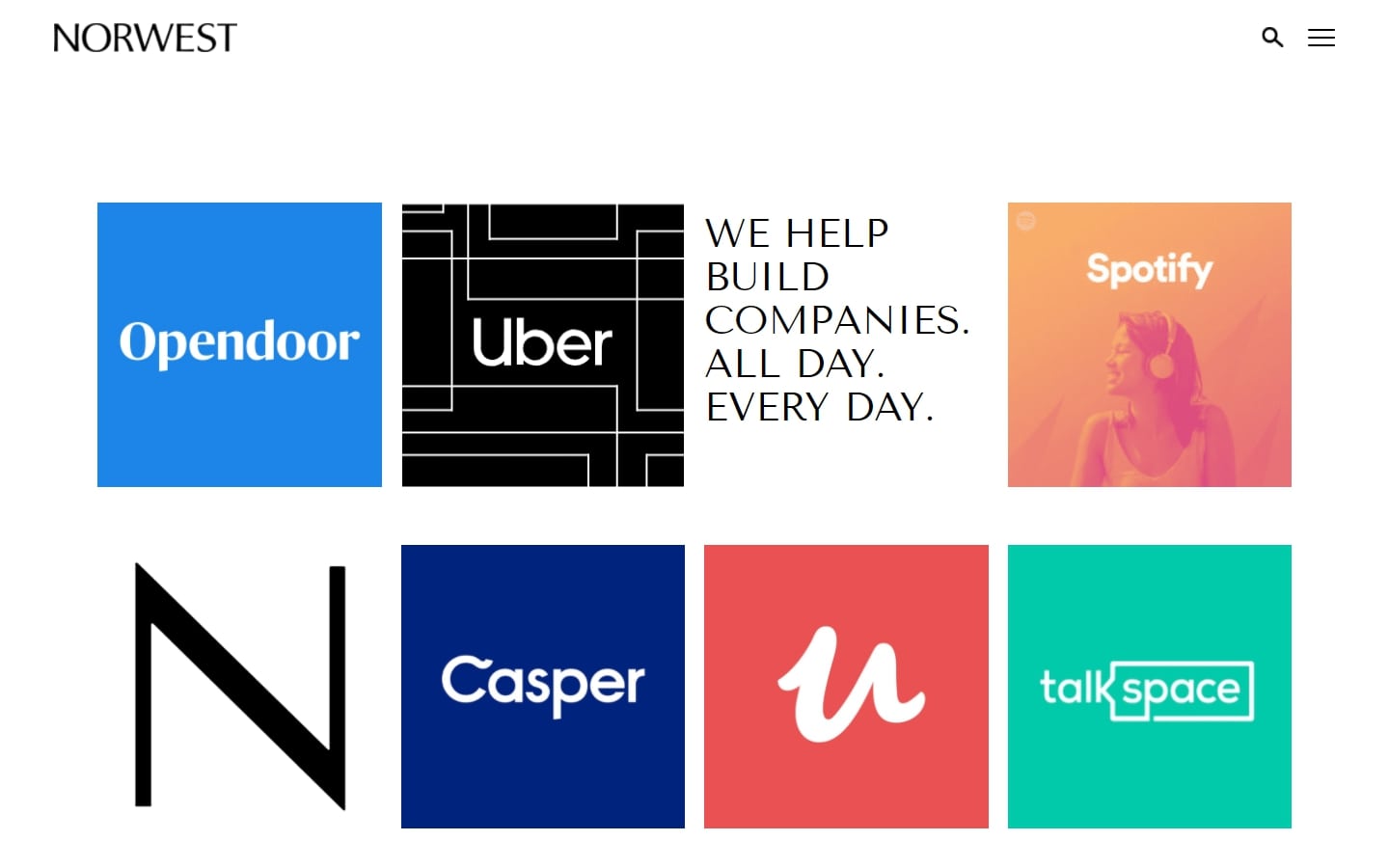
3. Norwest Venture Partners
Why it works: Simple, and very minimal while definitely not a cookie cutter. The design of the homepage of this venture capital website is the best way to directly showcase their portfolio companies. They understand that their expertise is the best brand ambassador that they have.
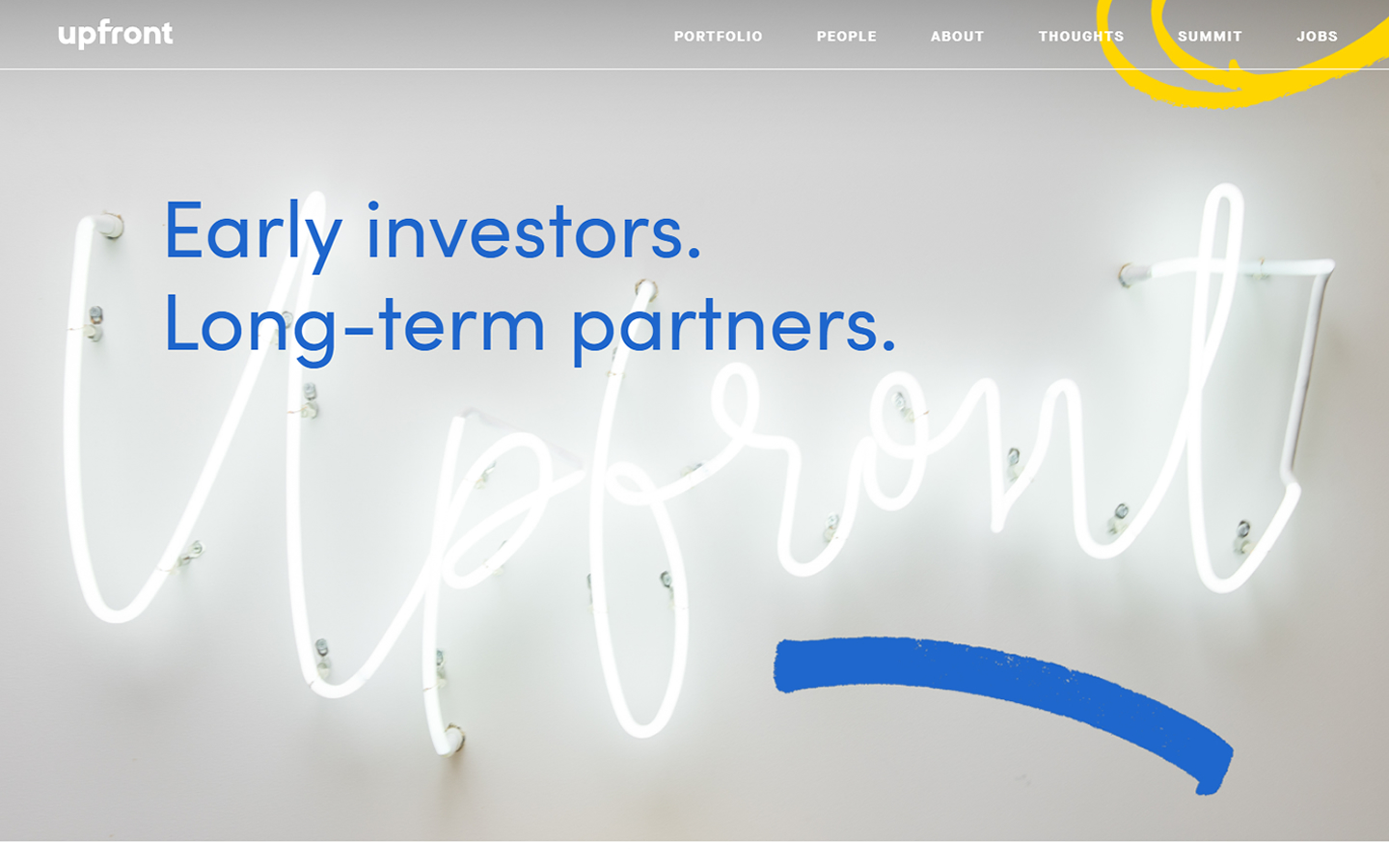
4. Upfront
Why it works: Bright colors and graphics without the traditional layout make this venture capital website design another standout on our list.
best venture capital websites
5. Obvious
Why it works: The hero section’s video background is very enticing, and it effectively conveys the organization’s vision, objective and core offering.

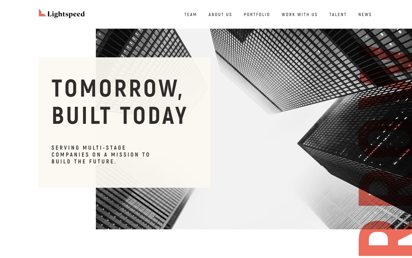
6. Lightspeed
Why it works: Gorgeous and modern look with a lot of contrasting features and visual boldness. It’s a pure pleasure to scroll through each portion of this venture capital website.
7. Alta Partners
Why it works: Surely love how every element and design such as the colors and typography suit well to the vc space. A very strong presence indeed.

8. Atomico
Why it works: The smooth scrolling between each anchor point is delightful and engaging. The site also has a plethora of images that suit their brand voice perfectly.

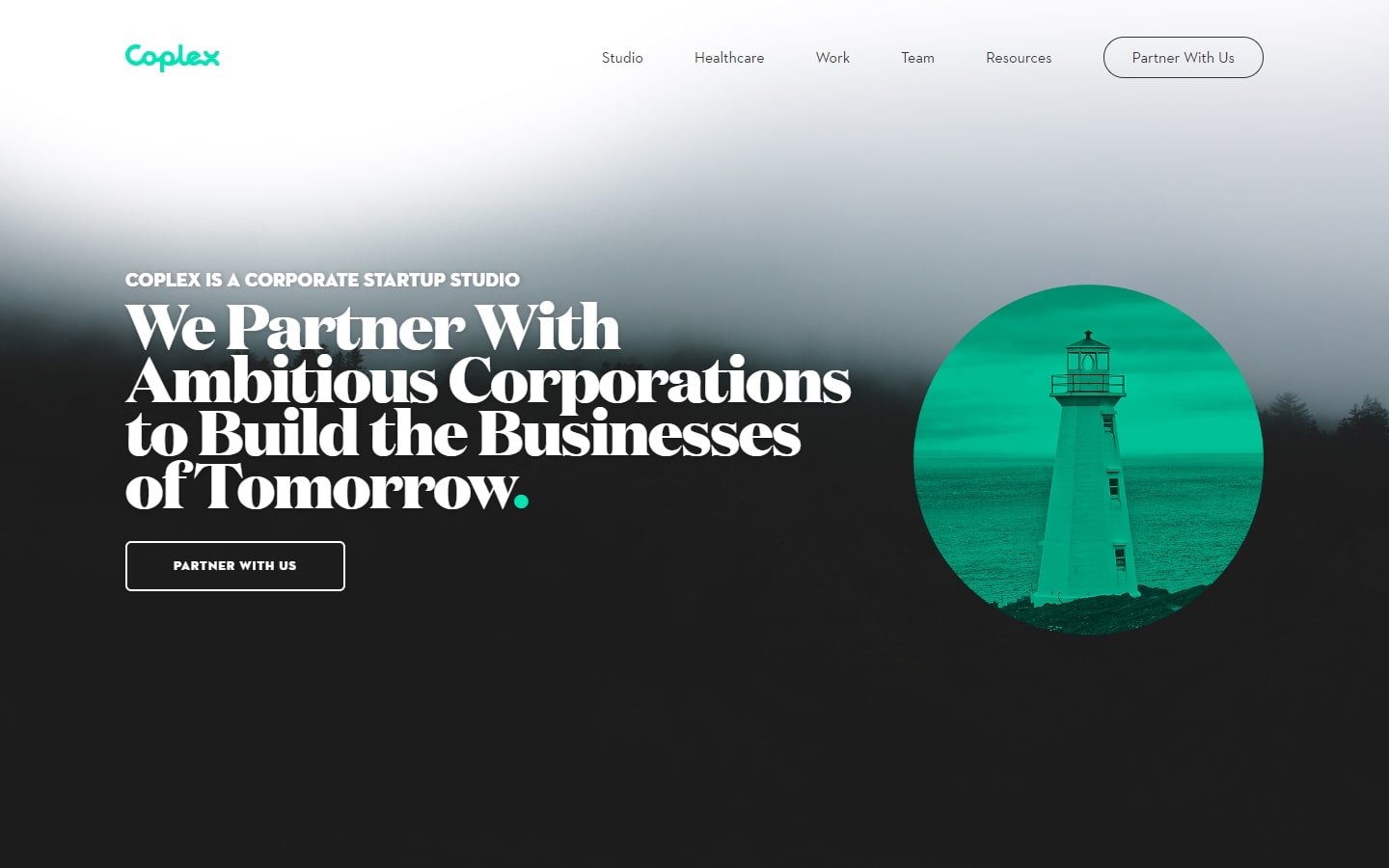
9. Coplex
Why it works: The effectiveness of this site is derived from its simple, user-friendly design. With this pleasant venture capital website design, virtually everyone can get around quickly.
venture capital websites
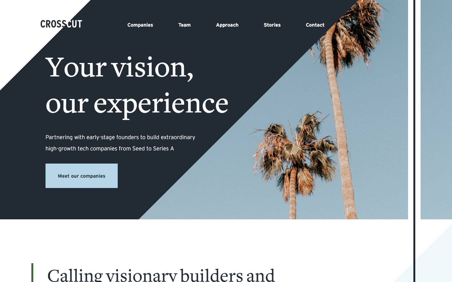
10. Crosscut
Why it works: This venture capital website cleverly uses geometry to create additional interest in the design and layout. The partner logos on the homepage display social proof.
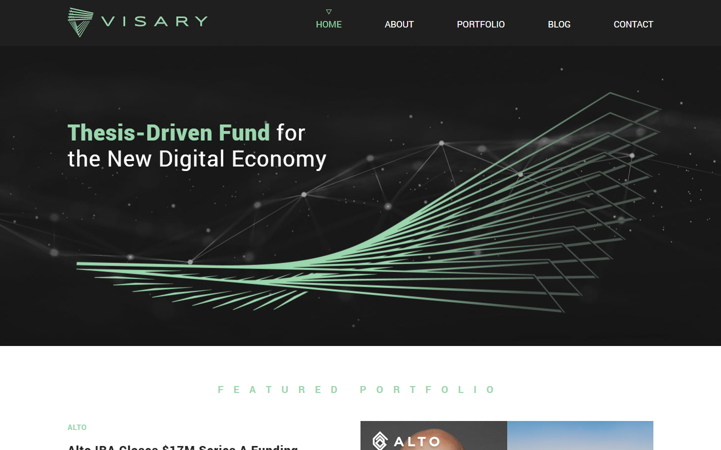
11. Visary Capital
Why it works: Apart from its beautiful design, the website also has interesting animations that work well with all the elements and immerses you in their world.
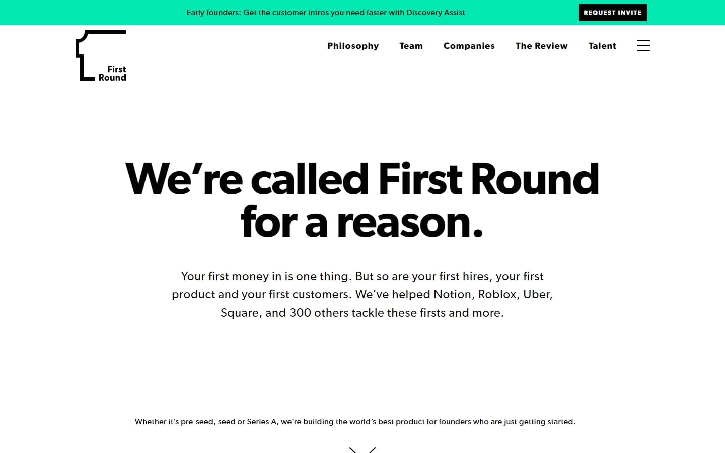
12. First Round Capital
Why it works: Even without the usual graphics or images, we can all detect its authority simply by looking at this website’s design.
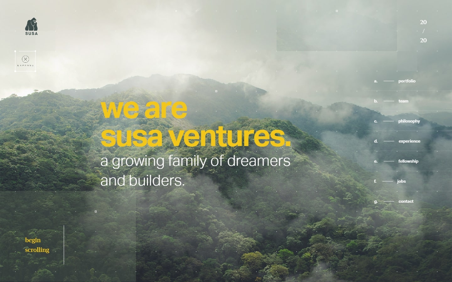
13. Susa Ventures
Why it works: One of the most admirable web design work. Every aspect of the venture capital website design, from the graphics to the tiniest element, was flawlessly executed. The website felt so alive and immersive.
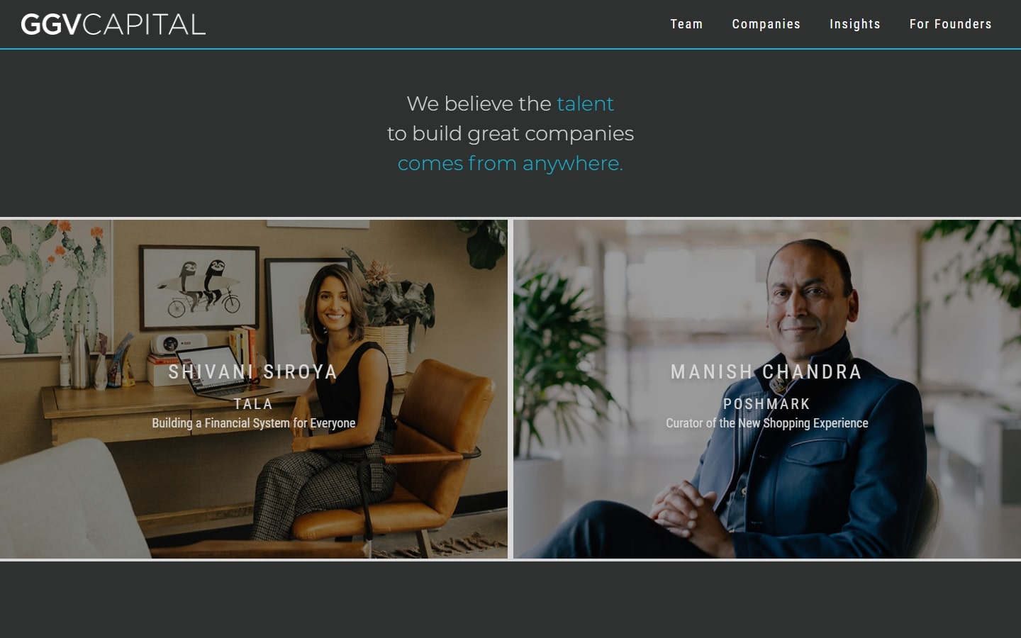
14. GGV Capital
Why it works: What we appreciate most about the design is the unique layout that emphasizes various success stories.
top venture capital websites
15. Kleiner Perkins
Why it works: If you know the signature Apple website look and feel, this venture capital website emanates the same digital experience. The way they showcase their portfolio on the homepage is simple yet communicates confidence.

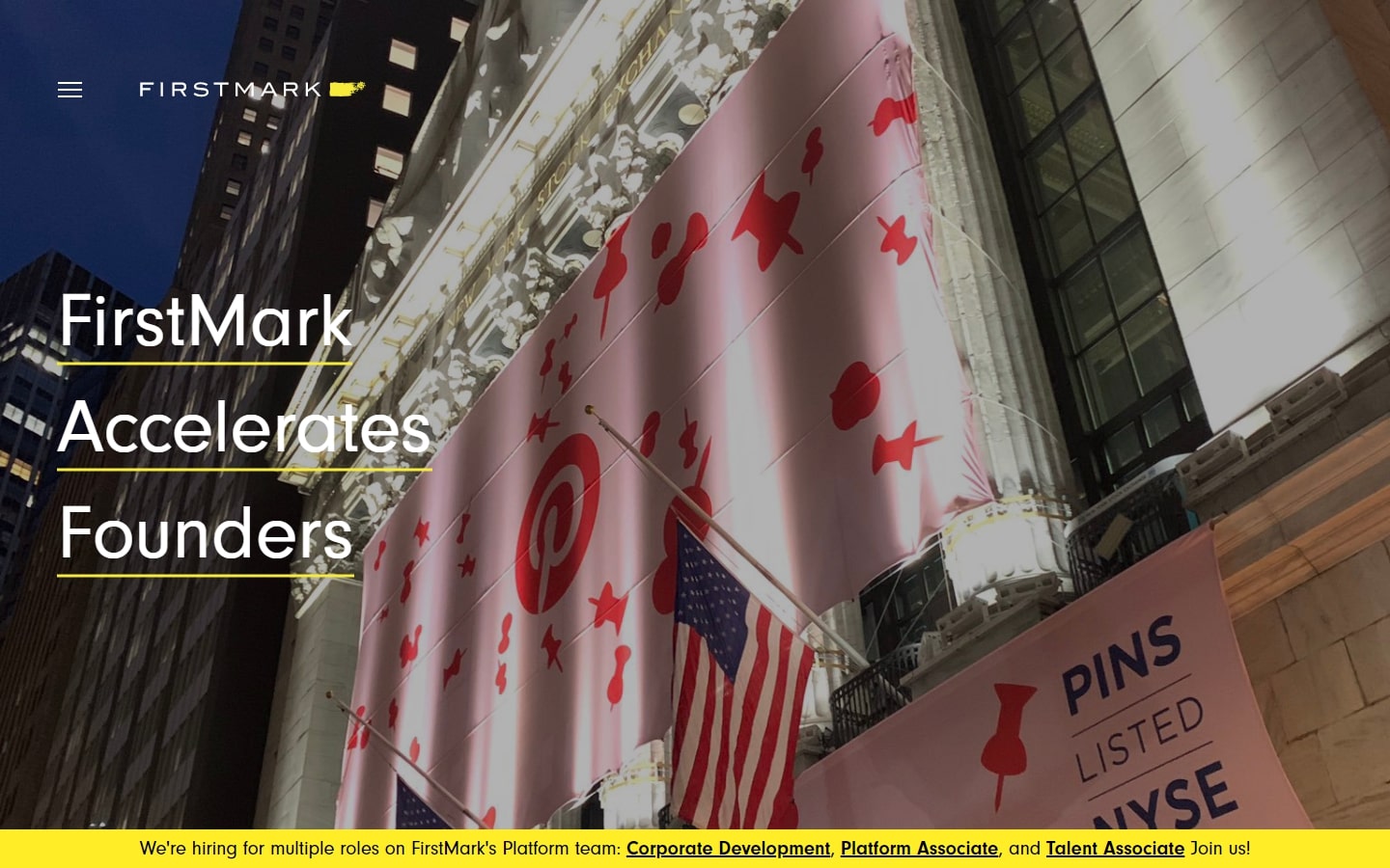
16. FirstMark
Why it works: This website is worth mentioning for its extraordinary use of parallax scrolling animations not only on sections but even on texts.
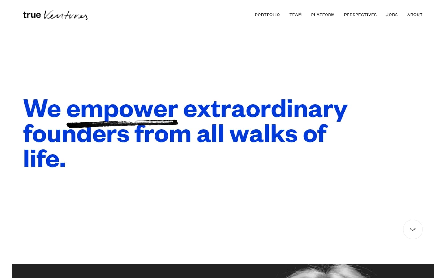
17. True Ventures
Why it works: The web design of this site is just out of this world in the best sense possible. The minimalistic approach is paired with a bold color theme. The incorporation of videos in the black-and-white sections is simply brilliant.
18. Snowcloud Capital
Why it works: No one should miss the full-screen video banners of this venture capital website — it’s an absolute head-turner! Moreover, the rest of the site felt clean and refreshing, without being crowded by too many graphics or images. Dark backgrounds are used on some of the key pages of this site.

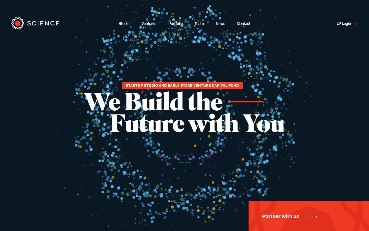
19. Science
Why it works: This website design is both simple and daring, with a distinctive personality owing to its outstanding yet strong typefaces and energetic hues.
vc website
20. Speedinvest
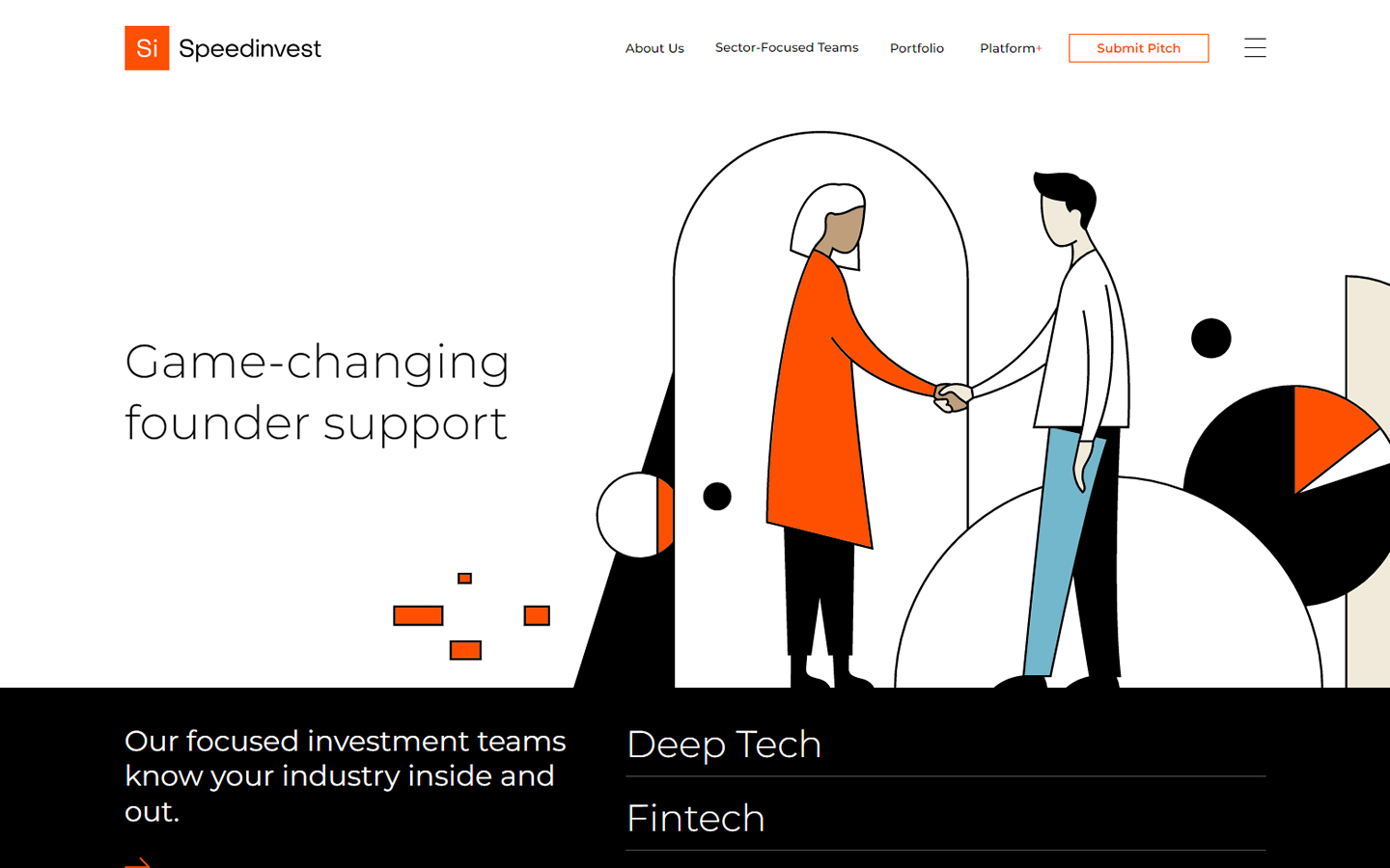
Why it works: Joining our list is a private equity and venture capital website that uses lines and geometry to perfectly complement the bright orange theme. The easy to use navigation bar is another major highlight, as well as the bright ‘submit pitch’ button.
21. Polaris Partners
Why it works: In this website design and layout, content is the true king. By stripping away whatever’s unnecessary, the delivery of the message they cater to becomes unparalleled.

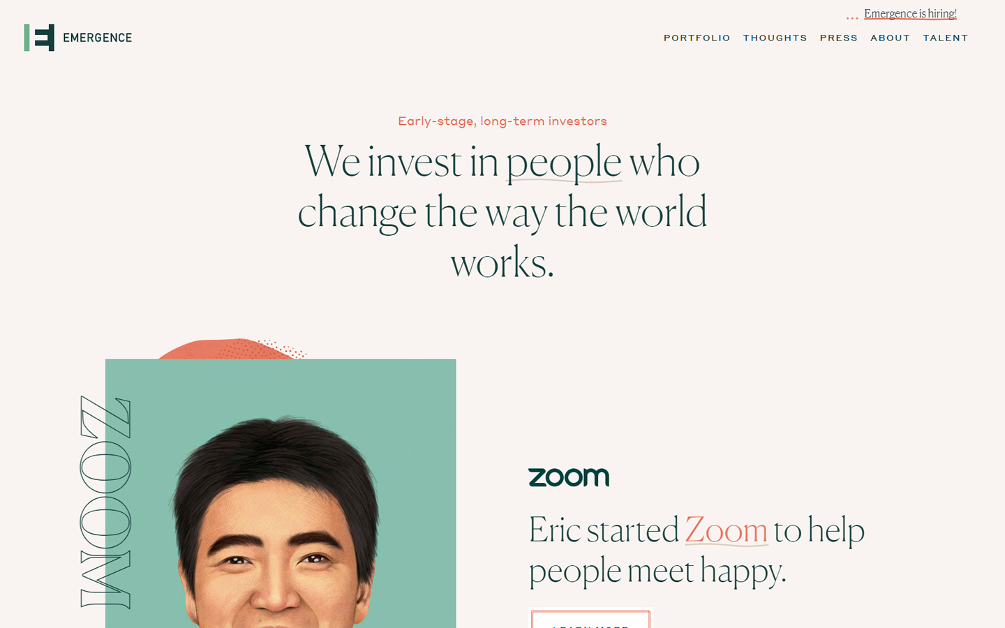
22. Emergence Capital
Why it works: What’s really a standout in this design is the use of hand-painted portrait illustrations, making this venture capital website a name to remember.
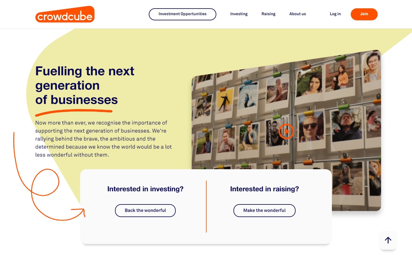
23. Crowdcube
Why it works: This is another venture capital firm worth noting with this website’s clear CTAs, engaging layout, serious yet friendly tone.
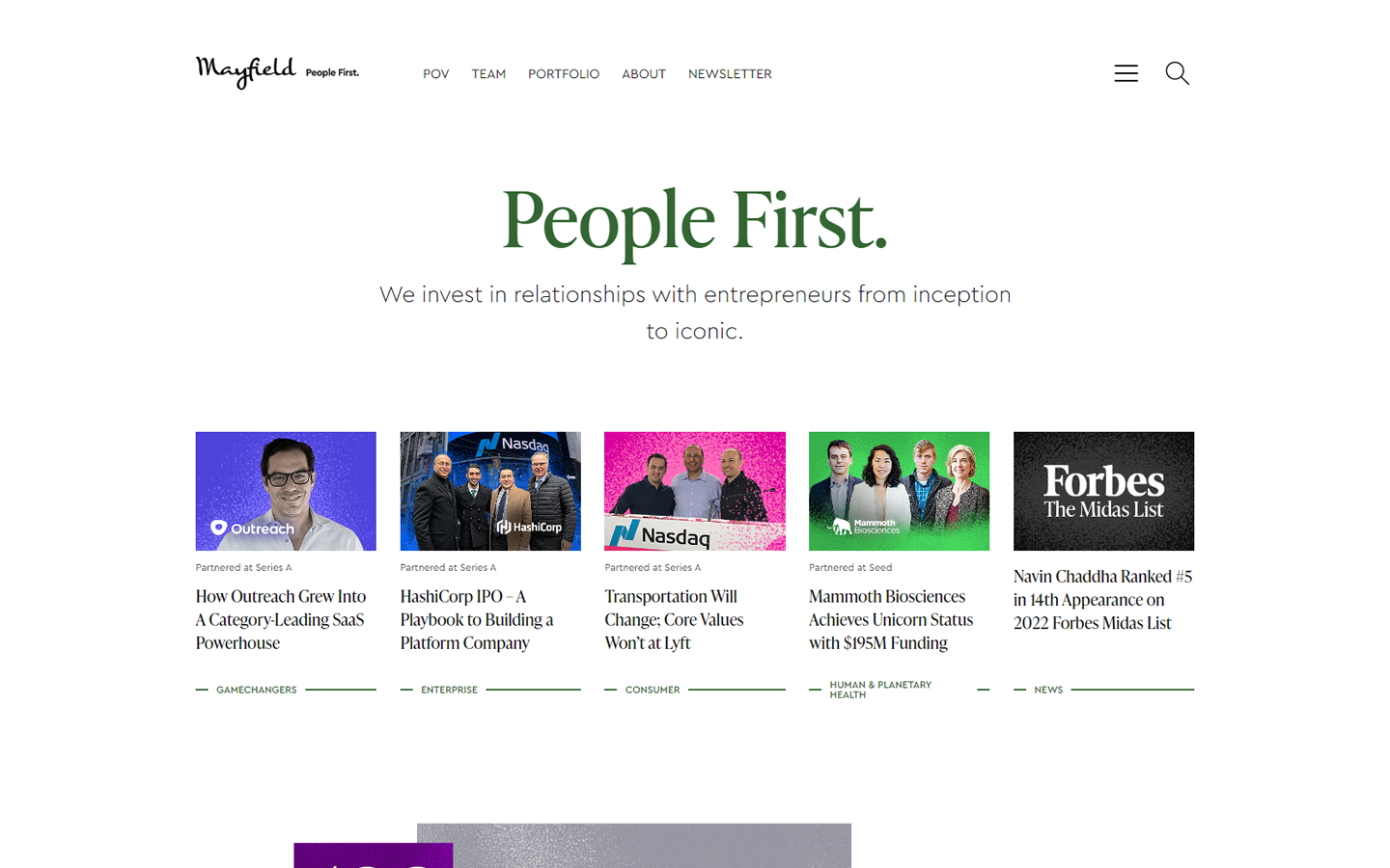
24. Mayfield
Why it works: The layout has a somewhat magazine-style feel, showcasing news and stories about the companies they invest in. The design is simple and straightforward, with pleasant typography.
venture capital website design
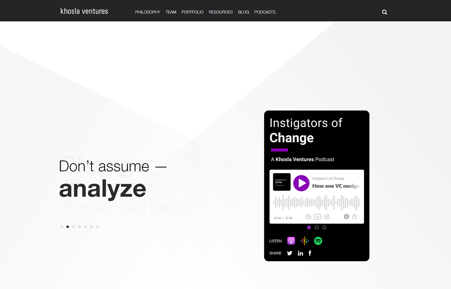
25. Khosla Ventures
Why it works: Another excellent minimal website. One of the most interesting aspects about this website is its strong content.
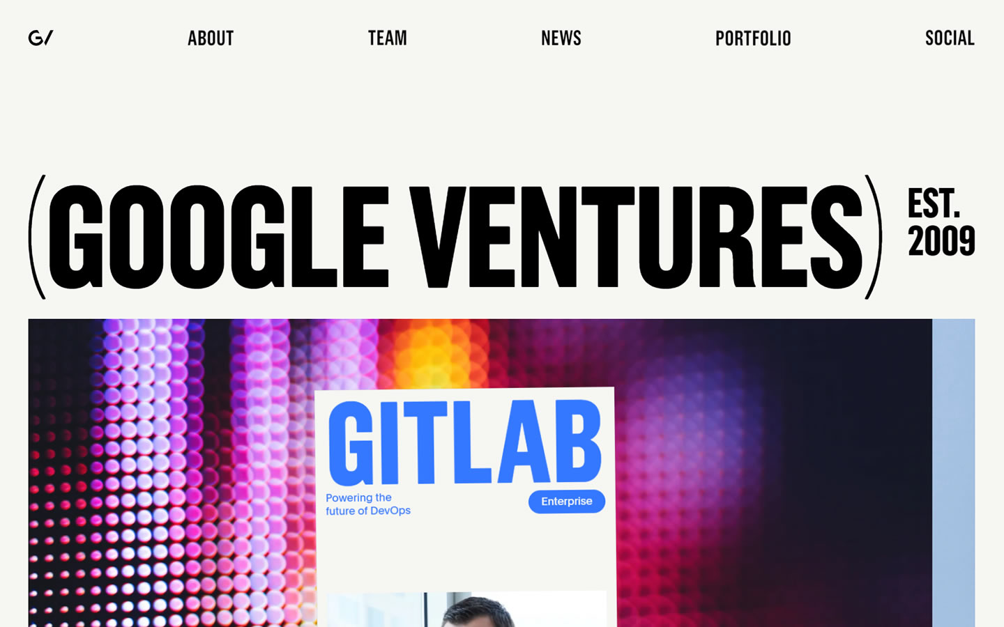
26. Google Ventures
Why it works: Clean and modern, with a big and bold fonts. The generous use of whitespace overall gave the site an extra professional feel.
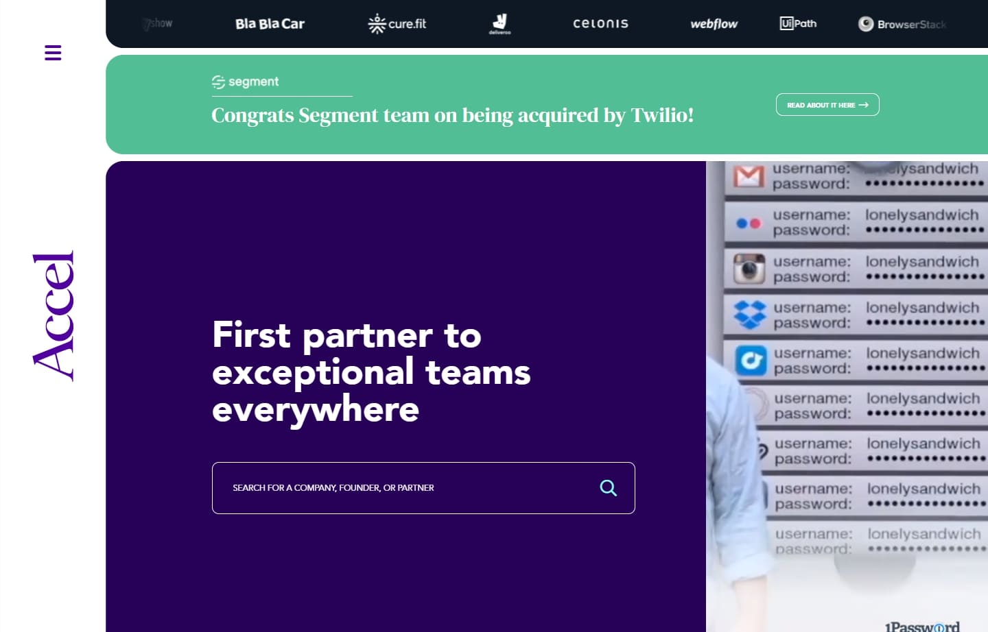
27. Accel
Why it works: What we love about the design of the website is the artistic use of tiles and grids to give everyone a unique online experience.
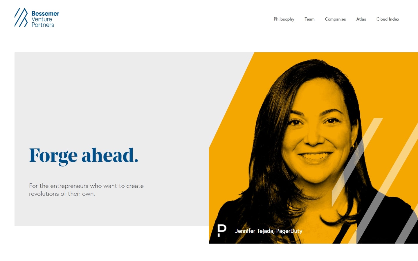
28. Bessemer Venture Partners
Why it works: The brightness and uniqueness of their logo are reflected in the website. The user experience is simple without sacrificing aesthetics.
29. Founders Fund
Why it works: Ultra-modern website design which is unbelievable for the niche it belongs. All graphical decisions made for Founders Fund really did a good job of pushing content straight to the viewers.

best venture capital websites
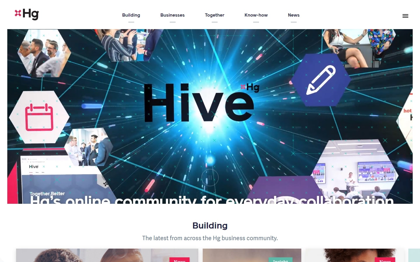
30. HG Capital
Why it works: Aside from the intro video that piques interest, the splashes of bright youthful colors on this venture capital website are phenomenal.
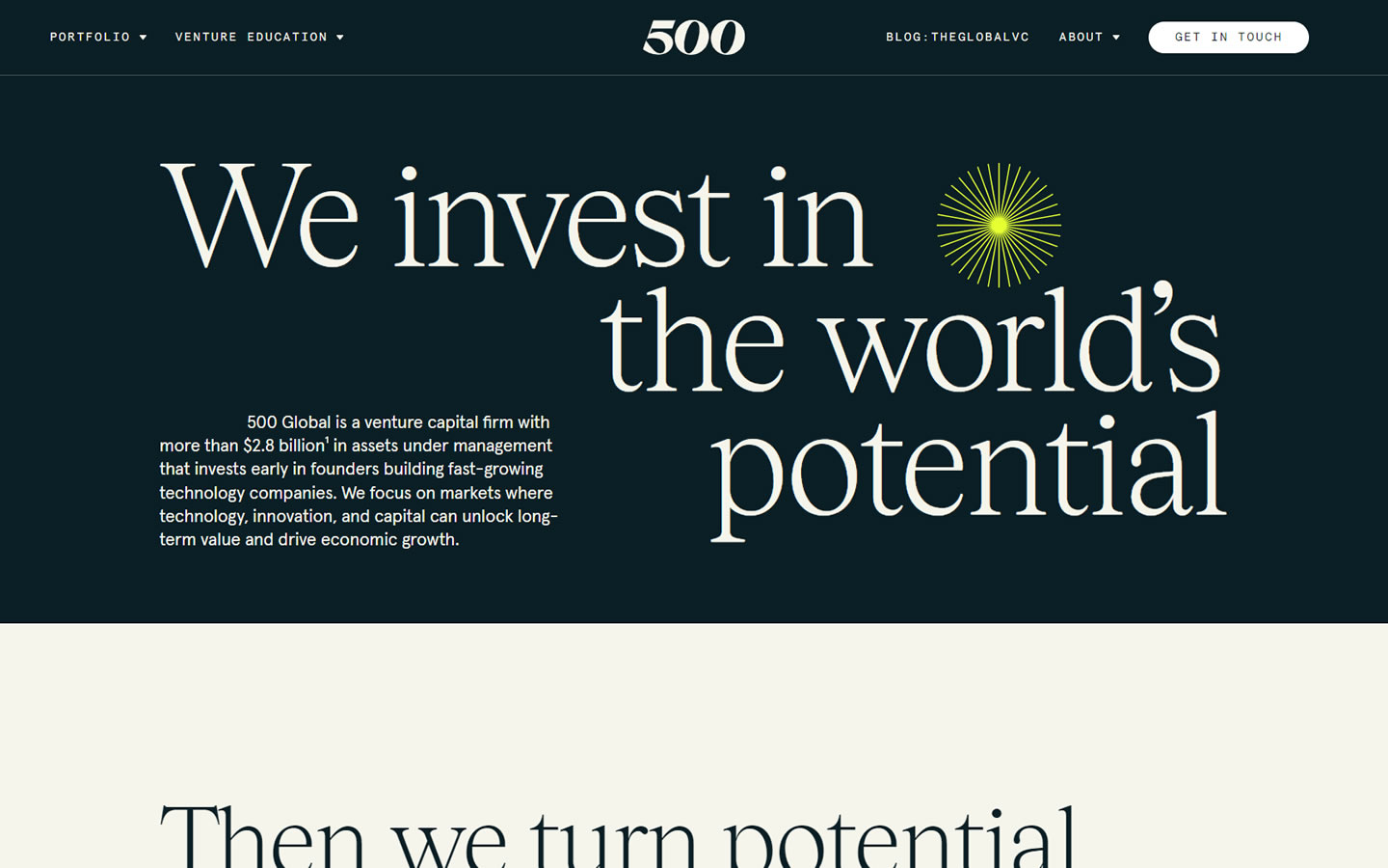
31. 500 Startups
Why it works: Despite its somewhat standard design, this website makes it onto our list because of the pleasant user experience it offers to its visitors. The use of limited hues throughout adds interest to this website.
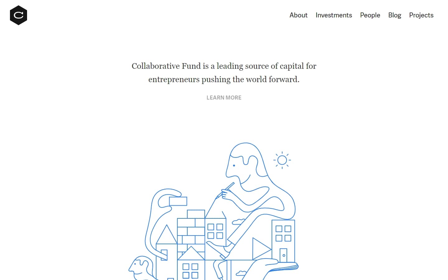
32. Collaborative Fund
Why it works: Such an uncomplicated yet elegant site! The use of subtle animations to bring its lovely pictures to life is what attracts our attention the most.
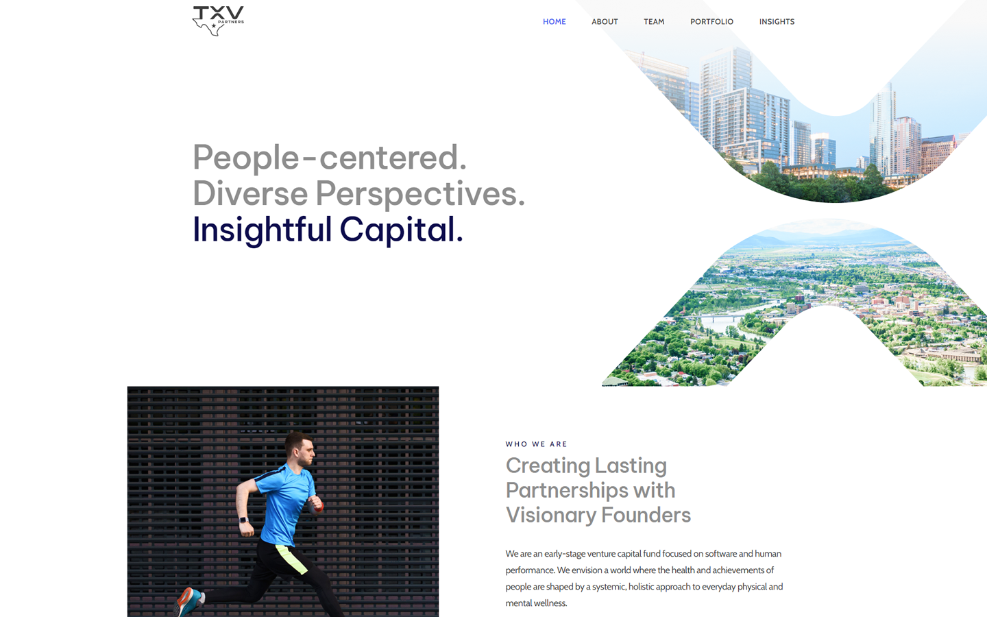
33. TXV Partners
Why it works: This venture capital firm’s website distinguishes itself by using plenty of vibrant images, even in an industry as serious as venture capital. The site had a lively and friendly look that’s convincing because it doesn’t sacrifice function or design.
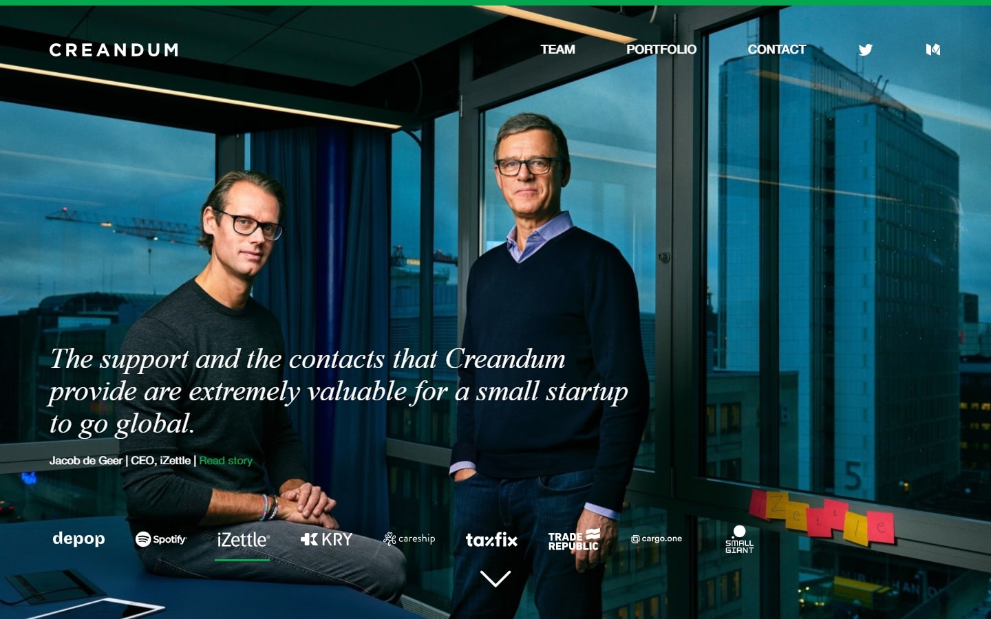
34. Creandum
Why it works: Investing in some of the most well-known companies of today, such as Spotify and Trade Republic, this website has a design that is a perfect balance of a very professional appearance with modern trends, especially with the creative use of green on a dark-themed area.
venture capital websites
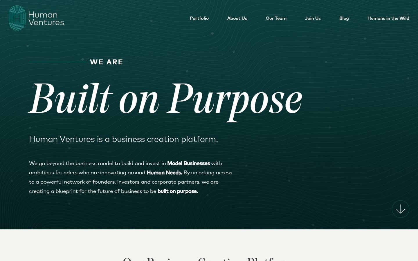
35. Human Ventures
Why it works: Overall, the design felt very unified, from the clean lines to the dynamic movements. We can’t take our eyes off the beautiful typeface, either!
36. Underscore VC
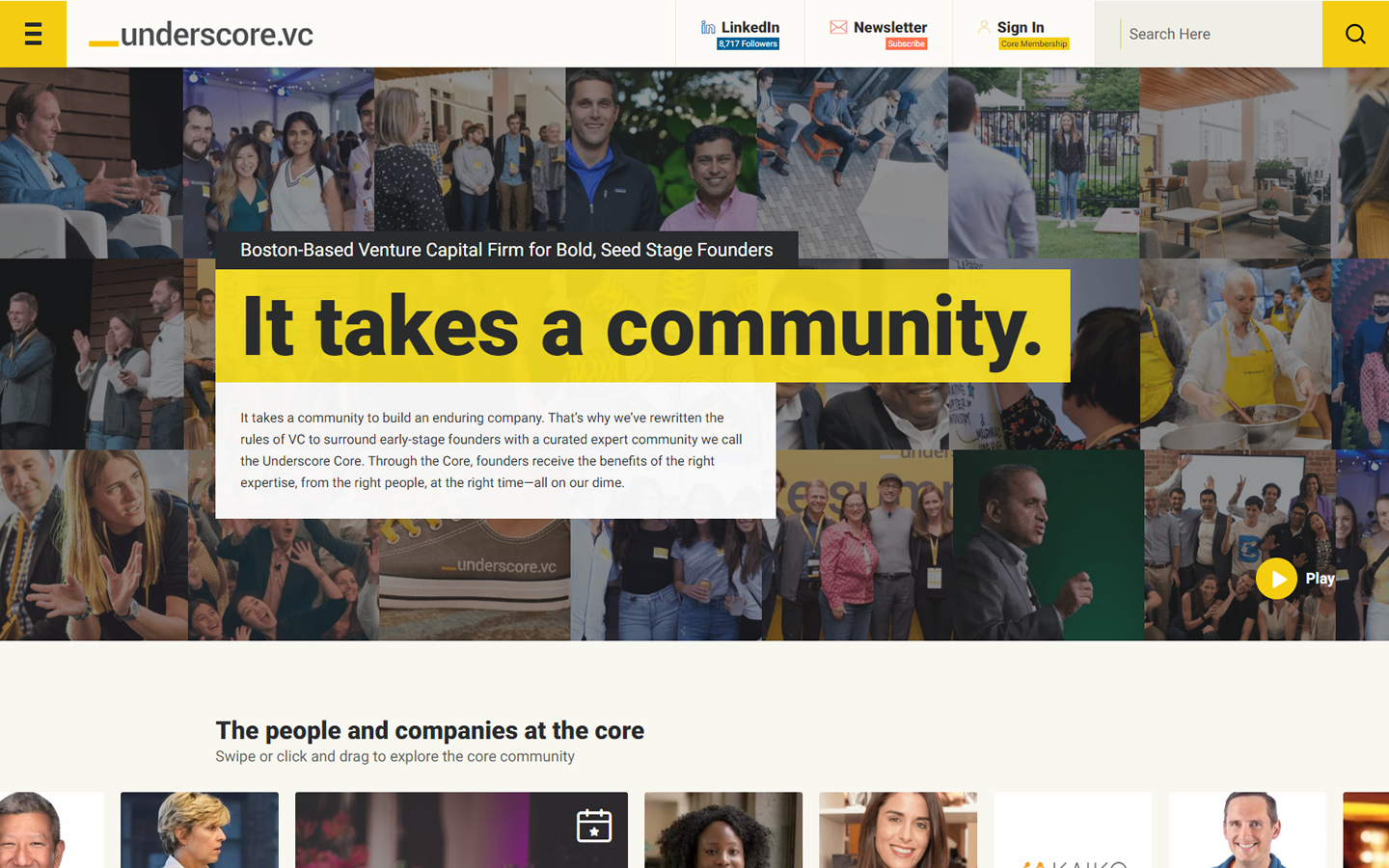
Why it works: We adore the appealing and energetic look of the entire website design, which is not without being a professional website. The website is informative, full of fun, and interactive.
37. Fifth Wall
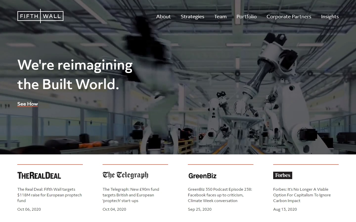
Why it works: Another great example of a portfolio site that delivers different interesting ways of using grids and tiles.
38. NEA
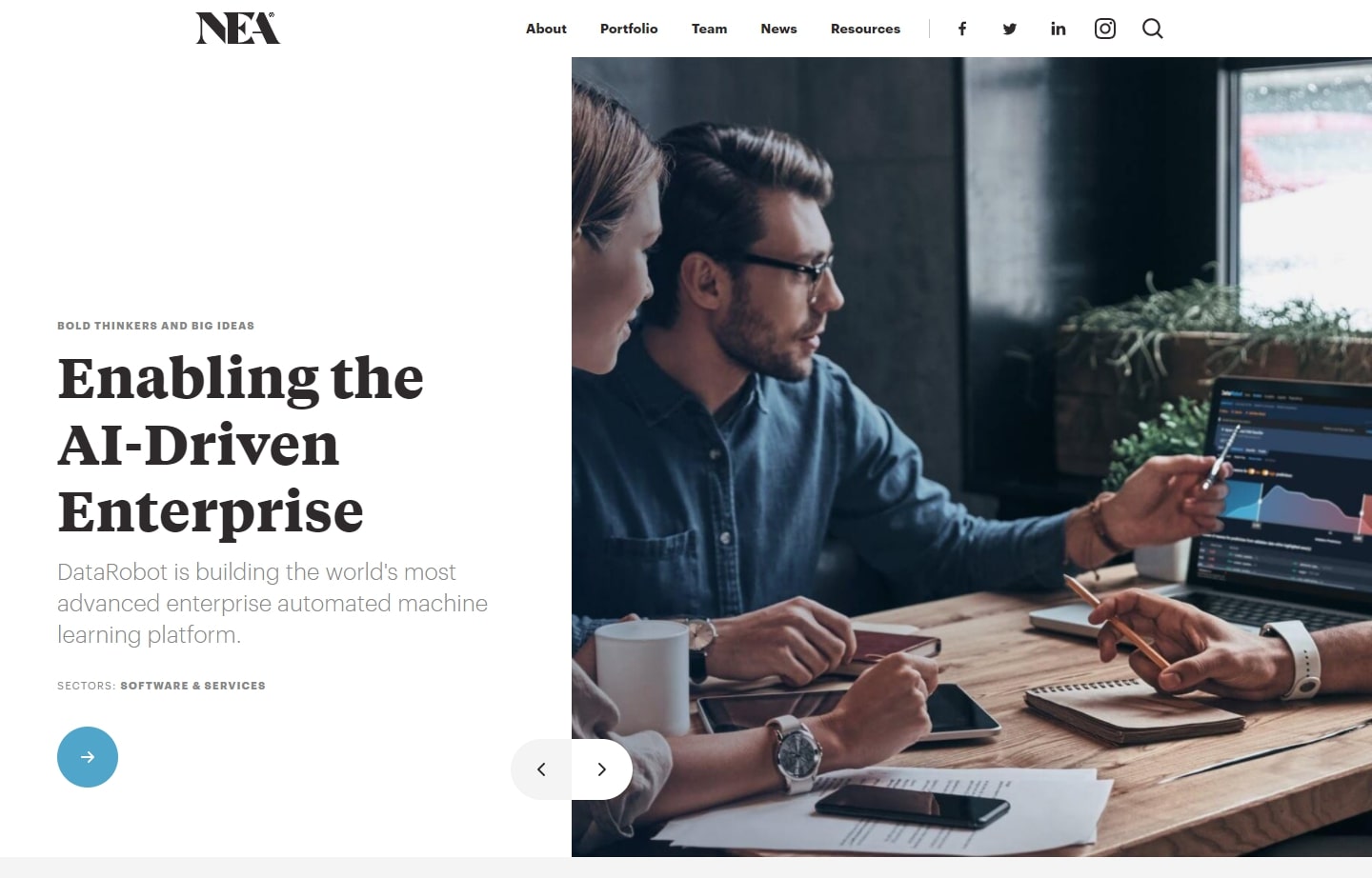
Why it works: One great highlight of the design of this venture capital website is its ability to deliver information in chunks and in the prettiest way possible.
39. FactoryMade Ventures
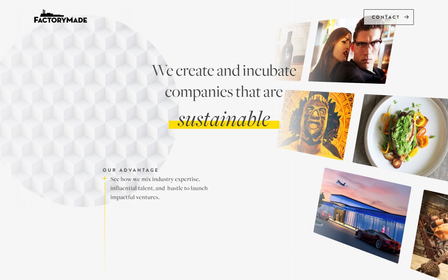
Why it works: A visually appealing homepage. The gentle and subtle animations and transitions give the site a delicate drama, leaving a distinct impression.
top venture capital websites
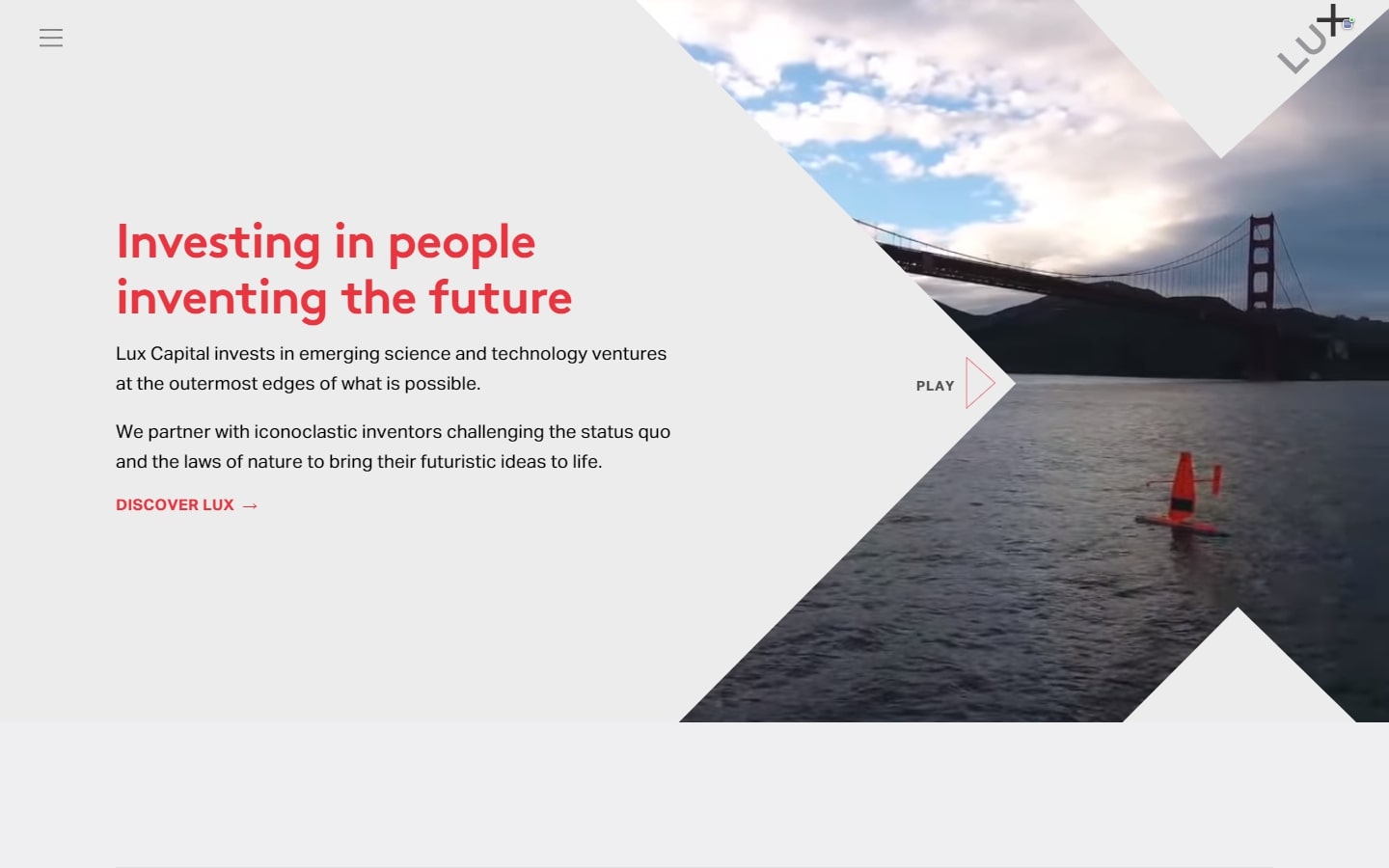
40. Lux Capital
Why it works: Real catchy hero video that doesn’t overwhelm the message above the fold. The typography is also very modern and easy to the eyes.
Conclusion
With so many successful VC Websites, it can be hard to know where to start when you’re looking for inspiration. Our goal with this post was not only to share some of the best examples we’ve seen lately but also to give you a place to go if you ever need help figuring out what might work best for your venture’s website. If any of these sites strike your fancy or seem like they’d fit well within your company, please don’t hesitate to contact us and let us show you how we could make them happen! We create custom websites with great design and can also help you with search engine optimization.
Here is a good deal. We will design a custom mockup of your new website before you sign or pay for anything. There is nothing to sign and no payment information will be taken. If you like our design for your business we can move forward working together. If not, there are no hard feelings and no other obligations. Click the button below to learn more.