Optometrists know the importance of having a strong online presence and are constantly looking for new ways to market their services and reach more patients. In this post, we’ll highlight the top 40 best optometry websites on the internet. If you need inspiration or resources or relevant information or just want to see what’s out there this is a great place to start. From clean and sleek sites with modern layouts down to fun and colorful ones, these websites have it all. Check them out!
1. EyeHealth1st
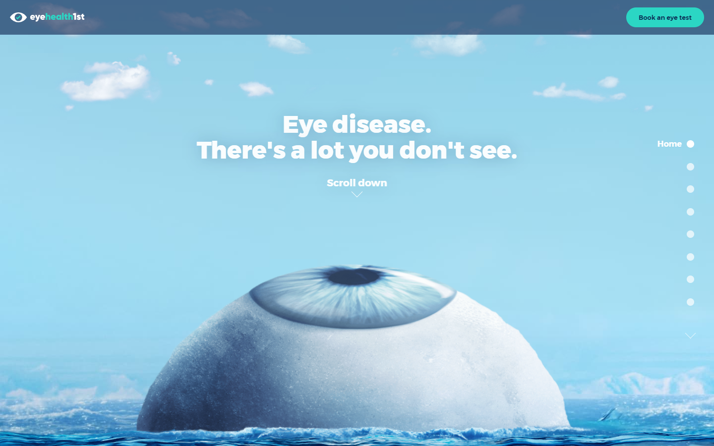
Why it works: The unique aspects of this website are the very creative and attention-grabbing visuals, interactive animation effects with animated and non-intrusive popups, smooth transition as visitors or patients scroll down the website page, creative storytelling that leads to a call-to-action at the bottom.
https://www.lookdeeper.com.au
2. Imagin Optique
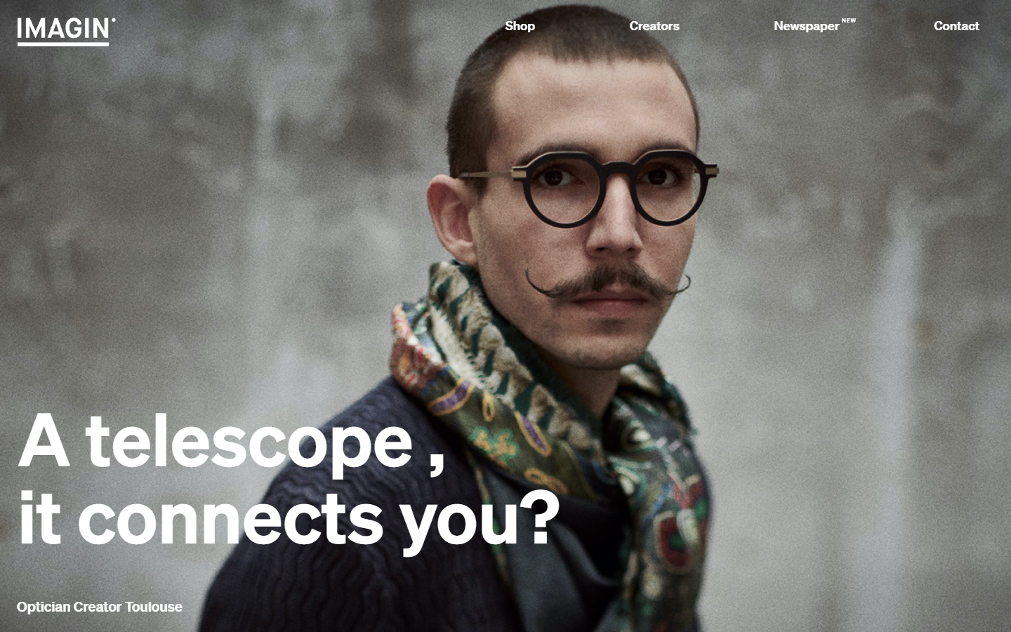
Why it works: Stylish and minimal content and design elements, subtle scroll animation effect, super high contrasting text to background, large heading text and readable content text, high-quality images of quality eye care products.
https://imaginoptique.com
3. Warby Parker
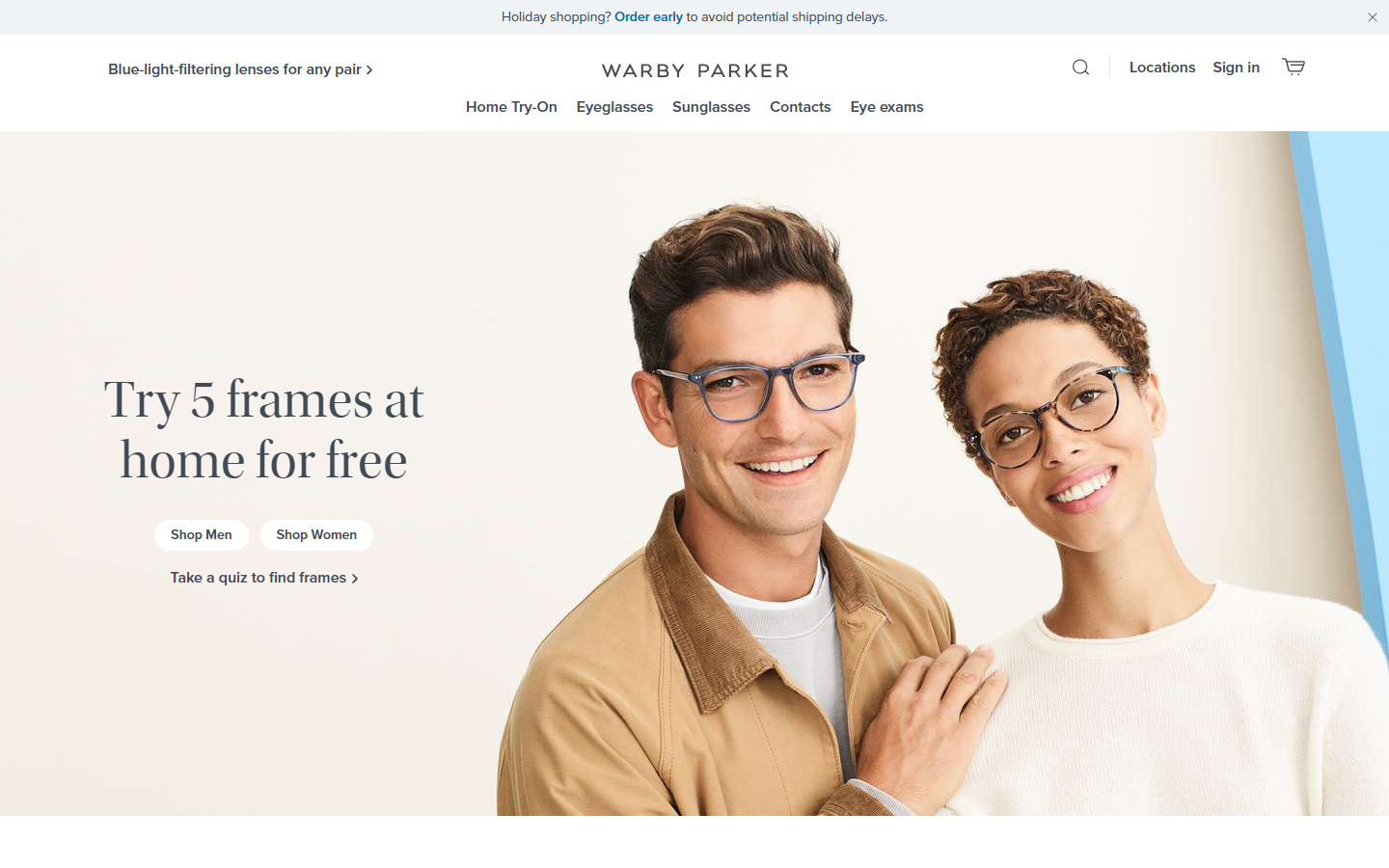
Why it works: Clean and crisp fonts, light and airy website feel, awesome use of white space providing focus to content, detailed and creative product pages of prescription glasses and contact lenses, use of quality images of eye care services, full-blown and detailed footer providing access to every page in this best optometry website.
https://www.warbyparker.com
4. Vision Group
Why it works: Stylish and sharp, well-defined sections, subtle but eye-catching animation effects, consistent styling, use of striking color scheme, use of sharp and professional-looking fonts, unique and creative inner pages.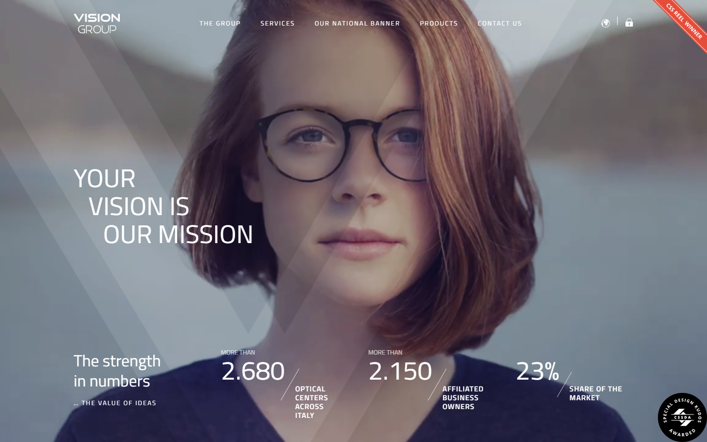
https://vision-group.it/en
optometrist website design
5. Smart Optometry
Why it works: This optometry website is properly themed as “smart” which is evident in the semi-futuristic feel that the images and fonts provide; the alternating light and dark color scheme add interest to new patients and other eye care professionals, and the use of partner and brand logos together with membership logos will let them gain access to the trust of the patients.

https://smart-optometry.com
6. Pro Optix Eye Care
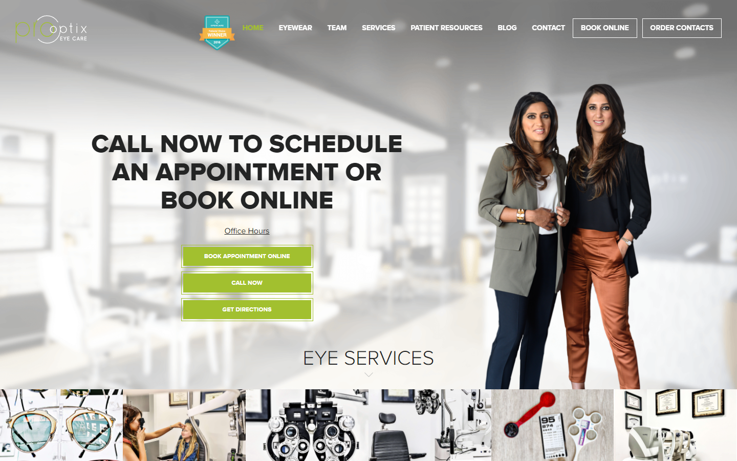
Why it Works: Use of actual pictures that convey the practice of professionalism by eye care specialists, social media proof in the form of patient testimonials with Instagram photos and a clean association with well-established brand logos create and build trust, a clean contact information section near the footer.
http://prooptixeyecare.com
7. Blink Optometry
Why it works: Stylish and modern optometry website, short but concise. Consistent and professional use of colors that give life to the website, rounded and easy to read fonts, non-standard placement of navigation links, creative overall but still provides a professional feel.

https://blinkduluth.com
8. Perspective Family Eye Care
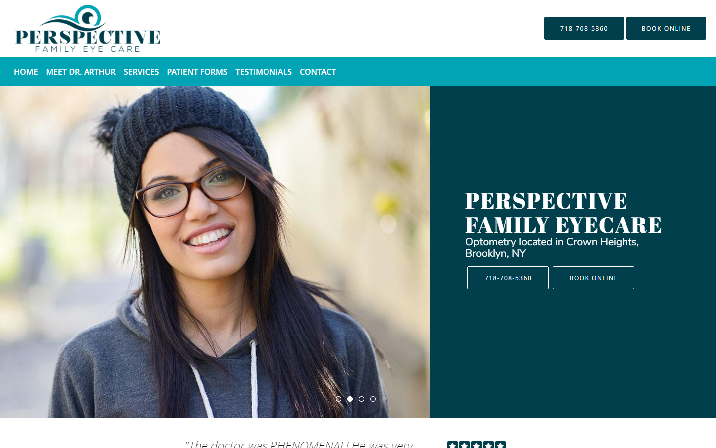
Why it works: The content text of this optometry website is easy to read because of good contrast, colors that convey and create trust and professionalism, full-width video, alternating dark and light homepage sections, detailed location with office business hours, and contact information with a location map.
https://www.perspectiveyes.com
optometry website design
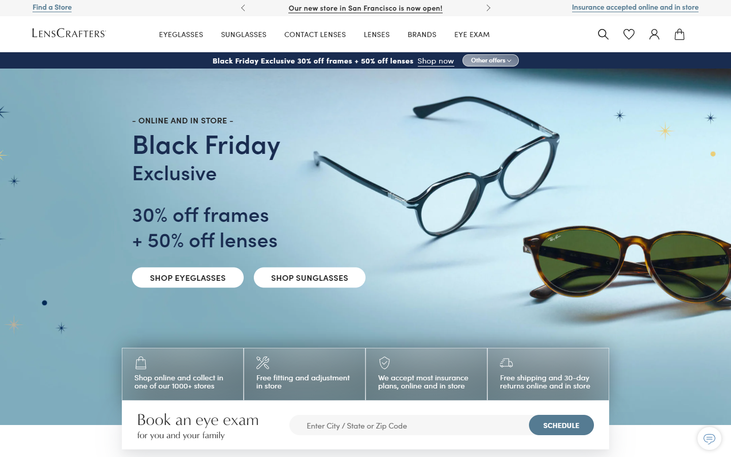
9. LensCrafters
Why it works: Strong call-to-action links and buttons, a book and eye exam link to determine the nearest eye wear store or eye doctors’ clinic, use of top-quality product images, clean and crisp fonts, professional product pages with alternating on-hover images. This site is also mobile device friendly.
https://www.lenscrafters.com
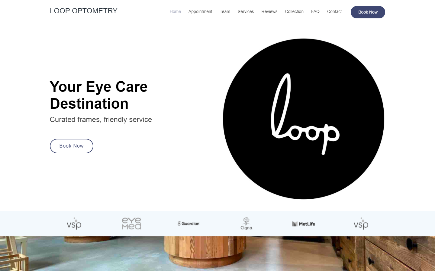
10. Loop Optometry
Why it works: Subtle scroll transition animations, high contrast text for easy reading, a good example of a single page website wherein the sticky navigation when clicked brings the site viewer to the specific section in the website page without the need to open another window tab.
https://www.looptometry.com
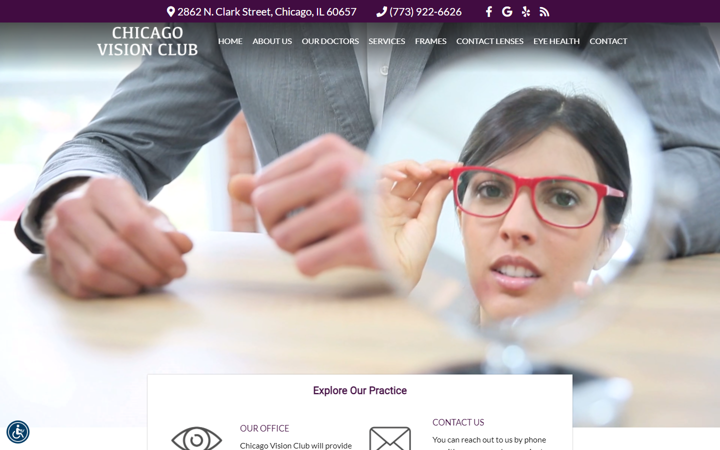
11. Chicago Visions Club
Why it works: Location and contact information prominently displayed at the top that can be easily seen at first glance; looping video in the hero section briefly showing a typical experience visiting an eye doctor or an ophthalmologist; call to action links in different sections in the homepage; and social media integration.
https://optical-chicago.com
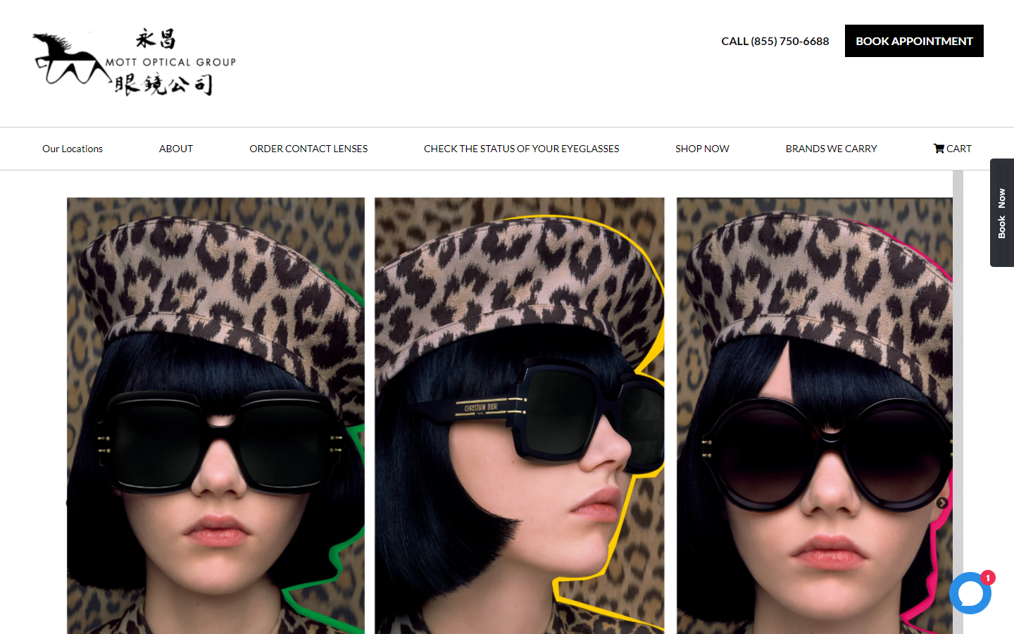
12. Mott Optical Group
Why it works: This is considered as one of the best optometry websites on the web because of its large product shots, use of quality images, very limited use of colors on the homepage thereby adding emphasis on the images, sticky book now button which is always visible even when a visitor scrolls down the website.
https://www.mottoptical.com
website design for optometrists
13. Premier Eye Care
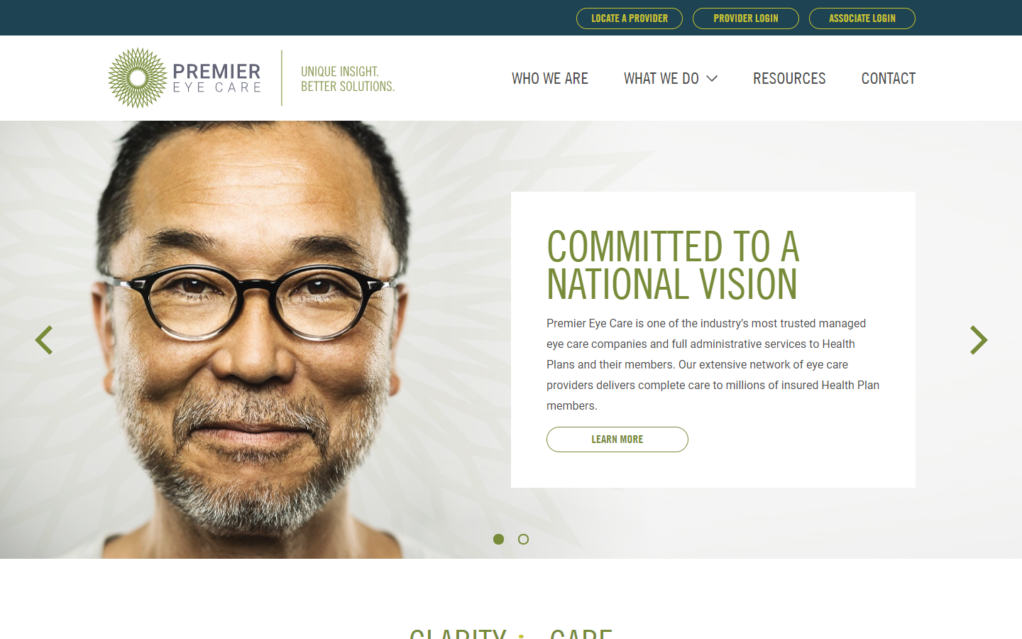
Why it works: Large images featuring happy and smiling faces, consistent use of colors that are easy on the vision, large heading and content fonts, well-curated professional team page with all of them smiling.
https://www.premiereyecare.net
14. Cohen’s Fashion Optical
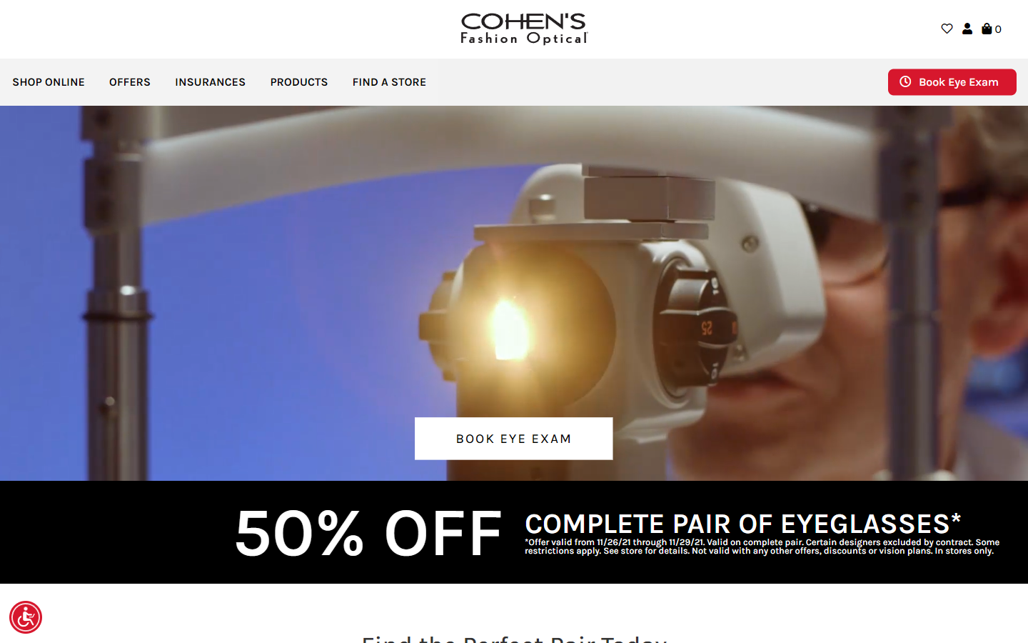
Why it works: Fashionable and functional looping hero video, large 50% offer link, large and high contrast product images, large and clear content fonts, clean and minimal product pages, easy to use, and intuitive store locator.
https://www.cohensfashionoptical.com
15. Jins Eyewear
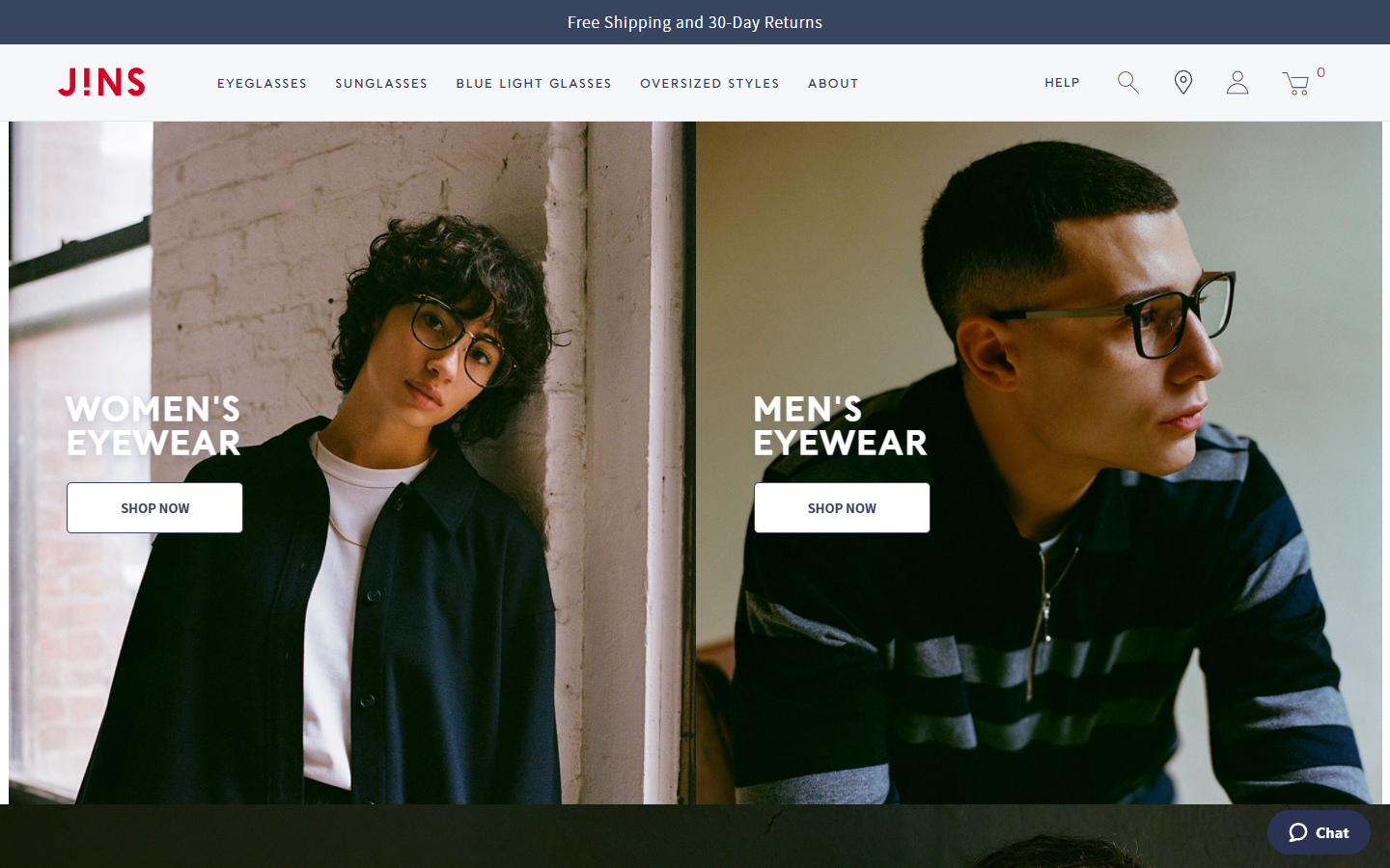
Why it works: High-quality images throughout the website, big and bold heading fonts with large content text for easy reading, full-blown and detailed footer providing access to every other page in the website, navigation dropdown with images and links.
https://www.jins.com
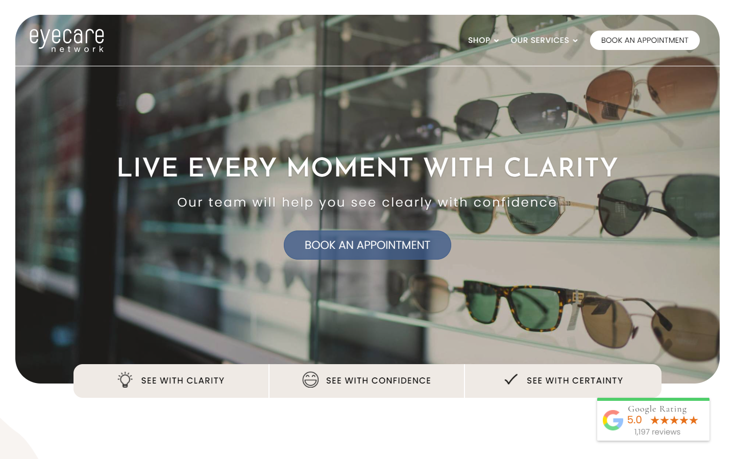
16. Eyecare Network
Why it works: Creative treatment of images accentuated with background design elements, subtle but functional hover animation effects, navigation is always visible even after scrolling, use of Google rating widget.
https://eyecarenetwork.com.au
optometric website design
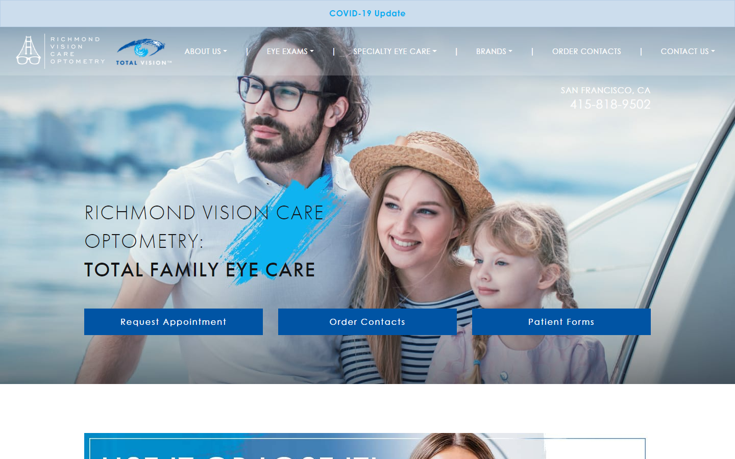
17. Richmond Vision Care Optometry
Why it works: Creative business ad banners, consistent use of color throughout the website, sticky main navigation which is great for going to specific other pages, complete contact and location information available on every website page.
https://richmondvisioncare.com
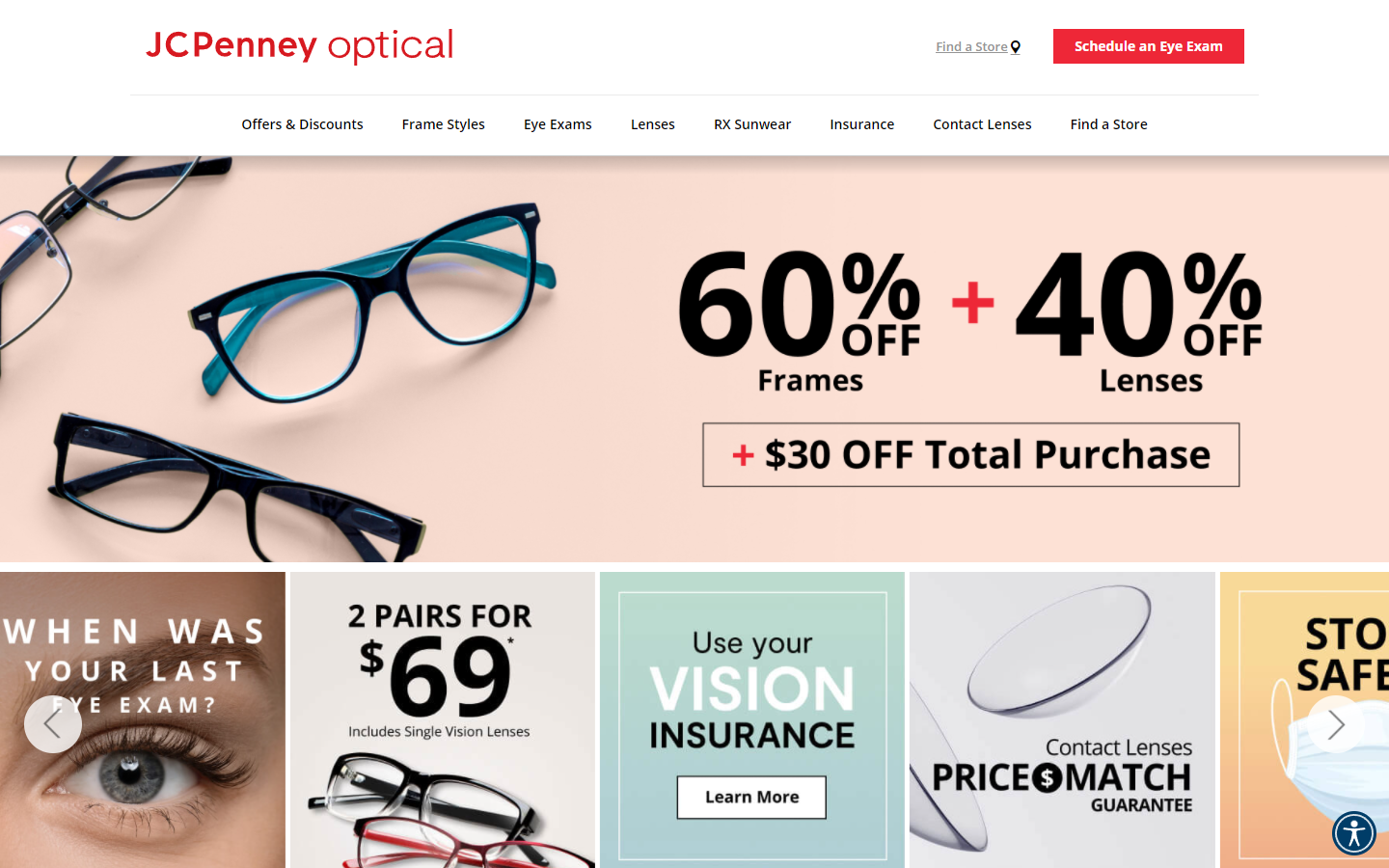
18. JCPenney Optical
Why it works: Trendy colors, use of sharp images, subtle animation and movement for mouse hover effects, well-organized pages, easy-to-find content, awesome functionality in filtering products, overall a very informative website providing other eyecare professionals and patients not only facts but also products and services.
https://www.jcpenneyoptical.com
19. Vision Source Studio 20/20
Why it works: The creative font in the logo adds character to the site, the hero section grabs attention which makes up for the minimal content below, informative articles, well structured, and easy to navigate inner pages, and subpages.

https://visionsource-studio-2020.com
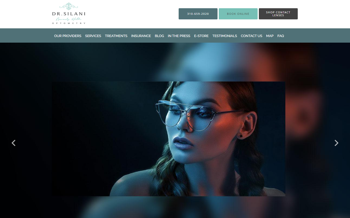
20. Dr. Silani Beverly Hills Optometry
Why it works: Use of quality photos, use of alternating dark and light sections adds to website content organization, chatbot integration, detailed business services section, contact number, and location map of the business visible on all website pages. One of the best optometry blogs there is, it features articles helpful for eyecare professionals, patients, or anyone in the health care service industry.
https://www.bheyeguy.com
optometry web design
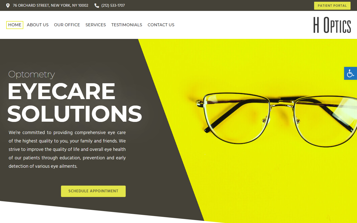
21. H Optics
Why it works: Large heading and content fonts, large images, well-defined page sections, unique logo placement, a creative footer with contact information visible on every sheet, use of parallax image scrolling effects makes this stand out from the other best optometry websites.
https://h-optics.com
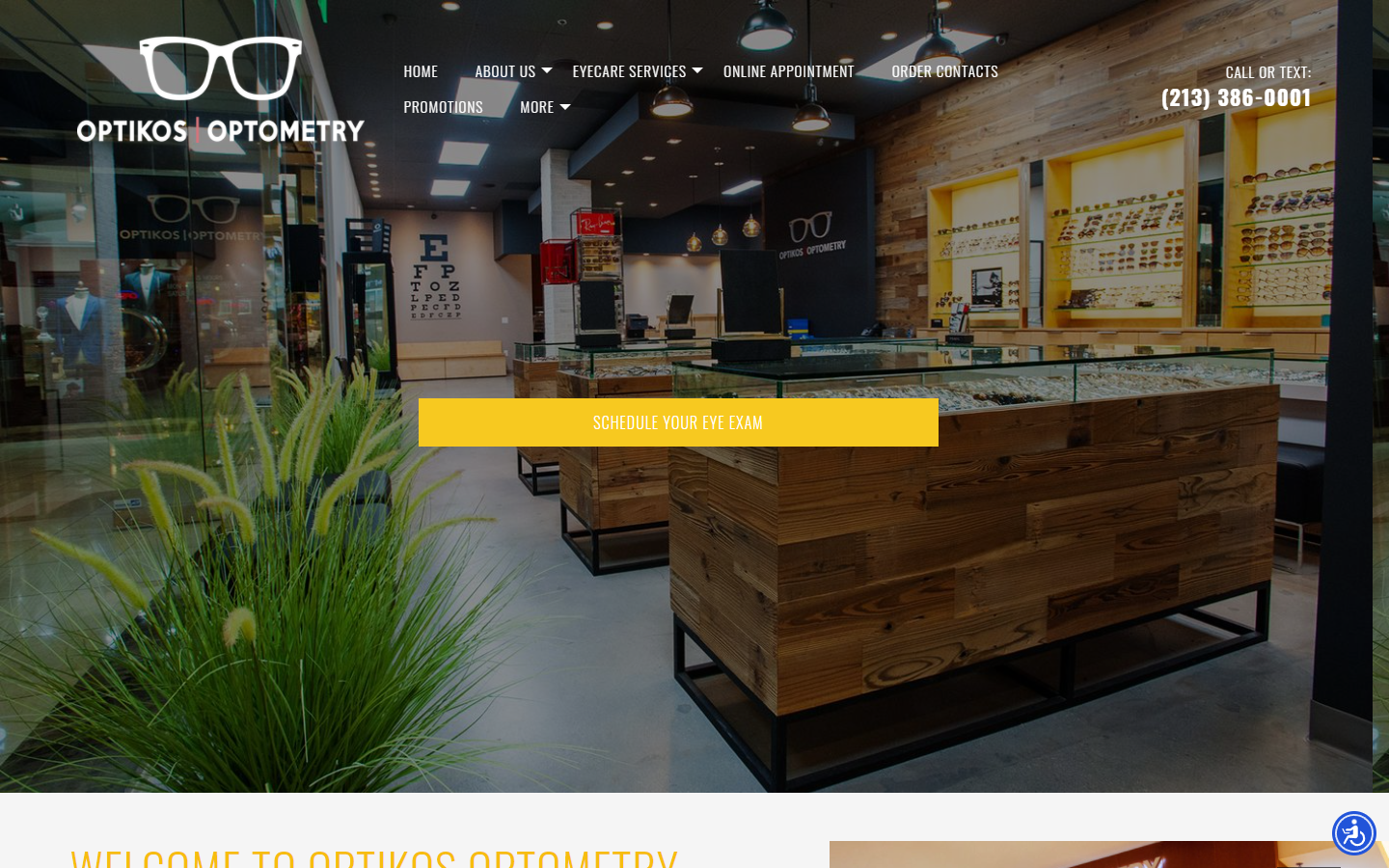
22. Optikos Optometry
Why it works: Large hero image of actual health service business store/clinic, quality images with overlay filter for easier text to read, stylish and sharp narrow heading fonts, prominent contact form, and business location map on the home page.
https://www.optikosoptometry.com
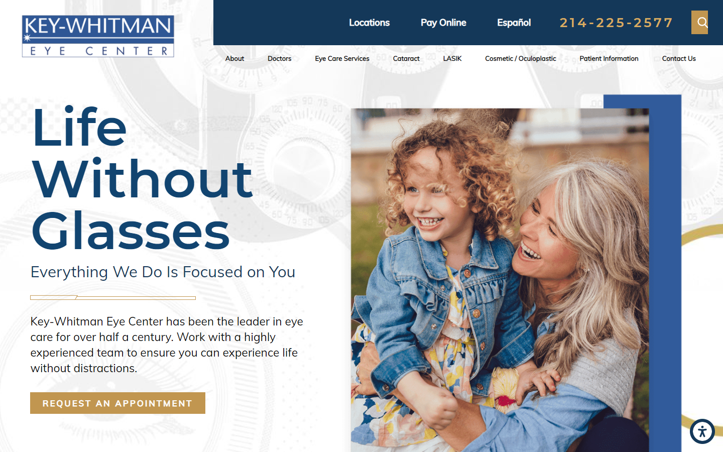
23. Key-Whitman Eye Center
Why it works: Large heading text, subtle scroll transition effects, creative background, and design elements in the content section, despite looking boxy, the sections are well defined and separated. Prominently displayed search engines, services, and contact information.
https://www.keywhitman.com
24. 730 North Optometry
Why it works: This best optometry website uses consistent colors, colored heading fonts add interest and contrast, alternating text and images in the content section, social proof in the form of patient testimonials and reviews of services, and brand logos.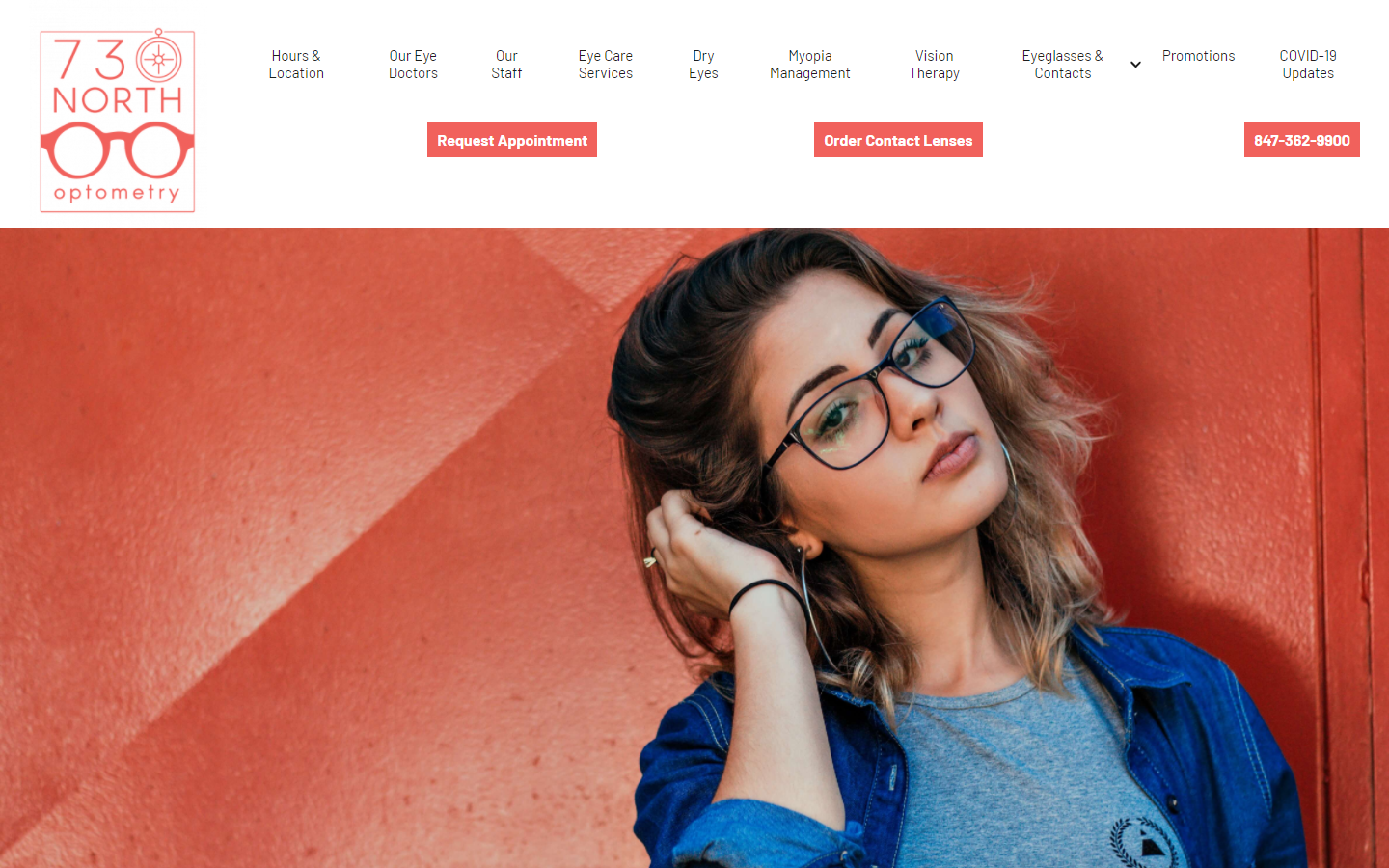
https://www.730northoptometry.com
best optometrist websites
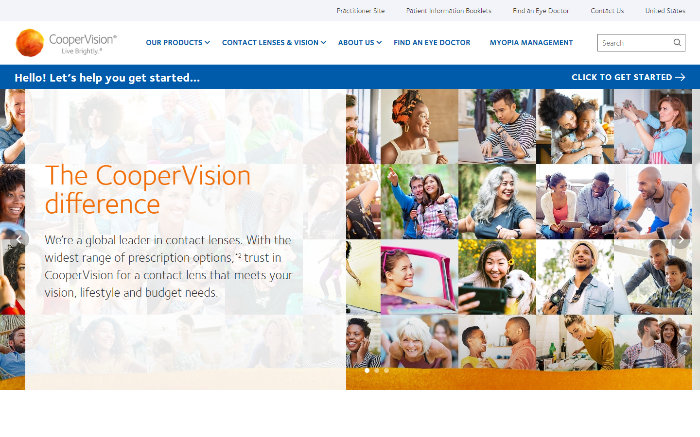
25. Cooper Vision
Why it works: Friendly, active, and vibrant color palette, full-blown footer section, full-width content sections, a consistent combination of photos and illustrations in the different home page sections, large and highly visible call-to-action buttons on the website.
https://coopervision.com
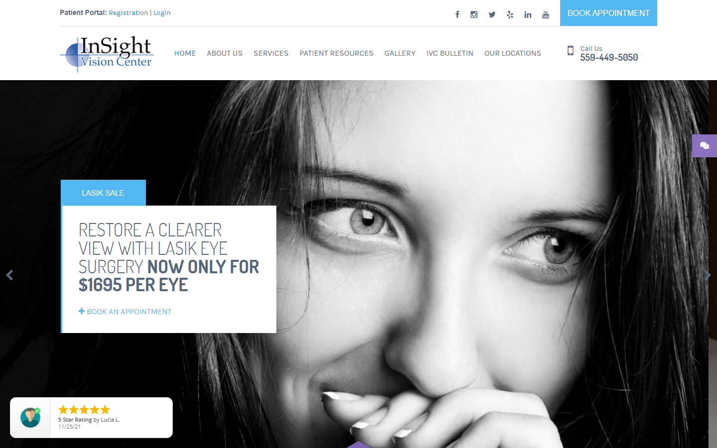
26. Insight Vision Center
Why it works: Contact information and social media links visible on the page header, large hero image slider with framed text description for easy reading, professional colors, use of patient testimonials and google 5-star rating widget.
https://www.insightvisioncenter.com
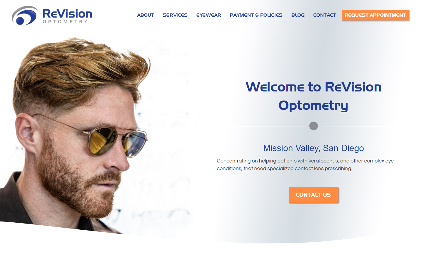
27. ReVision Optometry
Why it works: Creative use of curves to separate page sections, consistent alignment of design and content elements, high contrast text and backgrounds, use of actual eye doctor clinic, and location photos which adds trustworthiness in the industry.
https://revisionoptometry.com
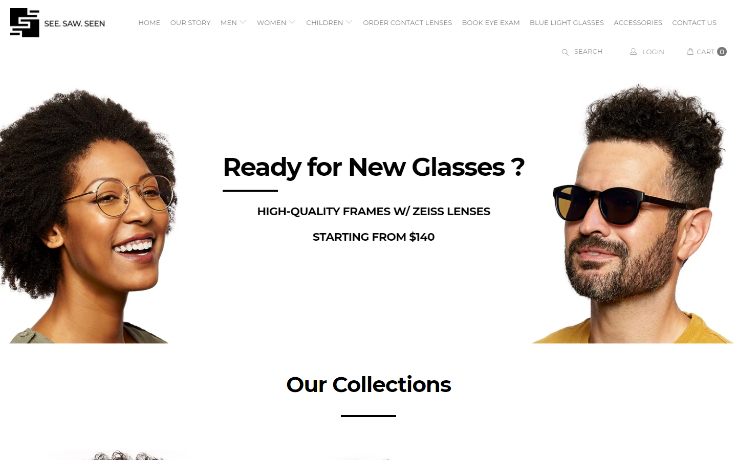
28. See Saw Seen Eyewear
Why it works: Fashionable and stylish pages, quality images and product shots, detailed website inner pages with pictures of the actual clinicians and patients with real eye conditions, full-blown and detailed footer providing access to every page in the website.
https://seesawseeneyewear.com
best optometry websites
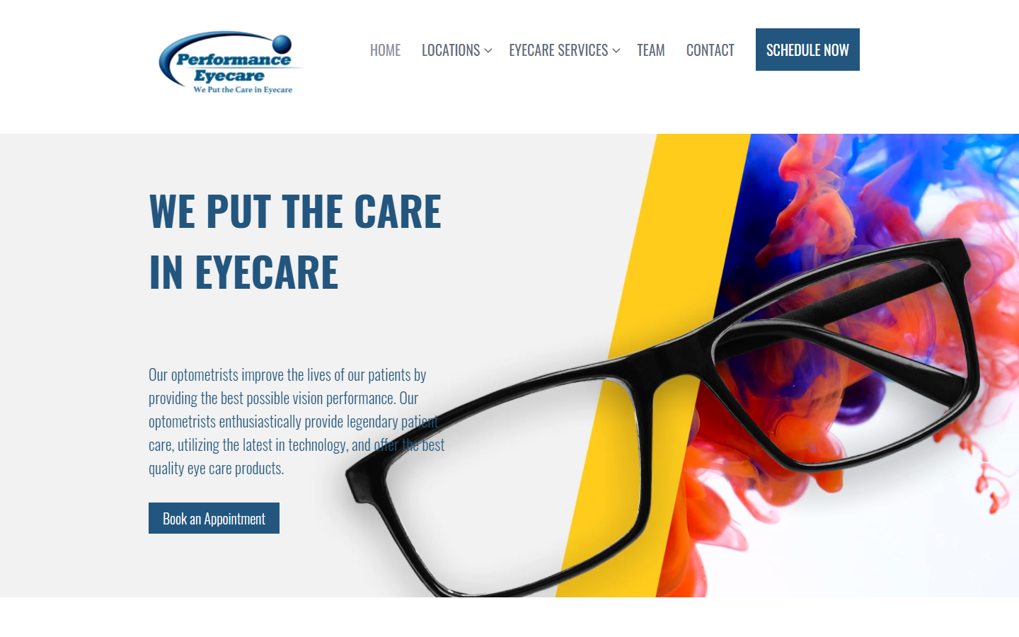
29. Performance Eyecare
Why it works: Creative combination of still images and videos, consistent image styling, fun and creative use of shapes and colors that give life to the website, detailed vision care team page, functional and creative location map, use of patient care testimonials, and health explainer videos to keep patients stay informed.
https://performanceeyecare.com
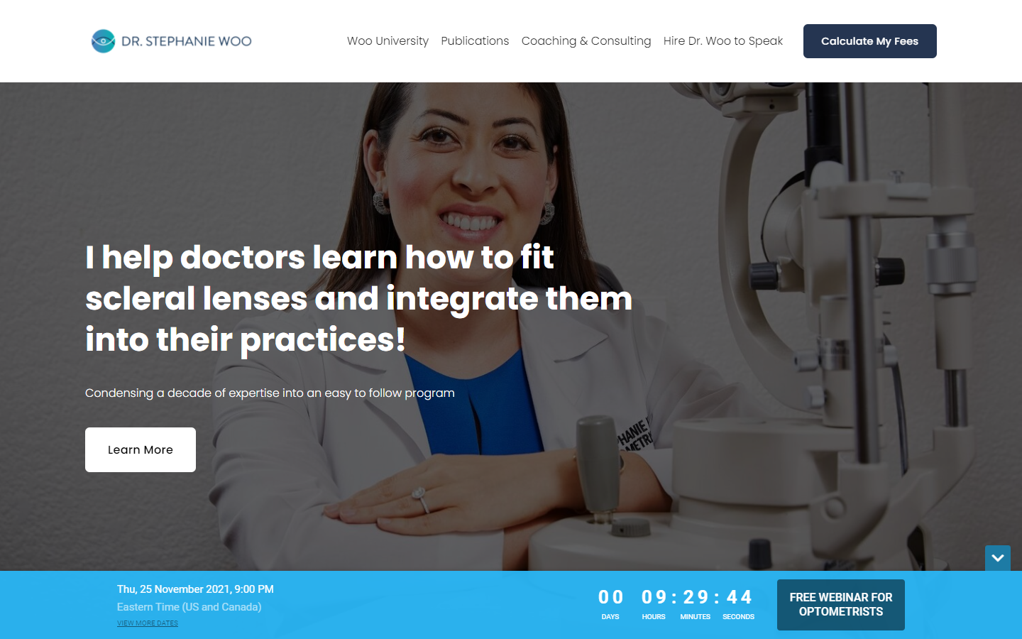
30. Dr. Stephanie Woo
Why it works: Professional and clean, easy to read content, focus on the eye care doctor and her health experience and capabilities, use of actual photos of the doctor in action makes sense, dedicated online page for calculating fees which add transparency and honesty.
https://www.drstephaniewoo.com
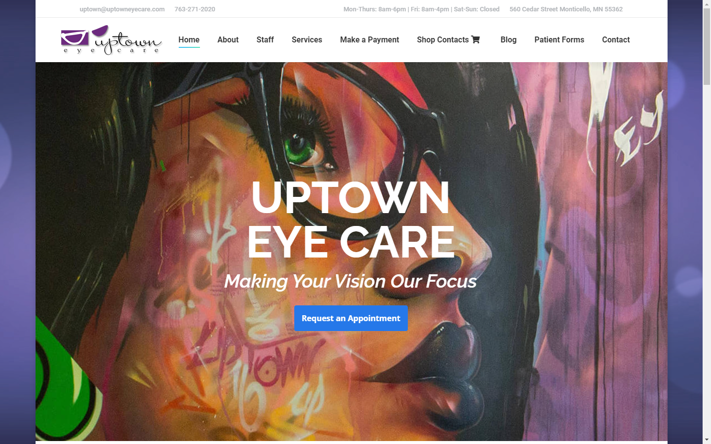
31. Uptown Eye Care
Why it works: Strong and clear statement of purpose, the inclusion of a virtual tour of their eye health facilities, highly informational website for the patients and doctors continuing education, alternating use of paintings and actual photos which adds online interest and portrays creativity.
https://www.uptowneyecare.com
32. Cargo Eye Care
Why it works: Images of smiling and happy people, warm colors throughout the pages, subtle animation and hover effects, effective use of whitespace, regularly updated content, navigation is always visible even after scrolling, and call to action buttons visible on every page of this vision care website.
optometry web site design
33. Optx Optometry
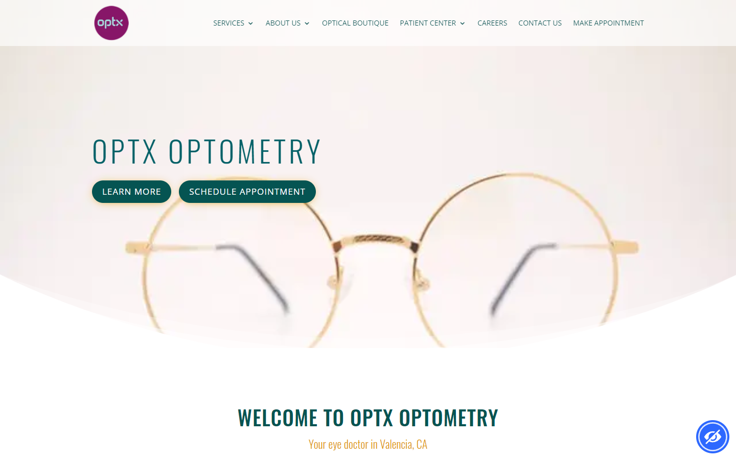
Why it works: Cool scroll transition and animation effects, well-defined sections, the website exudes a light and airy feel because of the whitespace, balanced combination of rounded design elements with sharp and crisp fonts.
https://optxoptometry.com
34. Northeastern Eye Institute
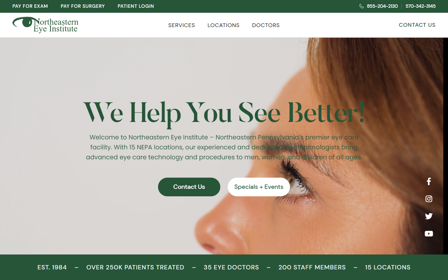
Why it works: Use of large imagery and hero video background, consistent and professional-looking colors, large heading fonts, spacious and well-defined page sections, regularly updated content with events and testimonials or reviews of vision care patients.
https://www.neivision.com
35. Specs Optometry
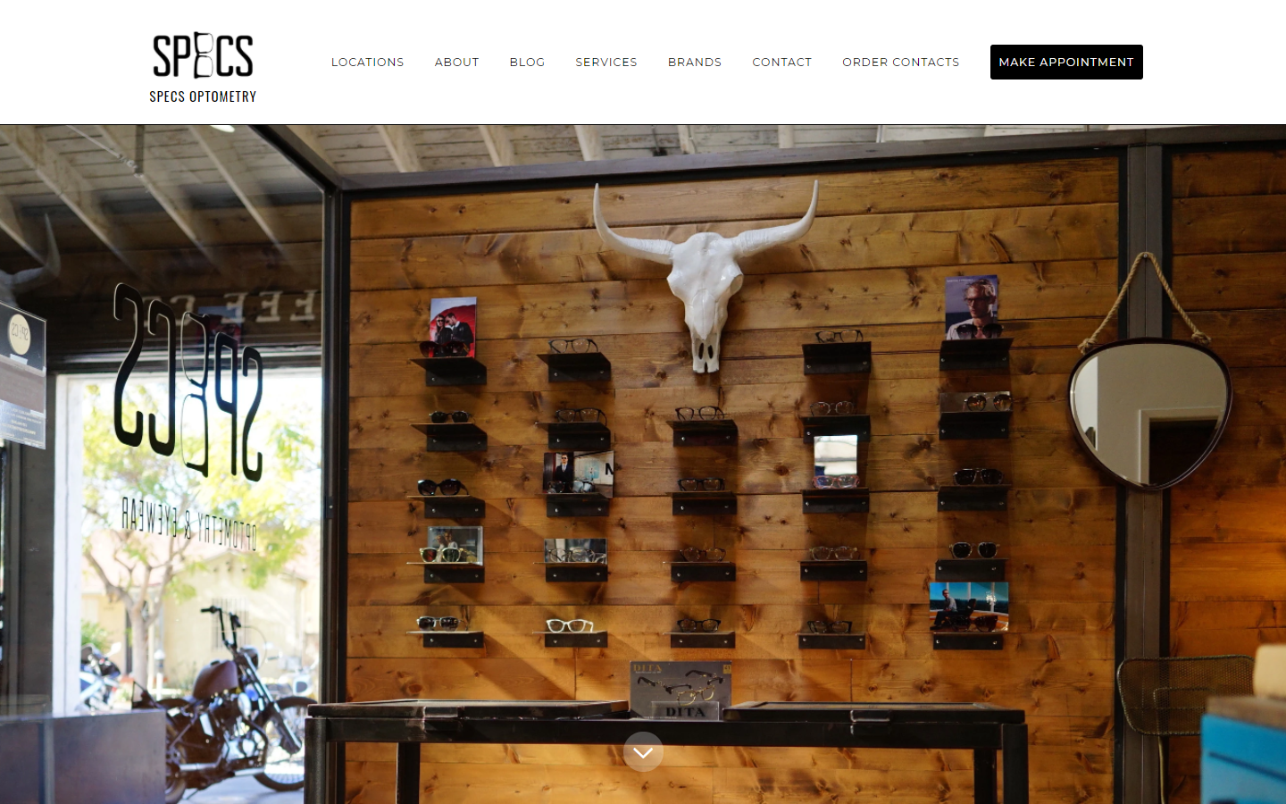
Why it works: Creative logo and branding, sharp and large photos consistent with sharp fonts and section containers, use of an introductory video on the homepage, large hero images for many of the inner pages.
https://www.specsoptometry.com
36. Heights Vision
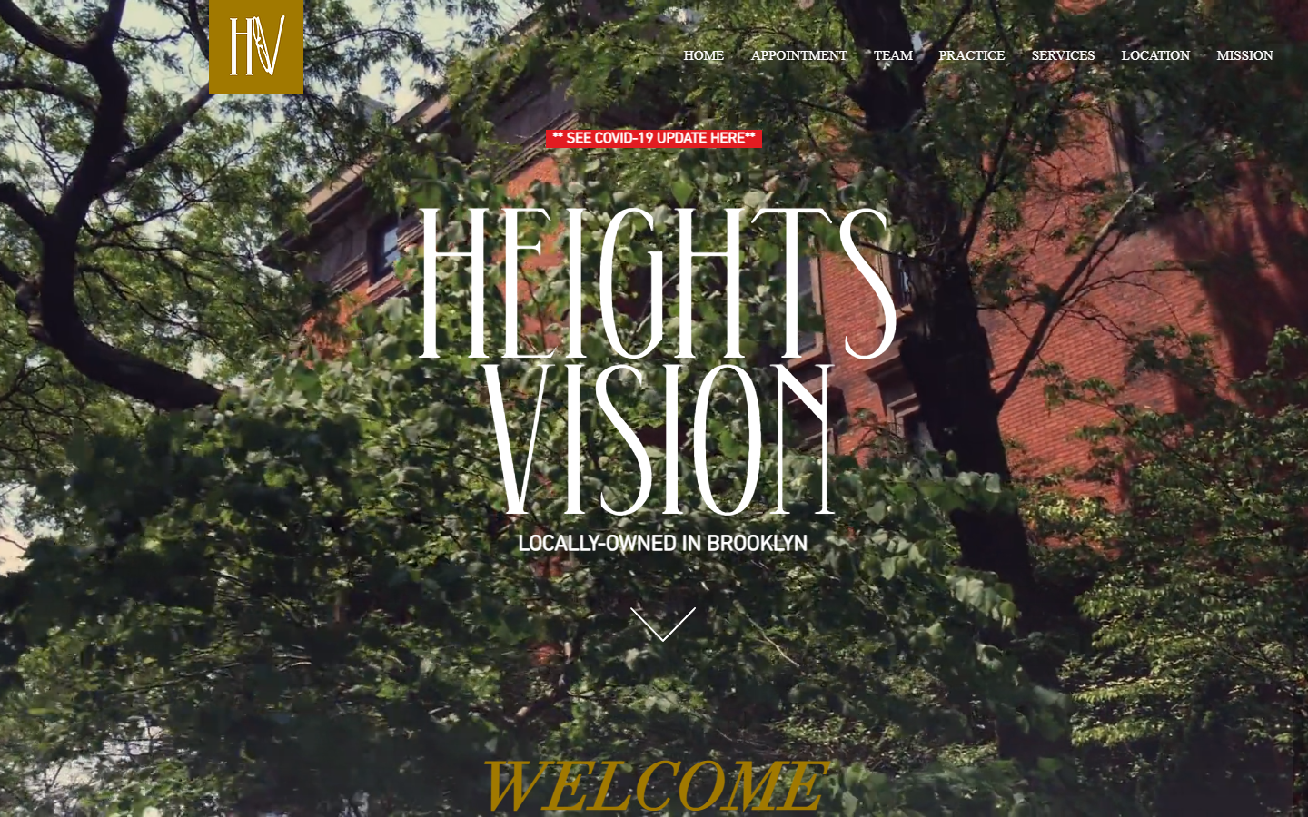
Why it works: Extra large heading fonts are used in this optometry website, the hero video background adds life to the website, sections of the homepage below the hero acts as a directory to lead the site viewer or eye care patients to specific pages in the website.
https://www.heightsvision.com
optometrist websites
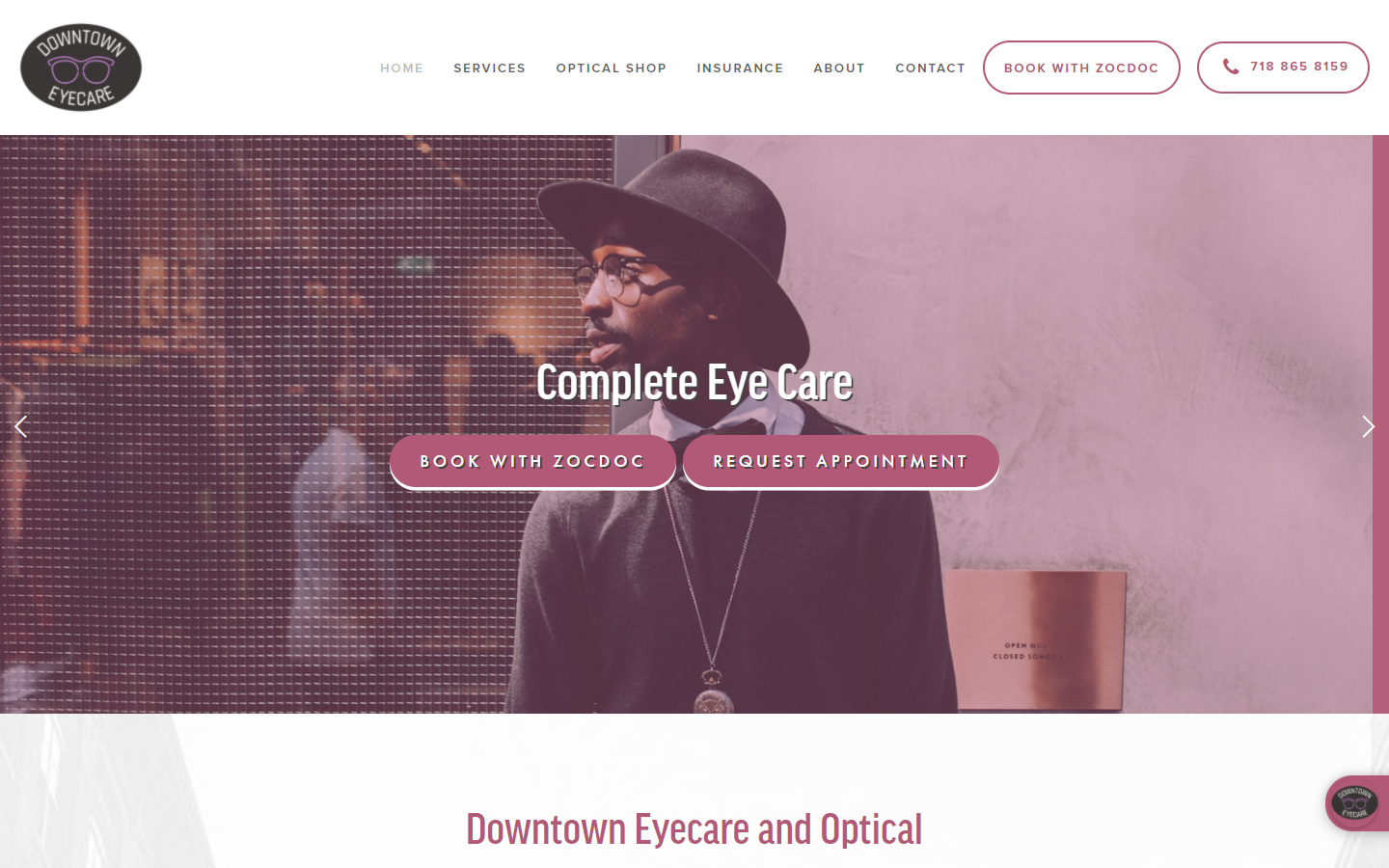
37. Downtown Eyecare
Why it works: Consistent use of colors, consistent and creative treatment of eye care images and location map, stylish content fonts, highly detailed and unique inner pages accentuated with scientific illustrations and images.
https://downtowneyecareandoptical.com
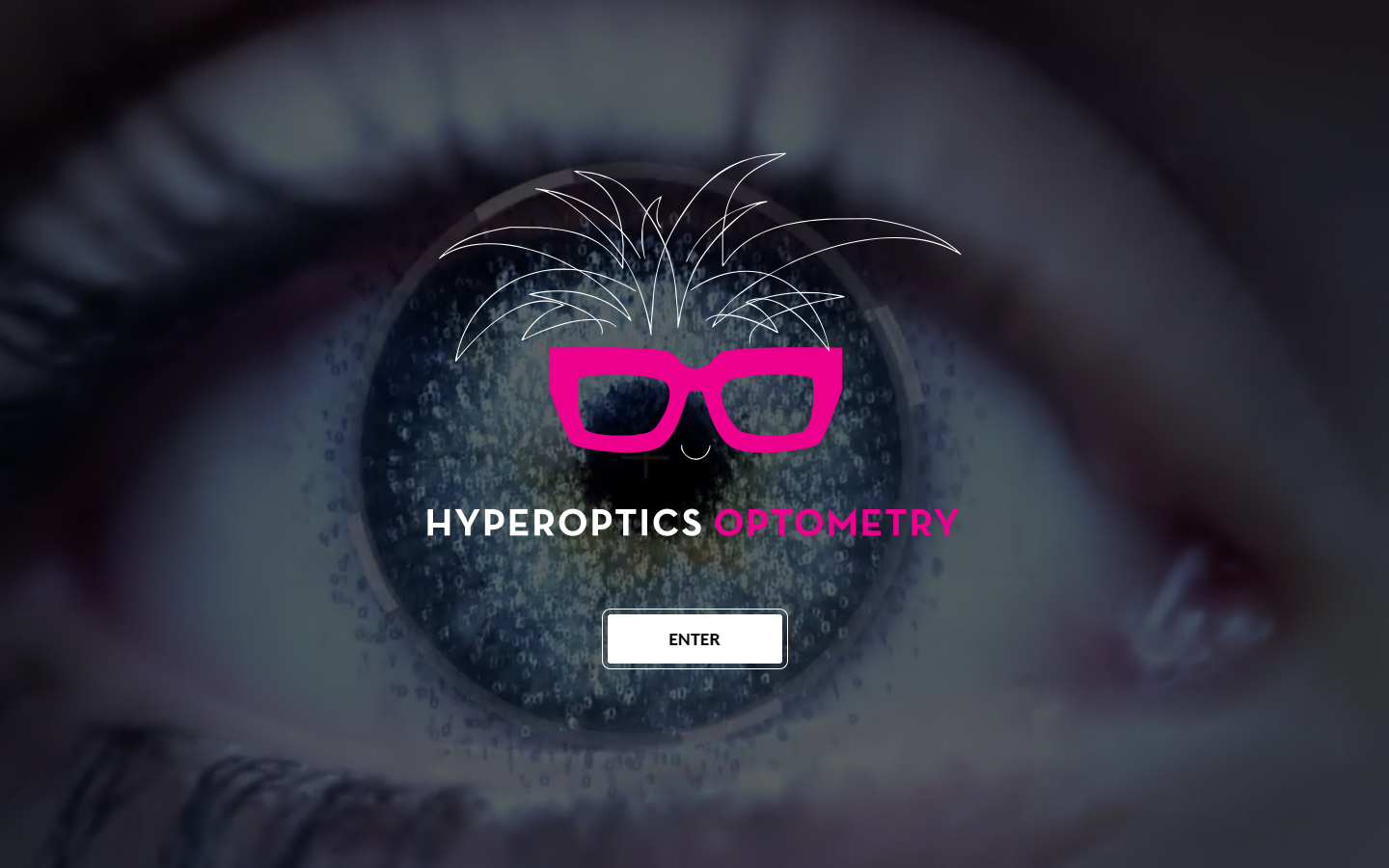
38. Hyperoptics Optometry
Why it works: Creative welcome screen with a looping video background which highlights the company logo, playful and lively color palette, use of actual pictures of the eye care store/clinic, detailed doctors’ appointment forms, complete contact information including a map.
https://hyperopticsoptometry.com
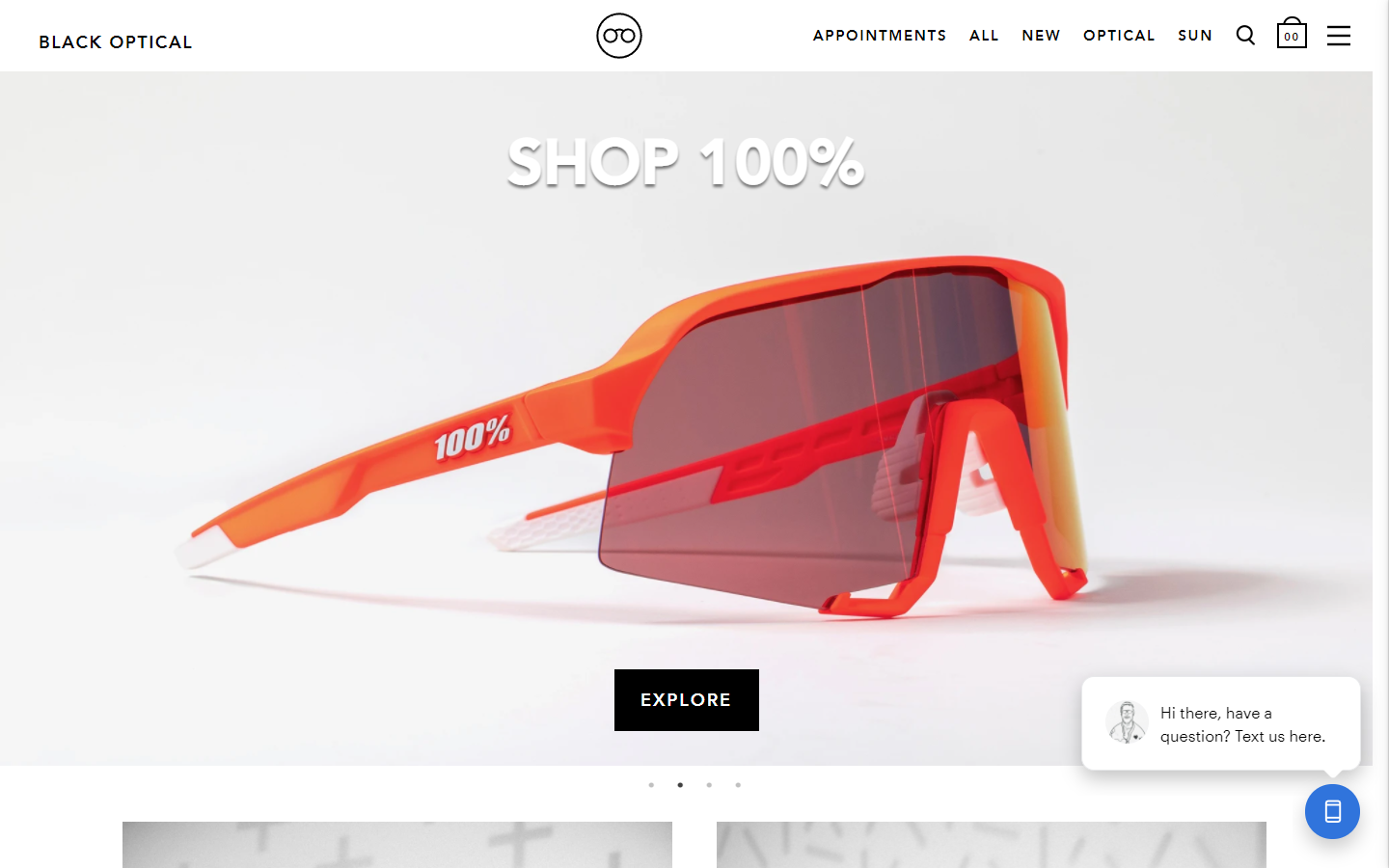
39. Black Optical
Why it Works: Stylish and minimal content and design elements, subtle scroll animation effect. Other aspects of this eye health website are the super high contrasting text to background, large heading text and readable content text, high-quality images, and vision product photos.
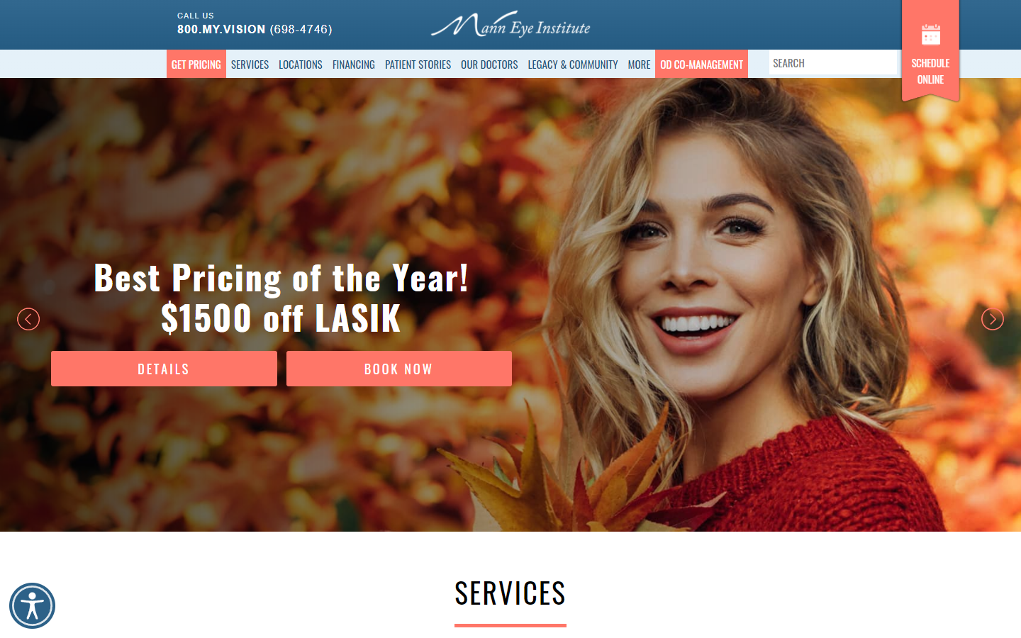
40. Mann Eye Institute
Why it works: This optometry website has creative and highly visible call-to-action buttons and links, consistent use of colors, vision friendly and positively appealing photos, informative and detailed services, use of social proof such as testimonials, award logos, and membership logos create and build trust in the online eye health industry.
https://www.manneye.com