As dental offices become more and more digitized, dental websites are becoming a necessity for dental practice. A dental website is the first impression that patients will have of your dental practice; new patients will judge how professional you are based on your online presence. In this blog post, we will showcase 40 of the best dental website designs on the web. Hopefully, this article will give you some inspiration and insight into creating an effective dental website.
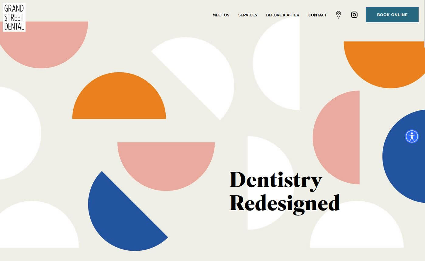
1. Grand Street Dental
Why it works: This website’s youthful approach is achieved through its contemporary appearance with beautiful photography and well-executed typography. It’s simple to use, yet aesthetically pleasing at the same time.
 grandstreetdental.com
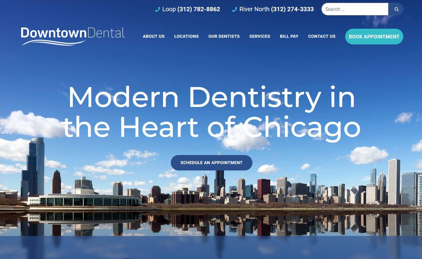
2. Downtown Dental
Why it works: Downtown Dental has clear bold text with clear calls to action buttons for online booking. The phone numbers and business hours are clearly displayed for potential patients. Services are effectively highlighted.
 downtown-dental.com
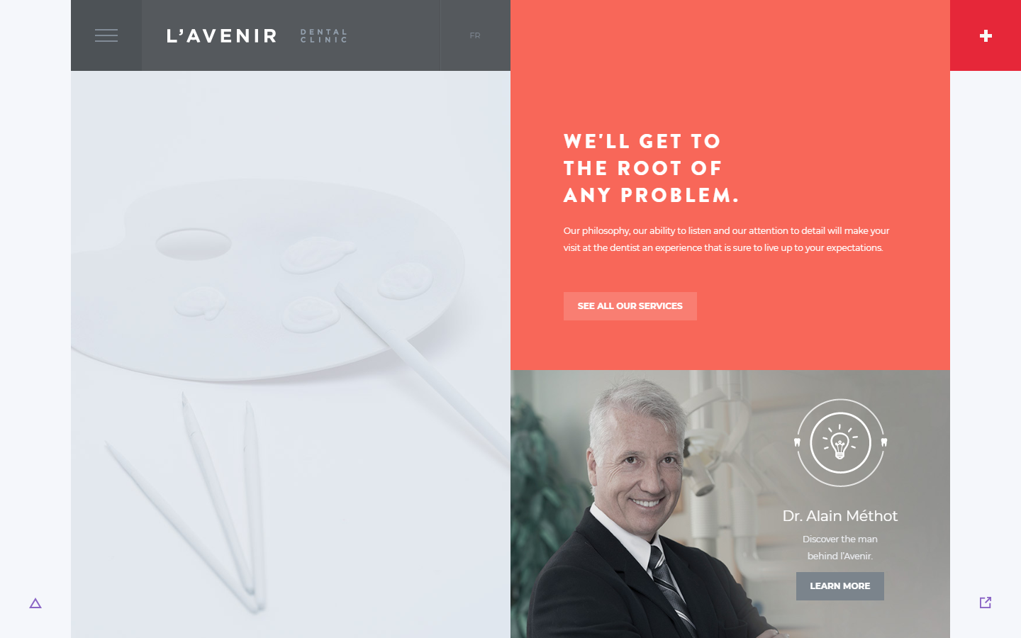
3. L’Avenir Dental Clinic
Why it works: L’Avenir Dental Clinic’s unusual interior is brought to life through animations and creative transitions. The website is well-designed, with many interactive features such as bright-colored buttons.
 avenirclinic.com
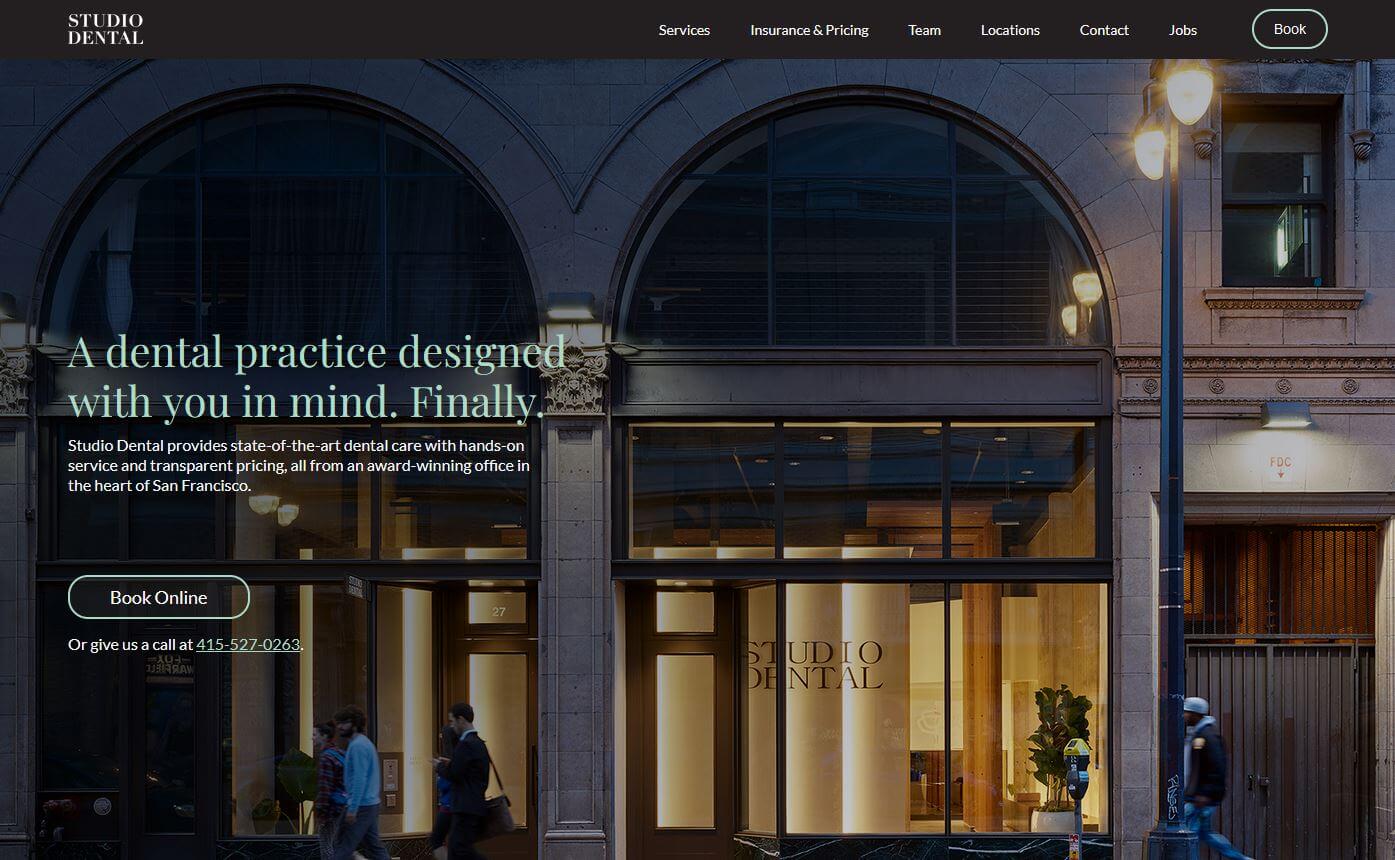
4. Studio Dental
Why it works: This site is a one-stop shop when it comes to dentistry. The site offers detailed information about their services, including photos and videos that vividly convey a very elegant and sophisticated vibe.
home.studiodental.com
Well-Designed Dental Websites
5. Health Inspired Dentistry
Why it works: From its name Health Inspired Dentistry, this site has a very positive atmosphere that promotes health and wellness. It’s simple to book a schedule for new patients with the sticky appointment button. The patient testimonials and company stats adds credibility to this site.
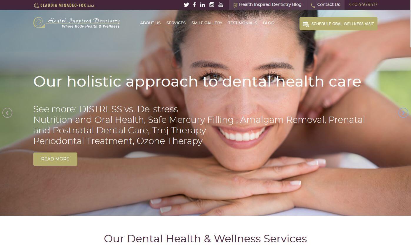 healthinspireddentistry.com
6. Archpoint
Why it works: The subtle transition effects bring life to this traditional web design. Locations and phone number are easily seen. The way they present their client review is outstanding from the rest.
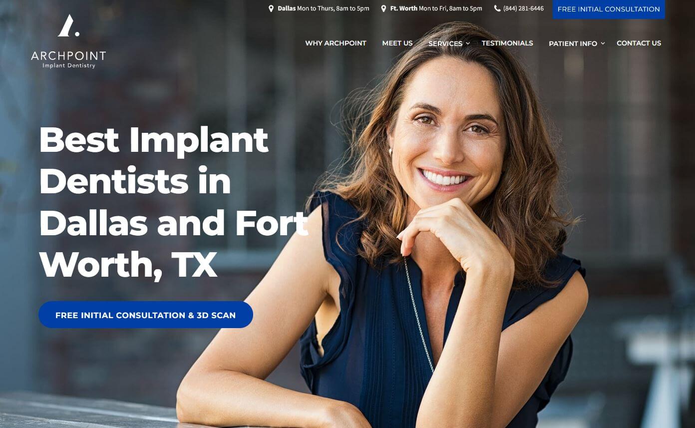 archpointid.com
7. Cedar Village Dentistry
Why it works: The bright and lively colors of Cedar Village Dentistry, as well as the very moving video presentation of their services gives a personal touch this site. The live chat features and before and after photos are a nice highlight when you visit the site.
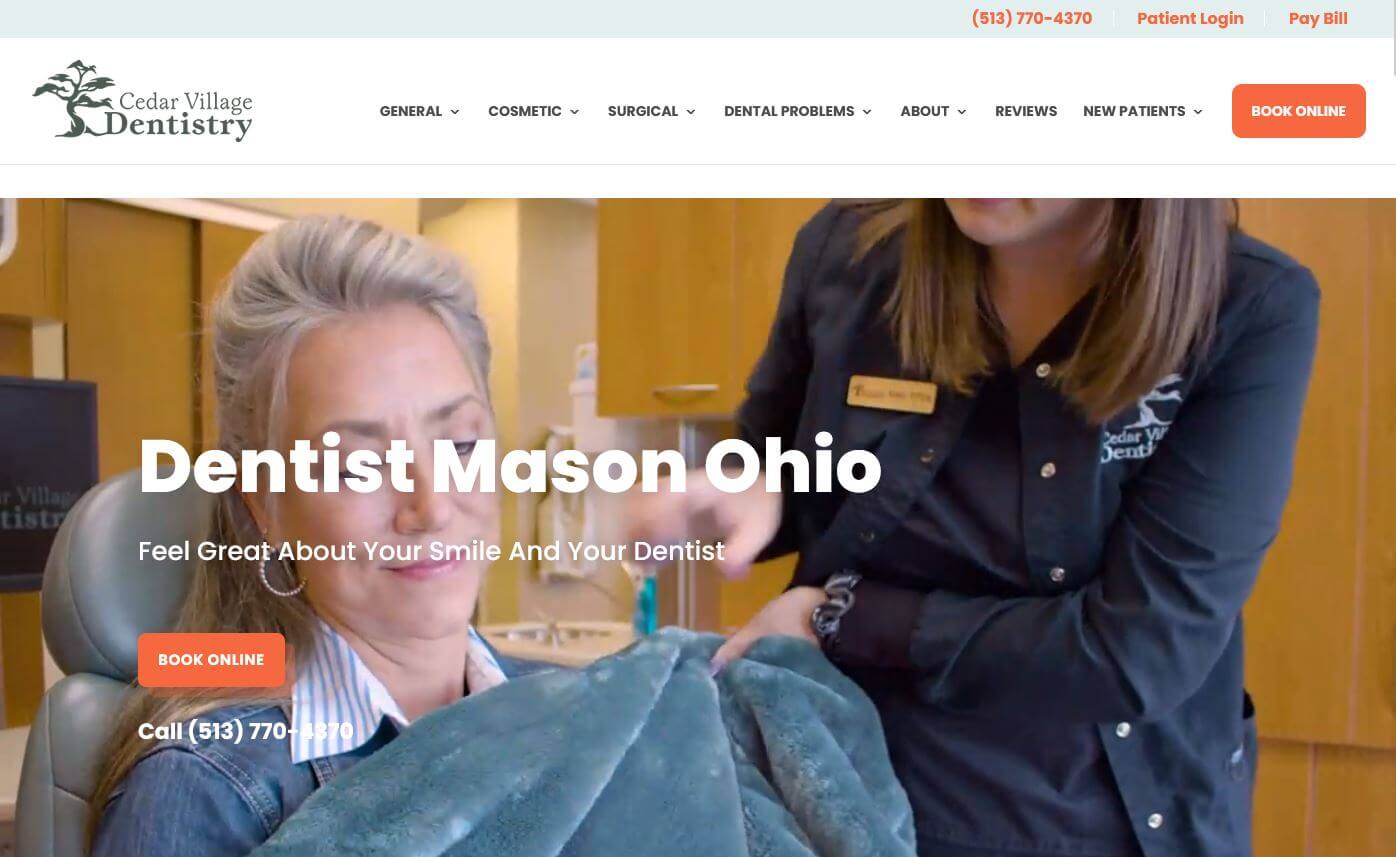 cedarvillagedentistry.com
8. Glo Modern Dentistry
Why it works: Glo Modern Dentistry is both attractive and well-designed, demonstrating the personalized care, modern methods, and high standard of dental practice and services it provides.
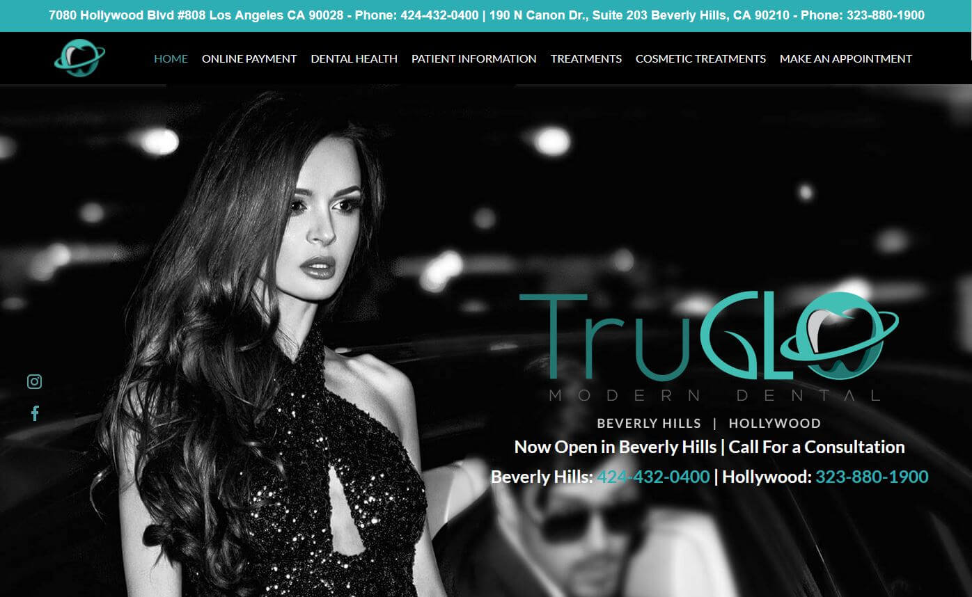 https://glomoderndental.com
Professional Pediatric Dentist Websites
9. Greenspoint Dental
Why it works: Greenspoint Dental’s website offers live chat, upfront pricing, a quick method to get in touch with the dentist, informative content, testimonials, and badges as its most appealing characteristics and features.
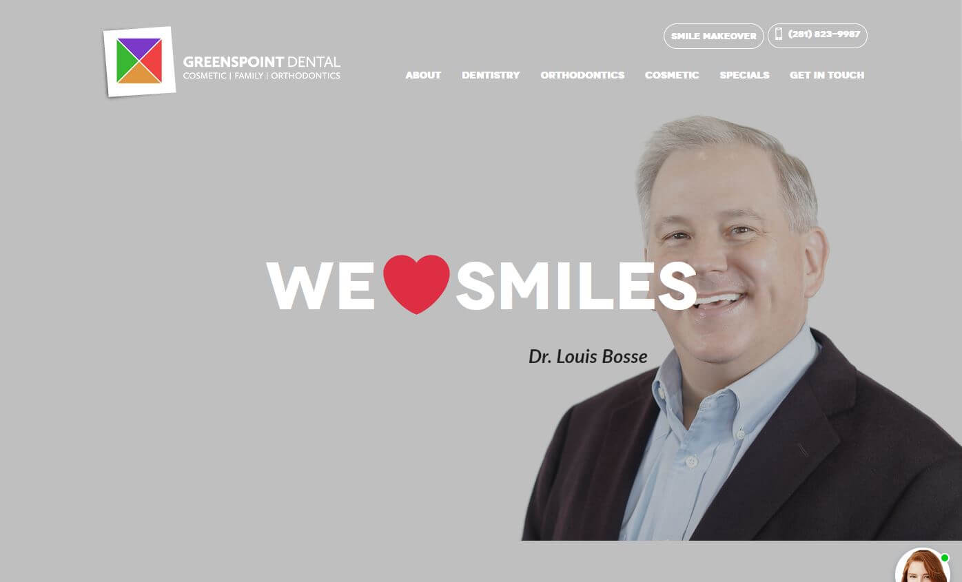 http://greenspointdental.com
10. The Little Royals
Why it works: Who doesn’t love shooting stars? Overall, the site seemed to want to put family and children in the spotlight specifically. Another great example of website in dental industry.
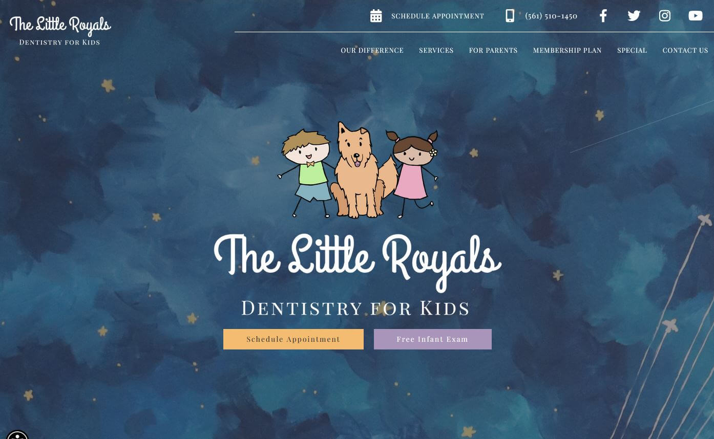 https://www.thelittleroyalsdentistry.com
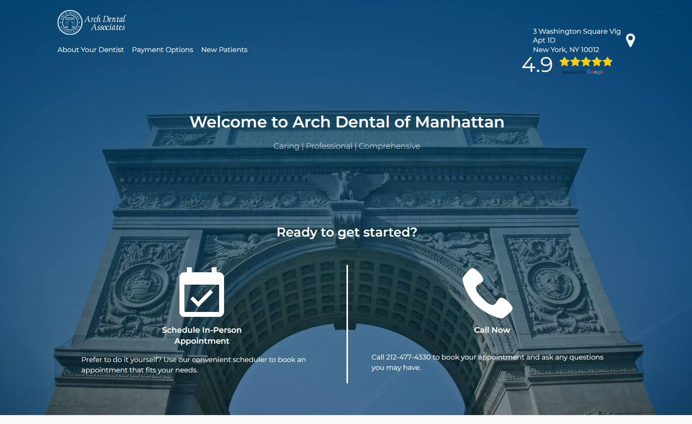
11. Arch Dental Associates
Why it works: All users will appreciate how quickly they can discover what they need. Everything required to know is clearly visible above the fold section, with easy-to-understand and informative navigation pages.
 https://archdentalofmanhattan.com
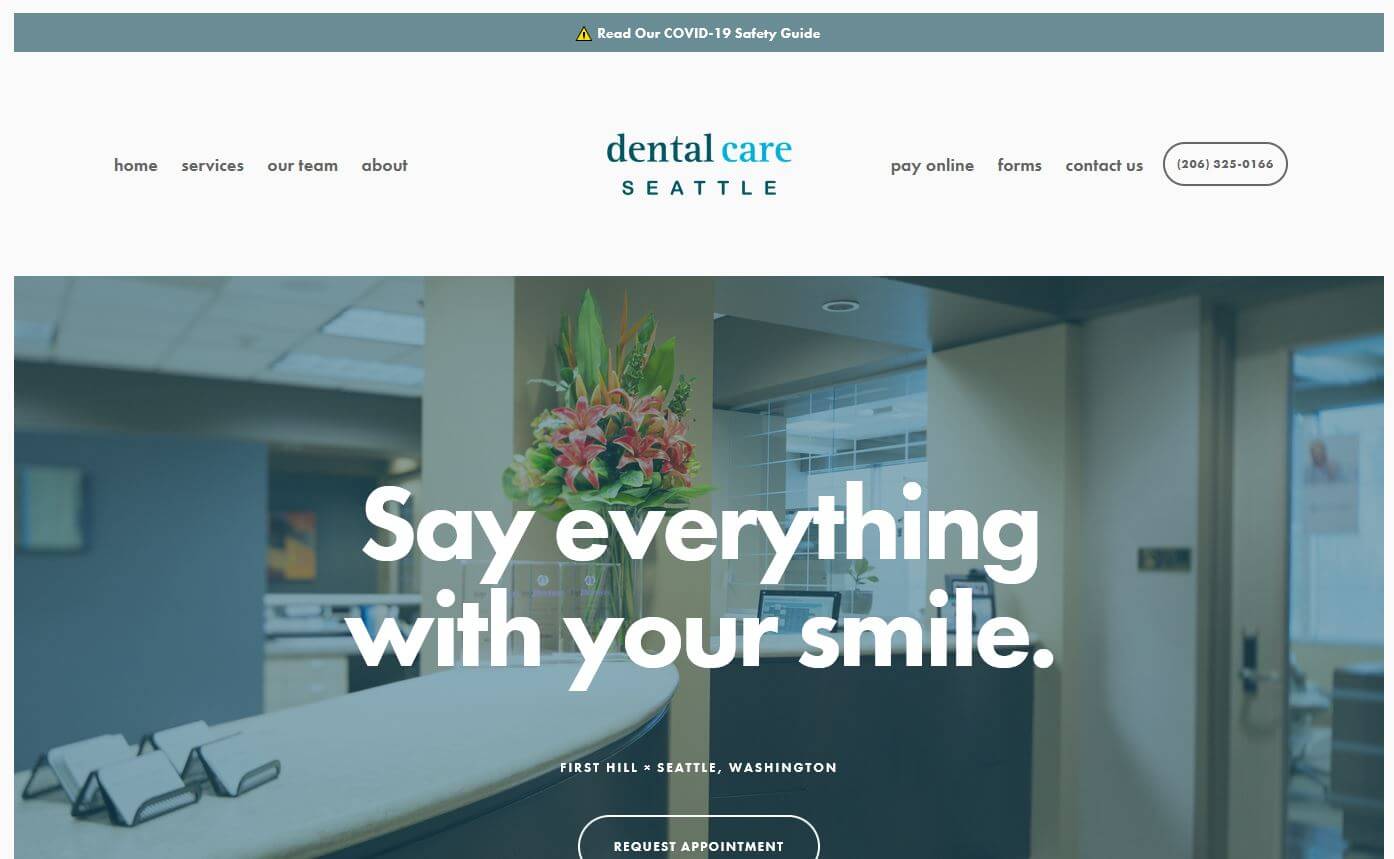
12. Dental Care Seattle
Why it works: Dental Care Seattle has created a light-themed website with a very relaxed feel, simple design and compact without losing functionality and aesthetics. Design with super easy user experience.
 https://www.dentalcareseattle.com
best dental websites designs
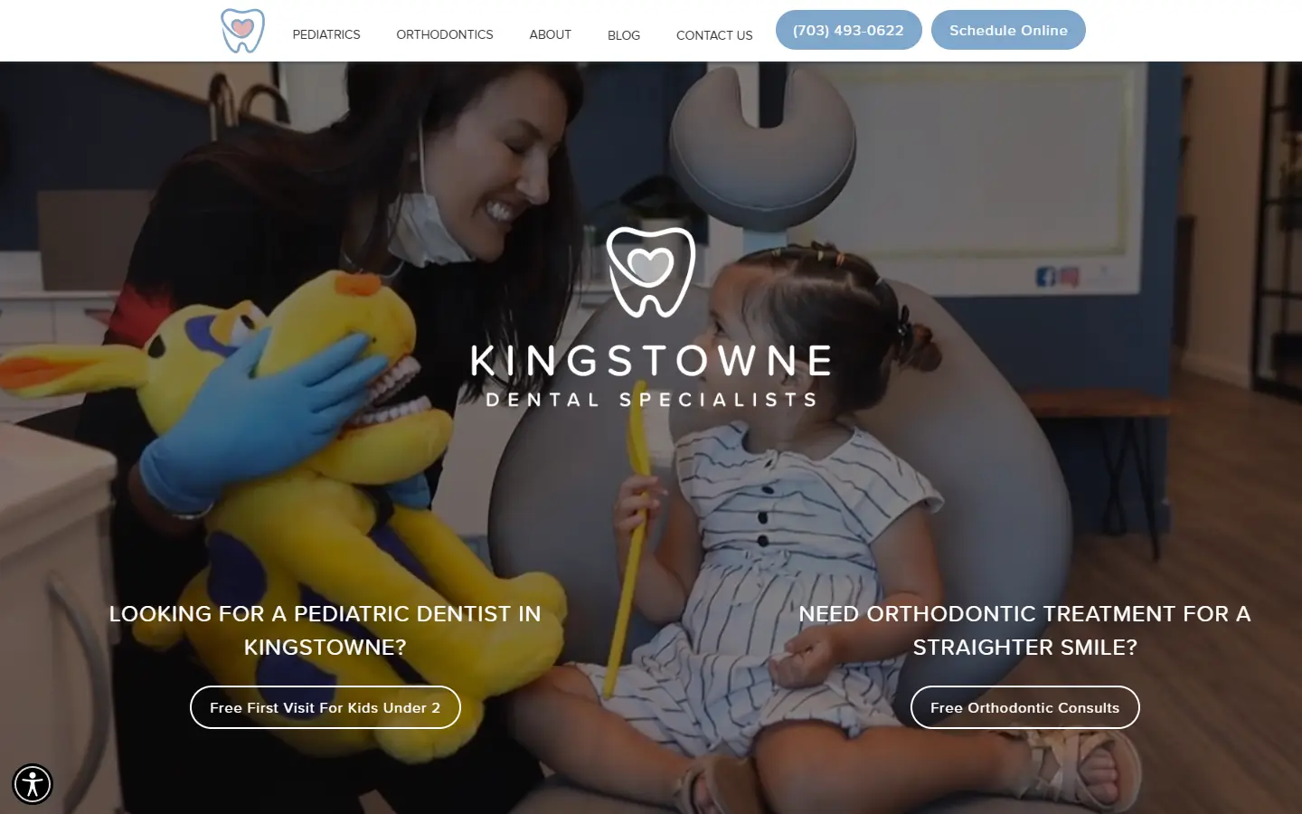
13. Kingstowne Dentist
Why it works: A welcoming and relaxing font choice that can attract and make people of all ages feel at ease, a page with plenty of useful information, beautiful photos, videos, and personality.
 https://www.kingstownedentist.com
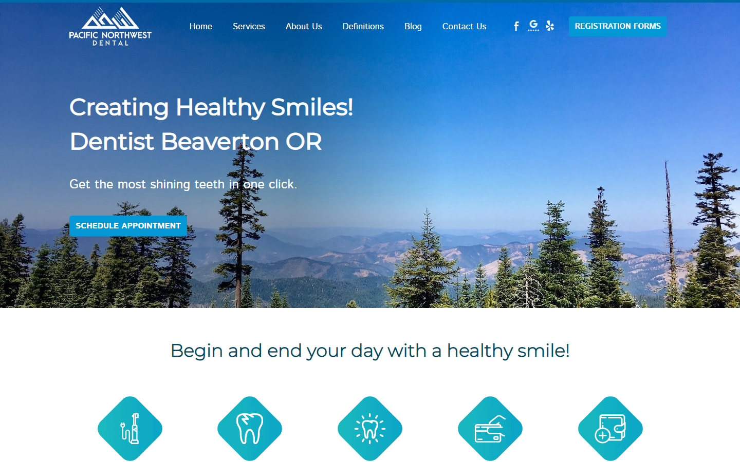
14. Pacific Northwest Dental
Why it works: Pacific Northwest Dental has a bright and calm overall design, simple, minimalistic, easy-to-use yet completely functional. All of the relevant information is readily available.
 https://pacificnorthwestdentist.com
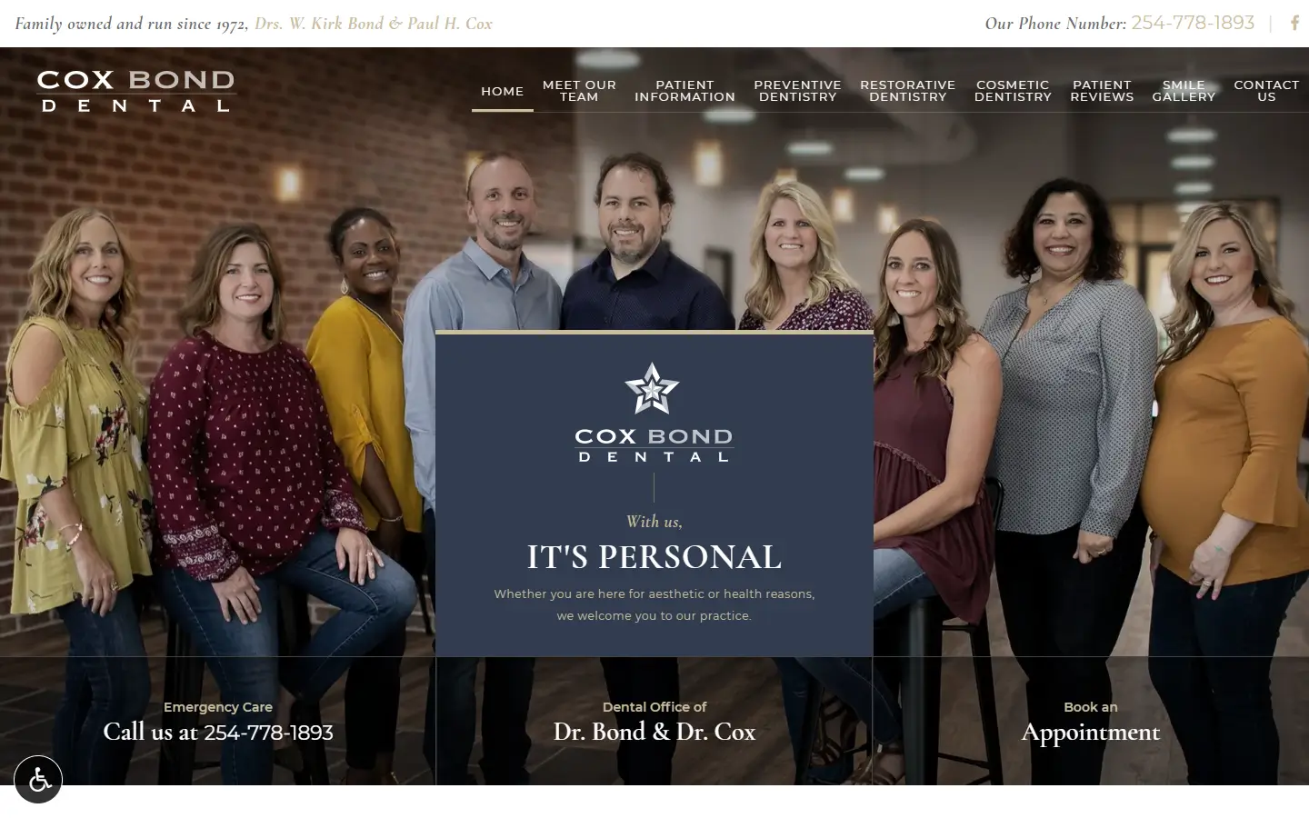
15. Cox Bond Dental
Why it works: Cox Bond Dental is another great example of a harmony of elegance, professionalism, great typography, and excellence and stand out in every aspect.
 https://www.coxbonddental.com
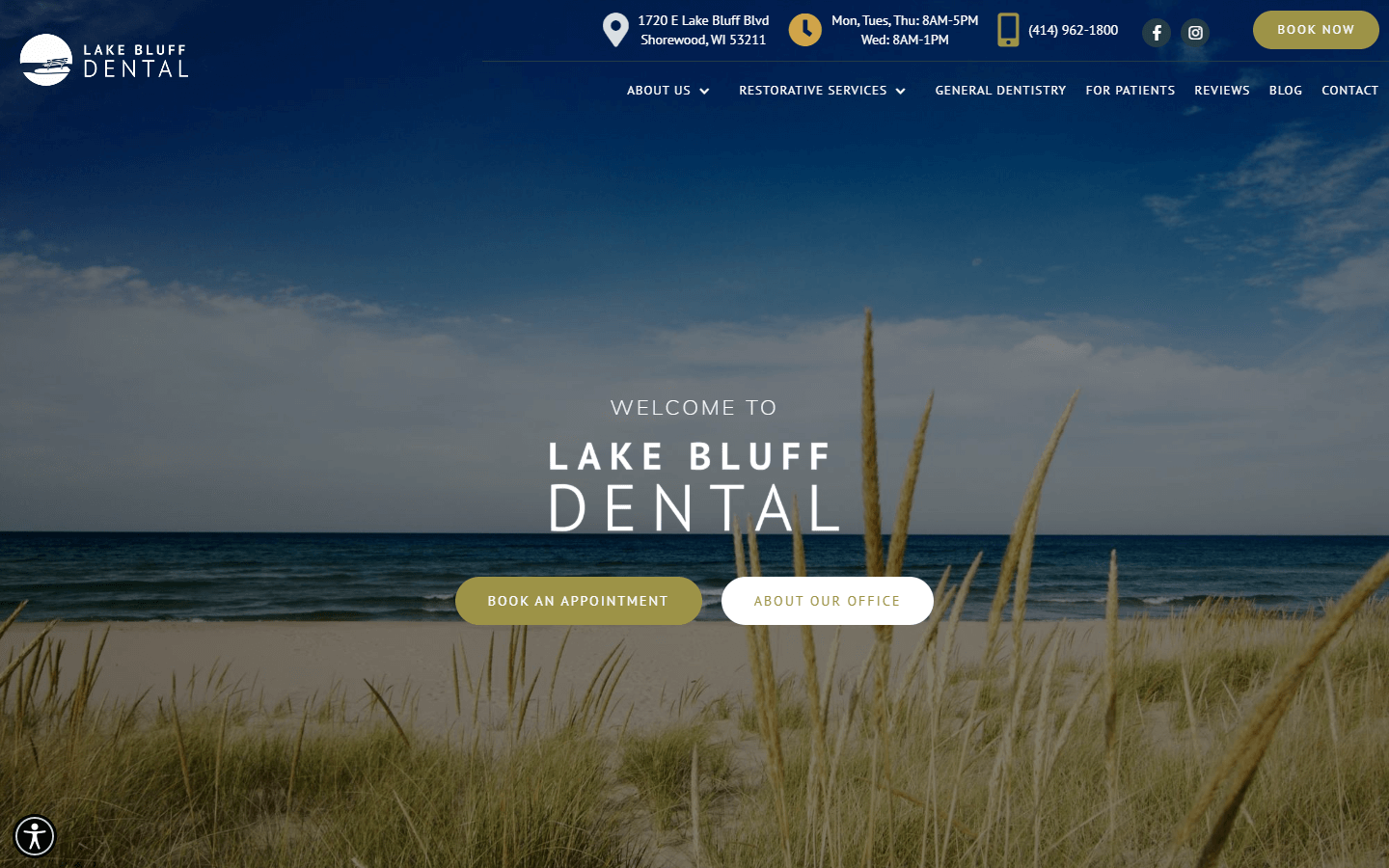
16. Lake Bluff Dental
Why it works: Overall, visiting the site is a pleasant and straightforward experience, with sticky navigation that includes all essential information and booking options.
 https://www.lakebluffdental.com
Dental Office Websites
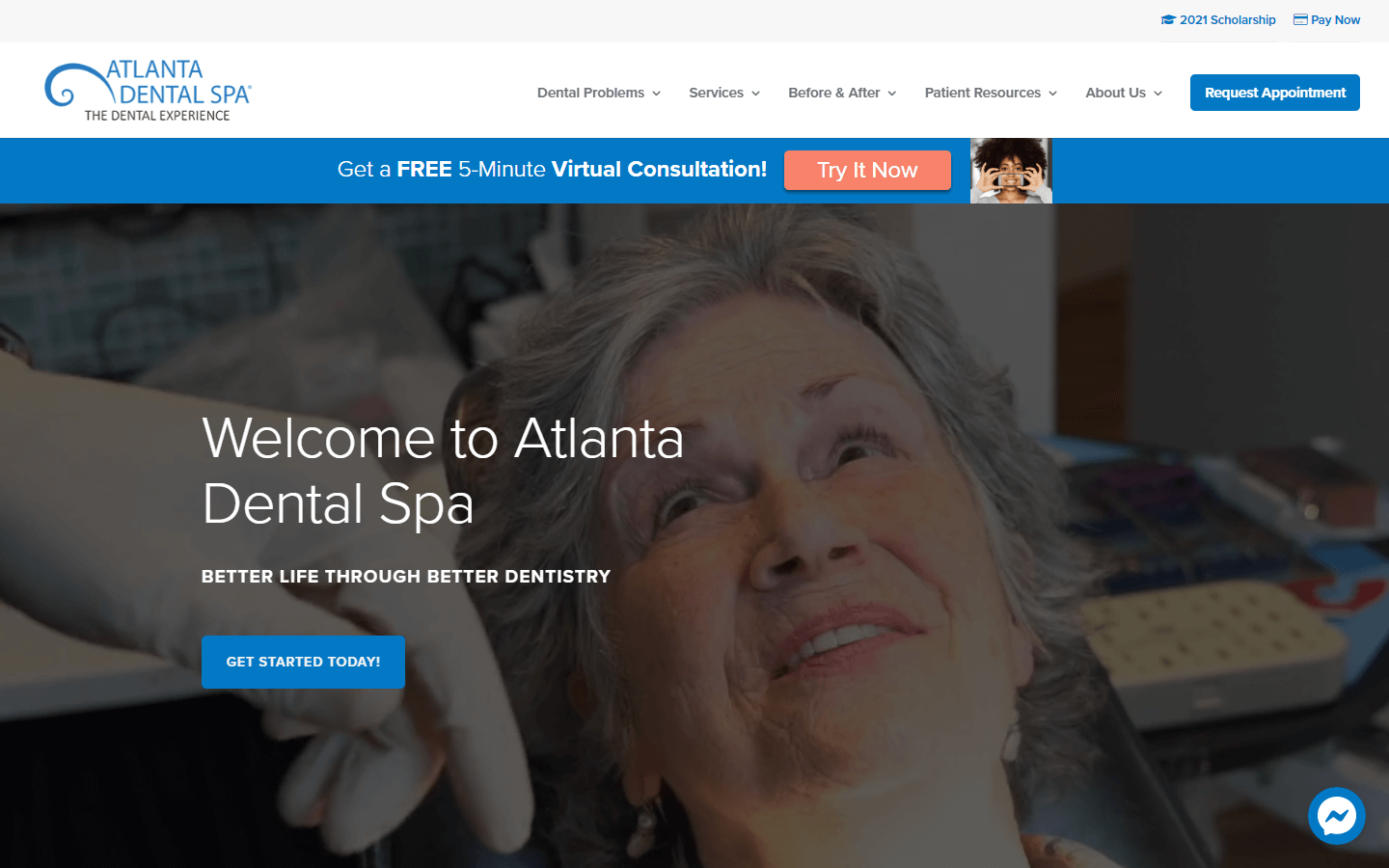
17. Atlanta Dental Spa
Why it works: Atlanta Dental Spa provides a virtual consultation, testimonial videos, and live chat. The appointment and contact information are clearly displayed to gain more patients, with the “Meet Your Doctors” section being a particularly impressive dental practice for any website.
 https://atlantadentalspa.com
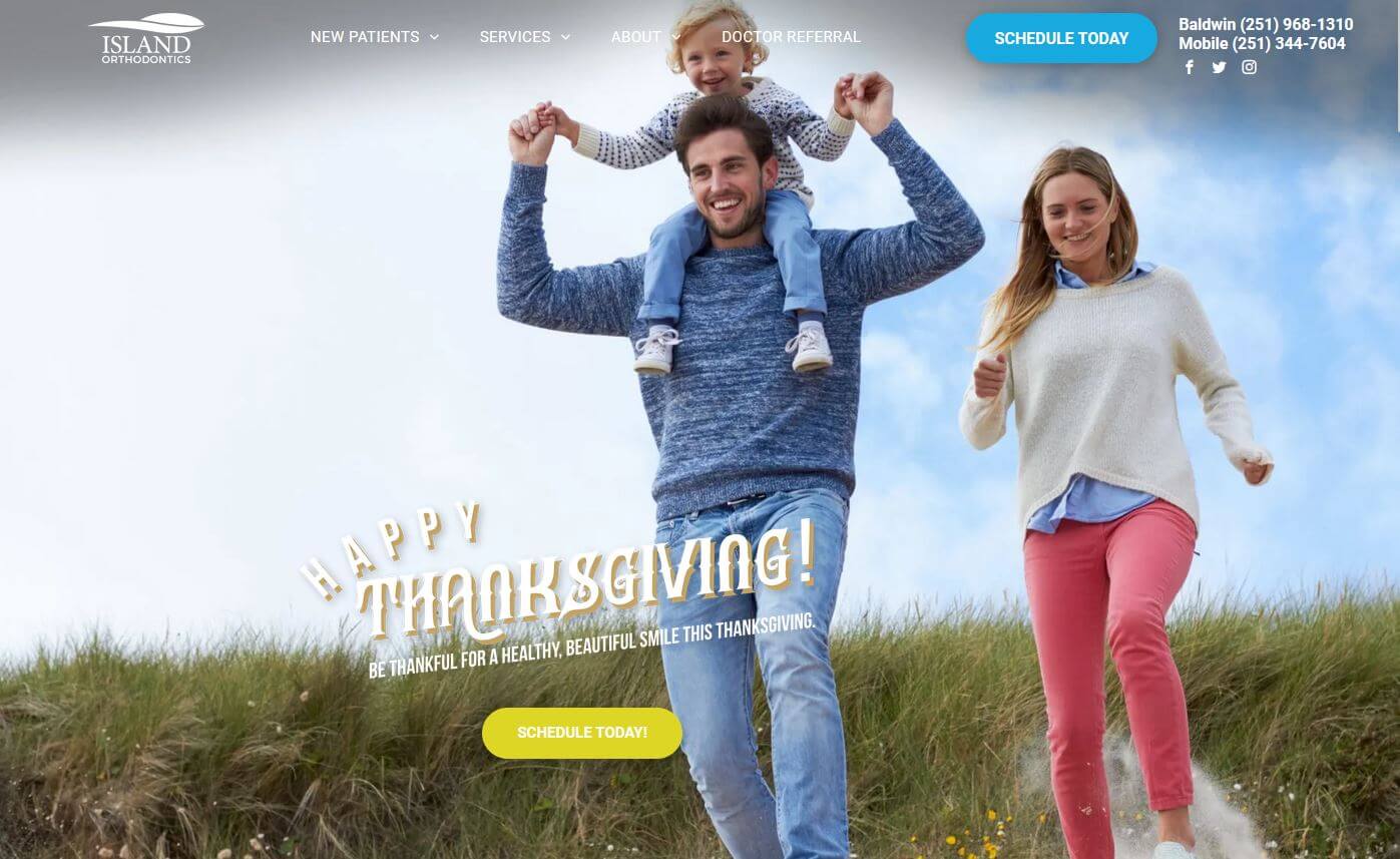
18. Island Orthodontics
Why it works: Island Orthodontics utilized happy photos. The pink and blue are a great mix, attractive, engaging, and fun colors. Terrific yet minimal graphics that complement very well.
 https://www.islandortho.org
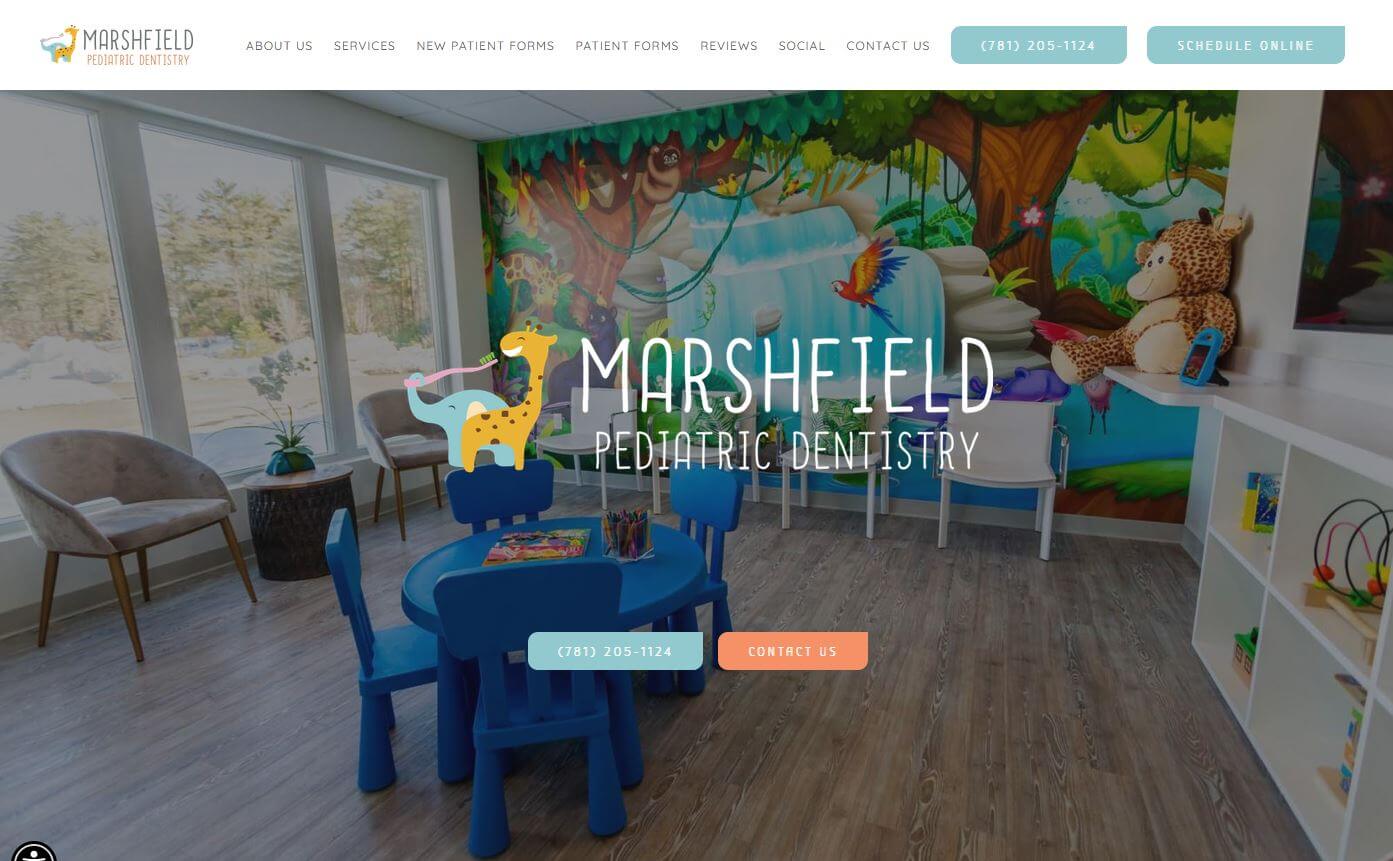
19. Marshfield Pediatric Dentistry
Why it works: A perfect example of a quickly identifiable as dentistry for kids. A clutter-free, lots of white space, bright, clean lines, and calm website with a lovely showcase of service they offer especially to their target audience – children.
 https://www.marshfieldpediatricdentistry.com
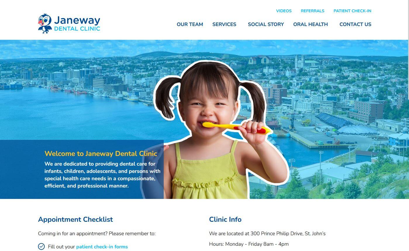
20. Janeway Dental Clinic
Why it works: Janeway Dental Clinic showcased a cute little girl up front that promotes healthy teeth. The colors were bright and vivid. Quick details and contact info are easily seen.
 https://www.janewaydental.ca
Dental Websites Design
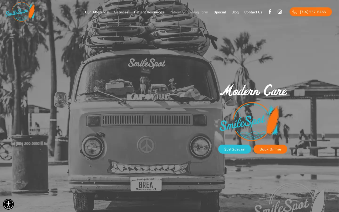
21. SmileSpot Brea Dentist
Why it works: A very refreshing take for a dentist’s site design. Expect contact information and hours of operation are readily available.
https://www.smilespotbrea.com
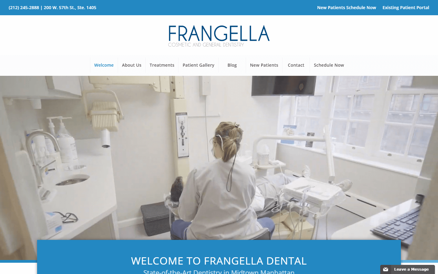
22. Frangella Dental
Why it works: Intuitive layout specially designed for potential Frangella Dental clients. The video customer testimonials add and create credibility to the site.
 https://drfrangella.com
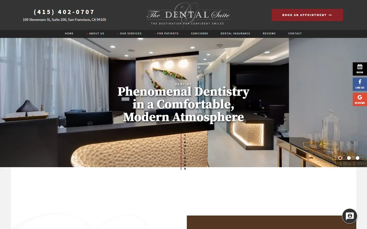
23. The Dental Suite
Why it works: The Dental Suite exudes elegance and glamour. They showcased their modern facilities which boost the clinic’s capability. We adore the cosmetic and esthetic dentistry section of the website.
 https://www.dentalsuite-sf.com
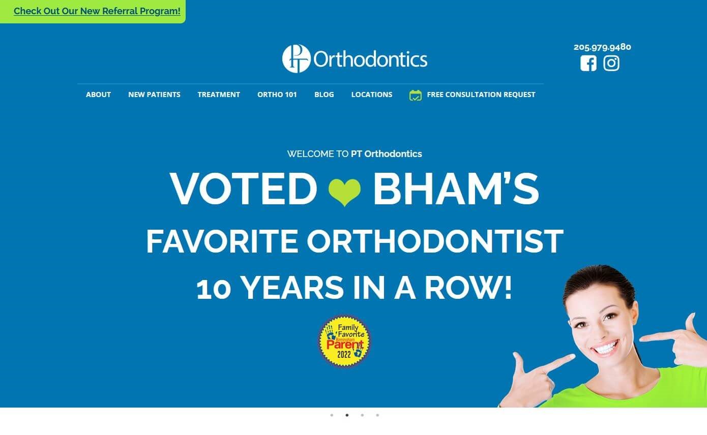
24. PT Orthodontics
Why it works: Particularly like the website of PT Orthodontics, which has smooth transitions from one service to another in a particular order.
 https://ptortho.com
Top Dental Websites
25. Natural Dentistry
Why it works: A rather unusual magazine-style layout with bright youthful colors. The video intro was not obtrusive but informative and stand out.
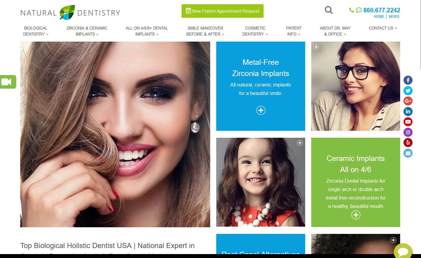 https://naturaldentistrycenter.com
26. Smile and Company
Why it works: It gorgeous black-and-white website with the same style as the hero video. Good photography and real patient images were used.
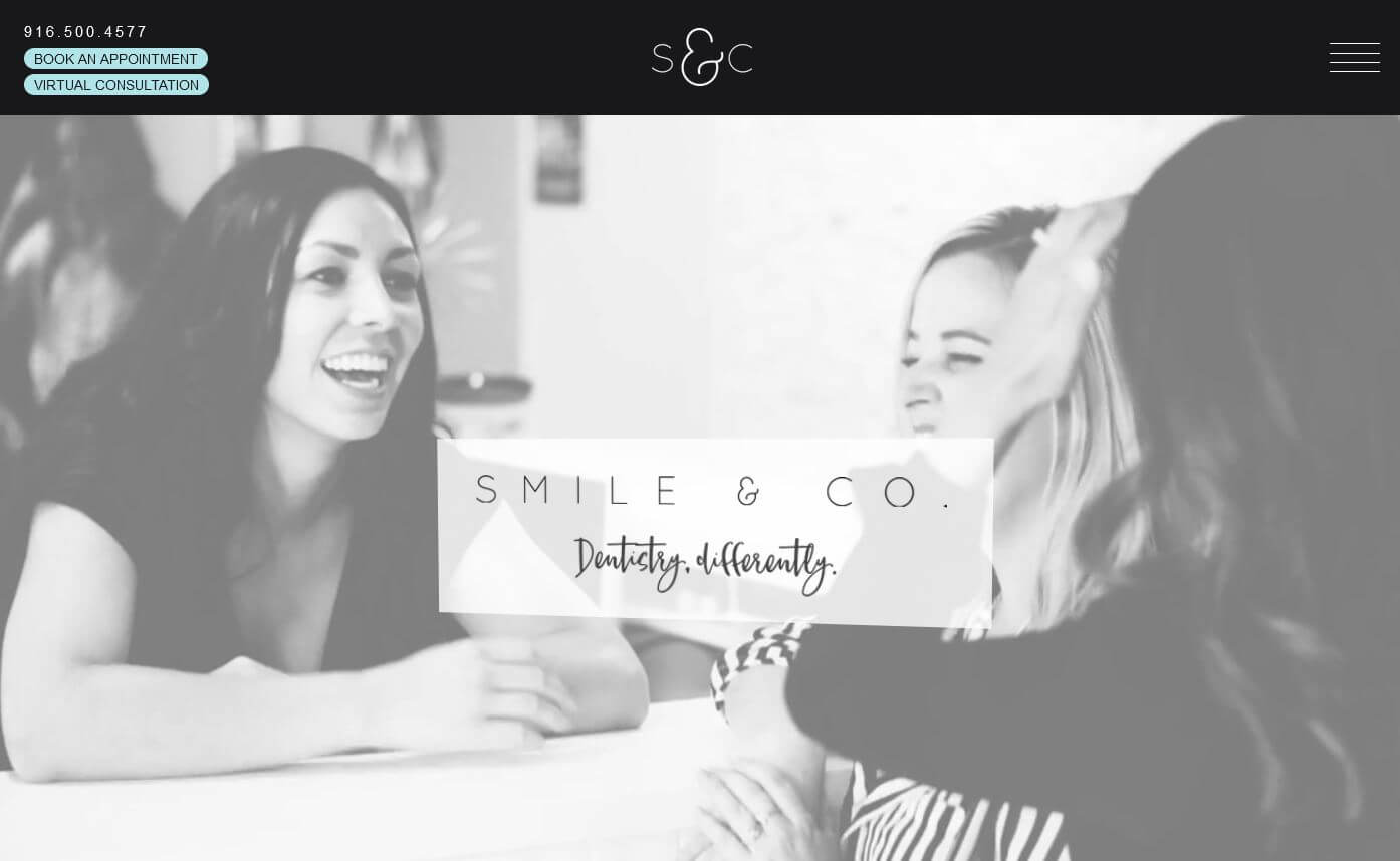
https://smileandcompany.com
27. Del Mar Dental Studio
Why it works: Very professional and elegant dental website. They have a comprehensive overview of the dentists and team specialists, as well as before and after photos of the patients.
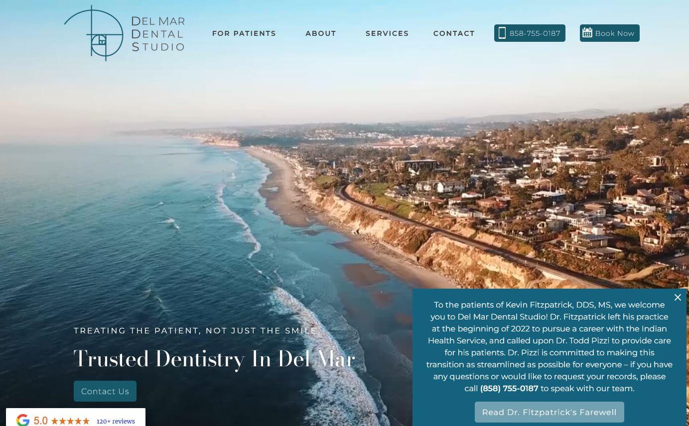 https://www.dentistdelmar.com
28. Alemany Dental
Why it works: Excellent use of anchor scroll coupled with a straightforward design and compelling narrative. Specifically, clear and actual photos were used on the Alemany site page.
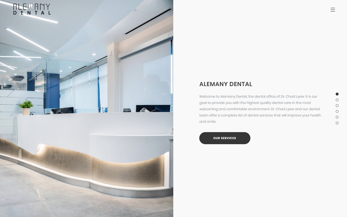 https://alemanydental.com
Websites For Dental Practices
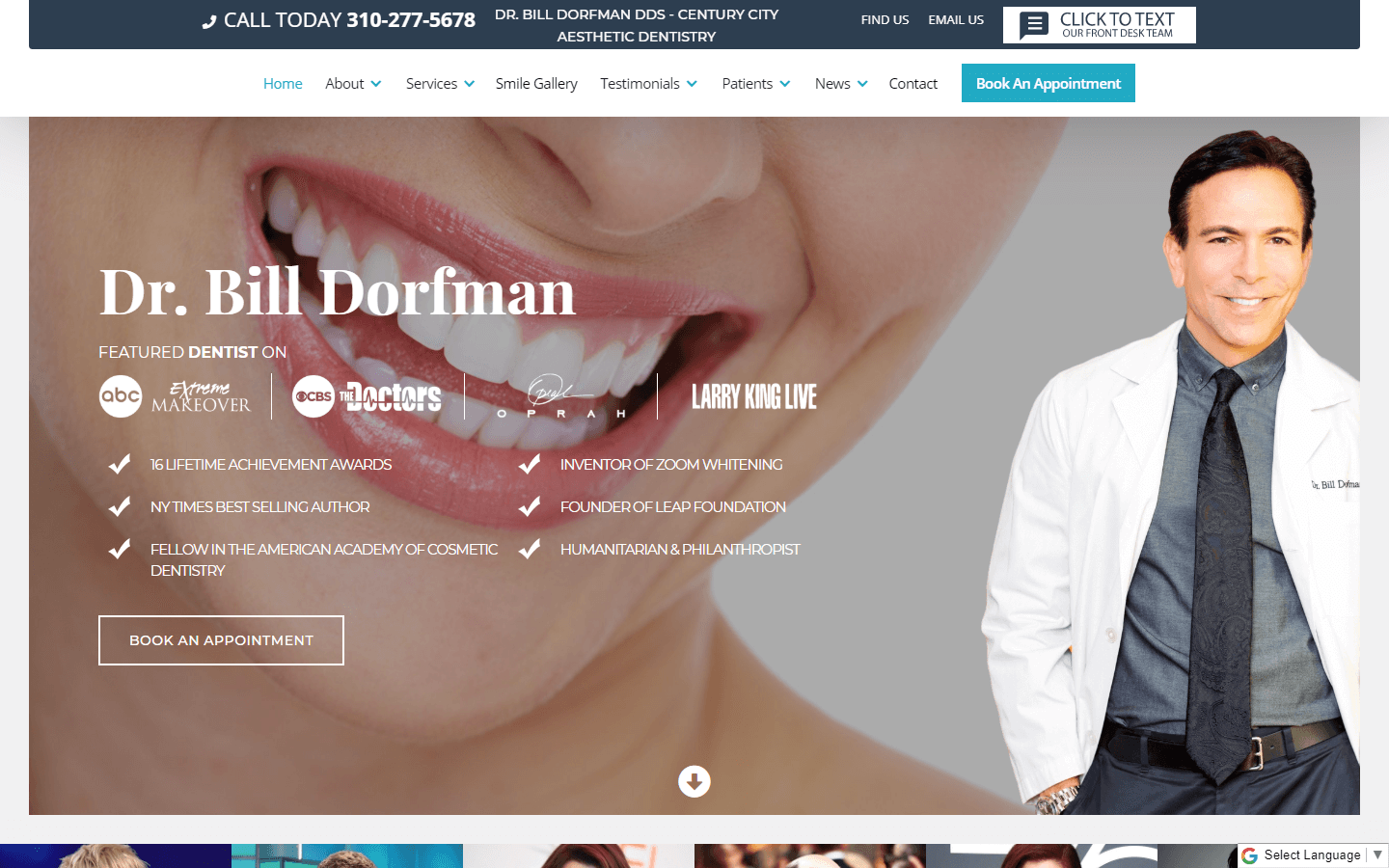
29. Bill Dorfman Dentistry
Why it works: The badges, expertise, and reviews convey a strong message and authority from the dentists and company. The services they provide are clearly defined.
 https://www.billdorfmandds.com
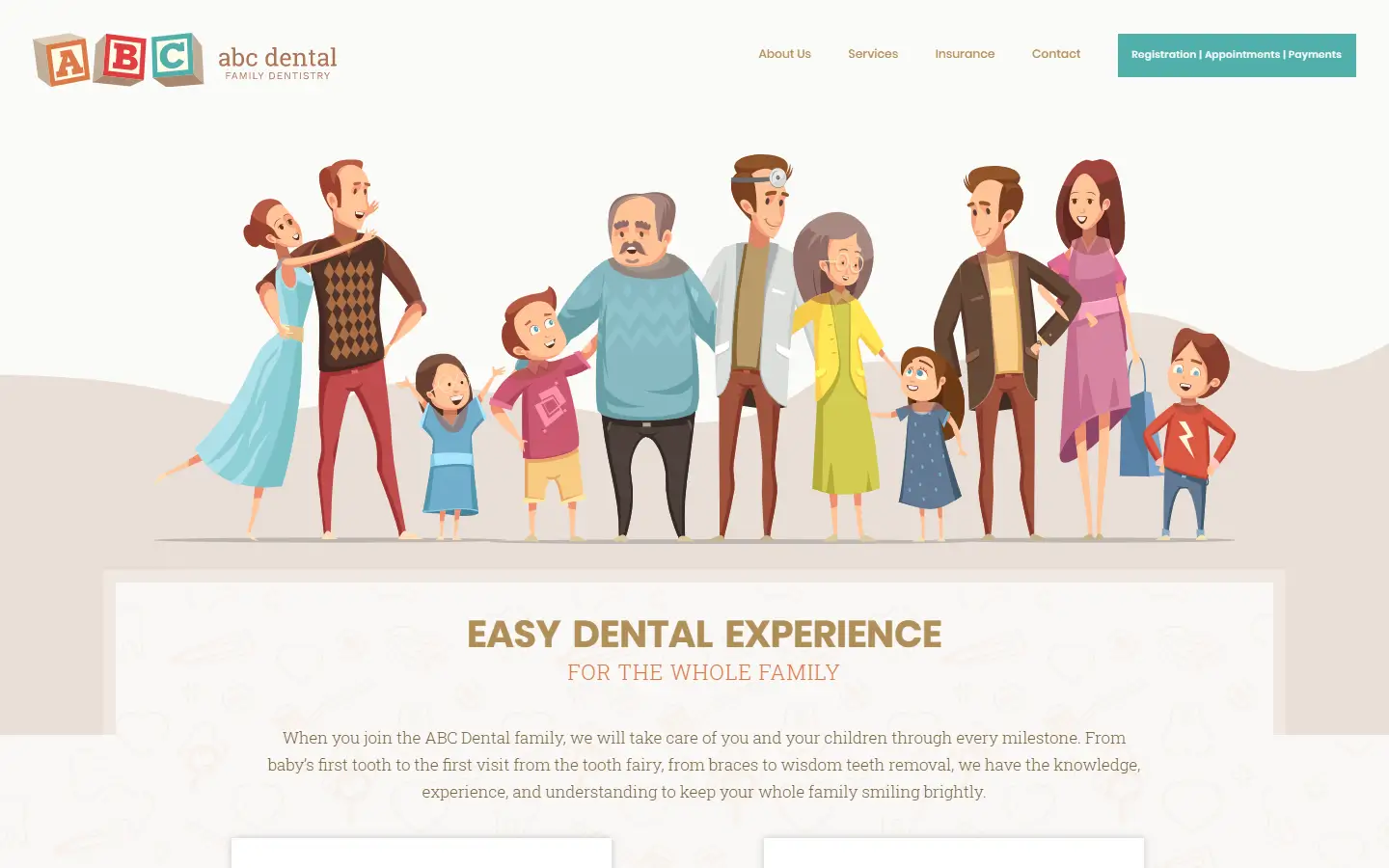
30. ABC Dental
Why it works: The website is light and uncluttered. For people of all ages, the usability of the site is well-designed. The theme, as well as the detail of the illustrations, are fantastic.
https://abcdentaltexas.com
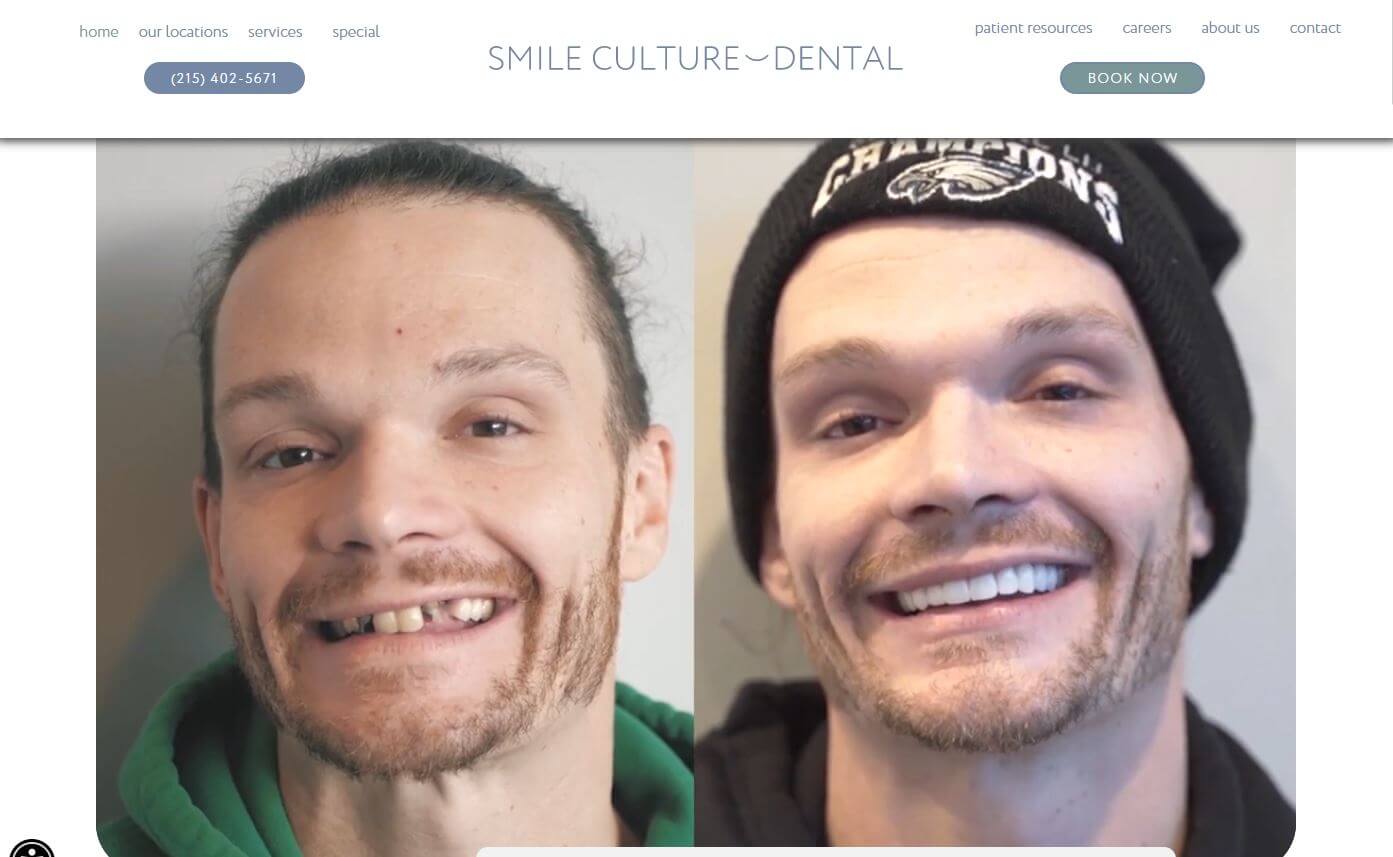
31. Smile Culture Dental
Why it works: A very bold and brave move and a great practice brand to display their actual operation procedure in the video. Overall, the website has the ability to provide a pleasant user experience.
 https://www.smileculture.com
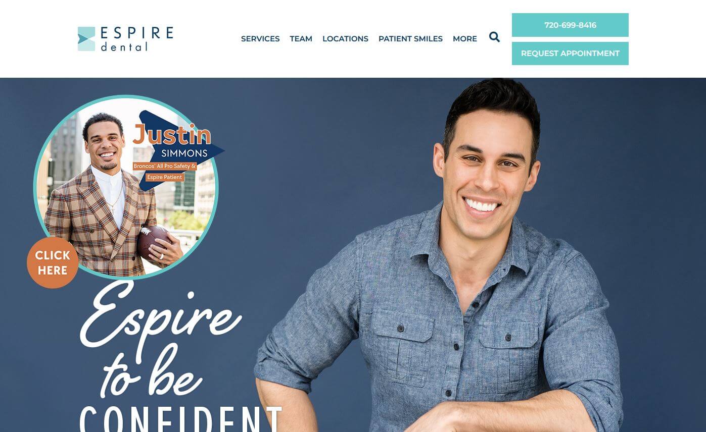
32. Espire Dental
Why it works: Espire Dental placed the contact and appointment form just below the hero section. Beautiful portraits are used throughout the site as well as a showcase of their awards as a celebration of their achievements.
https://espiredental.com
Dental Website Examples
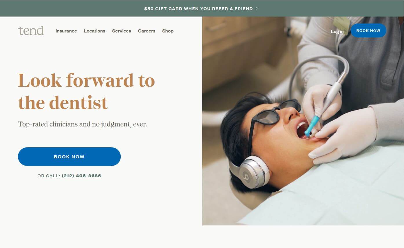
33. Tend
Why it works: Modern design and layout with strong CTA in a color that stands out. Minimal but beautiful video on the hero section and easy-to-read texts throughout the site creates personality.
 https://www.hellotend.com
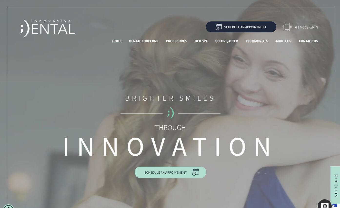
34. Innovative Dental
Why it works: For a dental website, Innovative Dental used a unique color scheme and theme. On all pages, expect the content is generous and informative.
 https://www.idspringfield.com
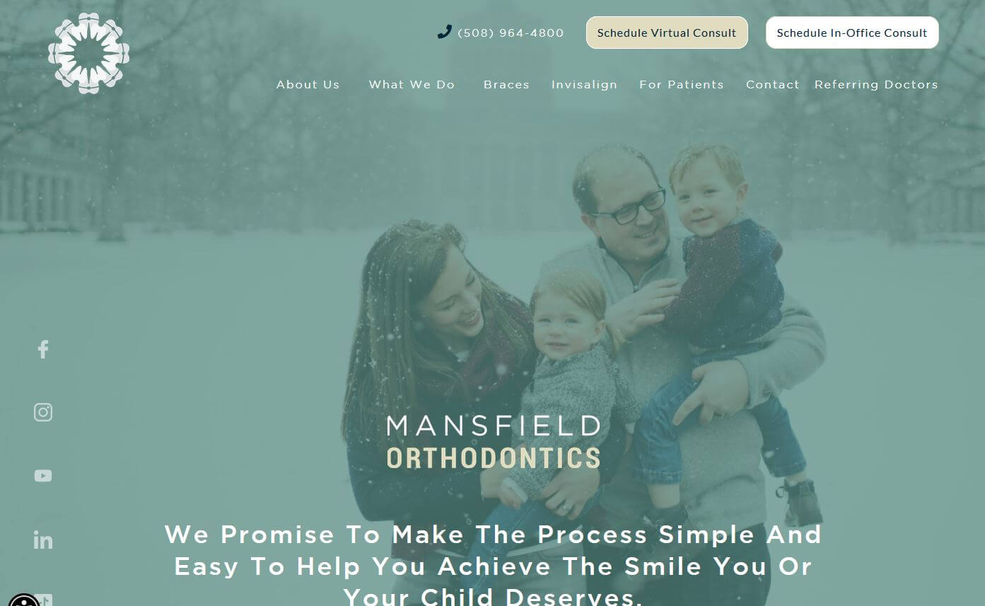
35. Mansfield Orthodontics
Why it works: The header has bright and easily readable buttons, as well as a clinic’s nicely shot photographs. The focus on virtual consultation is quite evident.
 https://www.mansfieldorthodonticsma.com
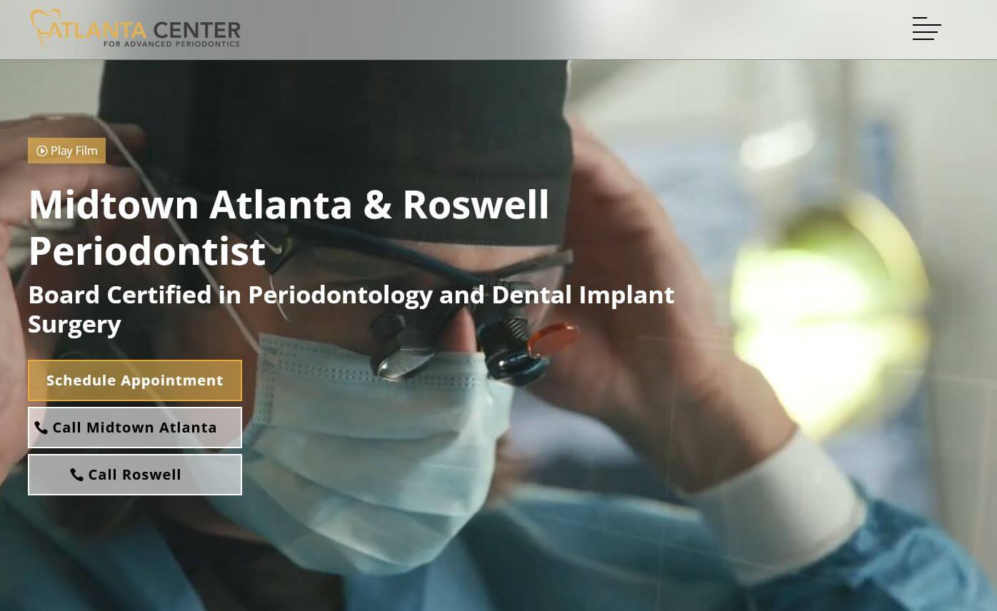
36. Atlanta Center for Advanced Periodontics
Why it works: The slow-mo video showcases the professionalism, clinic design, and the team at work. Mansfield Orthodontics’ website is clean and easy to navigate.
 https://advancedperioatl.com
Best Dentist Websites
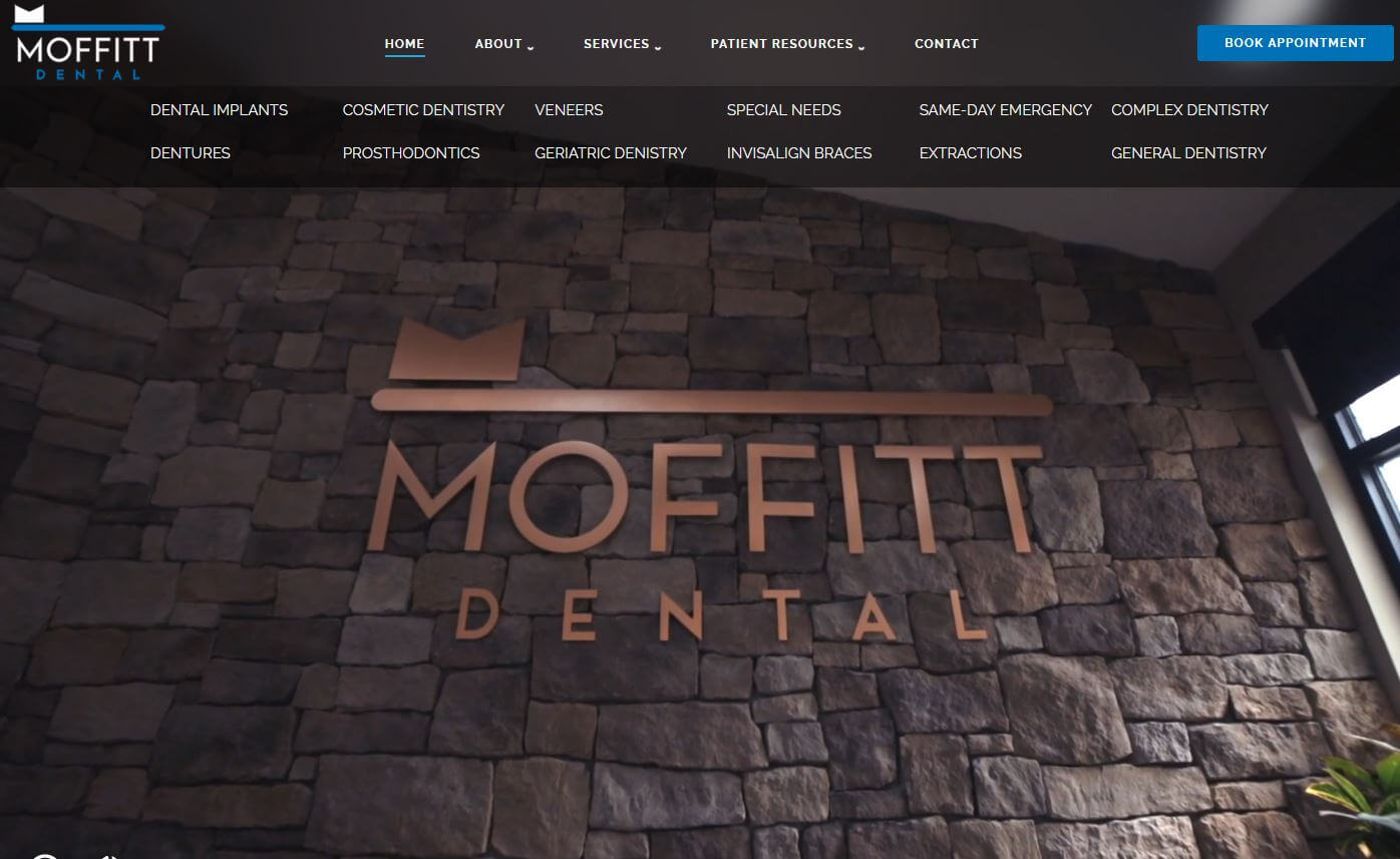
37. Moffitt Dental
Why it works: After the video hero section, you may utilize a very robust contact/appointment application. There’s also a virtual office tour and promotional ideas available.
 https://moffittdentalcenter.com
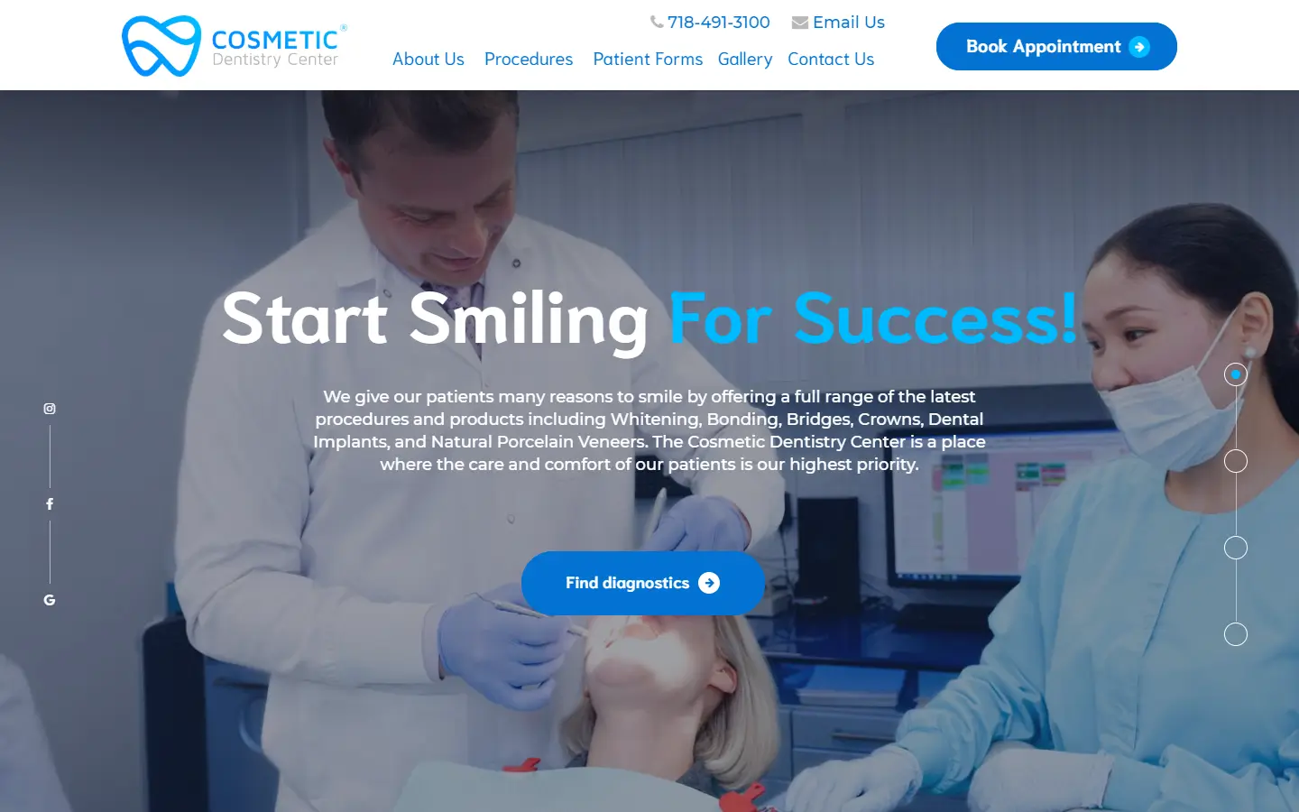
38. Cosmetic Dentistry Center
Why it works: The bright colors and pictures on the content created by the services are particularly appealing. The design is clean and comfortable.
 https://www.cosmeticdentistrycenter.com
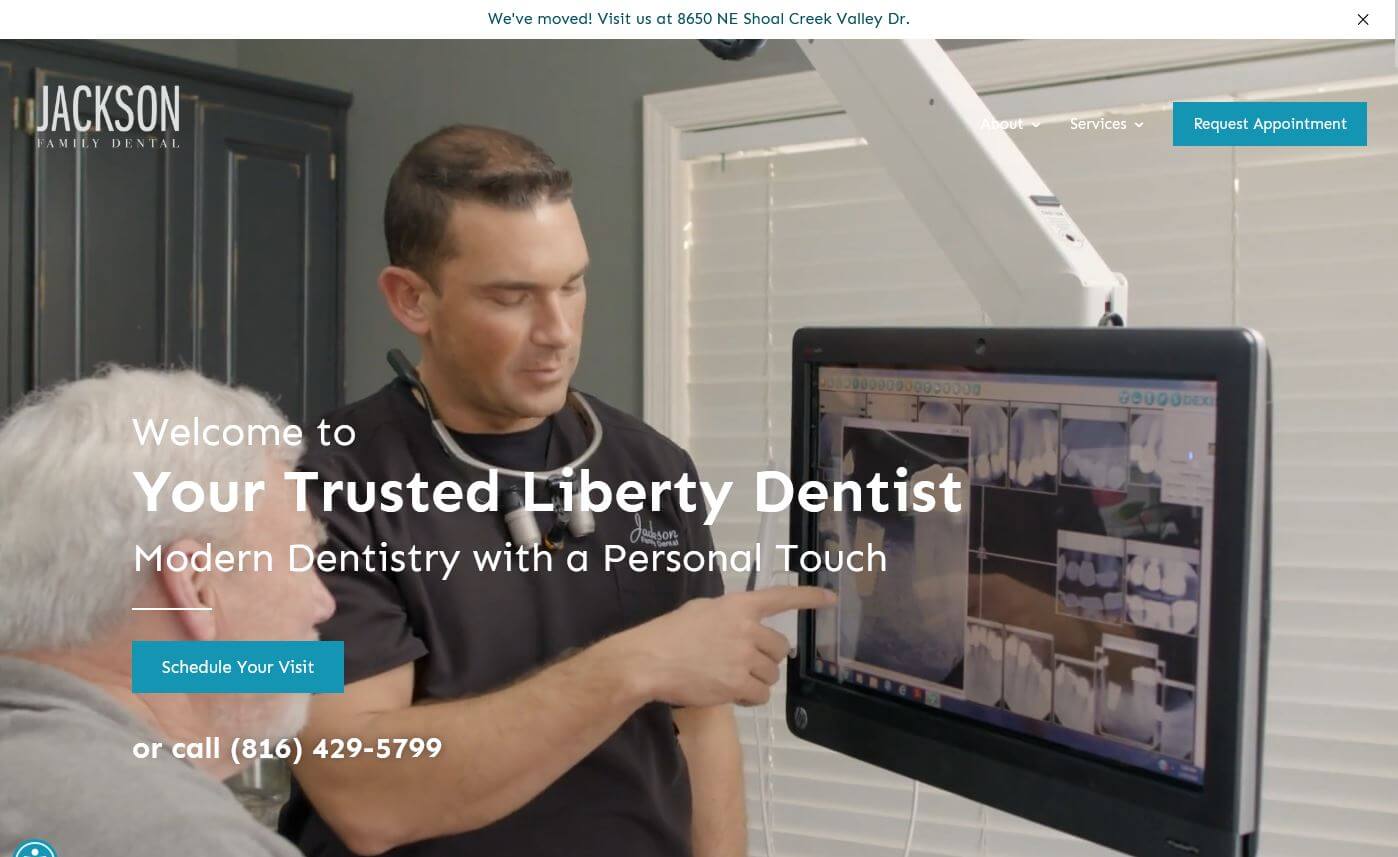
39. Jackson Family Dental
Why it works: Their video shows off their technology and great staff. This company website is both modern and professional, with the appropriate color choices.
 https://jacksonfamilydentalonline.com
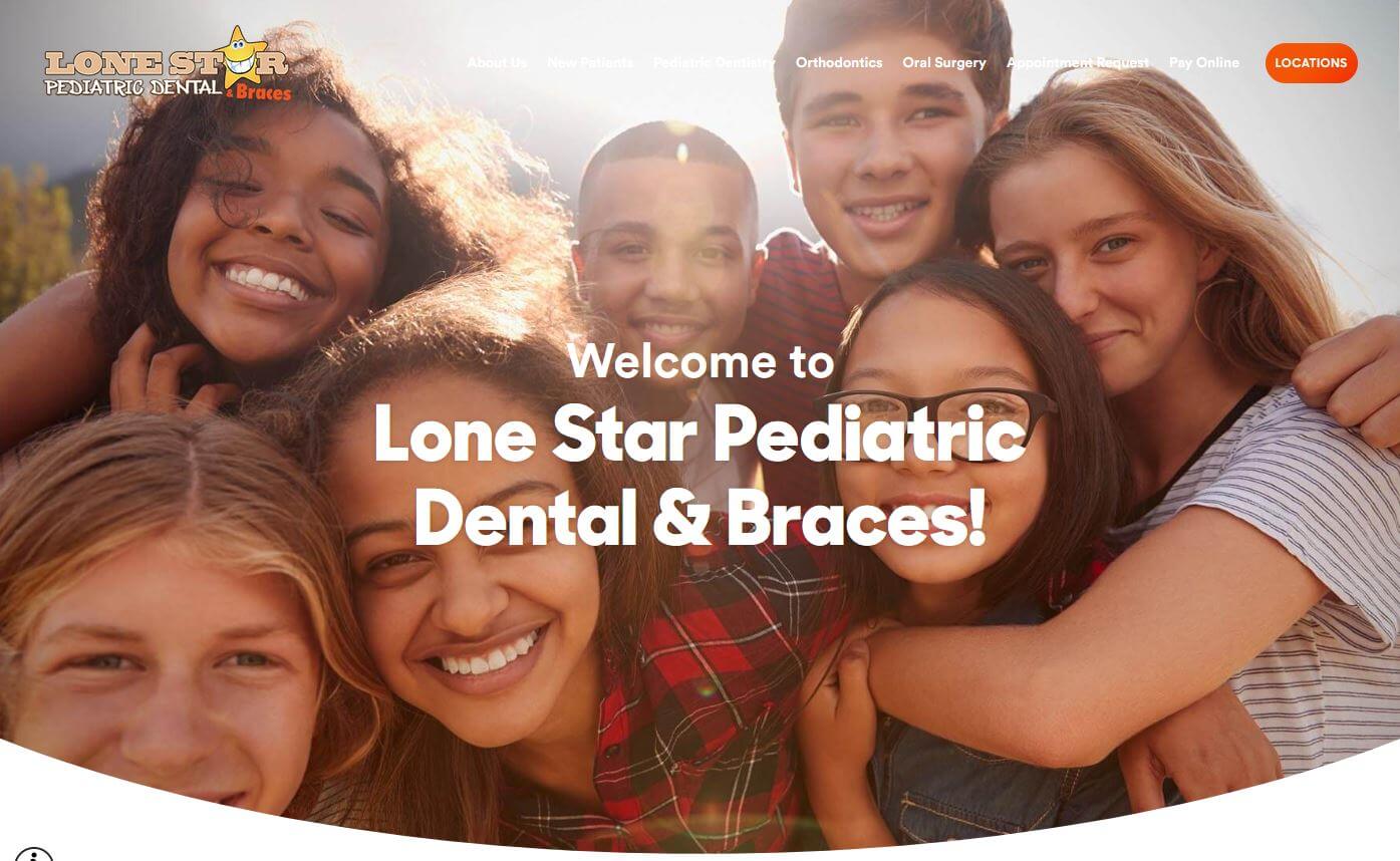
40. Lone Star Pediatric Dental
Why it works: The level of accounting at this dental website is excellent. It includes accessibility buttons, a captcha to reduce spam, and other features that are ideal for children.
 https://www.lonestarpediatricdental.com
Conclusion
We have compiled the 40 Best Dental Websites designs on the web. These are some of the most creative, innovative, and engaging dental website design examples online today. If you’re looking for inspiration to redesign your own site, this list is a great place to start! If you need assistance in creating or updating your website, you’re in the right place.
We’ve worked on many dental websites and have a proven process to generate results. Best of all, we offer a Free Custom Mockup of your new site before you sign or pay anything, which is the best part. Click here to learn more.