There are a lot of different good consulting website design examples on the internet, but which ones are the best? We’ve compiled a list of 40 great examples that you can use for free as inspiration for your consulting website. These include startups, small businesses, and large corporations. They run the whole range from professional to fun and creative!
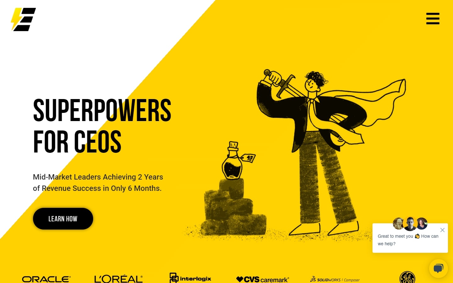
1. Edgy Inc.
Why it works: First on our list is Edgy’s trendy and fun-looking website. The subtle animation on the hero section brings some life to an otherwise flat feel. The buttons are easy to identify and distinct from one another, with the contact form at the bottom of the page making it very easily accessible.
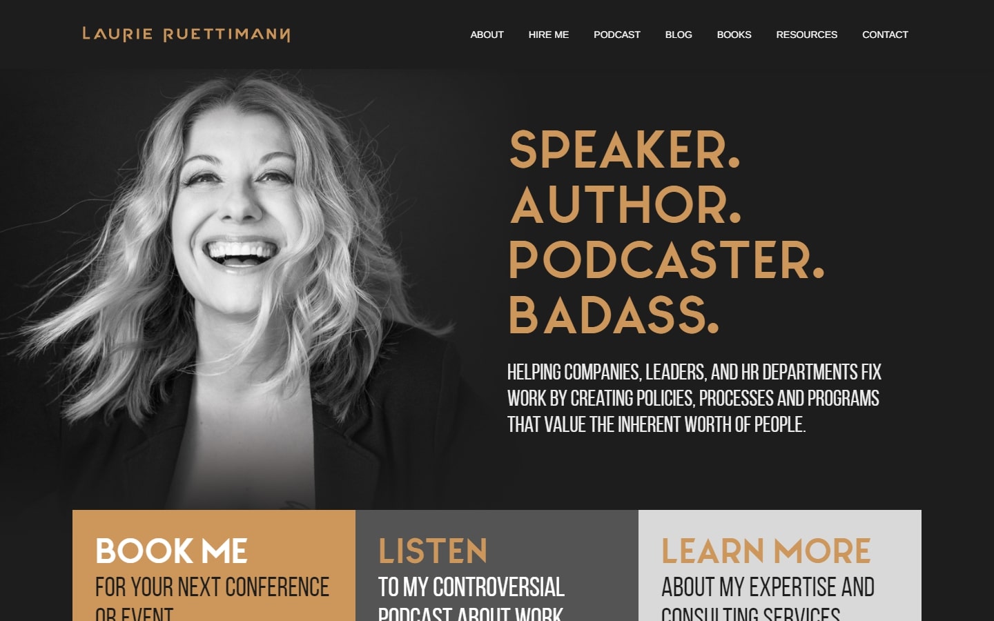
2. Laurie Ruettimann
Why it works: Laurie Ruettimann’s consultant website uses a classic combination of grey and gold accents. The author’s website looks sleek and classy, with big texts that stand out and are easy to read. The overall framework is clean and easy to navigate.
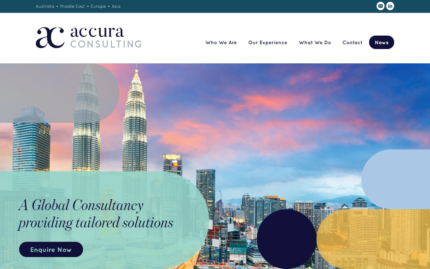
3. Accura Consulting
Why it works: It’s not always easy to implement circles as the main geometric feature of a website design, but this site demonstrates how it is done best. The color palette is simple and elegant, with just the right amount of contrast to make everything stand out. The web designer chose the typography well, and the overall effect is one of sophistication and professionalism.
https://www.accuraconsulting.com
Consulting Web Design
4. Fahrenheit 212
Why it works: The web design is both innovative and modern, providing a fairly minimal layout. Much more, we love the perfect choice of typefaces against the clean white background. This allows the customers to focus on the important aspects of the website, such as the content and the services that are being offered.
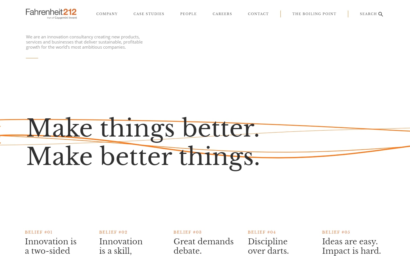
https://www.fahrenheit-212.com
5. Prophet
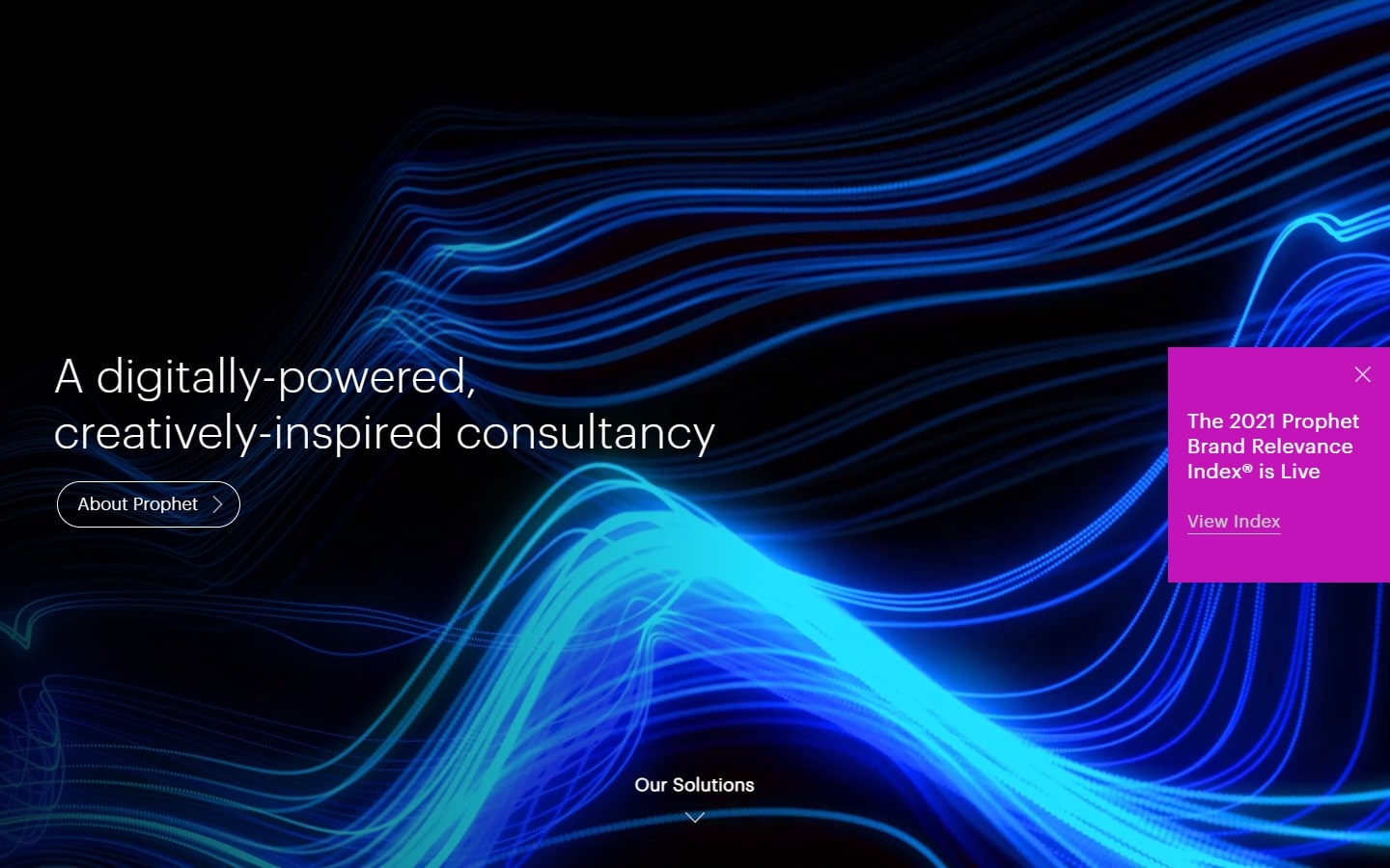
Why it works: The design of this website emulates the metro interface with bright colors and contrasting text. The abstract moving image in the background creates a futuristic feel. This can be a great choice for companies that want to show that they are innovative and cutting-edge.
6. Landor
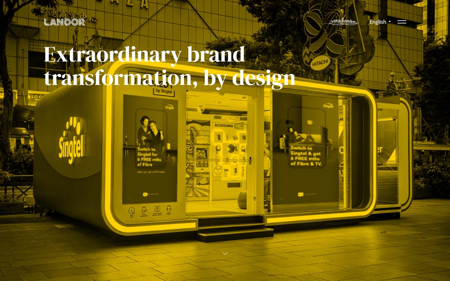
Why it works: Aside from the obvious pops of colors from top to bottom, we also love how the texts contained in each section are kept to a bare minimum. This helps to keep clients’ attention on the photos and allows them to quickly browse through the website without having to read much text.
7. UI Breakfast
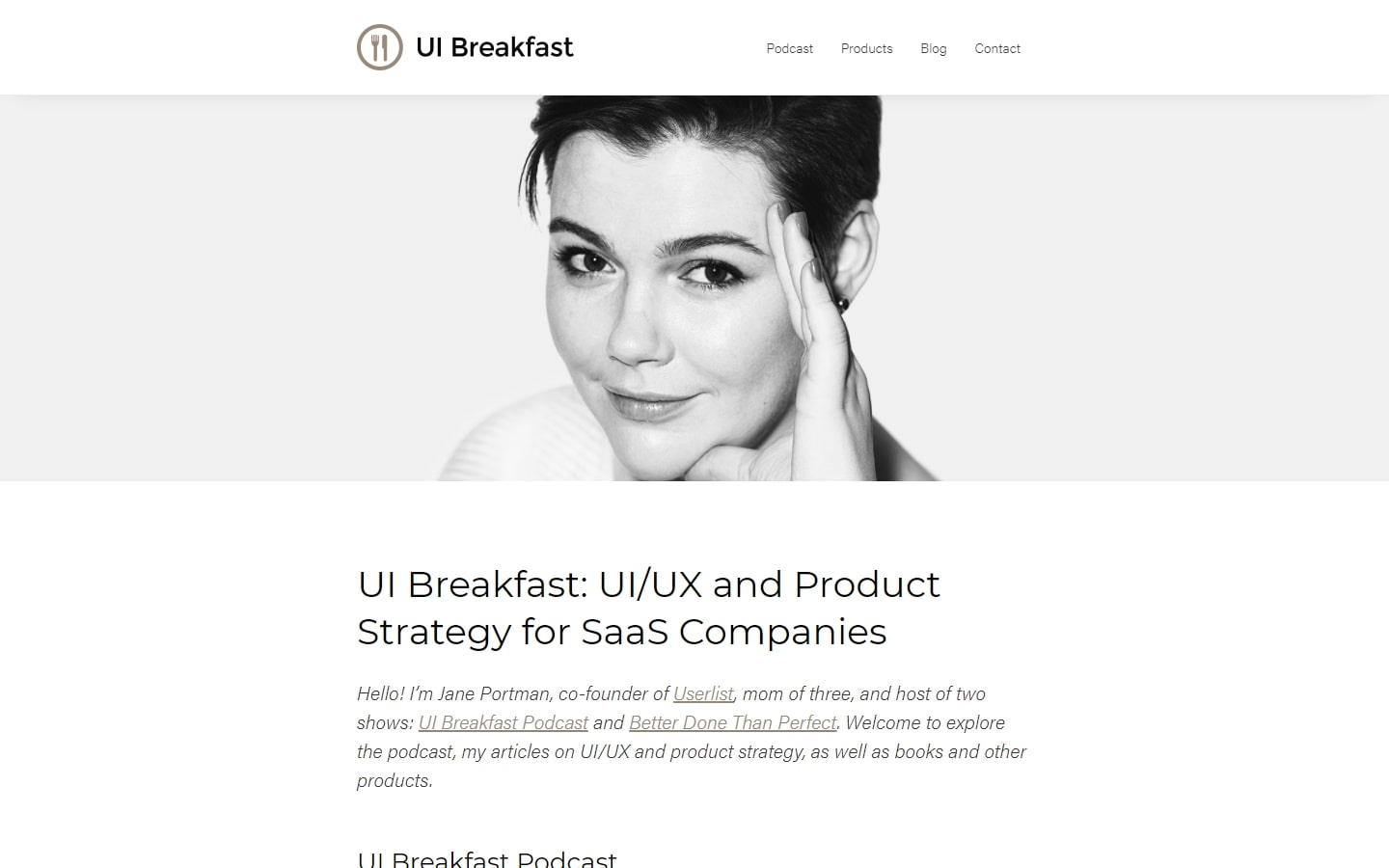
Why it works: For a UI/UX website design, we have high expectations. Jane Portman’s website is more than an interface; it celebrates the UX as well. This wiki-like design is both modern and minimalistic, with great attention to detail in every corner of its user experience.
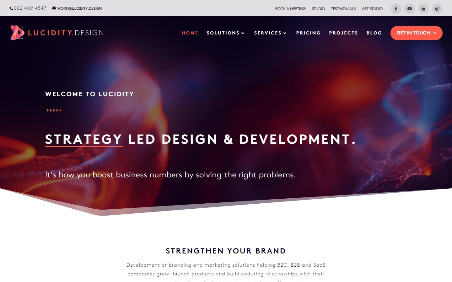
8. Lucidity Design
Why it works: Featured in this list is Lucidity’s website design which is a perfect example of cohesiveness in business branding. Every part of the site is well-designed without feeling too busy or bare. The website is a well-designed and immersive experience for all visitors, with a focus on content that doesn’t feel too cluttered. The colors are simple yet striking and the text contrasts nicely against the background to be both legible and beautiful at once.
Consulting Web Design
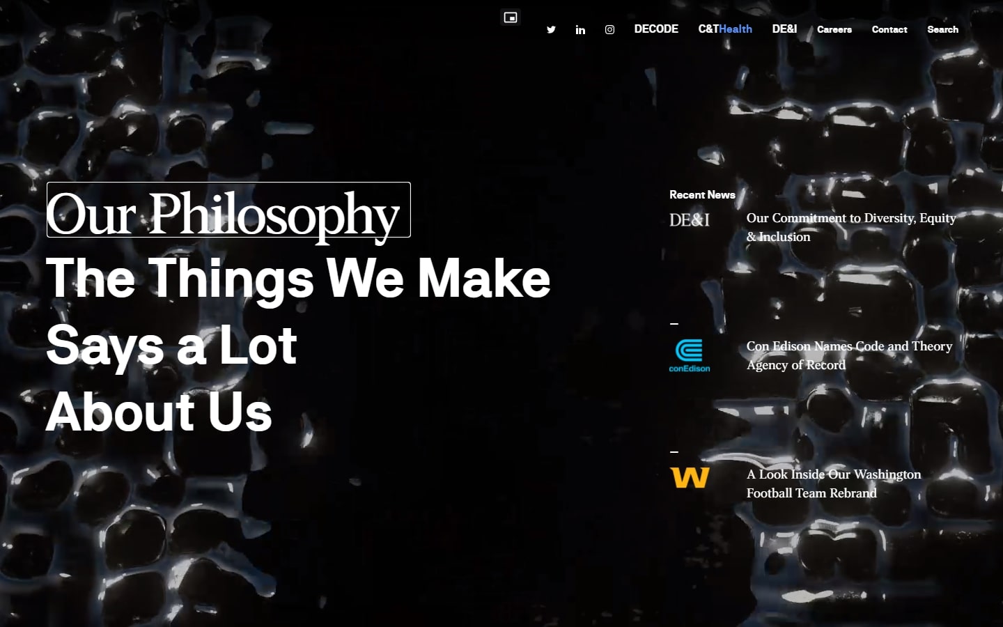
9. Code and Theory
Why it works: Perhaps the best word we could use for this web design is ‘powerful’. With great emphasis on typography and storytelling, this design gives a good impact on the web design industry.
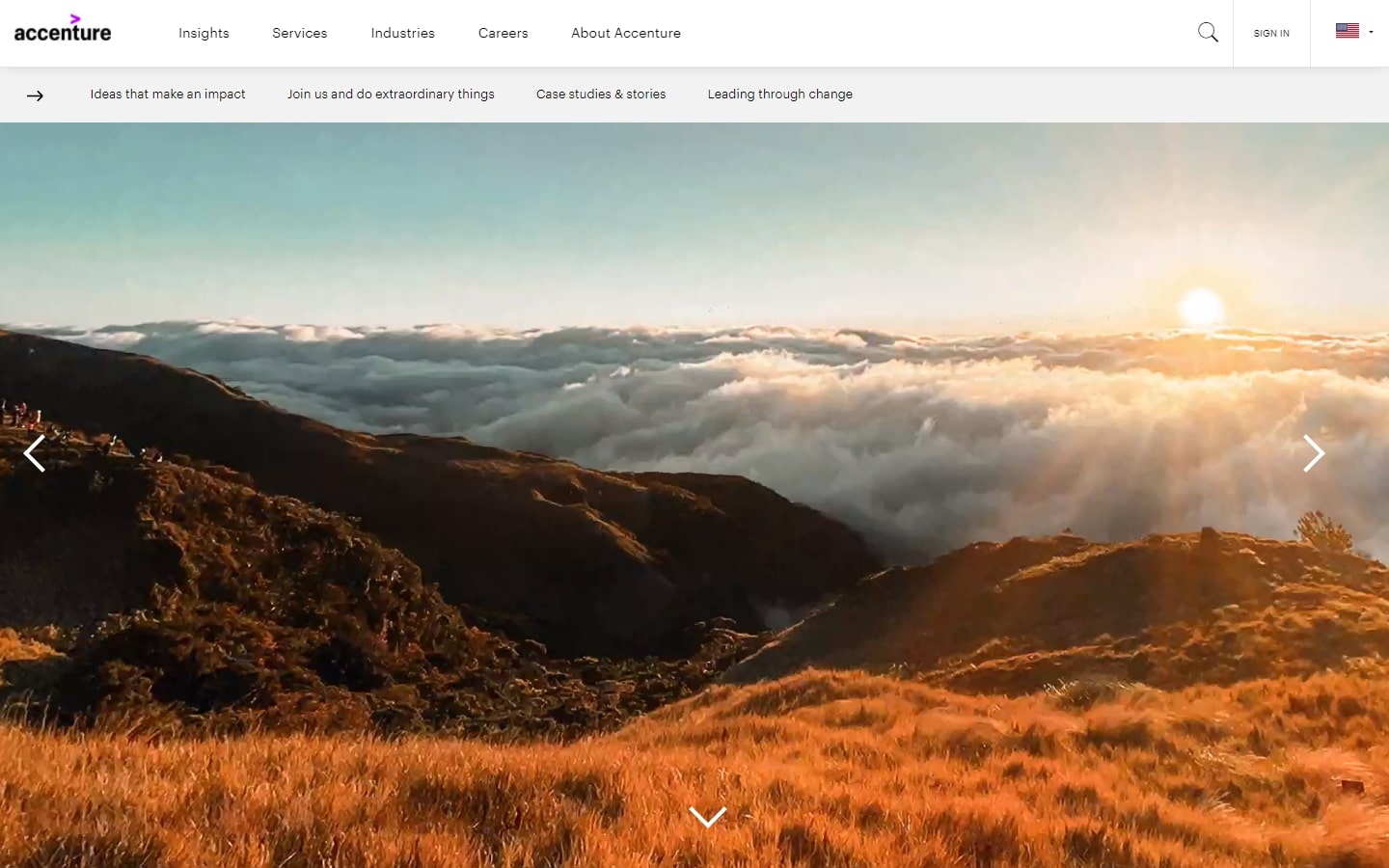
10. Accenture
Why it works: For a simple and impactful web design, Accenture’s website is a symbol of thoughtful and smart design. We also love the various colors splashed all across the website every time we scroll on, making for an engaging experience.
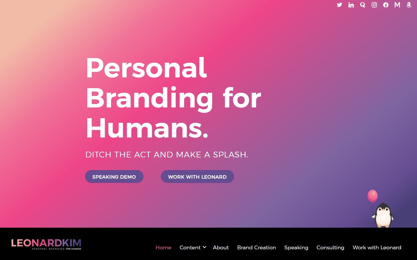
11. Leonard Kim
Why it works: Leonard’s consultant website features a lot of dynamic design elements that not only amuse but also engage readers to the content. Furthermore, we also love how each section is different from the others.
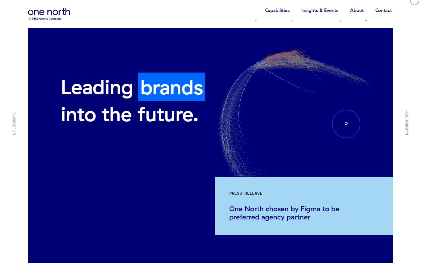
12. One North
Why it works: The use of electric blue is more than just a trend. One North’s consultant website dares to try its take on the color, making it into something that feels both beautiful and refreshing. The use of white space creates that perfect balance between too much or not enough design.
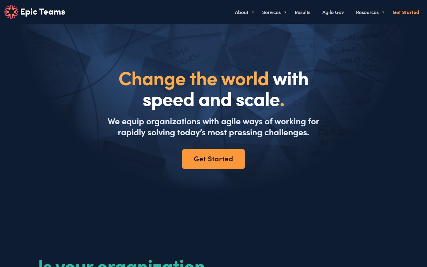
13. Epic Teams
Why it works: Trust us when we say that flashy doesn’t have to be tacky. It can be done tastefully and this consulting website design proves it with its dazzling color scheme, high-quality graphics, and perfect execution of its platform.
consulting web design examples
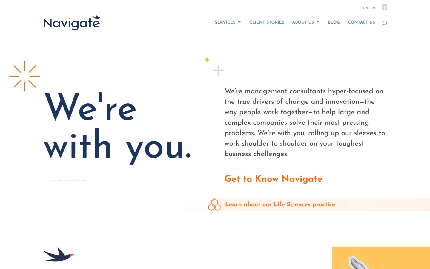
14. Navigate
Why it works: Unlike usual websites, Navigate has a web design that doesn’t bombard clients with large images. Instead, it scatters a good mix of graphics and colors to further their company branding on the design.
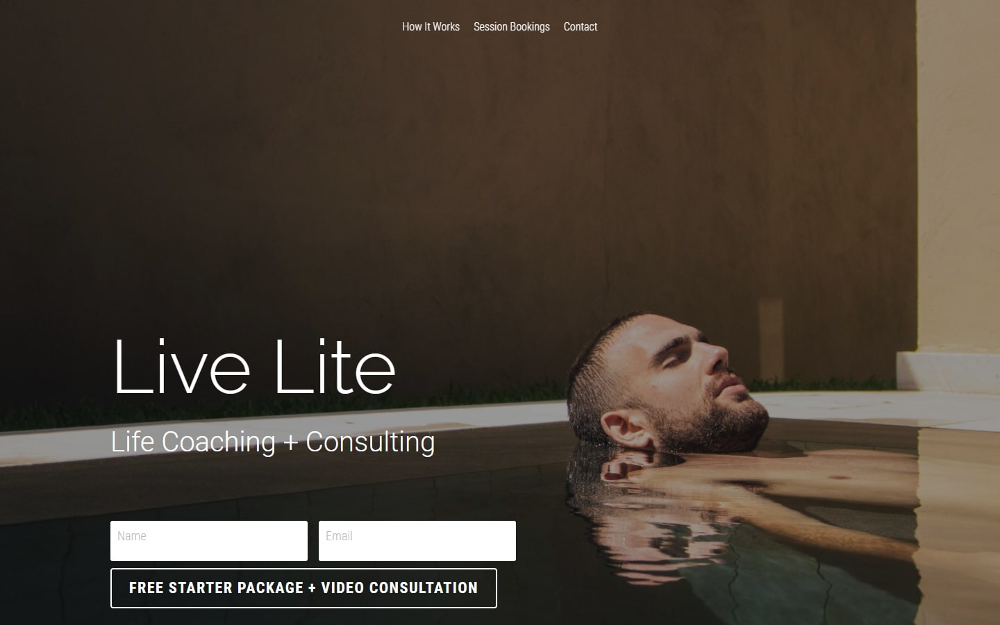
15. Live Lite
Why it works: Super minimal yet interesting consulting website. This website design does the value proposition quickly, and even explains the process well.
https://livelite.mystrikingly.com
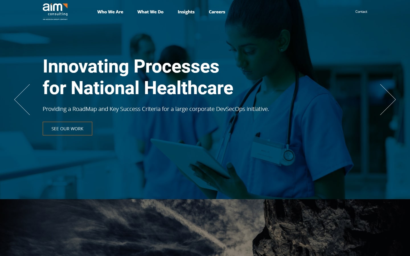
16. Aim Consulting
Why it works: Strong and emotional imagery. We also love how the design communicated well to the customers despite the weight of their company branding and content. Moreover, the icons located at the bottom of their page that illustrate each location are smart.
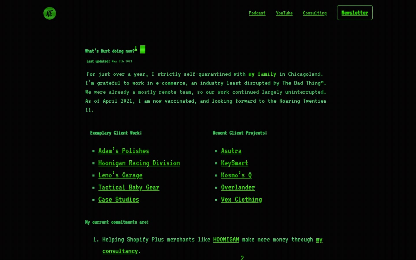
17. Kurt Elster
Why it works: Let’s break the ice by taking a look at Kurt’s highly unusual website. Just like that.
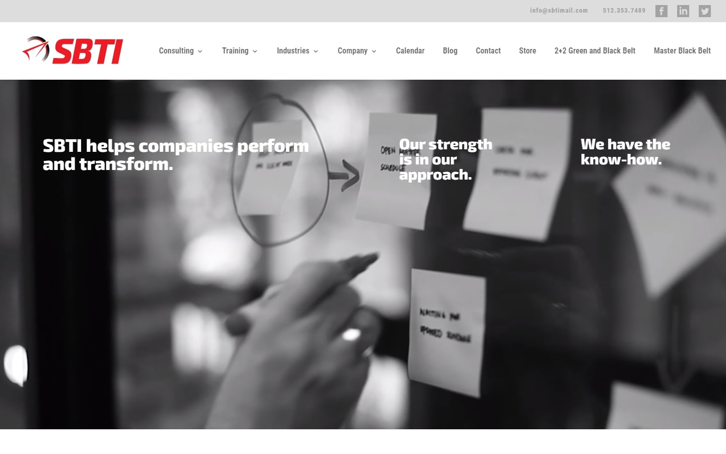
18. SBTI
Why it works: Qualifying in our list is SBTI’s website. The hover effect on the hero section is surprising yet appealing. The overall marketing design is simple and easy to navigate.
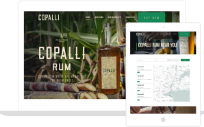
consulting company website
19. Mindset Online Course
Why it works: This web design stands out from the crowd because of how refreshing it looks. The content is also compact enough to deliver the story without making the visitors feel bored.
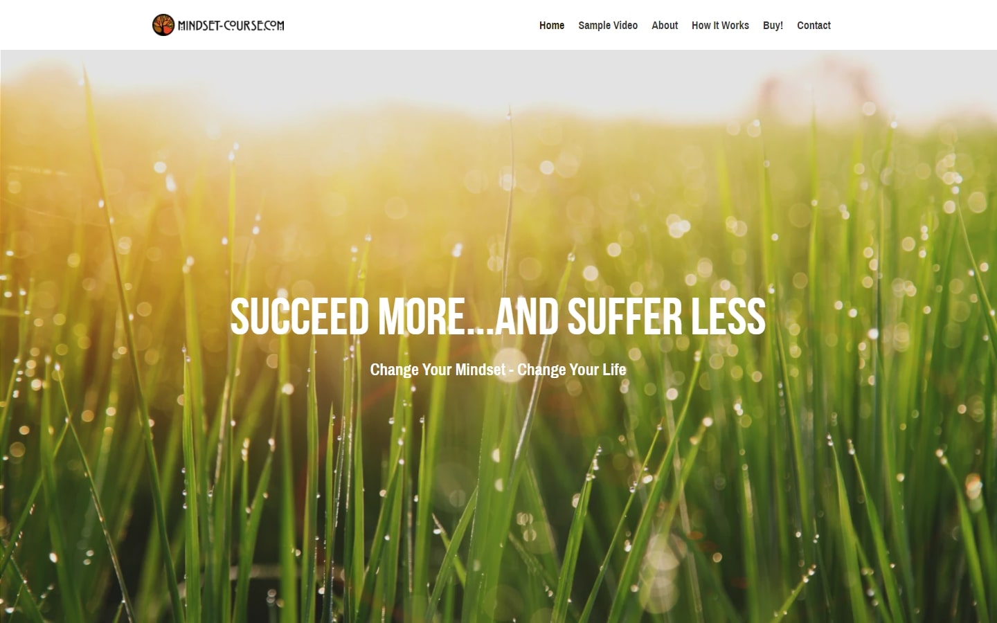
https://www.mindset-course.com
20. Pontoon
Why it works: Despite the use of line drawings, the website still looked clean and catchy. We also love how the team of designers scattered the arrows across the page which brought life without any animations needed.
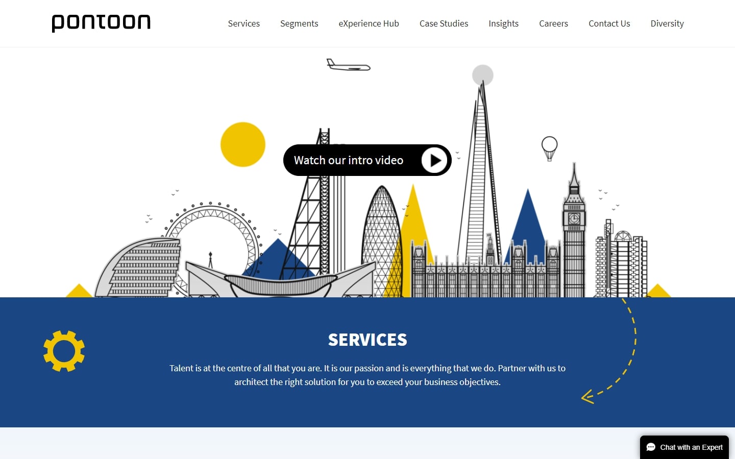
https://www.pontoonsolutions.com
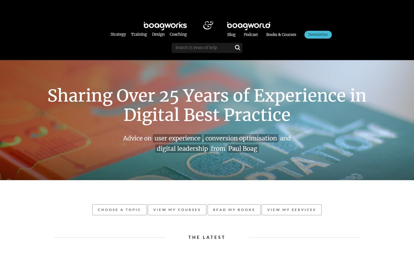
21. Boagworks & Boagworld
Why it works: This may be the most useful website on this list because of how straightforward its content is without compromising on aesthetics.
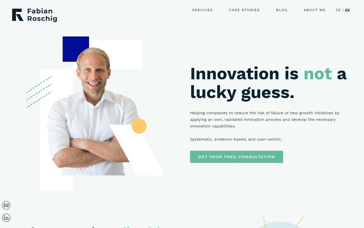
22. Fabian Roschig
Why it works: Simple, modern, yet has a storyline that the visitor would love to read. We also love the out-of-the-box thinking of the designer to customize and utilize the graphics and images.
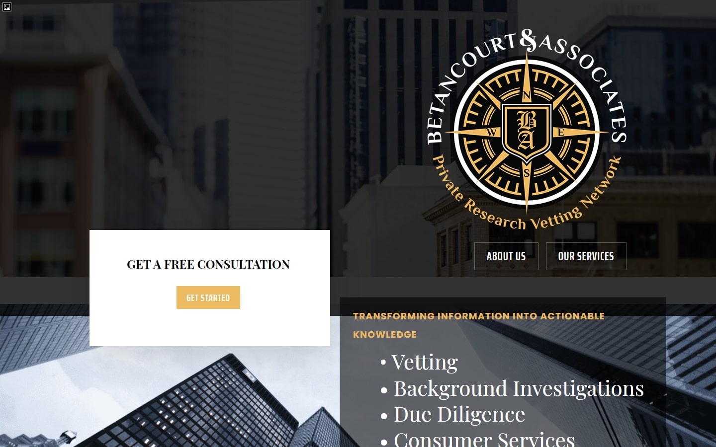
23. Betancourt & Associates
Why it works: The highlighted logo on the right side of the page creates an unusually interesting layout. The use of serif typeface on the body is still legible and pleasing, which is a rare case.
best consulting websites
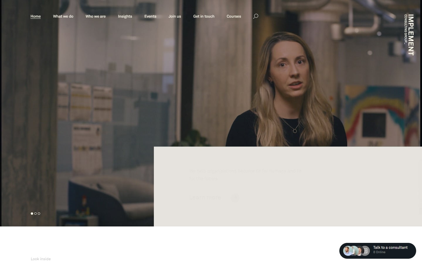
24. Implement Consulting Group
Why it works: This website has an award-winning project design and layout. We love the “talk to a consultant” widget on the bottom right of the screen.
https://implementconsultinggroup.com
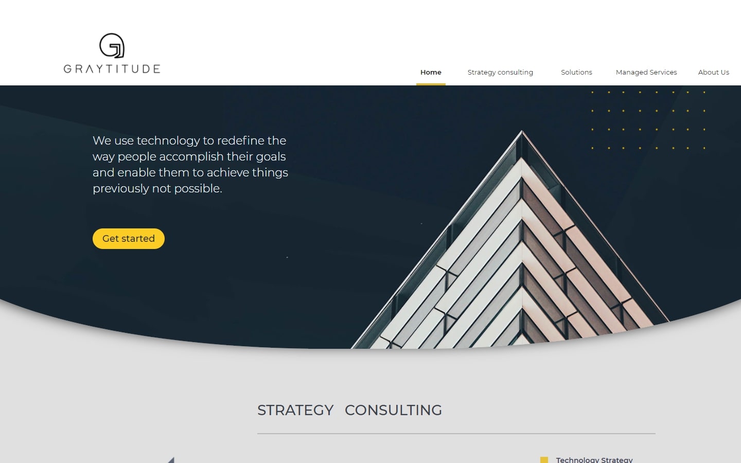
25. Graytitude
Why it works: We love the uniqueness and originality of this website. Each content is put in chunks, making the message very much friendly and just right.
26. Bell Lap Advisors
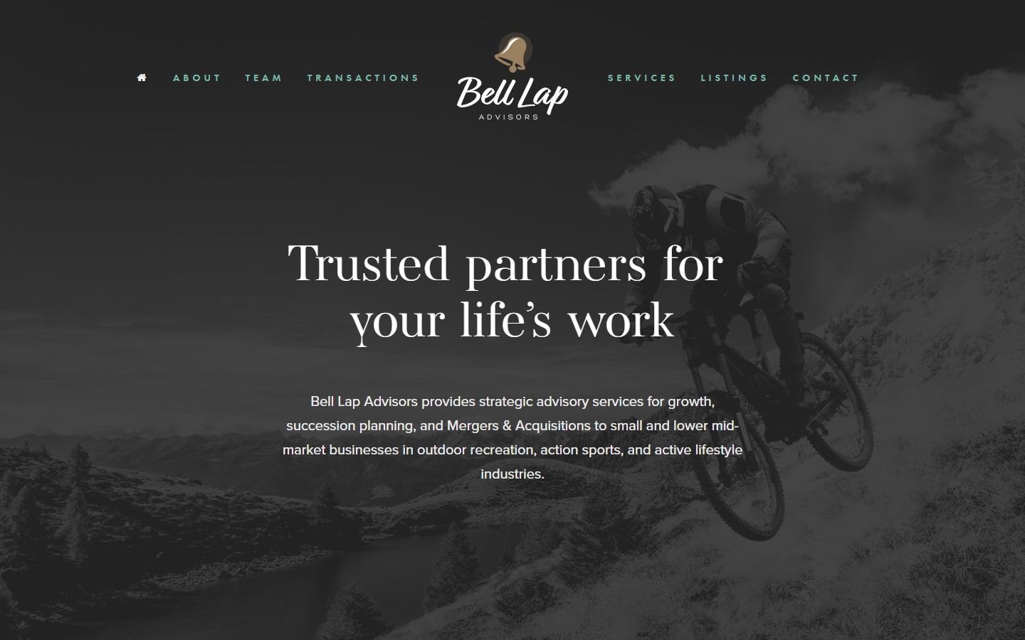
Why it works: One of the most elegant designs on the list, Bell Lap Advisors has a website with great typography, imagery, and of course, a gorgeous layout. The website design is minimalistic yet exciting with its high-quality graphics and colors.
https://www.bell-lap-advisors.com
27. Kearney
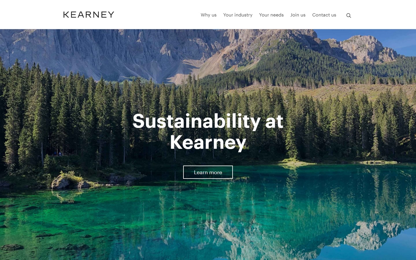
Why it works: Most consulting websites bombard us with tons of texts and business images. Kearney’s website designers step out of that comfort zone and create a refreshing, minimalistic yet sophisticated feel.
28. Motivated Mornings
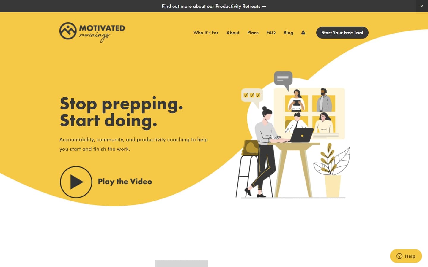
Why it works: How do you spell ‘morning’? It’s bright sunshine, a cup of coffee, and plenty of reasons to wake up. A consultant website like this gives you an even better feeling when it comes to mornings.
https://www.motivatedmornings.work
best Consulting Web Design
29. Daniel G. Siegel
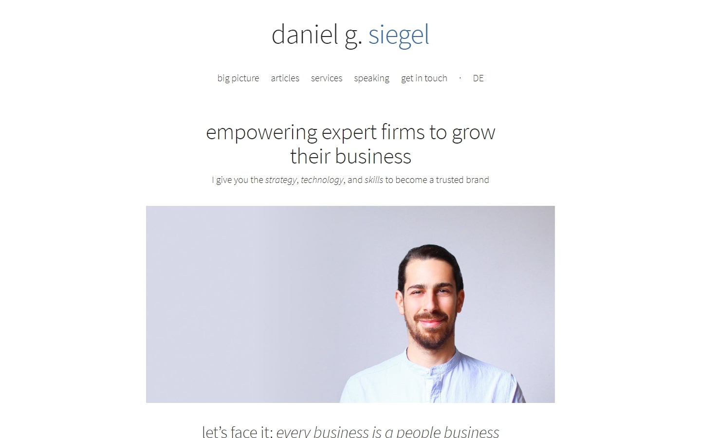
Why it works: This web design doesn’t have beautiful graphics or creative elements, but we love that it’s so straightforward yet still beautiful. Minimalism at its best!
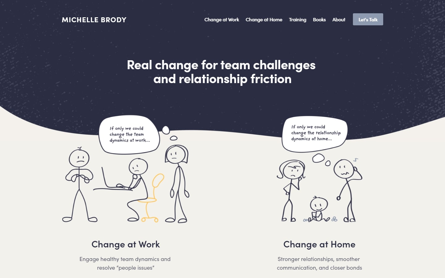
30. Michelle Brody
Why it works: We love the use of comic cartoons in this web design. It’s absolutely genius and it helps communicate the message with wit and intelligence. Not only is it fun and enjoyable to look at, but it also helps to keep the visitor engaged.
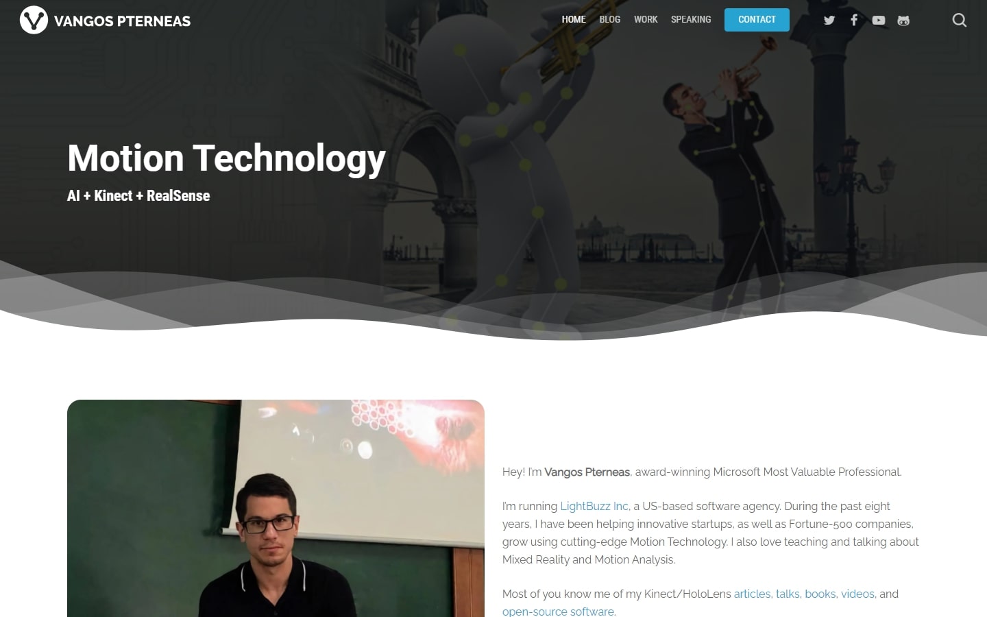
31. Vangos Pterneas
Why it works: If you’re after a consultant website that features more work than the agency itself, look at Vangos’s website. We especially love the gallery on the home page that highlights some of the projects they’ve completed including Intel and Microsoft Azure.
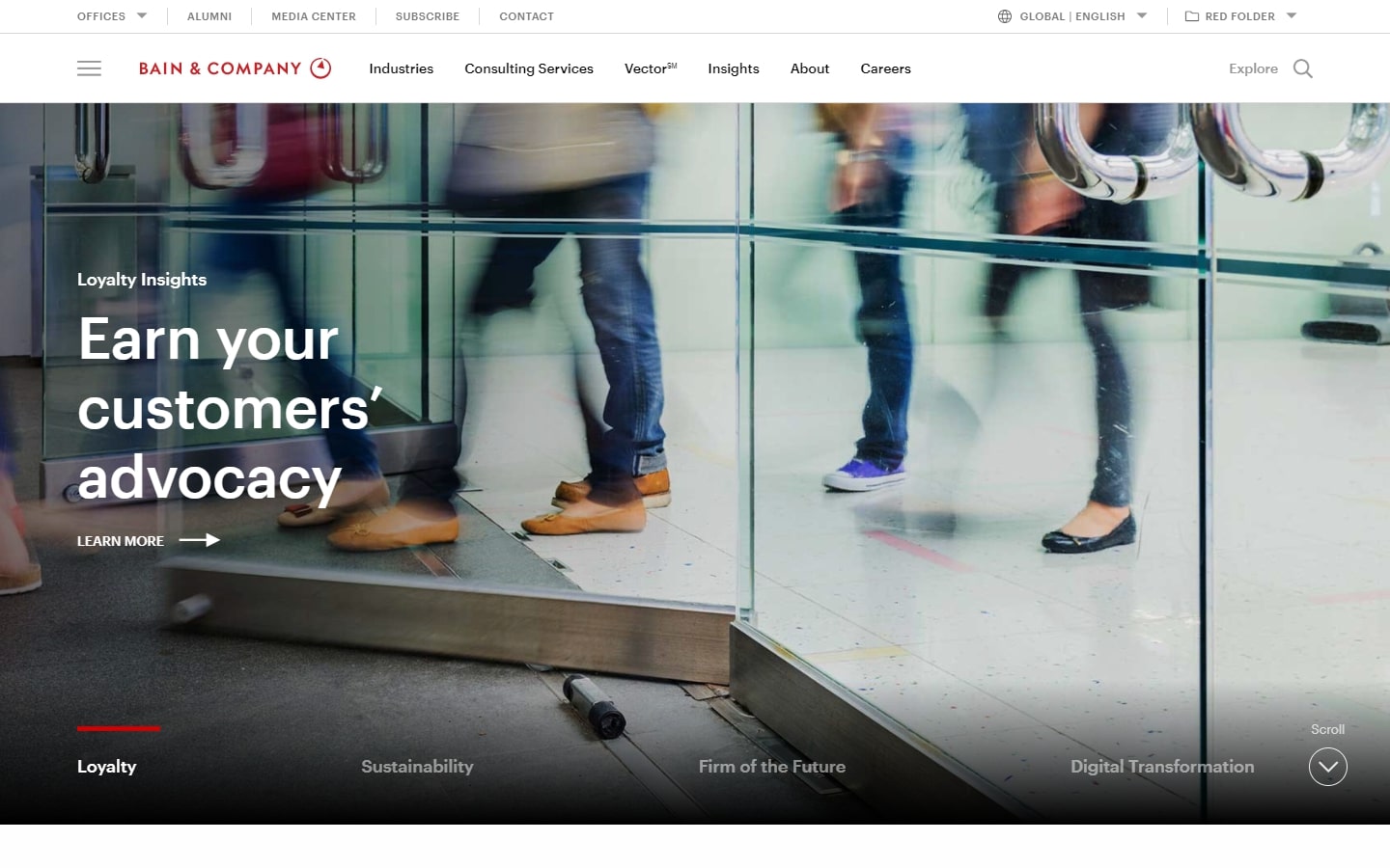
32. Bain & Company
Why it works: This modern-looking website design with a very sleek feel to both the typography and choice of images. The site felt very professional, authoritative, and useful.
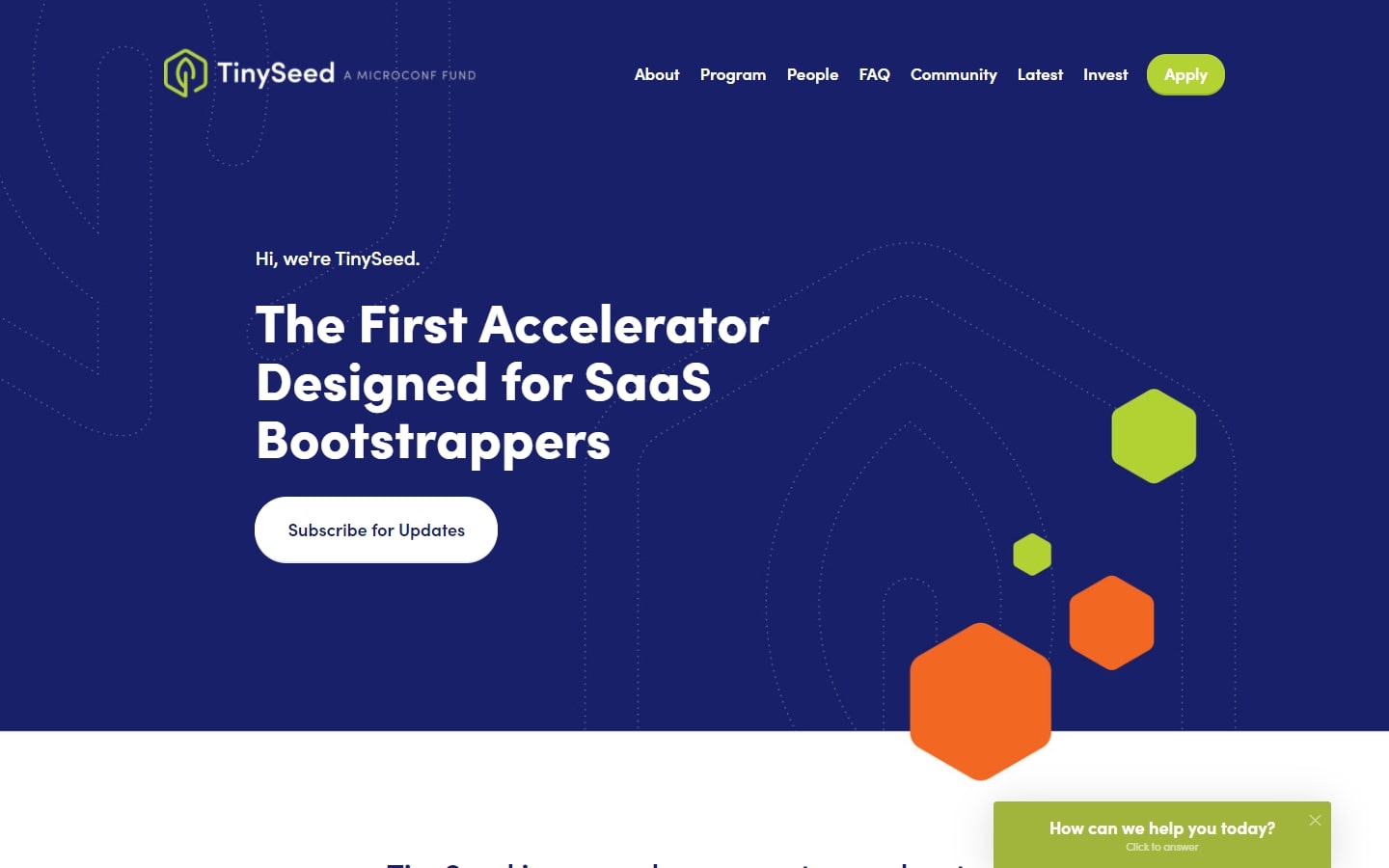
33. TinySeed
Why it works: Despite the playful feel of the consultant website, one can easily tell how serious they are in the mentorship of their business based on the content, all without overdoing it.
top consultant websites
34. Fresh Consulting
Why it works: Modern, trendy, and youthful. Subtle yet entertaining scrolling animations are applied by the web development team to elements throughout the website.
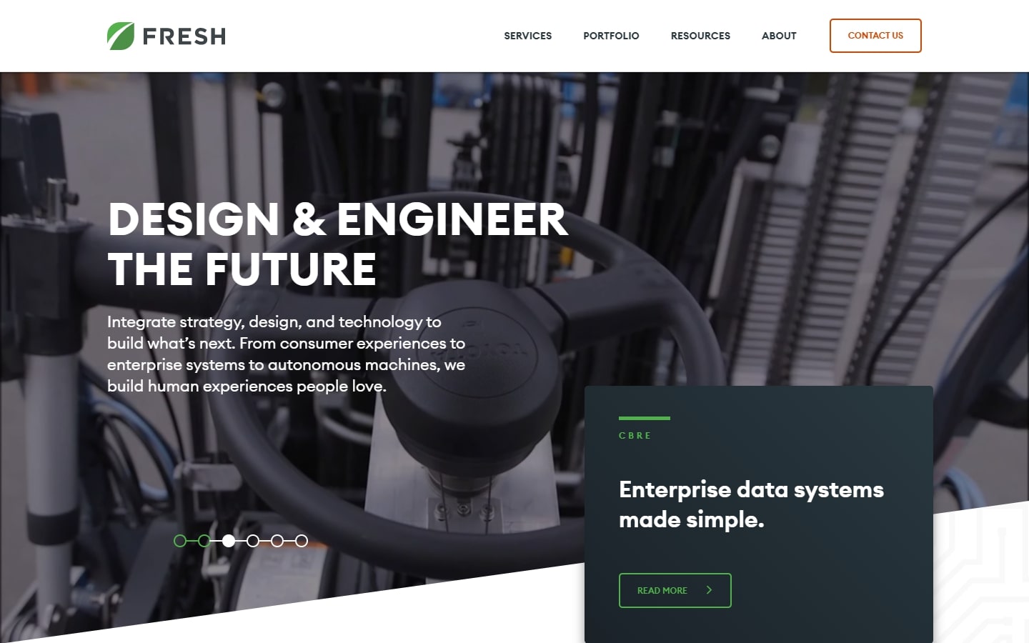
https://www.freshconsulting.com
35. The Process Consultant
Why it works: The most obvious element to make this website on the list is of course the hero graphic. It’s a creative way to show how they streamline fuzzy services for their clients.
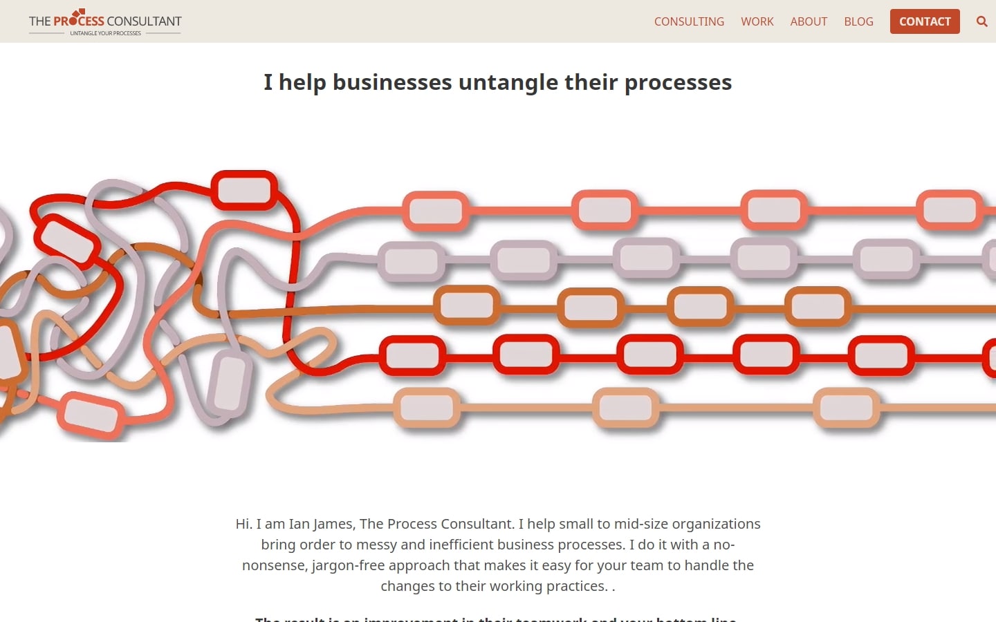
https://theprocessconsultant.com
36. Cities Reimagined
Why it works: The strategy of using tiny pictures and blobs on the page shows the personality of the business brand to visitors without much effort.
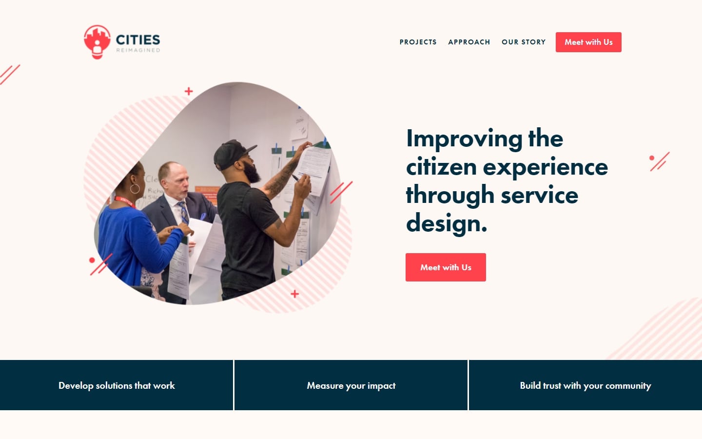
http://www.citiesreimagined.com
37. Pontefract Group
Why it works: We love the dynamics of the elements interplaying in this web design. The harmonious and explosive mix of different font choices and colors creates an everlasting impression.

38. Matt Olpinski
Why it works: The organization and simplicity of this great website are awesome. The website is easy to navigate, and the content is well-organized. The design is simple and elegant, and the strategy of the web designers is perfect. It’s beautiful and professional – perfect for any consulting business.
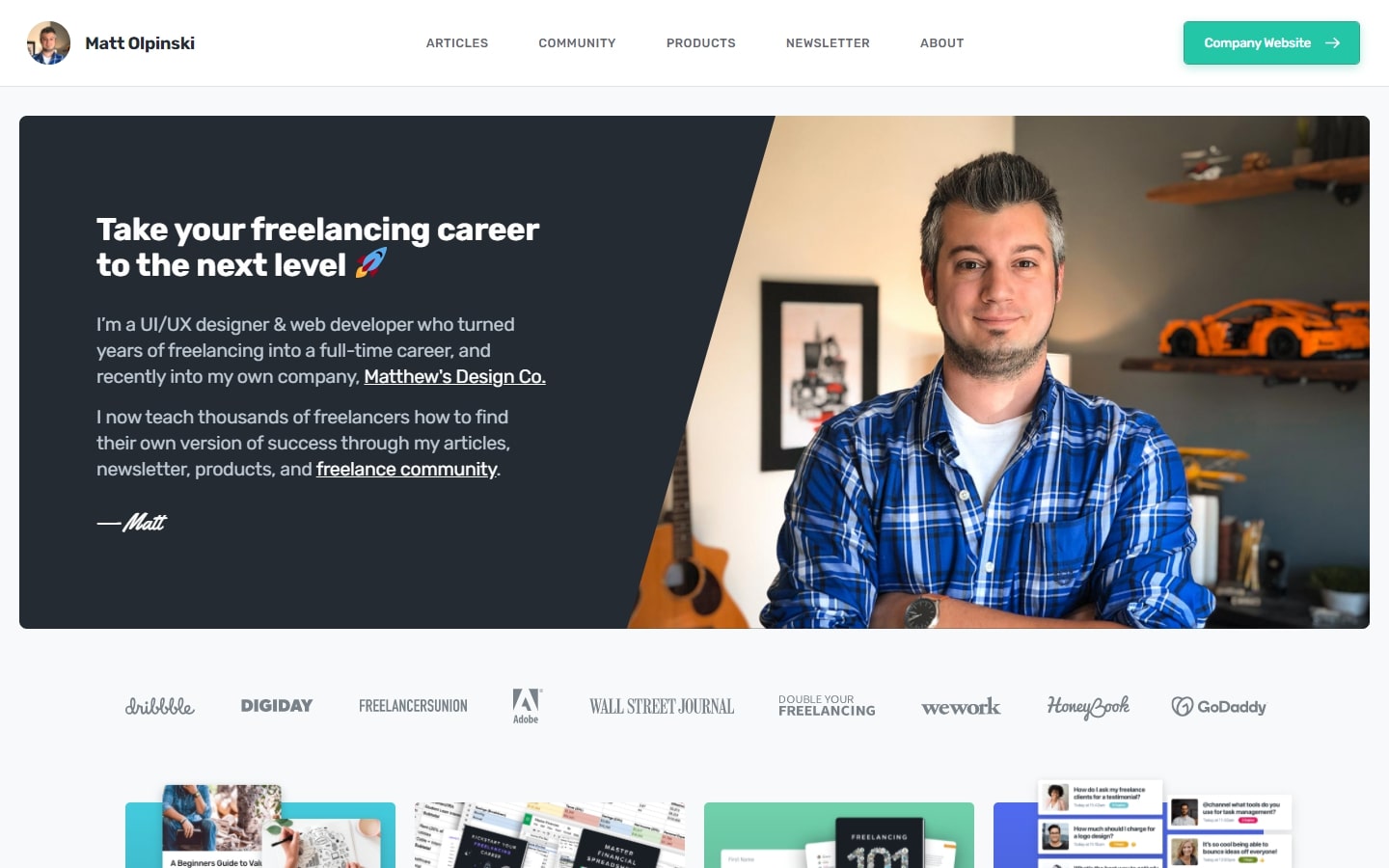
best consultant websites
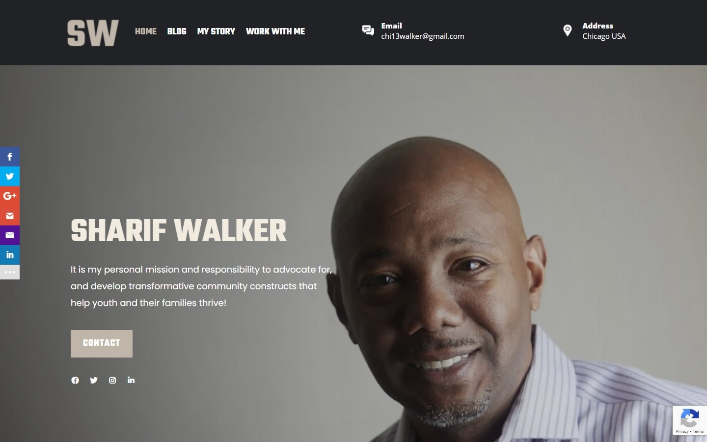
39. Sharif Walker
Why it works: The design of this consulting website speaks of a very original tone and feel. Entrance animations of elements or sections in the website is a real welcome feature for the clients.
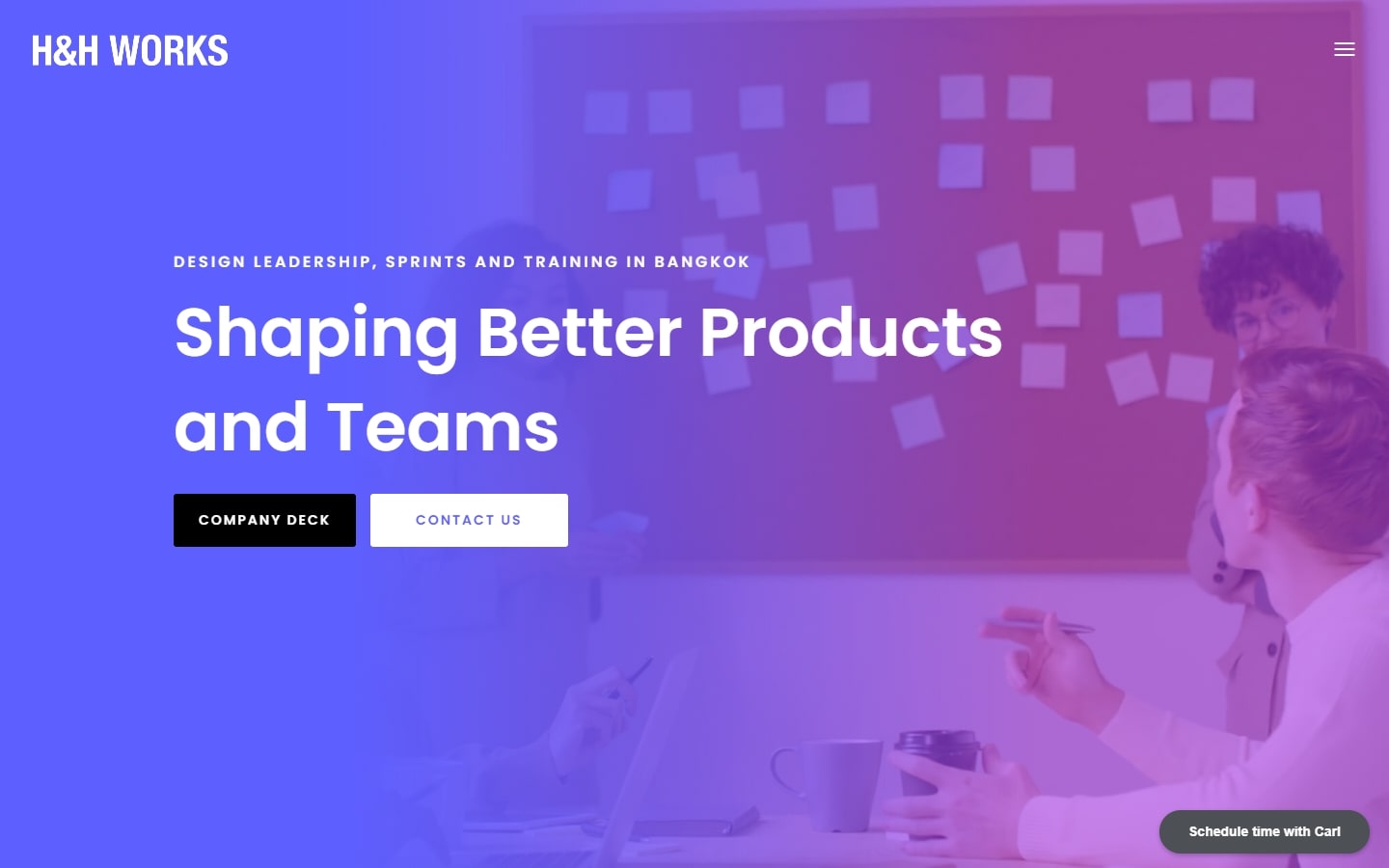
40. H&H Works
Why it works: The business website employs striking use of modern typefaces and bright vivid colors. No section looks the same, as there is the creative use of big bold shapes and letters for a more custom and optimized look.
Conclusion
Consulting business is a competitive industry and standing out from the competition can be difficult. A great way to do this is by developing eye-catching, professional-looking websites that will attract potential clients. If you need help creating websites or updating your current one, Contact Us today for more information about how our expert web development team can make sure your site stands out against other companies.
We will create a custom mockup of your new website before you sign or pay for anything. There is nothing to sign and no payment information will be taken. If you like our design for your business we can move forward working together. If not, there are no hard feelings and no other obligations. Click the button below to learn more.