When it comes to finding the Best Dermatologist Websites, there are a number of things that you should keep in mind. You want your site to be attractive and professional. You also want visitors to know all about what dermatology services you offer and how they can contact you for an appointment or consultation. We’ve searched far and wide to bring you the 40 best dermatologist websites with great design and functionality.
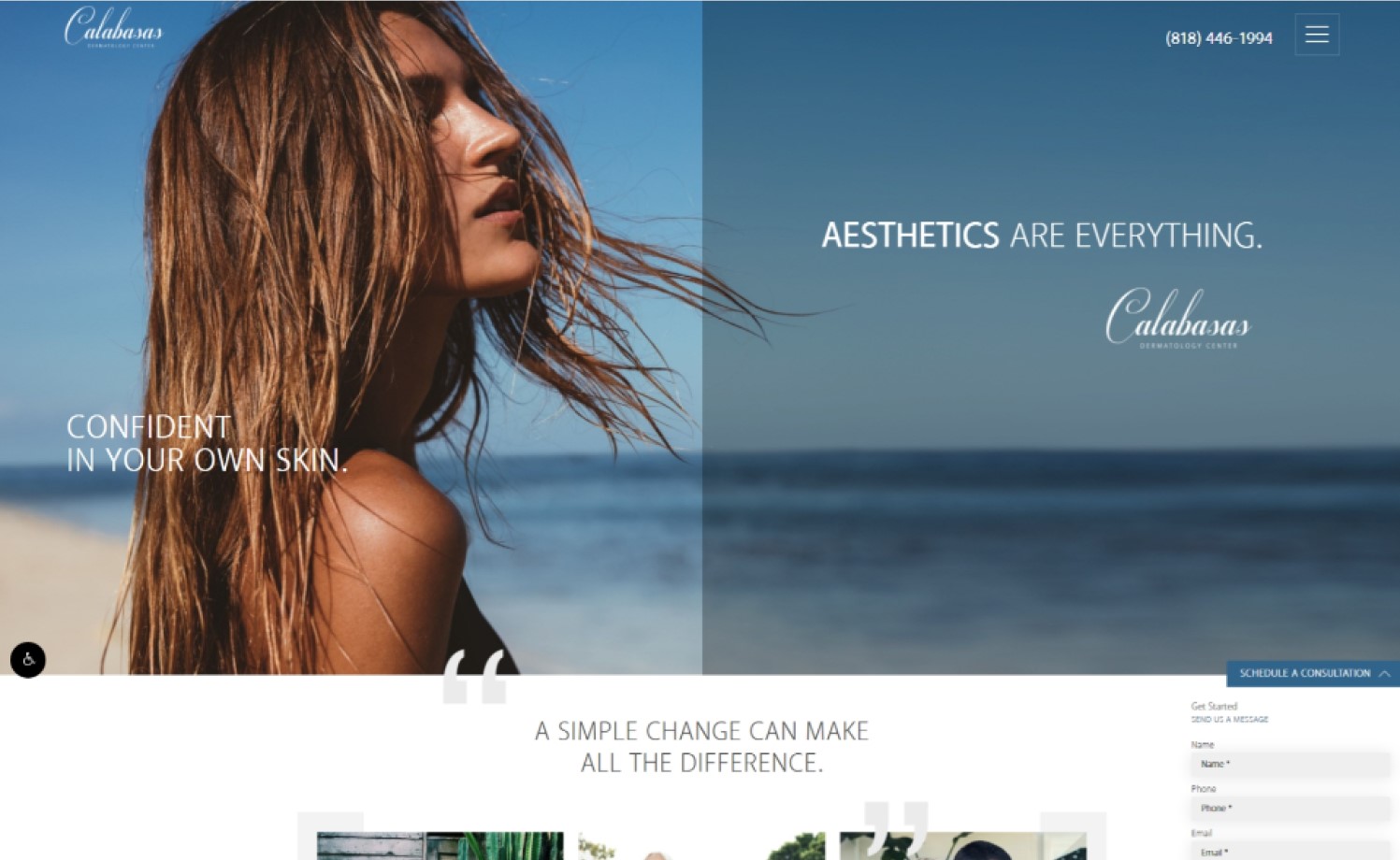
1. Calabasas Dermatology Center
Why it works: Calabasas Dermatology Center has a full-page hero image that is engaging. The layout is aesthetically pleasing with easy-to-find information thanks to sections, thumbnails and navigation. They also provide images of diverse people with varying ages groups which indicate who they serve and their target demographic.
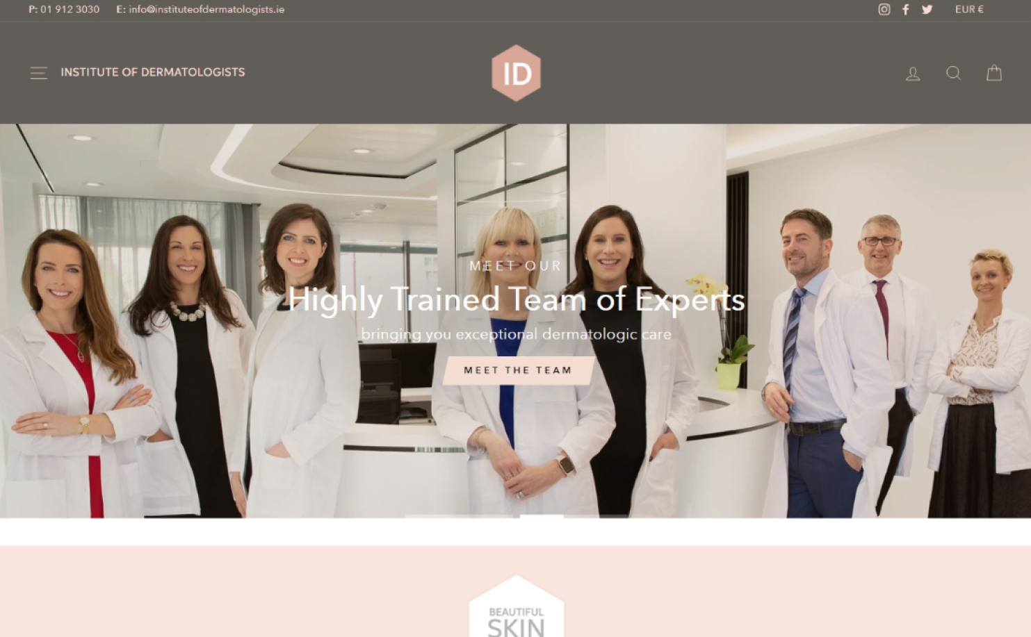
2. Institute of Dermatologists
Why it works: This site is easy to navigate and there is a lot of information about the board-certified dermatologists. The office and doctors’ pictures as well as their custom video adds credibility and integrity to this clinic.
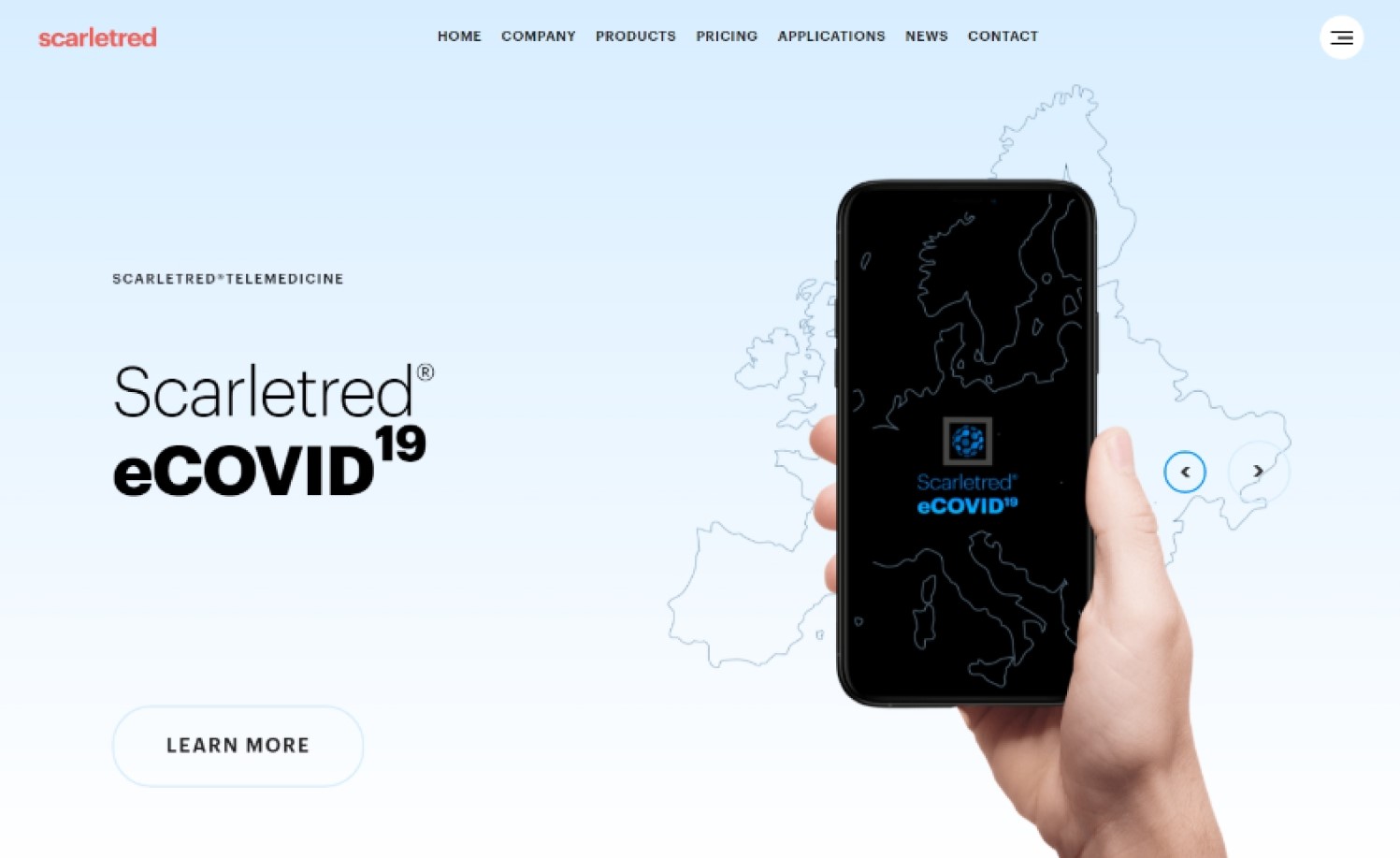
3. Scarletred
Why it works: Scarletred develops better skin products and innovative medical care and dermatology care faster at a low cost. This is clearly shown in the website using an effective layout and design. The subtle movements throughout the website gives it life.
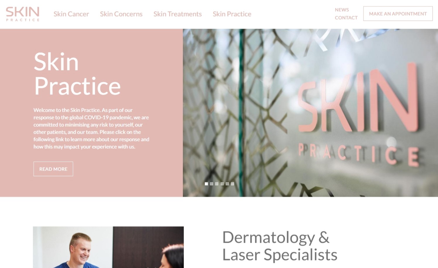
4. Skin Practice
Why it works: The colors used in this cosmetic dermatology website are muted and pleasant. The sticky navigation containing links to skin cancer, skin conditions, skin issues and treatments makes the site easy to navigate.
Best Dermatology Websites
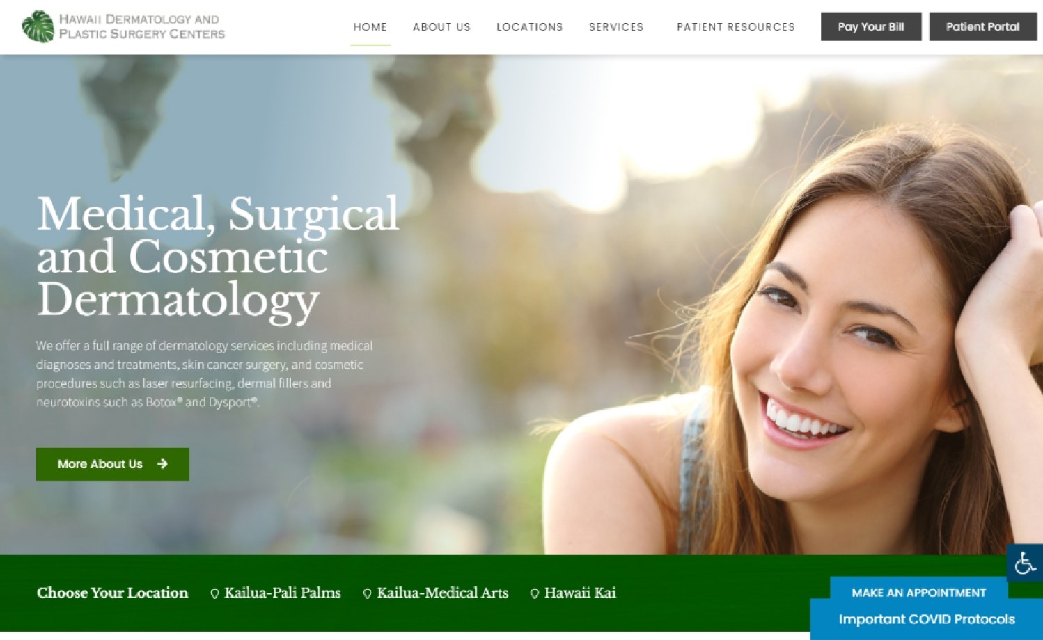
5. Hawaii Dermatology & Plastic Surgery Centers
Why it works: Hawaii Dermatology & Plastic Surgery Centers has a user-friendly interface. The well-organized navigation and layout, along with the imagery of smiling faces and bright colors give the website an inviting feel.
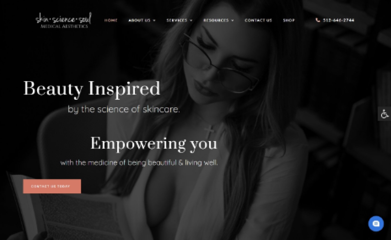
6. Skin • Science • Soul
Why it works: The black-and-white pictures add an elegant, sophisticated touch to the site. They utilized the header to promote their online dermatology services. While the information on the treatment plan and health savings account are easily accessible.
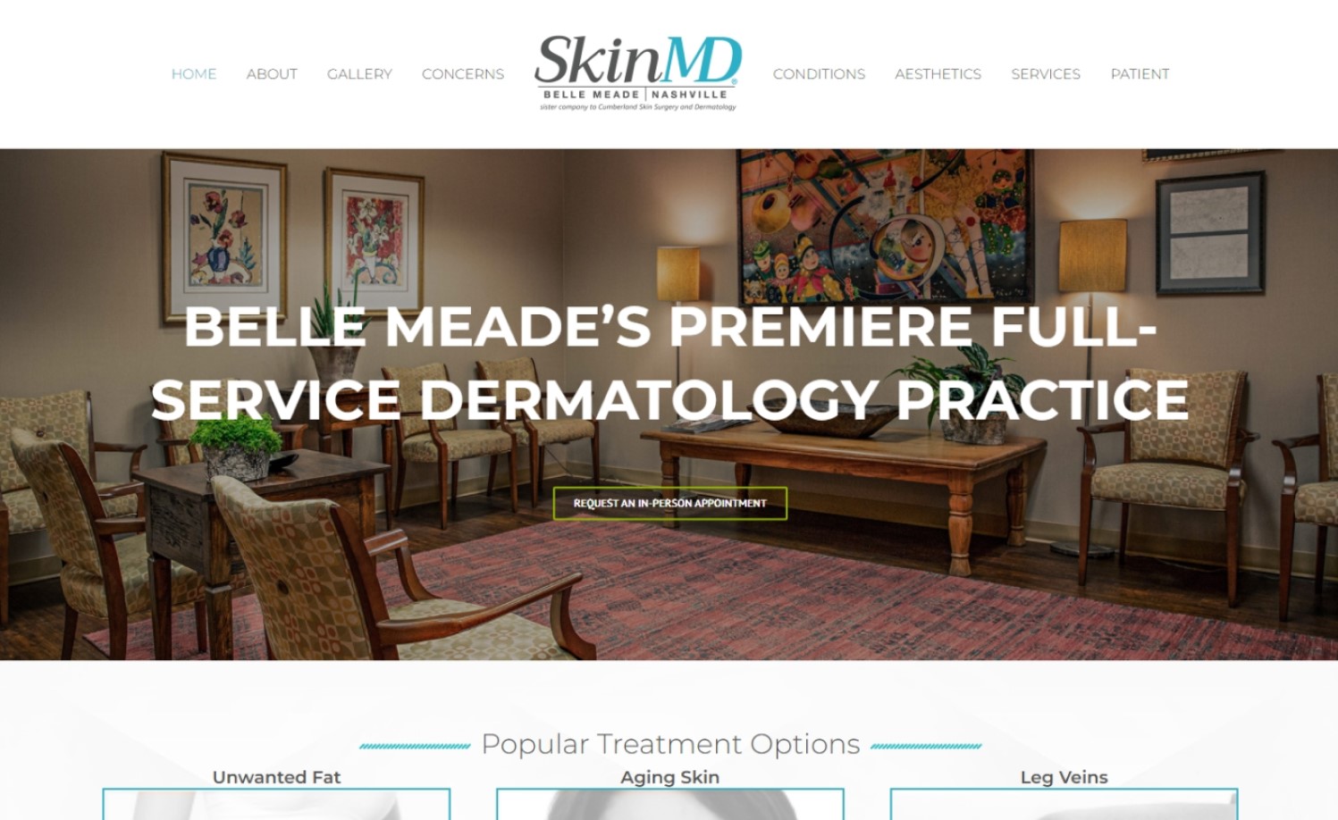
7. Skin MD
Why it works: SkinMD has an informative dropdown menu. The office picture makes you feel like you are physically there. Nice graphics and the colors are easy on the eyes. They accept insurance and flexible spending account to encourage more patients.
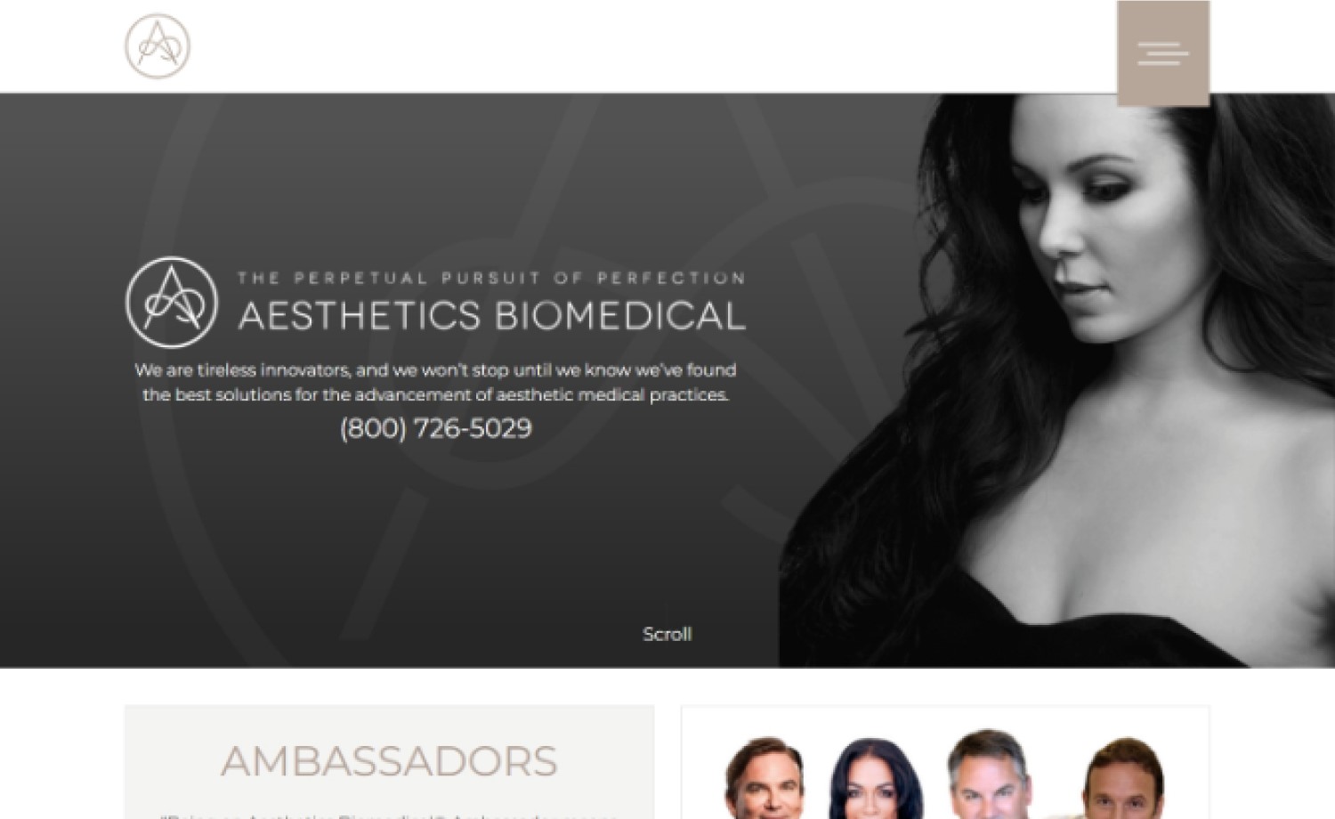
8. Aesthetics Biomedical
Why it works: Aesthetics Biomedical has a bold and modern look. The choices of colors on the home page are great, and it does an excellent job presenting their information.
Top Dermatologist Websites
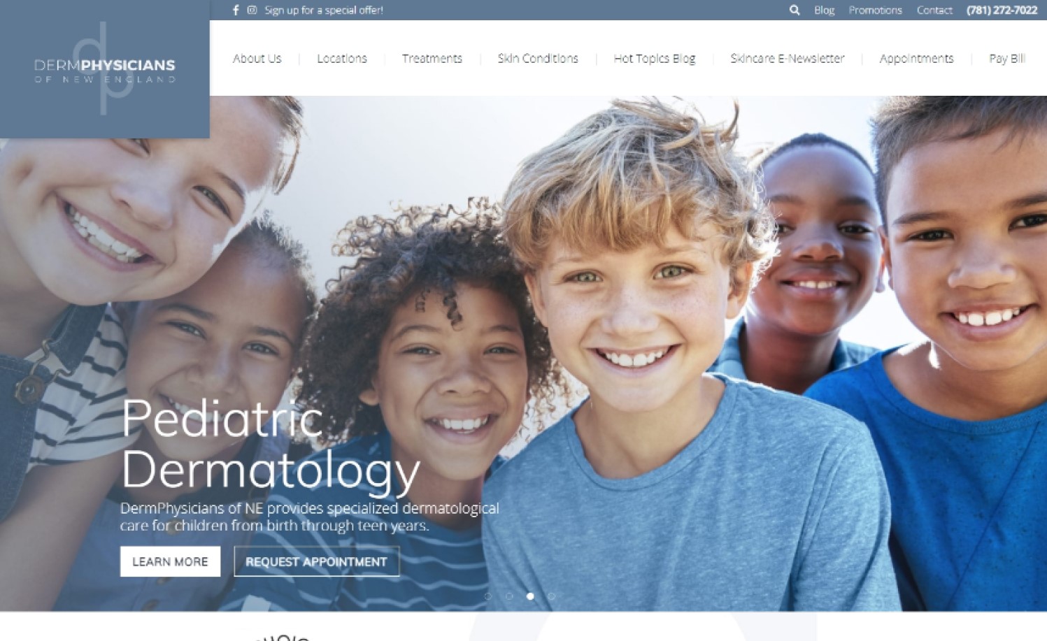
9. DermPhysicians of New England
Why it works: DermPhysicians of New England’s use of muted blue is well suited for their brand. There are top-level navigation sections on the home page that make Information easy to locate.
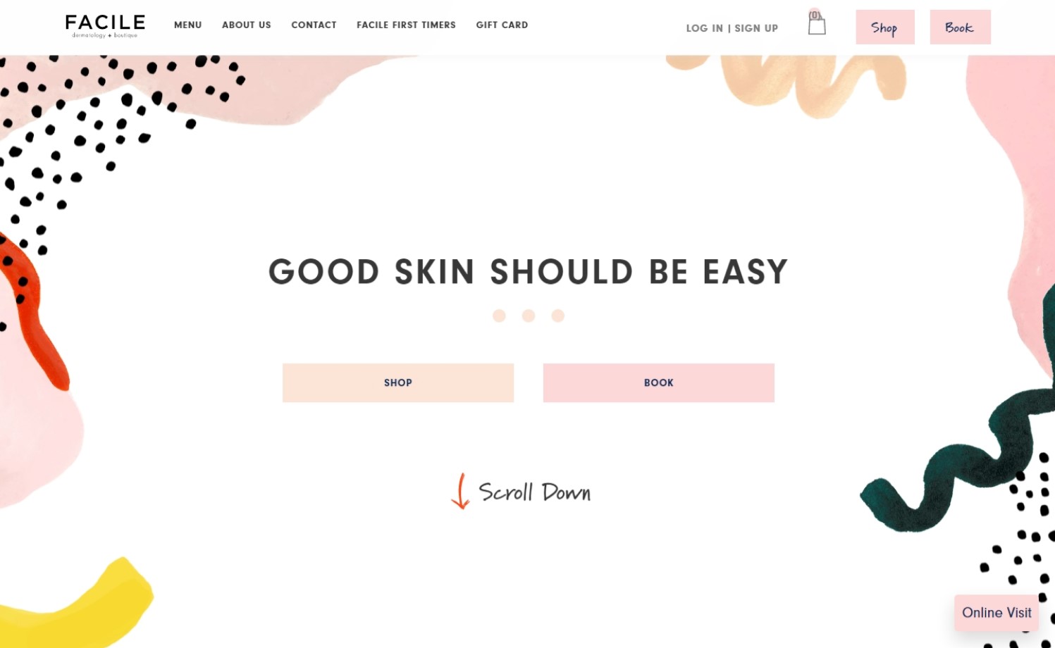
10. Facile Dermatology + Boutique
Why it works: Facile Dermatology + Boutique’s use of pastel colors and chic graphics is precisely what their demographics need. The simple layout and the use of iconography make the site’s information easy to assimilate.
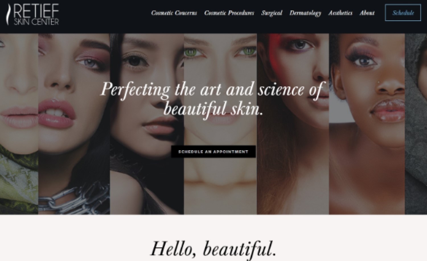
11. Retief Skin Center
Why it works: At a glance, Retief Skin Center shows what kind of services they offer. They include links to Yelp reviews and their Instagram feed, giving potential clients a better understanding of what the center offers.
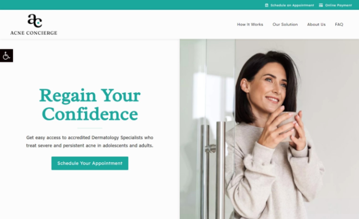
12. Acne Concierge
Why it works: Acne Concierge’s use of simple layout and color helps visitors focus on the images to understand what the company is all about. Their sticky navigation is perfect for ease of use when exploring their website.
Best Dermatologist Websites
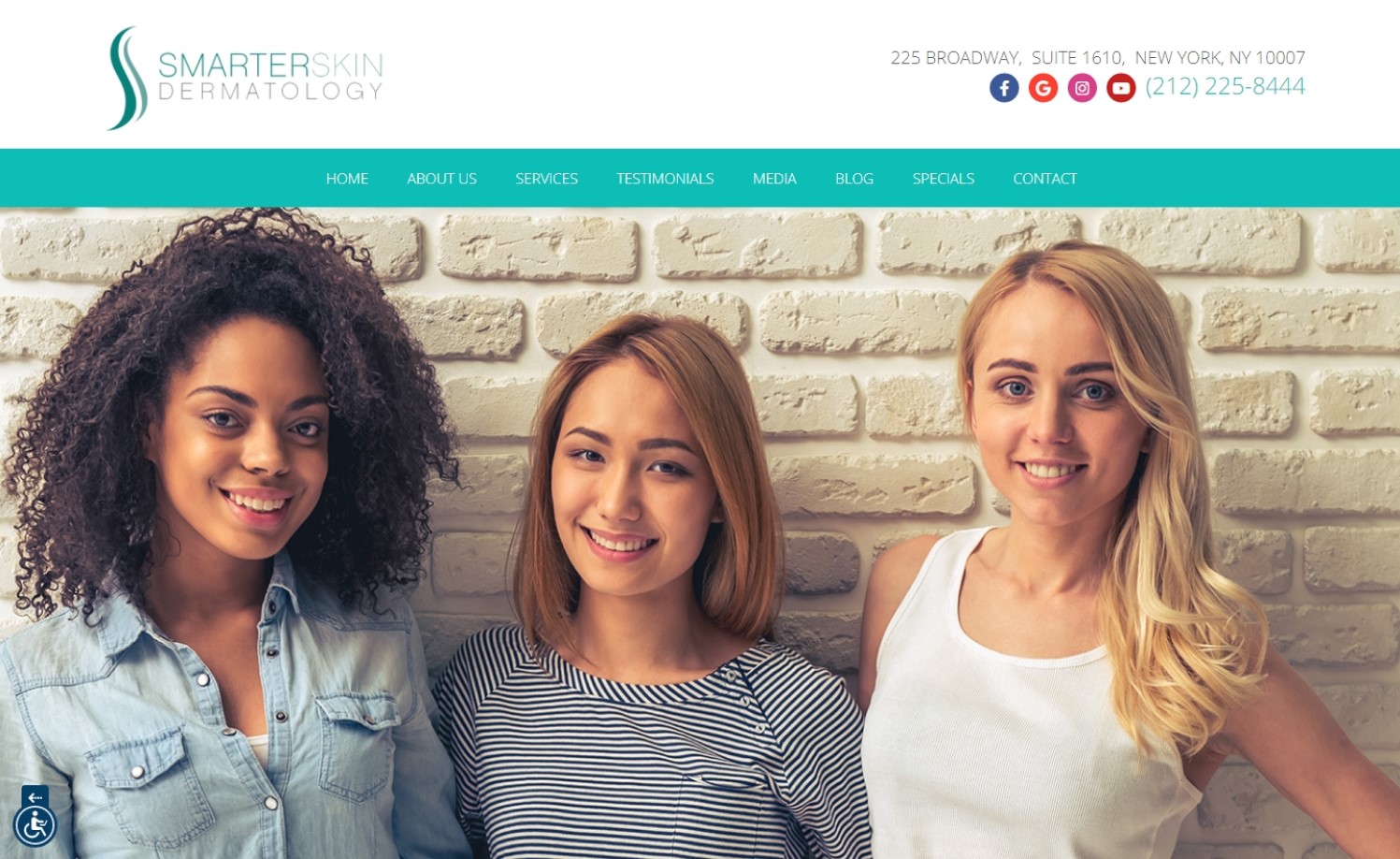
13. Smarter Skin Dermatology
Why it works: The Smarter Skin Dermatology’s hero image indicates that they give importance to diversity. The group of call-to-action strips helps visitors navigate through their pages. The main page features a contact form, for information and questions.
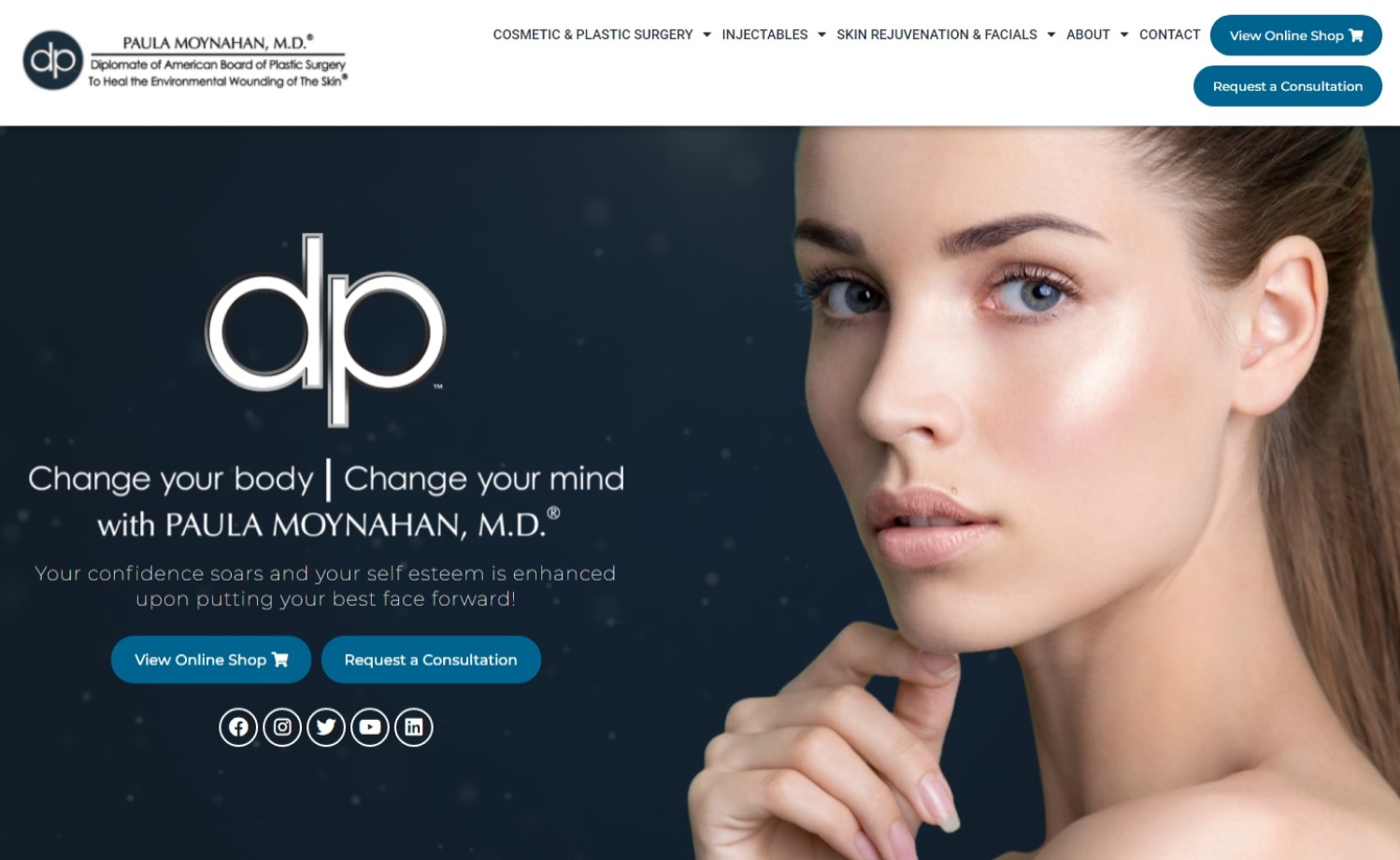
14. Paula Moynahan MD
Why it works: The simple animation together with the clear and pleasing image gives life to the full page, no scroll home page. The home page’s call to action clearly gives the visitor an idea that aside from consulting, the site also features an online shop.
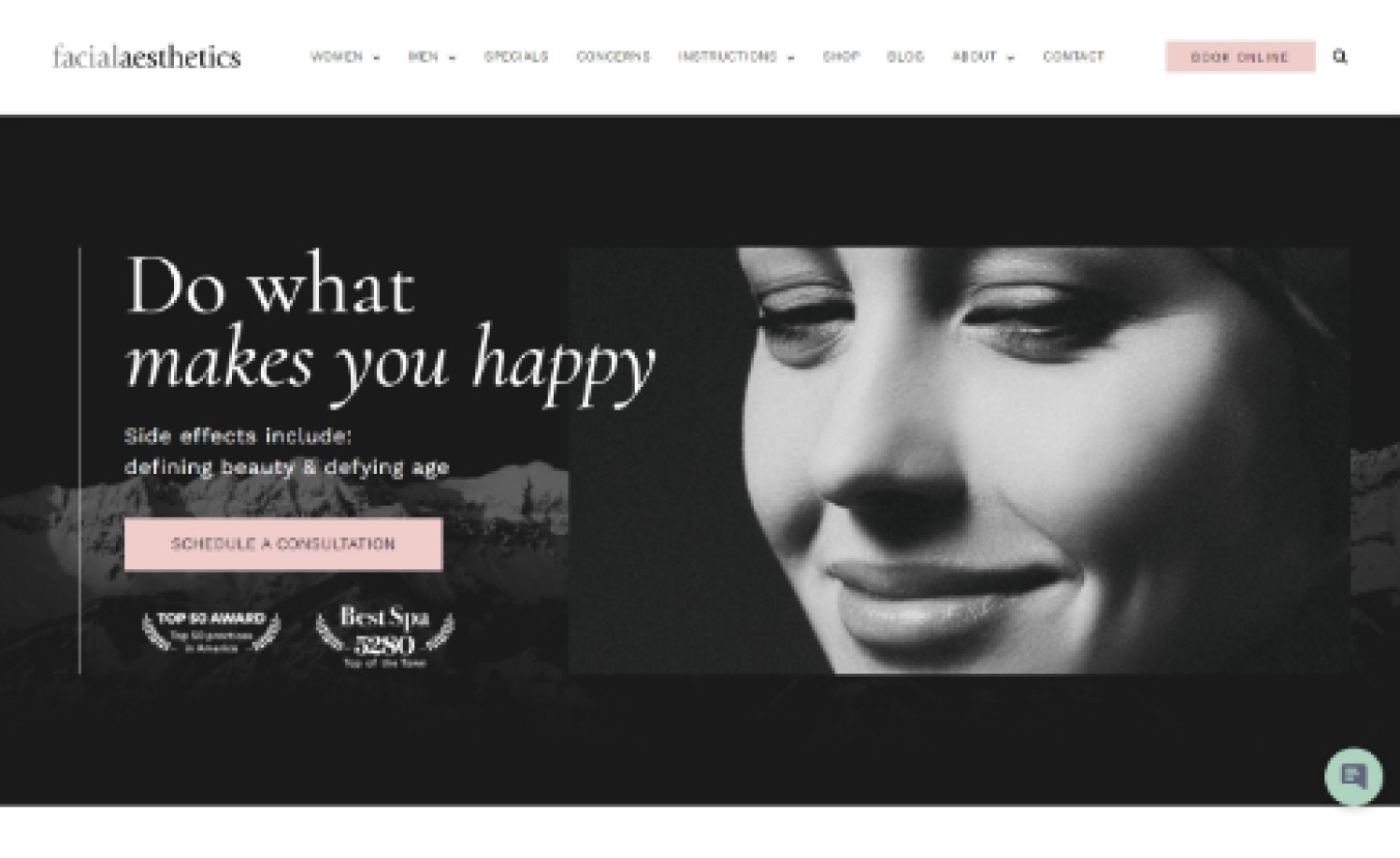
15. Facial Aesthetics
Why it works: Facial Aesthetics’ black and white imagery adds elegance to the website. The award badges on the hero section makes this facility credible and trustworthy. The picture of diverse and happy people with varying age indicates their demographic, their service, and friendliness as a company.
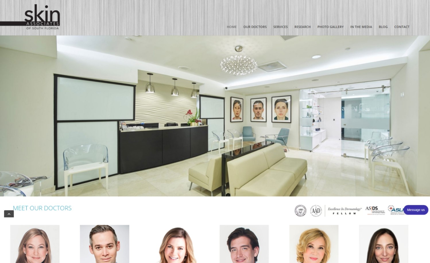
16. Skin Associates of Southern Florida
Why it works: The Skin Associates of Southern Florida website makes you feel as if you are right there in their office. The physician’s pictures present on the homepage adds integrity. The sticky navigation helps a lot in terms of website exploration, and having a form for visitors or clients’ questions helps with interaction.
Best Dermatology Web Design
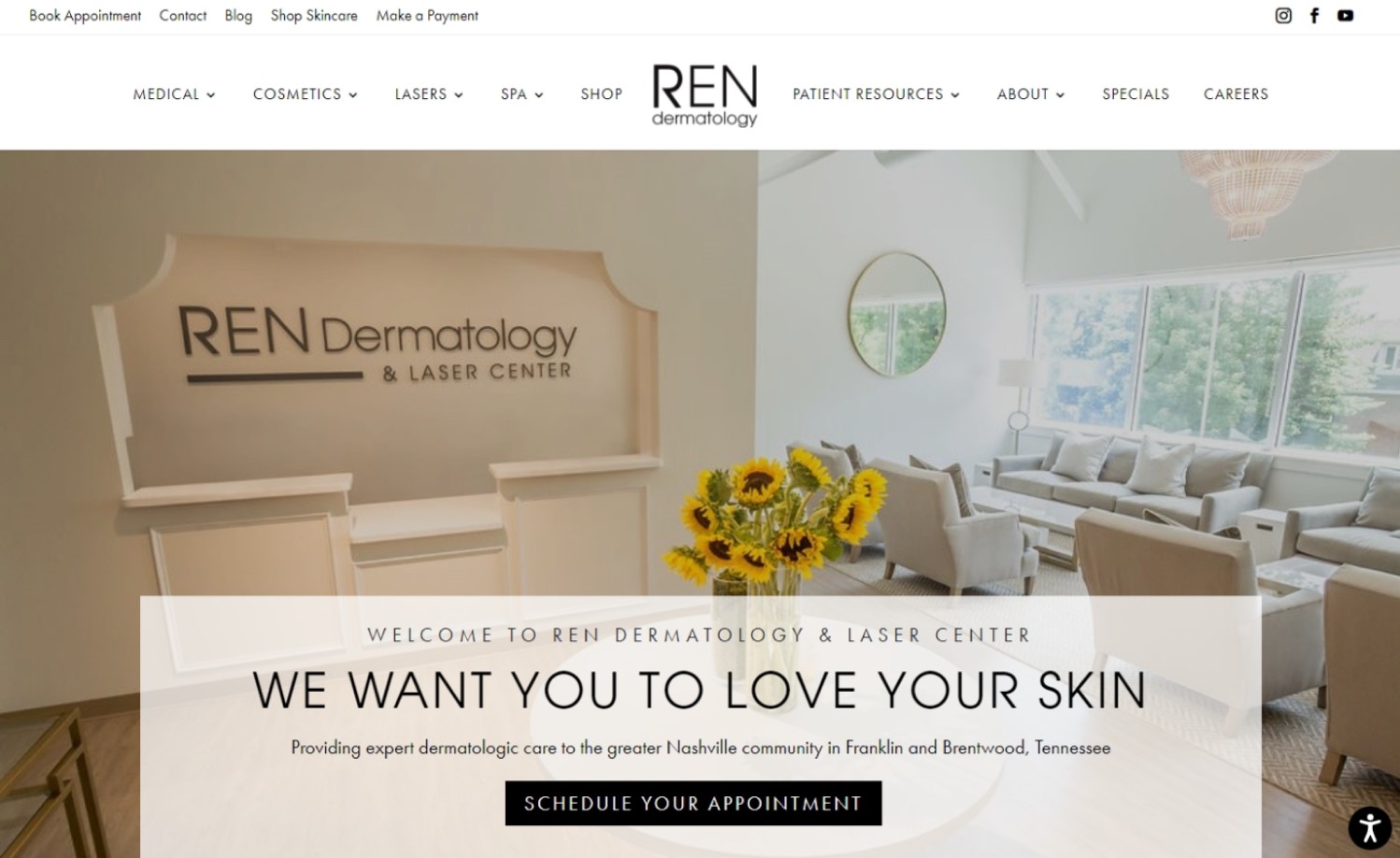
17. Ren Dermatology & Laser Center
Why it works: Ren Dermatology’s thumbnail images help visitors understand what kind of services they offer. The clinic’s photos, dermatologists’ photographs and having an Instagram on the front page increase the integrity of the center.
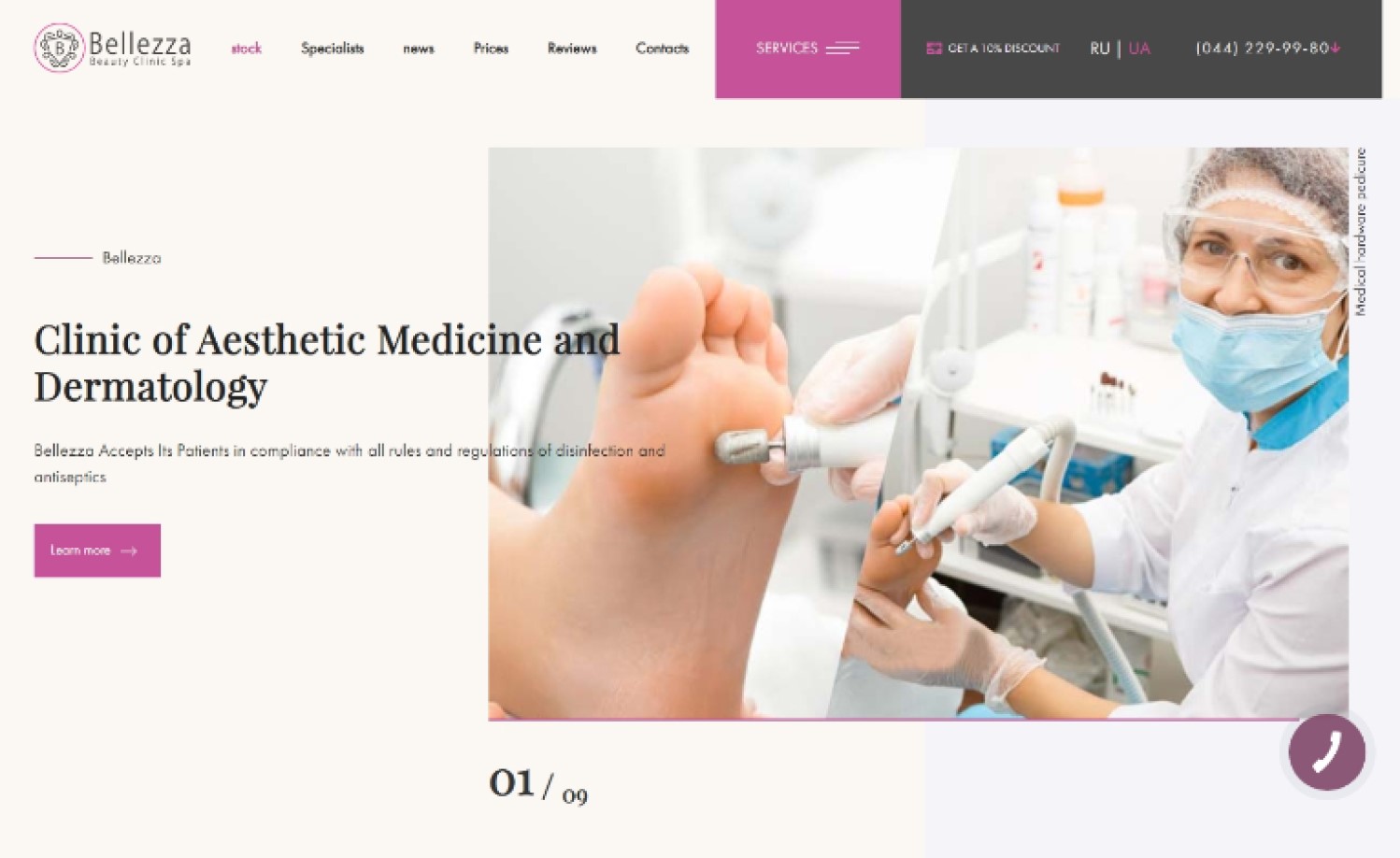
18. Bellezza Beauty Clinic
Why it works: The hero slideshow helps visitors make a sense of what Bellezza Beauty Clinic is all about. The video tour of the clinic is a very personal approach to showcase their clinic. The services thumbnails that serve as a portal are essential for the visitor to explore the different services they offer.
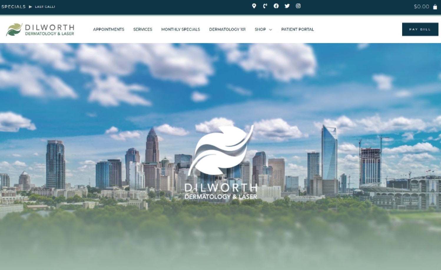
19. Dilworth Dermatology & Laser
Why it works: Dilworth Dermatology & Laser Medicine has an interesting layout and overall design. The logo’s design elements and colors were used throughout the website. The added third color is not invasive and goes well with the brand’s colors. The use of scroll-activated animations is not distracting as opposed to animations that are constantly moving.
 dilworthdermatologyandlaser.com
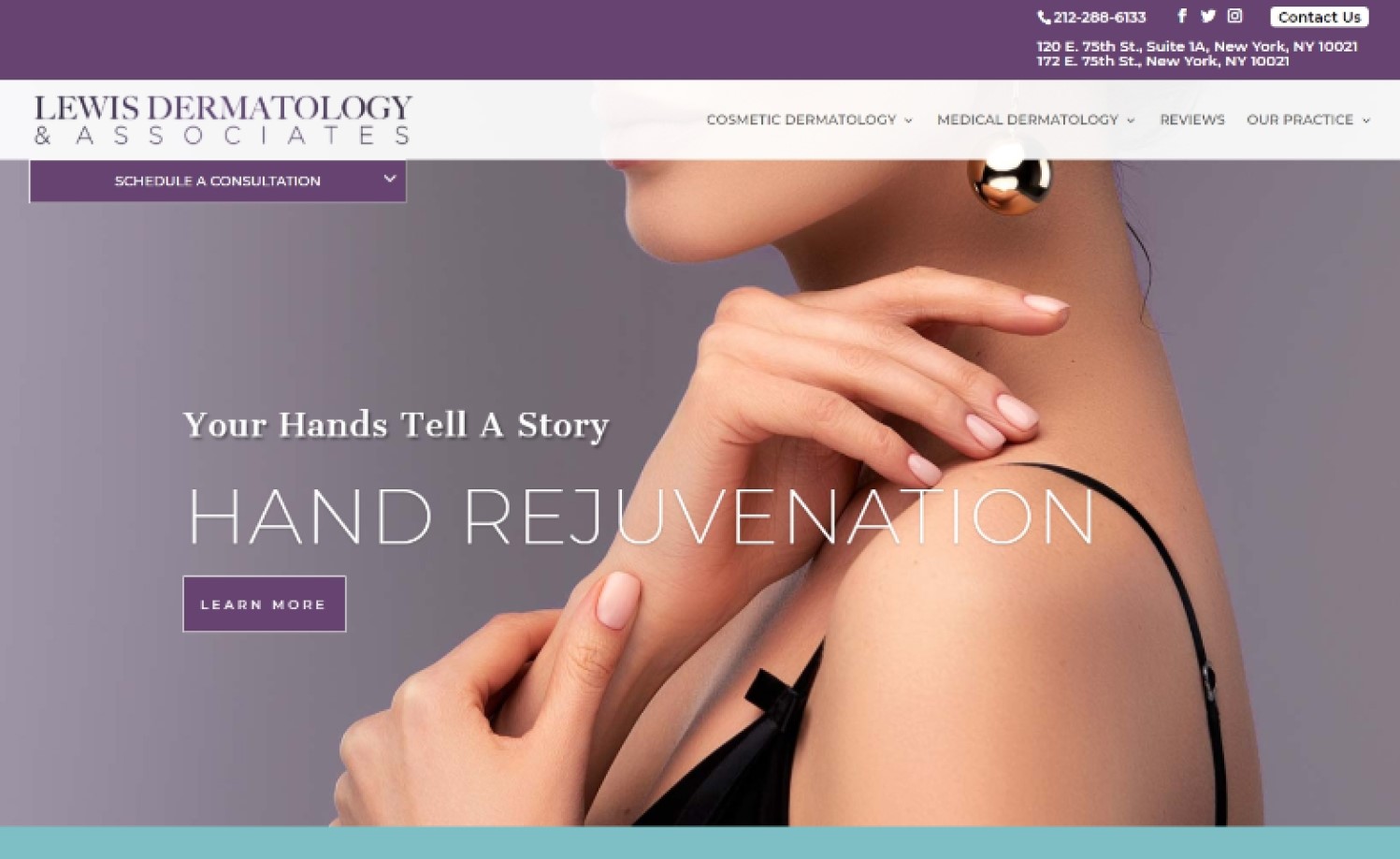
20. Lewis Dermatology & Associates
Why it works: The hero section with pictures of their skincare physicians and Dr. Lewis is meant to provide credibility for the clinic, as well as the testimonial section showing patient reviews. The website’s navigation and service thumbnails make it easy for visitors to find the medical attention or treatment plan they’re looking for.
Dermatologist websites for inspiration
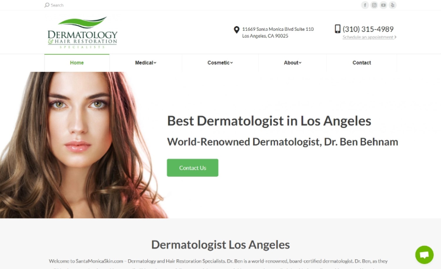
21. Dermatology & Hair Restoration Specialists
Why it works: The website of this dermatology and hair loss specialist comes with a refreshing feel. The sticky navigation, services section, and call to action sections are designed to make it easy for visitors to explore the website.
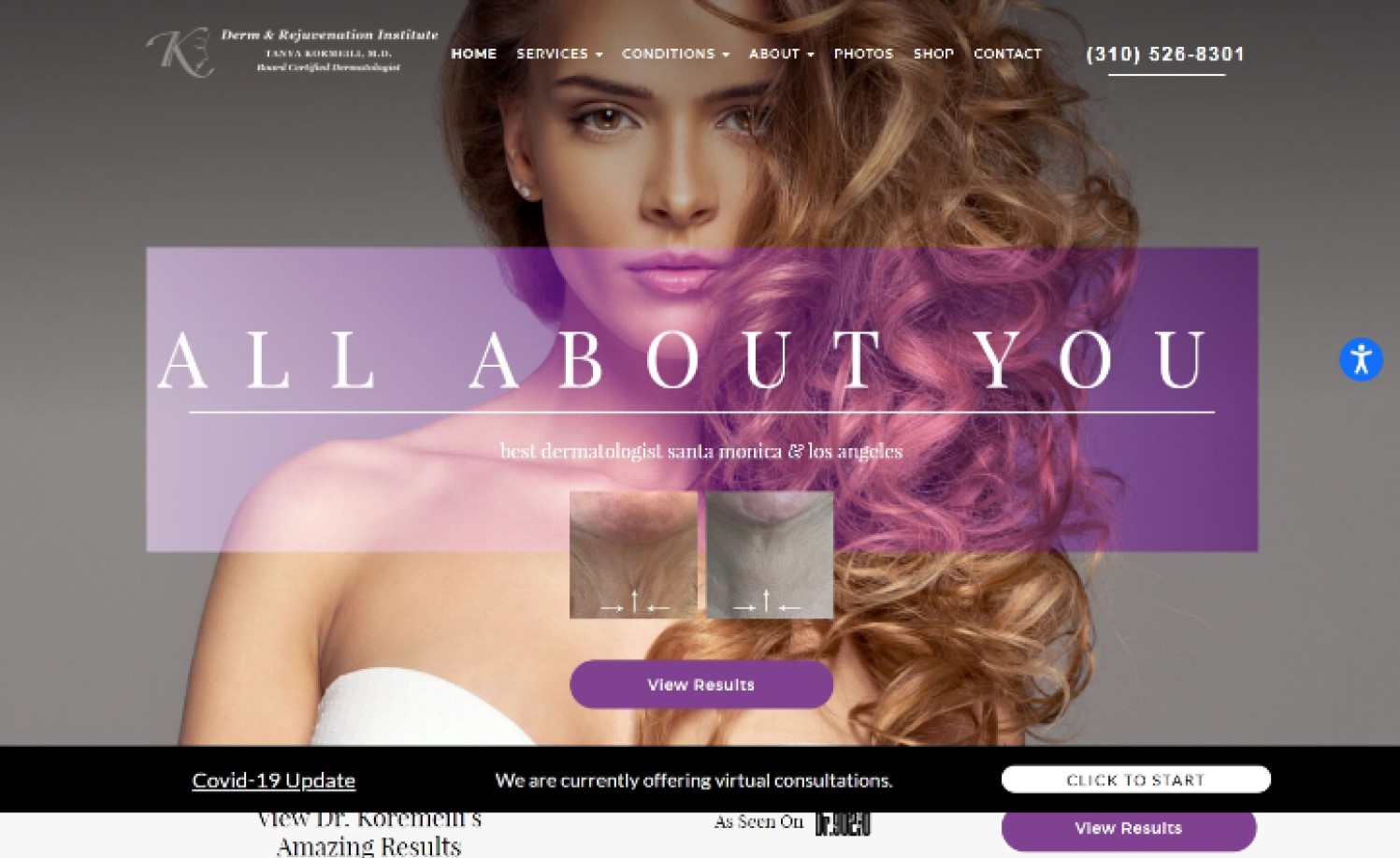
22. Tanya Kormeili Dermatology
Why it works: The website is designed with appealing aesthetics and eye-catching images. There are sections that display the credentials of the owners and testimonials from satisfied clients. Before/after photos are provided for potential patients to see board-certified dermatologist Dr. Kormeili’s work in detail.
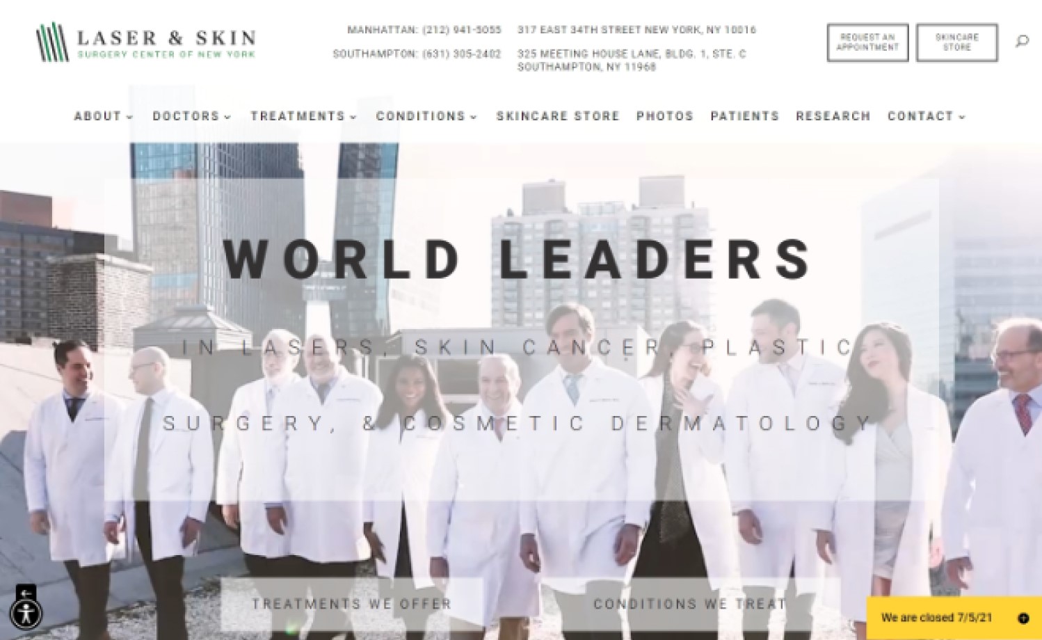
23. Laser and Skin Surgery Center of New York
Why it works: The way the information is disseminated on the home page is well thought out. They upload photos for the before and after section to provide credibility to their medical degree and what they can do. All of the sections presented are with an important purpose; to either provide credibility or as a portal to their most important pages.
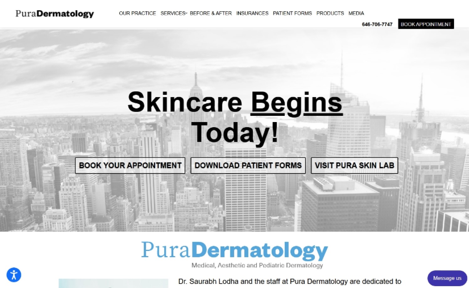
24. Pura Dermatology
Why it works: The way Pura Dermatology presents its services makes it easier to find what you are looking for. The “book an appointment” call to action is also easy to find while the footer section displays contact information and business days.
Dermatology websites for inspiration
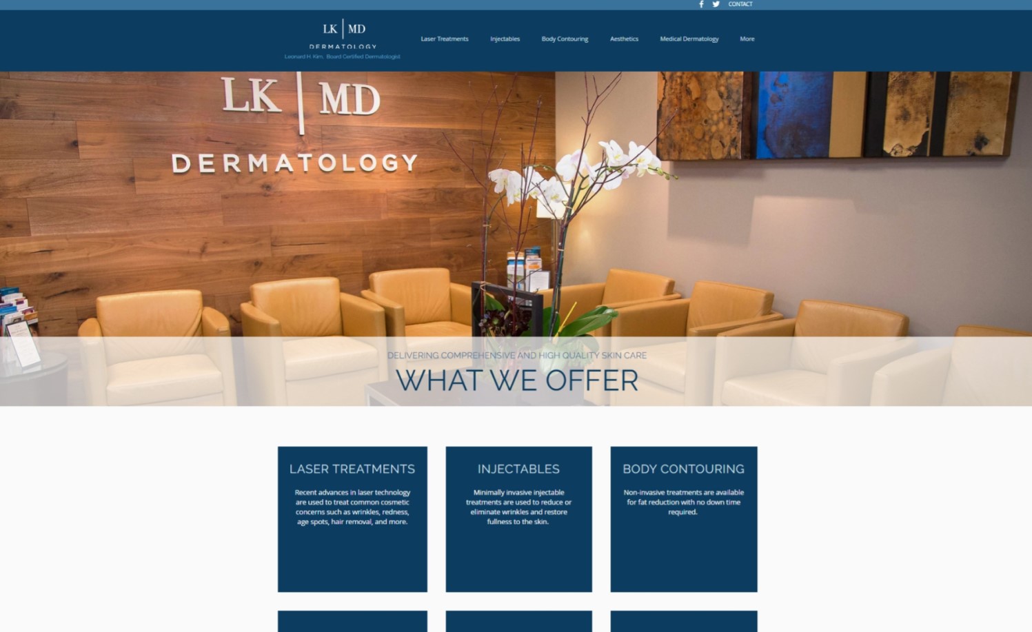
25. LKMD Dermatology
Why it works: LKMD Dermatology has a simple website that is easy to navigate. The services they offer are clearly presented on the homepage as thumbnails section. Also, LKMD’s objective is well presented and in its own section on the homepage.
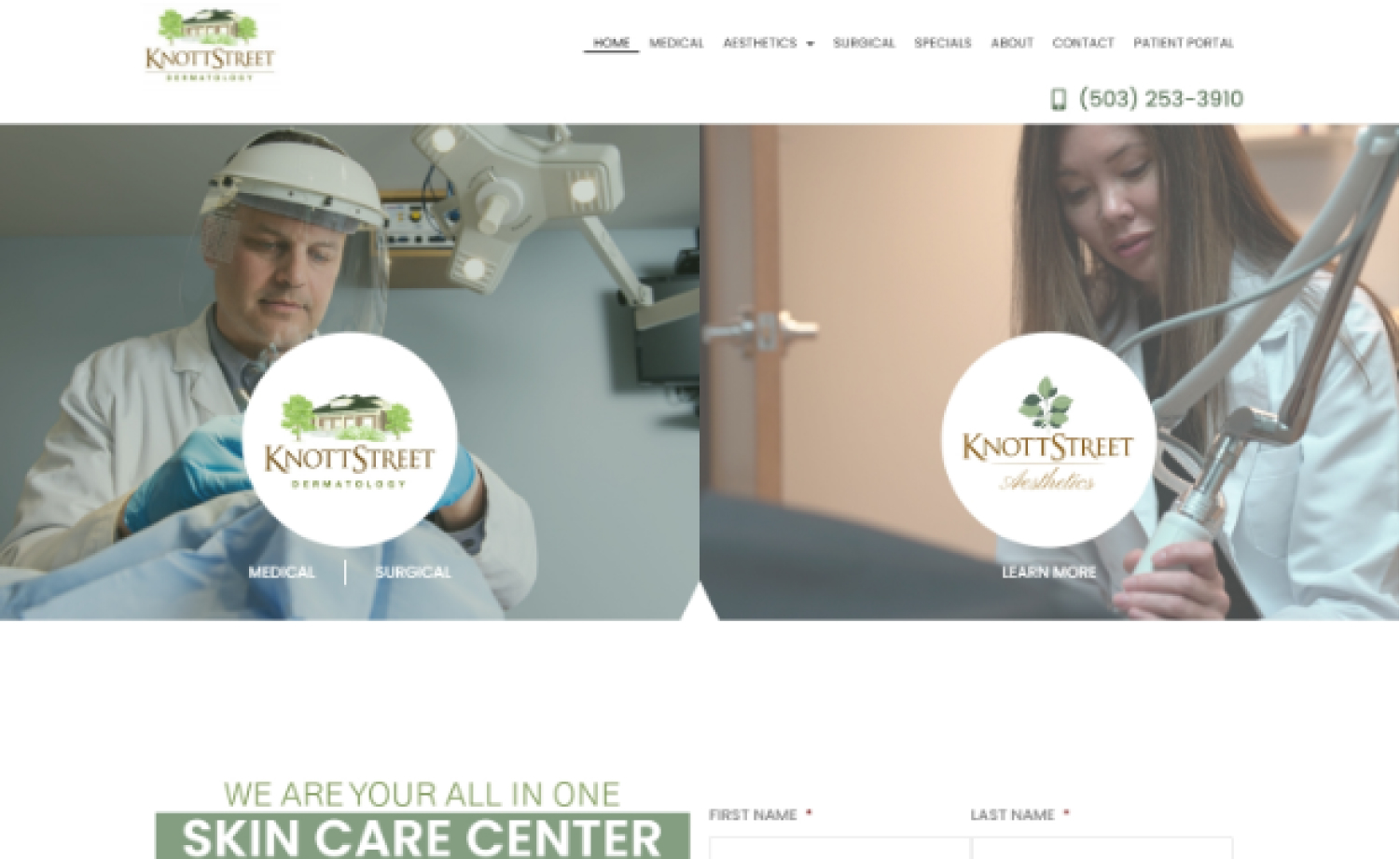
26. Knott Street Dermatology
Why it works: The home page of this medical and cosmetic dermatology website serves as a portal to their offering, resources, products, and other important pages. The video preview and video popup help visitors understand who they are and what they do which is important to target specific visitors and their interests. Also, there are multiple sections that boost their credibility like the before and after section and the team section.
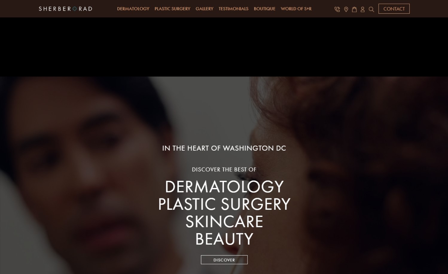
27. Sherber + Rad
Why it works: The clinic and doctors’ images and videos are obviously of high quality and very well presented which is very important to gain a reputation in the field of dermatology services. A list of their services like skin cancer, other skin conditions, skin diseases and skin concerns is categorized properly.
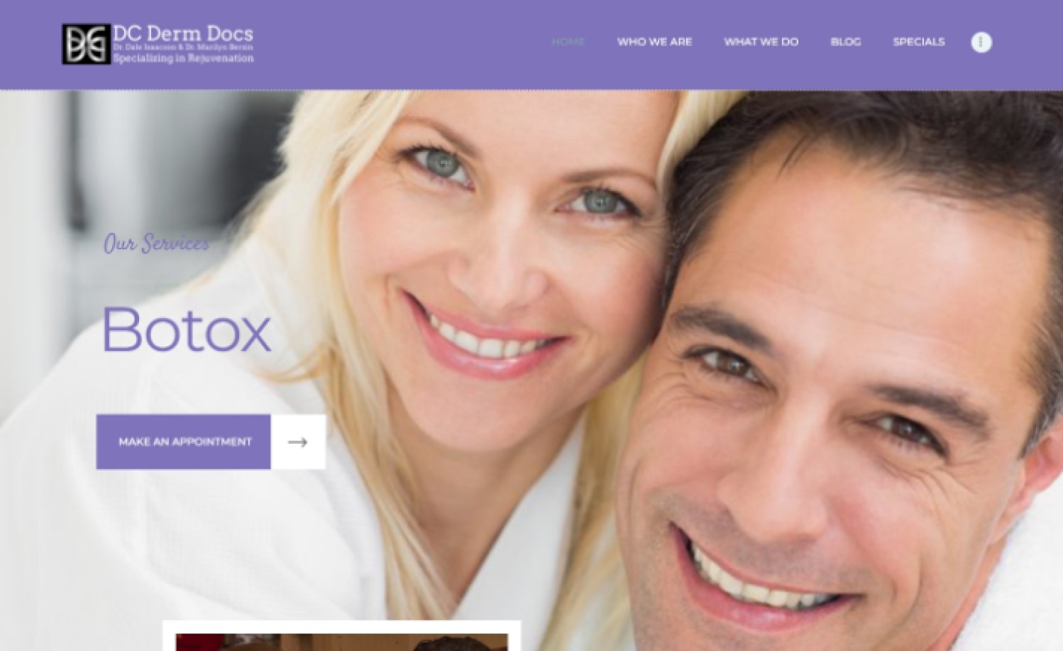
28. DC Derm Docs
Why it works: The overall structure of this dermatology specialists website is excellent. One can easily find relevant information on the home page. The hero section has on-point images that easily show their specific services.
Top Dermatologist Website design
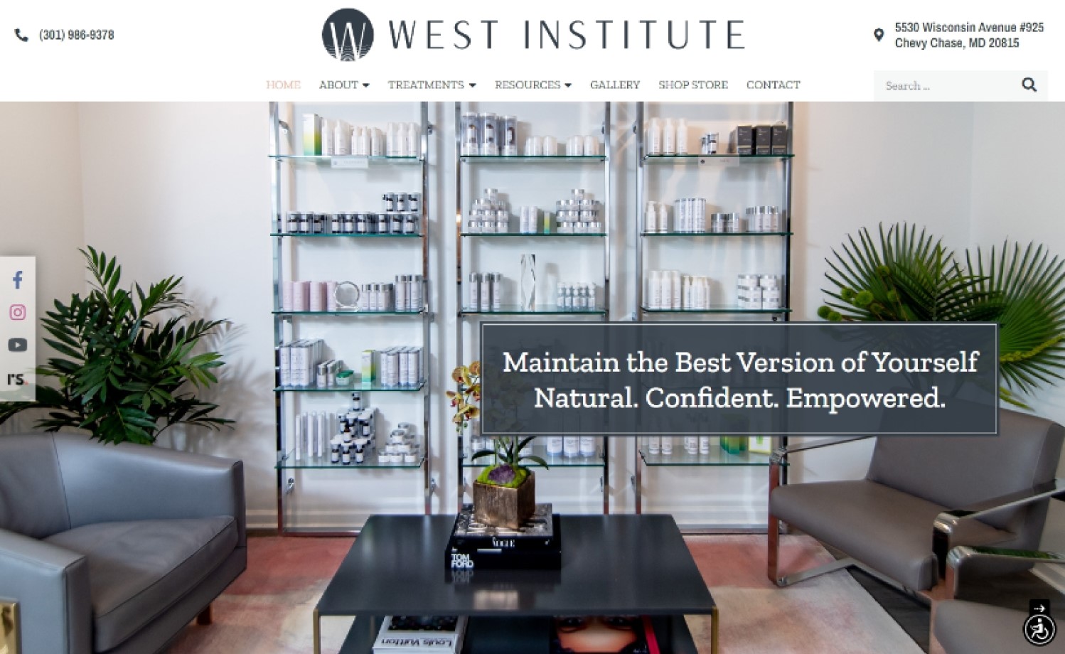
29. The West Institute
Why it works: The use of their logo’s design element throughout the site makes it feel more custom and personal. Overall, The West Institute’s website feels unique and modern. As for its ease of use, you can easily find dermatology information on their home page which is excellent.
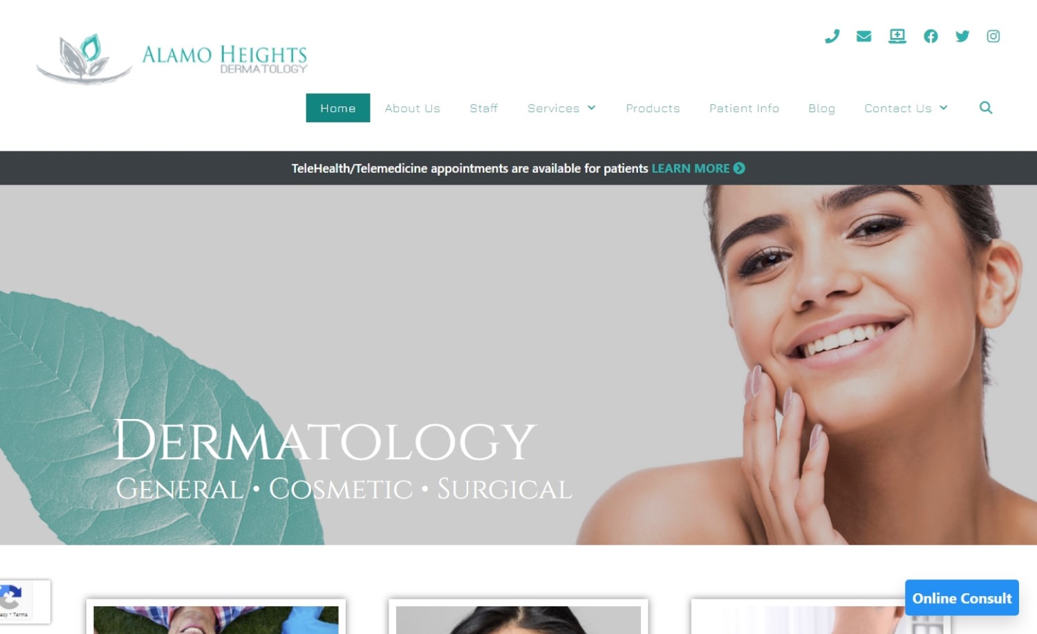
30. Alamo Heights Dermatology
Why it works: The website color theme of Alamo Height Dermatology, together with the elements used complements the company’s branding. The services section helps users find what category of services they are interested in and the simplicity of the site makes it easy to use.
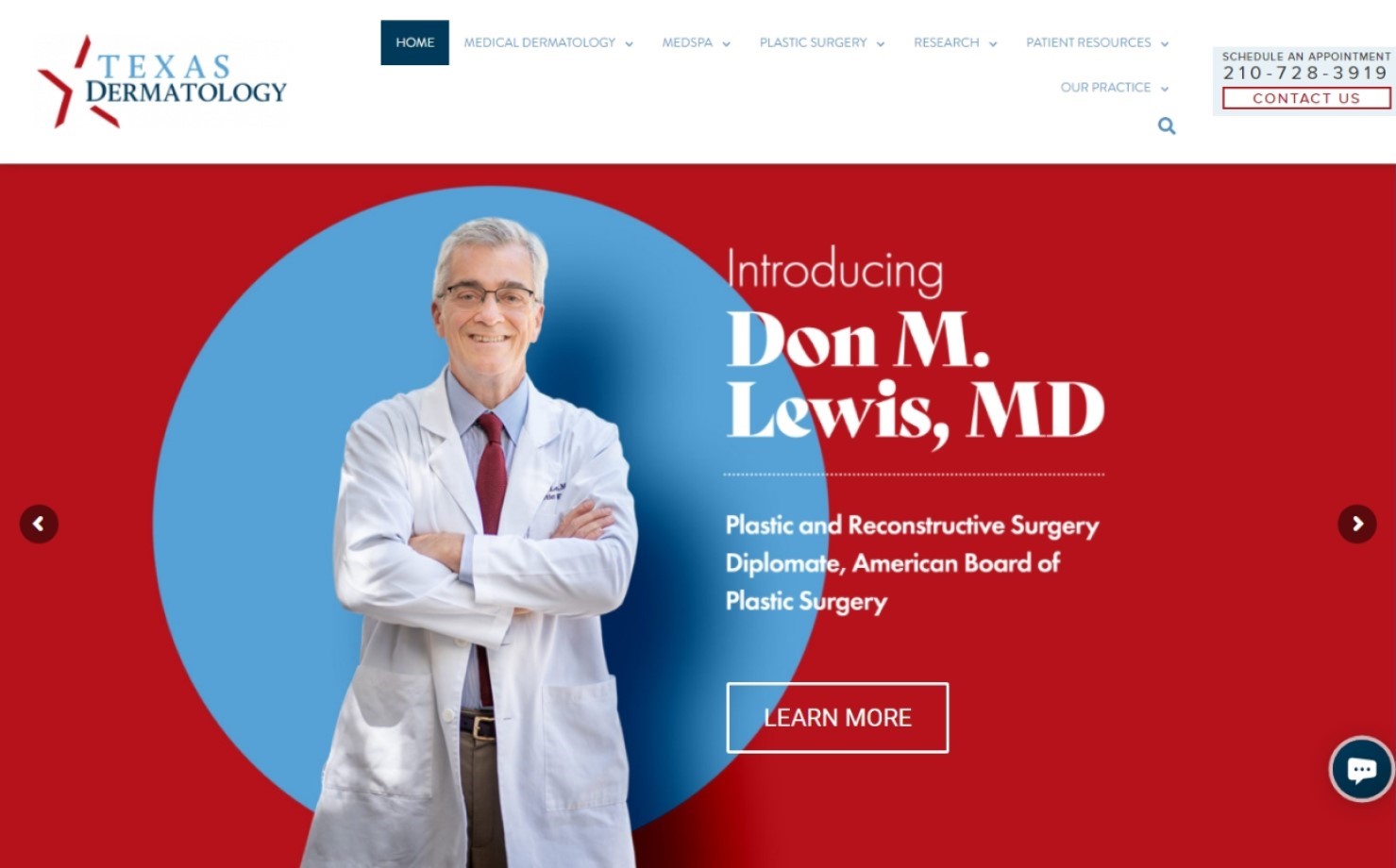
31. Texas Dermatology and Laser Specialists
Why it works: It’s always pleasing to have branding colors complement the website’s color theme, it makes the website feel more personal. Though this dermatology site has a lot of content, visitors will be able to find what they need since the structure is arranged effectively. They also have a useful dermatology news section, which explains certain skin conditions, dermatological conditions, and skin issues in detail.
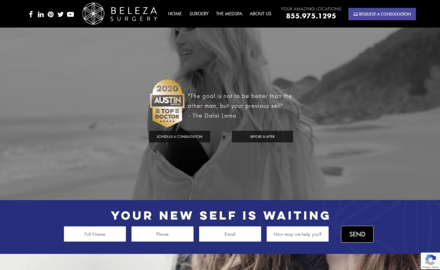
32. Beleza Med Spa
Why it works: Beleza Med Spa’s home page features a captivating video banner and a front and center call to action button. There is a section for the main dermatology categories along with other important information like the clinic’s awards and dermatology association affiliations. Overall, the website looks clean and organized.
Best Dermatology Websites
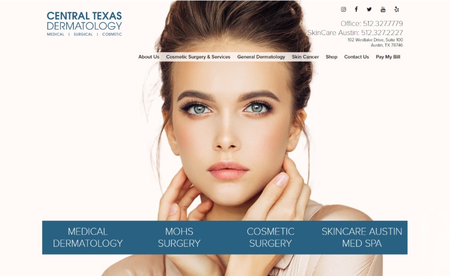
33. Central Texas Dermatology
Why it works: The images used in the Central Texas Dermatology website are attractive and engaging. The navigation is clear and the information is strategized and categorized in a way that visitors can easily follow. They also included quick links to Mohs surgery, cosmetic surgery, medical dermatology and skin cancer for easy access.
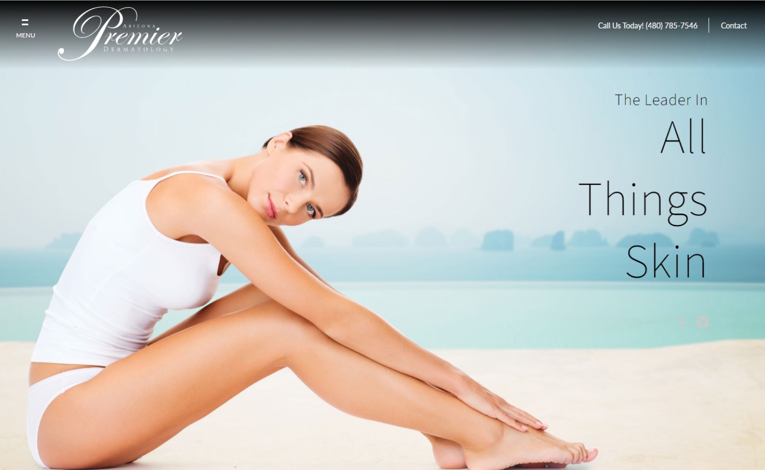
34. Arizona Premier Dermatology
Why it works: Arizona Premier Dermatology uses high-quality images for its hero section and all throughout its website. The site is designed with a pastel and earth tones palette. This provides for a calm and soothing dermatology website.
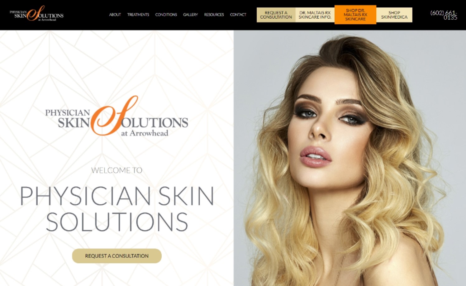
35. Physician Skin Solutions At Arrowhead
Why it works: Physical Skin Solutions at Arrowhead has an interesting design and layout. They upload images for the before and after section to highlight their medical accuracy results.
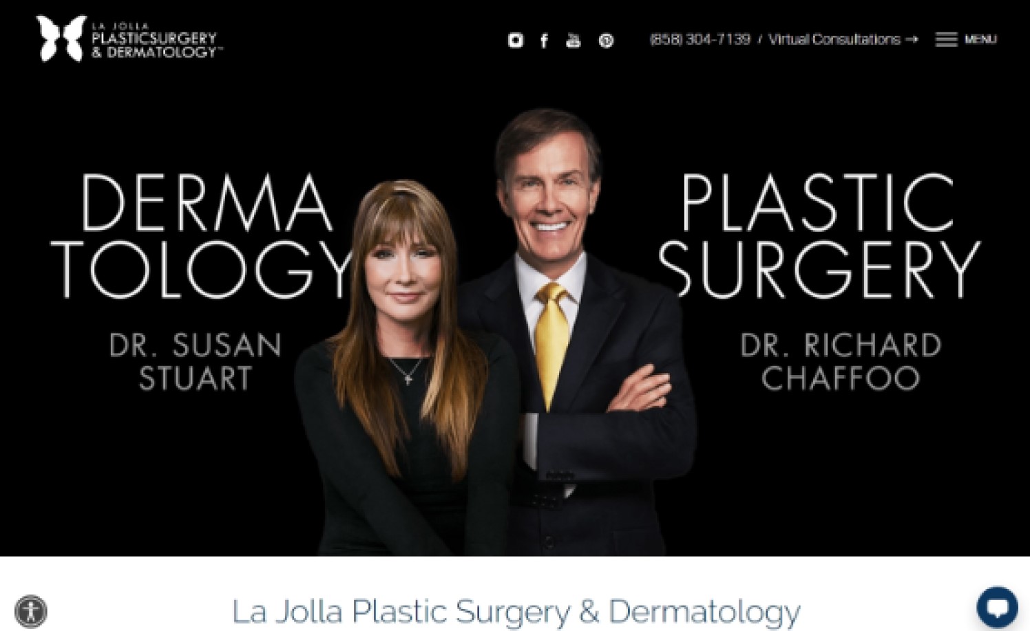
36. La Jolla Skin
Why it works: Despite being content-heavy, La Jolla Skin’s website is well structured and easy to navigate. This cosmetic surgery site uses high-quality images and a simple but nice typeface.
Top Skin Dermatologist Websites
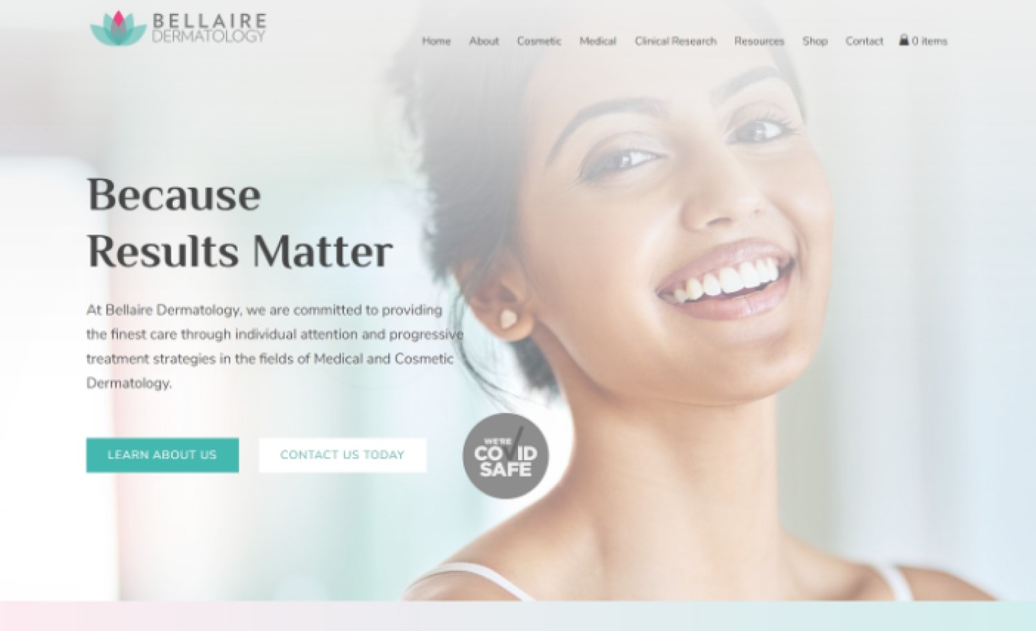
37. Bellaire Dermatology
Why it works: The website design is based on their brand color and logo, giving it a personalized feel. It also has a before-and-after section that showcases results of treatments from their board-certified dermatologist.
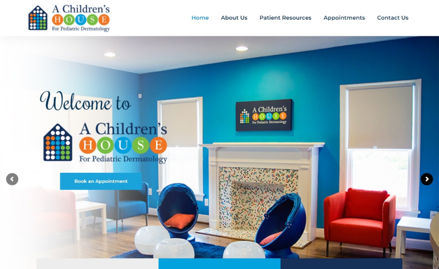
38. A Children’s House for Pediatric Dermatology
Why it works: The website design uses large images of children and vibrant colors to build the impression they are a pediatric dermatology clinic. This is an effective approach that will reach a targeted audience.
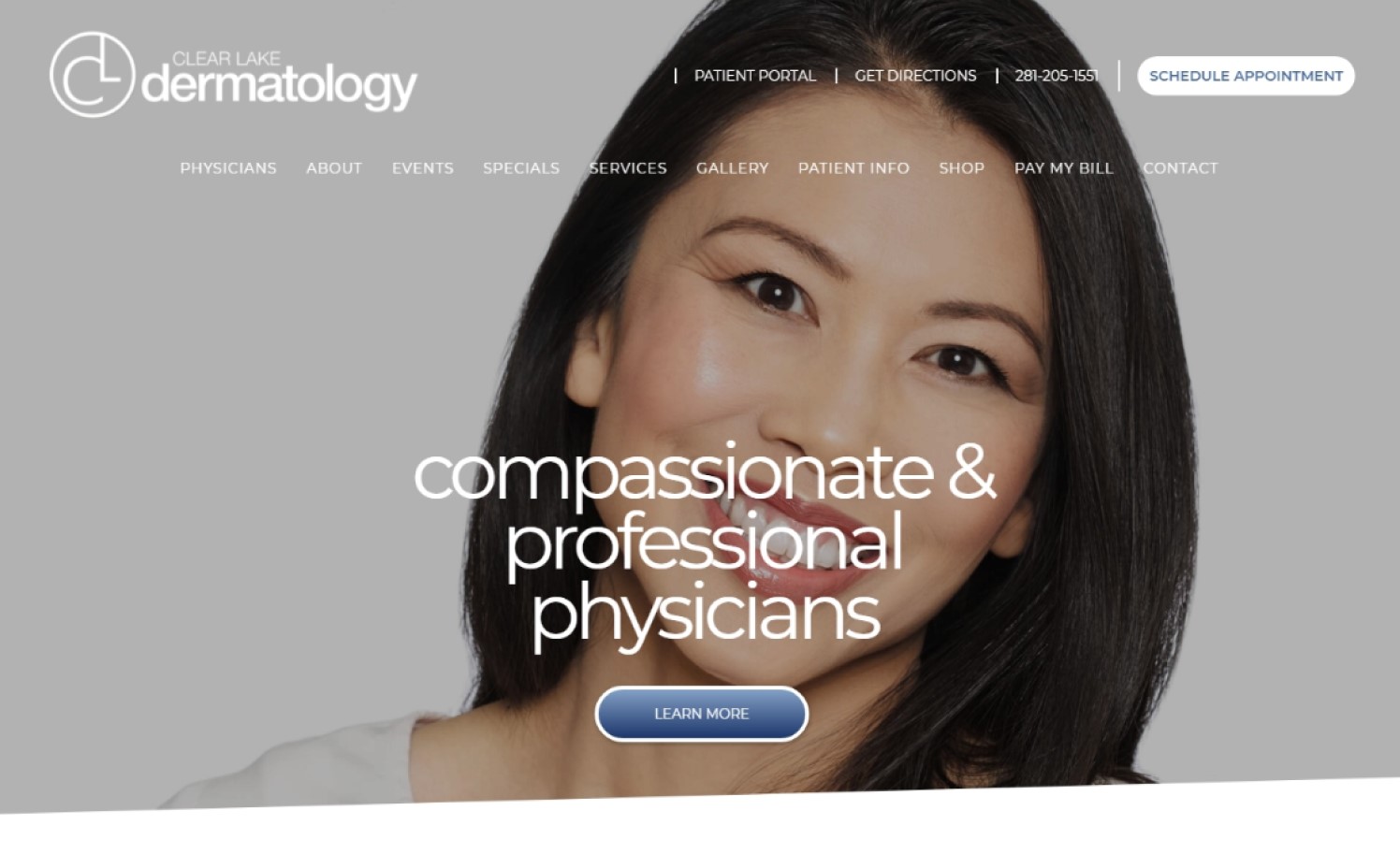
39. Clear Lake Dermatology
Why it works: Clear Lake Dermatology has an interesting page design that uses diagonal sections. The information about their doctor’s office, board-certified dermatologists, and services is presented on their home page well enough. It’s easy to navigate and find information with the help of their sticky navigation bar.
40. Dundee Dermatology
Why it works: This medical and cosmetic dermatology clinic uses colors and typefaces that look great with high-resolution images. The website is simple to navigate and all of the essential information is readily accessible.
Conclusion
The websites included on this list are aesthetically pleasing, informative, and function well to provide excellent user experience. If your site needs a new redesign or is just in need of some updates you’re in the right place.
We will design a custom mockup of your new website before you sign or pay for anything. There is nothing to sign and no payment information will be taken. If you like our design for your business we can move forward working together. If not, there are no hard feelings and no other obligations.