Event websites are a hot topic in the world of business marketing right now, and for good reason. Event websites can help you generate leads and create a buzz in the world before your event even takes place! Event website design styles have changed drastically over the past few years, with many companies opting to go live and showcase on social media sites like Facebook instead.
Event planners need to know which style is best for the community to get started. In this blog post, we will take a look at 40 different best event websites that range from simple and sleek to flashy and creative!
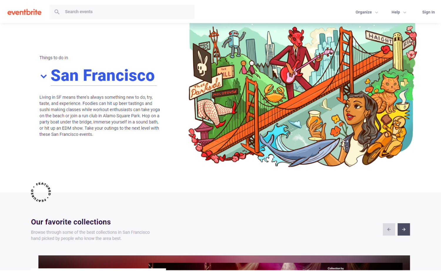
1. Eventbrite
Why it works: This event website is clean, modern, beautiful, and has a flavorful aesthetic despite the minimalist appearance. The generous use of white space provided the site with an extra professional look.
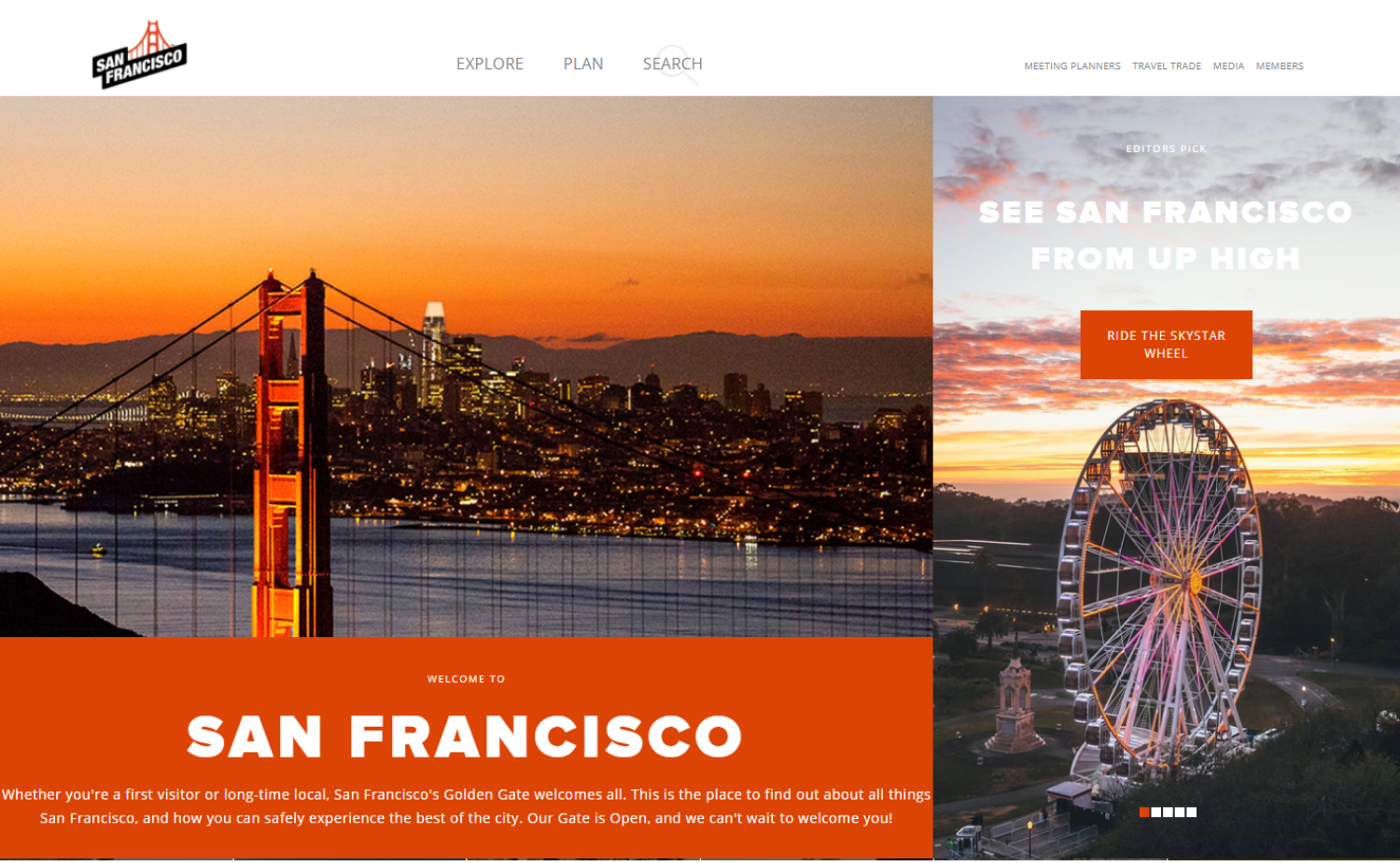
2. SFTravel
Why it works: A very vibrant event site with strong colors, the right choice of typefaces, and images that pique interest and engagement abound.
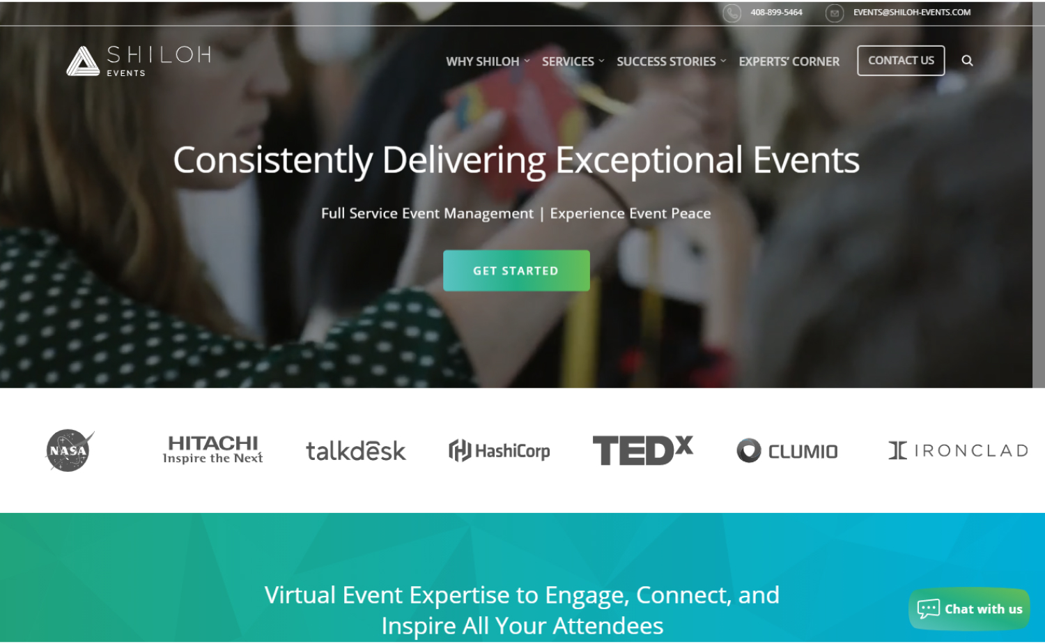
3. Shiloh Events
Why it works: The Shiloh Events website has a modern and elegant aesthetic with clear branding. The clean design of this website is easy to navigate or browse and provides all the information for visitors.
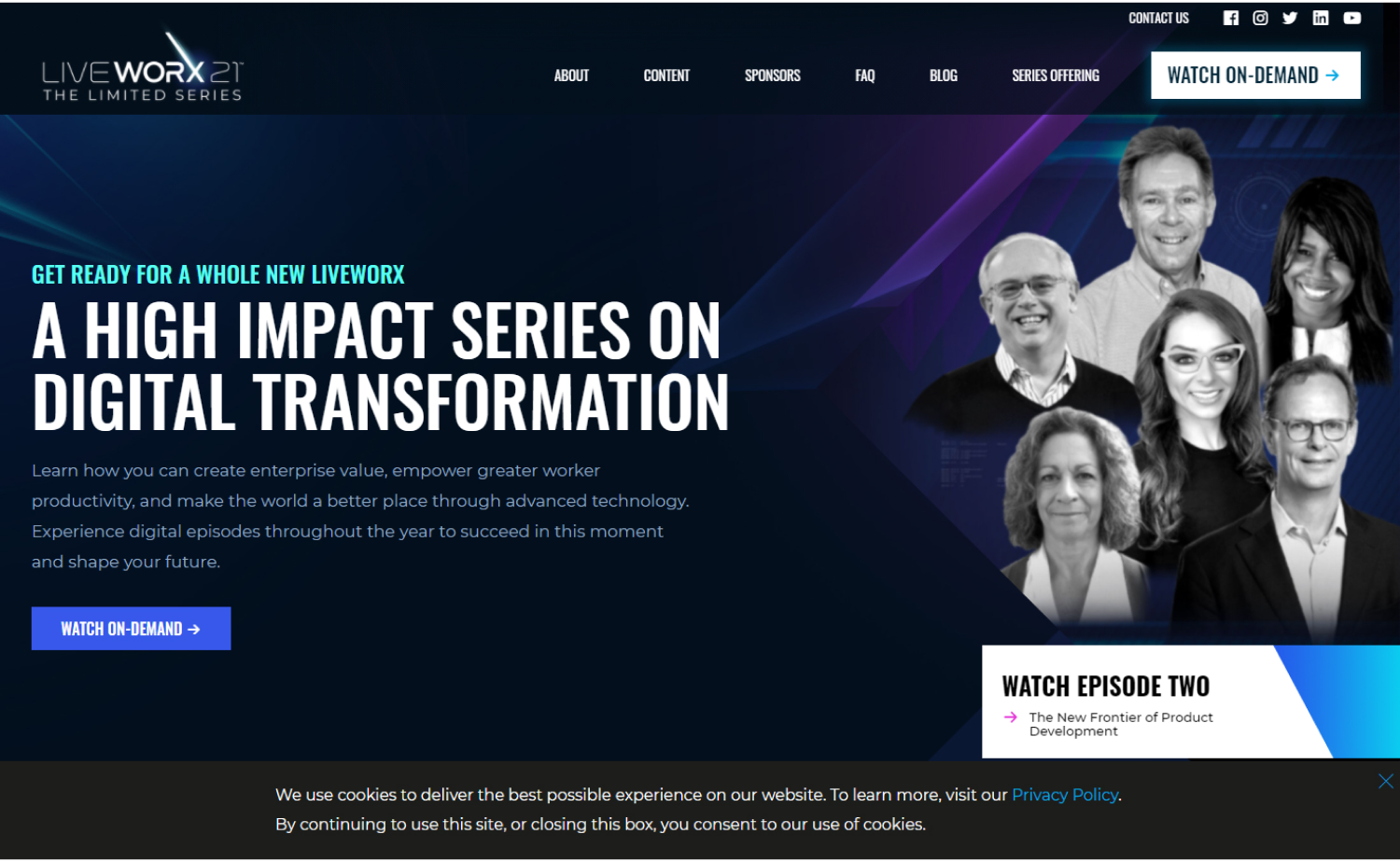
4. Live Worx
Why it works: Live Worx’s website, on the other hand, is quite different. This dark yet elegant event site has a subtle moving hero background. The website also uses ultra-modern animations and other features, making it an excellent choice for this list.
Events Websites
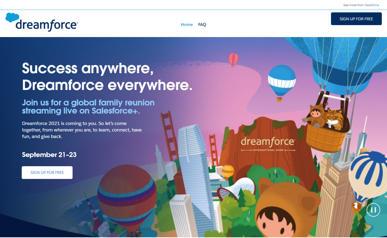
5. Dreamforce
Why it works: Fun, dynamic, active, and colorful—are some of the words we can use to describe this website. We also appreciate how the simple layout was created while still keeping things in the right place.
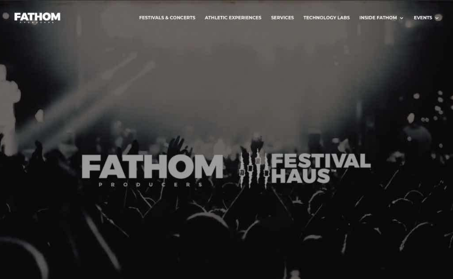
6. Fathom
Why it works: Fathom’s event website is brimming with amazing photographs and videos of their events. This great event site is jam-packed with fun and excitement, perfect for those who are looking to create a lasting impression.
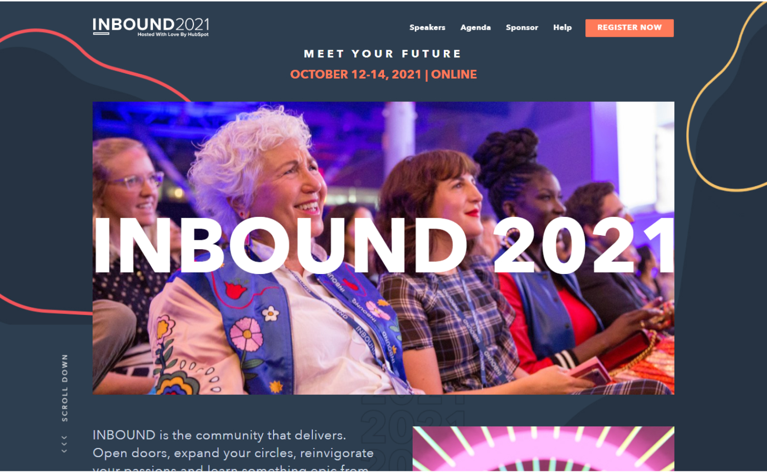
7. Inbound 2021
Why it works: The website’s aesthetic is based primarily on attractive personal photos that go well with their mission and branding.
8. Summit
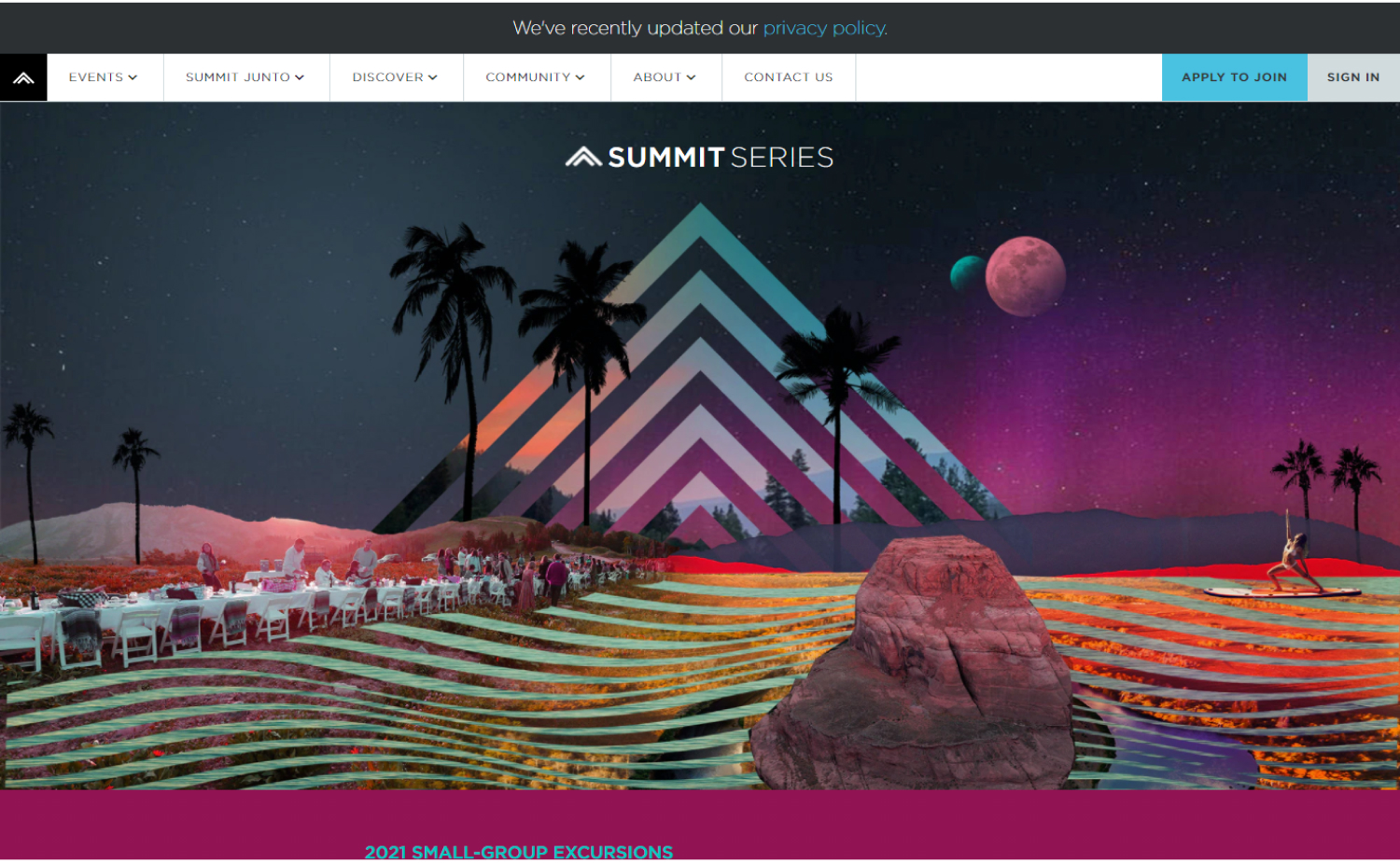
Why it works: This event website uses big, easy-to-read typefaces with bursts of bright color. It’s simple to find your way around the grid-style design.
9. Epicurrence
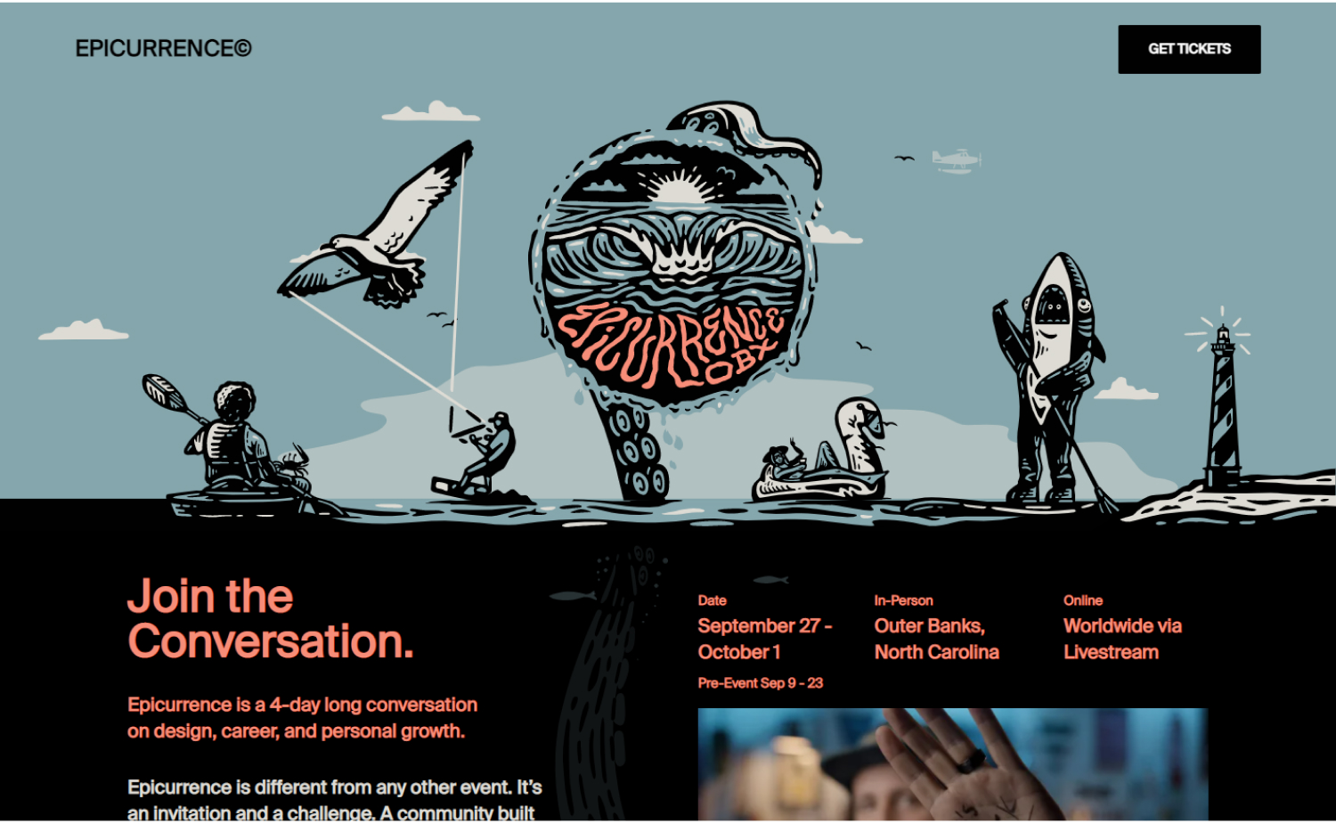
Why it works: Epicurrence’s dark-themed website effectively highlights the beauty of its work. Typography is used sparingly but to great effect, and the use of a custom font reinforces the unique identity of this event website.
Best Events sites
10. Coachella
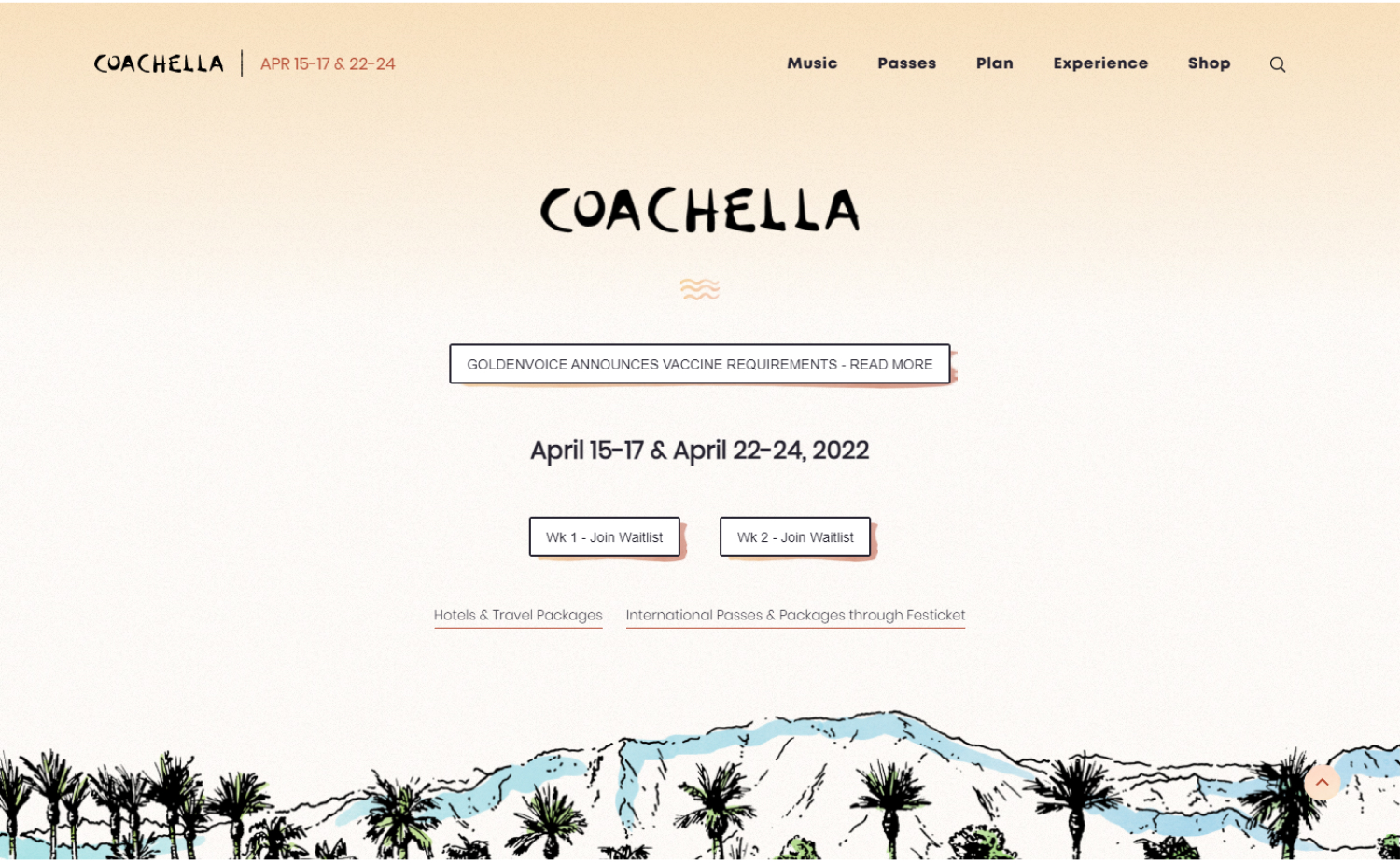
Why it works: We like the cleanliness of this site, which is on point. We appreciate how neatly this event website is designed and how simple and compact it is. The number of high-quality photos is another selling feature as well.
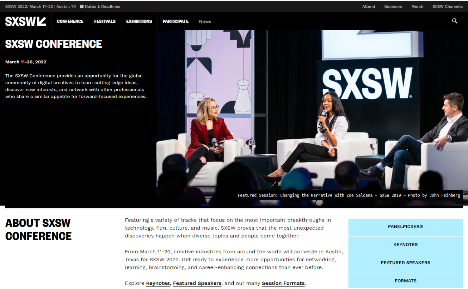
11. SXSW
Why it works: The website of SXSW is one of the neatest on the list. The white space is visually pleasing. Even though they offer a lot of material, they were able to make the design appear sleek and minimal.
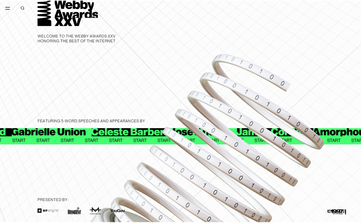
12. Webby Awards
Why it works: What we like about this event website design is the gorgeous mix of greyscale tones with just the right splashes of mint green across the homepage. The inner pages are very creative, interactive, and entertaining.
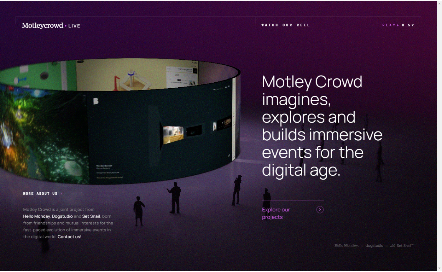
13. Motley Crowd
Why it works: The use of animated graphics and videos distinguishes Motley Crowd from any other best event website designs, making it unique. They also included a mouse effect interaction to help it stay exciting.
14. Make Me Pulse
Why it works: The site’s distinctiveness comes from how it incorporates and balances the use of large images, big headers, and cartoony characters.
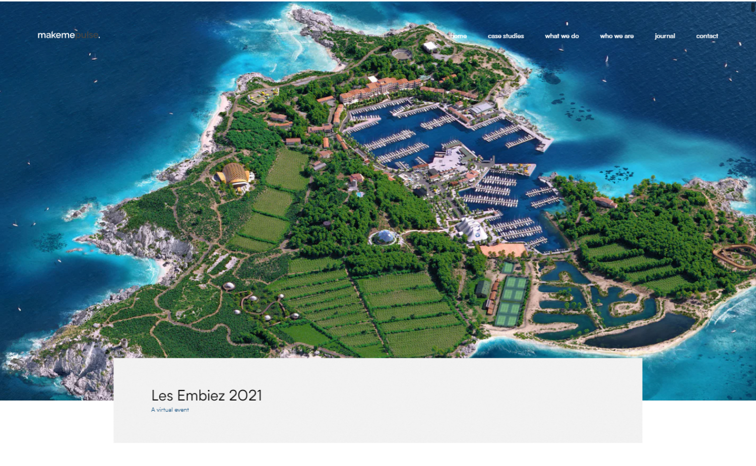
makemepulse.com/case-study/les-embiez-2021
Top Events Websites
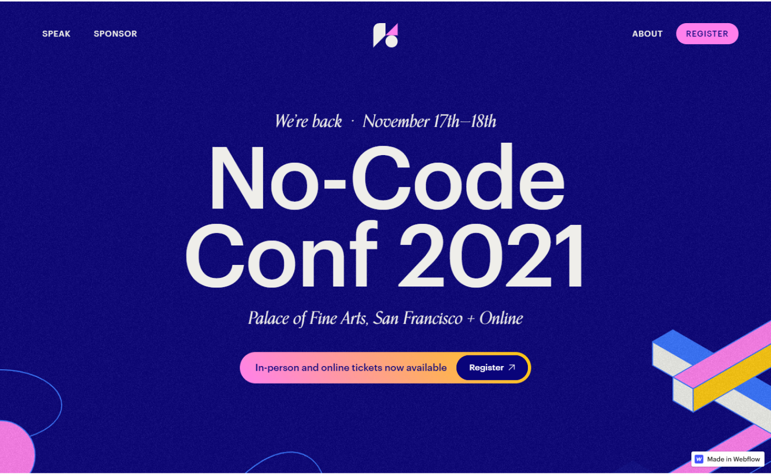
15. No-Code Conf 2021
Why it works: One-of-a-kind custom web design with flowing shapes and interesting graphics. We love the amount of art put on the website as a whole, all without the expense of usability.
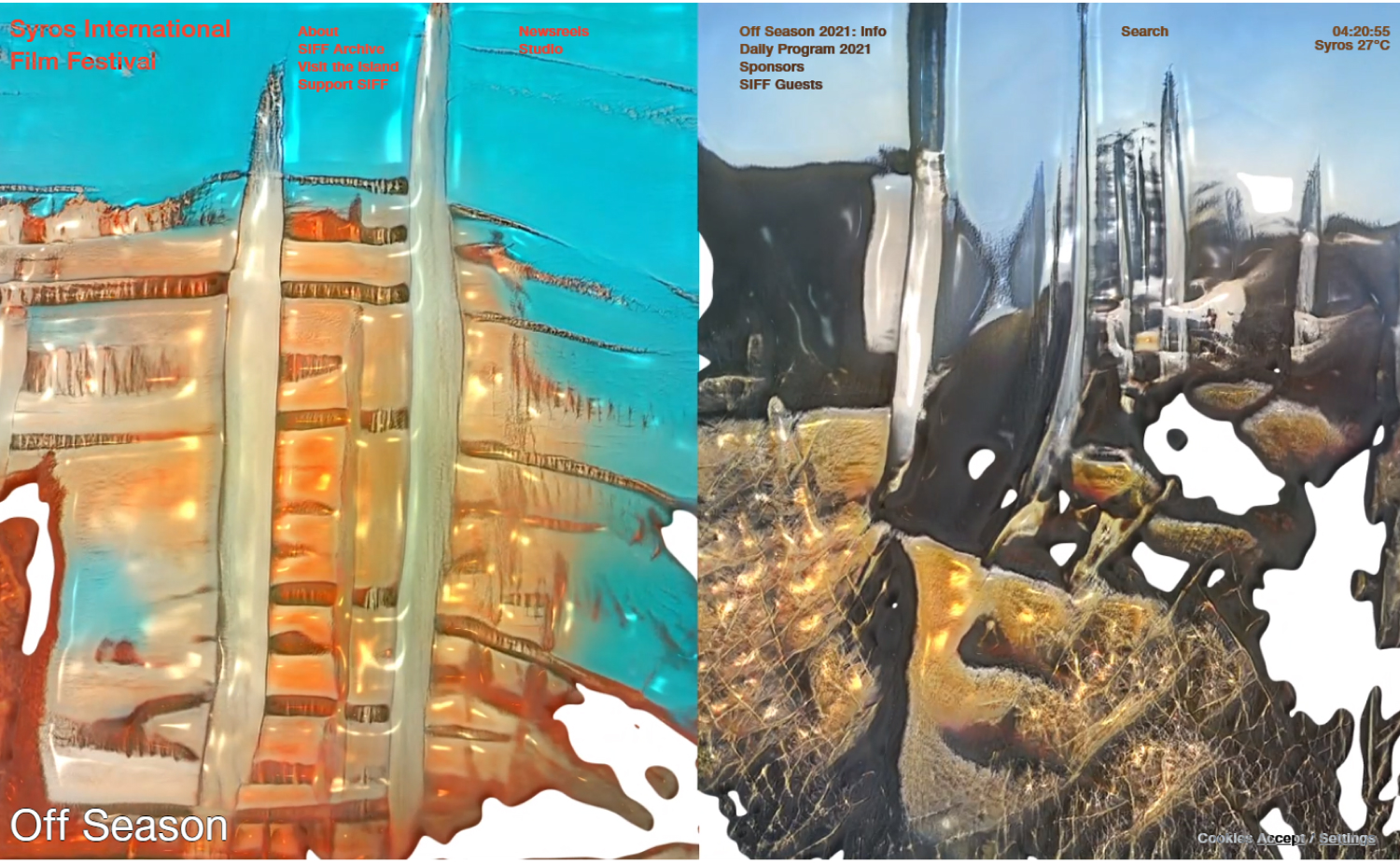
16. Syros International Film Festival
Why it works: The diverse photos and films on this website will entice visitors to scroll through to the rest of the site. The layout is simple and easy to navigate with a large focus on visuals that tell a story.
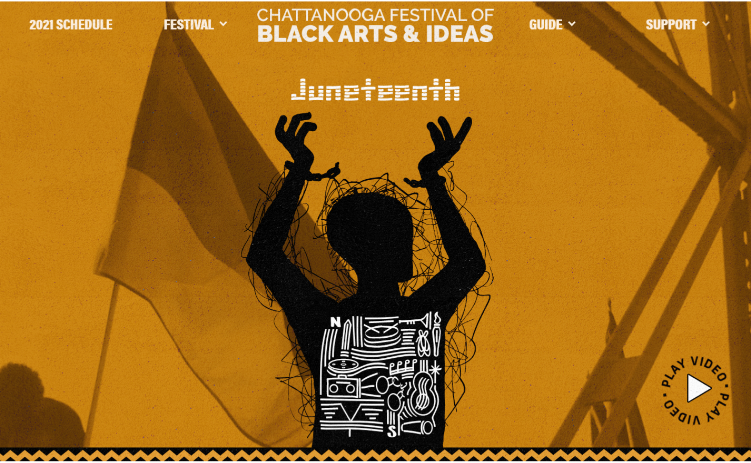
17. Black Arts & Ideas
Why it works: What we love about the design of this event website is the artistic use of images and line drawings to create a brand new experience for everyone. It also didn’t feel dry or uneasy because of the amazing colorful art from top to bottom.
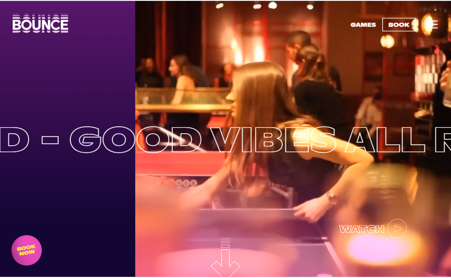
18. Bounce Pingpong
Why it works: A very trendy and fun-looking event website. The use of the animation and video on the hero section brings life to the site.
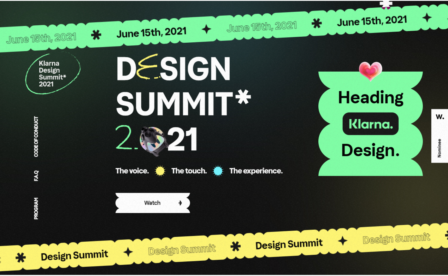
19. Design Summit 2021
Why it works: We love this great event website because of the use of festival colors against the dark background. Simple yet engaging.
Events Websites for Inspiration
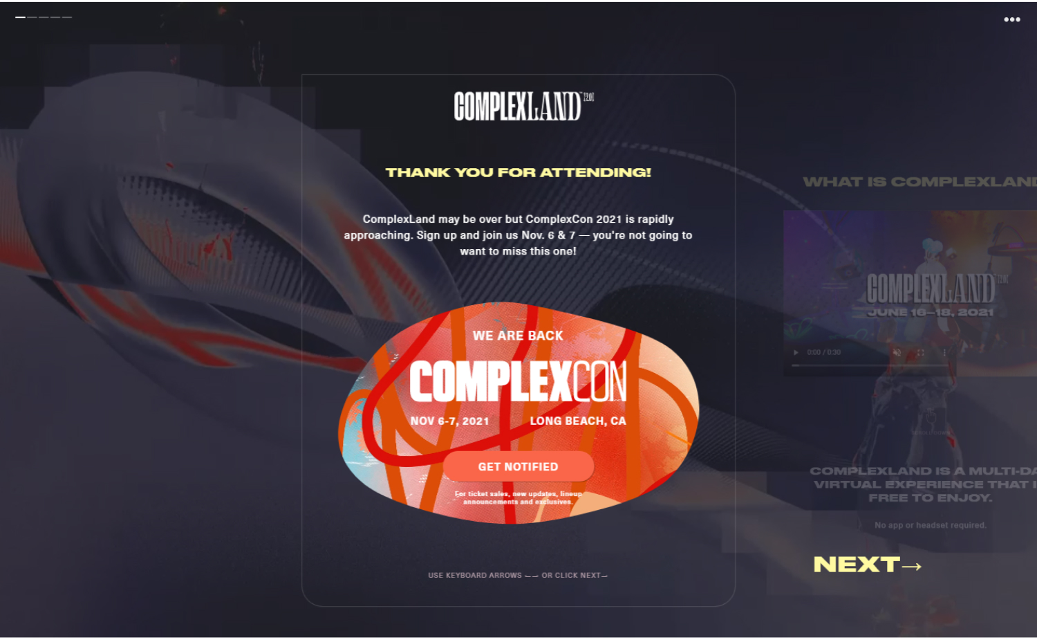
20. Complex Land
Why it works: The site has a modern layout and style with just the right amount of text and images. The hero section’s video doesn’t overpower the rest of the site. The overall atmosphere is calm yet full of vitality.
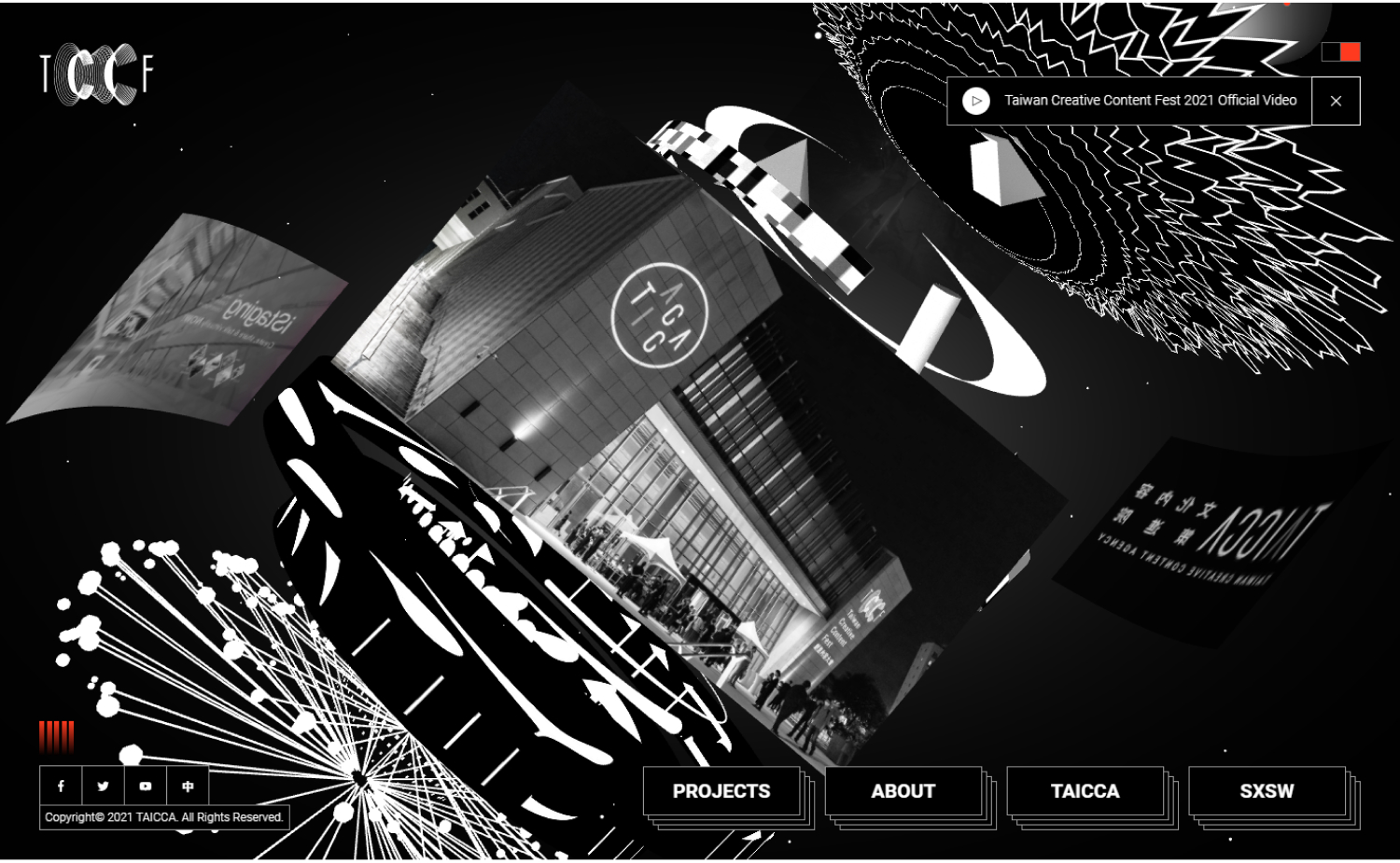
21. SXSW 2021
Why it works: This is a good dark-themed website design. Excellent use of black and white with an orange accent color.
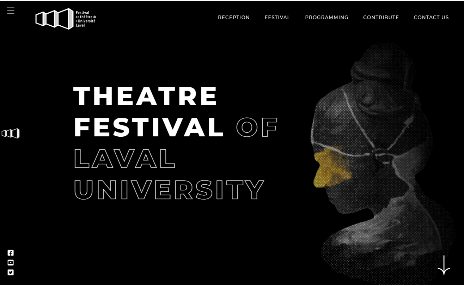
22. Theatre Festival of Laval
Why it works: Theatre Festival of Laval has a dark aesthetic that not only has high-quality images and graphics, but also large loud typography that draws the attention of visitors.
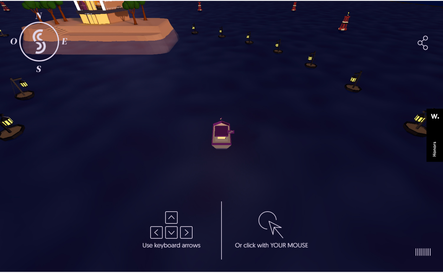
23. Passation Synerghetic
Why it works: It’s one of a kind. It has no scroll, but it does offer many interactions. The advantage is that you may navigate a 3D boat with complete control and easy navigation to see all the concealed pieces of information.
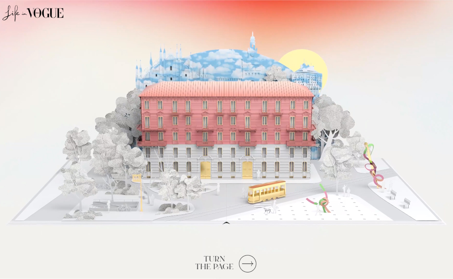
24. Life in Vogue
Why it works: This great event website has an interactive and immersive quality that makes it feel like a complete entertainment and festival experience. You’ll be transported to a whole new world when you go through their creative site.
Best Events Sites
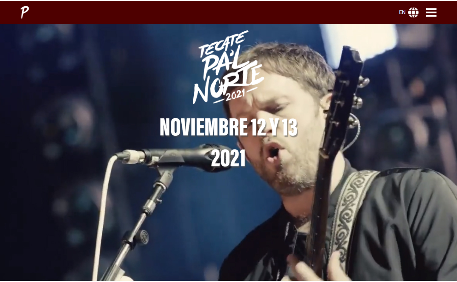
25. Tecate Pal Norte
Why it works: A decent mixture of aesthetics, functionality, contrast, and simplicity of use. This good event website is extremely professional.
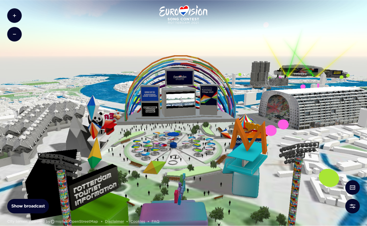
26. Euro Vision
Why it works: A decent mixture of aesthetics, functionality, contrast, and simplicity of use. This good event website is extremely professional.
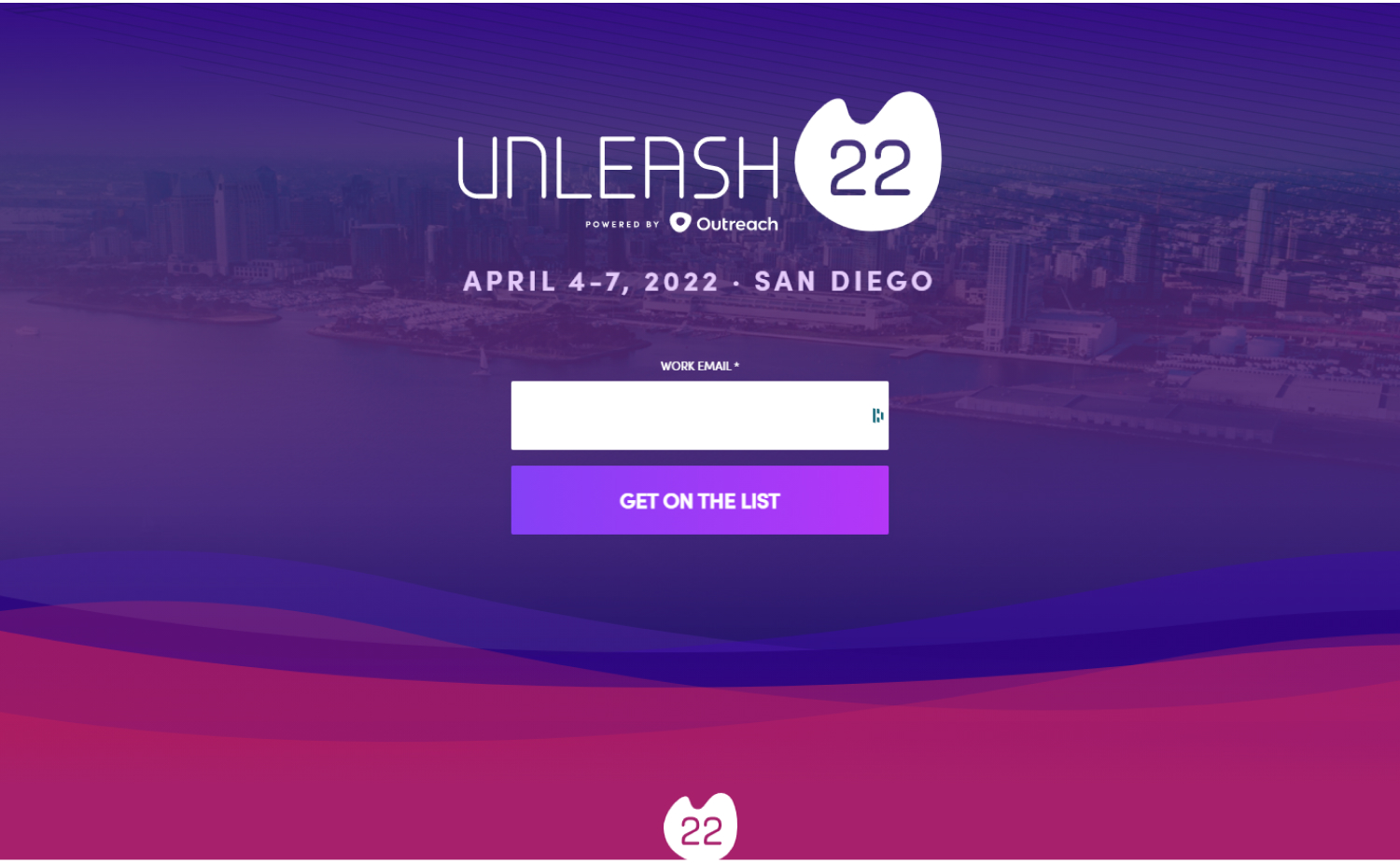
27. Unleash 22
Why it works: To engage both customers and prospects, Outreach put up a kind of “save the date” event page— for the attendees. Simple, colorful, and creates an exciting festival feel for what’s to come.
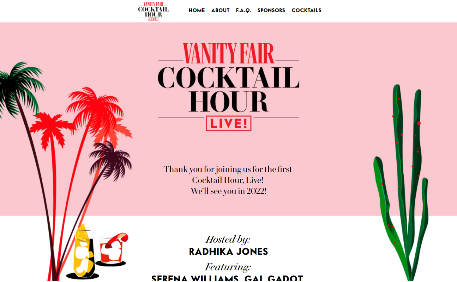
28. Vanity Fair
Why it works: With a muted color palette, unique fonts, and a minimal look, the site looks more like a poster than an event page. This gives it a high-end, exclusive feeling.
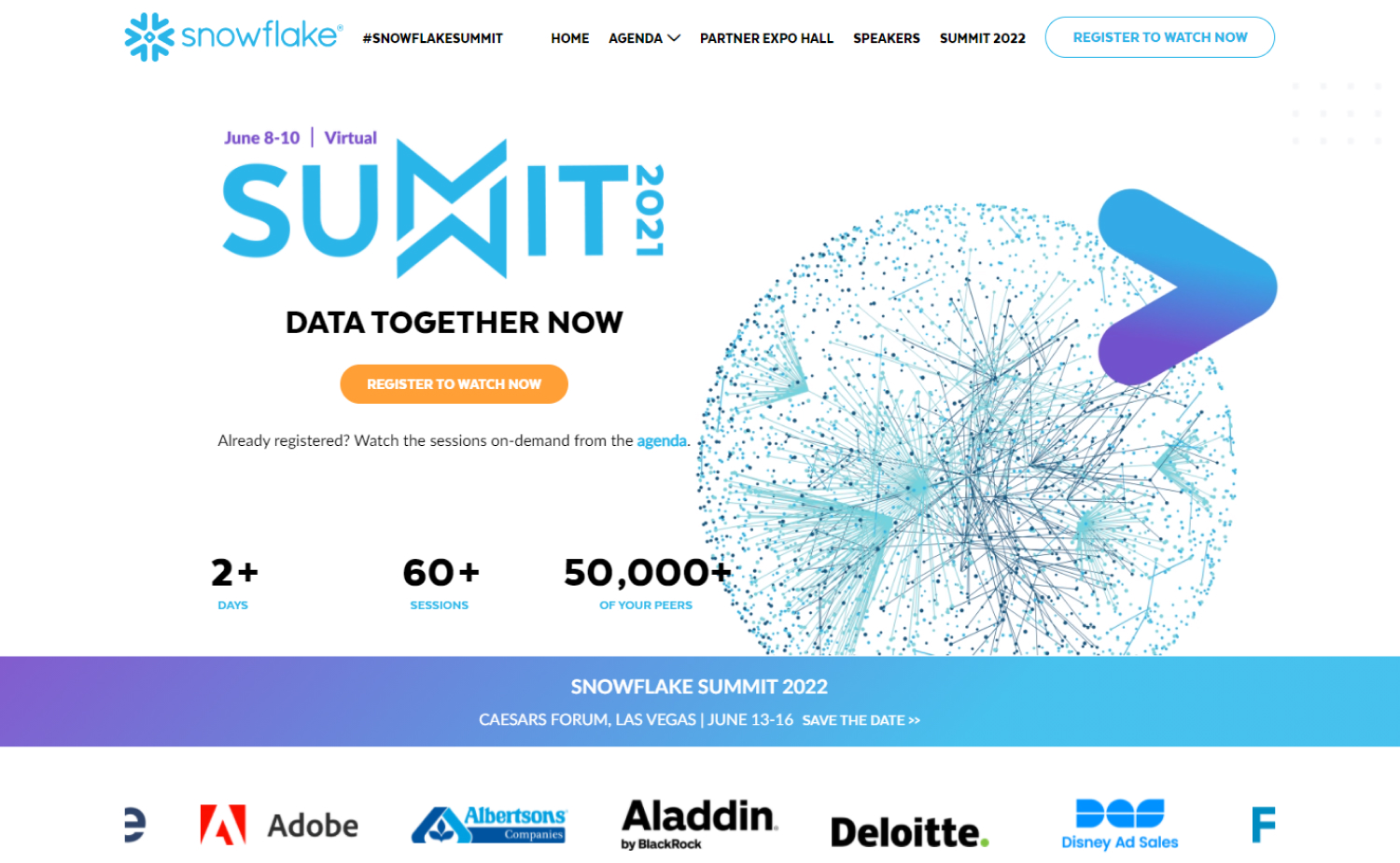
29. Snowflake Summit
Why it works: On-point branding. We like the 2022 event CTA in front and center. The website overall is beautiful and easy to navigate, with a modern look and feel.
Events Websites to love
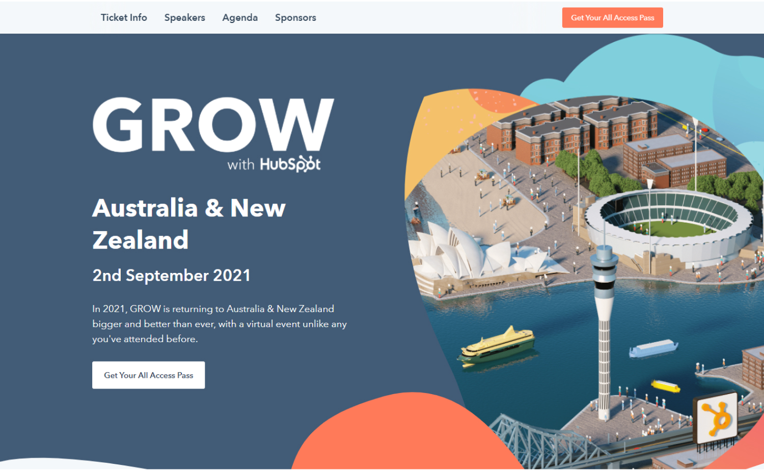
30. Grow
Why it works: Simple navigation across the top, a clear call to action, and the front-and-center brand made this an effective event website for the company.
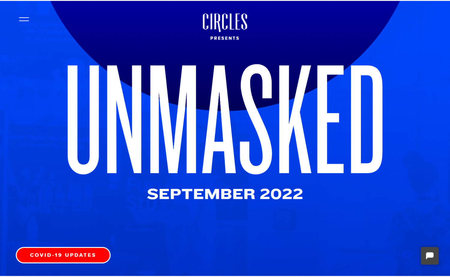
31. Circles Conference
Why it works: For an event experience that’s still more than a year away, this event website goes out of its way to get potential community attendees excited.
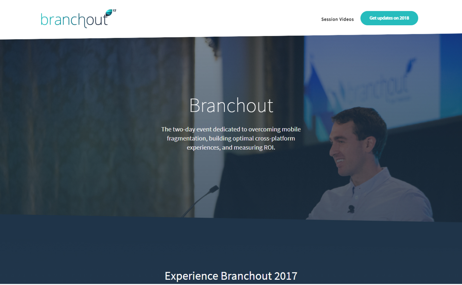
32. Branchout
Why it works: Not all event websites need to be flashy with impressive graphics. Branchout uses a simple and clean design to resonate with the target audience and align with the event vision.
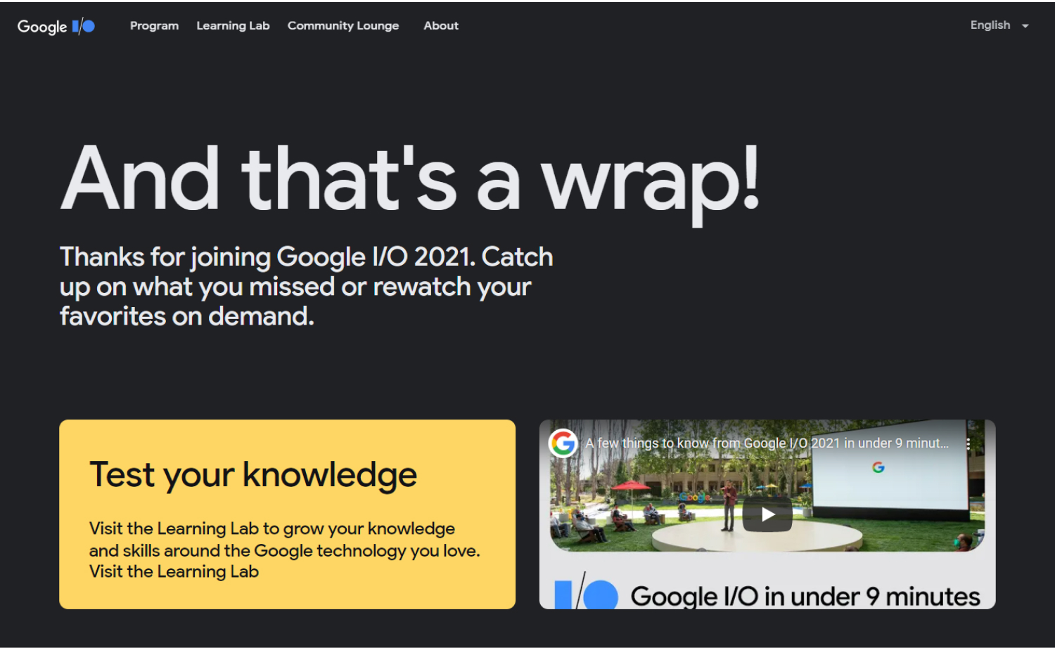
33. Google Events
Why it works: Big bold graphics, super large font size, focused on quality over quantity. This event website is perfect for a company that wants to put on a large-scale, impressive and creative event.
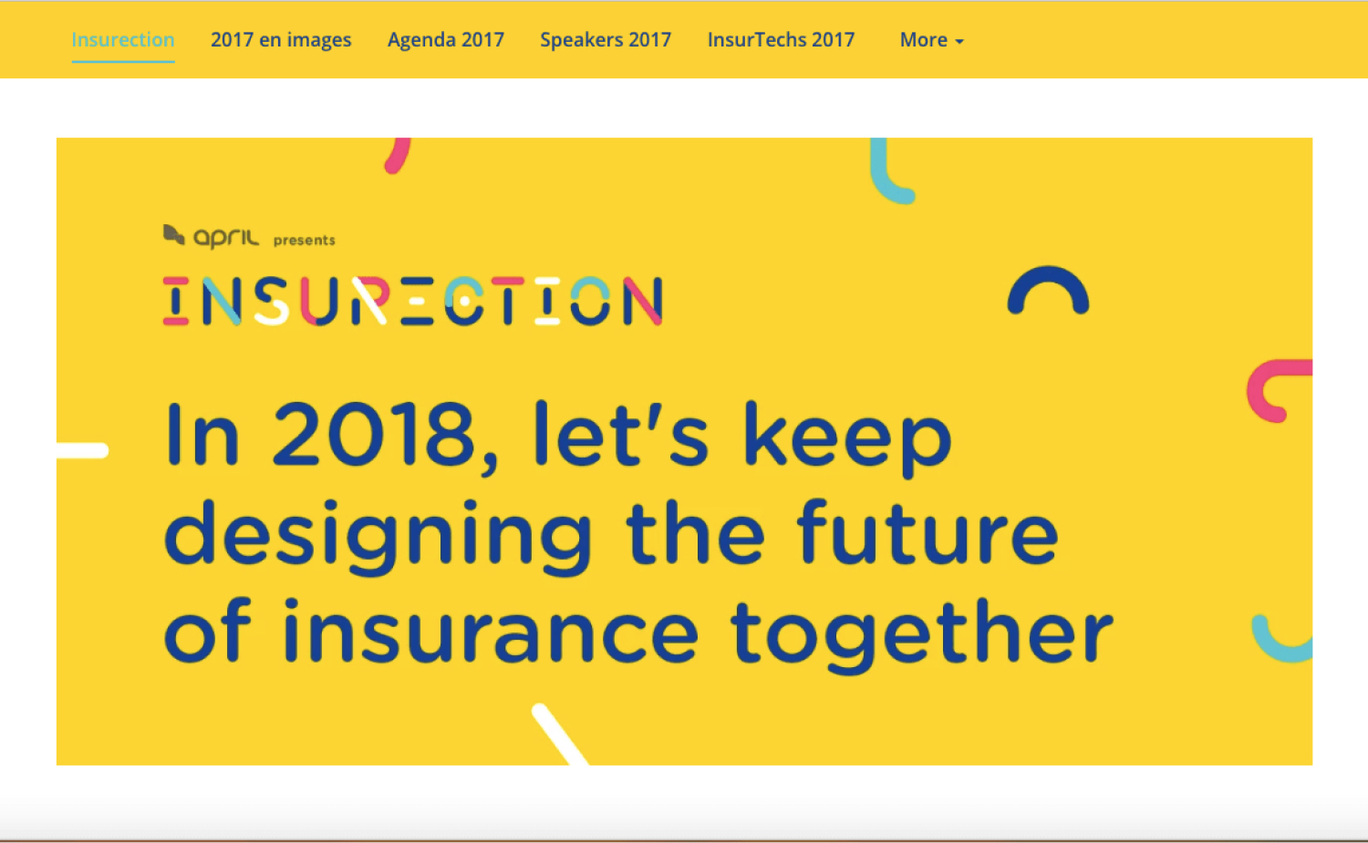
34. Insurection
Why it works: The vibrant yellow banner, like the varied palette of colors and shapes used across the website, is entertaining.
Top Events Website Design
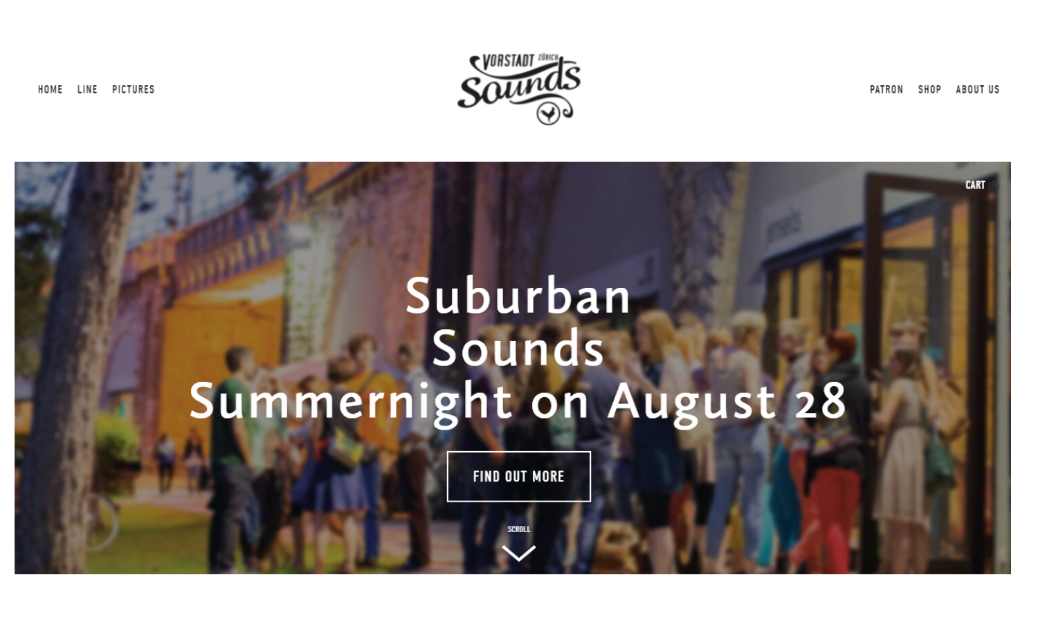
35. Vorstadt
Why it works: We adore how this site is both simple and beautiful. Minimalism at its finest! It has a very classic feel with an elegant layout and tasteful typography.
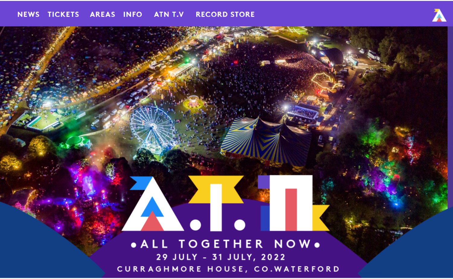
36. All Together Now
Why it works: This is a cheerful and fun website. The web designer used colors and designs that blend well with the company’s branding.
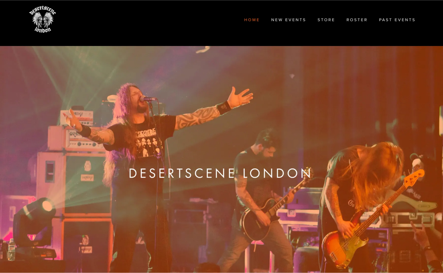
37. Desertscene
Why it works: Short, simple, but delivers the right message and does it very well. The hero background for the hero area brings the whole website to life.
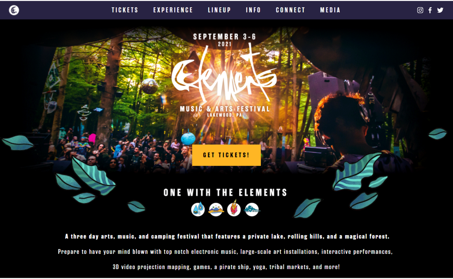
38. Elements
Why it works: This music and arts event’s website is both fun and innovative. Elements’ website features a unified aesthetic that is attractive.
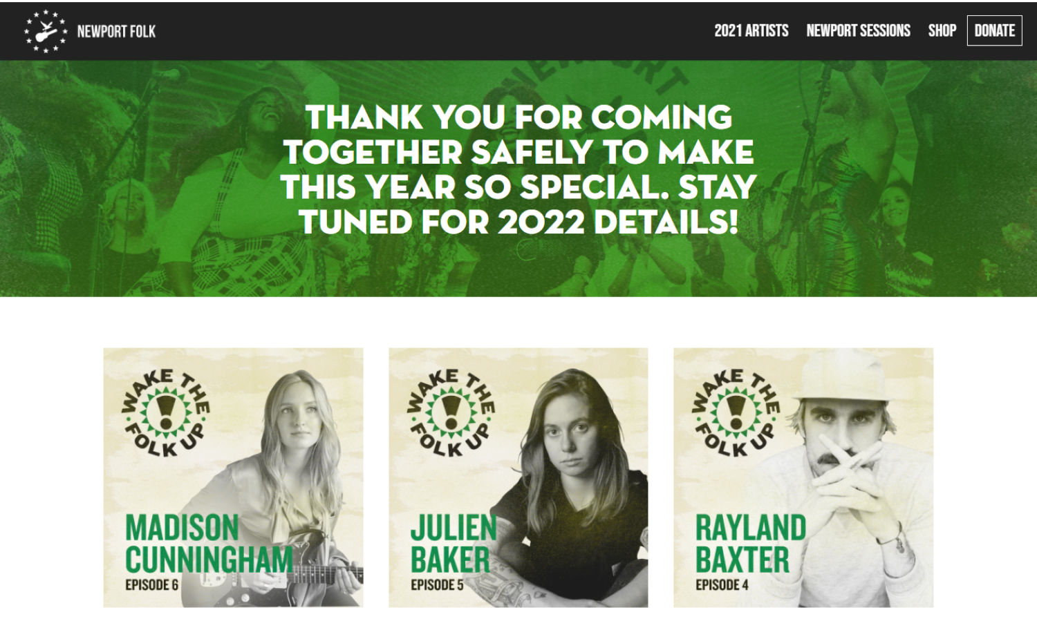
39. Newport Folk
Why it works: Grid-style home page is easy to navigate and looks great on mobile. The image treatment is cohesive and on-brand.
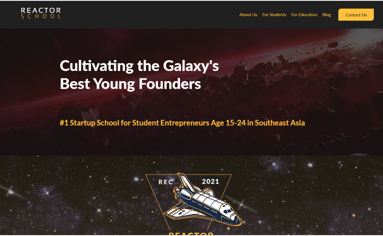
40. Reactor
Why it works: The website for Reactor is appropriate for its mission. The space-themed website demonstrates that these youngsters’ horizons are limitless.
Conclusion
We’ve given you a few of the best event website design styles on the market. If you want to know which one will work best for your own event website, contact us and we’ll help find out!
We will design a custom mockup of your new website before you sign or pay for anything. There is nothing to sign and no payment information will be taken. If you like our design for your business we can move forward working together. If not, there are no hard feelings and no other obligations. Click the button below to learn more.