Lab website designs are an important part of any laboratory, research facility, university, or scientific institution. These sites vary in their design and functionality, but they all share the same purpose: to provide information about what is happening inside that lab. The best lab websites list has been compiled using several factors including website popularity, design elements, ease of use, functionality, content quality, and more. We hope you find this list useful!
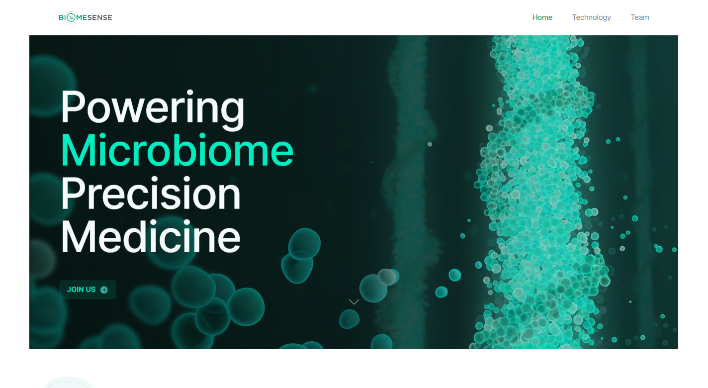
1. Biome Sense
Why it works: Visiting this laboratory website is a fascinating experience, the color theme, structure, and ease of use are great but what stands out is how effectively they represent every piece of information to the user. Their use of animations on the page, whether it was controlled, scroll-triggered, or static were all thought out which makes them attractive tools in marketing.
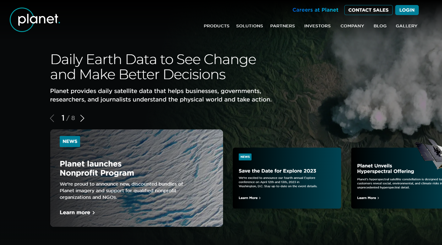
2. Planet Labs
Why it works: Without reading any further, this laboratory website has an interesting hero image that expresses who they are and their services. On-point icons, pictures, and videos are used to clearly convey all vital information. Visitors can easily explore the entire website by using the sticky navigation menu.
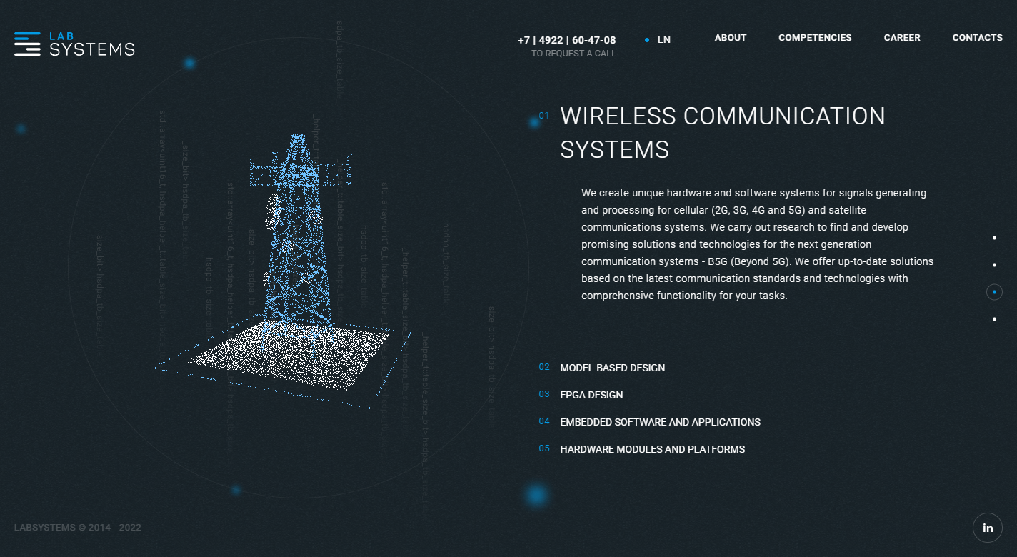
3. Lab Systems
Why it works: By using custom graphic animations, Lab systems made its website professional and captivating. The use of blue and white foreground colors complements the carbon-colored background which really makes it easy for the eyes of website visitors.
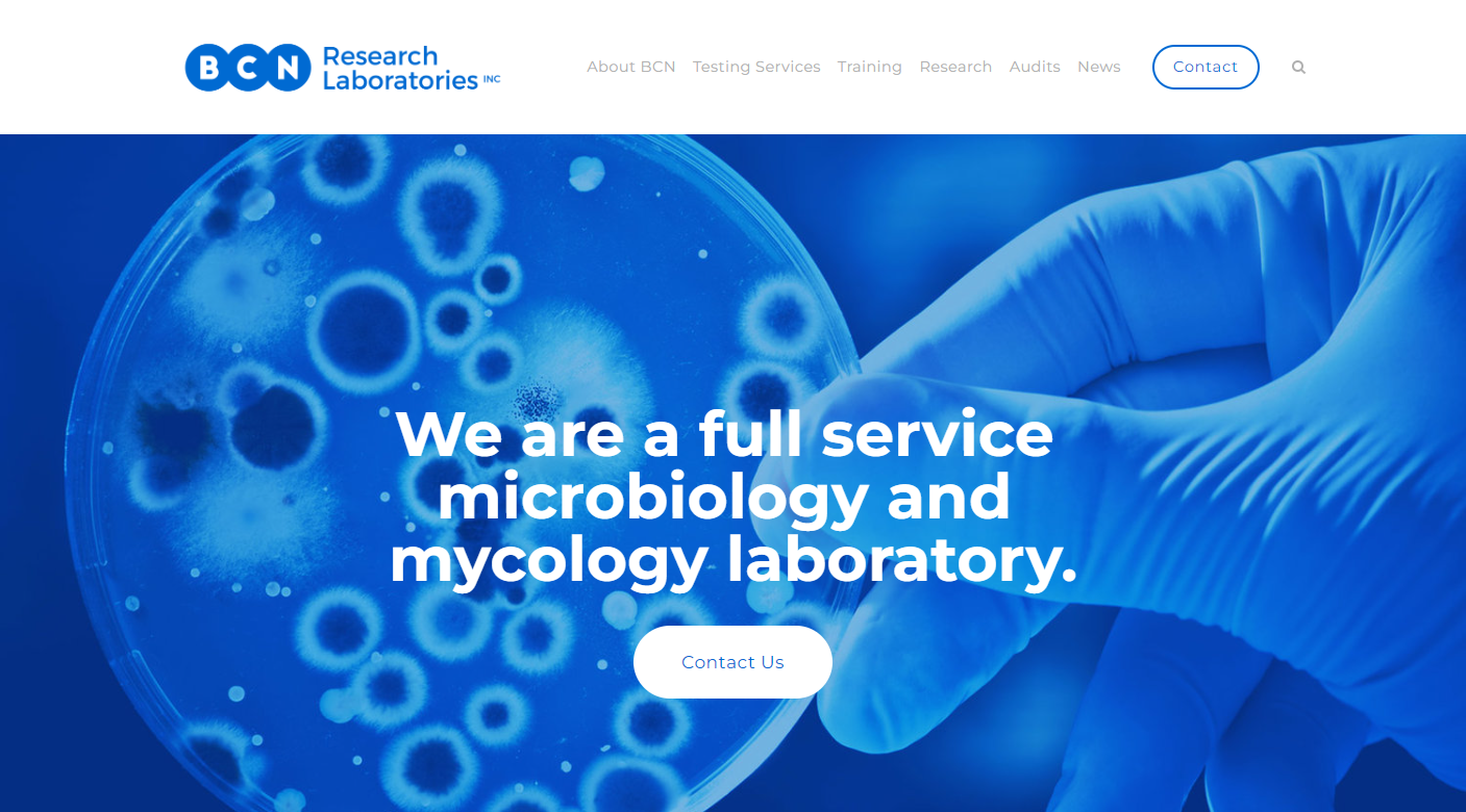
4. BCN Research Laboratories
Why it works: The design might be monotone, but BCN Research Laboratories’ use of blue goes well to their advantage as it makes their research laboratory website professional, calm and serene. Their use of section blocks on their home page helps them present important information to their target audience.
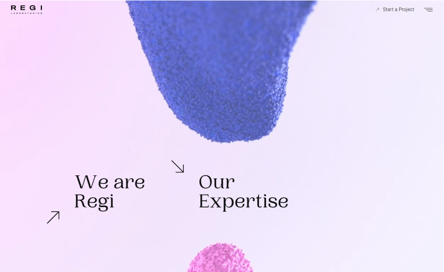
5. Regi Laboratories
Why it works: Regi Laboratories’ use of animations made its home page fun and carefree. Overall, the design uses a lot of colors but interestingly they all blend well together which is a perfect representation of what the company does.
Lab Website Design
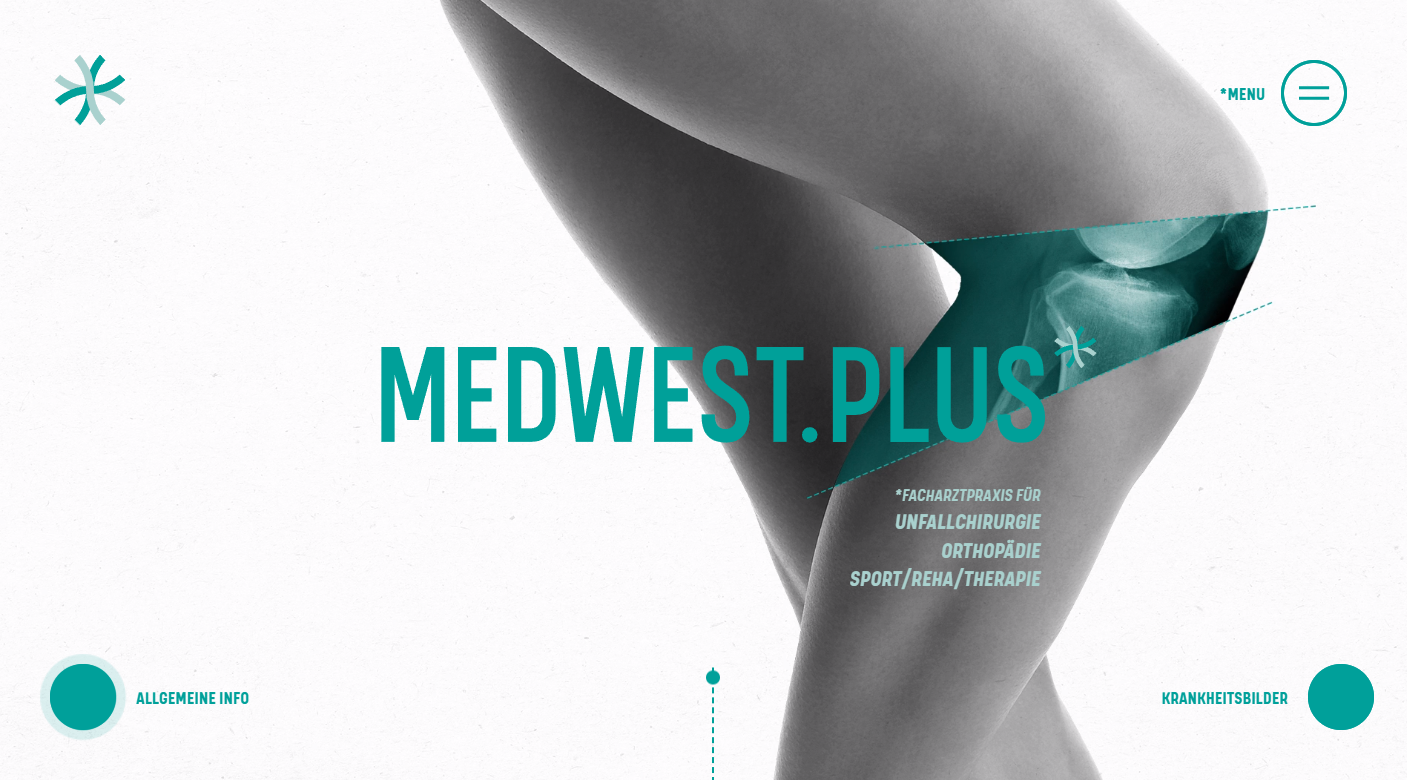
6. Medwest.Plus
Why it works: Great use of web animated hero section to represent their new services and specialty. Medwest Plus has an engaging website page that utilizes hovers and scrolls for its web interactivity. The use of a single color on a page is tricky but they managed to blend it well with the web element’s transitions and movements.
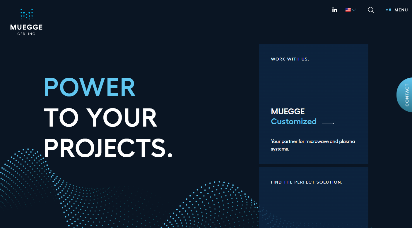
7. Muegge
Why it works: Muegge has an unorthodox laboratory website design, the design elements looks modern and has great transitions of light to dark backgrounds. The colors blend well and there is enough important white space, especially on dark backgrounds.
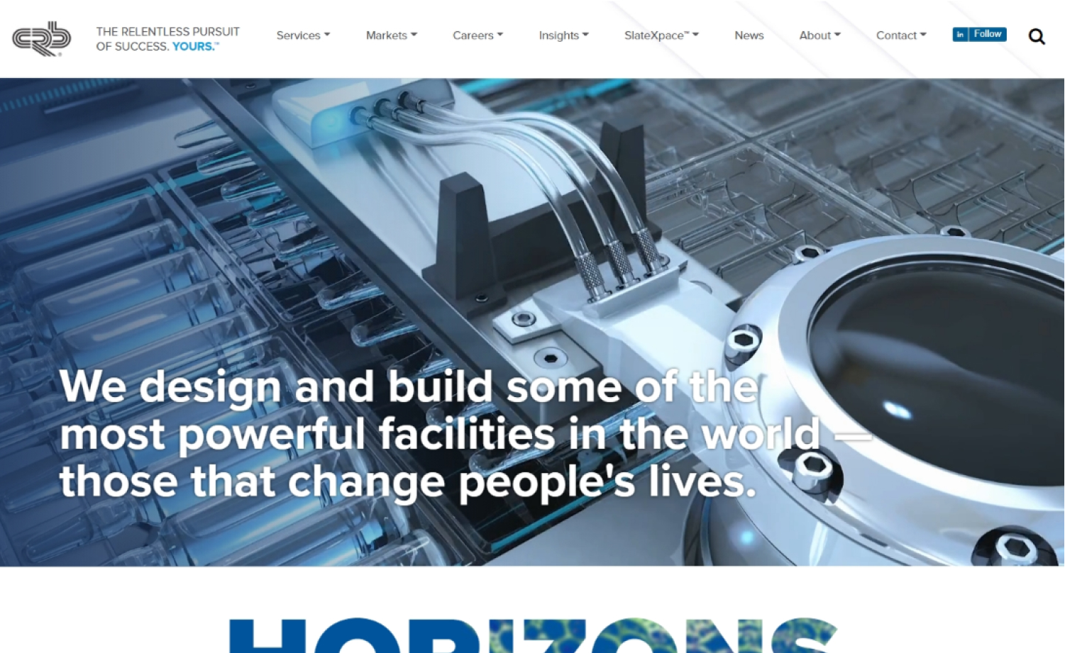
8. CRB Group
Why it works: CRB Group has an engaging compilation video as their hero section that helps showcase their brand, new services and business. The laboratory website is well structured with the pages and sections dissected for important purposes.
9. Radix
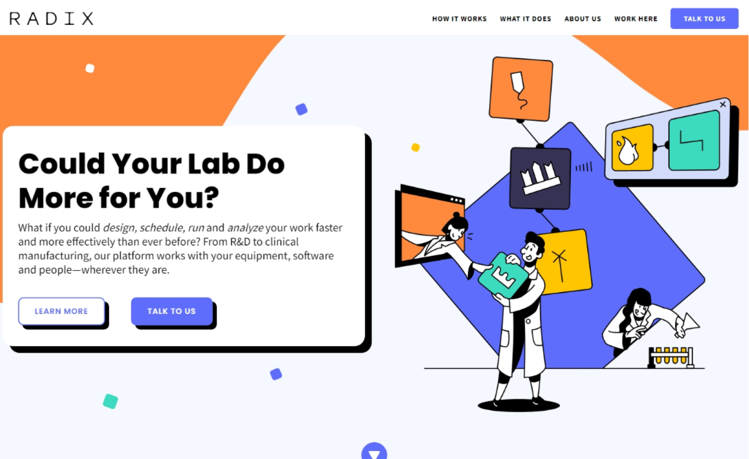
Why it works: Radix’s website uses hand-drawn graphics that don’t feel unprofessional or juvenile it helps a lot in giving value to what their brand represents. The site structure is easy to follow which is always a positive thing for the user experience of the audience or potential customers.
10. Biocad Global
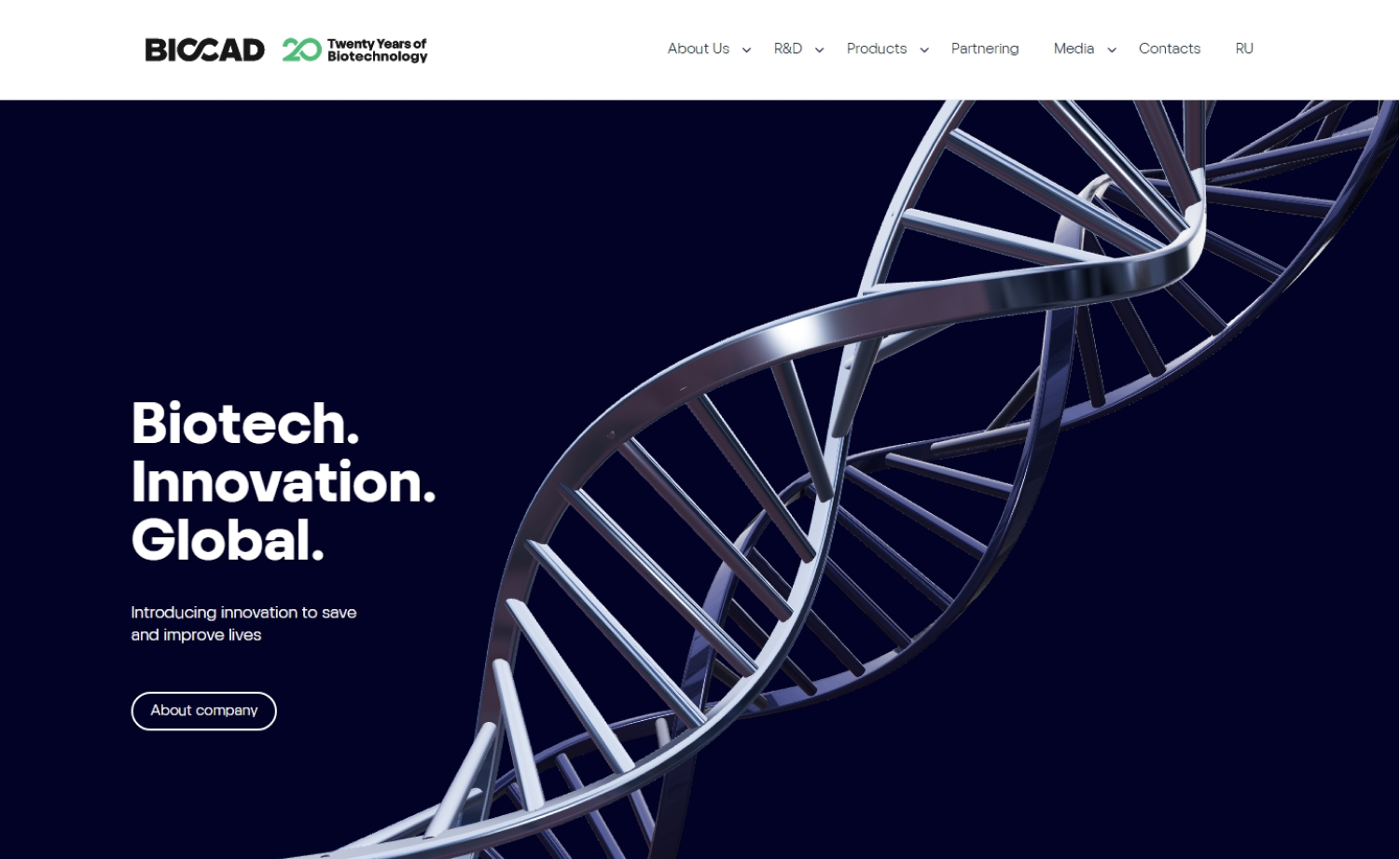
Why it works: Biocad Global’s site is mesmerizing due to the hero animation. The inner pages may be simple but they are functional. Everything appears fresh with every article located where it should be.
Laboratory Websites
11. Ulrick & Short
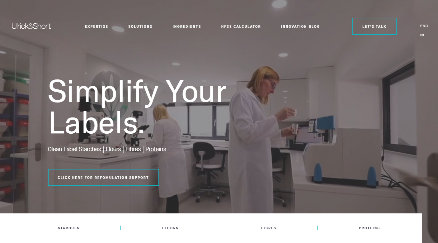
Why it works: The lab website design of Ulrich & Short is well thought out and very interesting. The company website is well structured and the images and videos used are obviously of high quality.
12. Living Lab
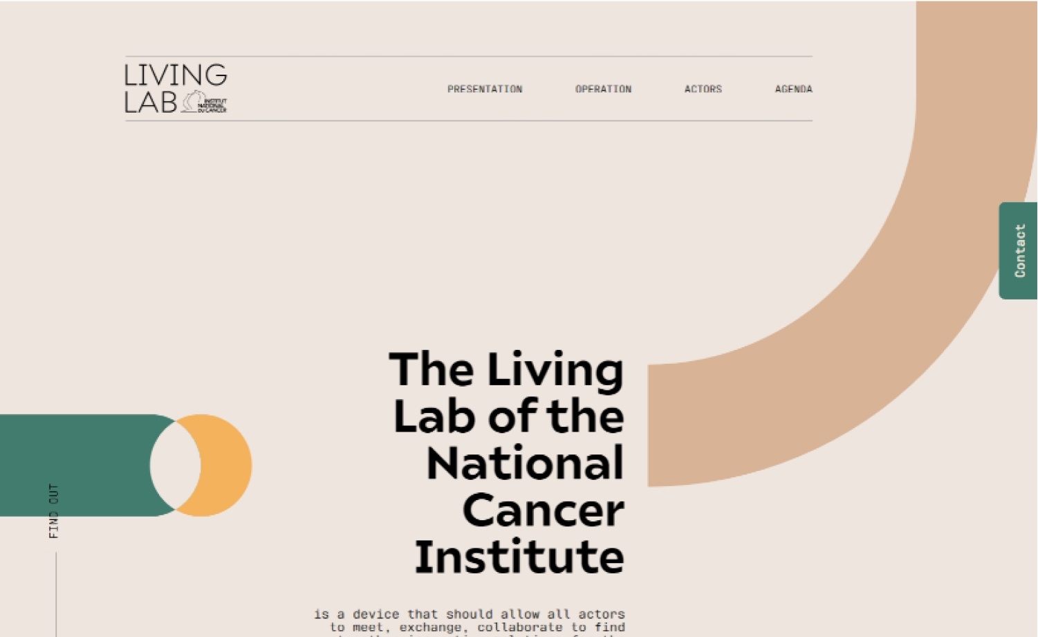
Why it works: This is definitely one of those unconventional designs that hit the “hit” on a “hit or miss” structure, color story, and typography altogether. This is an example of old and new blending together. The slight animation and scroll-triggered transitions together with a mixture of modern and classic typefaces give the website an overall modern feel.
13. Benech
Why it works: The company’s video is fascinating, and it shows what they do in the hero section. The fundamental yet modern home page layout provides all of the crucial company information in an easy-to-understand format.

14. Earth Science Analytics
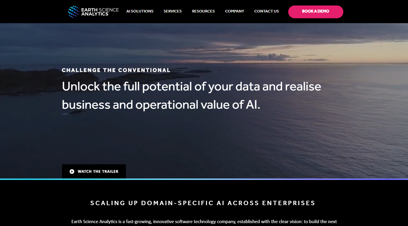
Why it works: Earth Science Analytics’ website visual design abides by the popular “less is more” rule. The use of a single color with white space and flat illustrations makes it look very sleek, modern, and professional.
15. Lucid Reality Labs
Why it works: The design is appealing. Lucid Reality’s website has a techie vibe. The use of their demo video to show what they do and for what verticals is the most essential part of their site.

Best Lab Websites
16. The Jackson Laboratory
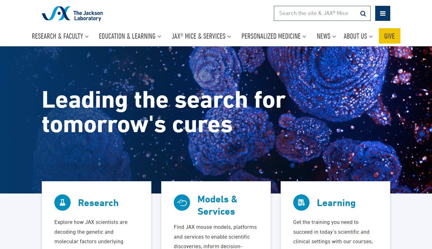
Why it works: The Jackson Laboratory is a leading science research lab that focuses on improving human health. They have an excellent website that is packed with information about their research, facilities, and services. What I really like about their web design is the way they use color to highlight important information.
17. Cornell CALS
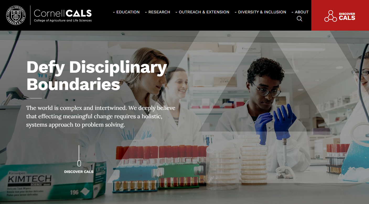
Why it works: Cornell CALS smartly incorporated its brand mark as one of the design elements giving it a more personal feel. The modern layout with color distribution makes their laboratory website interesting and engaging.
18. Enveda Bio
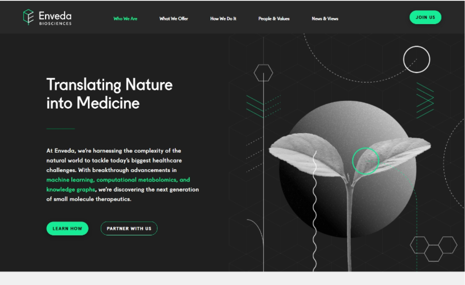
Why it works: Enveda Bio’s website is unique because of the custom icons and graphics. Having well-structured, well-designed, and obviously, well-thought-out content inspiration makes this site design great.
19. Pacific Northwest National Laboratory
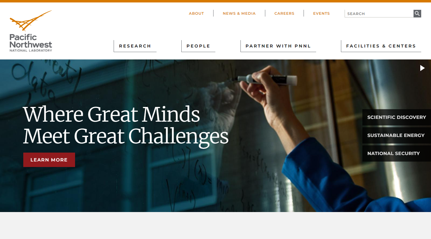
Why it works: There’s no doubt that the Pacific Northwest National Laboratory has one of the best professional websites out there. It’s packed with information on the lab’s science research, services, facilities, and staff, and it’s easy to navigate. Plus, the design looks great and is always up-to-date.
20. Les Biologistes Indépendants
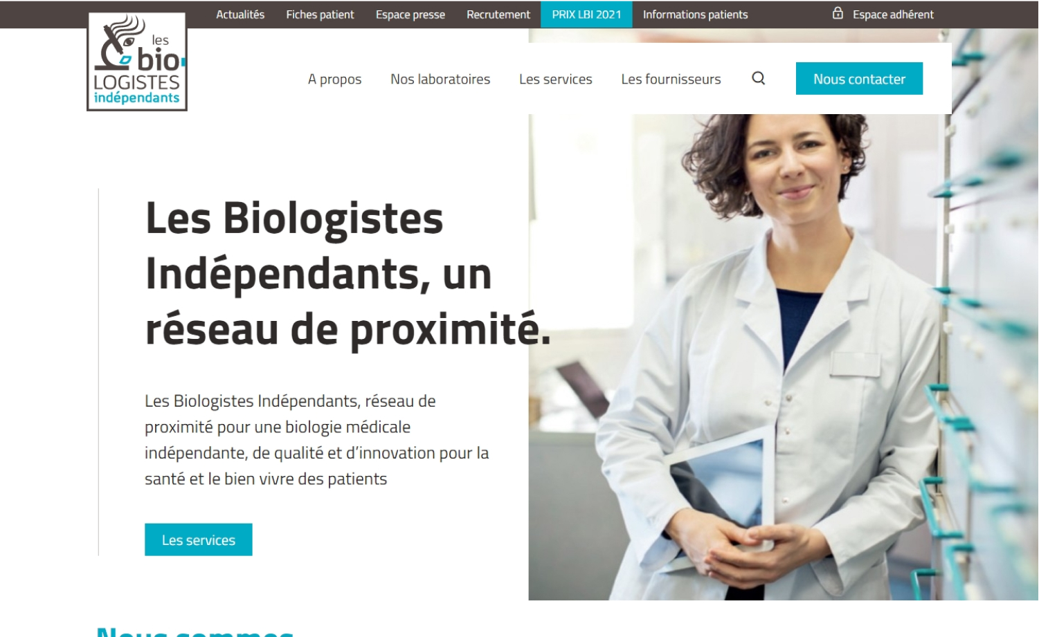
Why it works: Les Biologistes Indépendants website has an interesting web design layout that is slightly out of the norm which added professionalism and personality. The colors on the research laboratory site are effectively distributed making the site more appealing to the audience.
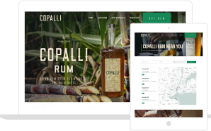
Laboratory Website Design
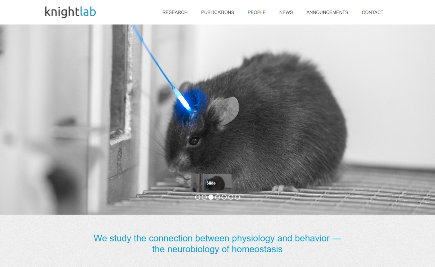
21. Knight Lab
Why it works: This university medical laboratory website is easy to use and understand. Links to the contact, lab research development, and article publications pages are easily accessible on the sticky navigation.
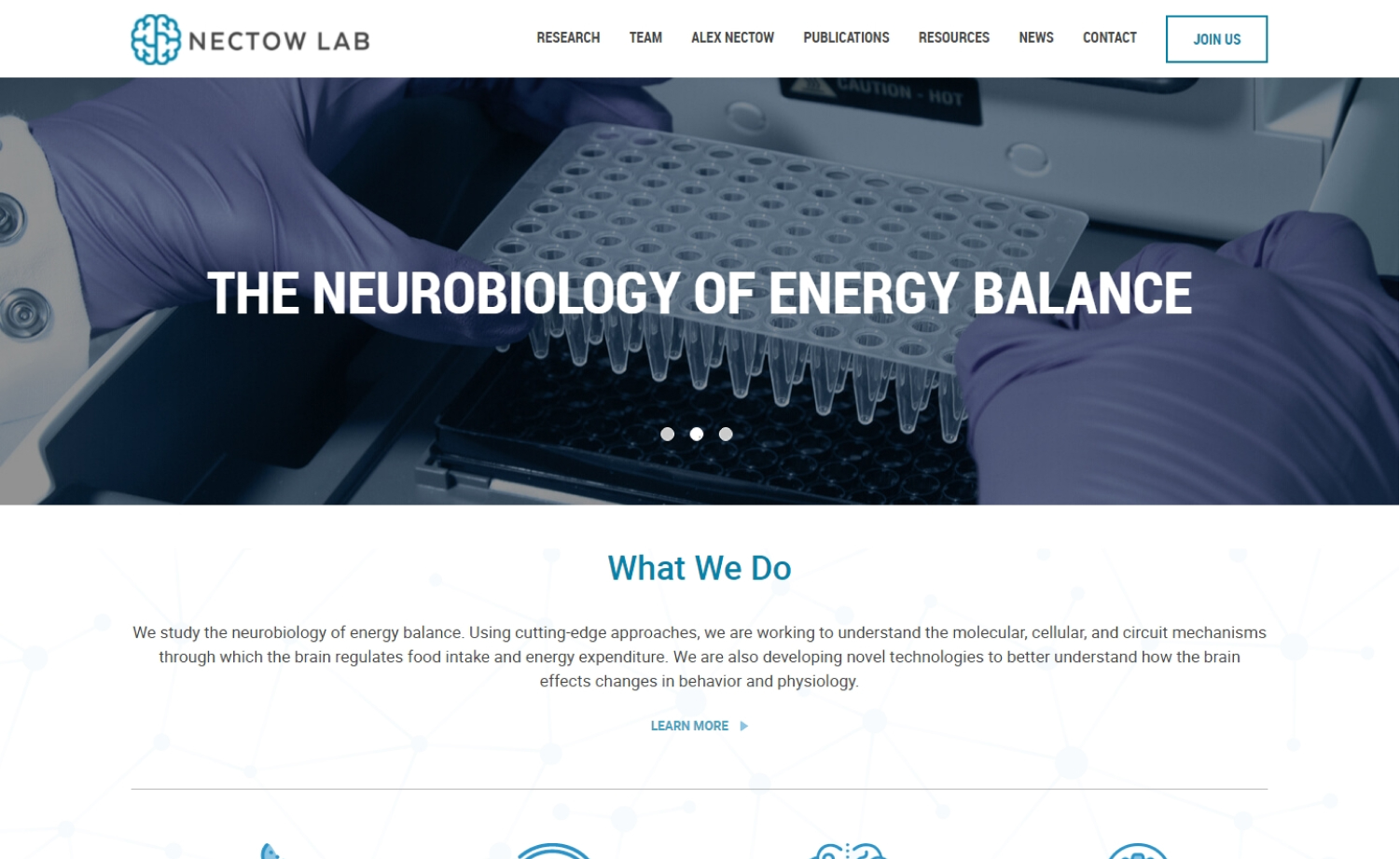
22. Nectow Lab
Why it works: Nectow Lab’s website is a breeze to use. They effectively used the homepage to communicate critical information about the brand and industry they are in while also making it a gateway to the rest of the science website.
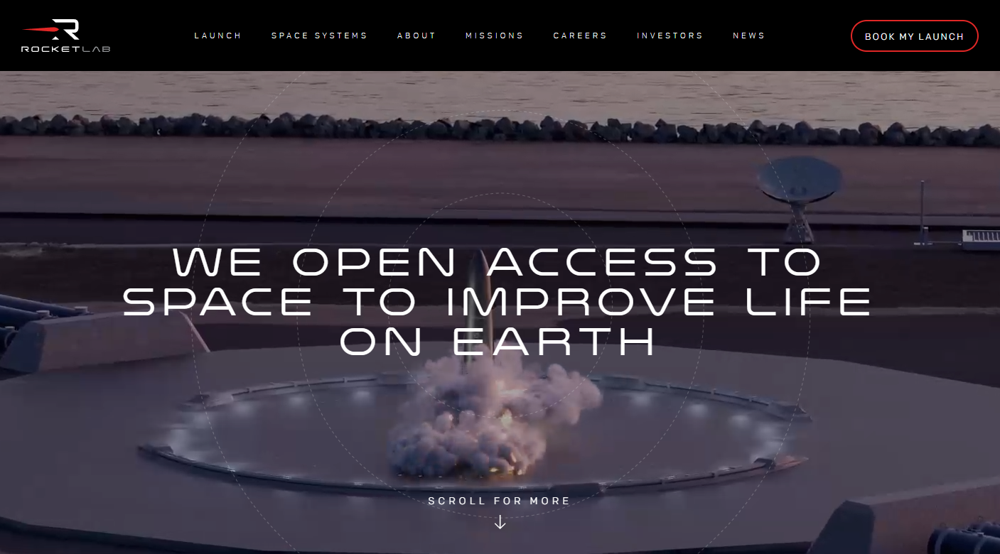
23. Rocket Lab
Why it works: The Rocket Lab’s videos on the hero section are spectacular and certainly captures the interest of more people or audience. The entirety of the website is image-heavy but nothing feels cluttered and the brand information and additional features are easy to digest.
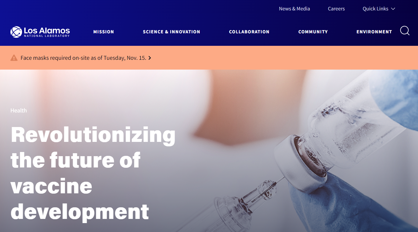
24. Los Alamos National Laboratory
Why it works: The way Los Alamos National Laboratory presents its information on the homepage makes the website easier to navigate. The sticky top navigation with the search function helps with the ease of navigation as well.
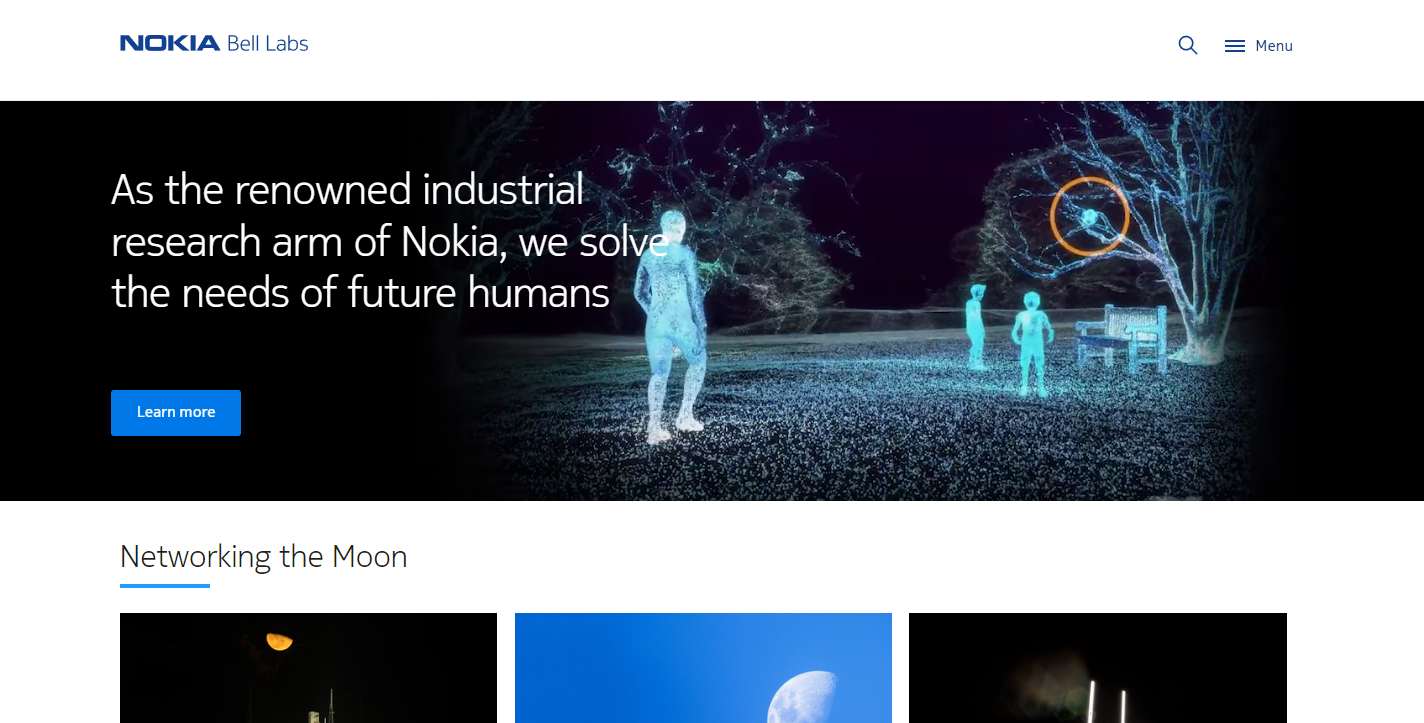
25. Nokia Bell Labs
Why it works: Nokia Bell Labs’ website is more fascinating and engaging because of the web videos and graphics or images featured. The effective use of grids makes this information-heavy site, easy to follow.
Best Laboratory Websites
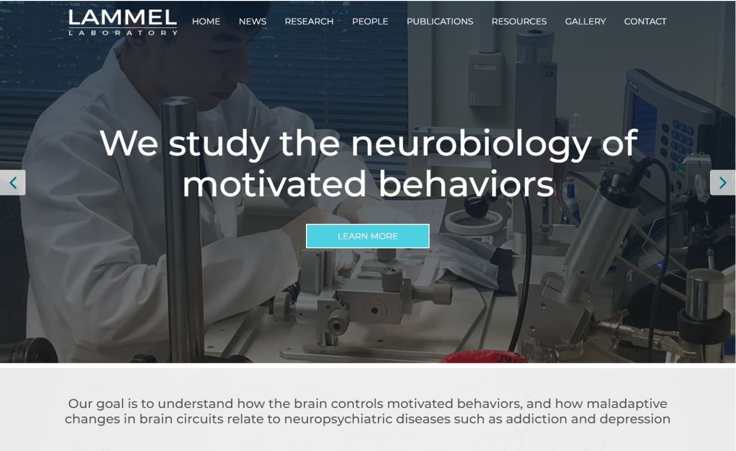
26. Lamell Laboratory
Why it works: The visual design of this WordPress website is uncluttered and easy to explore. The homepage is effectively utilized to disseminate information on the development, technology, and science of neurobiology.
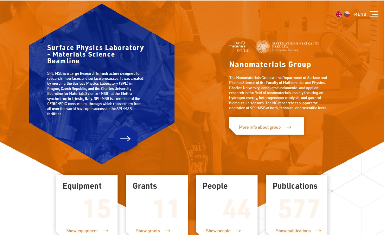
27. Nanomaterials Group
Why it works: A non-traditional design with great use of hexagons. Nanomaterials Group’s website looks different from other labs’ sites. Website audience or visitors can easily navigate to their web page of interest without even going through the navigation menu.
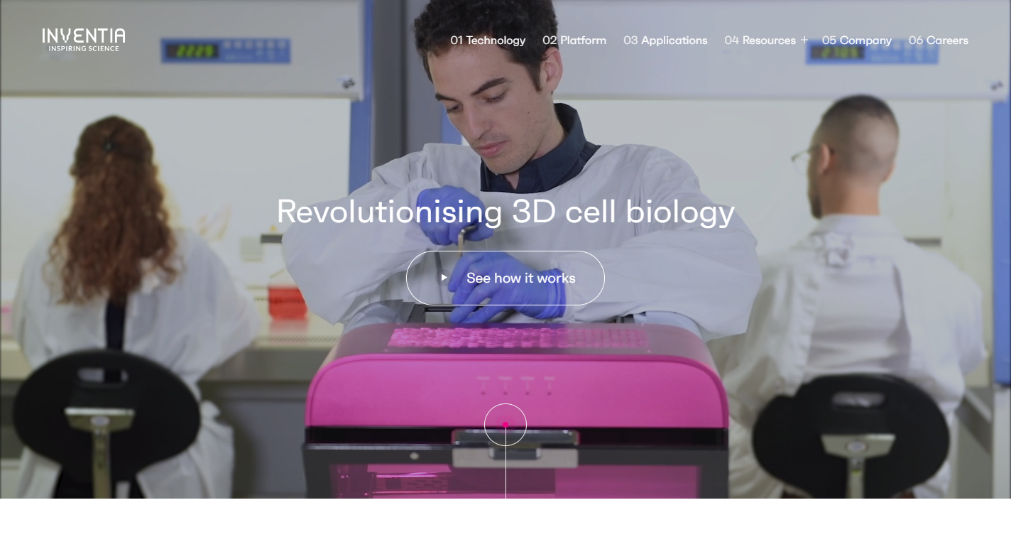
28. Inventia
Why it works: Inventia medical laboratory website effectively utilizes the hero section to showcase their ability, brand development, scientific research, and project through a series of videos. Their scientists are shown using their tools and devices. The combination of white space, typeface, and colors created a contemporary atmosphere.
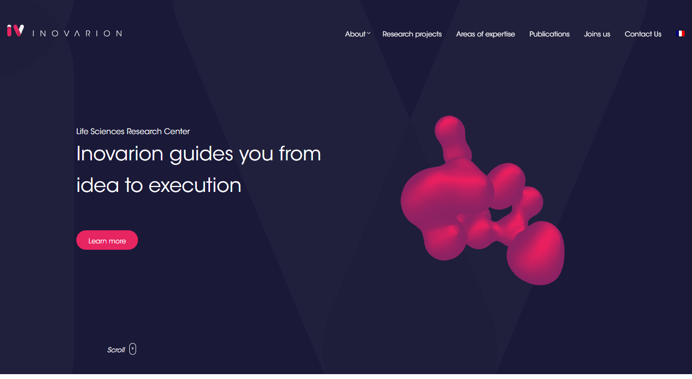
29. Inovarion
Why it works: Inovarion’s design uses a simple, modern layout with effective section transitions. The use of grids makes important brand development, services, and publications easy to follow.
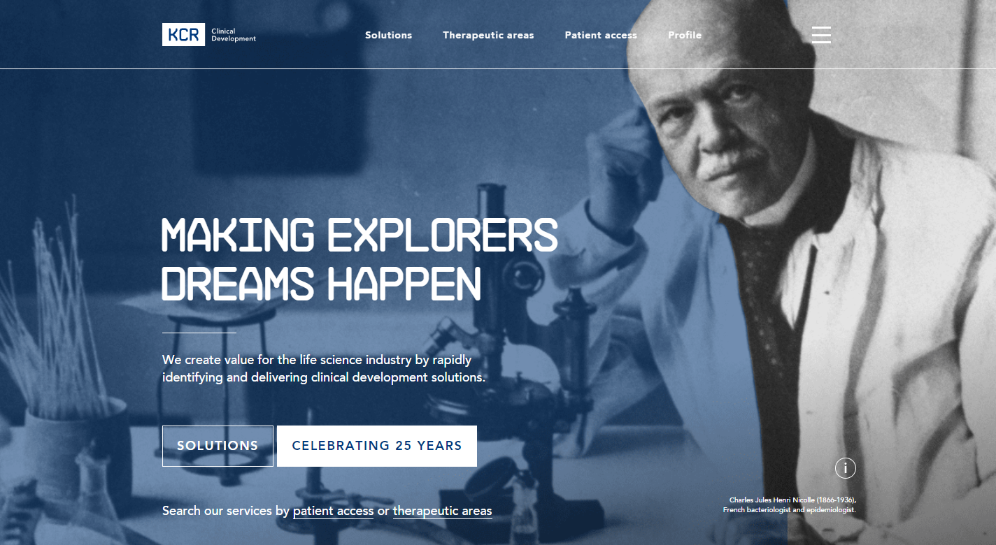
30. KCR Clinical Development
Why it works: The layout is simple, emphasizing the most essential website content on their business home page. Links to the news and department openings are available on the homepage.
Best Lab Website Design
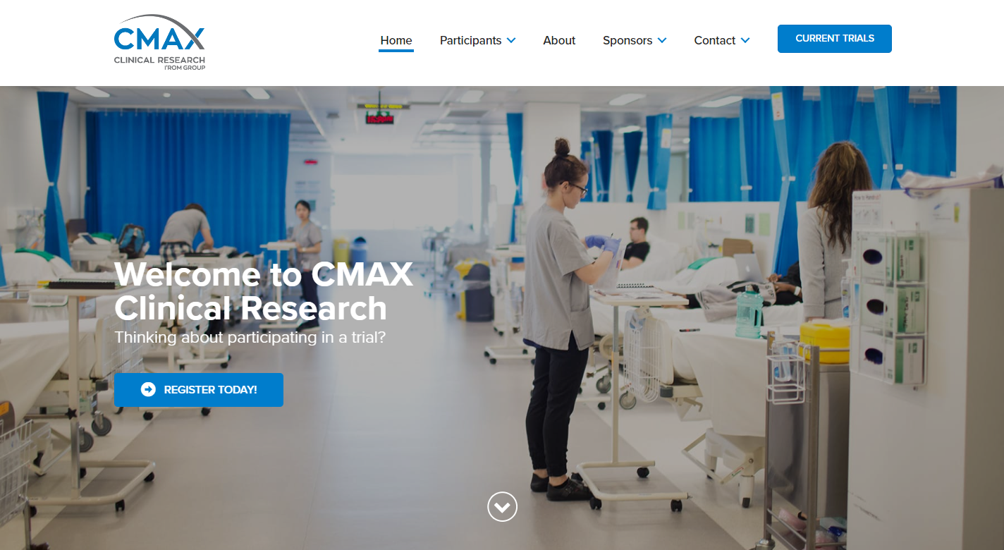
31. CMAX
Why it works: CMAX clinical research website has an attractive website that serves as a landing page for both participants and sponsors. Even though the site design is simple, it was executed well, with all web design components being vital and strategic in their business marketing and branding.
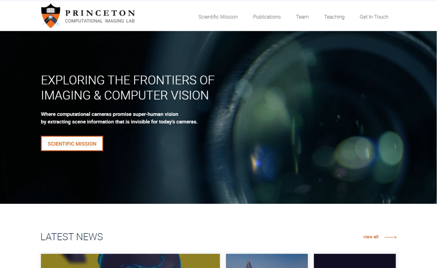
32. Princeton Computational Lab
Why it works: This University Lab served its specific purpose, this is an informative website that aims to showcase its professionalism and mission. Links to the latest science news and development and related publications are easily accessible on the homepage.
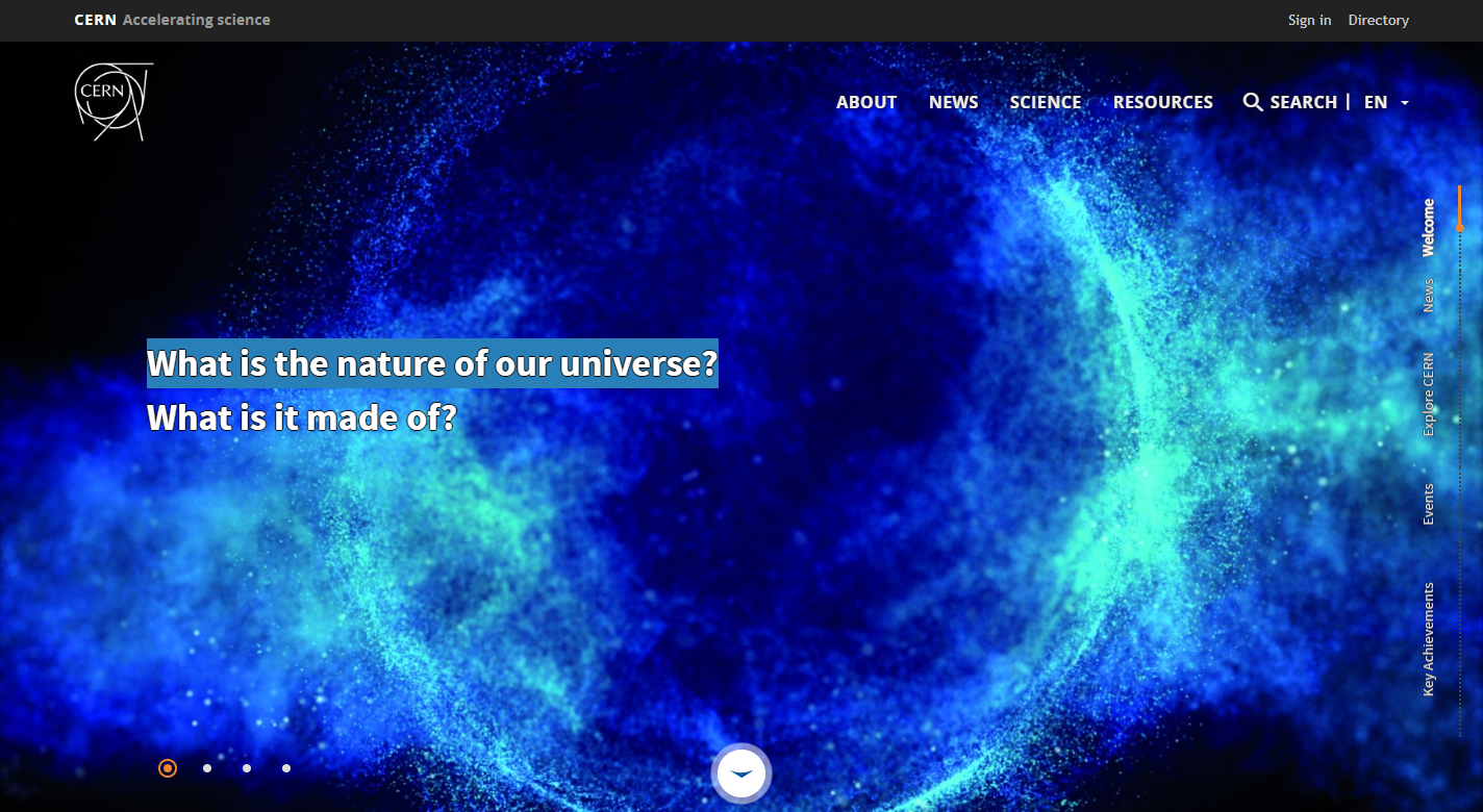
33. CERN
Why it works: The CERN hero section includes several fascinating pictures. It also uses an exceptional mega menu that helps organize and simplify website navigation. With cohesively designed sections, CERN’s website can deliver a lot of science information in an engaging and visually appealing way.
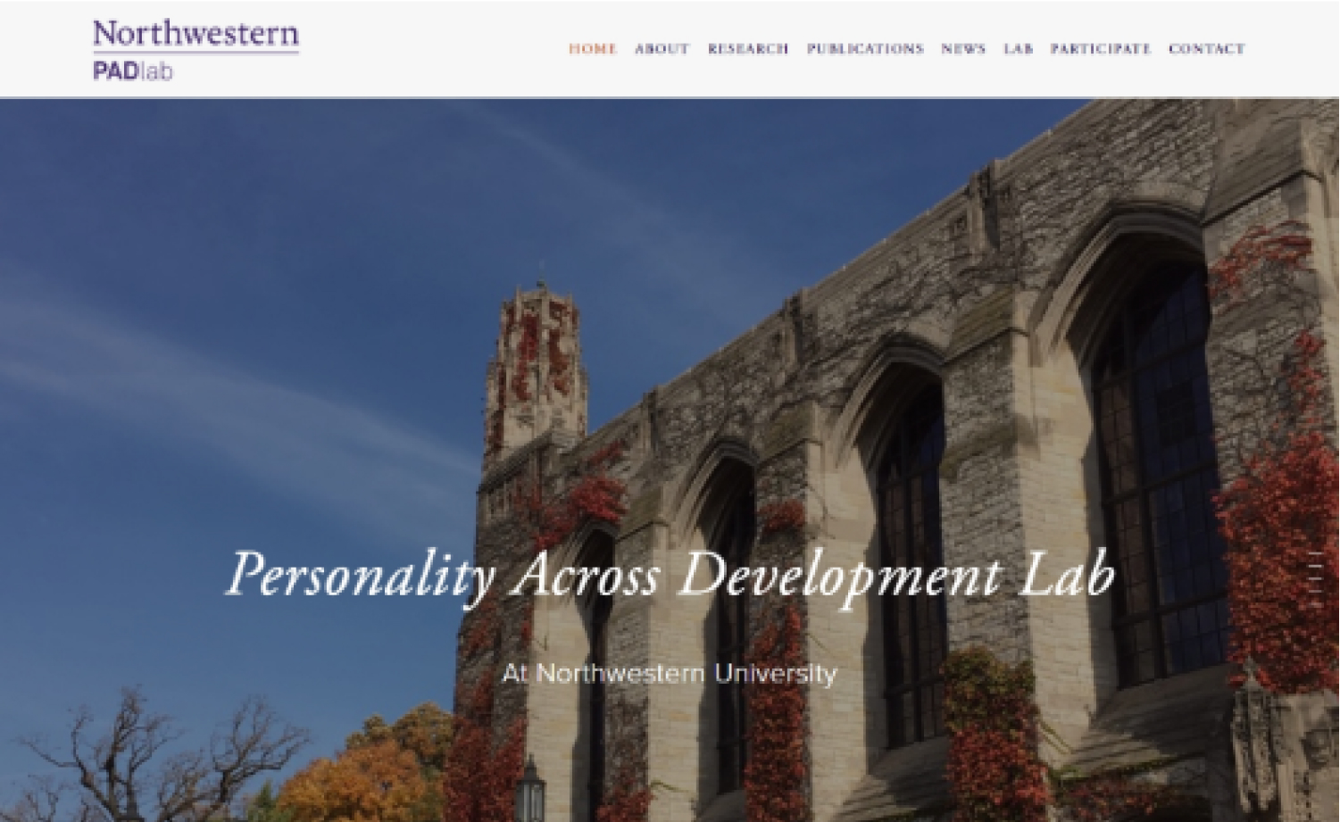
34. Northwestern PAD Lab
Why it works: Northwestern PAD Lab’s website has an attractive visual design thanks to the beautiful images of the university utilized as section breaks. Interested students can easily contact science lab members by using the form on the participate page.
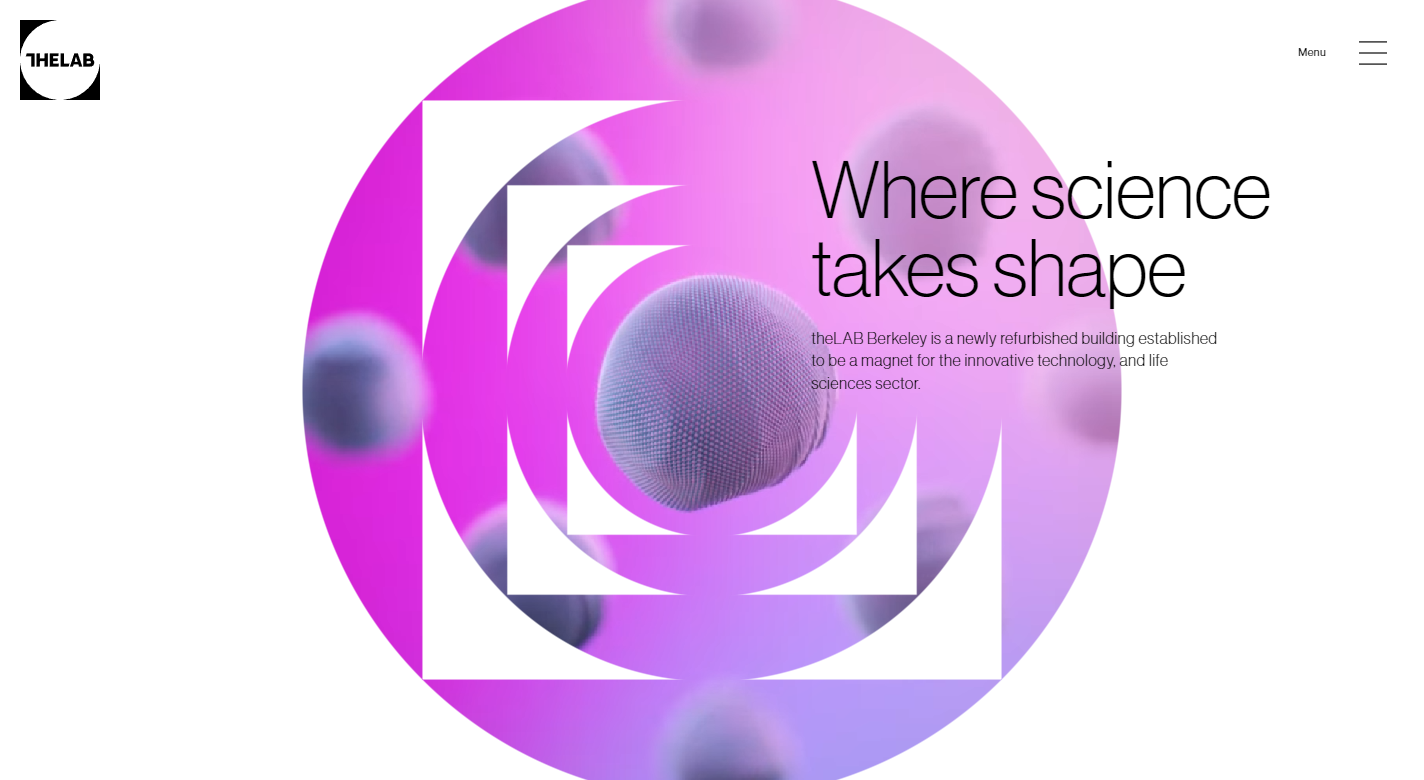
35. The Lab Berkeley
Why it works: The Lab Berkeley effectively focuses on user experience and interaction, making this science website engaging. How they used colors, animation and high-quality images mixed with horizontal scrolling make their brand website unique and one of a kind.
Great Design Lab Websites
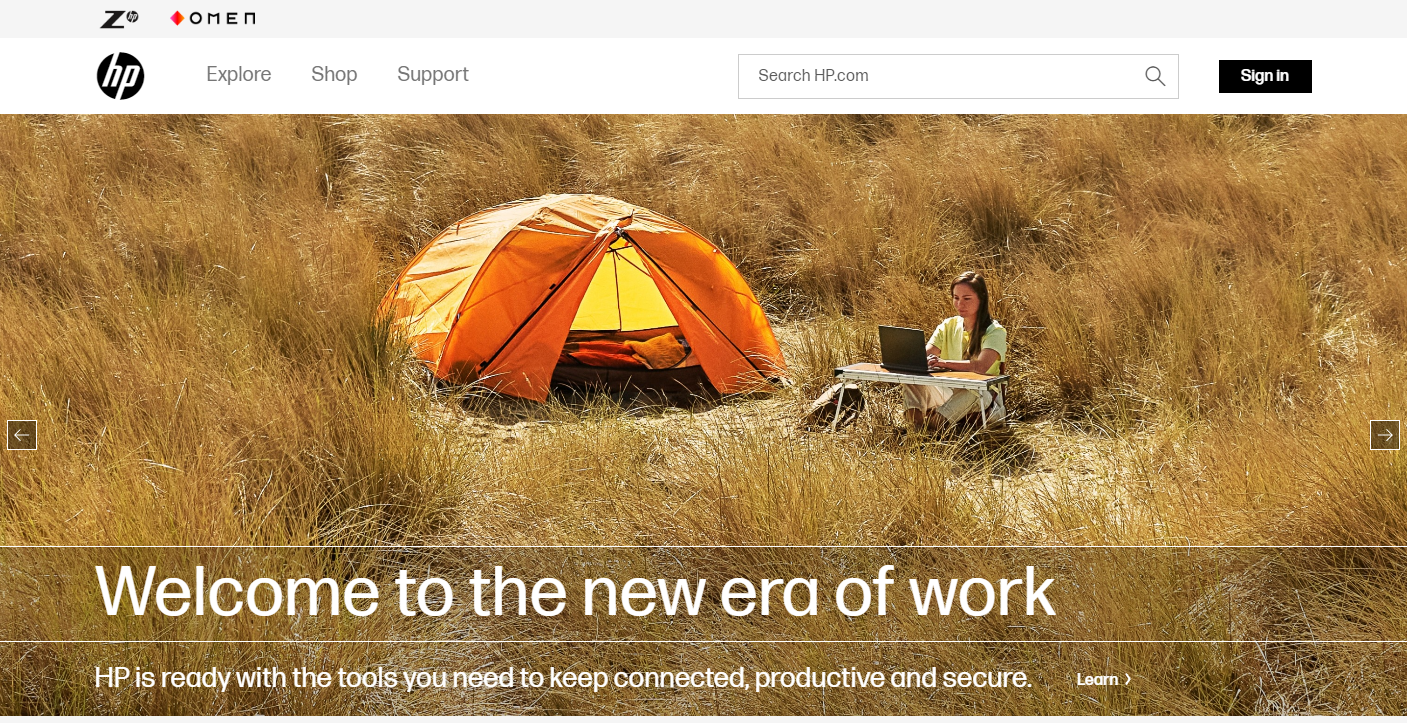
36. HP Labs
Why it works: HP Labs showcases video pop-ups on their hero section that summarizes their brand mission and services. The science website is information-focused but easy to follow. The web design also uses a sticky menu for the best results and to make navigation easier.
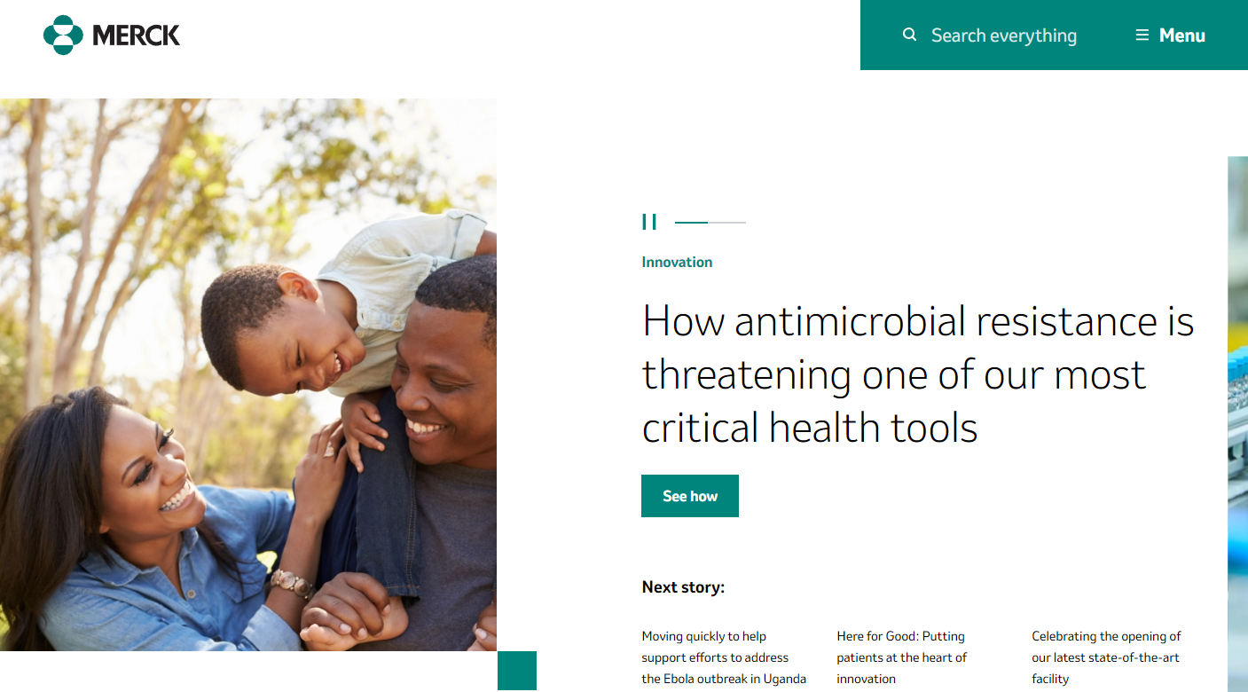
37. Merck
Why it works: The Merck website is well-designed and organized, with information about science that is simple to understand. They utilized only one hue for their web design components and let the photos provide and create the rest of the colors and vitality of this research-intensive biopharmaceutical website.
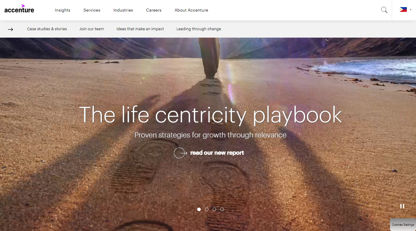
38. Accenture
Why it works: Accenture’s business website is unique and cool, it feels fresh and well-structured. Using their brand mark as a clipping mask in the career section is amazing.
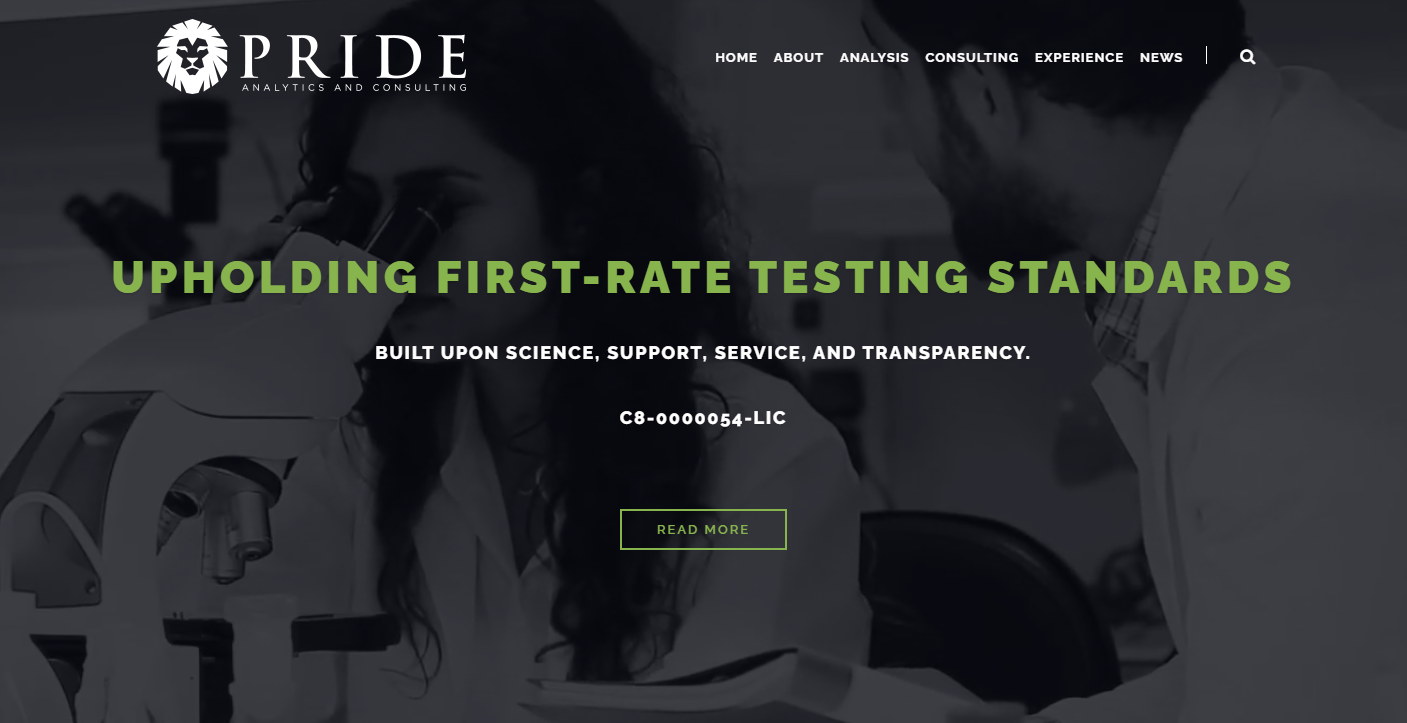
39. Pride Analytics
Why it works: In the hero section, Pride Analytics employs a video to demonstrate what their brand does. The science website is straightforward to navigate for all users.
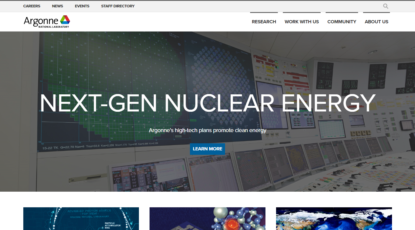
40. Argonne National Laboratory
Why it works: Argonne National Laboratory is an information-dense website with a well-designed and organized web design structure. Site users may quickly move around the pages and discover crucial research and publications on X-ray science.
Conclusion
We have created this list of the top 40 best lab websites from around the world that we think are worth checking out. Hopefully, you will find one or two lab website design examples that will serve as an inspiration for you to create an awesome designer’s website for your business or company as well! If not, don’t worry – just contact us and we’ll be happy to help with any web design needs you may need.
We will design and create a free custom mockup of your new business website before you sign or pay for anything. There is nothing to sign and no payment information will be taken. If you like our design for your business we can move forward working together. If not, there are no hard feelings and no other obligations. Click the link below to learn more about our free mockup offer.