Your professional services website is a critical component of your business marketing strategy. It’s the professional image that you want to project, and it can be a major source of revenue for your company. In this blog post, we’ve compiled a list of the best professional services websites from all over the web, to give you some ideas about what works best for other professional service companies.
Table of Contents
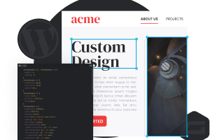
1. Crown Sign Systems
Why it works: This professional services site has a lot of qualities that make it appealing and unique as compared to many websites. The header, in terms of design, is quite distinctive. The clarity of the photographs of the industry is excellent. The typography is modern yet easy on the eyes.
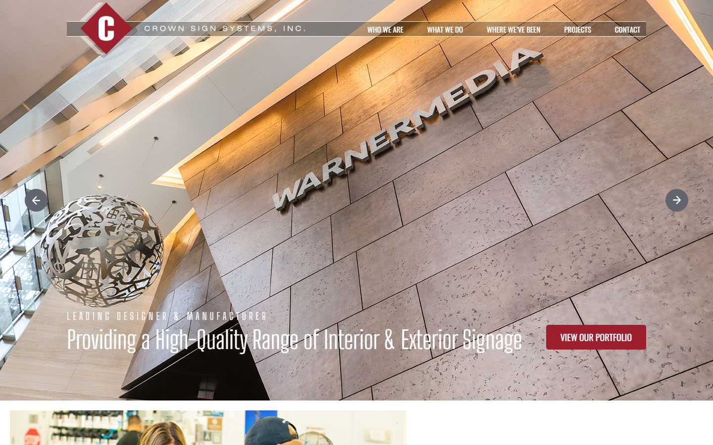 crownsigns.com
2. Giorgi Girl
Why it works: Elegant, sophisticated, and charming. We adore the excellent typography on this website. The floral decorations complement the company’s distinct personality very well.
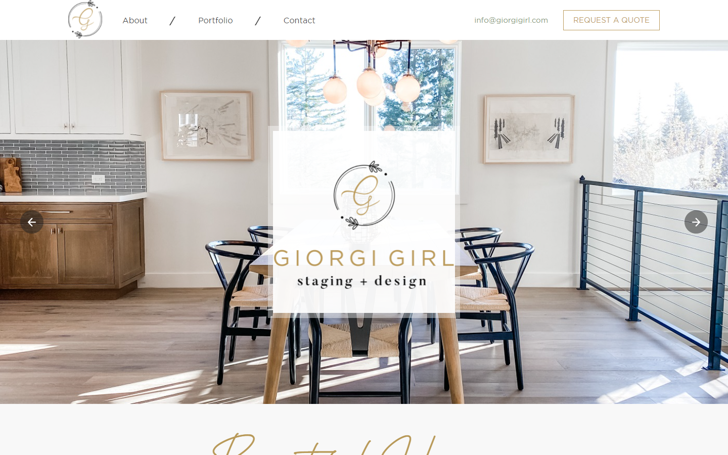 giorgigirl.com
3. Movie Mogul Productions
Why it works: The overall website design is simple yet elegant. This professional services website includes great videos and images illustrating the company’s craft.
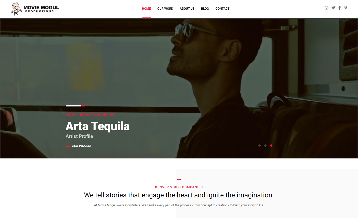 moviemogul.tv
4. Scorpion
Why it works: There’s much on the home page of this website, especially the most important thing: interest. We really like how the landing page has a glimpse of everything a client might need. And yes, please don’t miss the awesome menu design.
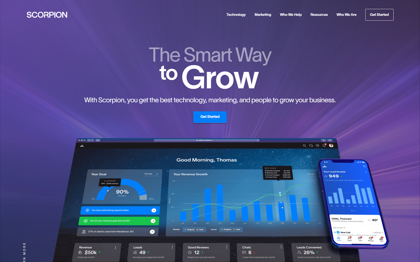 scorpion.co
Professional Services Web Design
5. Palo Alto Fit
Why it works: First impressions last, and this web layout is nothing short of giving a really good one. The colors are highly contrasting while the pictures and videos feel very personal and well thought out.
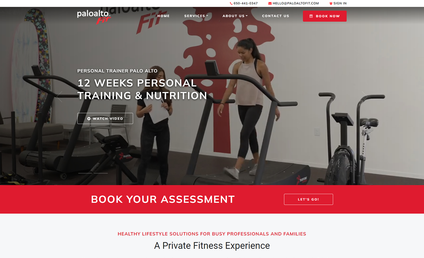 paloaltofit.com
6. ServiceScape
Why it works: At first glance, one can easily tell why this professional services website is on this list. Finding a freelancer on this site is easy, and the different niche is enumerated right on the home page.
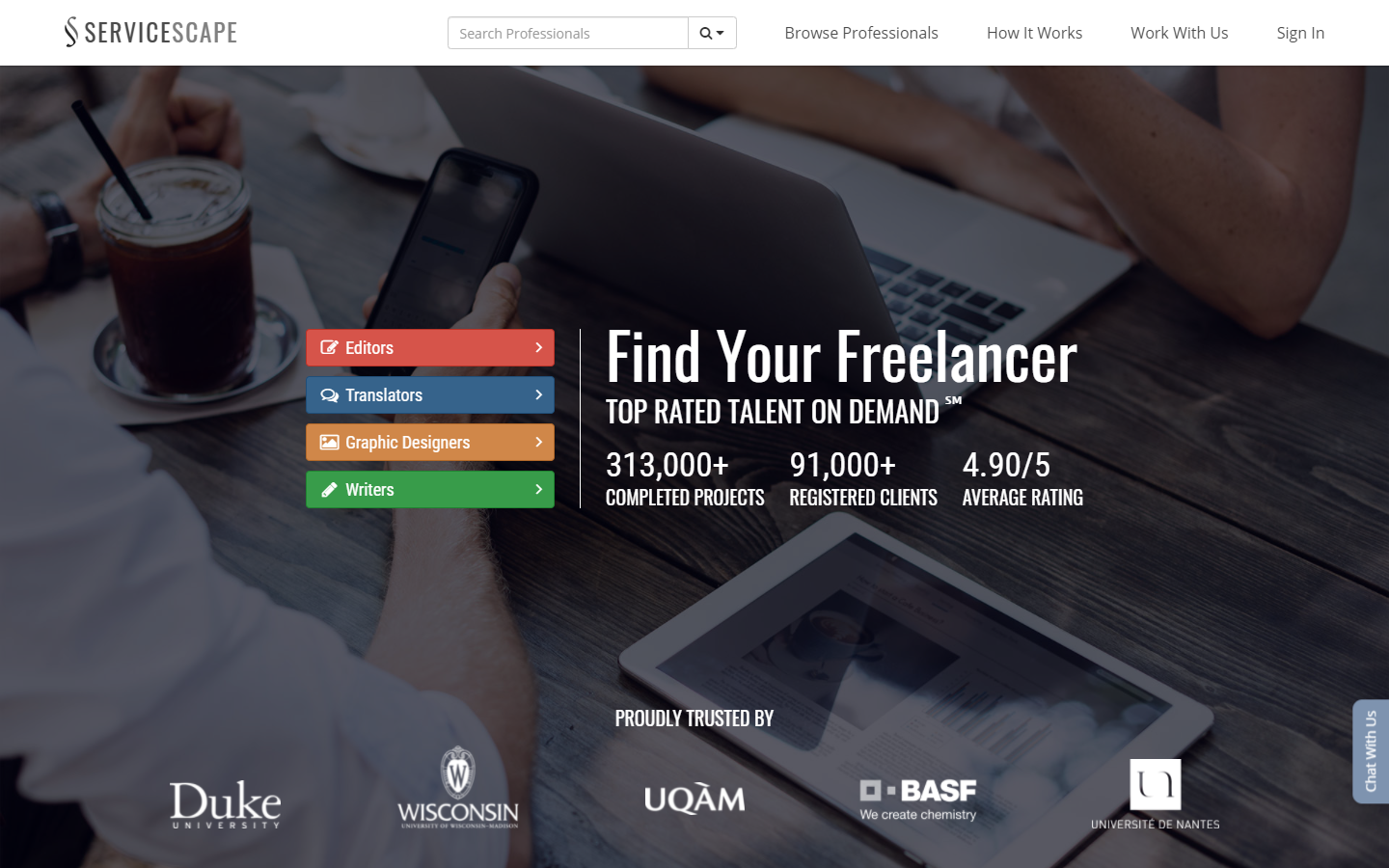 servicescape.com
7. Suasive
Why it works: A stunning business site with just the right amount of accent colors. It’s not overwhelming. Even the main video background, while simple, is evocative.
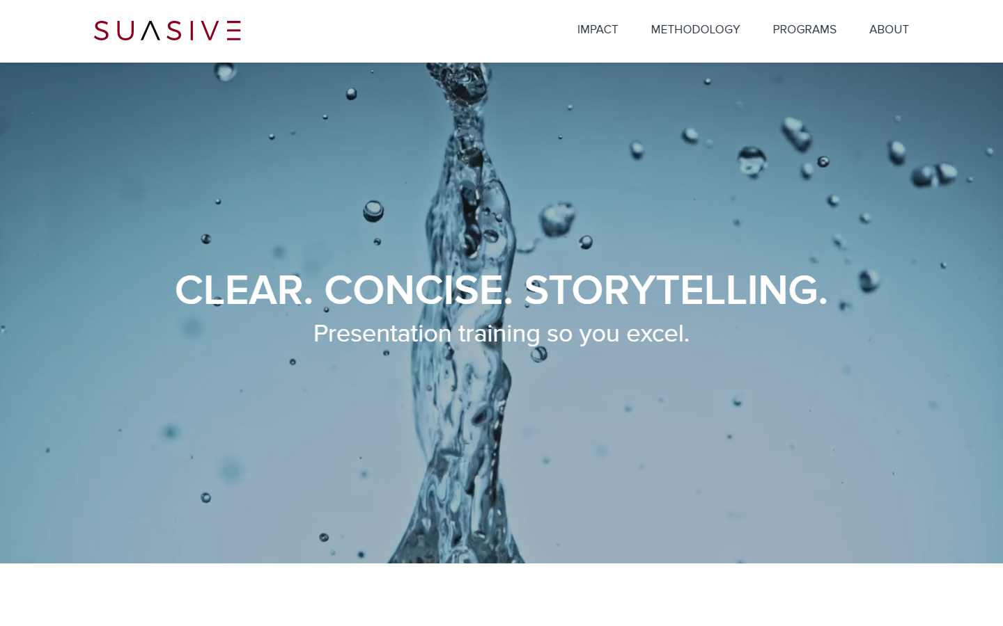 suasive.com
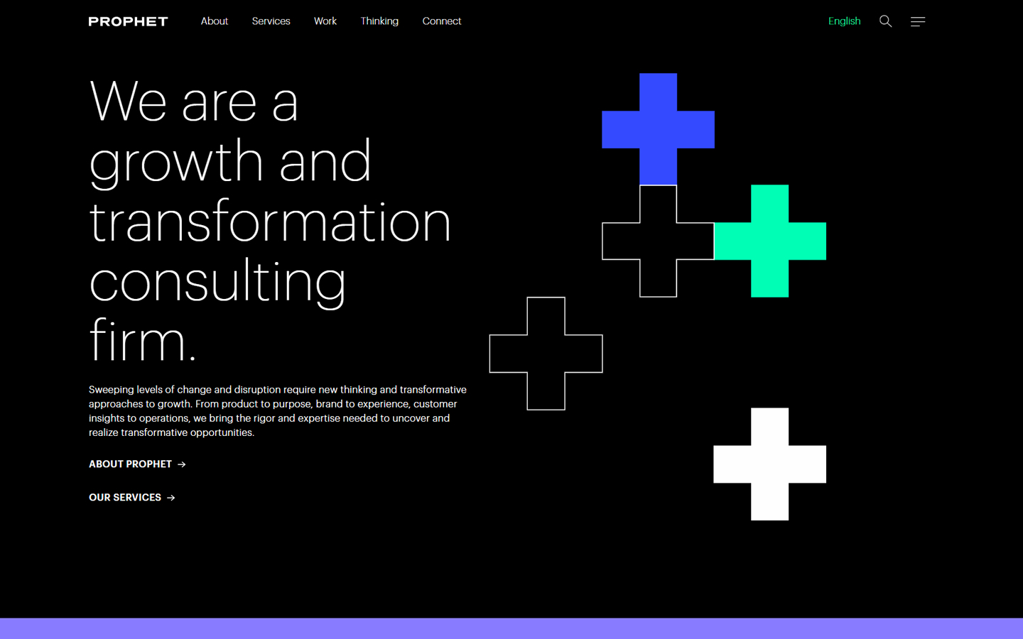
8. Prophet
Why it works: In this web design, a vibrant neon graphic greets the visitors. The web is sleek and modern. The graphics are also minimal yet abstract enough to be interesting.
 prophet.com
Professional Services Websites
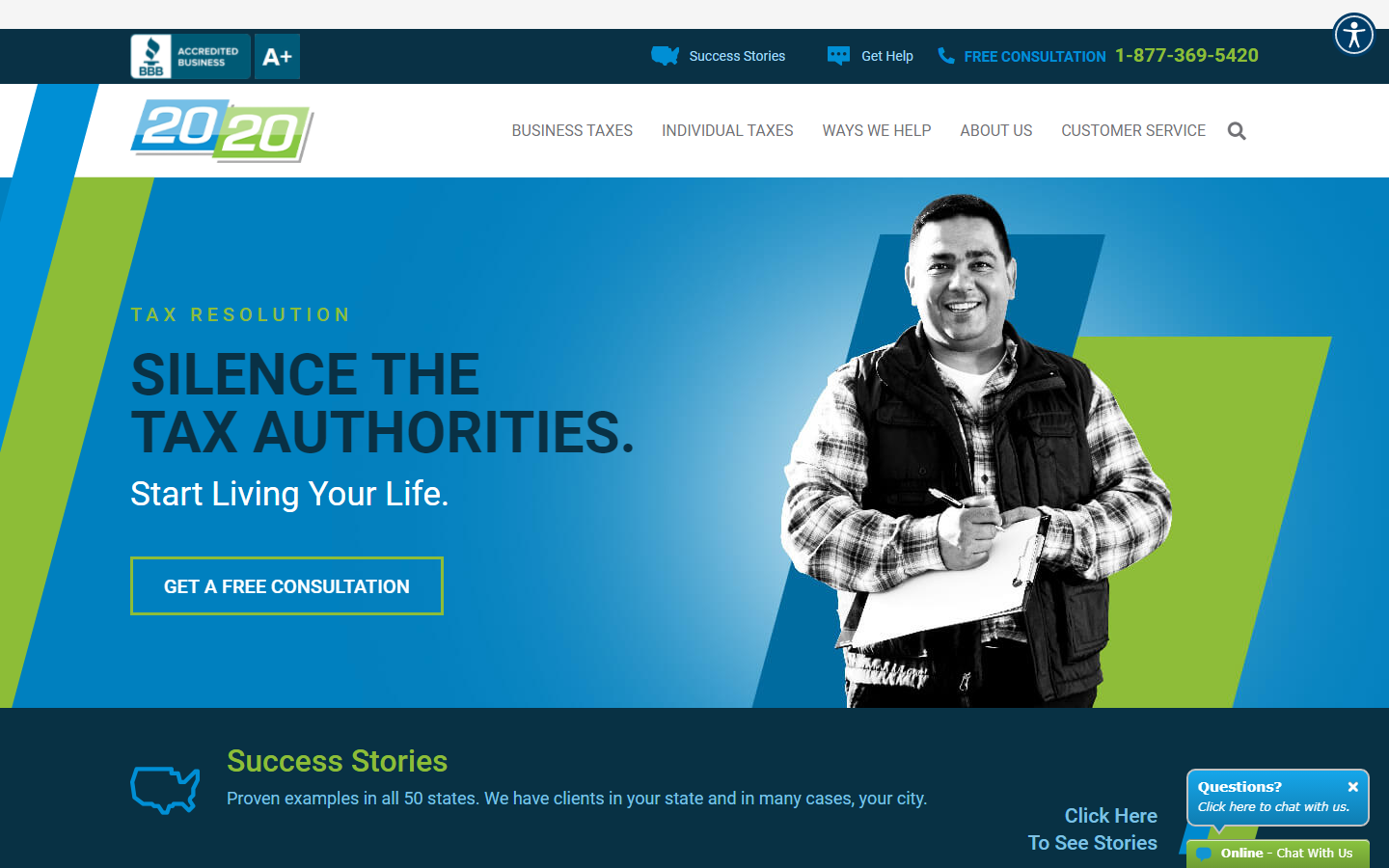
9. 2020 Tax Resolution
Why it works: A greyscale portrait on a solid color background is an incredibly clever and successful technique to make a lasting impact. Every section is interesting to read and never boring.
 2020taxresolution.com
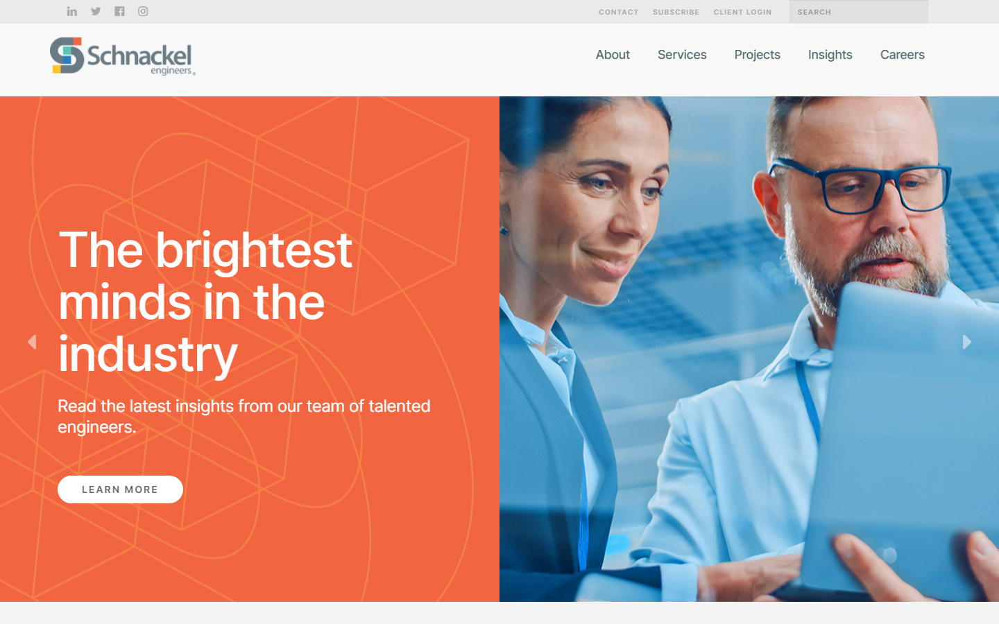
10. Schnackel Engineers
Why it works: From the beautiful line drawings down to the images, one can easily gauge how well-designed this website is by a team of professionals. The professional websites’ layout and design are also minimal yet properly planned. And above all, the header area is so intuitive surely no new clients will get lost.
 schnackel.com
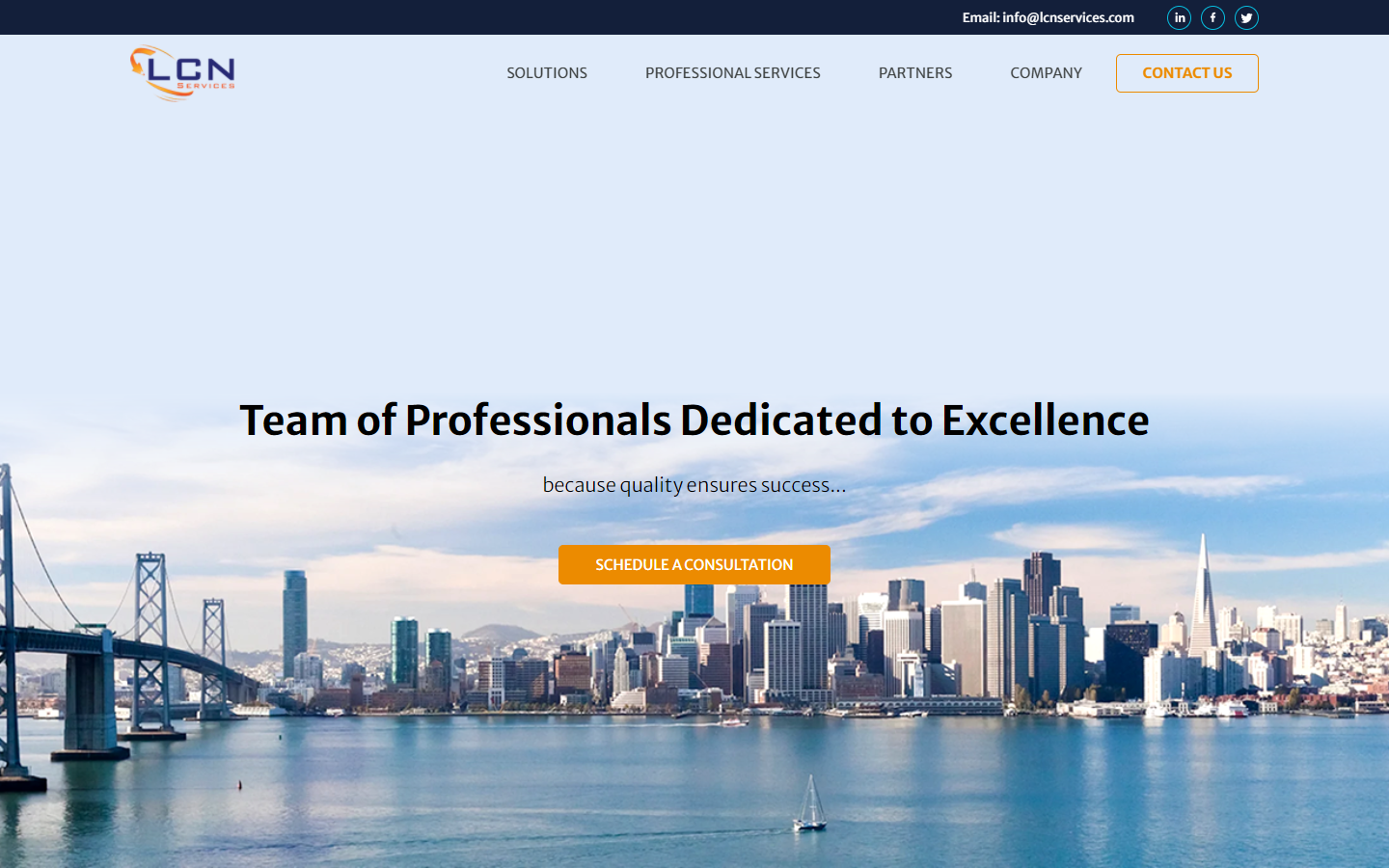
11. LCN Services
Why it works: A lot of professional services websites have tons of paragraphs, but this one creatively utilizes illustrations and other visuals to help achieve marketing their professional business better.
 lcnservices.com
12. Action Mary
Why it works: This website got lots of tricks up its sleeves, and users will undoubtedly want to go from one link to the next since it is so interesting and user-friendly.
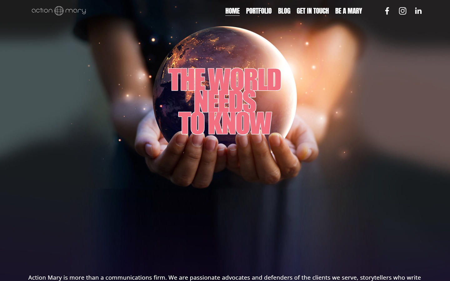 actionmary.com
Best Professional Services Websites
13. The Knot
Why it works: The Knot is one of the most well-known wedding websites. The sections are pruned to the essentials. The mega menu, on the other hand, is clear and neat.
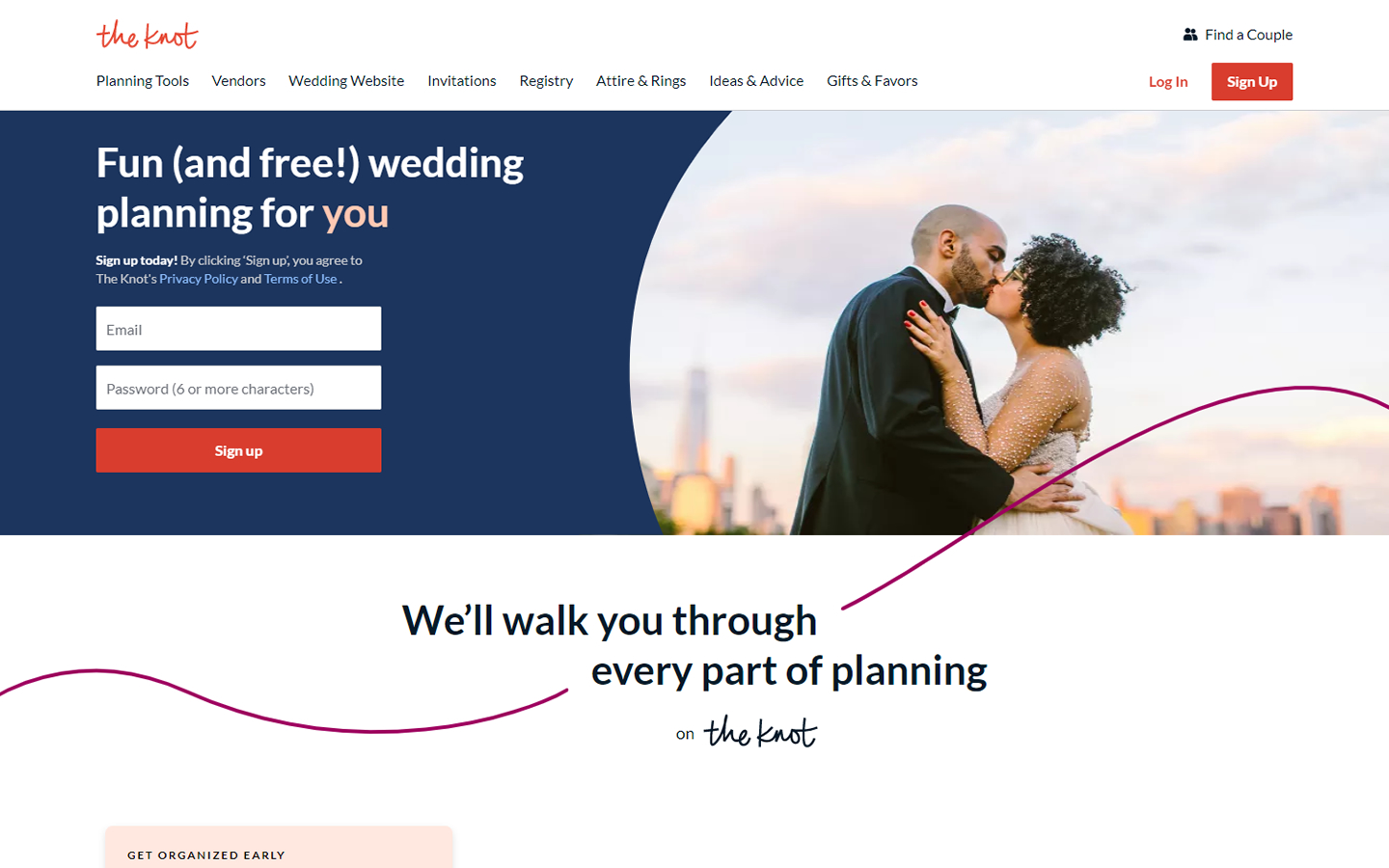 theknot.com
14. Envoy
Why it works: The website design greets the visitors with a beautiful gradient, bold icons, and a clean canvas. Information is also broken down into smaller parts to make it user and mobile-friendly.
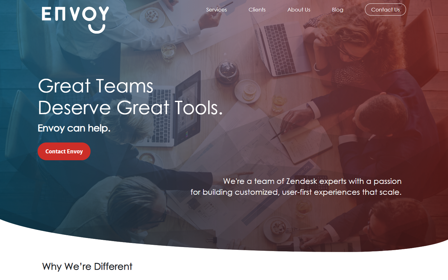 goenvoy.co
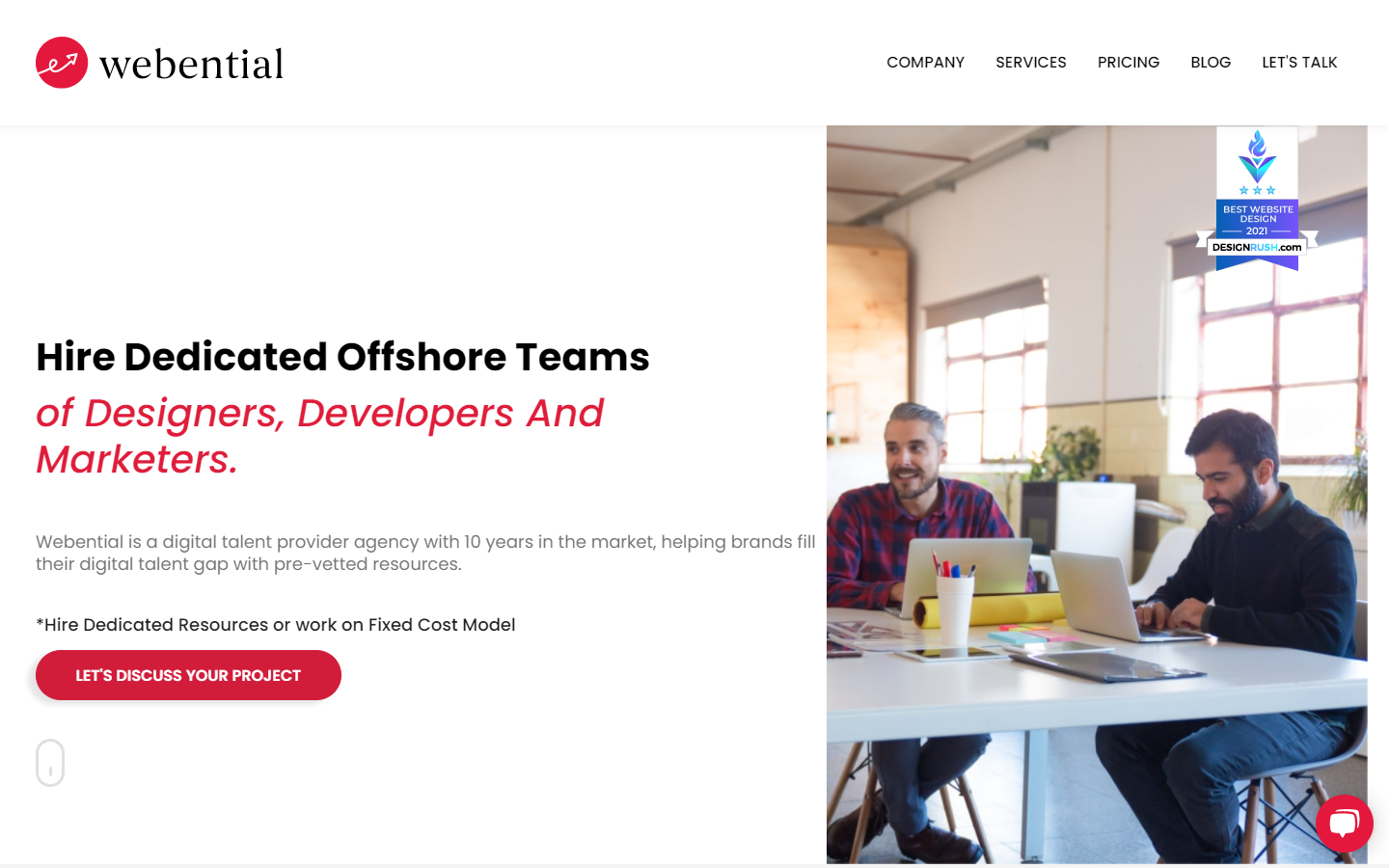
15. Webential
Why it works: While many professional services provider concentrates on visuals and a wide variety of interesting designs, what Webential’s website did was focus more on typography over other design elements, and it does it remarkably well.
 webential.com
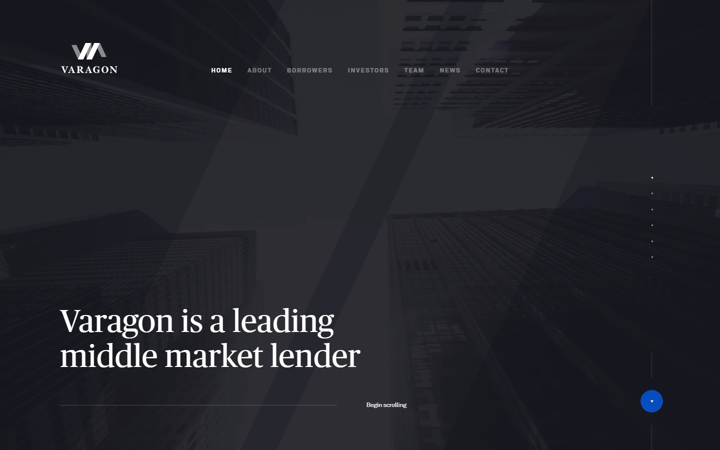
16. Varagon
Why it works: We adore how this professional web utilized anchor scroll in its website. Each section has a very clean canvas, with a simple type against a blank slate. And the minimalism? It might be an industry trend favorite, too.
 varagon.com
Well-Designed Professional Services Websites
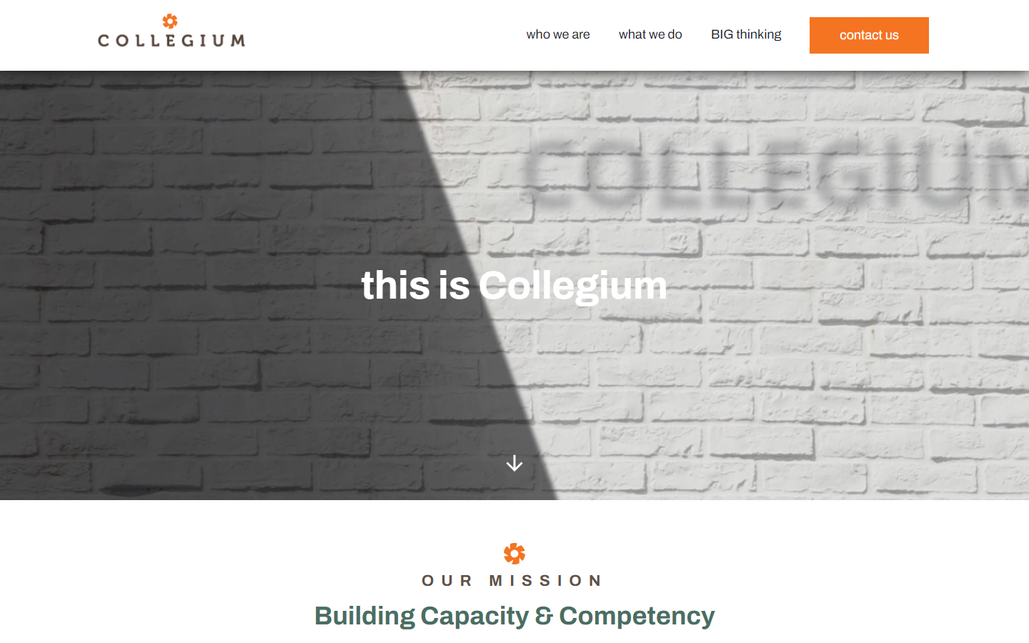
17. Collegium
Why it works: You’ve got your basic, easy format that’s both simple and effective in marketing businesses. We appreciate how minimal the design is of irrelevant elements to better convey their websites’ message.
 collegiumpartners.com
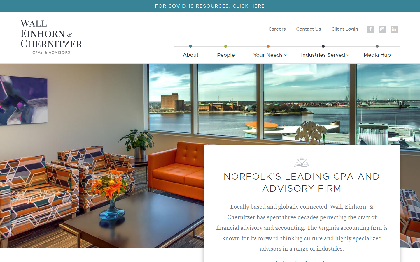
18. Wall Einhorn & Chernitzer
Why it works: This professional service website design is minimal with splashes of colors and graphics. We love the quality of pictures they used, making the site stand out and feel very professional.
 wec.cpa
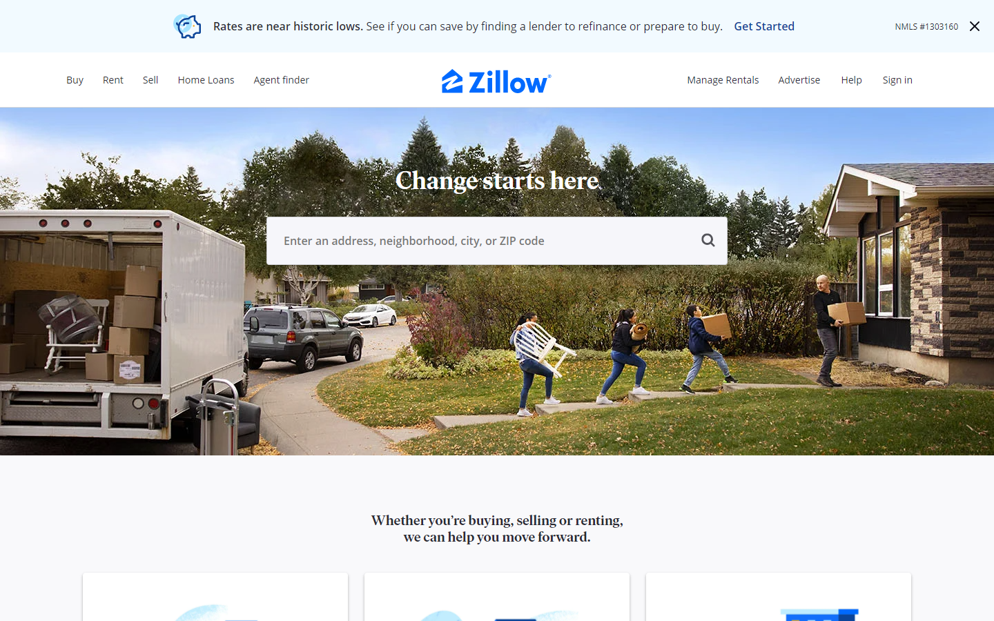
19. Zillow
Why it works: We appreciated Zillow’s website layout, which is simple yet effective. The homepage is compact, but it still has a sense of direction. Simply by looking above the fold, one can identify what best professional services they provide with ease.
 zillow.com
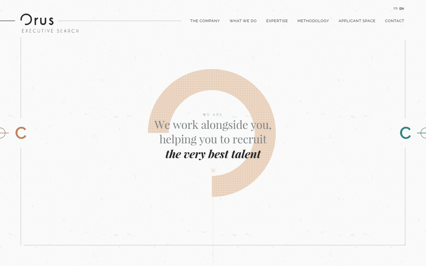
20. Orus
Why it works: Best professional services websites come in all shapes and sizes. But of all the professional services websites that I’ve seen, Orus is one of the most memorable. From the modern and sophisticated design to the stunning effects and animations, this site is truly a work of art.
 orus-executivesearch.com
Modern Professional Services Websites
21. Youngblood Photography
Why it works: This photographer’s website will surely pique someone’s interest. Large, striking photos take center stage, showing the photographer’s talent and style.
 youngblood.photo
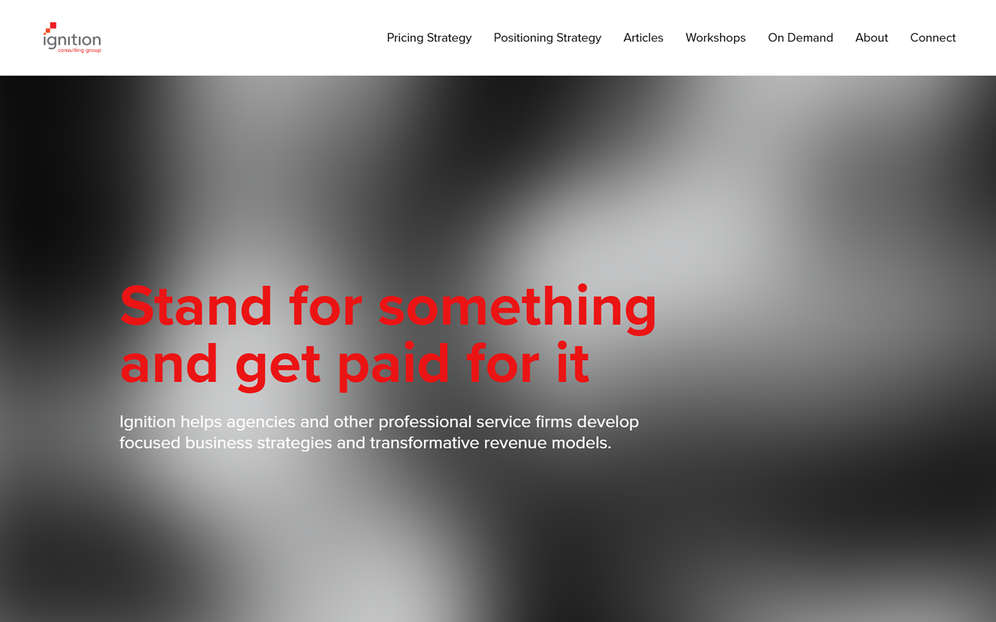
22. Ignition Consulting Group
Why it works: A cool video background makes this best professional website a one-of-a-kind on our list.
 ignitiongroup.com
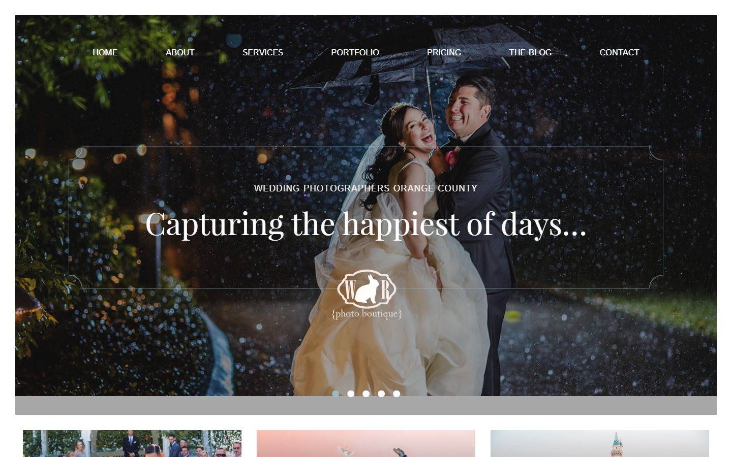
23. White Rabbit Photo Boutique
Why it works: The quality of the images and their business branding focus create a genuinely personal vibe. We appreciate the personal touch of the team that was provided by the high-quality photos exhibited. The typefaces and hues are also appropriate in terms of tone.
 whiterabbitphotoboutique.com
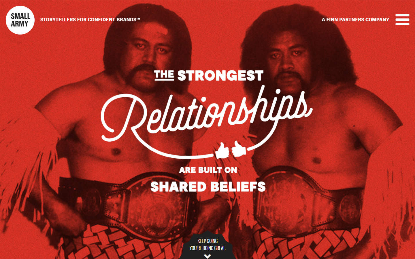
24. Small Army
Why it works: Despite the duotone design, this best professional website’s visuals are extremely creative. The subtle animations and the rough humor all add well to the personality of the brand of business.
 smallarmy.net
website design for professional services
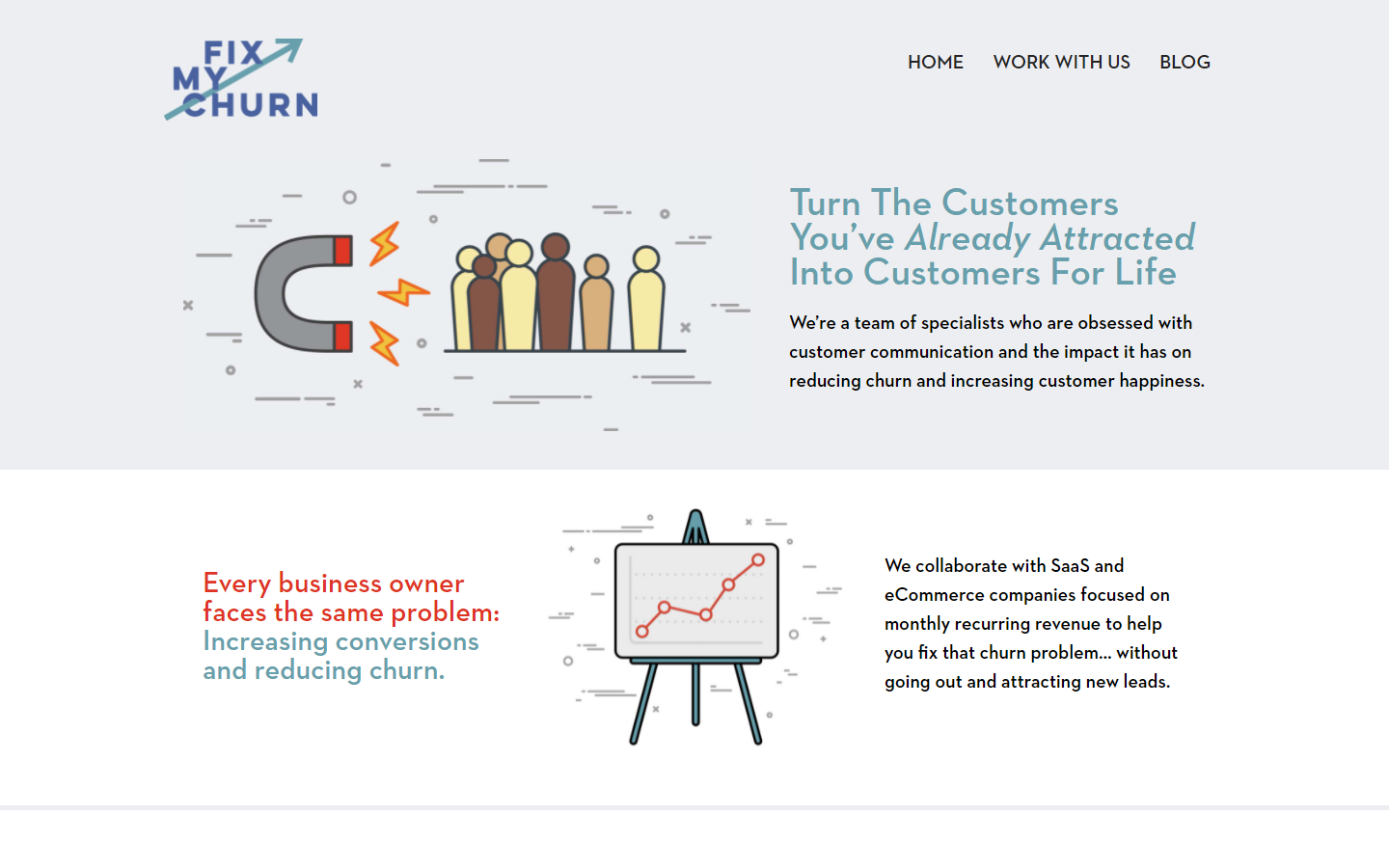
25. Fix My Churn
Why it works: This professional services website has an unusual yet captivating layout, not to mention the cute graphics that come along in every section. For a lighter user experience, web navigation is also kept to a minimum.
 fixmychurn.com
26. PCT Learning Center
Why it works: Breaking the ice in our list today is PCT’s professional services website. This white website design with just the right touch of golden yellow color is easy to navigate, purposeful in approach, and throws a positive vibe.
 pctlearningcenter.org
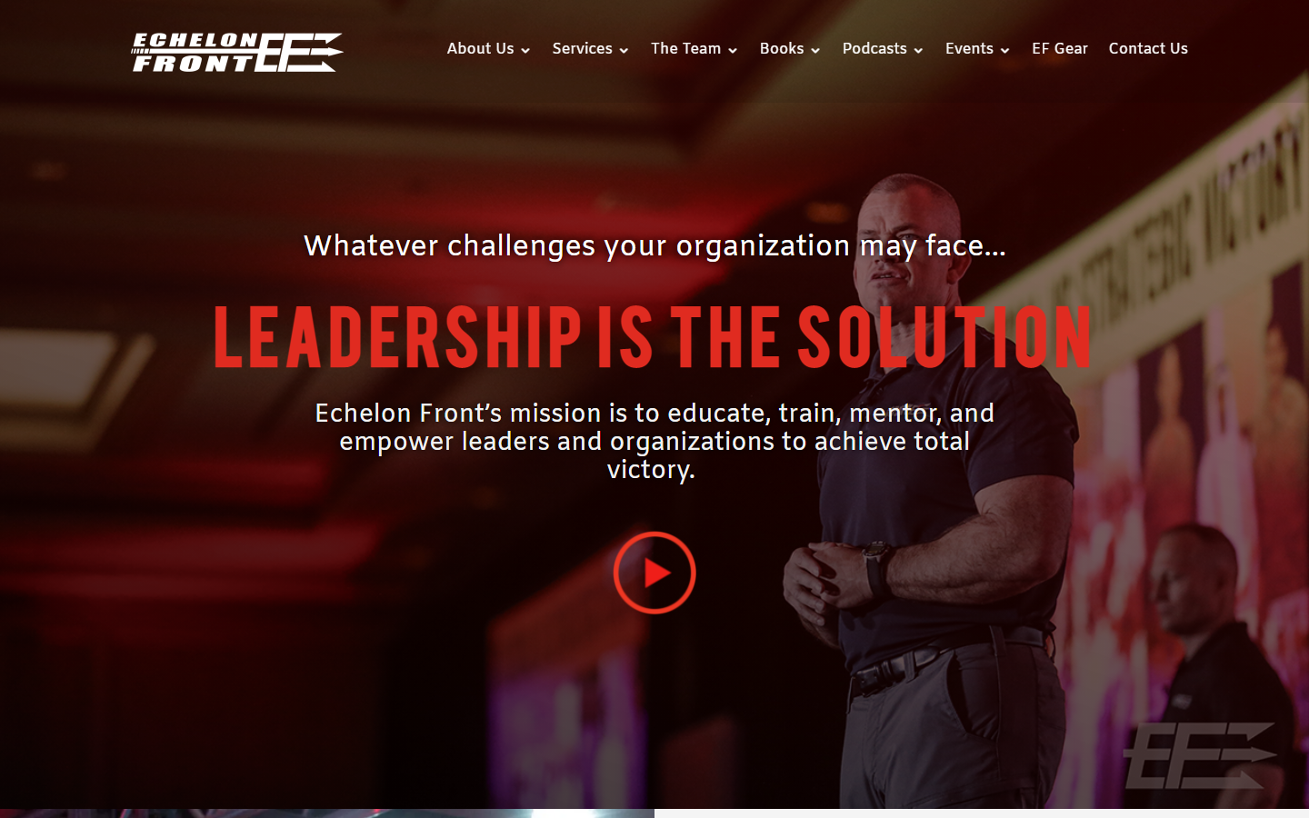
27. Echelon Front
Why it works: Big, impactful, and promising—three words to start describing the website design of Echelon Front. Simply browsing this business website, one may immediately determine the quality of the outcomes they guarantee in each of their services for their customers.
 echelonfront.com
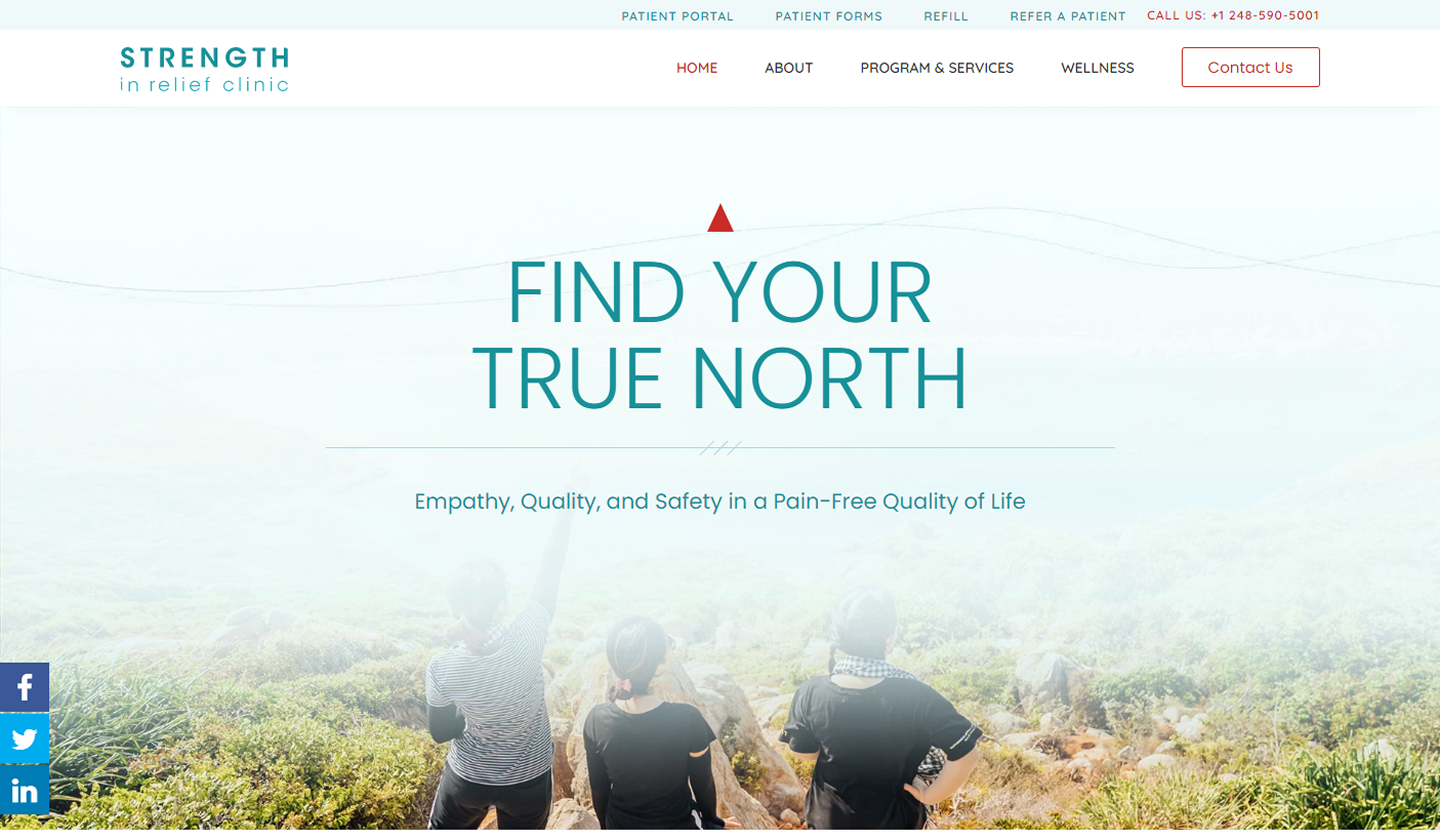
28. Strength in Relief
Why it works: The sticky navigation that is always visible aid navigability. The cool colors and layout make this new website striking and interesting at the same time.
 strengthinrelief.com
Best Professional Services Websites Inspiration
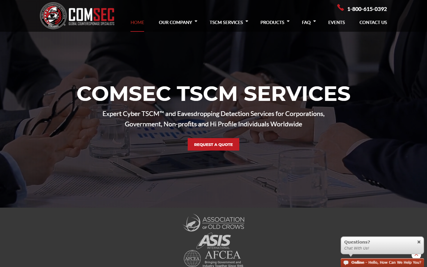
29. ComSec
Why it works: The site is well-designed and has a lot of characteristics that jump out. The hover effects are clear and focused. Illustrations are crisp and well-executed, especially on the ‘measure points’ section.
 comsecllc.com
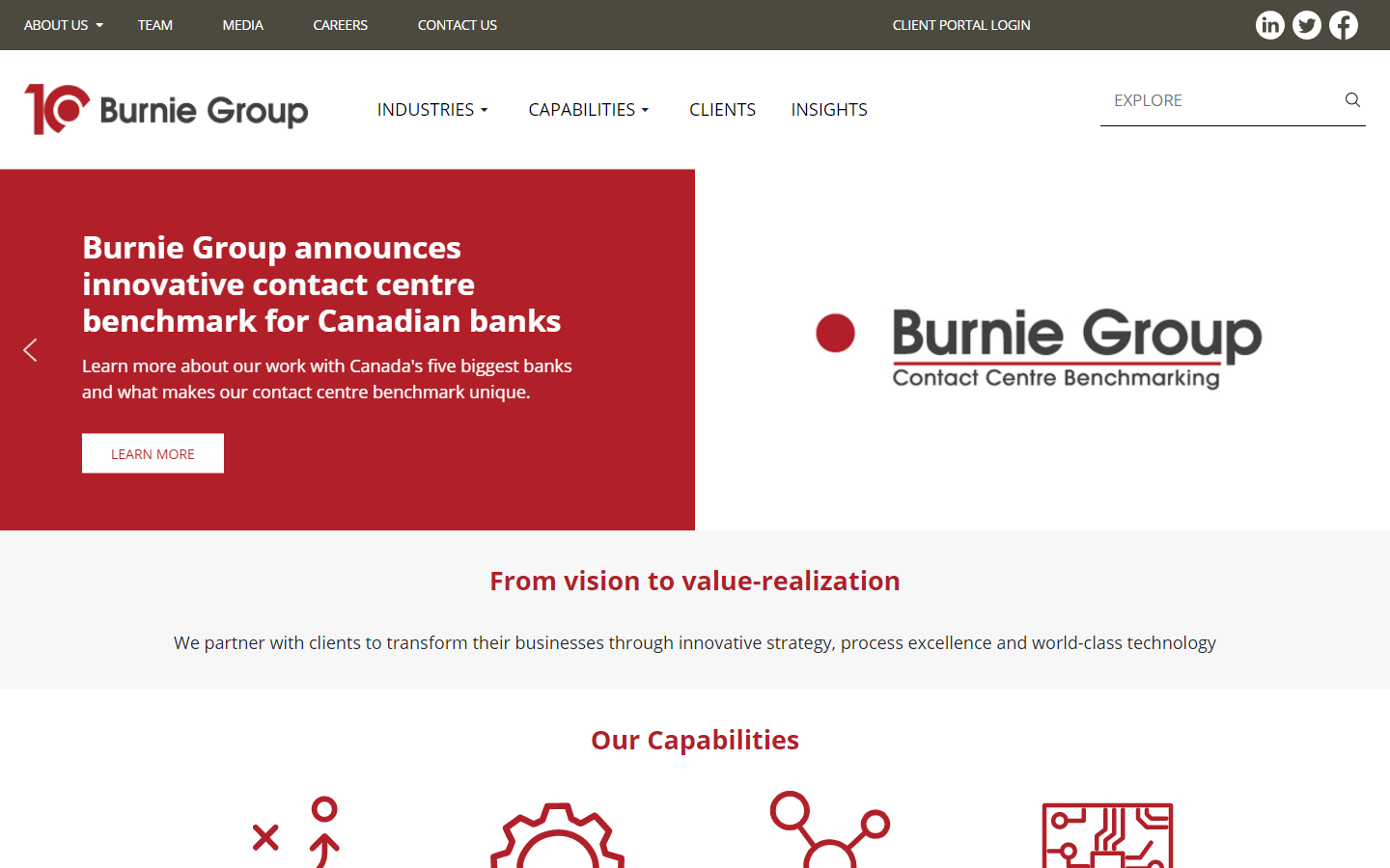
30. Burnie Group
Why it works: A prominent hero section is used by many sites today, but this one emphasized showcasing their capabilities and expertise that build trust. The icons are large so that they may be seen by the audience. Awards are proudly displayed at the bottom of the sites as add features of the website.
 burniegroup.com
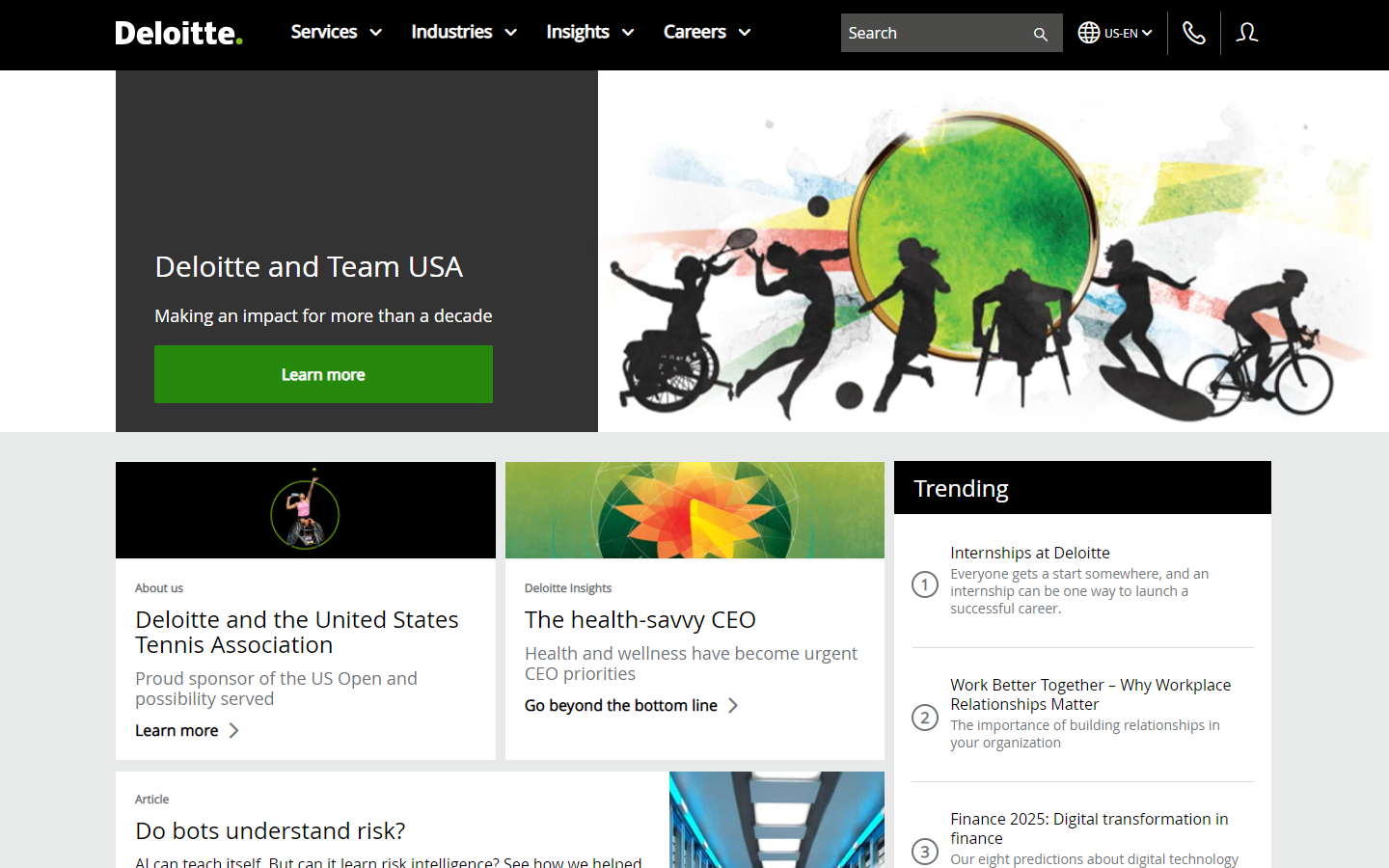
31. Deloitte
Why it works: Deloitte’s marketing website seemed more like it’s trying to educate first than trying to upsell a service, and they did this beautifully without breaking user experience. The mega menu is also highly striking design.
 deloitte.com
32.California Fire Detection
Why it works: The various aspects of the design are so ardent because of how cohesive the branding is to the story and service they offer. Every detail on the web, from the icons to the words and images, is connected to the topic and message they wish to convey to their clients.
 cafiredetection.com
great professional services websites
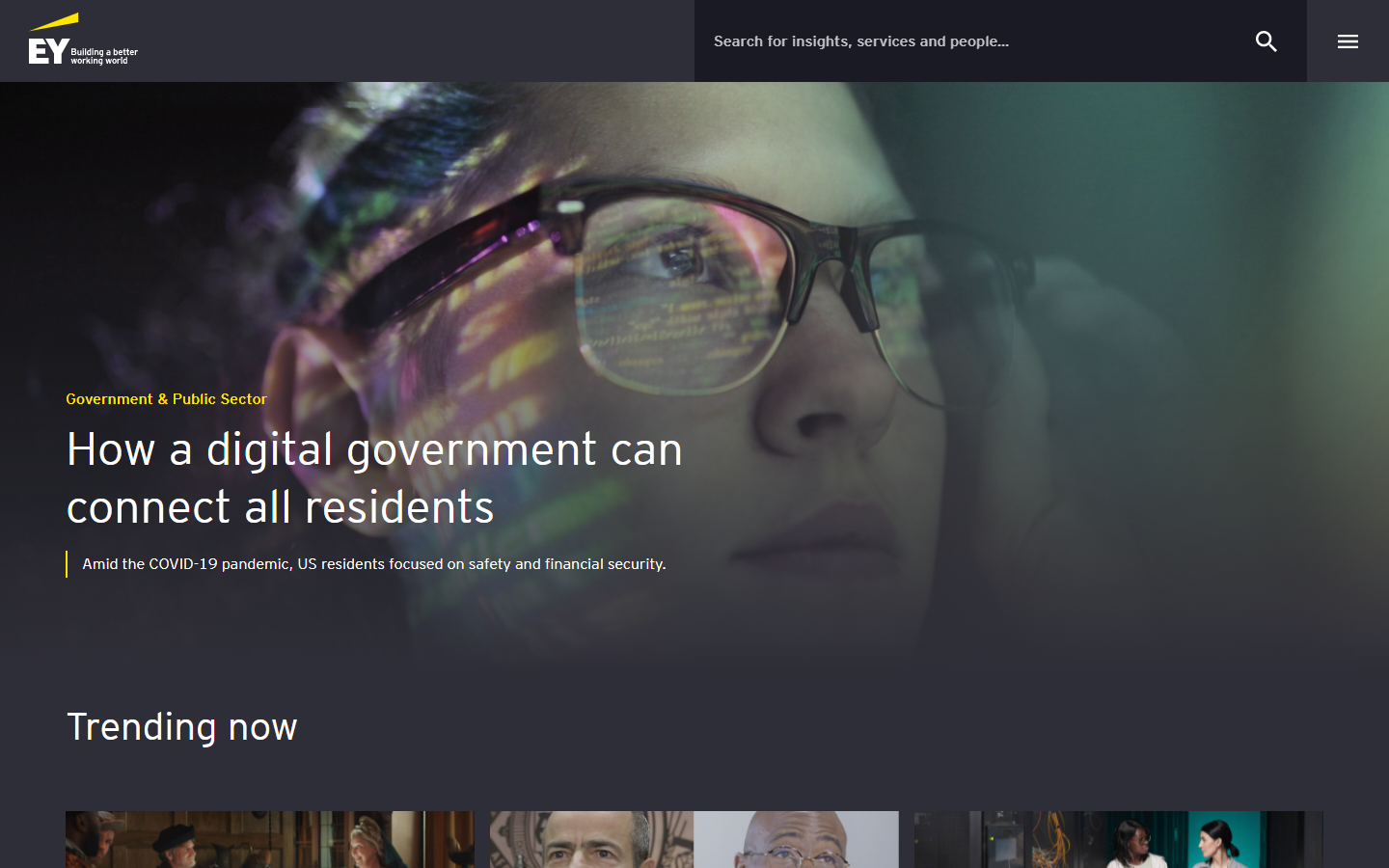
33. EY US
Why it works: This website has a search bar instead of the usual menu or navigation. Visitors may use the search bar to look for not just material but also the team professional services. The appearance of the site is clean and well-designed.
 ey.com
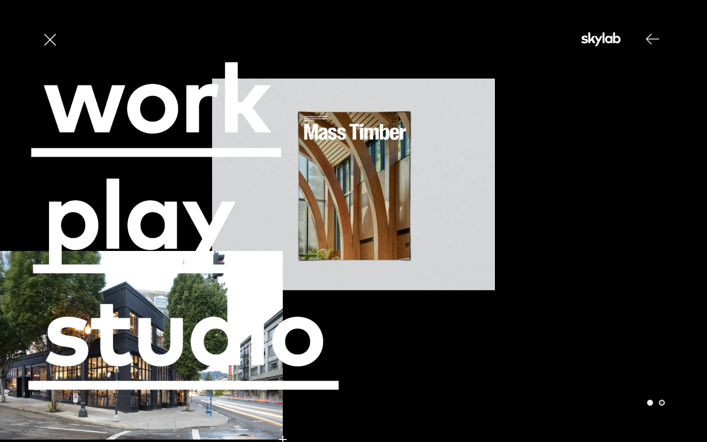
34. Skylab Architecture
Why it works: Catching up to these modern times is this design by Skylab. The company made sure that the website looks and feels good to match the very high standards they maintain for marketing their best professional services.
 skylabarchitecture.com
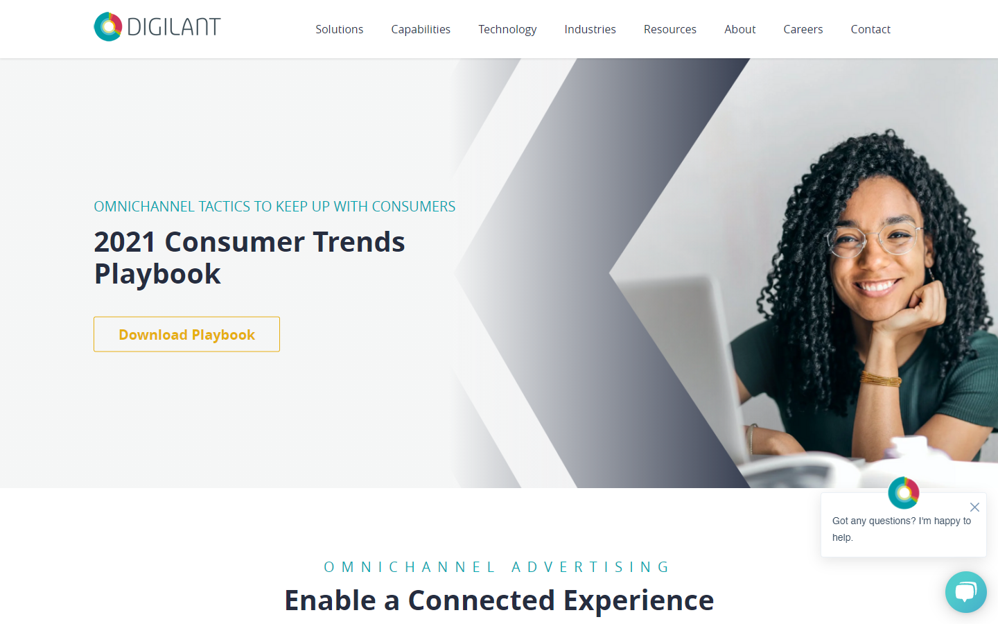
35. Digilant
Why it works: We appreciate the wide range of hues from top to bottom. The design also has a lot of visual features that keep the website exciting and intriguing.
 digilant.com
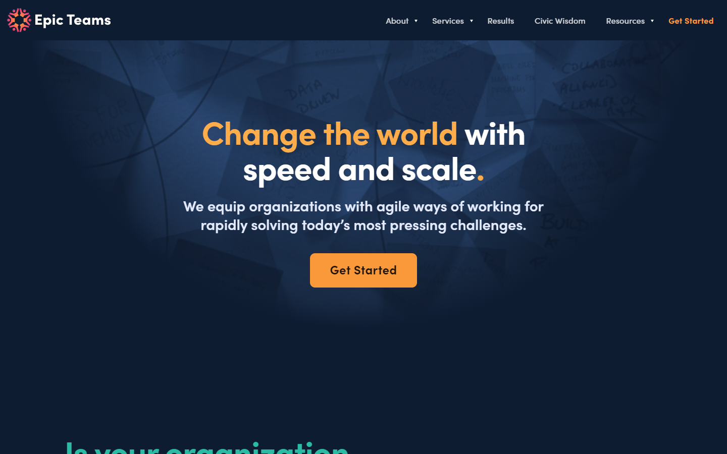
36. Epic Teams
Why it works: This website’s design is a fantastic combination of trendy typography, cool animations, and electrifying graphics. Pages also load fast, and the messaging is clear every step of the way.
 epicteams.co
Unique Professional Services Websites
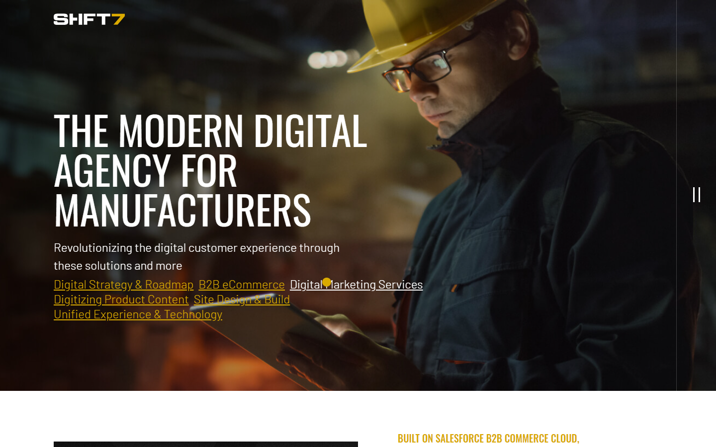
37. Shift7 Digital
Why it works: Shift7’s website is attractive in appearance, yet serious enough to suit the industries they serve. The pictures are extremely crisp and personal. The services they provide are well-defined above the fold.
 shift7digital.com
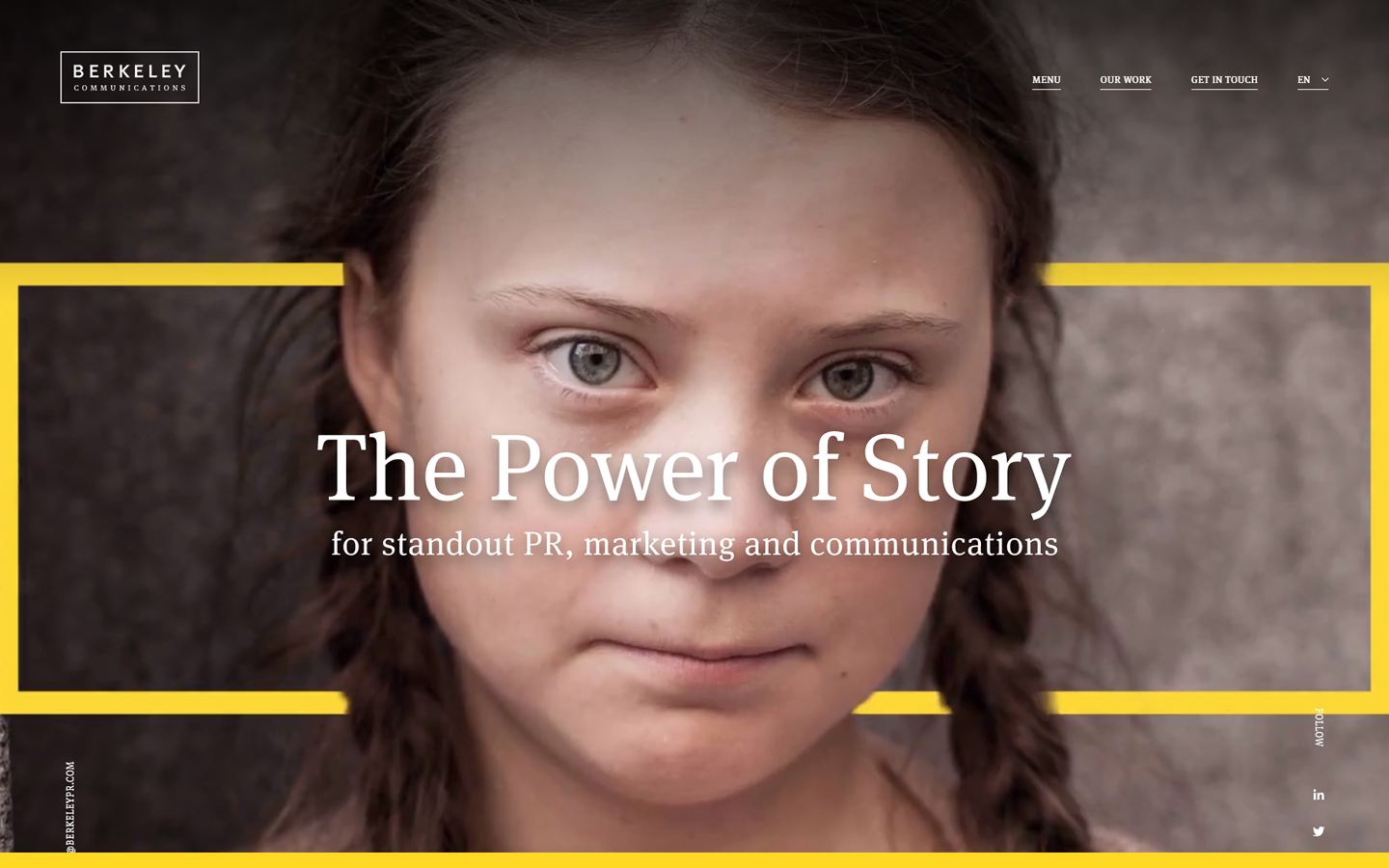
38. Berkeley PR
Why it works: Awe-inspiring effects compliment this website design. Other than that, we also love the out-of-the-box thinking applied to this website, down to the inner pages. This projects unique and creative visuals that help to keep the user engaged.
 berkeleypr.com
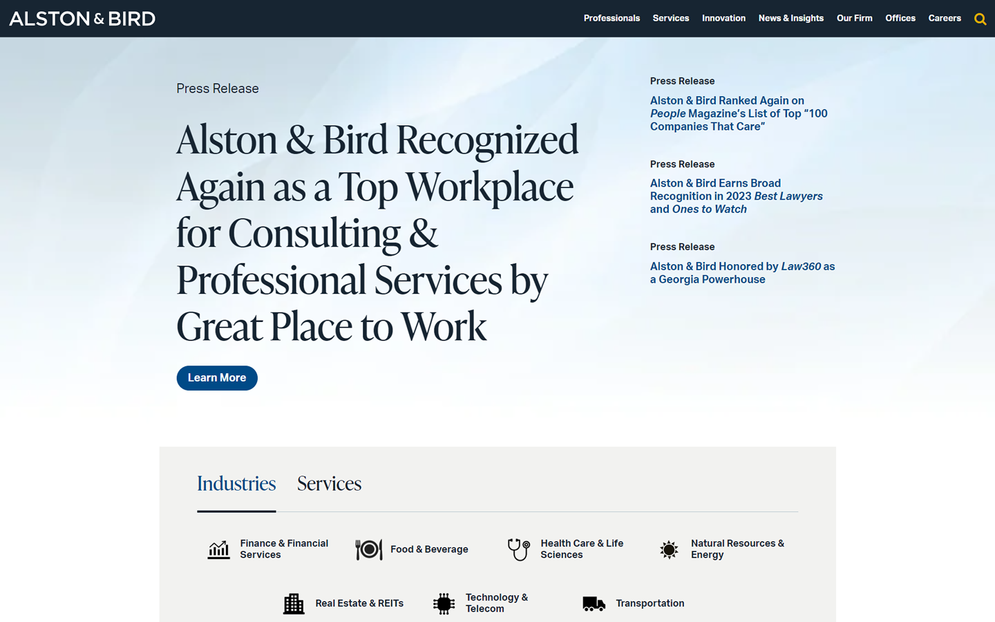
39. Alston & Bird
Why it works: This website design nicely combines brevity and clarity while also providing services upfront. The slide-in search is likewise an effective means of speeding the process for clients to find content fast.
 alston.com
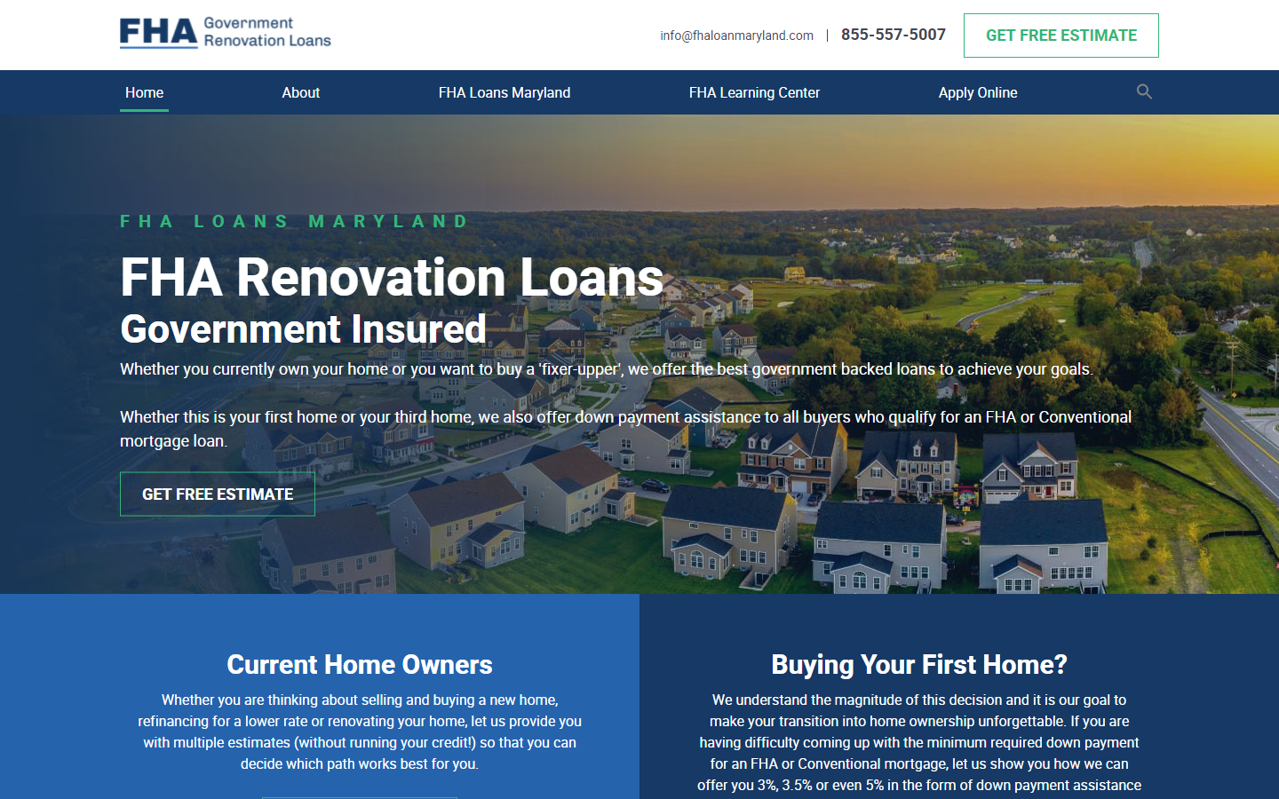
40. FHA Loans
Why it works: Apart from the lovely colors that inspire trust and excellence, we appreciate the targeted boxes aimed at the two specific audiences they appeal to current homeowners and potential purchasers.
fhaloanmaryland.com
Best Professional Services Web Design
The Ultimate Guide to Creating the Best Professional Services Web Design
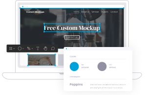
Since we offer professional services ourselves, we know that the primary function of a service website is generating new business. With that in mind, we focus on five strategic areas while designing your site.
|
|
Rank for Maximum Exposure
We incorporate several proven strategies to get your site ranking in the top spots on Google. We can say “proven” because our company ranks #1 for “San Francisco web design” and “hire a web designer.” Ranking #1 out of 20 million competing sites, says a lot about what we can do.
To help your site rank, we often use a combined strategy of SEO and paid advertisements. Both SEO and pay-per-click (PPC) accomplish the same thing. They put your website at the top of the search results. A good marketing strategy includes both. It’s true that PPC is more costly than SEO, but it produces immediate results.
SEO costs less and lasts longer. However, to capitalize on SEO, you need time and someone to optimize your content so that you sit in one of the top three spots of the search results. There are several ways to optimize your site, and that’s where our professional services web design experience comes into play. We make sure to structure your content for both your customers and the search engines.
Keywords and related search strings help search engines know what you have to offer. Researching and incorporating these keywords takes experience. We do the research and make sure your website is ranking as it should.
Get A Website Optimized for Mobile Devices

Every day more and more people are searching using mobile devices. Currently, over 30% of all Google searches come from smartphones or tablets. This trend raised a few flags at Google. In 2017, the company plans to use their mobile index as their primary source for returning search results. In other words, this means that if your site does not perform well on mobile devices, you are going to pay the penalty in rank. This penalty applies even when prospective clients are searching using desktops.
All our professional services web designs come fully optimized for mobile devices. We make them fast, and mobile-friendly. By doing this, we increase the likelihood that your site will rank higher in the search engine results.
Your Professional Services Web Design Is Market Driven

Not all professional service industries are alike. Therefore, all of our professional services web design projects are 100% unique.
Before we ever start building your website, we sit down and ask you the important questions.
- Who are your primary customers? Your secondary clients?
- What type of professional services do you offer?
- What types of goals do you in regards to your website?
- How does your site figure into your overall business plan?
After we identify your specific needs, we make a free mock-up of your proposed site. Every layout is 100% custom made for each of our clients. There won’t find another website like yours anywhere on the web. That includes layout, text, or images.
⇒ Sites Need to Be User-Friendly
With a plethora of information just a click away, people don’t bother with poorly structured websites. Instead, they want to find what they need and “go.” However, the last thing you want them to do is “go.” Instead, you want them to linger on your site and engage.
We help you identify customer’s needs and make sure it’s easy to find. If you give your visitors a positive experience, they WILL come back.
⇒ Establish Credibility as a Professional Services Provider
One of the best ways to build credibility is to make an investment in quality content. Whether you are comfortable writing your material or prefer to hire professional writers, we can help.
Generate Leads and Grow Your Business
Our sites are designed to generate leads. The landing pages include compelling offers and strong calls to action. We don’t just believe in beautiful graphics. Instead, we believe in making sales and bringing in new business for our customers. Our landing pages showcase compelling offers and strong calls to action. After all, your website is a sales tool, not just window dressing.
To increase sales, you need to add new clients AND keep the existing ones. Turning one-time purchasers into lifelong customers requires clear communication. We design opt-in forms for mailing lists and create engaging newsletters to help you accomplish this.
Stand Out from the Crowd!
At Thomas Digital Design, every website we build is 100% unique. This difference goes way beyond surface presentation. To see the difference, look at our portfolio. We never use pre-made templates – EVER! If you think that all websites look the same these days, it’s because they are all using generic templates. If you want to set yourself apart, then you need a custom designed website.
Our professional services websites changes with each of our customers. However, our goal to achieve maximum results applies to all the sites we design.
Why Professional Service Companies Choose Us as Their Web Design Agency
Clients rave about our professional services websites. We hold over 50 5-star reviews on Yelp. Let us shoulder the burden of programming and web design. There is no risk. Unlike with other web design firms, you see a mock-up of what your website will look like before you ever commit to spending a dime.
This free mock-up is what makes us unique. We offer a no-hassle, risk-free experience. What do you have to lose? To see what your professional services websites design could look like just accept our Free Mockup Offer.
And to prove that we never reuse a design, take a look at our “rejected designs.” For one reason or another, the company chose not to move ahead. We understand. However, we still feel confident enough in our work to show it off anyway. Yes, we could have recycled them for another client, but that isn’t what we do. Your design is made especially for your business.