Are you looking for the best websites on the web? You’re in the wrong place!
Today, we will be looking at bad websites. The 40 worst websites on the web to be precise.
But these aren’t just regular ‘bad websites’, we’re covering popular websites with bad design. So, you’re a website designer or care about good design, cover your eyes 😉
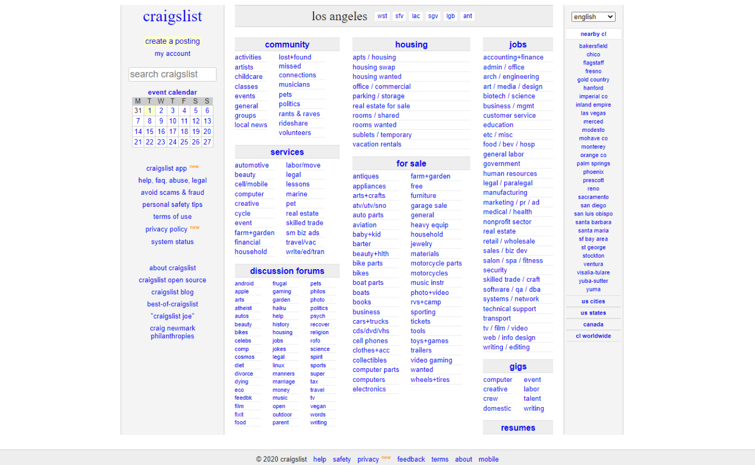
1. Craigslist
Why it doesn’t work: So popular and so in-demand, one can only think if the overt simplicity of the site is rationally intended.
2. Berkshire Hathaway Inc.
Why it doesn’t work: While clean and light, this website is just way too far from what a multinational holding company should be.
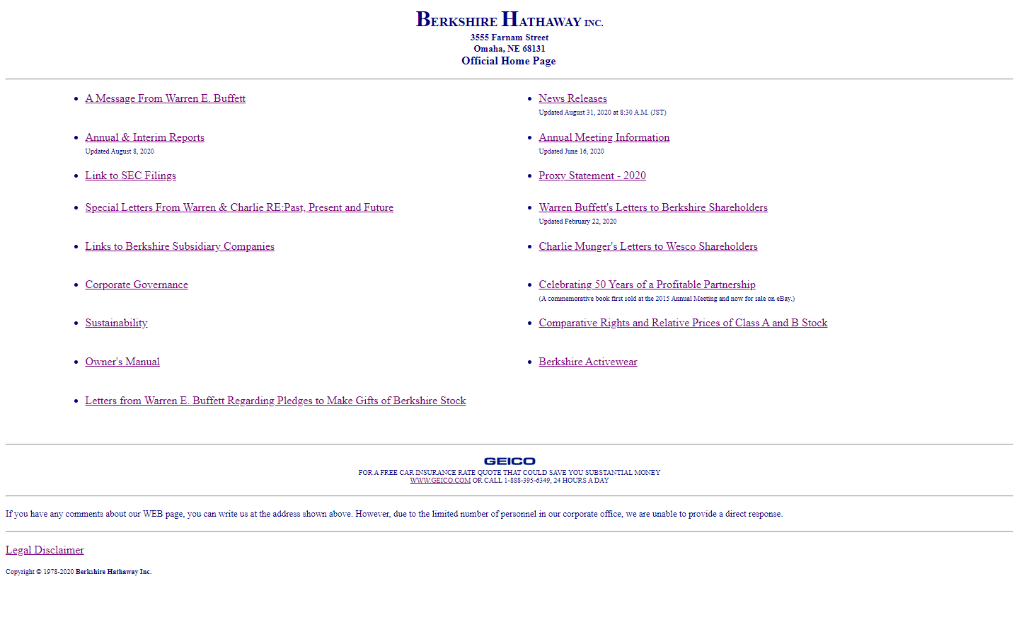
https://berkshirehathaway.com/
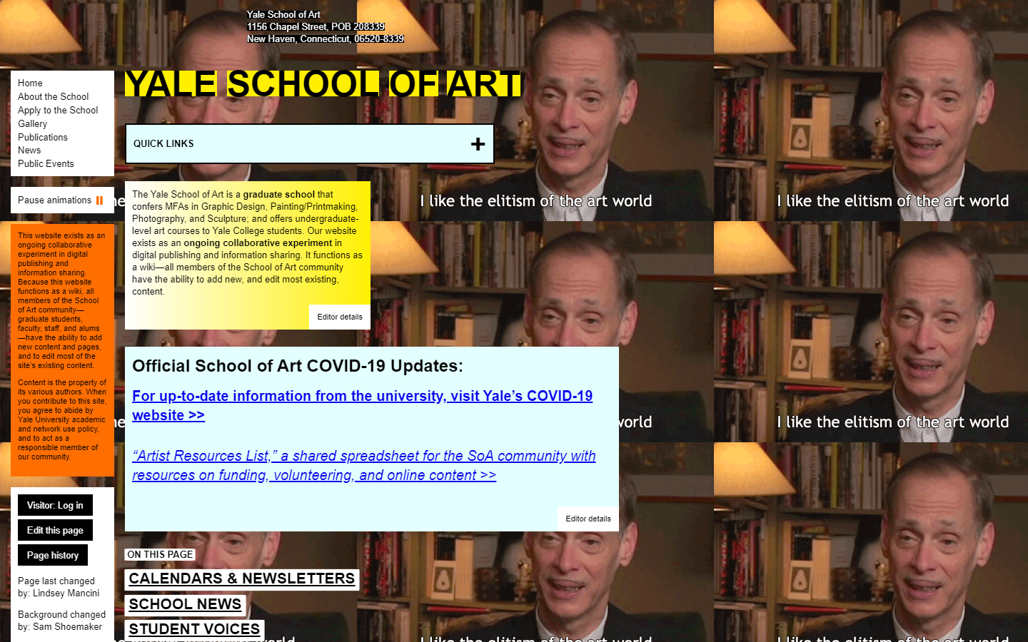
3. Yale School of Art
Why it doesn’t work: The website looks old, distracting, hard to read, and the Elitism GIF background is just plain wrong. It leaves you wondering if you are in the right website.
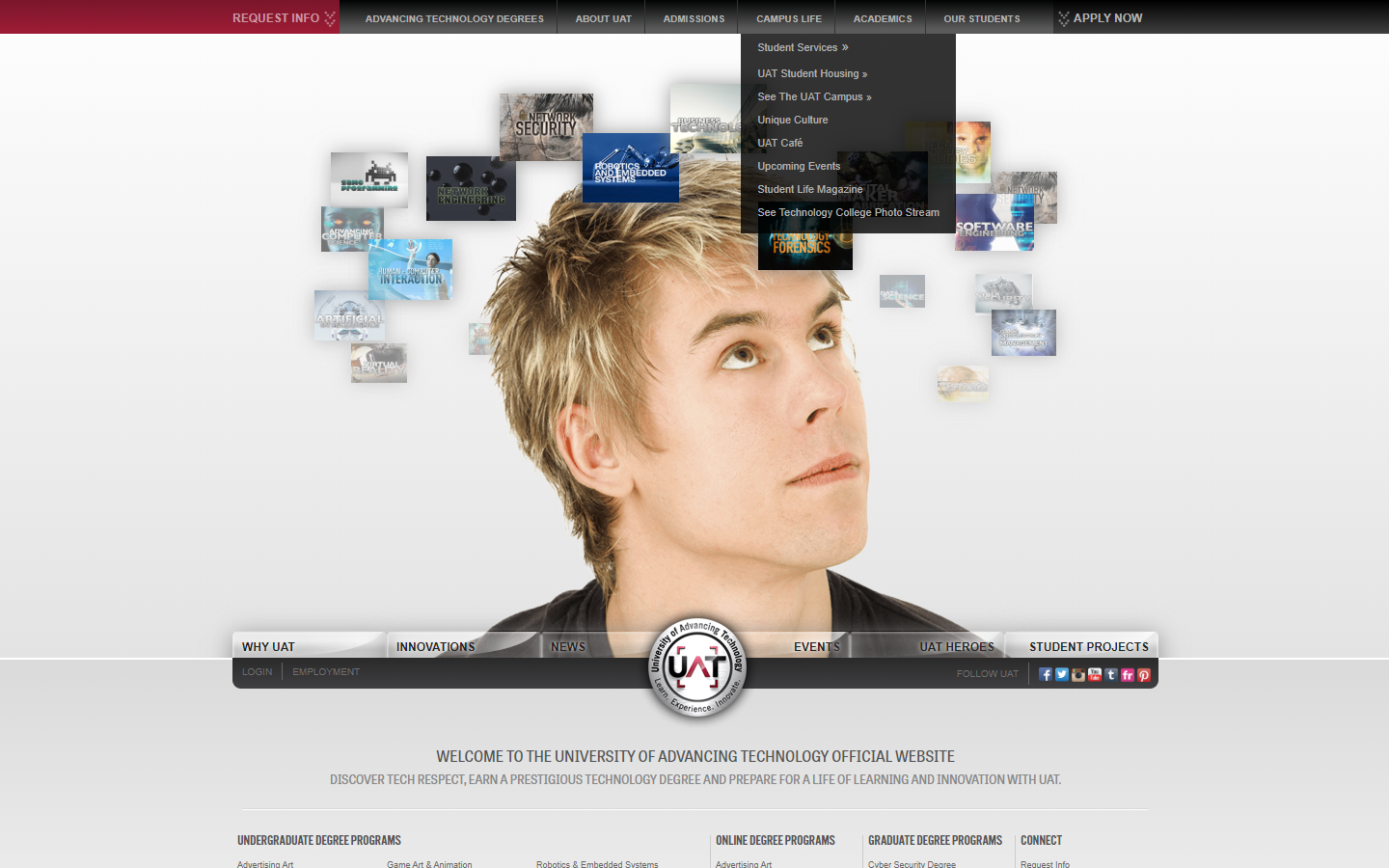
4. University of Advancing Technology
Why it doesn’t work: Website design looks outdated and distracting because of so many things that try to steal your attention.
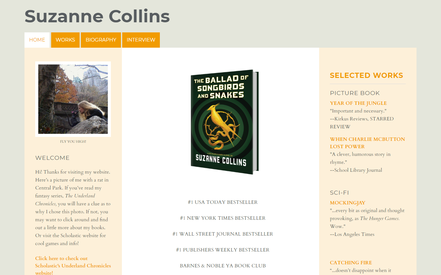
5. Suzanne Collins
Why it doesn’t work: Who doesn’t love Hunger Games? You’d expect their website to look great but instead, it’s stuck in the past. Even the portrait image of the author is unclear!
http://www.suzannecollinsbooks.com/
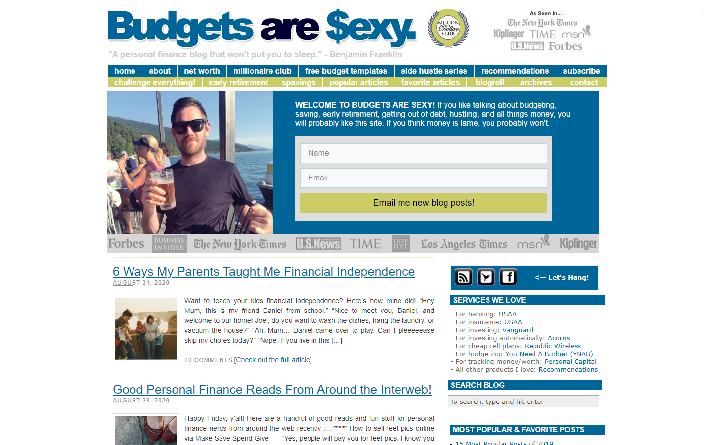
6. Budgets Are Sexy
Why it doesn’t work: Featured in prestigious firms like NYT and Forbes, this website looks cramped, busy, and monotonous.
https://www.budgetsaresexy.com/
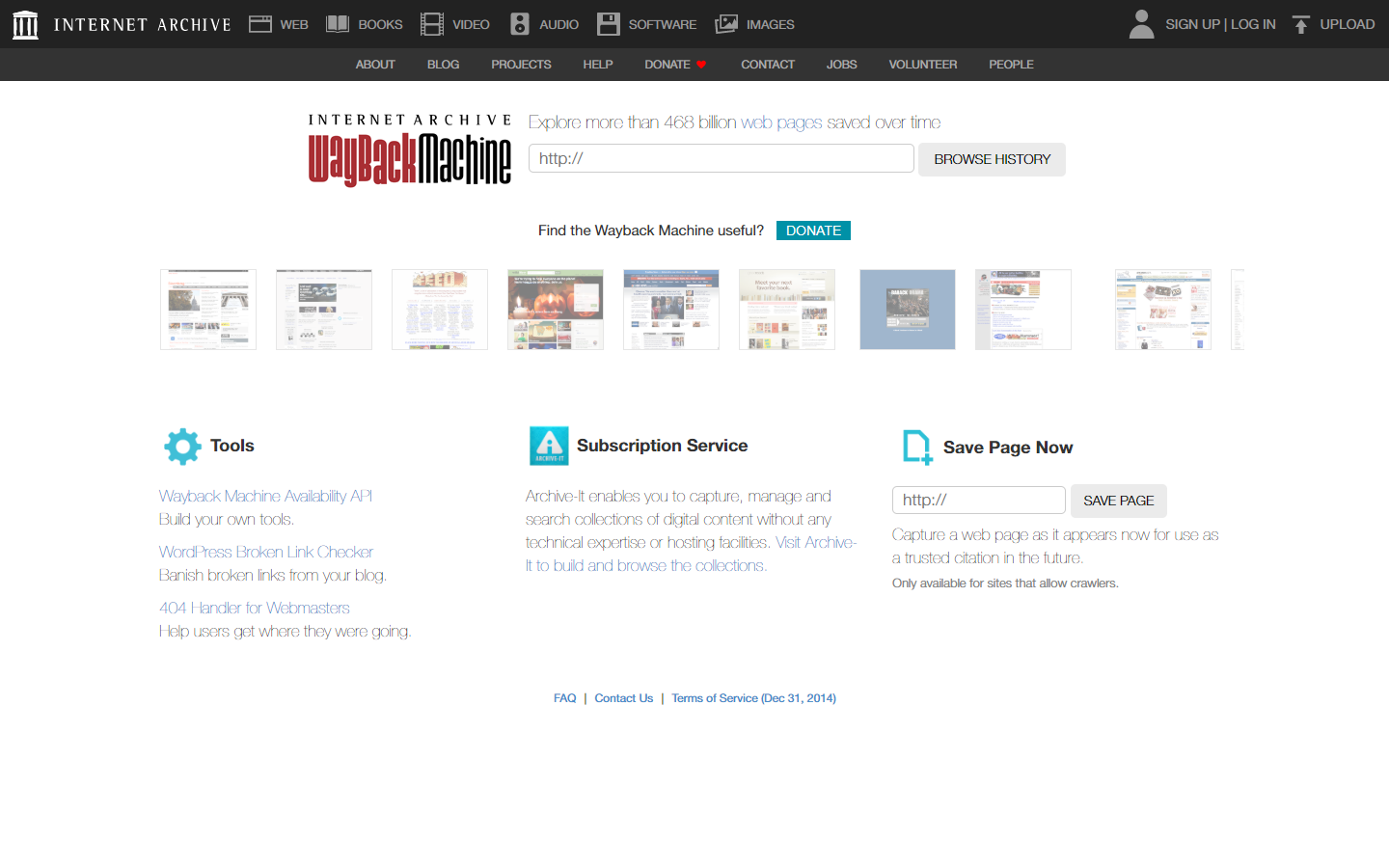
7. Internet Archive Wayback Machine
Why it doesn’t work: For a website that serves millions in a day, and for a website that has a strong clear purpose, this website has a backward design and has tons of links at the header.
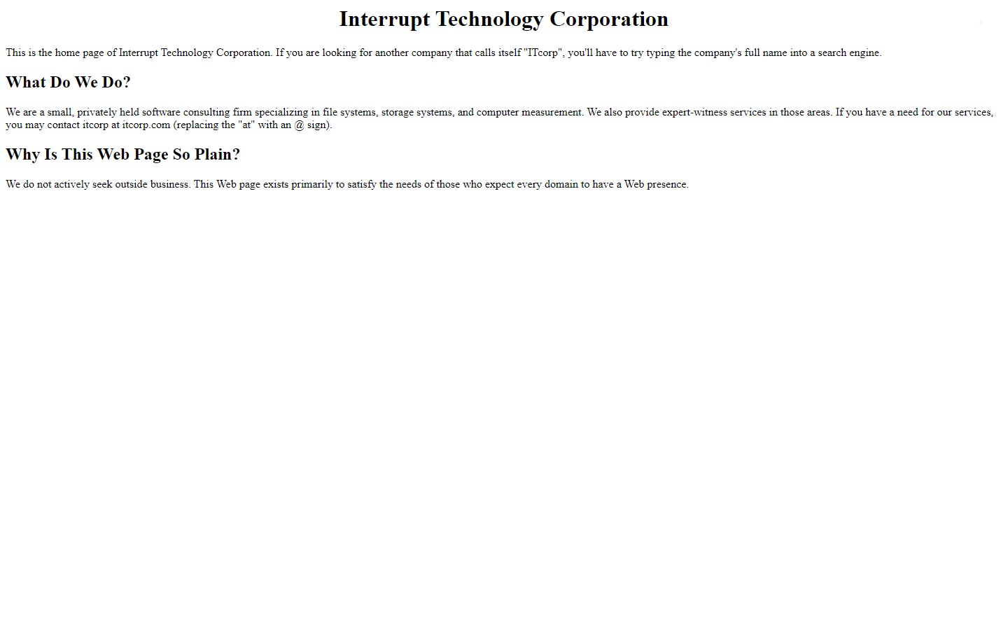
8. Interrupt Tech Corp.
Why it doesn’t work: A good domain name, but this website design felt like it’s just there for the sheer sake of being on the internet. What’s more hilarious is the way they explain why such is such.
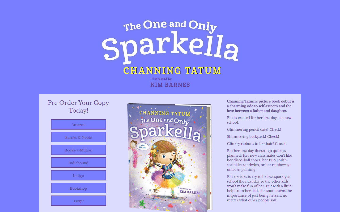
9. The One and Only Sparkella
Why it doesn’t work: Channing Tatum’s picture book features a stunning dreamy book cover that captures the youngest of hearts. We can only hope they also pay the same attention to the lackluster website.
https://read.macmillan.com/mcpg/the-one-and-only-sparkella/
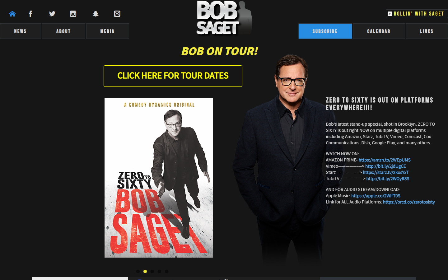
10. Bob Saget
Why it doesn’t work: The information is all there, but the structure of the site is messy, with unclear headings between sections, lots of off-grid elements that try to distract you, and texts with lack of contrast.
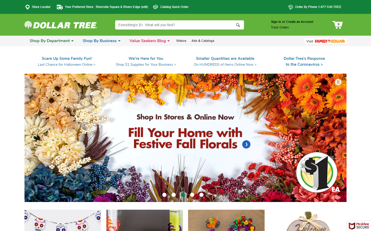
11. Dollar Tree
Why it doesn’t work: Well-known providers of party supplies have a website that has too many texts on each of the products showcased. The green color scheme is supposed to deliver a refreshing feel, not a stressful one.
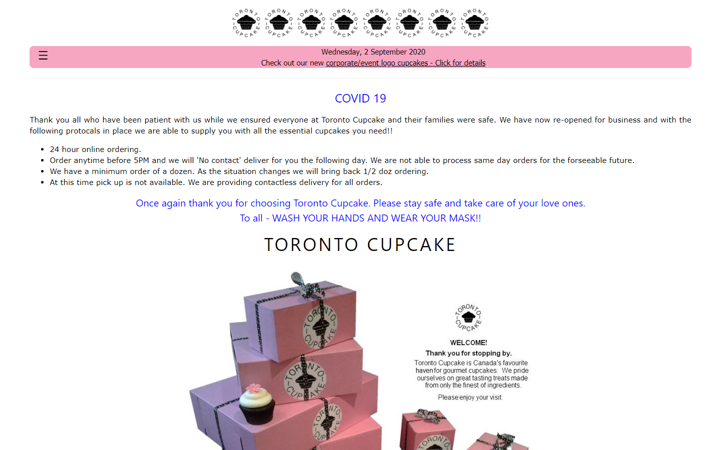
12. Toronto Cupcake
Why it doesn’t work: Repeated logos yet still unclear, no proper headings, risky layout, and user experience.
https://torontocupcake.com/index.html
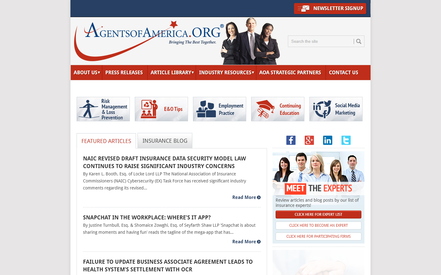
13. Agents of America
Why it doesn’t work: Unless you have previous experience with the agents, one can hardly tell what agency this website discusses. It’s also not clear what they offer, and the site looks more like a blog with an unclear niche.
http://www.agentsofamerica.org/
14. Illuminati Exposers
Why it doesn’t work: The design is outdated and the colors used are too bright.
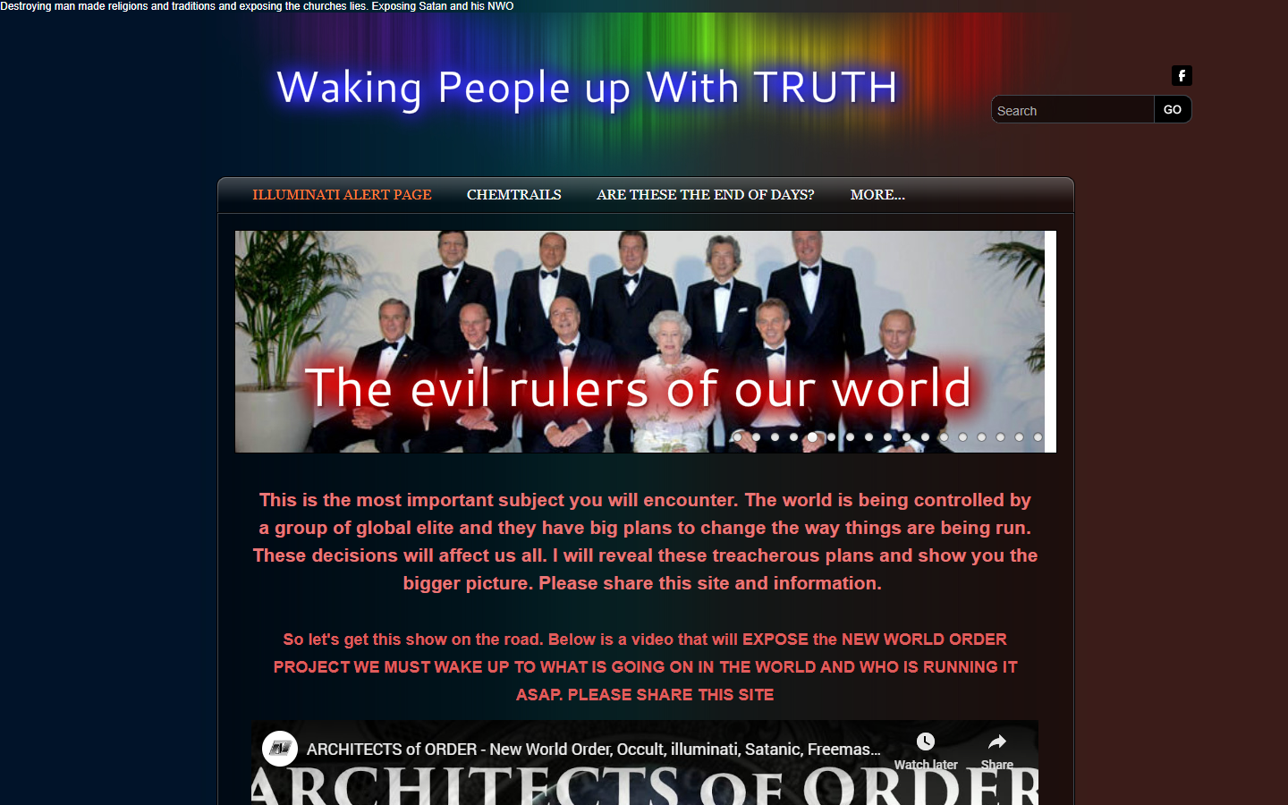
https://nwokillers.weebly.com/
15. Rite Aid Pharmacy
Why it doesn’t work: Though functional and catchy, there are some negative spaces on the website design that felt more like voids. Could use more valuable content on the homepage too.

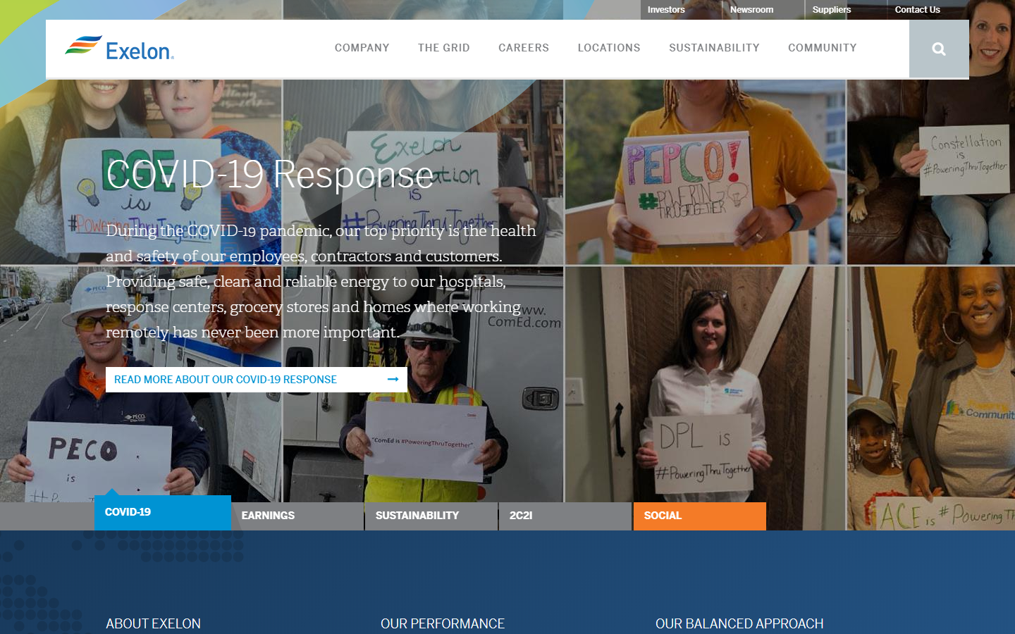
16. Exelon
Why it doesn’t work: The contrast on many elements is intolerable for a Fortune 500 company. Some elements have useless negative spaces too.
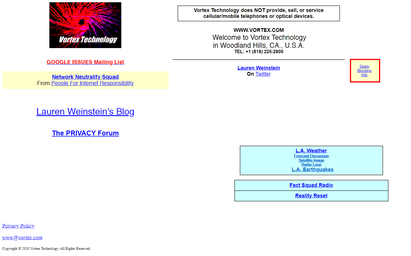
17. Vortex Technology
Why it doesn’t work: If you’ve lived during the ’80s to 90s and used dial-up networking to connect to the web, this website is one that you could stumble upon, pun intended
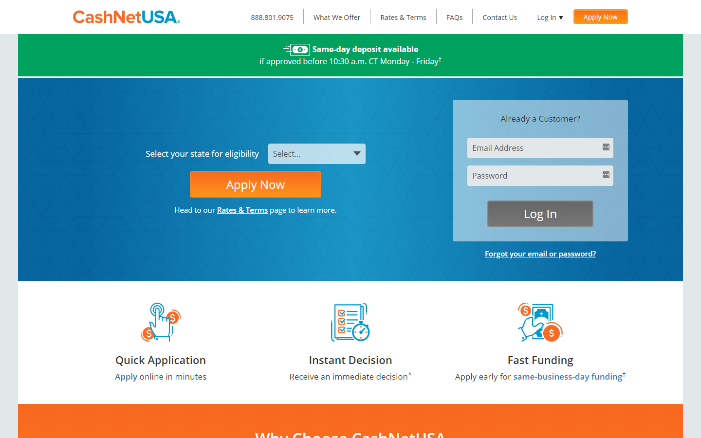
18. CashNetUSA
Why it doesn’t work: The colors are there, but the lack of images destroys the company’s reputation and impact. The hero area is especially bland and underwhelming.
19. UPS
Why it doesn’t work: UPS website is utterly underwhelming in terms of design. It’s very basic.
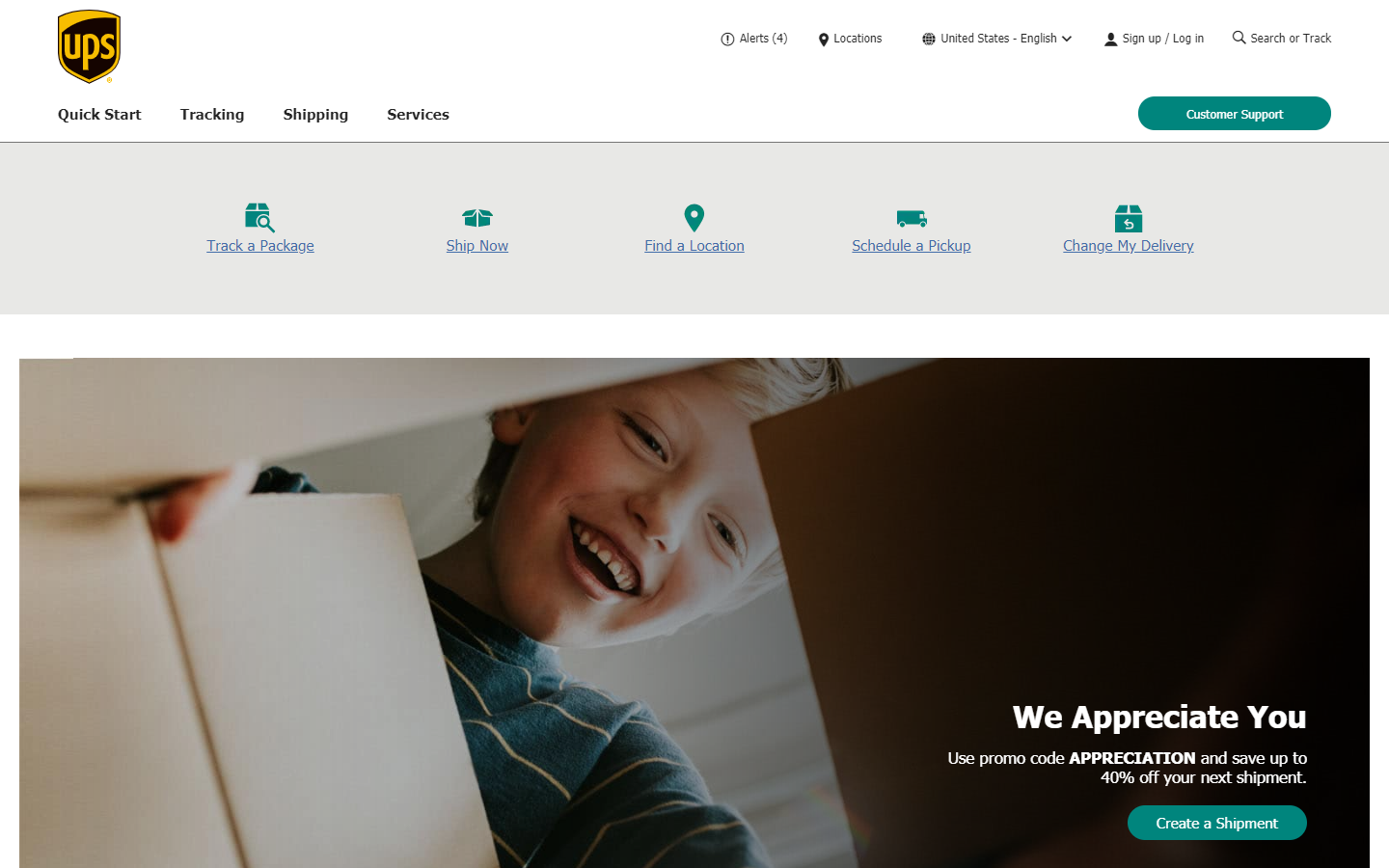
https://www.ups.com/us/en/Home.page
20. Paul Graham
Why it doesn’t work: The website is so small, and you can’t tell what’s going on. At least many can recognize the title ‘Paul Graham’ which somehow gives the website design some dignity.

21. Turner Construction Company
Why it doesn’t work: Despite the authority in their chosen industry, their website looks way outdated, and the images that showcase their work are just too small.
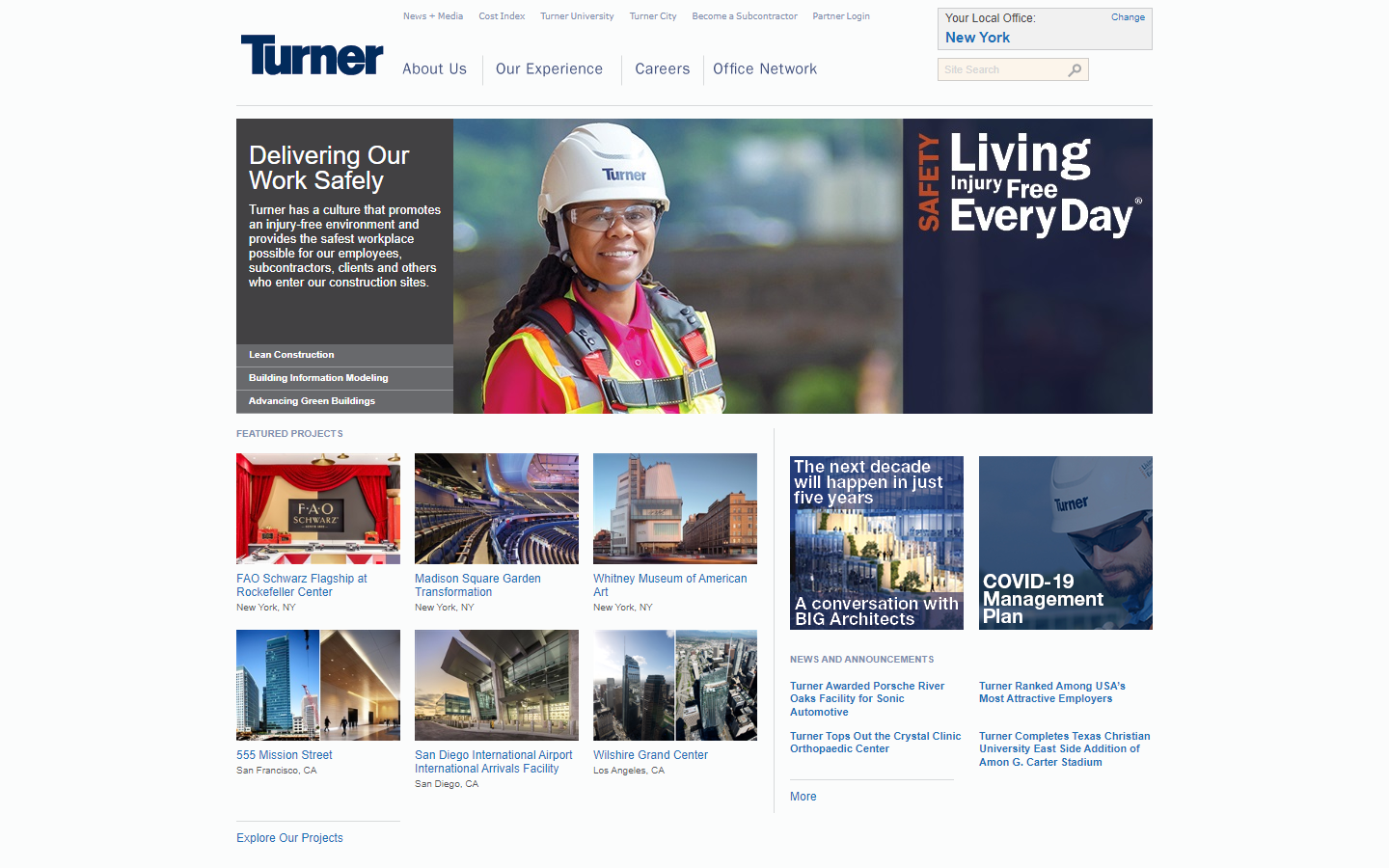
https://www.turnerconstruction.com/
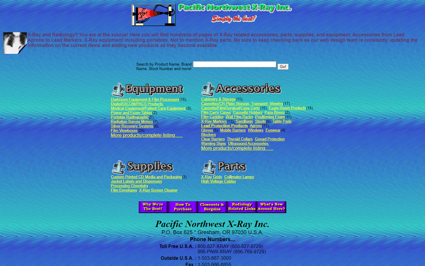
22. Pacific Northwest X-Ray Inc.
Why it doesn’t work: Incorrect color usage, cheap clip-art animated logo and rasterized typeface logo with an effort to cut the shadow—I just wish the contact details down below should be the first thing people should see.
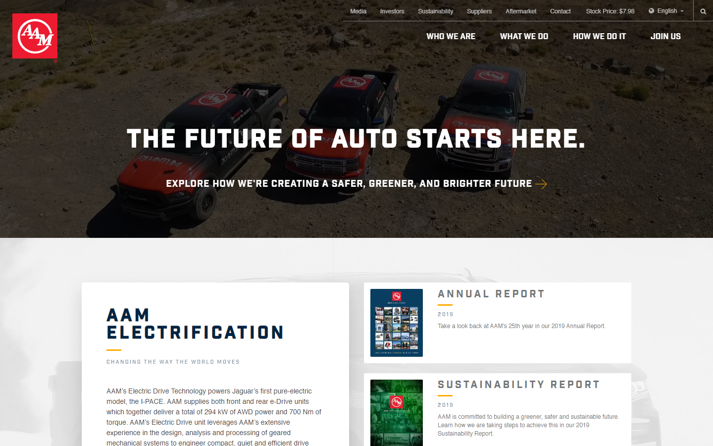
23. American Axle & Manufacturing
Why it doesn’t work: This website has an interesting hero that felt modern enough, but the rest of the site lacked value and impact. There’s also a lot of unnecessary white spaces all over.
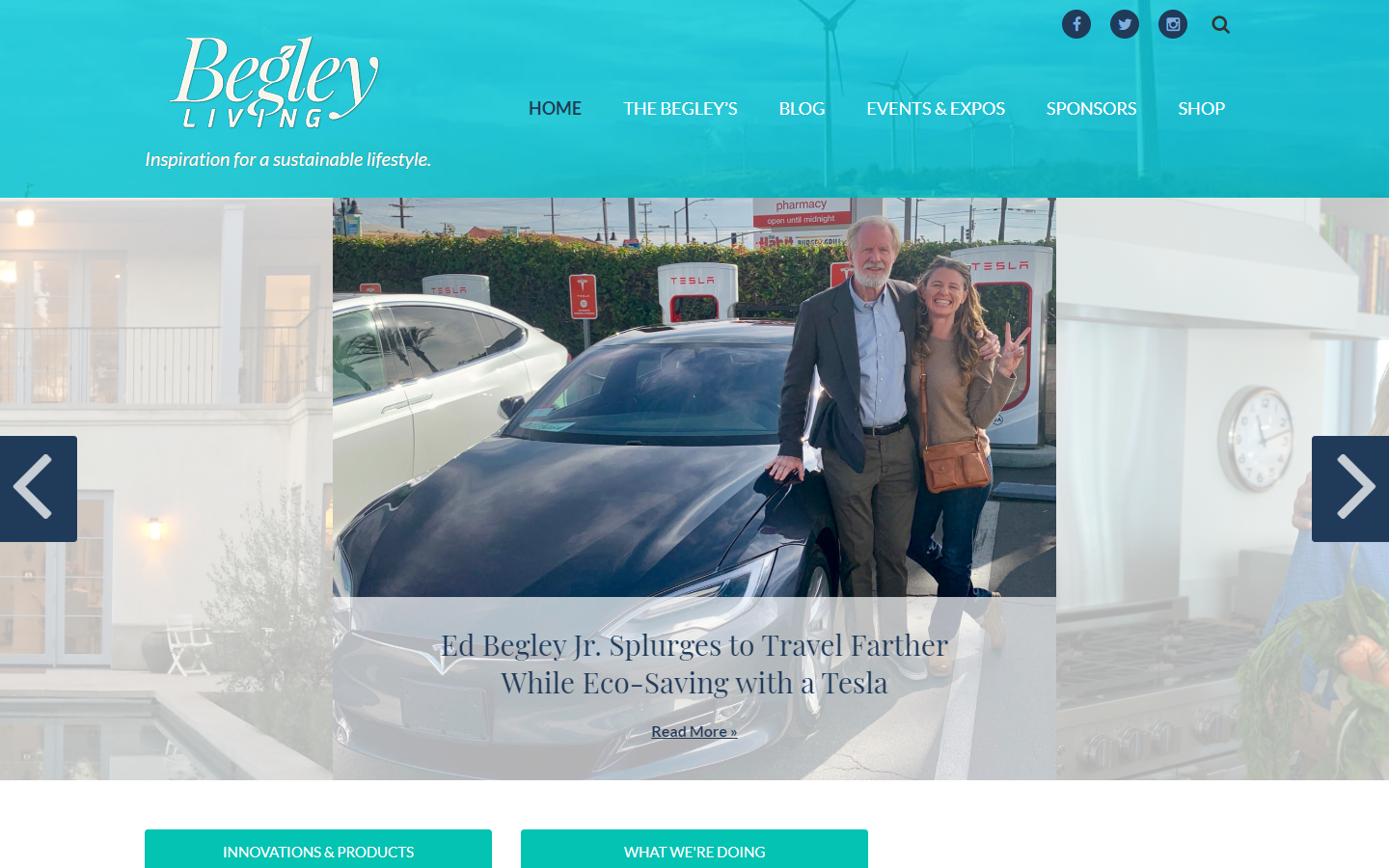
24. Begley Living
Why it doesn’t work: Known for American actor Ed Begley Jr., this website felt like a last-minute investment without investing properly in a good web design company. It lacks a solid layout.
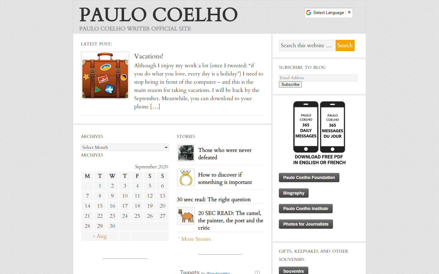
25. Paulo Coelho
Why it doesn’t work: The official website of a renowned author felt like a fresh-out-of-the-box blog template of WordPress
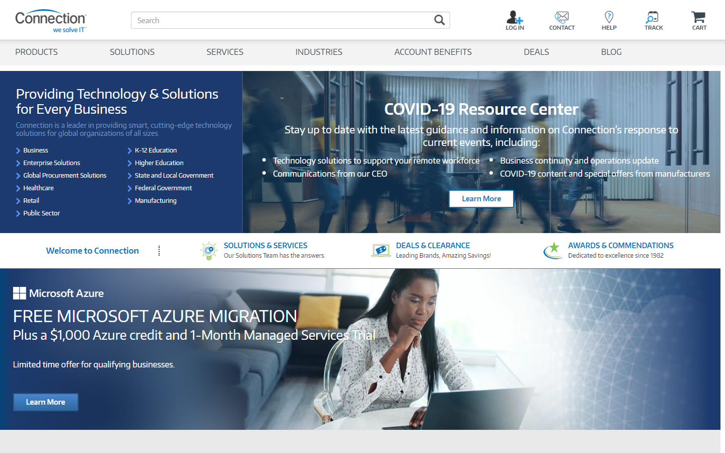
26. Connection
Why it doesn’t work: A website that’s in dire need of breathing room and extra space to move around. The copy is all crammed at the top of the site.
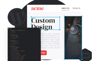
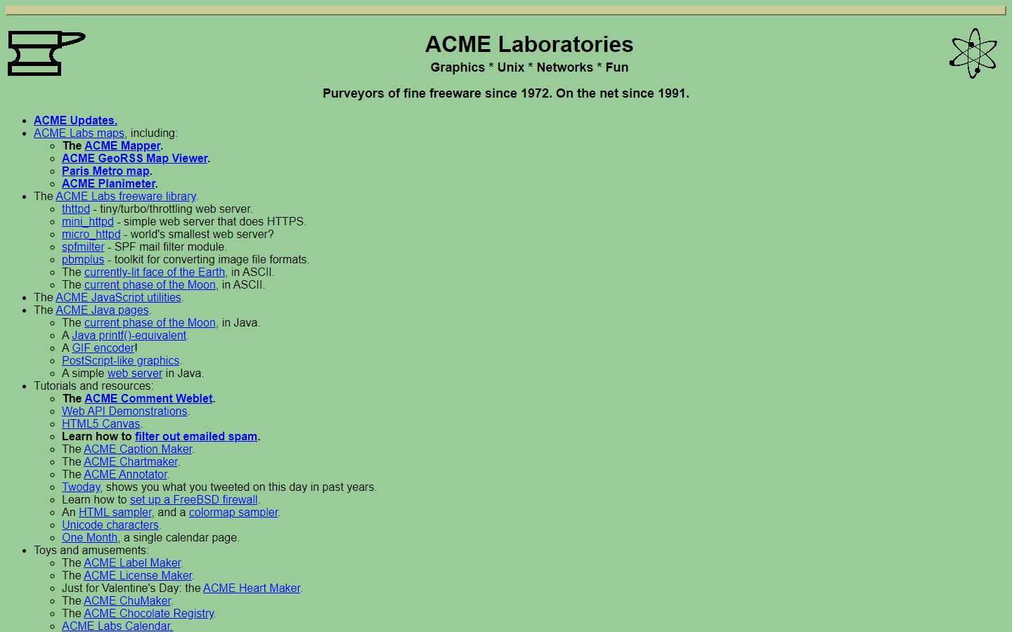
27. ACME Laboratories
Why it doesn’t work: One fossil on the internet worth mentioning. While very informative and link-rich, the design is way too old for the niche they’re trying to represent.
28. USA Real Estate
Why it doesn’t work: Lots of texts are cut off or hard to read, lots of elements fail design-wise and the marquee rolling effect on the hero is just totally absurd.

29. Maverick Industries
Why it doesn’t work: Aside from the website screaming it’s needed for an update, putting up keywords in the background is a terrible tactic to get more hits.

https://www.maverickindustries.com/
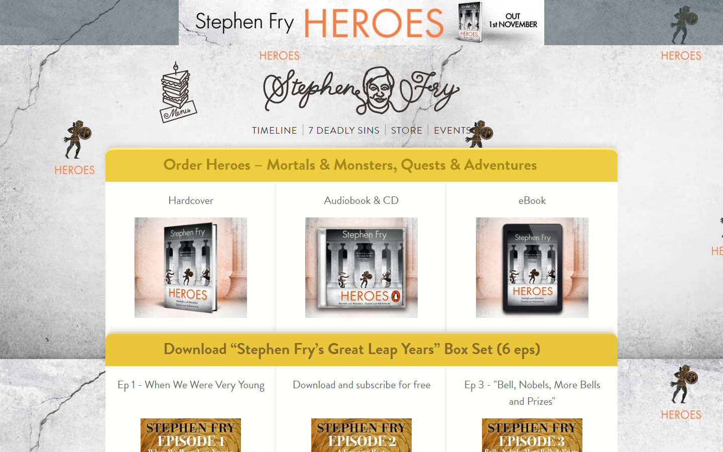
30. Stephen Fry Heroes
Why it doesn’t work: Famous Stephen Fry website has a lot of distracting elements, unclear website structure, and a color scheme that lacks cohesiveness.
31. Riverside Art Center
Why it doesn’t work: A website for an art center but with no images upfront? You got it. The logo seemed lost or misplaced. Texts also are hard to read. And what’s that chat bubble saying up there?
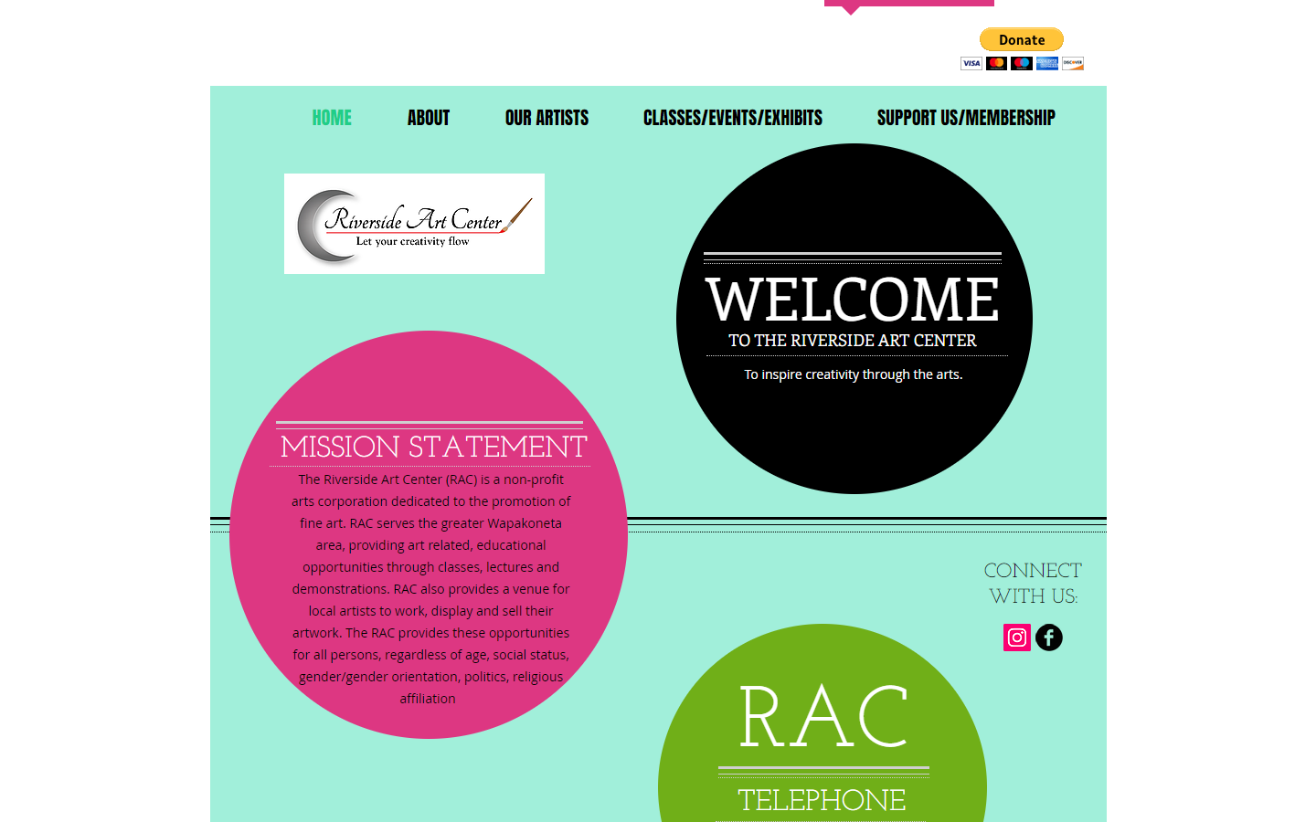
https://www.riversideartcenter.org/
32. Roadside America
Why it doesn’t work: Niche is unclear and the layout lacks clear navigation. Take a look also at that cute search bar!
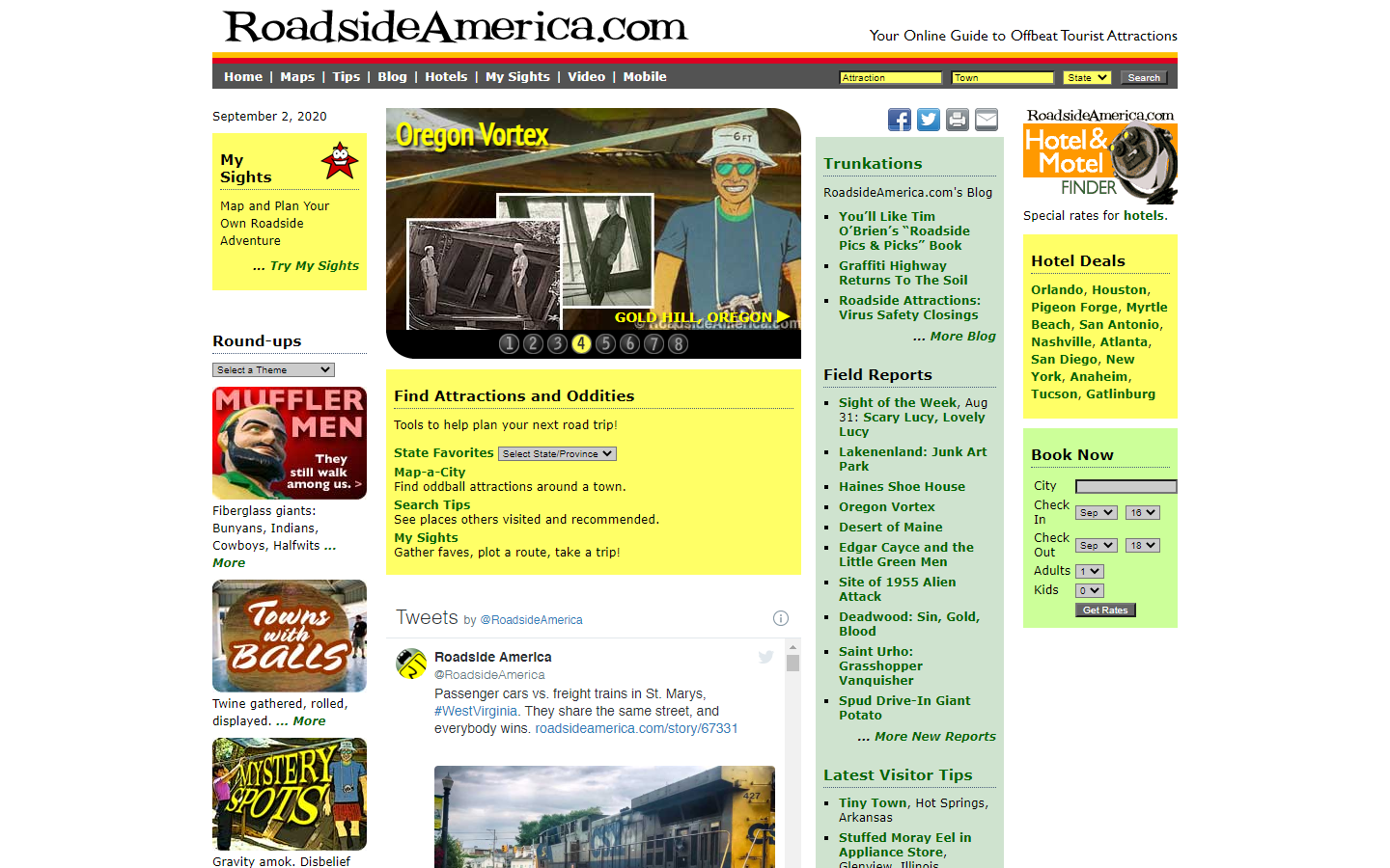
https://www.roadsideamerica.com/
33. JPMorgan Chase&Co.
Why it doesn’t work: The overall website design lacks taste and style, with absolutely no design elements to factor in; just plain texts and images.
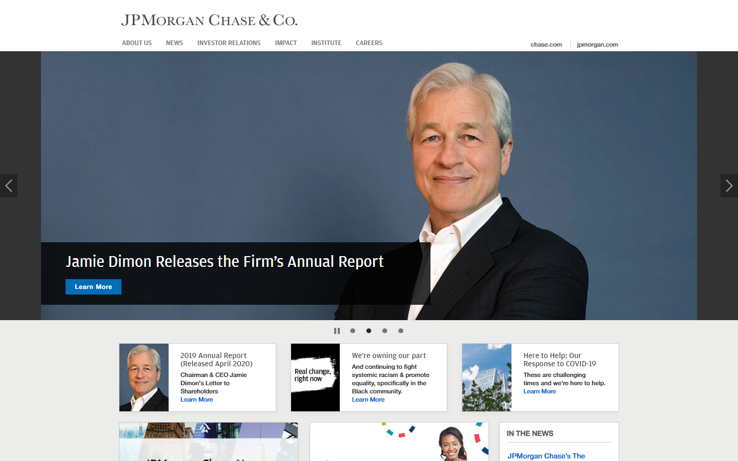
https://www.jpmorganchase.com/
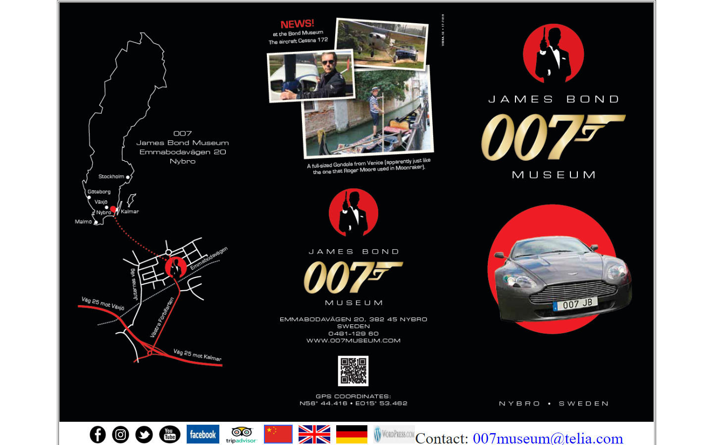
34. James Bond 007 Museum
Why it doesn’t work: Unclear structure and collages of images are all crammed into the website. Poor navigation.
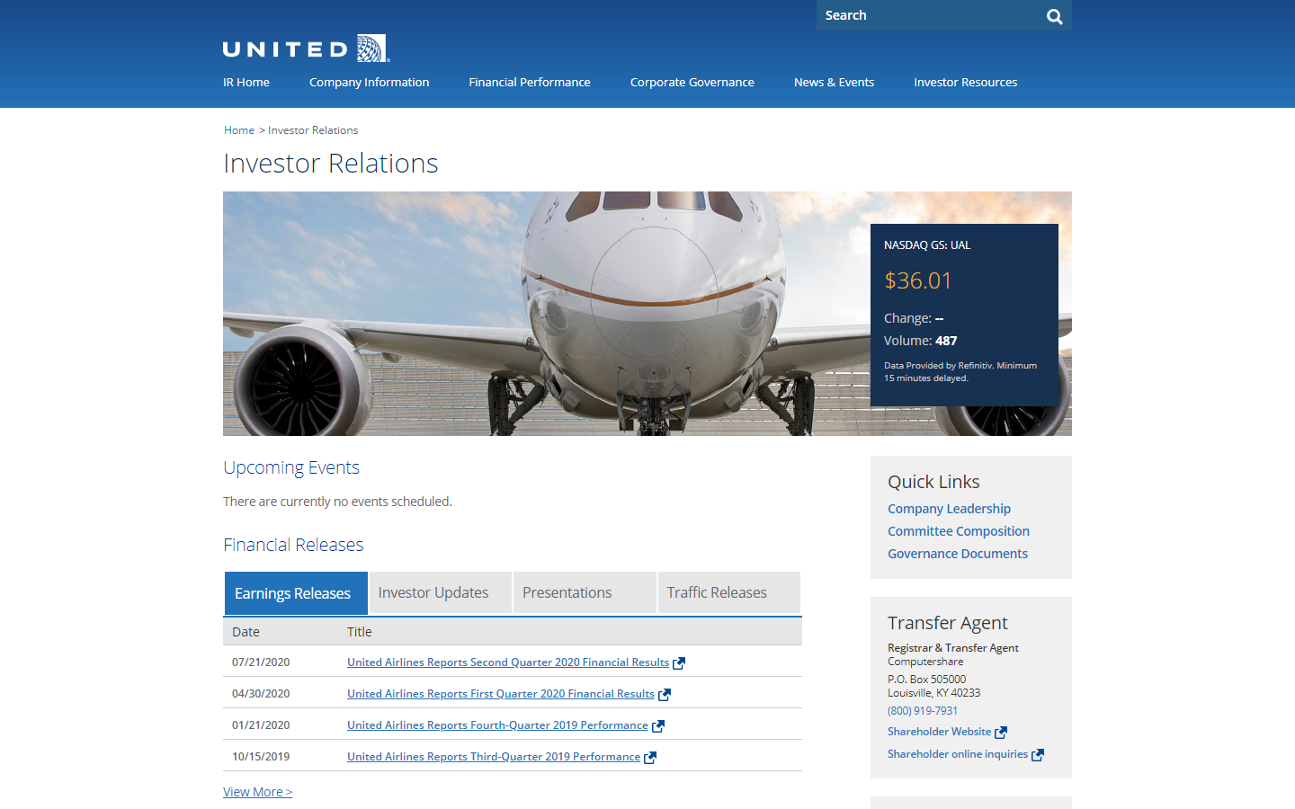
35. United Airlines – Investor Relations
Why it doesn’t work: The website design looked too simple making some visitors confuse it with an old wiki site.
36. Empire Metal Products
Why it doesn’t work: No this ain’t Star Wars or Star Trek, but you’ll be startled with the ‘explosive’ design.

http://empiremetalproducts.com/home.html
37. Atari Best Electronics
Why it doesn’t work: A word document looks a hundred times better than the site design. Worse than that, one cannot tell which paragraph is more important than the rest.
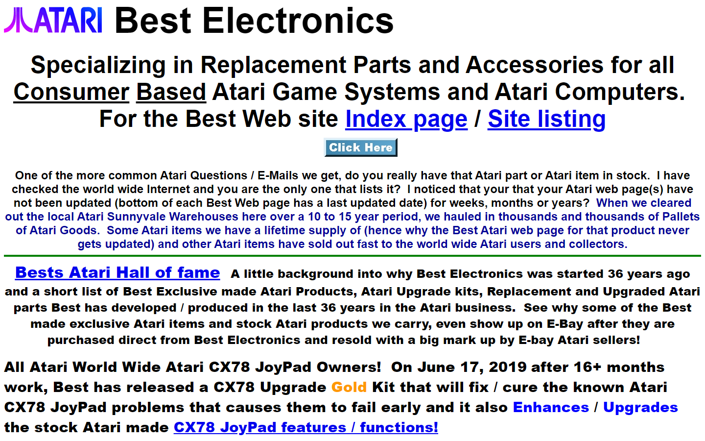
http://best-electronics-ca.com/
38. Plains All American
Why it doesn’t work: The header is too tall and overwhelming, there are misplaced icons on the header, some texts hard to read, and a very boxy layout.
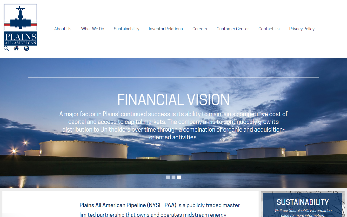
https://www.plainsallamerican.com/
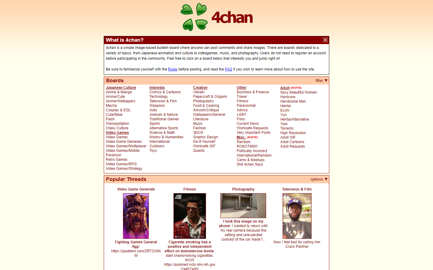
39. 4chan
Why it doesn’t work: The site is intended purely for content consumption, but a little love would do an amount of trick.
40. Internet Archeology
Why it doesn’t work: The site is filled with features such as accessibility buttons, captcha, and animated elements suitable for children.
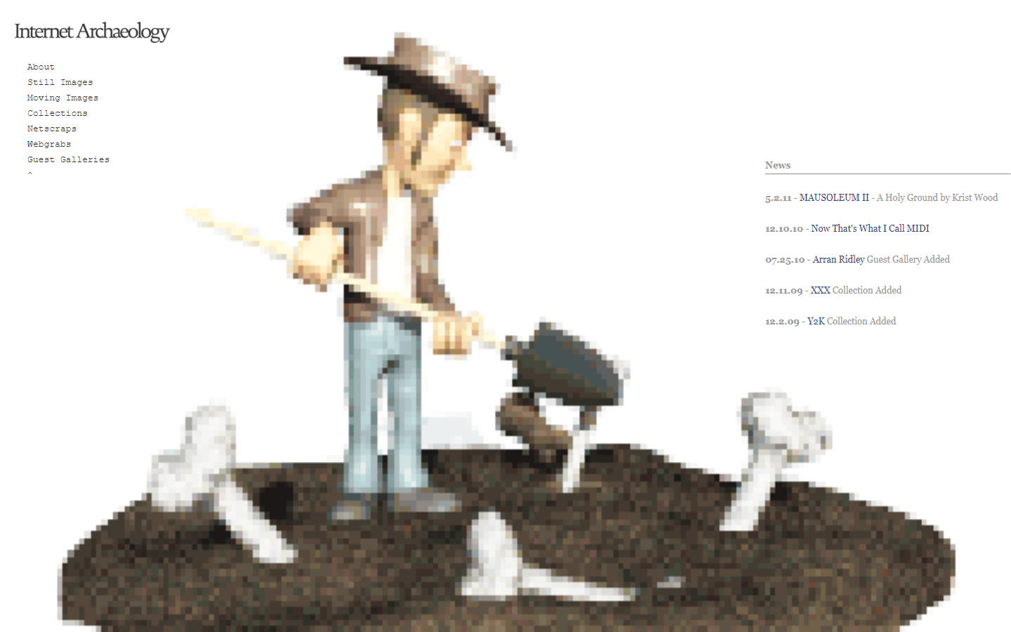
http://www.internetarchaeology.org/
Bad Websites – Conclusion
If you’re looking to redesign your website and you’ve had enough of bad websites, we recommend a change of page checking out our portfolio to see some good website design in action.
Also, if you need help with your website project, check out our ‘Free Mockup‘ page where you can learn about how we will design a free custom mockup of your new website before you sign or pay for anything.