In this article, you will discover 40 of the best technology web design examples on the web. We have scoured the web to bring you the top technology web design inspirations out there. We then share with a brief guide on the best practices of technology web design and exactly what goes into designing and stunning technology website.
Table of Contents

Technology Website Design Inspiration
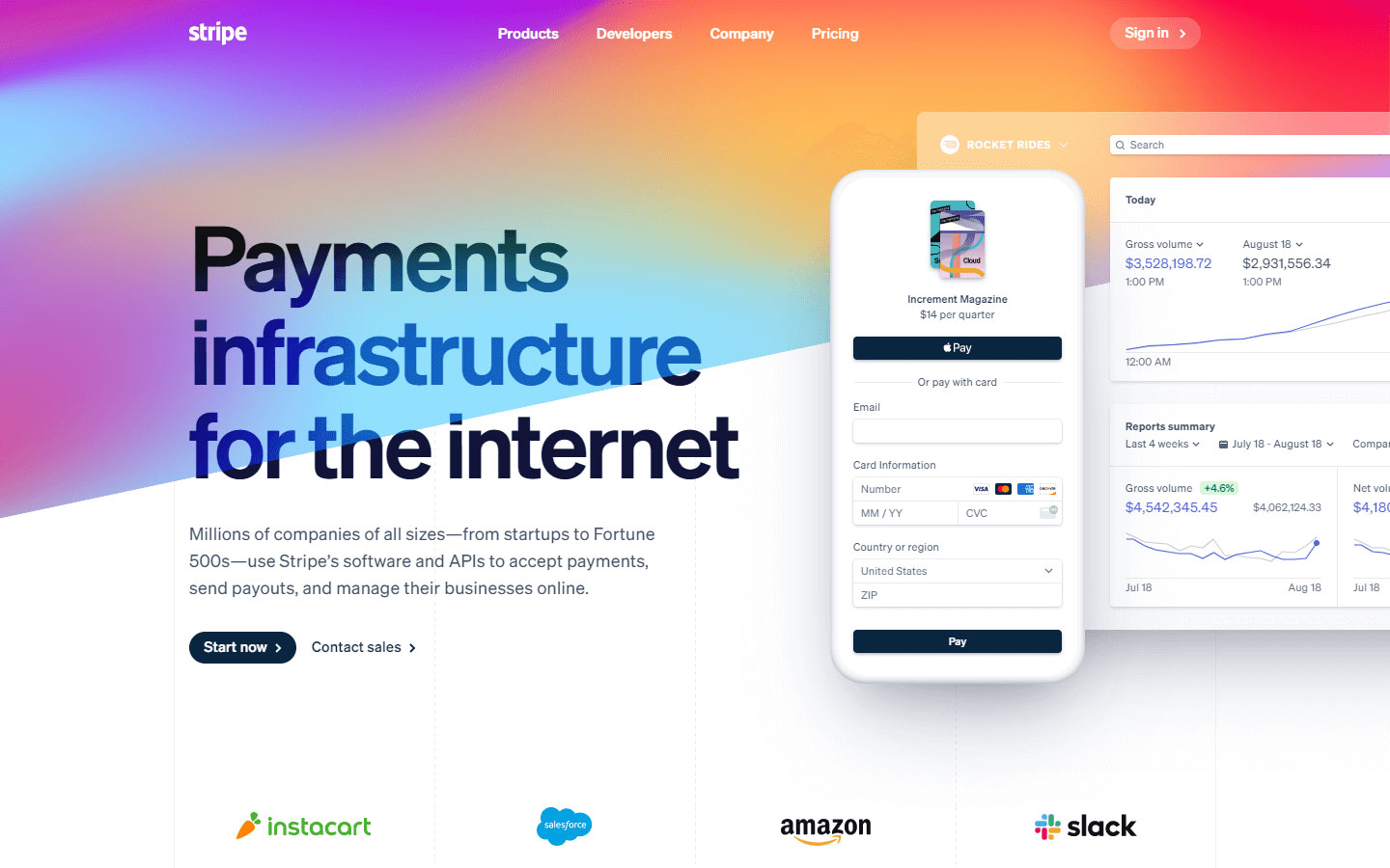
1. Stripe
Design Highlights: Subtle animated backgrounds and transitions, custom crafted graphical elements, clearly defined sections.
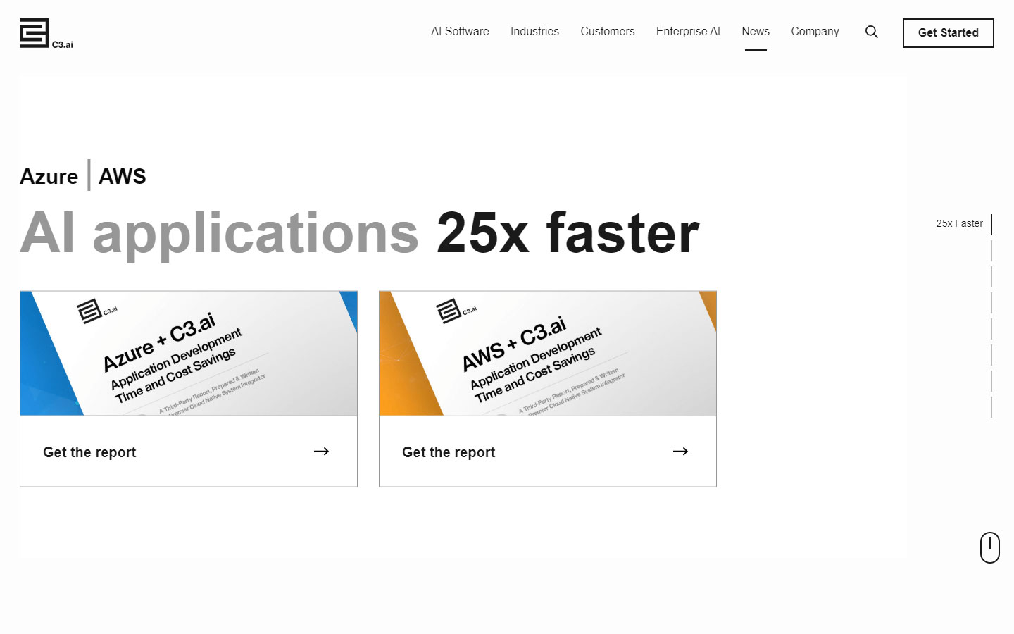
2. C3
Design Highlights: Bold value proposition, clean, focus on clients and their story, single full screen sections with each presenting its own content, use of social proof.
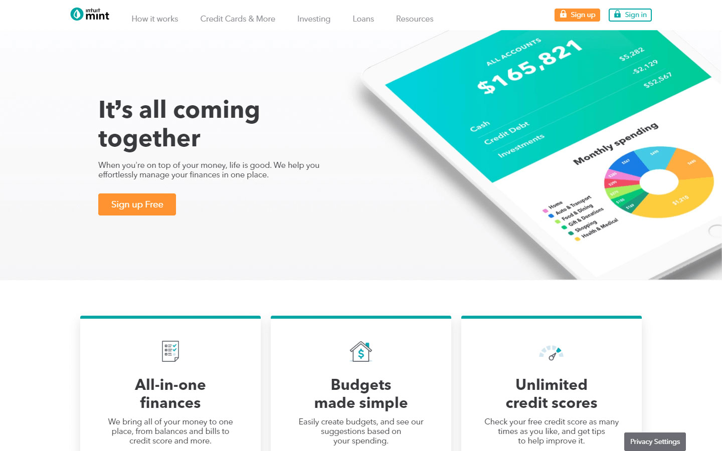
3. Intuit Mint
Design Highlights: Bold heading fonts, all white background to highlight content through contrast, complimentary colors, full blown footer.
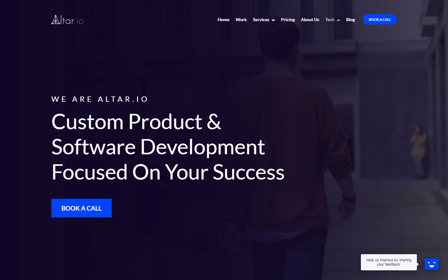
4. Altar.io
Design Highlights: Effective use of whitespace, clean and minimal design, subtle hover animations, featured section displaying their awards, client logos, unique footer.
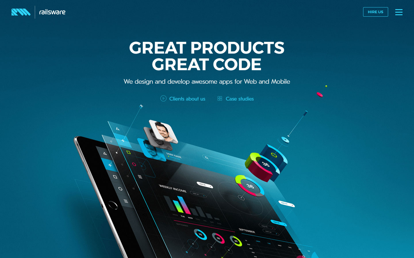
5. Railsware
Design Highlights: Beautiful custom graphics, organized content flow, well crafted team section, custom inner pages, wonderful team page.
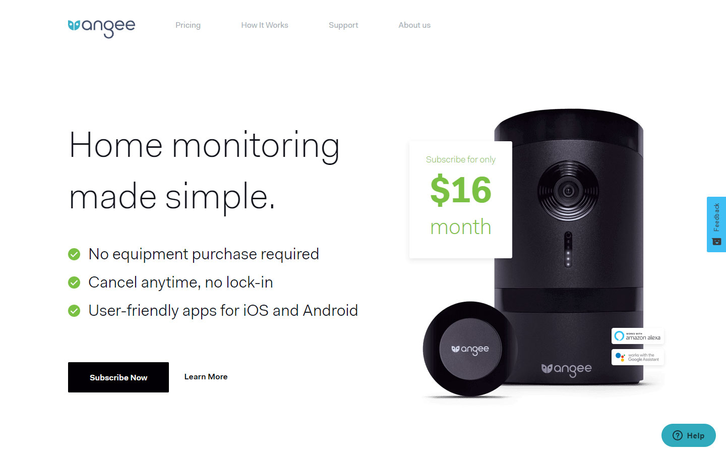
6. Angee
Design Highlights: Engaging content design, beautiful product photos and animations. use of social proof, clean layout.
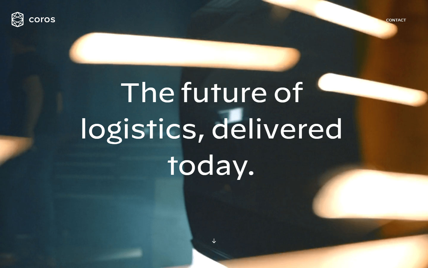
7. Coros
Design Highlights: Stylish storytelling, use of high quality images and video backgrounds. bold and readable heading fonts.
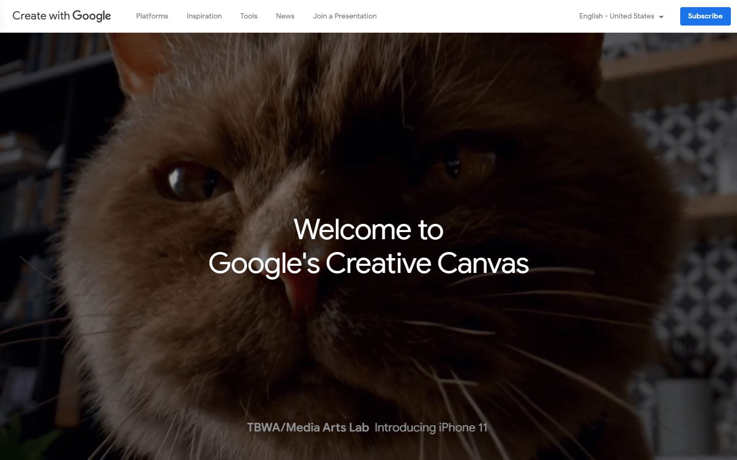
8. Create With Google
Design Highlights: Beautifully crafted design, clean overall look, readable fonts in terms of placement and sizing, creative image reveal animations.
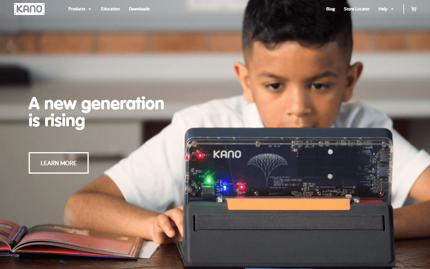
9. Kano
Design Highlights: Simple and clean, large whitespaces, colorful and friendly appeal, beautiful product shots.
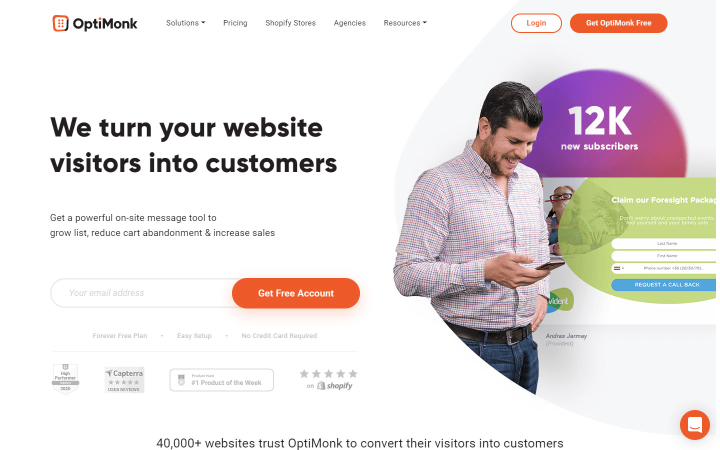
10. OptiMonk
Design Highlights: Lively and colorful design, beautiful and functional dropdown menu, use of social proof, creative transition as you scroll through.
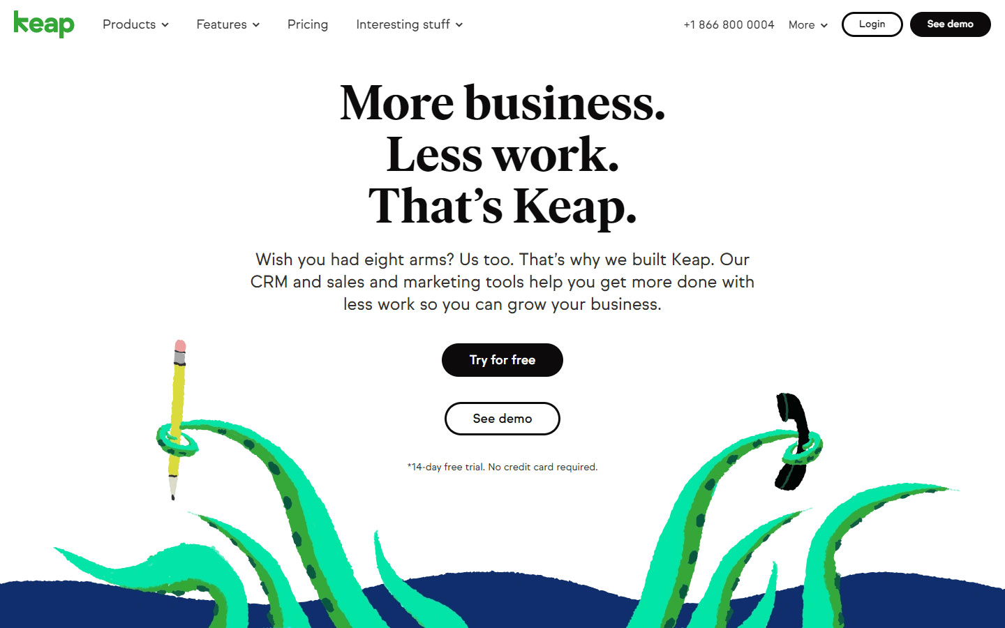
11. Keap
Design Highlights: Big and bold heading fonts, high contrast for better readability, animated elements, visible call to action buttons.
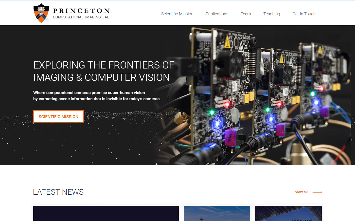
12. Princeton Computational Imaging Lab
Design Highlights: Simple and professional, changing hero backgrounds everytime you visit the site, content updated regularly.
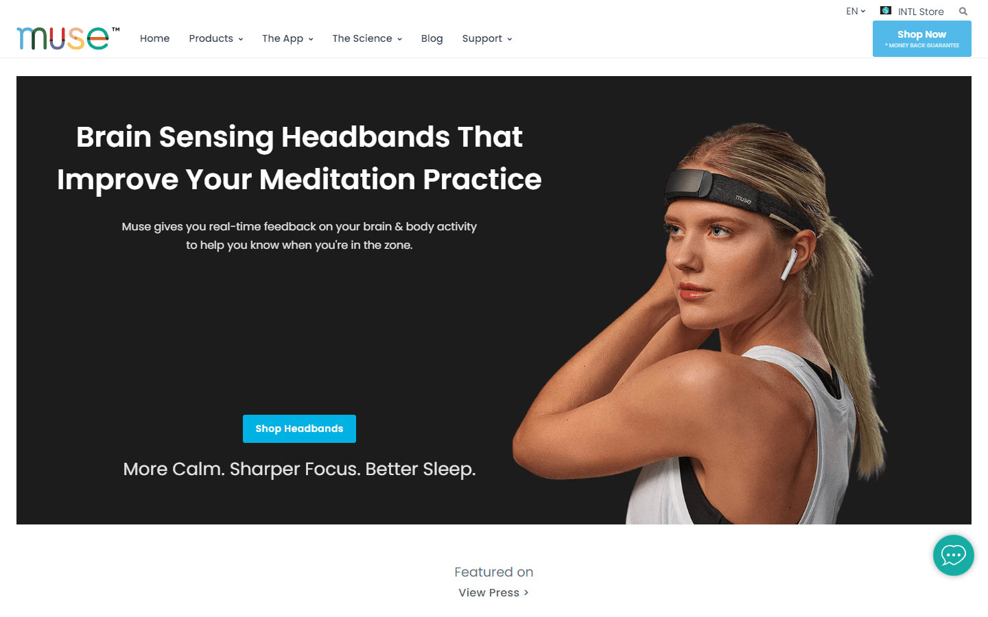
13. Muse
Design Highlights: Use of high quality images and product shots, social proof in the form of testimonials and press releases, clean geometric symmetry of design elements.
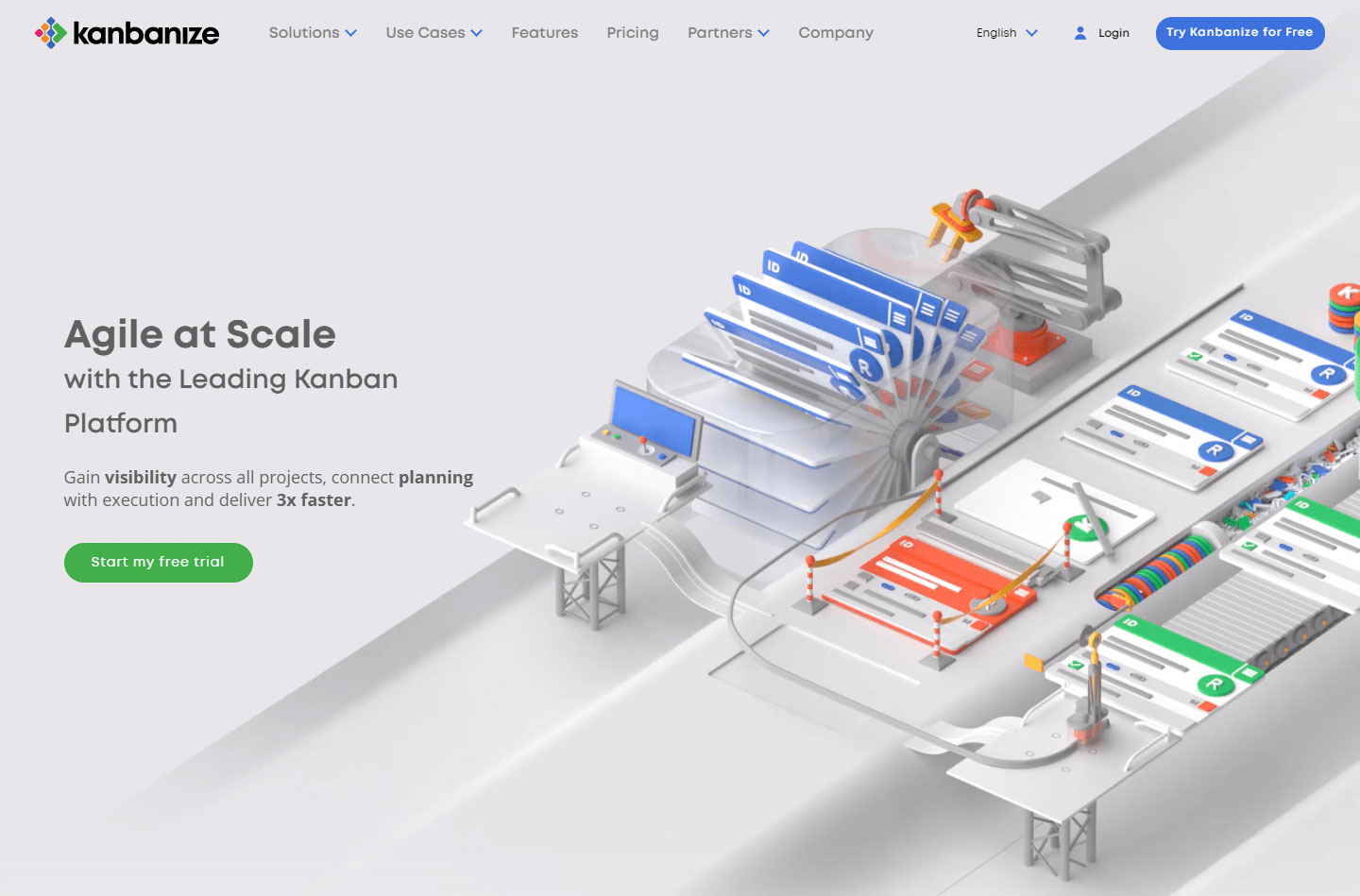
14. Kanbanize
Design Highlights: Use of subtle animations, trendy colors, unique testimonial section, full blown footer section.
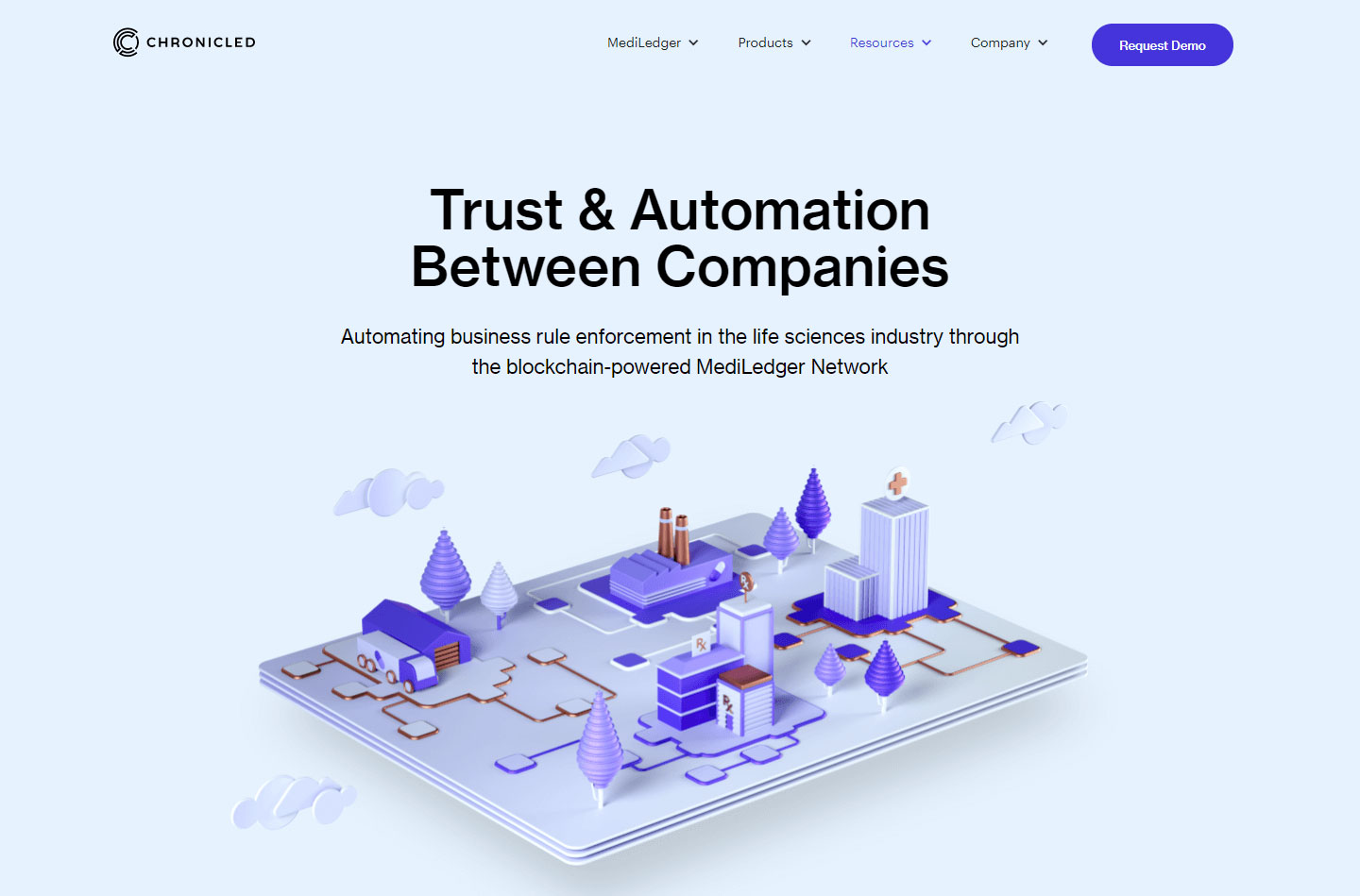
15. Chronicled
Design Highlights: Use of custom graphics that match the overall color scheme of the site, clear and visible call to action buttons, social proof.
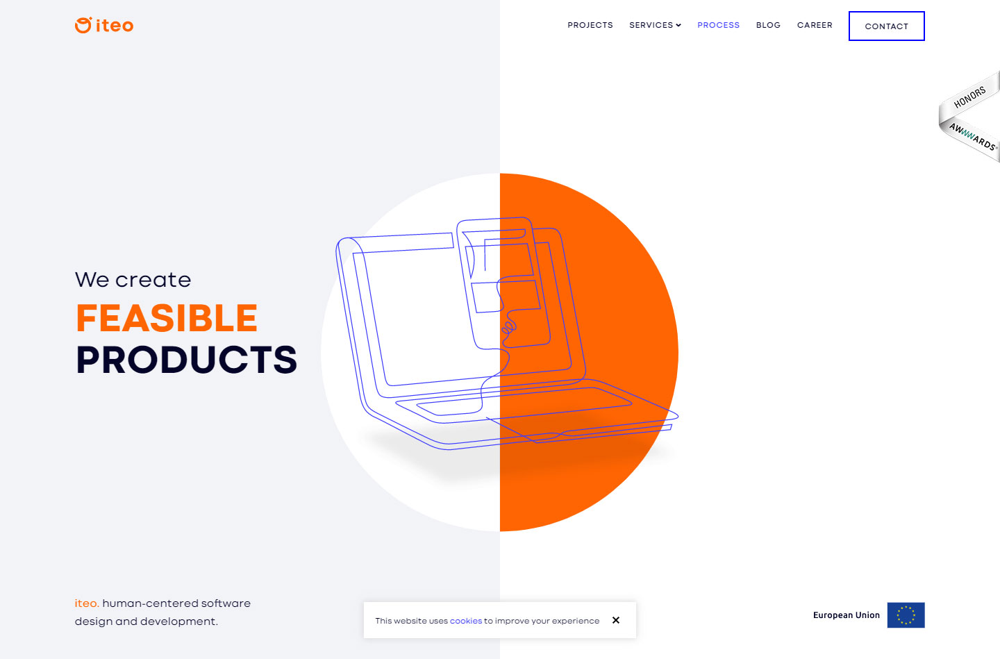
16. Iteo
Design Highlights: Use of custom SVG animation, effective use of whitespace, consistent use of image and graphical elements all throughout the site.
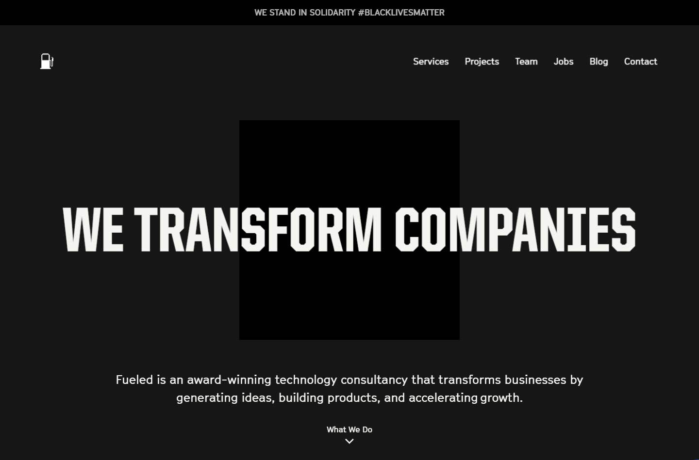
17. Fueled
Design Highlights: Big and bold headings, full screen transitions for storytelling, use of bold colors, custom inner pages, non conventional transition animations.
18. Digilant
Design Highlights: Toned down colors, use of custom icons in the homepage and inner pages, chatbot on the lower right corner of every page.

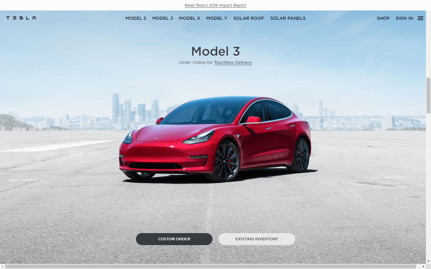
19. Tesla
Design Highlights: Toned down background colors to highlight products, simple and elegant, easy to browse, inner pages are full of product details with high quality images, animation and videos.
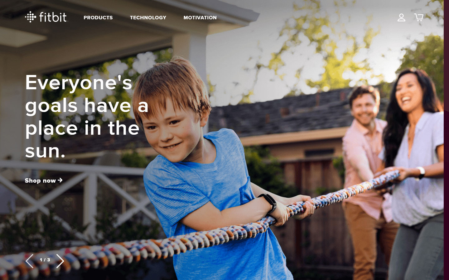
20. Fitbit
Design Highlights: Trendy, colorfull and full of life – actual photos of people using their products, detailed dropdown menu for products, full blown footer.
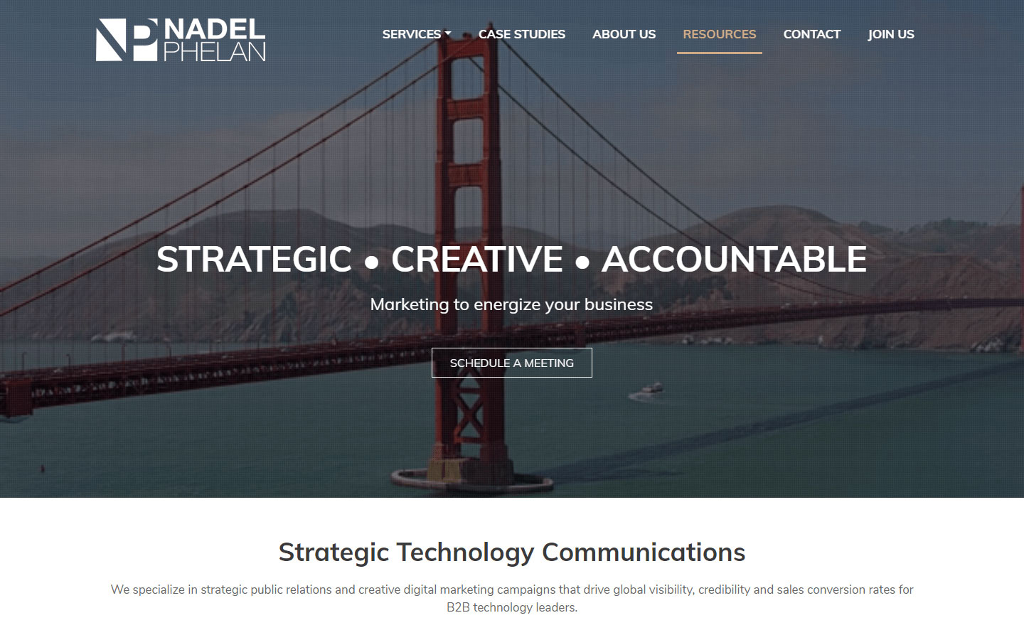
21. Nadel Phelan
Design Highlights: Professional design, use of company metrics to highlight company capability, client list/logos, contact form on home page, full blown footer.
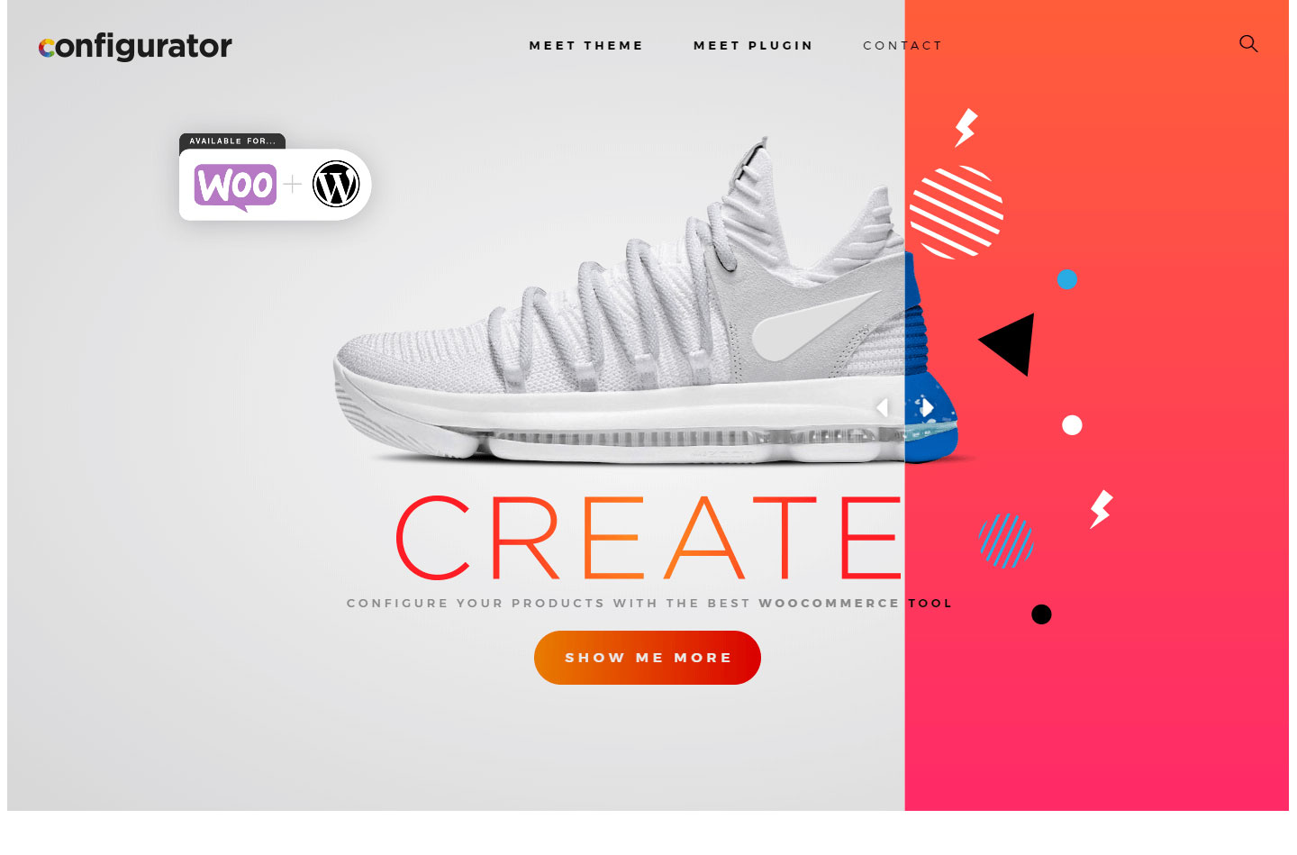
22. Configurator
Design Highlights: Interactive hero section, use of quality product shots and graphical elements, clearly delineated sections, chatbot functionality.
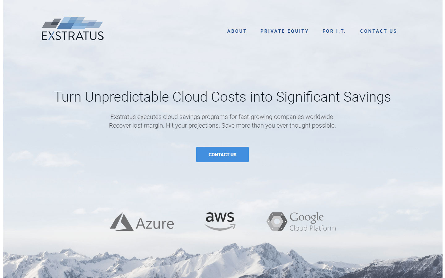
23. Exstratus
Design Highlights: Clean and professional design, page navigation always visible, consistent color scheme including icons and graphics
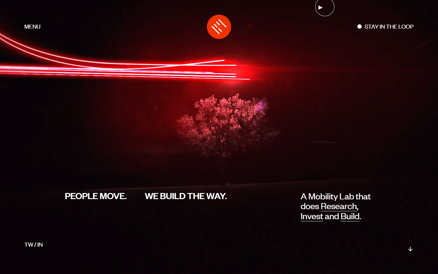
24. b4motion
Design Highlights: High quality video background, custom mouse pointer, unconventional use of text overlay on images
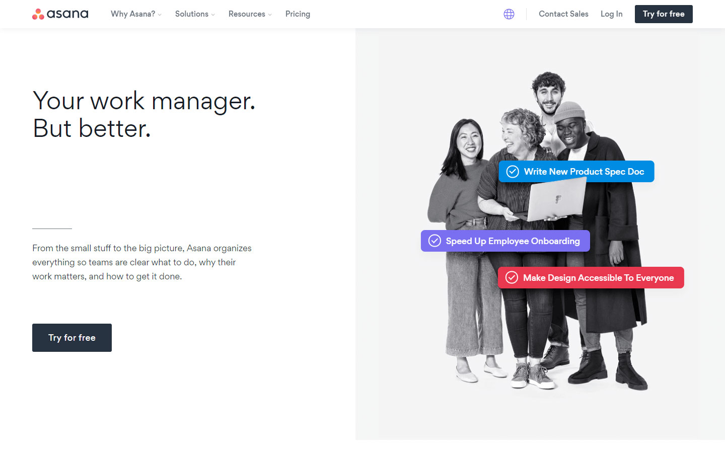
25. Asana
Design Highlights: Detailed product description, split screen sections, effective use of whitespace, exploded footer
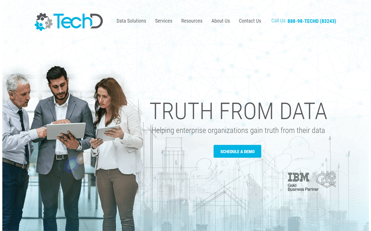
26. TechD
Design Highlights: Organized content, grid based layout for easy reading, full blown footer.
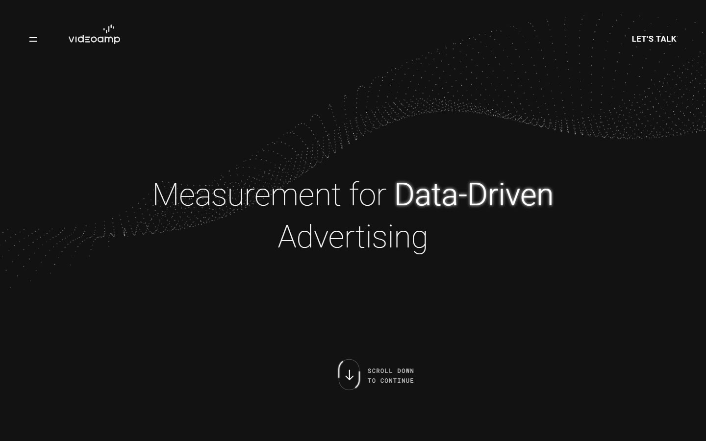
27. Videoamp
Design Highlights: High contrast dark background, on-scroll content reveal animations, high quality videos
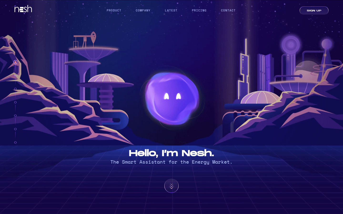
28. Nesh
Design Highlights: Consistent color scheme all throughout, on-scroll animation effects that guide viewers eyes to important content
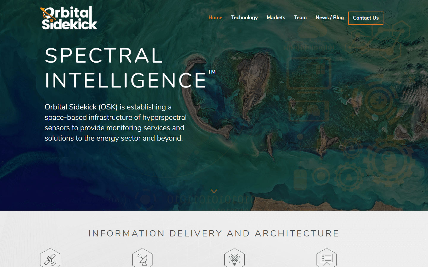
29. Orbital Sidekick
Design Highlights: Professional design, direct to the point content, sharp and readable fonts
30. The A-Z of AI
Design Highlights: Non-conventional classic look, subtle animations, custom mouse over animations
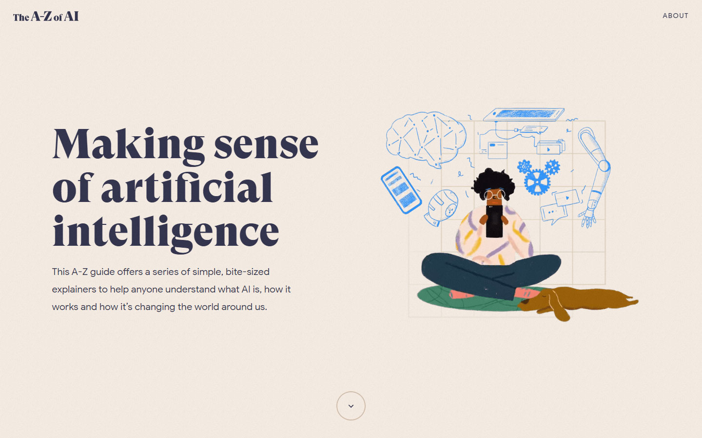
https://atozofai.withgoogle.com
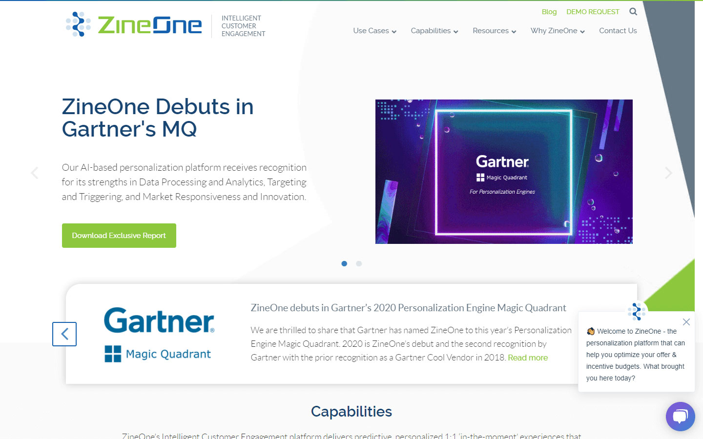
31. ZineOne
Design Highlights: Subtle transition and overlay effects, good colors and contrast, full blown footer
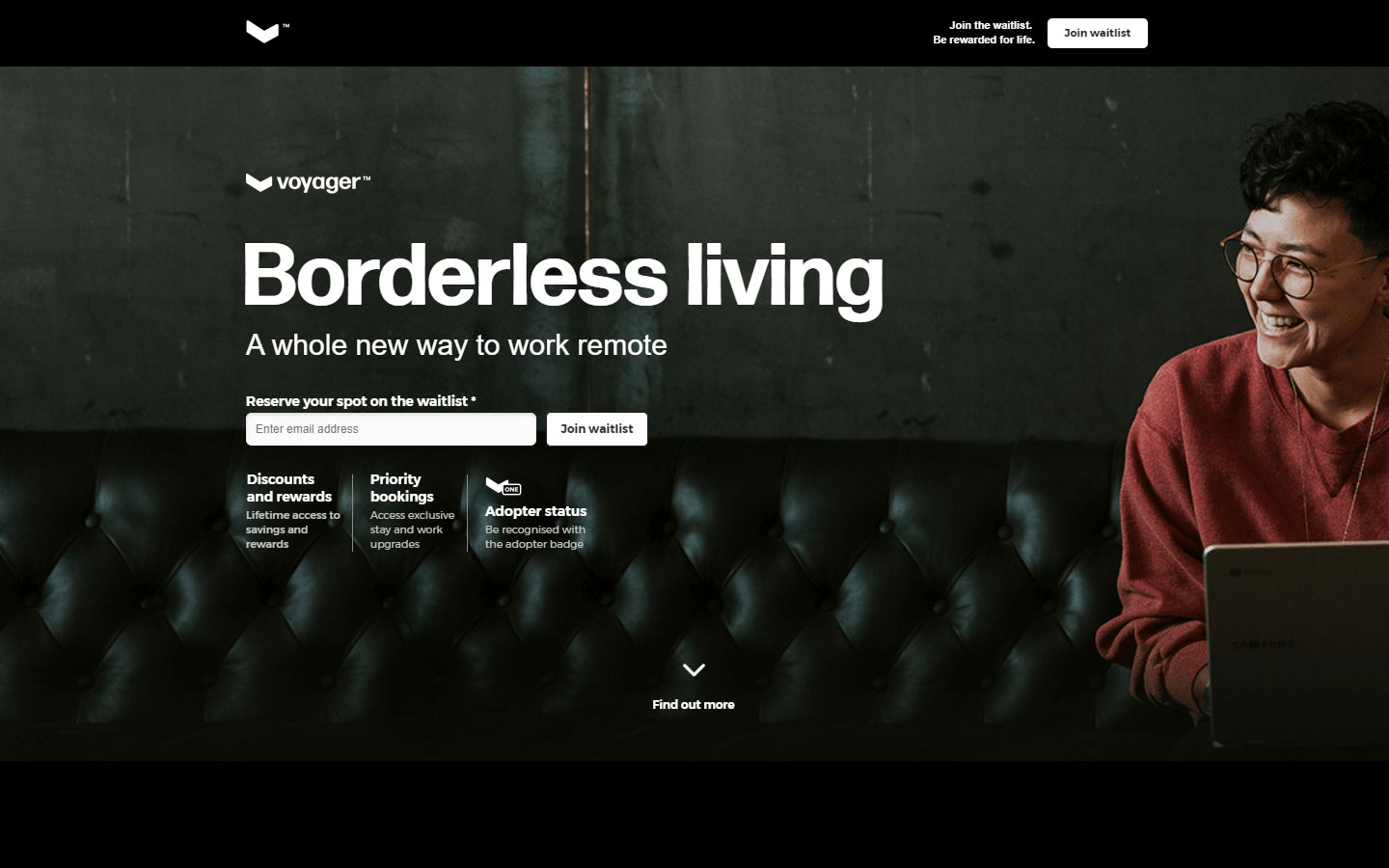
32. Voyager
Design Highlights: Bite-sized content for each section, relaxed colors, very subtle animations
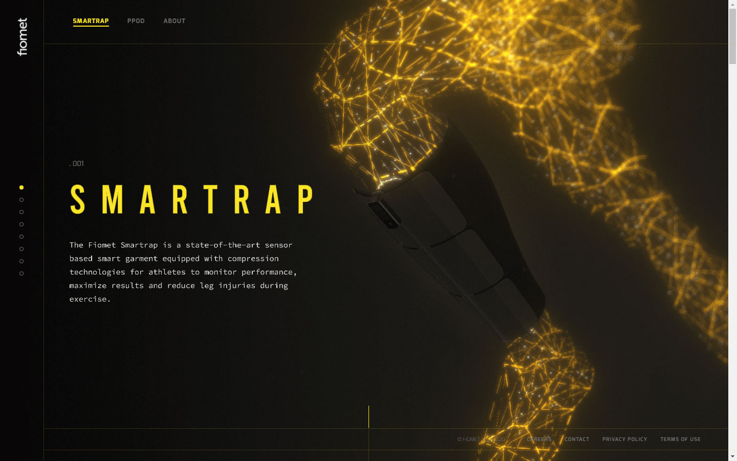
33. Fiomet Smartrap
Design Highlights: Unconventional and beautiful screen transitions as you scroll, highly technical animations, great color contrast
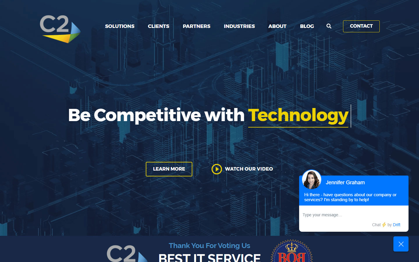
34. C2 Computing
Design Highlights: Use of company metrics, awards and social proof, chatbot function, visible call to action buttons
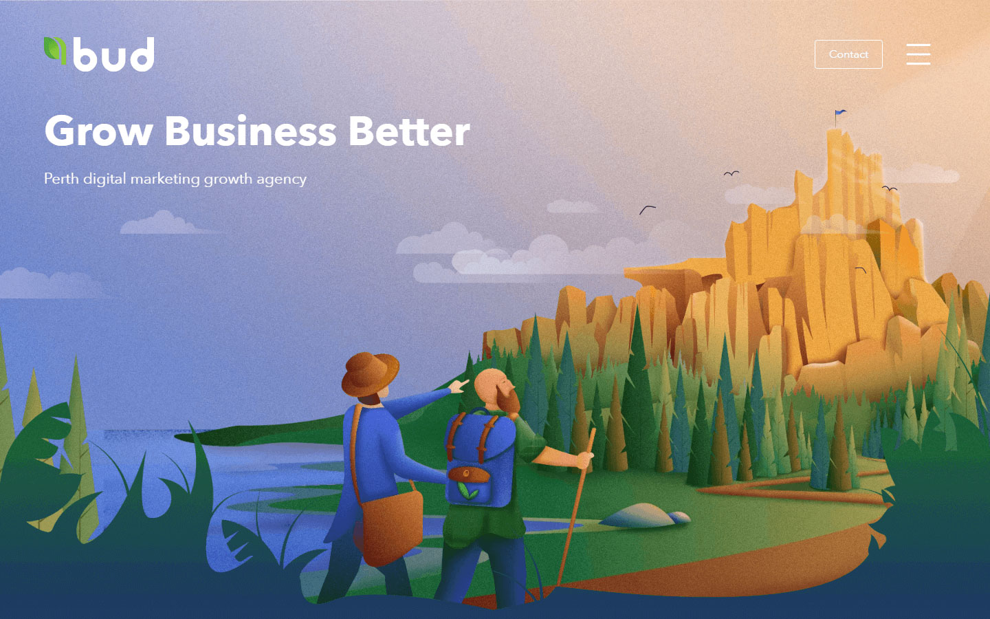
35. bud
Design Highlights: Very artistic website images, consistent colors, handmade icons and images, use of social proof
36. Critical Techworks
Design Highlights: Beautiful storytelling, center aligned content, high qyality images and consistent animation effect on the whole page
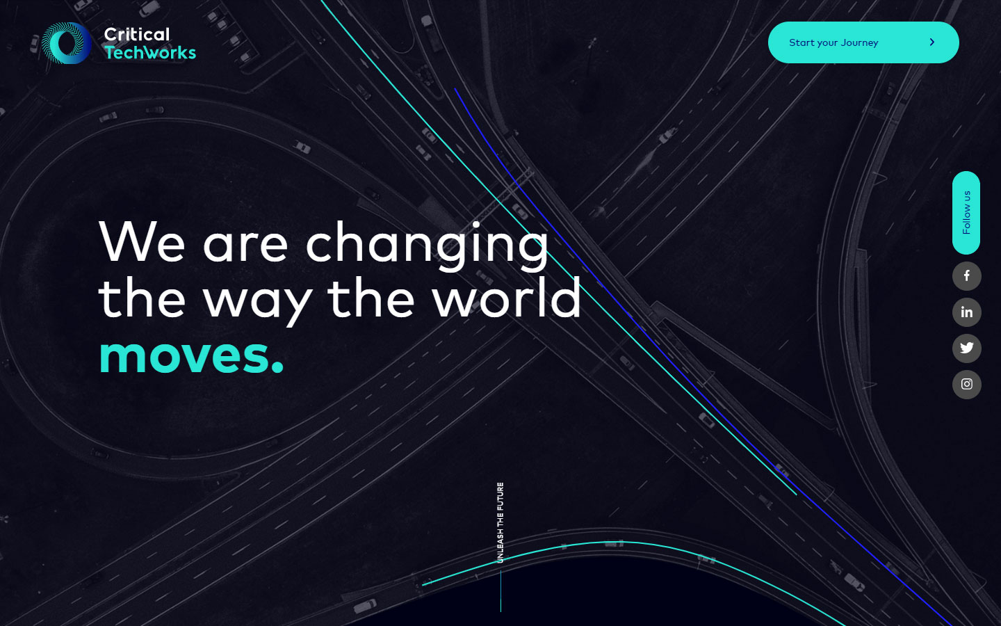
https://www.criticaltechworks.com
37. Single Cell Technology
Design Highlights: Consistent color scheme all throughout, video background, regularly updated content
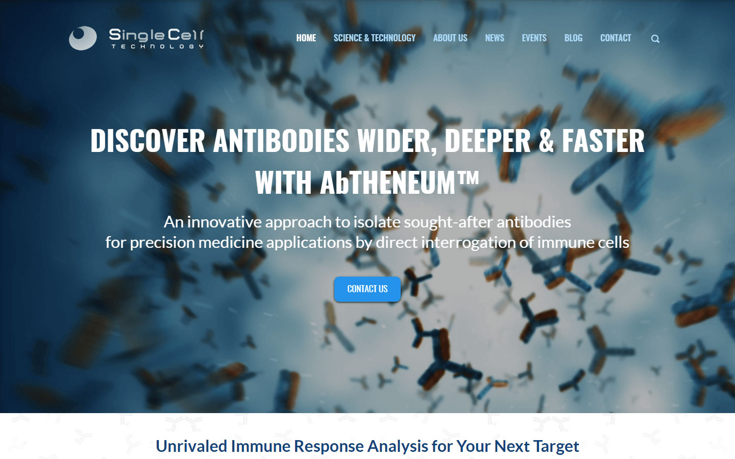
https://www.singlecelltechnology.com
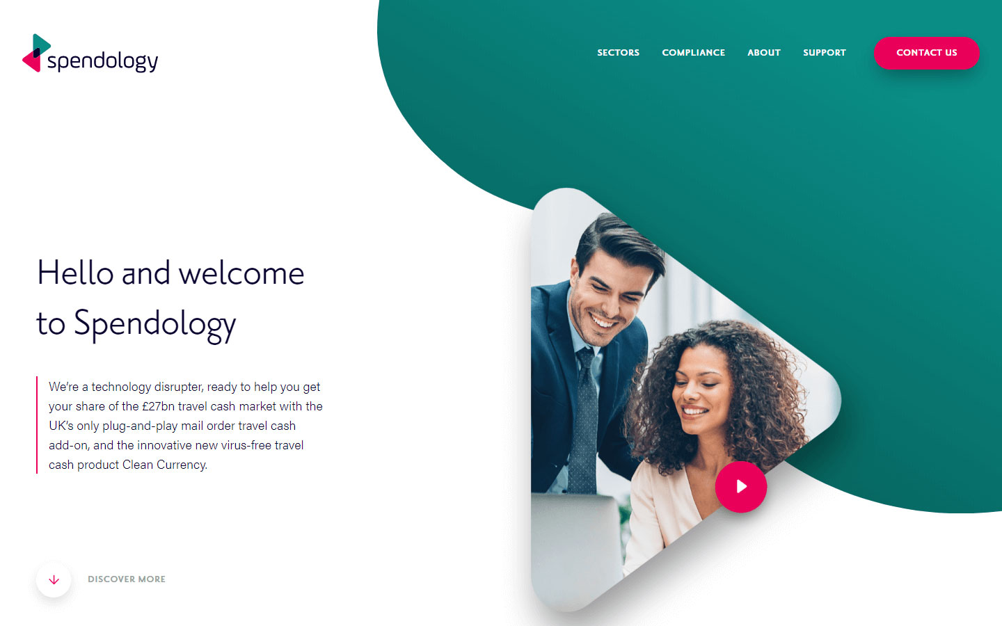
38. Spendology
Design Highlights: Elegant and very clean design, large whitespaces, consistent color use
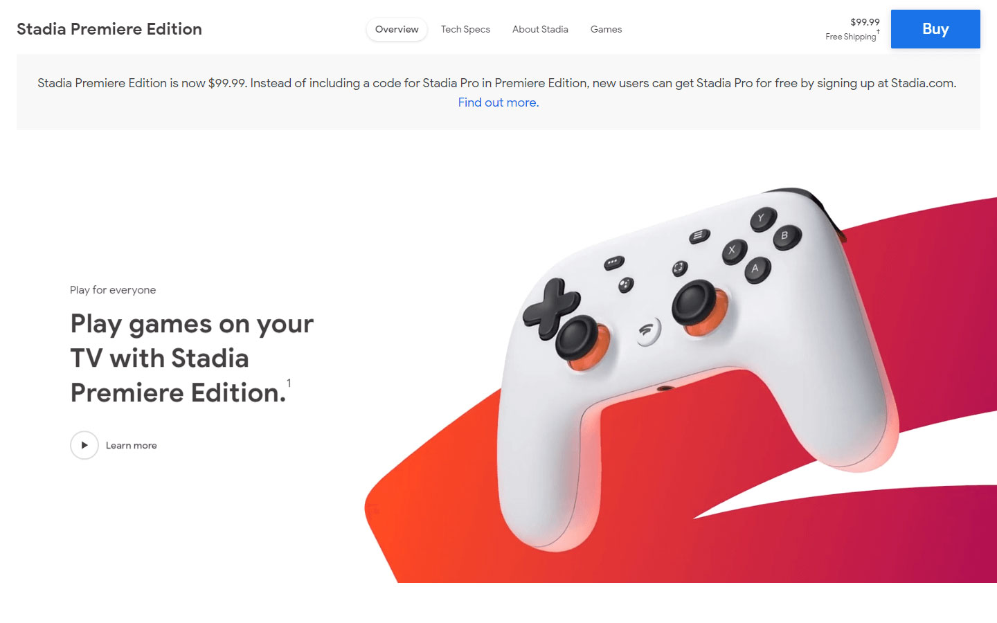
39. Google Stadia
Design Highlights: High quality product shots, cool animation, clean ans spacious page sections
https://store.google.com/us/product/stadia
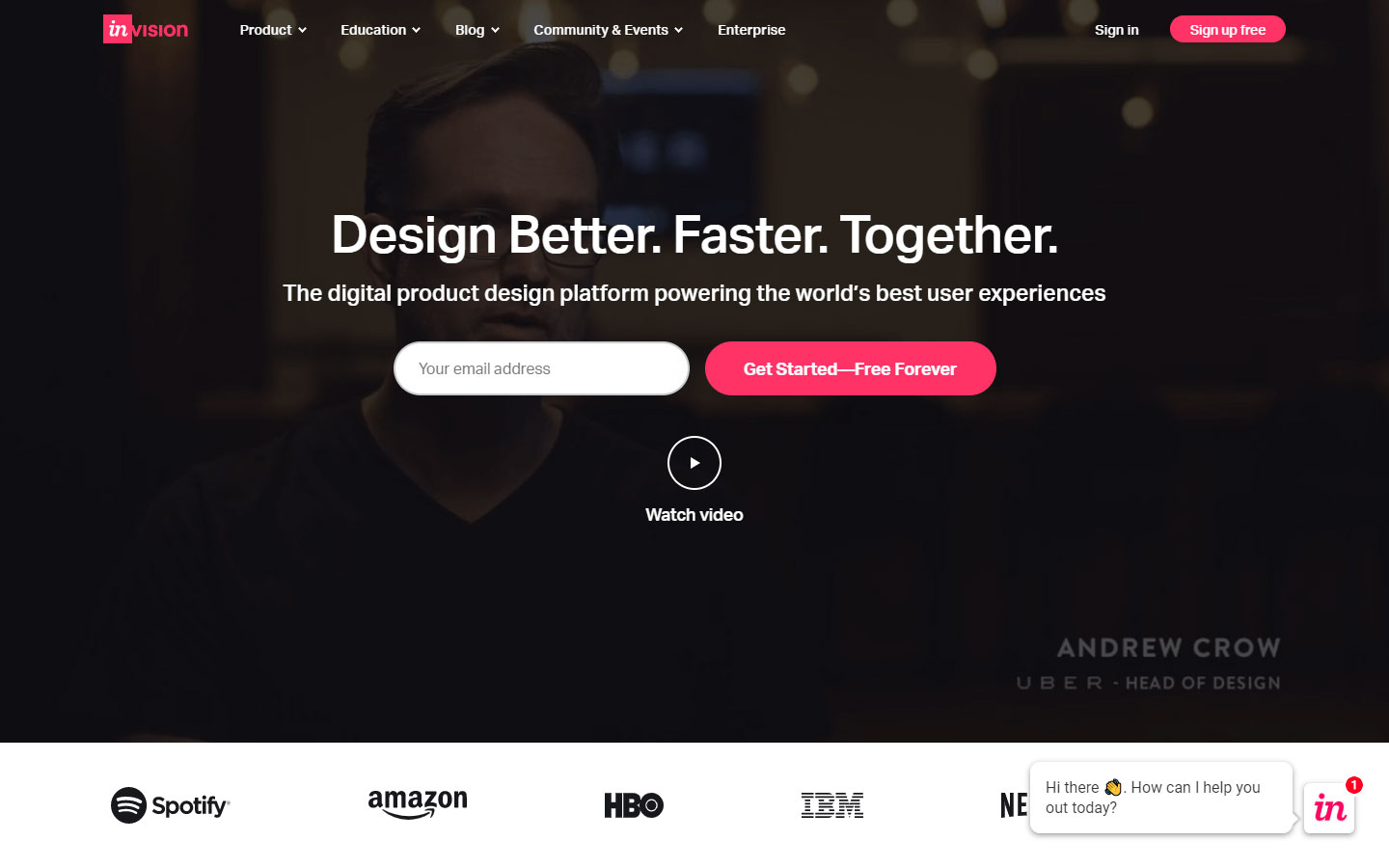
40. Invision App
Design Highlights: Detailed description of product functions and benefits, customer testimonials, strong call to action

Technology Website Best Practices
Here’s the main challenge when it comes to technology web design. Your site must be 100% custom. Here’s why. When you’re selling a technology product whether it be a SaaS product, an energy solution or even industrial machinery, you are selling something unique. There is quite a bit of education when it comes to selling a technology product. You have to tell your prospective customer a story about how the product works and the problem it solves. And this story has to be told in a language the visitor understands. We’ve found that telling a story visually through unique and engaging graphics has worked best.
1. Identify Visitor Types
One of the main challenges with website design in general and technology web design in particular is identifying the various user types coming to the site and developing content paths tailored to their specific needs. We help clients by identifying the specific types of users who will be interacting with the websites, what their specific needs are and to make sure that the site is design and structured to meet their needs. This is especially important with technology websites as user types can be quite different ranging from developers and CTO’s to marketing managers and business owners. Telling the right story to each of these user types is key to your website’s success.
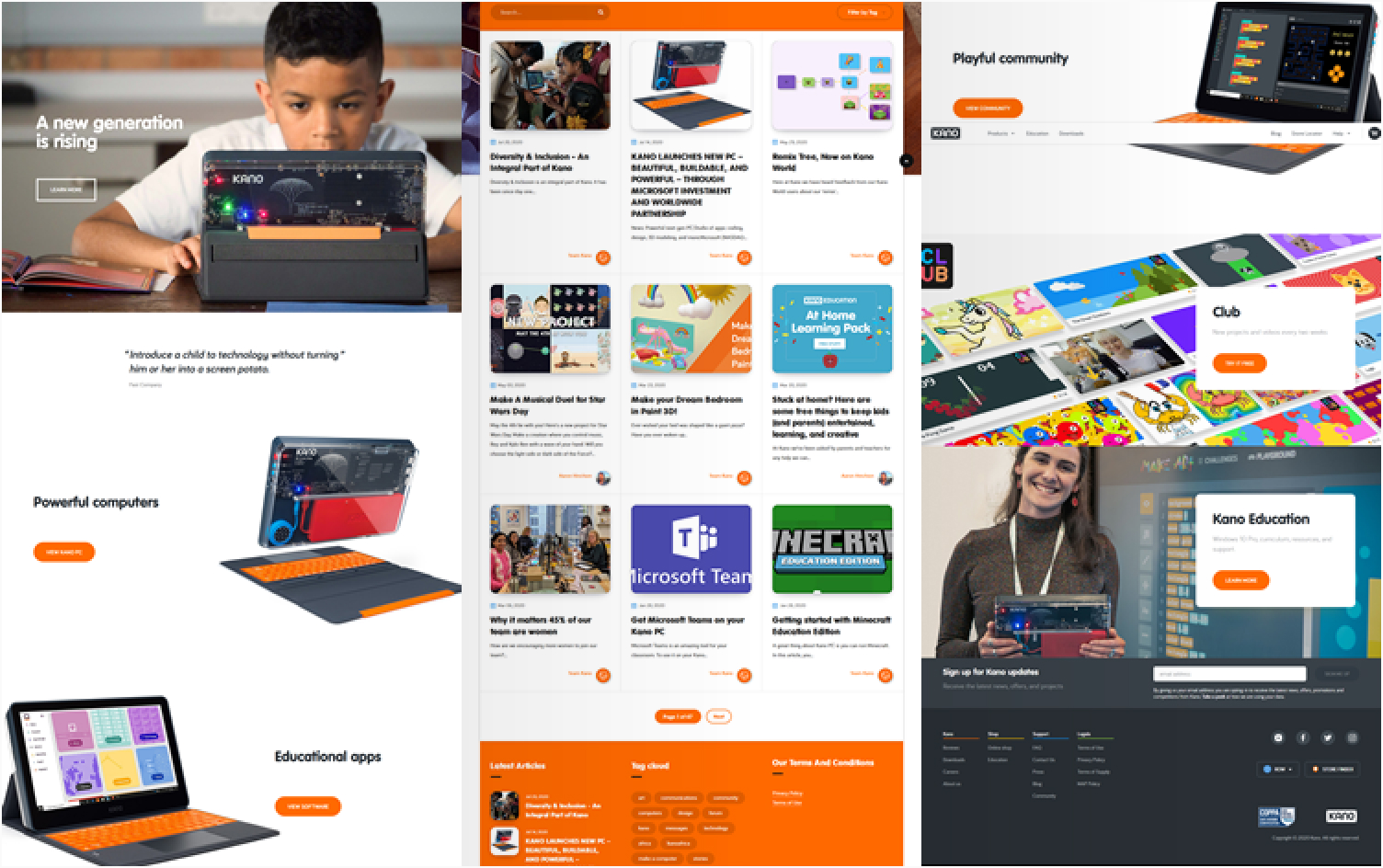
Kano, (#9 featured above) makes technology products for kids. Their products feature colors that appeal to the younger population. Their website uses friendly colors, rounded buttons, rounded fonts, and images of kids, teachers and parents.
2. Tell Story Visually
Let’s face it, people don’t like to read these days. Everyone has ADD and gives only partial attention to anything at any given time. Because of this we’ve found that telling a story visually through custom graphics and diagrams works well to convey technical data in a easy to understand way. We will work with you to really understand what it is your business does, the problem your technology solves and the process of how it works. We will then turn this understanding into visually appealing technical diagrams that will be easily understood by technical and non-technical people alike.
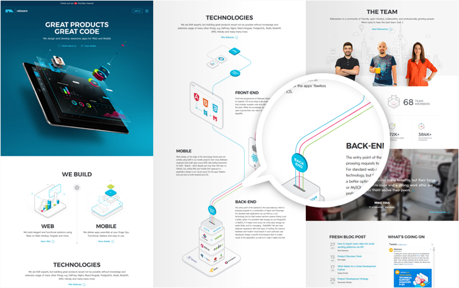
Railsware, (#5 featured above) uses custom graphics, technology product icons, and diagrams that flow from one section to another. Added to this is the use of a unique team section that shows comfortable and happy people.
3. Digestible Metrics
Going back to people’s partial attention, most visitors don’t really read a website, they scan. They are quickly skimming through the content looking to quickly qualify or disqualify the website for their needs. Another way we’ve found to capture visitor’s attention is to display easily digestible metrics. These can be anything from specific stats, percentages or key numbers that validate the performance of your technology.
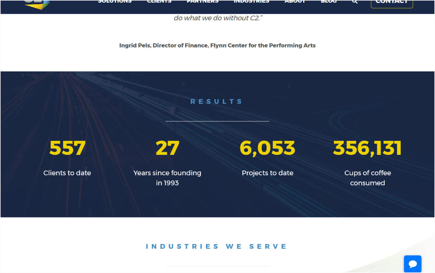
C2, (#34 featured above) features a Results section which highlights their total number of clients to date, years of experience, number of projects, and cups of coffee consumed (added for fun). The metrics are also animated to attract more attention.
4. Strong Call to Action
At then end of the day the purpose of a website is to make sales and that’s what we do best. Our sites are designed to look beautiful, unique and interested; but really the sites we build are designed to sell. We make sure that there is always a strong call to action found on all pages of the site and that the user is taken down a clear path with the final destination being an action taken. For B2C tech companies this can be an immediate sale. For B2B tech companies this the action is typically an inquiry for more information or a product demonstration.
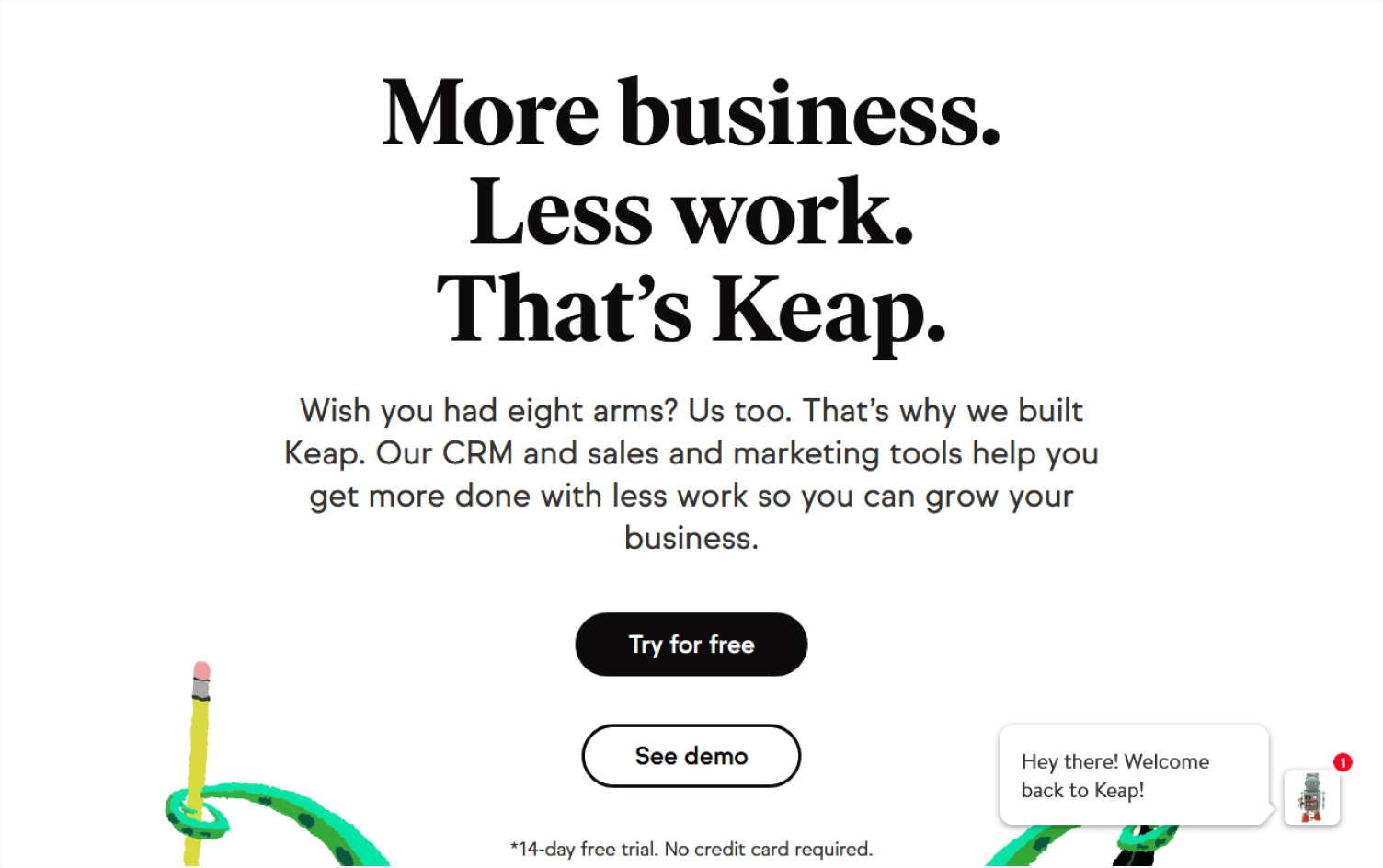
Keap, (#11 featured above) uses strong color contrast to highlight their CTA (call to action) button. By having the word “FREE” in their CTA, they make clicking the button worry free. The CTA is also supported by a statement of assurance: “*14-day free trial. No credit card required.”
5. Identify Use Cases
As they say in direct response marketing: “People don’t want to buy drills they want to buy quarter inch holes.”
In many ways, your product, whatever it is, is an obstacle to the thing they want. They aren’t looking to invest in a new technology, they are trying to solve a specific problem. What we do is identify the specific problems your clients are trying to solve. Then, we reverse engineer how technology solves that problem. We then help to structure the site in such a way that the client is able to search via your technology. We also make it so they are able to search via the use case they are trying to solve and discover your technology based off of that.
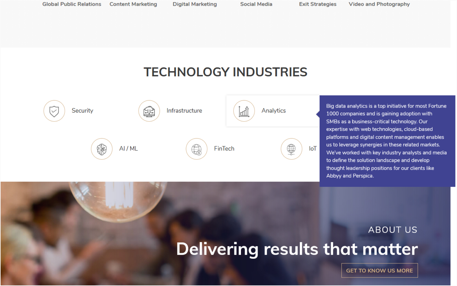
Nadel Phelan, (#21 featured above) has a technology industries section in their homepage. It contains a list of industries that are a fit to their services
Need Help With Your Tech Company Website?
If you’re looking for help with technology web design you’ve come to the right place. We get tech and can help your company with an awesome new client generating website. But don’t just take our word for it. We’d like to make you an offer you can’t refuse. We’ll design a custom mockup of your new website for free before you sign or pay for anything. If you like it, we can move forward working together if not, there are no hard feelings and no other obligations. Read below to find our more.