Looking for inspiration for your next construction website design project? You’re in the right place!
In this article we cover the good, great looking construction websites that will give you inspiration. The bad, common technical mistakes construction company websites will make. And the ugly, design issues you will often within construction website design.
Lastly, we will share our construction web design process and how it might be the right fit for your project.
Table of Contents
The Good
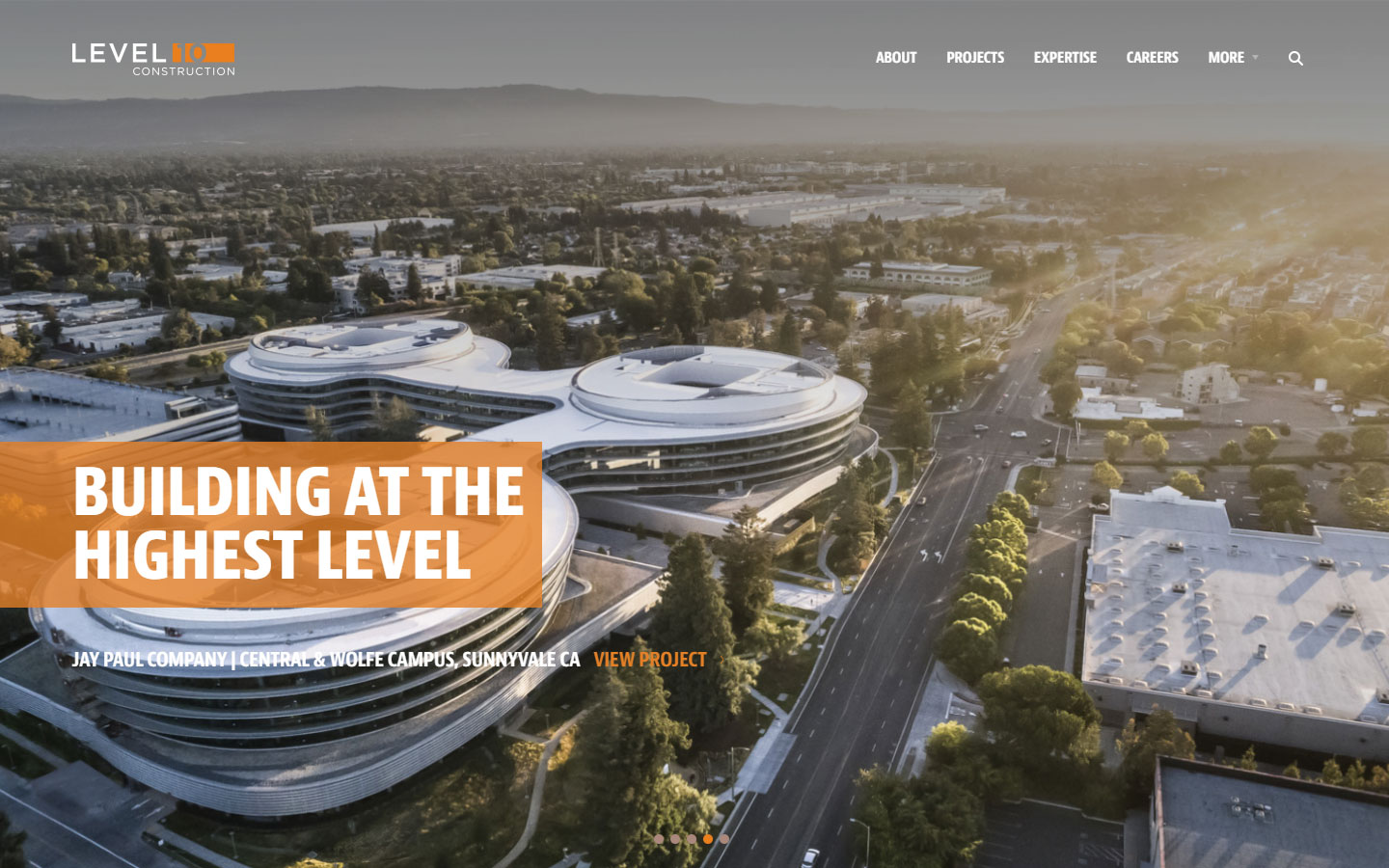
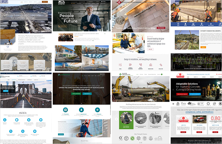
1. Level 10 Construction
Why it works: Level 10 Construction’s website has a modern layout with easy-to-read texts all over. A beautiful slideshow of their projects are shown on the hero section.
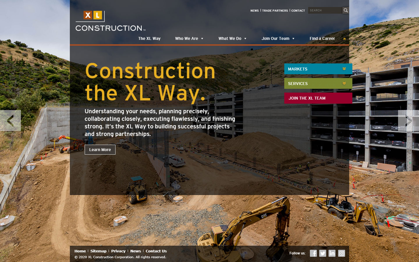
2. XL Construction
Why it works: The site’s layout is unusual but creative, not crowded, and not overpowering. They used colors to distinguish important components of the website.
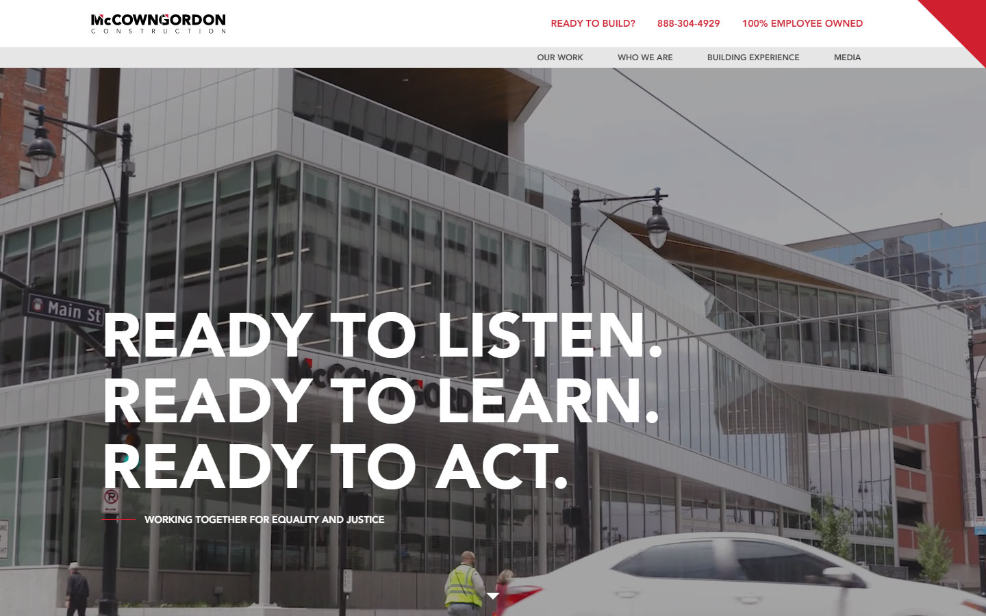
3. McCownGordon Construction
Why it works: The content is very nicely laid out and has subtle animations that encourage more interaction. The features section boasts excellent coding and design.
Good Construction Websites
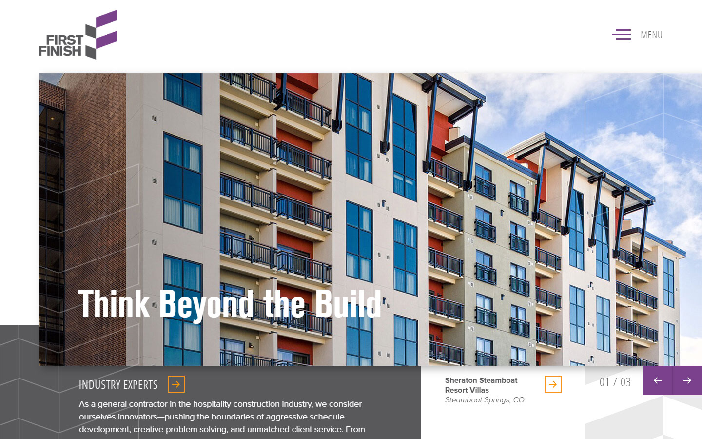
4. First Finish
Why it works: The layout is innovative and creative. The elements are separated by shadows, which adds depth to the composition. The hierarchy in the ‘process’ section is genius.
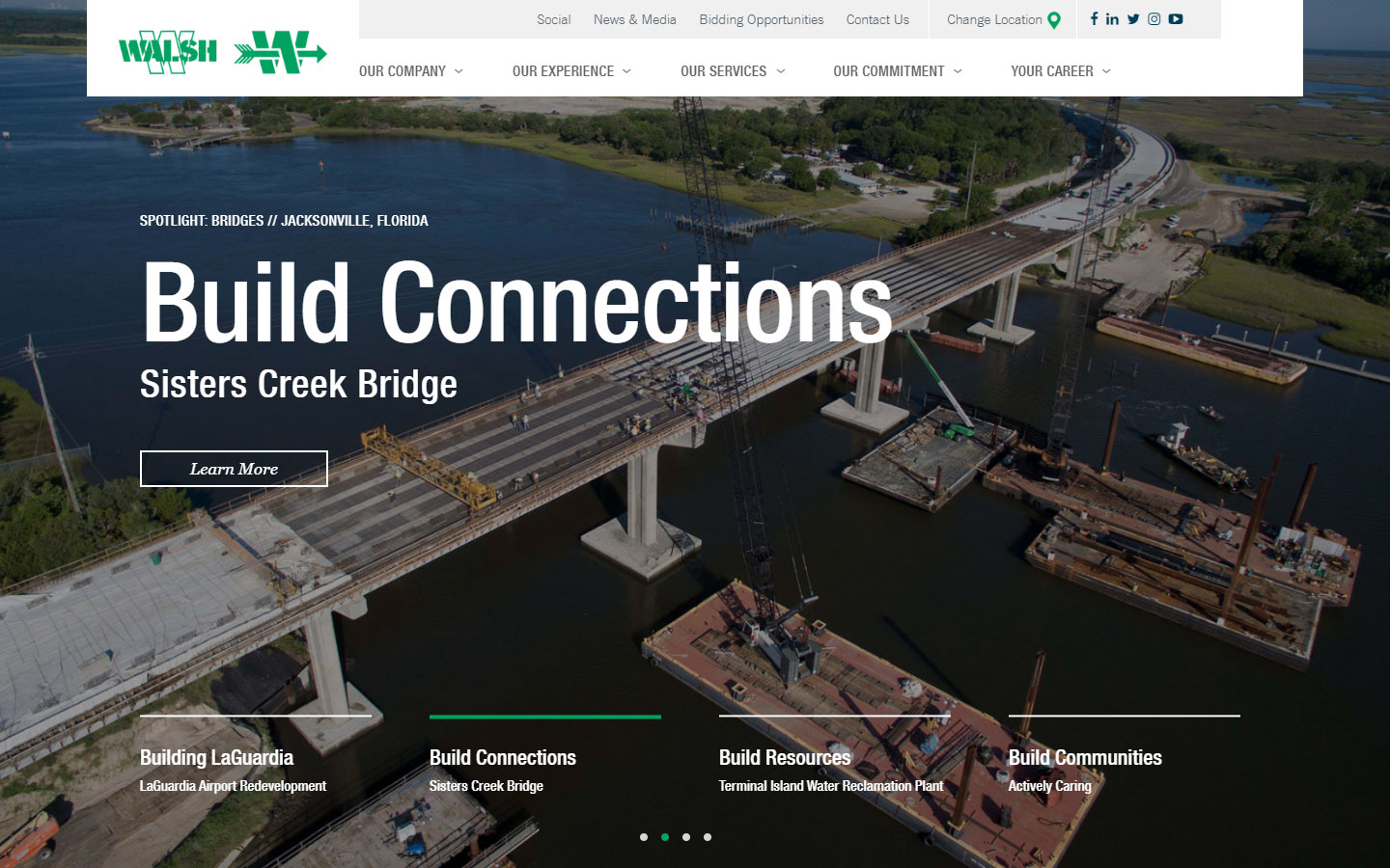
5. The Walsh Group
Why it works: The transitions of elements in hero slideshow is engaging. Website design and layout is simple to use and navigate.
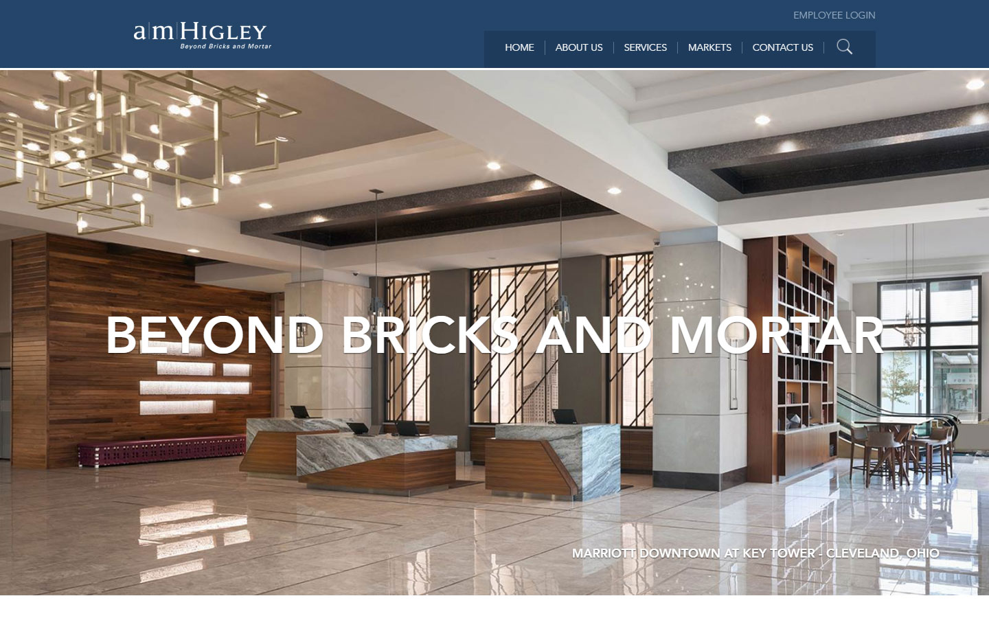
6. AMHigley
Why it works: The content body width is narrower than usual, making it easier to read and pleasant for mobile devices. In addition, each photograph in the slideshow was labeled appropriately.
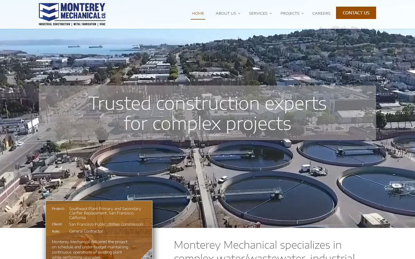
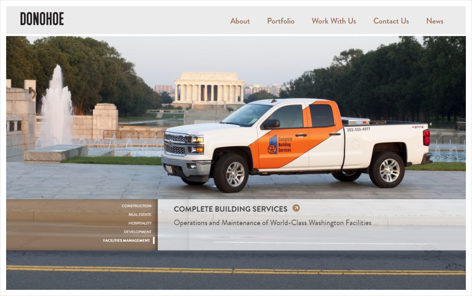
7. Monterey Mechanical Co.
Why it works: Monterey Mechanical Co. used their own quality project images. A clear declaration of what they do and offer is stated upfront. Sections were clearly-labeled.
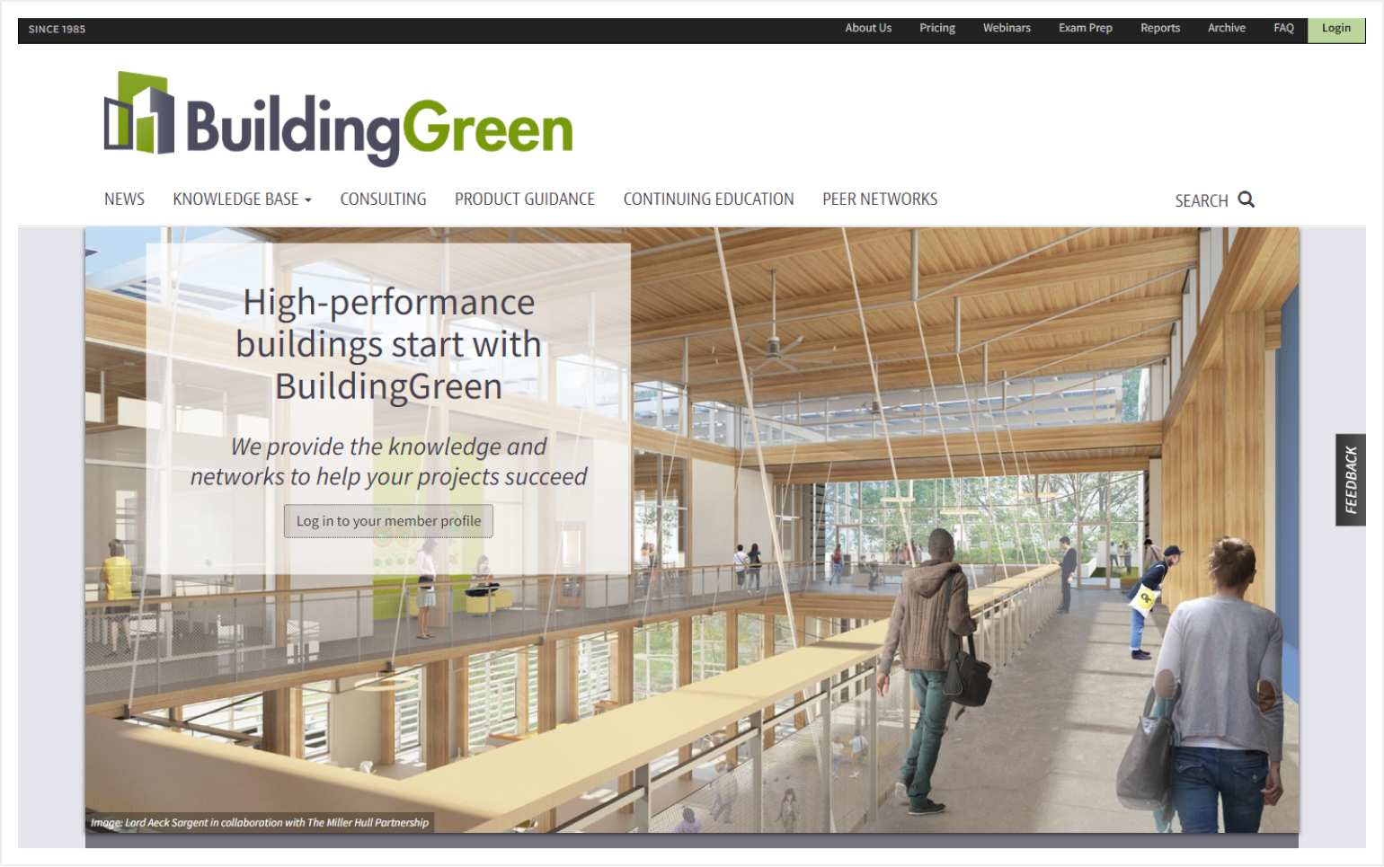
8. Building Green
Why it works: The topmost navigation is not distracting. To promote their brand and presence, a clear main navigation with a large bold logo is used. Services offered are clearly presented in a single column.
Good Website Design
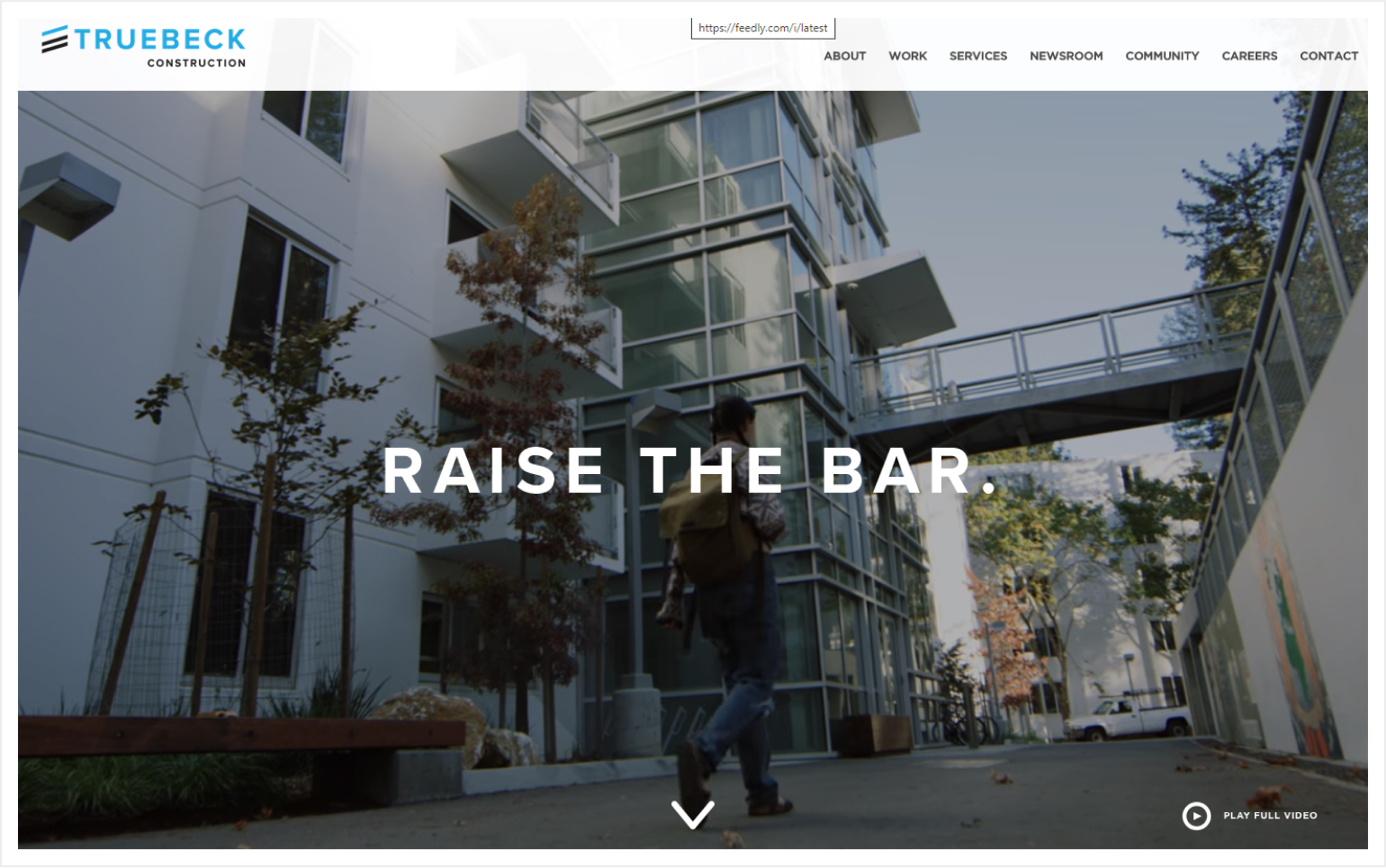
9. Truebeck Construction
Why it works: On the hero area, there is a stunning slow-motion video. This construction website design is overall minimalistic and straightforward.
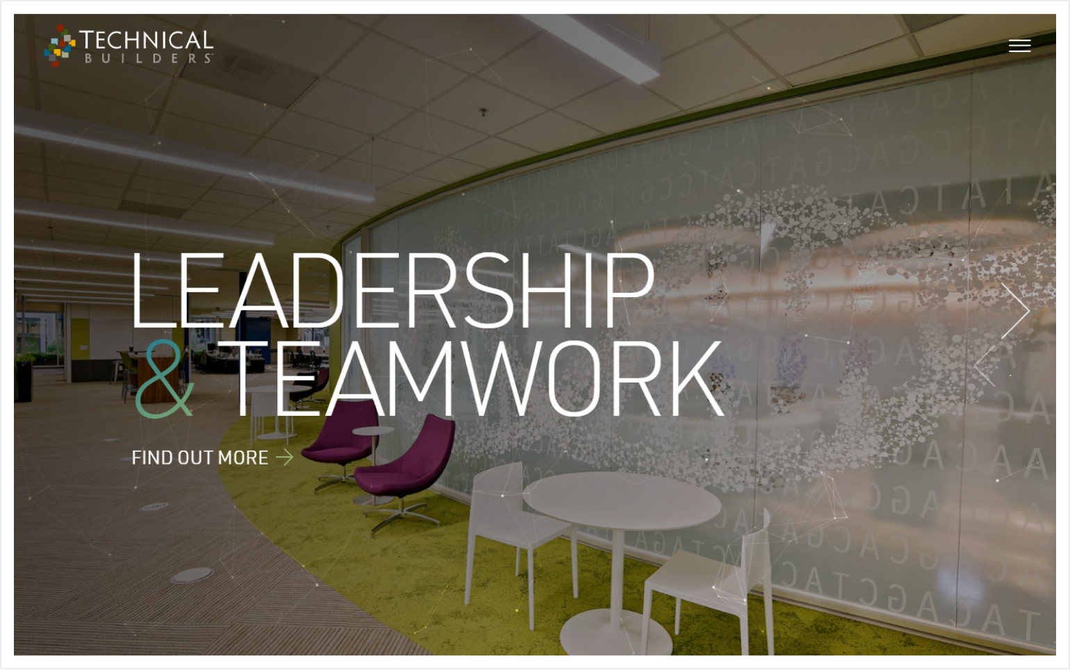
10. Technical Builders
Why it works: The website’s visuals are fantastic. Photography that is beautiful and eye-catching is used throughout the site. There are big, attention-grabbing titles and short content on the site.
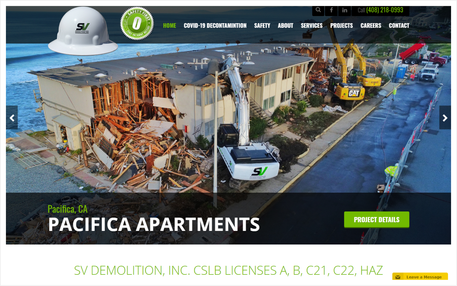
11. SV Demolition, Inc.
Why it works: The website’s color scheme is strong and vibrant. The hero section’s main CTA button is clear and projected well. A simple call to action (CTA) appears at the bottom of the page as well.
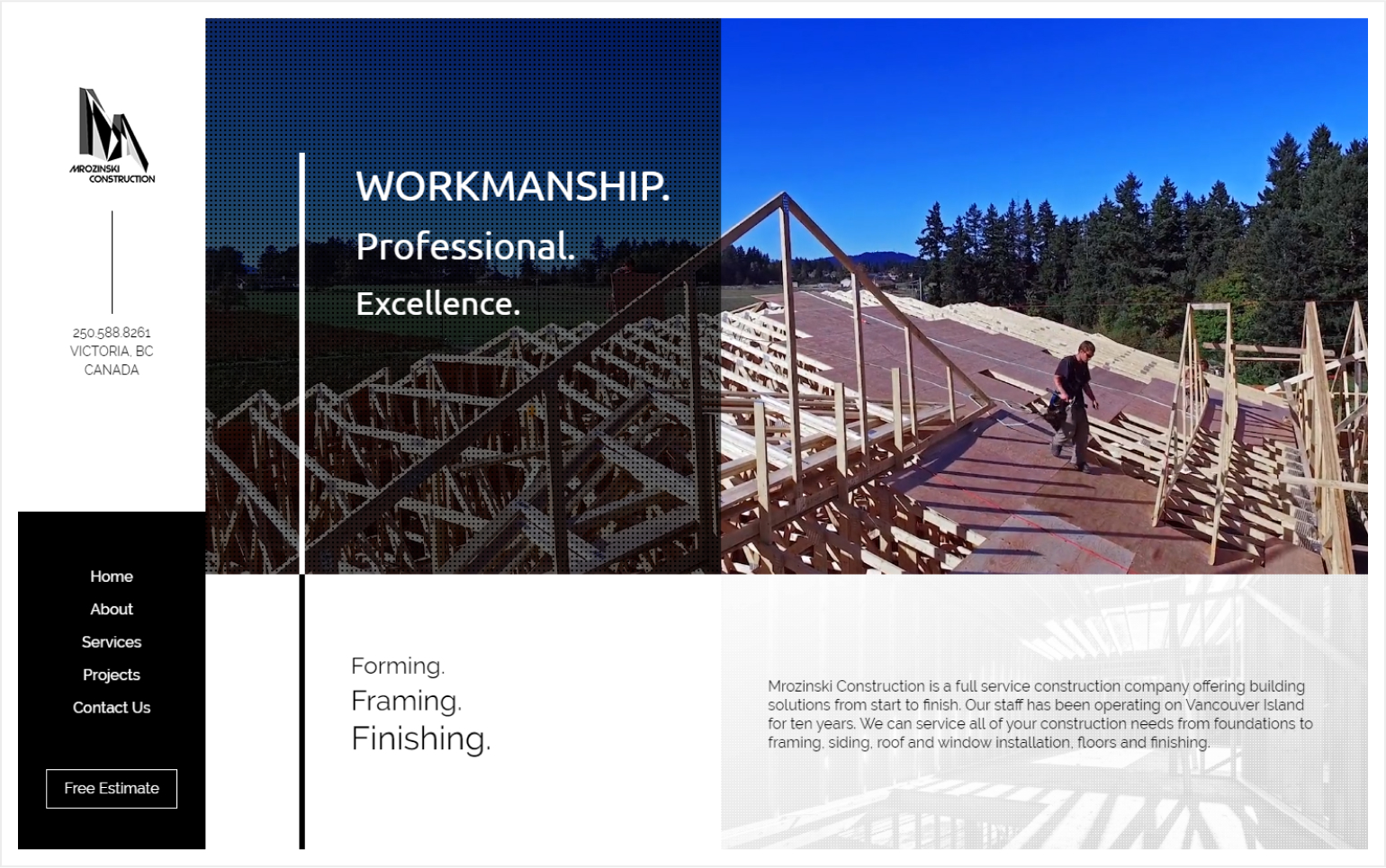
12. Mrozinski Construction
Why it works: Mrozinski Construction’s website features a unique layout with clear contrast between sections and elements. The hover animations were subtle but effective. The loading animation, too, is distinctive to the site and reflects the company’s identity.
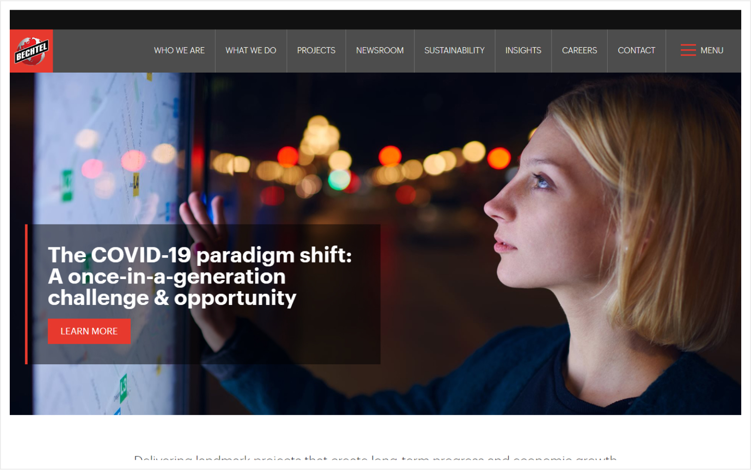
13. Bechtel
Why it works: The navigation bar has clear presence. Information throughout the site is properly segregated in chunks. The contact section has its own real estate, highlighting its importance.
Construction Website Design
14. Desert Star Construction
Why it works: This construction website design makes excellent use of whitespace to highlight their portfolio. Elegant typography was used paired with subtle but tasteful animations of sections.
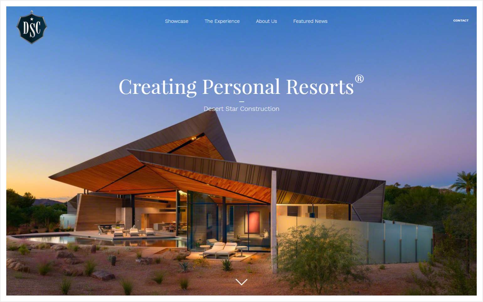
http://desertstarconstruction.com
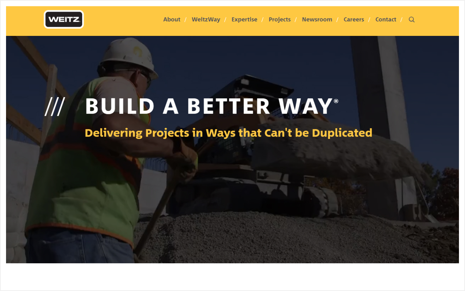
15. Weitz
Why it works: The colors of their website clearly tell you what they do and what industry they’re in. The typefaces and simple graphics complement the website very well.
The Bad
1. Outdated Website
A regularly updated website is an indication of a company’s concern and attention to their image and reputation. Establish credibility quickly and simply by keeping your website up to date in terms of design as well as content.
2. Non-selectable or Flattened Texts
It’s important to keep your text searchable and readable by machines while still maintaining the visual appeal. This is especially essential for SEO.
3. Hard Transitions & Interactions
Our sample construction website design here has a hard-to-use transition that involves both a full mousewheel scroll and seconds of delay for the animation to take place. Transitions and websites should have intuitive and flowing animations to enhance user experience (UX).
4. Multiple Distracting Animations & Movements
If you use too much animation, slideshows, or transitions, they will distract visitors from the important parts of your website and direct them to unimportant sections. The chaos may lead people to lose interest and their attention may stray away from relevant areas.
5. Missing or Generic Favicon
A lot of websites miss this critical element in the website building process. A favicon serves the following purposes: 1) quick identification of website especially in search results; 2) easy to relocate a website lost in a lot of browser tabs; 3) It further establishes your brand, making it easier for visitors to distinguish a ‘familiar’ website from queries and other websites.
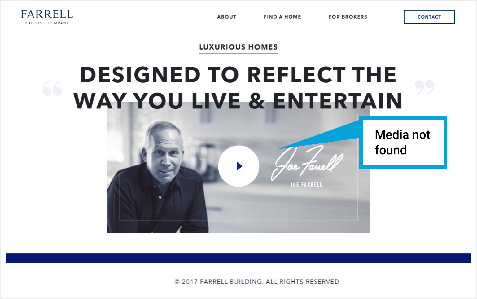
6. Broken Links and Media
Broken links are one of the most common reasons for website dissatisfaction. Aside from the typical 404 and 504 errors, discovering a website with missing or broken content and/or link quickly turns visitors away.
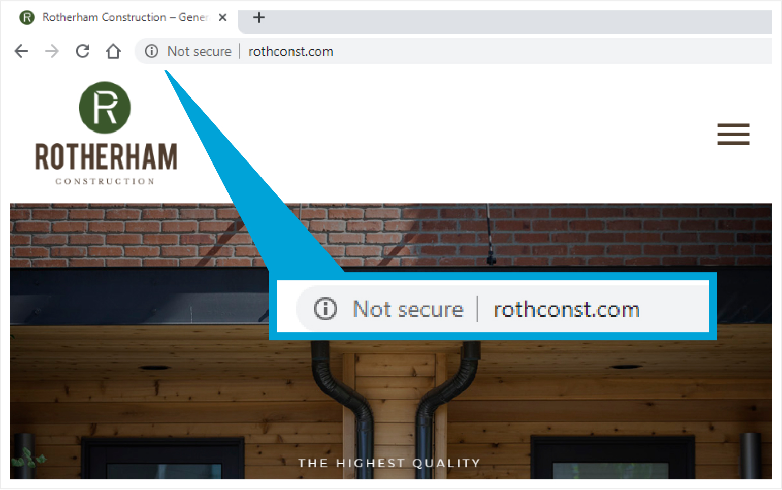
7. Not Enough Website Security
A missing security badge, such as the one seen in the website below, is critical in letting your visitors know that their privacy and information are secure. Information that goes through this connection may be tampered by unscrupulous people if it isn’t protected.
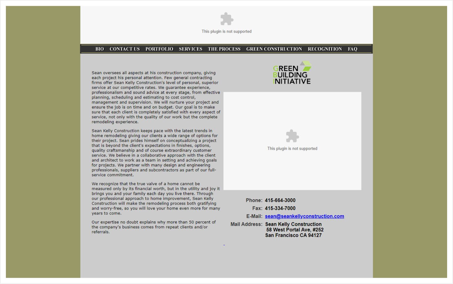
8. Flash is Dead.
Flash was once a popular “feature” on websites, particularly used for animations and the generation of dynamic elements. It is, however, obsolete and technically ineffective now. We should look at what today’s most fundamental web technologies (e.g., HTML5, CSS3, and Javascript) can already perform and how amazing it is as a solution.
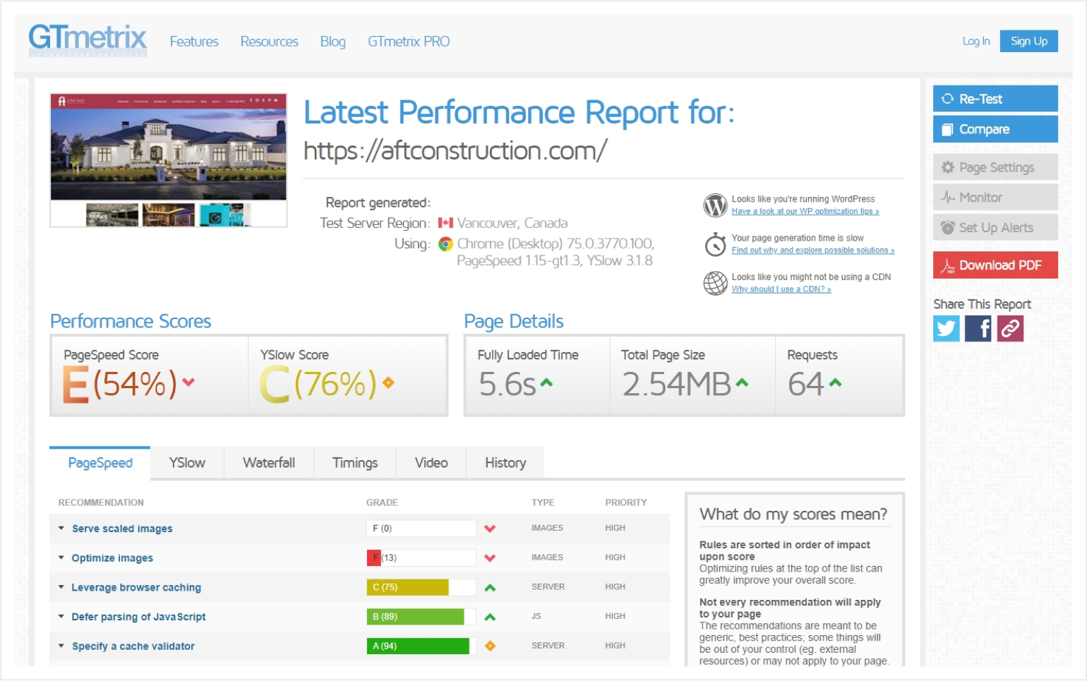
9. Low Page Speed and Website Performance
We may not notice these factors on a client basis, but who likes a slow website? Another issue that a visitor might face is when the site is large and he or she has a limited online connection. To provide the most end-user satisfaction, make sure your website is optimized.
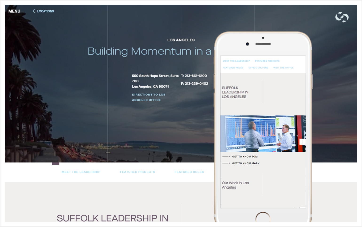
10. Bad Responsiveness/Not Mobile-Ready
A website might work okay from a desktop perspective, but how about in mobile? A lot of websites suffer this kind of issue where it gets totally messed up, like overlapping elements, unproportional layouts, and so on. Be sure to check your website if it works in at least a majority of devices today to ensure usability.
The Ugly
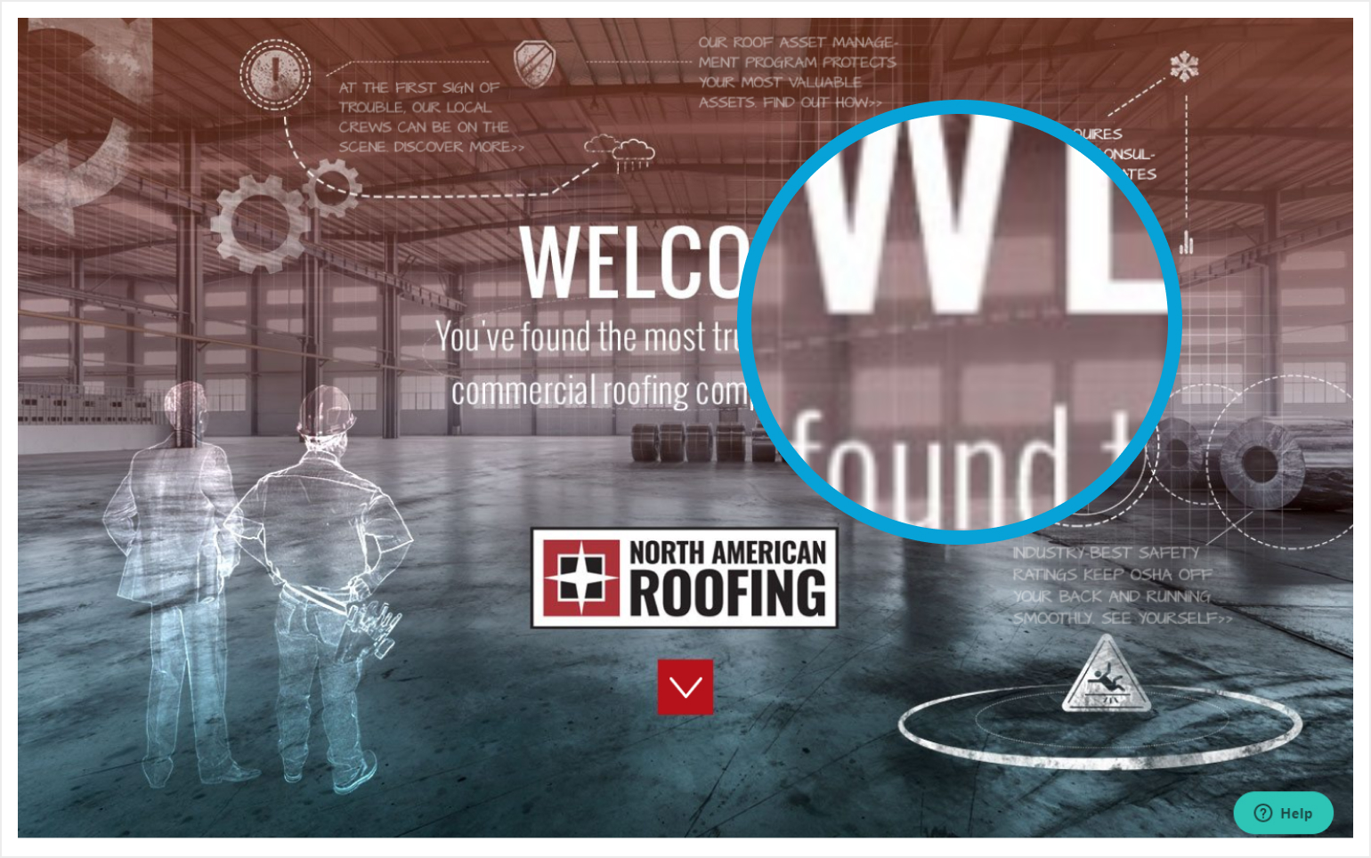
1. Hard to Read Elements/Texts & Improper Contrast
As seen in the construction website example, the logo is lost in the background image, and the social icons almost blended with the window area of the background. We should always test our components to ensure that the most essential elements can be quickly seen and identified.
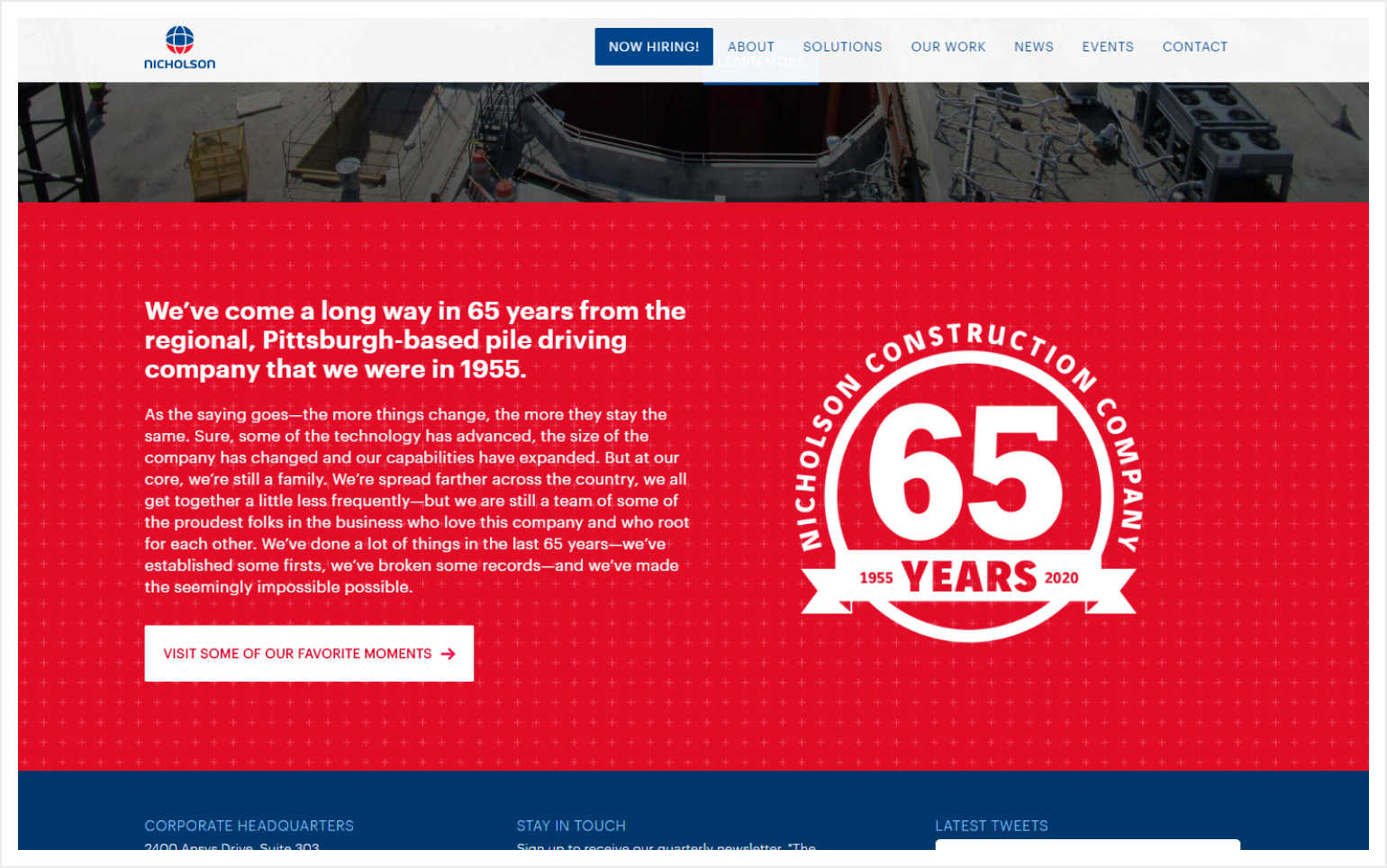
2. White Texts on Pure Red (No, please!)
Using pure bright red color on elements may be fine when implemented properly. However, a bright red section with white texts such as the example below only burns the eye, keeping visitors away from actually reading the content.
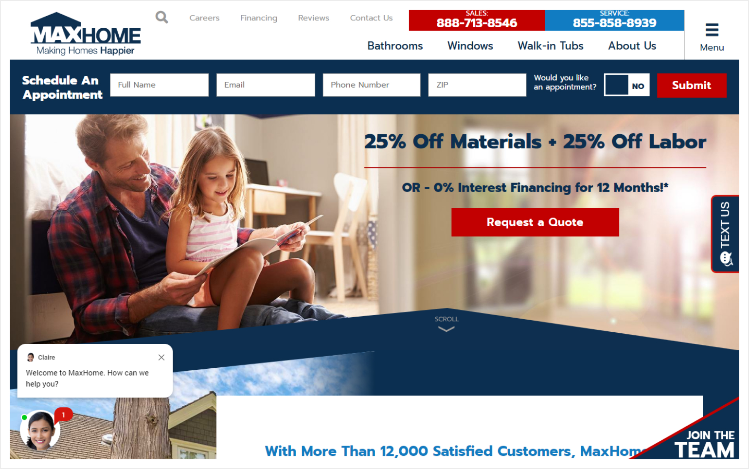
3. Too Much CTAs
The overall look and components of a website should communicate to visitors what the company does or provides, directing them to the correct actions. However, when you include too many buttons and call-outs, as well as some pop-ups, visitors will have a hard time figuring out which steps they should take.
4. Too Much Going on in One Viewport
The construction website below may seem aesthetically catchy, but a lot of elements are too small, and the overall layout looks too compressed. Using white/negative spaces serve one great purpose: to allow breathing room around elements or sections so users can focus on one idea at a time. This example could really use a lot more white space.
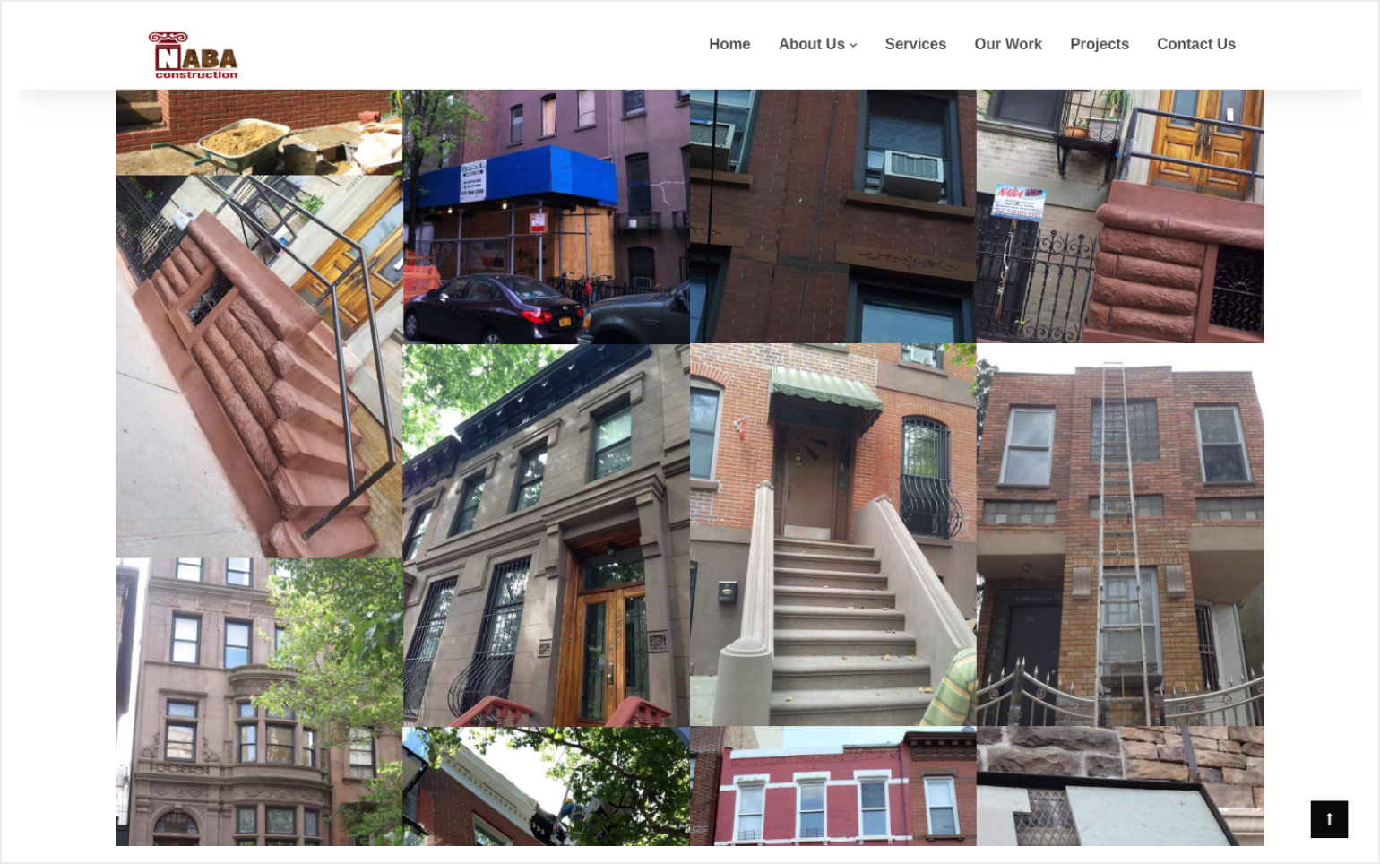
5. Ugly Collages/Galleries
The example below is a clear example of what we want to avoid visually. As much as possible, avoid having images that are rotated to a certain angle, or flipped, or stretched unproportionally. Doing such steers visitors away from looking at what you’re trying to showcase.
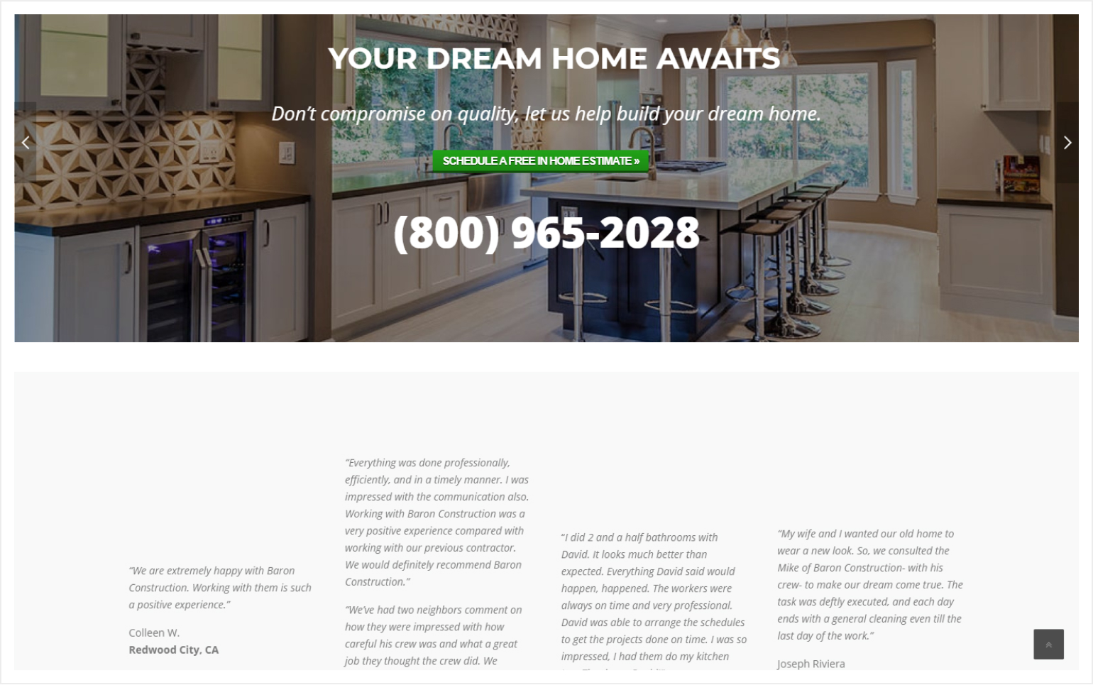
6. Uneven and Untidy Layout
Aside from having a weirdly-sized button on the hero section, the testimonials section has aligned content to the bottom, leaving an uneasy negative space above that serves no good purpose. Alignment in design is crucial because it makes UX more intuitive and allows the visitors’ eyes to flow naturally from one element to the next, based on a pre-determined hierarchy.
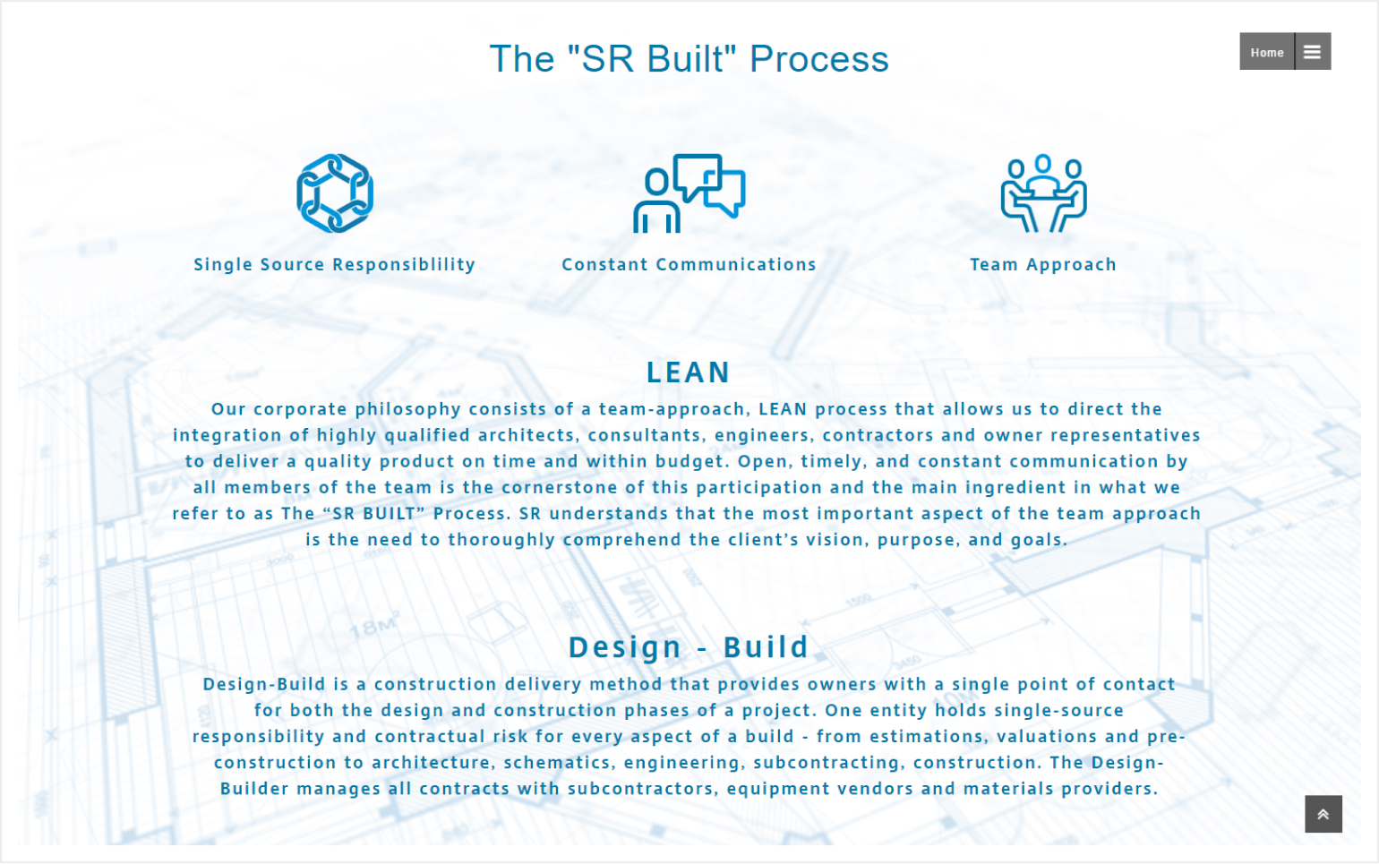
7. No Visual Contrast & Hierarchy
As you can see in the construction website below, practically all elements—including the background—uses only one hue of a color, and almost the same saturation at that. While the blue color might be easy on the eyes, finding information and distinguishing one element from the other will be difficult.
8. Blurry & Pixelated Images
This is basic: blurry or pixelated images are ugly. If you can’t provide a high-quality image of your own, better run to stock sites and grab a good one rather than sacrificing quality. This is one other big reason why we insist that companies hire proper photography services.
9. Too Much Going on Above the Fold
Aside from establishing a logical hierarchy for elements and providing a visible CTA, we must also avoid the temptation of flashing too many elements that we thought would entice visitors into grabbing our offers or services. Remember, by stripping away unnecessary elements, UX will be improved.
10. Lack of Effort or Investment in Web Design
As they say, “A business with no sign is a sign of no business”. It’s also tantamount to saying a business with an ugly website is a sign of a possible ugly business. Invest in a proper website. Hire the right web design and development agency. In the end, you get what you pay for.
Construction Website Design: Why We Love Working With Construction Companies
If you’re looking for help with your Construction Web Design project, you’re in the right place.
We love working with construction companies. Read the last paragraph in the article to find out why.
We’ve worked with many different clients within the construction industry. From piping, cutting and building infrastructure. To roofing, window installation and siding. While all of our clients are unique we’ve found that there are some similarities in terms of the main benefits we offer our clients.
Here are the main benefits we provide:
Highlight Your Projects
When potential customers come to your website they want to know that your company can deliver. Typically the first thing a visitor does when browsing a construction company website is visit their projects page to check out their work. We help our clients put their best foot forward by making the design clean, visually appealing and image heavy (people don’t like to read these days.)
Also, we use multiple category filters for every project, so visitors can filter by project type, such as piping, structural, hydronic, etc… Or they can search by industry, such as government, commercial and residential. This allows users to quickly filter through your project portfolio and get to the specific type of work they are interested in.
Easily Found on Google
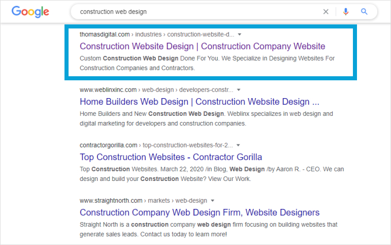
If you’re like most of our clients then you probably get most of your new construction business via referrals, word of mouth and personal contacts. But wouldn’t it be nice if your new website could generate an entirely new stream of business that you wouldn’t otherwise have gotten? This is something we help our clients do. As you probably know the construction industry is a little behind the times when it comes to online marketing. Because of this it won’t be that difficult for us to get you top ranking for key search terms in your area. And when it comes to SEO (Search Engine Optimization) we don’t just talk about it. Just ‘Google’ ‘San Francisco Web Design’ or ‘Hire a Web Designer’ and you’ll see that we’re at the very top of Google for both of those keywords.
Mobile Responsive
Did you know that almost 25% of all website traffic comes from mobile these days? All of the construction websites we design are fully mobile responsive. Adapting for the iPhone, the iPad and all other mobile devices. We also design your Project and Service pages in such a way that they are easy view on Mobile, since those are the pages most often visited.
Strong Call to Action
Our main goal when working with a client is not to make them a pretty looking site. You heard that right. Design is not our number one objective. To be sure we love making beautifully designed websites and hope that our portfolio of work reflects that. But at the end of the day the purpose of a website is to generate new business. That is how we measure success for our construction company website clients. Not just in terms of how the site looks, but how it performs in generating new business. That’s why all our sites are designed with strong and specific calls to action to compel website visitors to fill out a contact form, or pick up the phone and take an action.
Construction Website Done For You

Here’s the reason why construction companies love us the most; and frankly, why we love them. Most construction companies we work with are looking for someone to take charge and full ownership of the design process. They are looking for someone they can trust. Both in terms of design, content structure and project management.
Most of our clients want to just push a button, and for a new, awesome-looking website to appear without them having to do anything. And that’s exactly what we do. And frankly we love working that way. We appreciate working with companies that trust our vision and our process and let us do the heavy lifting for them.
If your company is looking for someone to rely on to deliver not only a great website but a great experience throughout the process, then count on us. We won’t let you down.